Critique fully documented Text Multiples! Put all documentation – images , title and a clear description of the work on your blog page.
Video Recording demo with Nathan
VISITING ARTIST TALK!
The School of Fine Art and Music is pleased to present the Winter 2022 Visiting Artists and Speakers Series. Our next event featuring visual artists Abbas Akhavan will take place on February 7, 6:00 – 7:00 pm EST.
Abbas Akhavan’s practice ranges from site-specific ephemeral installations to drawing, video, sculpture and performance. The direction of his research has been deeply influenced by the specificity of the sites where he works: the architectures that house them, the economies that surround them, and the people that frequent them. The domestic sphere, as a forked space between hospitality and hostility, has been an ongoing area of research in his practice. More recent works have shifted focus, wandering onto spaces and species just outside the home – the garden, the backyard, and other domesticated landscapes.
Akhavan’s recent solo exhibitions include Chisenhale Gallery, London (2021), Fogo Island Arts, Fogo Island (2019), and The Wattis Institute for Contemporary Arts, San Francisco (2019). Group exhibitions include Liverpool Biennial, Liverpool (2018), SALT Galata, Istanbul (2017), and Solomon R. Guggenheim Museum, New York (2016). Akhavan was recently the artist in residence at Atelier Calder, Saché (2017), Fogo Island Arts (2013, 2016, 2019), and Flora: ars+natura, Bogota (2015). He is the recipient of Kunstpreis Berlin (2012), The Abraaj Group Art Prize (2014), and the Sobey Art Award (2015).
You can find more information about Akhavan at the following link:
Zoom links for forthcoming events will be distributed via. email and made available on Instagram @guelphmfa
We acknowledge, with respect, that the University of Guelph is situated on the treaty lands and territory of the Mississaugas of the Credit and on the ancestral lands of the Attawandaron people. Their historical relationships with the land continue to this day.
Océane Buxton, Still from Saint-Madamette of Los Angeles Chapter 2, 2021.“The artists propose allegorical subversions to oppressive systems through a kind of propositional queering. Connecting these works are themes of identity, satire and costuming which foster a sense of liberty across the circuits of capitalism and production.”– Marissa Sean Cruz, CuratorFRUIT LOOPS: Video Art Live Screening curated by Marissa Sean Cruz Thursday, January 27th, 8PM ASTLive Stream LinkCuratorial Statement Marissa Sean Cruz, 3:42
S(HE) WOLF Alisson Escobar, 2019. 3:25
Taking is too easy, but that’s the way it is (Dance Dance, Revolution?) Alvin Luong, 2016. 1:55
bbssscrib1920x1280 Amy Lockhart, 2018. 2:21
Fruit Jus Arjun Lal, 2021. 1:12
Who Do You Think You Are, I Am Bridget Moser, 2019. 6mins 20secs.
Undefined Figure, Claire Hunter, 2022. 11:04
Abra Hiba Ali, 2018. 4:59
Welcome to the Alter-Ego Citadel KanikaxX, 2020. 14:22
Saint-Madamette of Los Angeles Océane Buxton, 2021. Chapter 1 and Chapter 2, 14:14More information about the artists and featured works can be found on our website.
About The CuratorMarissa Sean Cruz is a digital multimedia and video performance artist from Kjipuktuk (so-called Halifax). Their experimental videos use 3D modelling, sound design and costumed performances to study identity and value systems. Remixes of pop culture and commercialized products are synthesized creating alternative narratives. These humorous works aim to process a fast-paced contemporary present and envision possible, utopian futures. Marissa Sean Cruz (b. 1996) has been displayed in venues like Xpace, Studio 303, Gallery 1C03, Galerie VAV Gallery and Struts Gallery and Faucet Media Centre. Cruz’s various projects have been displayed throughout the United States and distributed digitally through spaces like the Centre for Art and Thought, Canadian Art, Video Pool Media Arts Centre, Public Parking and more.For more information visit:
Multiple by Maurizio NanuciBest known for his large neon installations, Italian artist Maurizio Nannucci has been producing artists’ books, records and multiples for over forty years. As a publisher, he has produced works by James Lee Byars, Fluxus, Michael Snow and many others From the artist books and multiples blogspot by DAVE DYMENT
5 ways Jenny Holzer brought art to the streets
Discover how this influential artist continues to produce art that is impossible to ignore
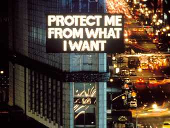
American artist Jenny Holzer is best known for her thought-provoking, text-based installations and her creative use of electronic technology. Whether seen on billboards, T-shirts, cups, condoms, or in a gallery, her work asks us to consider the words and messages that surround us in the information age.
I used language because I wanted to offer content that people – not necessarily art people – could understand Jenny Holzer
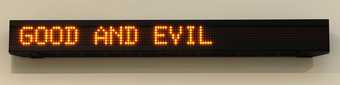
Words are central to Holzer’s work, whether pasted on a wall, flickering from an electronic sign or carved in granite. She presents messages in ways that reach people outside of museums and galleries, such as on stone benches, signs, posters and T-shirts. These texts reflect the language of breaking news, advertising and other mass media. They can often provoke strong responses. For example:
MONEY CREATES TASTE
ENJOY YOURSELF BECAUSE YOU CAN’T CHANGE ANYTHING ANYWAY
A MAN CAN’T KNOW WHAT IT’S LIKE TO BE A MOTHER
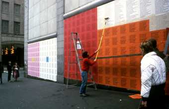
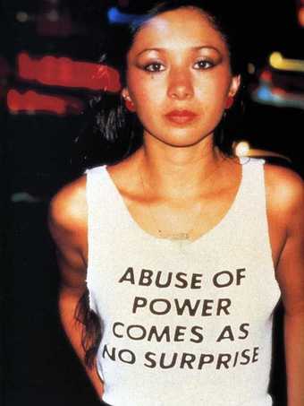
These messages come from her first major text work, Truisms, which explores the idea of gathering and presenting information as art. She created nearly 300 of these statements, based on common sayings and clichés, and expressing many different points of view. These texts first appeared on anonymous posters wheat-pasted throughout lower Manhattan in New York City. Later, they were placed on disposable cups, silver bracelets, condoms and electronic signs. In 1982 she displayed these messages across a giant electronic signboard in New York’s Times Square. Holzer hoped they would prompt people to recognise and question the ‘usual baloney they are fed’ in daily life.
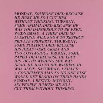
The tone of her next work, the Inflammatory Essays, is more challenging and aggressive. These took the form of 100 word paragraphs printed on different coloured papers. Holzer wrote these texts herself, but we shouldn’t see them as directly reflecting her own opinions. Her writing often considers issues from multiple viewpoints but always tackles issues important to many people.
2. COLLABORATION
I was so relieved to stop, not just for sheer laziness, but because I was able to expand what I could do when I work with other people.
Throughout her career, Holzer has worked with many artists and activists from different backgrounds. She was part of Collaborative Projects (Colab), a group of New York City artists. This collective championed access and inclusion and created work in response to the political issues of the late 1970s and early 1980s. In 1985 she brought her Truisms to life in a different way, working with choreographer Bill T. Jones on the dance project Holzer Duet … Truisms. In this performance, the actor Lawrence Goldhuber recited a text by Holzer while Jones danced with and around him.
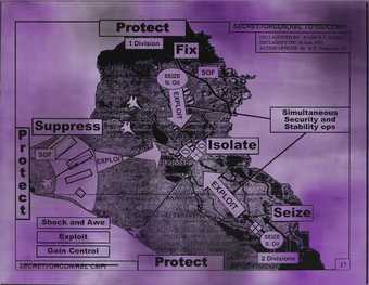
Holzer also uses texts written by others including poetry, prose and first-person accounts of war and its aftermath, such as those collected by charities including Save the Children, Human Rights Watch and The Not Forgotten Association. Declassified government documents offer another starting point for her art. For example, the 2007 screenprint Protect Protect is based on a PowerPoint presentation used to brief the White House in advance of the US and UK invasion of Iraq. By enlarging and adding bright colours to these documents, Holzer highlights the dangerous power of language. We see the words “protect”, “suppress” and “isolate” superimposed on an image of a deeply divided Iraq.
A great feature of the electronic signs is their capacity to move content. I love that because motion is much like the spoken word: you can emphasise phrases; you can roll and pause, the kinetic equivalent to inflection. It’s a real plus to have that programming capacity. I write my text by saying the words out loud, or I write and then say words, to test them. Having text move is an extension of that process.
For Holzer, technology is a tool that can convey her ideas to a much wider audience. She often uses light projections and LED signs in her work. The LEDs borrow technology traditionally used in public advertising and warning signs. Through these screens, she can make sure that her art is displayed in the places “where people look”.
In Sign on a Truck (1984), Holzer used a vehicle equipped with a sound system and an electronic display to present a mixture of speeches, interviews and humorous images. The project was an attempt to use technology to spark debate and capture a diverse range of voices and opinions on the eve of the United States presidential election.
Holzer builds a more intimate relationship with her viewers by creating art that exists outside of traditional art spaces. She wants her work to be something that you just happen to notice while going about your everyday life. She is not interested in work that can immediately be read as art. In this way, her work is similar to graffiti. When art is located on the streets, it cannot be ignored.
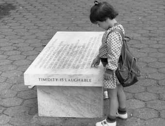
An example of this approach is Holzer’s stone benches. She began making these in the mid-1980s. Just like the benches you find in city parks and cemeteries, these objects offer a place for reflection or discussion. Everyone is invited to sit on them and chat together. Holzer works with many kinds of stone and carefully selects materials that suit the engraved texts.
The line between activism and art is blurred in Holzer’s work. Almost all of her art is political in tone. It asks questions about our roles in society and the differences between public and private life. Through her choice of statements and the minimal way she presents them, Holzer takes herself out of her artworks. They are no longer personal. They are not her words but a shared voice or many voices.
Her latest project IT IS GUNS is a response to student movements demanding more legislation for gun control in the United States. In March and April 2018 she presented anonymous text on LED screens mounted on lorries. The vehicles drove and parked by landmarks and city centres in Washington D.C., Los Angeles, New York City, Chicago, Atlanta and key locations throughout Florida. The screens showed animated texts with language relating to gun violence, such as SCREAM AGAIN, RED BLOOD or SHIELD HER. These words flashed up in quick succession like free-association poetry. They also suggested the rapid-fire rhythm of semi-automatic weapons.
Holzer’s work is as relevant now as ever before. The photo above shows Lady Pink, a New York graffiti artist and one of Holzer’s collaborators. She is wearing a T-shirt showing one of the artist’s Truisms. Taken in 1983, the photo went viral in 2017 when it was shared widely online in response to the #MeToo movement. (Holzer section from Tate Modern)
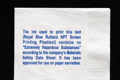
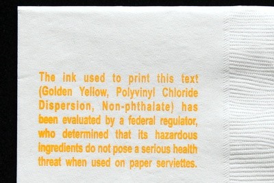
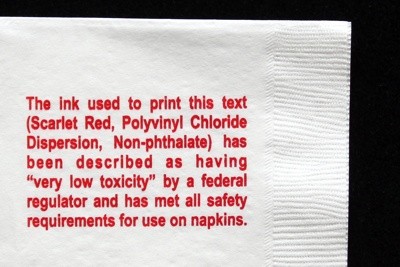
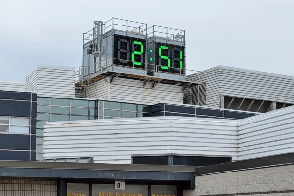
Jon Sasaki
Napkins (Materials Safety Data Sheet)
2011, Multiple, paper serviettes printed with one of three colours of ink. 5″ x 5″
A Clock Set to 24 Hours Into The Future
2014-2015, public artwork for Sheridan College’s Temporary Contemporary, Trafalgar Campus, Oakville Ontario.
“Unlike most campus clocks, this one has been set 24 hours fast, always displaying “tomorrow’s time.” Of course, on a four-numeral digital clock, tomorrow’s time appears indistinguishable from “today’s time,” and therein lies a small bit of levity that is intended to open up a range of poetic interpretations.”
“A clock tower running 24 hours fast is in fact practical and functional in the present, but serves also as an aspirational signpost pointing towards the idea of tomorrow.” From his site Jon Sasaki
(the accompanying didactic panel)
An Obsolete Calendar Towel Embroidered with an Identical, Future Calendar Year, 1970/2065, 1982/2049, 1976/2032 and 1969/2042
2012, ongoing, embroidered found vintage textiles, each approx. 17″ x 28″.
In an ongoing series, obsolete calendar towels have been embroidered with the date of an identical, future calendar year. Beyond giving the discarded object a renewed relevance, it proposes a disturbingly banal vision of the future… that decades from now we will still be pining for some vague 19th century inspired nostalgia… covered bridges, copper kettles, cast iron stoves and millponds… images that were anachronistic wishful fictions even at the time the calendars were first printed.From his site Jon Sasaki
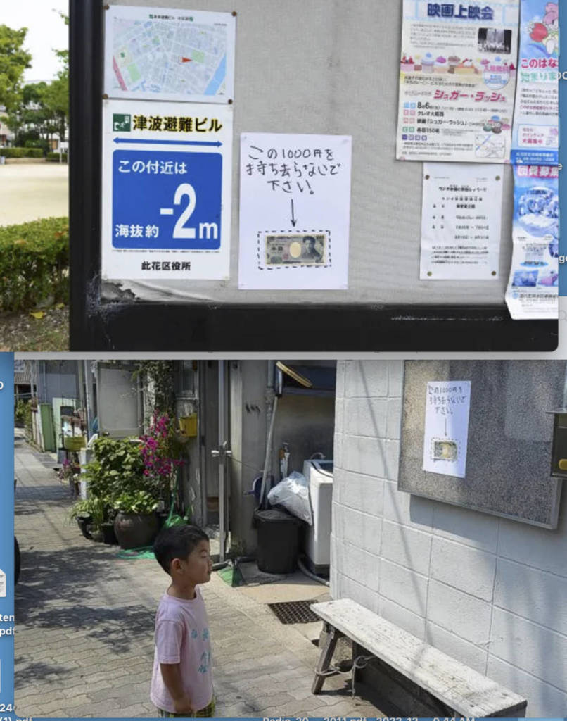
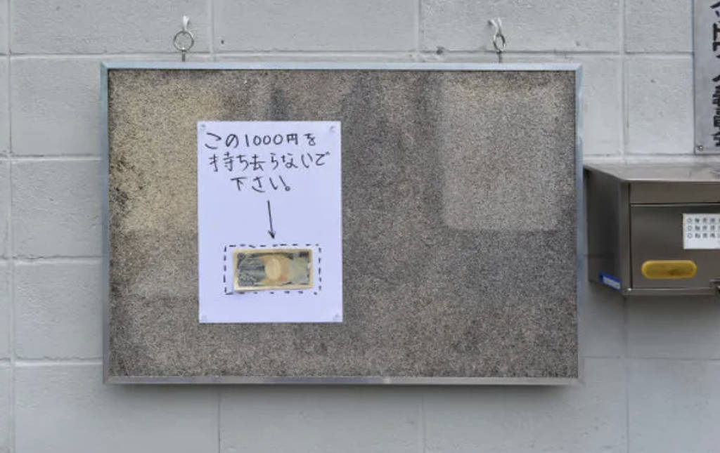
Please Don’t Take This 1000 Yen
2013, intervention in the neighbourhood of Konohana, Osaka Japan.
Jon Sasaki,
Please Don’t Take This 1000 Yen 2013, intervention in the neighbourhood of Konohana, Osaka Japan.
Upon arriving in Osaka, I observed hundreds of bicycles that had either flimsy locks, or no locks at all to secure them. I surmised there was some sort of honor system in play, and decided to test it a little. The results were surprising to me.
Four signs were placed around the neighbourhood early one morning, asking residents to please not take the 1000 Yen bill attached to it.
Two of the signs remained untouched until I retrieved them late that night. One sign disappeared mid-afternoon, although it probably had something to do with it being posted on the city’s bulletin board without permission. The fourth sign disappeared late in the day, which still impressed me. It turns out it was taken by a random, concerned neighbour who wanted to safeguard it. She did some sleuthing, somehow correctly guessed the restaurant I would be visiting later that night, and returned it (along with the 1000 Yen of course) a few hours before I arrived.
On his website, Lee Walton writes: “For Momentary Performances (2008-2010), I used vinyl text on city walls to announce ordinary moments that will take place. These texts are installed throughout the city weeks prior to each performance. Nearly 20 of these public works took place in Minnesota and Atlanta.
After acting out the script exactly on schedule, actors casually disappear into the city as if completely unaware of the descriptive text. Unexpected public is left to wonder about the reality of the serendipitous occurrence.”
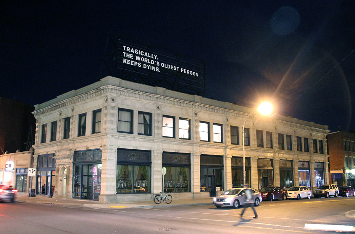
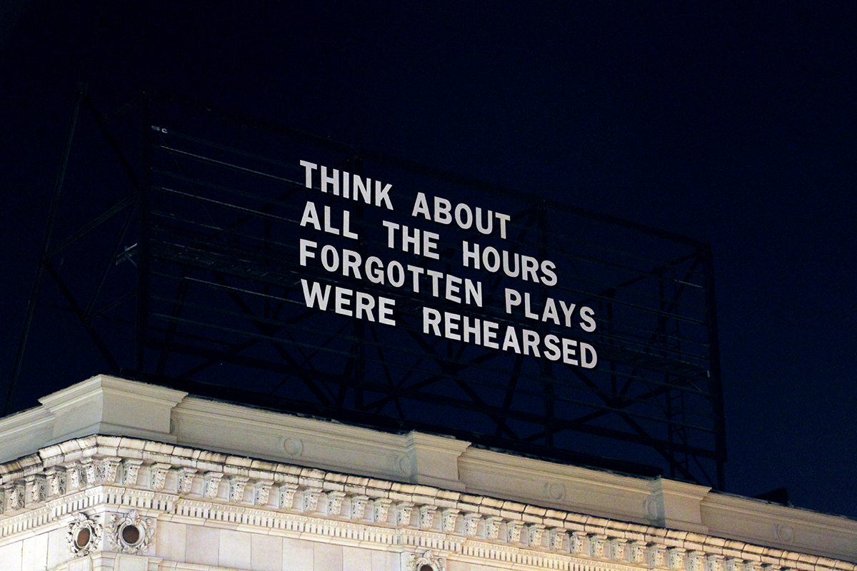
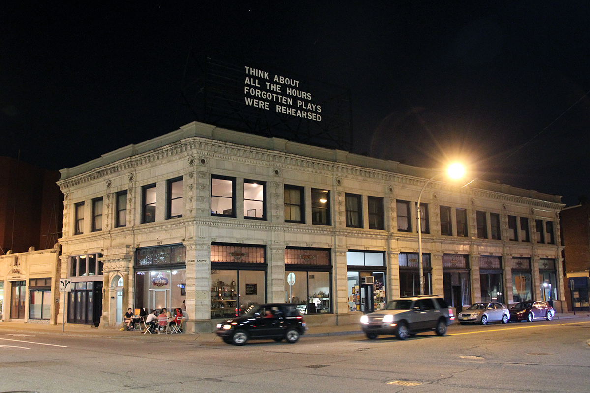
An Everyday Tragedy – Lenka Clayton
2016 / billboard text / 36 ft x 30ft / photos: The Last Billboard
The Last Billboard is a 36 foot long rooftop billboard located on the corner of Highland and Baum in Pittsburgh, PA, USA, that displays a different text each month composed by a different individual. The custom designed billboard consists of a rail system with wooden letters that are changed by hand. The billboard is curated by Jon Rubin.
All The Hours – Lenka Clayton
June 2014 / wooden letters on billboard / images: Jon Rubin / The Last Billboard
A new text work is currently installed on The Last Billboard; a changing billboard on the rooftop at South Highland & Baum in Pittsburgh, PA, curated by Jon Rubin.
Dad and David Visiting was produced while my father and his boyfriend were visiting us from San Francisco. They were sleeping on a mattress on our floor. When I was walking past them one morning I realized the beauty of the scene and grabbed my camera.
“Parade of Champions” (2015) explores the grief experiences of three black queer people, following the deaths of their mothers. Although grief is borne from loss of any kind, for an adult child, a mother’s death is incomparable. As universal and inevitable as it might be, this suffering is complicated by the restriction on mourning in our culture. Grief upsets us. It makes us uncomfortable. The bereaved are expected to mourn in private or at the very most, publicly for a short period only. For black queers, already unseen and othered, grieving a mother’s death requires a further pushing back against notions of disposability and invisibility.
Drawing on my own experience after my mother’s death in 2011, Parade of Champions centres this black queer counter-narrative in creating a poetic encounter with loss. Employing still video portraits and audio interviews, this immersive three-channel installation invites viewers to bear witness to this black queer grief. From https://vimeo.com/148414120
–
Mom and Dad
Mom and Dad, 1994, Silver dye bleach prints (triptych), 24 x 19 7/8′ each
“In Mom and Dad (1994), Antoni made up each of her parents in the guise of the other, photographing them together in three different permutations with either one or both of them costumed in this way.”
Momme
Momme, 1995, C-print, 35 x 29 1/3′
“For the 1995 photograph Momme, Antoni hid under her mother’s dress, her own adult body bulging like a pregnant belly.”
The short video projection 2 into 1 (1997) features a mother and her two sons, one generation lip-synching the dubbed words of the other. It is hypnotically disturbing to watch a pair of 10-year-old twins take turns speaking their mother’s exasperated love for them. “I think Lawrence is absolutely adorable, he’s gorgeous, I love every inch of him,” Lawrence says, in a slightly raspy woman’s voice. “But he’s got a terrible temper.” Halfhearted affirmations of self-esteem also figure in the mother’s monologue, along with deep fatigue, all sounding precociously sympathetic–if not a touch demonic–coming from her children’s lips. Equally unnerving is the mother’s mimed recitation, heard in the soft, clear voices of clever preadolescent boys, of her sons’ accounts of her. We hear their criticism of her driving (“too slow”) and clothes (“she doesn’t dress too well”), and their complaint that she goes out to clubs too much (slightly disheveled and obviously anxious, she looks like she could use the break). For their part, the boys, baby-faced and natty but incipiently loutish, are hardly ingratiating. A dazzlingly deft expression of the complex pushes and pulls in the mother-son relationship, 2 into 1 is an even more concise articulation of the triangulated relationship between artist, subject and viewer. Treating emotional truth as if it were the coin under the three fast-shuffled cups of a sidewalk con artist, this video pictures the circulation of meaning as a kind of vaudeville act, fast, funny and a little cruel.
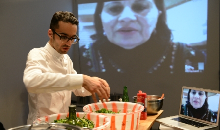
Basil AlZeri
Basil AlZeri is a Palestian artist based in Toronto working in performance, video, installation, food, and public art interventions/projects. His work is grounded in his practice as an art educator and community worker. He explores the intersections between the quotidian and art, and strives for interactions with the public, using social interactions and exchanges to create gestures of generosity.
AlZeri’s performance work has been shown across the Americas.
The Mobile Kitchen Lab
With The Mobile Kitchen Lab (2010 – present), AlZeri performs simple and generous gestures, inviting his guests to identify the Palestinian stories of land, resources and labour that are built into his recipes.
Initiated in 2010, his durational performances feature live projected instructions provided by his mother, Suad, via Skype.
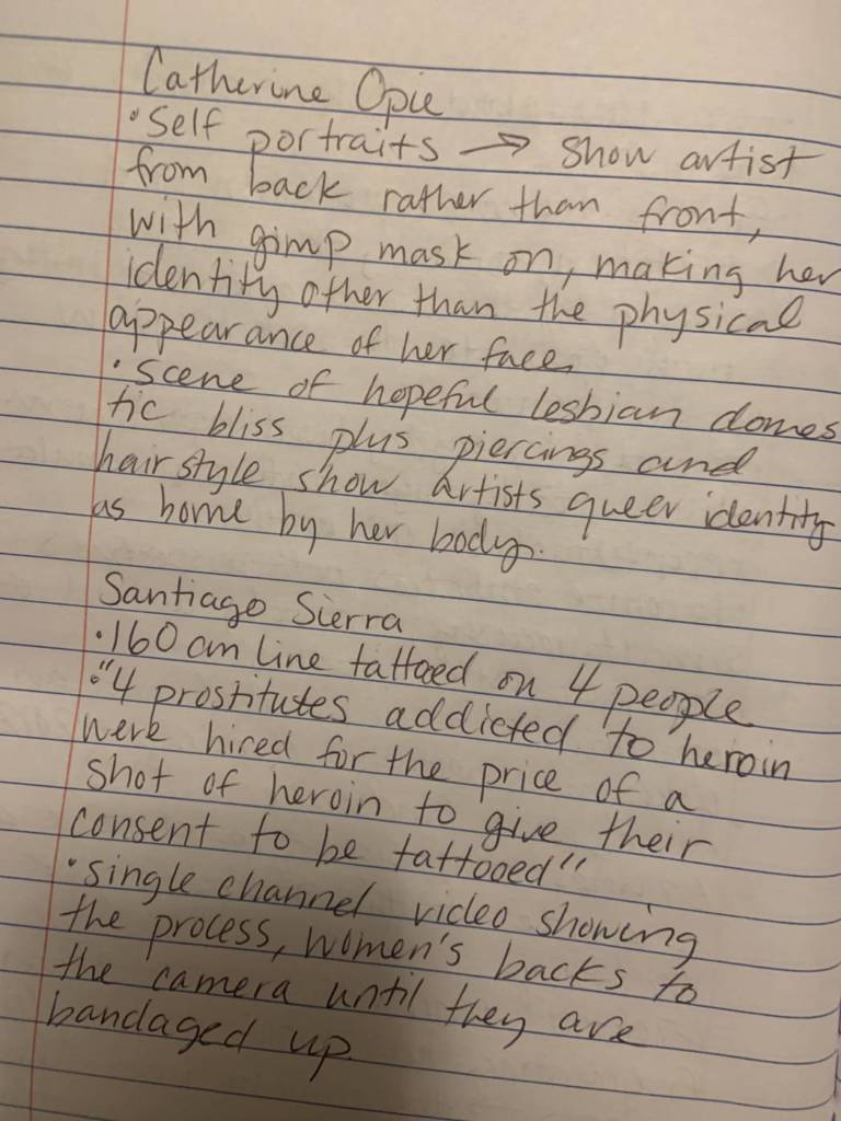
“Exploring the darker side of femininity and socially constructed notions of desire, Patty Chang often takes a corporeal, visceral approach to performance, an art form that underlies her work in video and photography. Like female pioneers of performance in the 1970s, such as Marina Abramovic, Eleanor Antin, and Hannah Wilke, Chang uses her body to address issues of the objectification of women and their representation in art history and popular culture. Chang’s work is often inflected with humor and often pushes commercial and popular female stereotypes to their extreme. In the photograph Melons(1998), for example, she uses cantaloupes as prosthetic breasts. How consumption and desire are inscribed upon the female body is addressed in Chang’s art, but equally so is a woman’s own desire of self.https://www.youtube.com/embed/P4HfEh-kT4c?version=3&rel=1&showsearch=0&showinfo=1&iv_load_policy=1&fs=1&hl=en&autohide=2&wmode=transparent
Much as Janine Antoni, Sally Mann, and Gillian Wearing have explored the sexuality and conflicts inherent to the parent-child relationship, Chang examines the territory of the primal, parental connection in her work In Love (2001). In this dual-channel video, two separate scenes of the artist with a parent are juxtaposed. Chang faces her mother and, in the adjacent frame, appears face–to–face with her father. Simultaneously both images show the artist’s and respective parent’s faces pressed together in what at first appears to be a deep kiss. Gradually it becomes evident that the video is running in reverse time, and that they share not a kiss but rather an onion from which they both eat. They bite into it slowly, pausing as they take turns offering it to each other, as if it suggests the proverbial, forbidden fruit. Parent and child swallow before they take additional bites, blinking hard to hold back tears from the onion’s sharpness and pungency. However, in the video’s reversal of time, the onion is reconstituted and the tears disappear—wholeness is thus regained.”
Every five years, artist Ragnar Kjartansson asks his mother to spit on him for several minutes in front of a camera. The Icelandic mother and son here discuss the fascinating performance, which Kjartansson argues has become “like a part of our family life.”
In 2000, Kjartansson asked his mother if she wanted to spit on him for a video project, which she immediately accepted without any further need for convincing. While spitting, Guðrún Ásmundsdóttir, imagines that her son is one of the businessmen that got Iceland into the financial crash. “When I feel that spit it never feels violent or something, she is just helping her son to do an art piece” Ragnar says, and goes on, “There has always been a lot of friendship in our relationship.”
Kjartansson furthermore explains that both of his parents were “militant feminists”, and that there are feminist undercurrents in his work, such as the spitting echoing how women got ‘a voice’ and were able to ‘spit’: “Being raised by an actor, you start to understand these emotional tools that actors – and directors and people making theatre – use … they use humour and confrontation as tools in making a composition.” Always seeking not to be too literal in his art: “It just doesn’t turn me on.”
Ragnar Kjartansson (b. 1976) is an Icelandic artist, whose work ranges from paintings and drawings to videos, music and performance.
See also Evergon:
Evergon
EXHIBITION TEXT
In 1990, my younger, gay brother died of AIDS and other complications. In 1992, my Mother, Margaret Lunt, modelled as Ramba Mama in my work, Ramboys: A Bookless Novel. In 1993/4, because of her modeling and because of her relationship as my Mother, she participated in the TV special Evergon on Adrienne Clarkson Presents. Immediately after the viewing, my Father went on a tirade because photographs of my Mother’s bared breasts had been shown on television. She had not told him of the modeling session and he had not seen any of my exhibitions since 1976. Two days later, he was admitted to the hospital with a heart attack, brought on by anger and rage.
Three years ago, my Father died of cancer. In the Fall 2000, while driving Margaret to Montreal to be with me for two weeks, she suddenly stated: “You don’t photograph me nude anymore.” I had never photographed my Mother totally nude. So during that visit, we completed a ‘nude Margaret’ photographic shoot. These images of Margaret, started during that visit, have continued on each successive visit. She is well aware of the power that these nude photographs have. They profile her as a strong woman within her aging body. The mirroring image of myself has been a response to the images of my mother and to our relationship as the sole survivors of our family and mirroring compatriots. Although, I can see my behavioural and physical traits inherited from my Father, I see and feel many more traits from my Mother. Margaret is now eighty-two. I am fifty-five.
– Evergon
See also: Jim Verburg, and Sarah Polley in studio.
–
Student works on the theme:
What Would Your Life Be Like Without Me?
These are stills from a video of my parents describing the lives they could of had, if they remained childless. C. Wisdom 2019
This is a still from a video of my parents. I asked them about their experiences with race and prejudices. The video aimed to highlight their contrasting experiences, however the results showed some endearing similarities and how their relationship has altered and shed light on their individual experiences.
–
Two Into One is a video that borrows the lip synching strategy from Gillian Wearing’s original video of the same name. I filmed my parents one Saturday morning for as long as they would let me. As I continued to antagonize them they became more and more self conscious. I later dressed in quick drag and lip synched to their complaints and concerns regarding the camera to create an abject and heightened reality of their own fears of being shown “not at their best”. Emily Reimer
To Look At Your Face and See Myself, 2022 – Claire Wright
Discussing Abstract Art
My parents were pulled away from their regular evening activities and sat down individually to discuss my most recent series of abstract paintings. They weren’t told to analyze them or criticize them, they were just told to talk about them. They also weren’t shown or told what the other had already said. This video reflects not only their relationship to me as their daughter and the art I produce, but also to how they go about viewing art in their own separate ways. Rachel V.
Miranda July and Harrell Fletcher, From Learning to Love you More – instructions followed by the publicAislinn Thomas, Food PortraitsJim Verburg, For a Relationship
My video is composed of cut together clips of my mom and my dad each describing where they want to be buried. I chose this because I know they each have very specific spots, and have had them for a long time, which have a lot of family history tied to them. My mom, coming from Quebec and my dad, coming from Saskatchewan, both have multigenerational Canadian families, and then they met in the middle and had me. My sister and I were both born in Manitoba and now live here, so even though my parents both have such strong connections to these places, I don’t have any of the generational ties and memories that they have. It’s interesting to see how, although they’re married and have their own children in central Canada, they still have a connection to their hometowns, which leaves my sister and I in the middle to eventually chose our own plots. I thought this would be a neat way of getting them to explain a bit about their families without asking for a direct description. I even filmed the video on their dining room table, which has fittingly been passed down a couple generations and was made by a relative from my mom’s side.
Here are the separate, uncut videos of my mom and my dad’s maps and descriptions:
Anastasia Flynn, 2022
Julianna Wright
Daniel Tyler Harper, Mom’s Smile, 2023
Alexia Castiglione, 2023, Now I Know My ABCs
Heirloom (Looking for a Likeness) Mackenzie Anderson
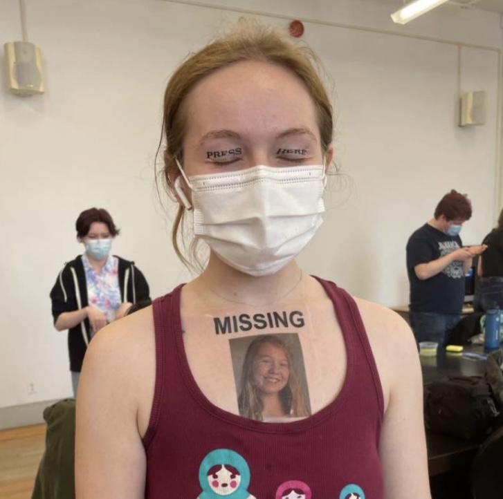
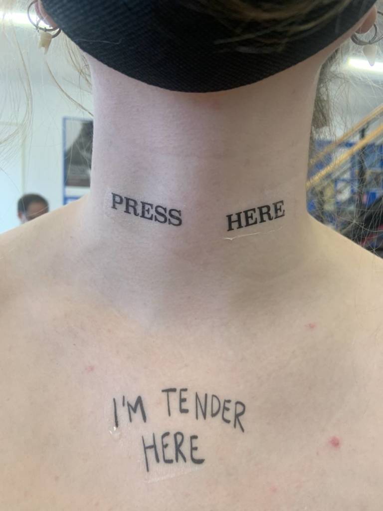
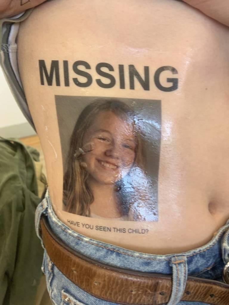
I decided to create two tattoo designs for this project. The first is press here. This tattoo was originally meant for the eyelids but works well in many locations. It invites action, whether that be a positive or negative action toward the one tattooed with it. The second tattoo is the missing poster. This tattoo features a picture of me when i was 14 years old. it was taken the year before i really started to struggle with borderline personality disorder. In the year following, i faced an episode that led me to run away from my home for a short while. This is something in my life i have always carried a great deal of shame towards, both my disorder and the situation i’m speaking of. i wanted to create this tattoo in an attempt to heal that little girl. To let her know that what happened is okay and that she is not inherently bad for mistakes she has made while struggling so deeply. I want to start a conversation surrounding borderline personality disorder. I want to speak and educate ones who aren’t aware of bpd about the intense emotions, mood swings, impulsive and self destructive behaviour and many other facets of life with bpd. It is a conversation that is more than worth having to understand these things and to destigmatize mental illnesses. This tattoo was very overwhelming for me to wear, it connected me to apart of myself that felt extremely lost.
WEEK 11
notes
WEEK 10
for my final video, I wanted to focus on the idea of a day in the life vlog. Although I wanted to track my daily life, I wanted to do so in a way that highlighted my own experience with technology and social media. I do not believe that people are meant to be accessible to other people 24 hours a day. With technology and our smart phones on us at all times, we tend to make ourselves there whenever anyone feels they need something or want to speak with us. There are societal expectations surrounding this and we feel as if we are not placing enough effort into our relationships or online personas if we do not respond or repost or make ourselves readily available at all times. if We are meant to have time to sit with ourselves away from our screens, to connect with the earth and the world around us and other people in real time face to face. I chose to use images of nature because I view it as the complete opposite of the technological world. It is also a true saving grace to me in many ways, one being when technology and the online version of me becomes to much, when I need to sit with the physical version of myself and understand my thoughts, my emotions and my being. The actions I chose to take are ones of me connection with nature in ways that are absurd, they are private actions and ones I would never share online to a social media platform. They accurately show my own digestion of a day in my life, connected to nature and afraid of the walls i’ve placed surrounding my self feeling the paradoxical need to be online, post and text while vehemently craving the opposite, natural connection and no technology clouding my being.
WEEK 7
notes
WEEK 5
For my final parents video, I decided to go with wrapping my umbilical cord like a necklace. I want to focus on the disconnect I feel surrounding an object that is so intrinsically connecting. In polish culture, a parent must keep their child’s umbilical cord or their child will be unsuccessful in all forms of life. I thought that using this would be interesting as it is truly a part of both my mother and I, neither of us really has any more claim over than the other does. In saying that, it symbolizes very different things for both of us. My mother used to love to wrap sea glass with craft wire. I used the same technique in wrapping my umbilical cord. I chose to have the unboxing and repacking of my baby items as the repetitive action and task based work reminds me of a parent completing tasks or packing a box with special things of you child’s. I also think it is necessary for the context of the video. I wanted the video to have fast cuts to signify this disconnect, to have the viewer jarred and acquainted with sharp cuts. I used an incandescent white balance while filming to make it look cold, distant, removed and sterile. Something I really struggled with is the audio. I tried many different forms of audio such as ambient noise, my mother reading the note that is in the box, breathing, end based text with a short phrase about connection but none of them felt right. I wanted the video to be very quiet in action so I decided to quiet the audio to make it match that. I found this video very emotionally draining but emotionally healing to make.
WEEK 3
notes
For my warning labels, I decided that I would focus more on the idea of wacky labels. The kind of warning label where you read it and think “woah someone actually had to do that to warrant a label”. I felt that stickers were the best format as they are easily moved around the world and placed in spaces that are commonly acquainted with the public. I chose to pair down the phrases to two “drinking pickle juice may cause harm” and “romanticizing apple sauce may cause harm”. I struggled with ideas of places to put these stickers as to put them in a traditional warning labels sense (ie on a windex bottle) would not be a place where my multiple could be seen by many. I decided to go for a walk and put up some stickers in places that felt right. I walked on Gordon street which is very busy so I know the ones posted there will be seen by many. I decided to place them in spaces completed unrelated to the content and in spaces warning labels wouldn’t usually be. This adds to the bizarre aspects of the viewers encounter with the label. Not only is it something they won’t understand and will wonder about, They will wonder why it is on the bus or a garbage can.
WEEK 2
When thinking about text work, i immediately thought of warning labels. I spoke with some classmates about the idea and thought of some bizarre warning labels, ones you know someone out there had to experience to warrant a label. I was thinking of content to produce these labels when i started thinking about intrusive thoughts. Intrusive thoughts at some points plague my brain and some thoughts can be harmful, even just to your mental health. I wanted to stick with the bizarre nature of wild warning labels though so I focused on some of these thoughts that were over on the bizarre end. These images of drawn warning labels include some intrusive thoughts and some absurd sentiments.
I am struggling to decide what kind of multiple I would produce these as. I was thinking stickers or posters. with stickers i think i would have to narrow down the number of varying designs. These are just some tests though so I wouldn’t be opposed to choosing 2-3 of them for stickers. I like the idea of stickers because you could place them on physical items as if the warning label was for that product. I think that posters could be interesting as well, printed fairly large.
WEEK 1
notes
Jenny Holzer is a text based artist who uses text on a public scale to urge a response from the viewer. He uses short, often provacative phrases to spark conversation and reaction. She focuses on themes of consumption, abuse, power, social structure and control. I am interested in Holzer’s work because of the feeling that is seeped into it. Her text packs a real punch of emotion and thought extremely successfully.
Holzer’s most well known work is her 1978-87 list of truisms. This piece is framed very interestingly because of the definition of truism. A truism is defined as a statement that is obviously true and says nothing new or interesting. Yet, Holzer’s phrases can be seen more as hard truths for some with different thought patterns. She uses this framework to enforce the idea that the ridiculousness that these phrases are not true to some people or society. The language she uses is simple and easily readable so it can be digested by many people. It is also featured in many different ways. She has shown this work through lists, t-shirts, billboards, large scale projection and installation, posters and other formats. Her work speaks on mass production and consumption as her use of simple text can and has been reproduced many times in many ways. An example of a truism in the list is “abuse of power comes as no surprise”. When acquainted with this phrase, knowing Holzer views it as truism, people are met with a feeling of discomfort. This is because it is a hard truth, people trust in their authority figures and government and hope or even in many cases turn a blind eye to their abuse of power. Holzer’s phrasing urges you to think critically about the structures surrounding you.
Another work is an essay from her 1979-81 series inflammatory essays. These essays were mass produced and scattered across city streets. This essay is printed on light pink paper, a colour associated with softness, tenderness, love and kindness. The words however, say something very different. It is a tale of destruction, of anger and hatred. It shows the narrative of a tenacious underdog, coming to take out the front runner after what feels like years of emotional build up. Although we do not know who the message is coming from and who is it is being delivered to, it feels very personal. The first two lines are “don’t talk down to me, don’t be polite to me”. I find this contradiction of phrasing very interesting as the first sentence is the only one Holzer writes that suggests some sort of retaliation. it then becomes quite aggressive with her saying “I’ll cut the smile off your face”. This rage and hatred is passionate. The final two lines are “The games almost over so it’s time you acknowledge me. do you want to fall not ever knowing who took you?” These lines make the piece more ambiguous. It is believed that Holzer is physically communicating with someone in the first few lines but these lines make that connection and speech more removed. It’s almost as if its a diary of a destructive thought pattern.
I believe that the real joy of viewing Holzer’s work is the feeling you experience from it. Although the narrator is removed and we are left with simple text on simple background, you can feel the emotion seeping through the production. The person speaking is removed yet enveloping you with word and thought. You can feel that they are enraged and want to push away from the mal things they experience.
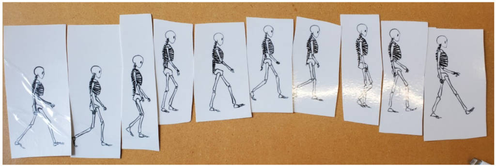
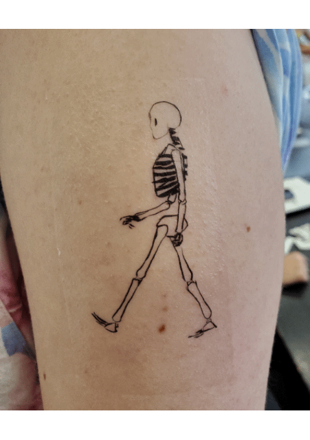
Although I had a lot of trouble deciding on a tattoo, I really enjoyed this assignment. After a lot of experimenting, I decided to do a skeleton walking animation tattoo. It is 10 frames of a skeleton. I thought it would be interesting to put a GIF of all the tattoos together at the end to show an animation.
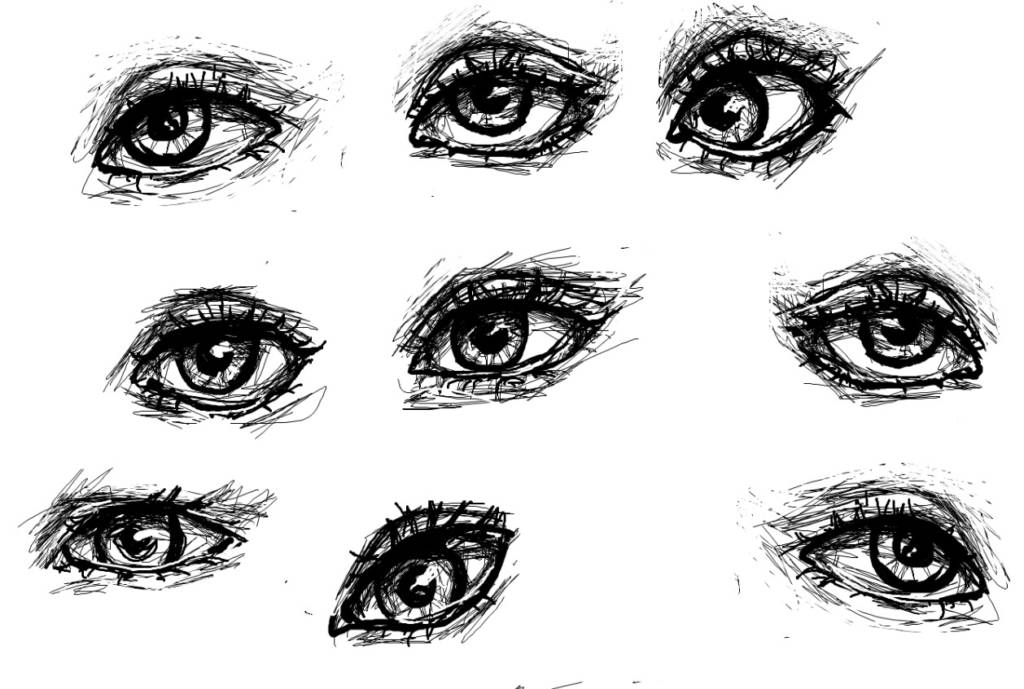
I also ended up printing out some eyes that I drew as well (forgot to take a picture of them printed out)
Video Art Presentation
Oblivion NPC videos
The videos originate from the game oblivion, which is known to have awkward and unpredictable NPC interactions, often due to glitches, as well as amusing dialogue and voice acting:
Oblivion NPC memes usually take a short out of context clip and overlay music from the game oblivion onto it. When the person in the video becomes aggressive, the audio usually switches from peaceful music to combat music. Almost every video I’ve seen is shot on a phone of random strangers in public, usually having an unreasonable altercation. There usually isn’t any visual editing, although I’ve seen some videos where a health bar or subtitles are added.
I personally haven’t played oblivion, but I know people that have seen these videos have commented on how they are nostalgic. I find these videos hilarious, and especially love the ones that properly switch between the music to fit the things that are happening in the video.
Parents Video
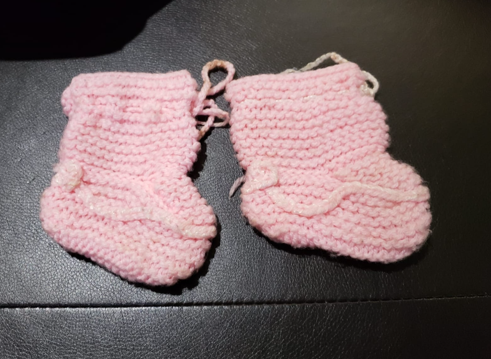
I spent a lot of time trying to think of something that my mom identifies with and is passionate about. I walked around the house looking for inspiration, and searched through old photo albums. Looking through drawers of her old clothes that she had brought from India (and then never got a chance to wear) I found these tiny knitted sweaters. I asked my mom about one and she spontaneously started telling me its story. She talked about how she dressed me in a full pink wool set she knitted herself when she took me to India to see her family. Her brothers called over their neighbors to show them what I was wearing, thinking it was an expensive set she bought. I asked her if she could tell me the rest for a video.
She said that there were a lot more things she had knitted, but had given them away or lost them, which she really regrets. The ones in this video are the clothes she loved the most and had to keep, except for these socks which were lost.
Before filming, I tried different poses – sitting on a chair or on the couch, standing, and sitting on the floor. In the end I decided that sitting on the rug would be best; it reminds me of old home videos (for example those videos of everyone opening their Christmas presents on the floor, or someone going through forgotten stuff in their grandma’s attic). I did not want to film more than once because I felt that the memories my mom was telling would become more rehearsed/less natural. This is also why I wanted my mom to be able to speak Urdu. I wrote subtitles for the video, although I am debating whether to add them to the video or not. I primarily wanted her passion, love, and longing for the days she used to knit to be in focus, and I feel that adding subtitles might be distracting. However, I do realize that it is difficult to personalize this video when you can’t see facial expressions, which might eliminate my reason for not adding subtitles. Other than this, the video has minimal editing. I struggled with this, because I did want to edit it, but I preferred this format of raw footage.
After a while, I became increasingly unsatisfied with this work. It seemed fairly plain and did not convey the feelings that I wanted it to. I was tremendously inspired by the aesthetics of the works of others in the class, and came up with another idea. I remembered part of a conversation I had with my mom after filming the previous video:
Mom: I really miss knitting…it’s so sad that we lose our talents and enthusiasm as we become old.
Me: Why don’t you knit anymore? You should.
Mom: I’ve forgotten how…I would never be able to make something like this again
So I asked my mom to try to knit, and I would record one take of it, however it came out:
I couldn’t decide whether to use the voiceover from the first video as background noise, or just keep the natural sounds of the knitting needles, but I decided that using the voiceover would better transmit the emotion of regret of losing her eagerness to create art. When she came to Canada, she gradually stopped doing things for her own enjoyment. I find it incredibly painful that she is so talented but can’t express it after becoming a mother and taking on all the responsibilities that she did. She used to sing very well, and sew and paint. All of it stopped in time, and now she doesn’t do anything fun for herself. I like that this video portrays how she is struggling to do what she once used to do so easily, but after some practice, she could gain her skills back.
Other ideas:
-collection of cartoon representations of parental figures (cartoons that show depiction of the perfect parents/what every young child thinks their parents are vs the contrast of the imperfection of reality)
-Driving- dad taught me driving/still takes me out to teach things/practice – wanted to record footage of it but winter
-Mom is always trying to teach me how to cook and bake
-Wear mom’s wedding clothes, and match to wedding photos
-Sound of footsteps: was thinking of how I can recognize my parents’ footsteps
-Footage of my dad driving a car vs my mom driving, and then me and my brother driving (how parents affected our driving style)
Multiples
From the examples of multiples shown in classes, I really liked Please Don’t Take This 1000 Yen by Jon Sasaki. I was intrigued by the idea of leaving something out in public where it is so easy to steal without consequences. No one stole his money, so I tried to think of something even easier to “steal” such as information.
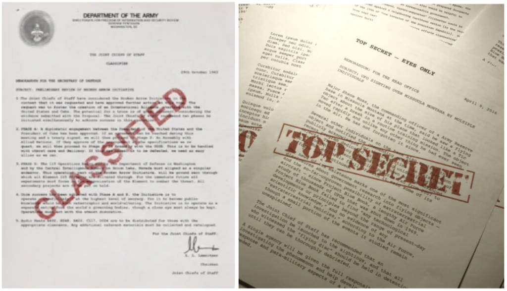
Classified documents
Folders/papers that say classified on them
Lots of random text inside (text that is hard to read: unreadable font/colour/ different language)
If you have found this message, contact …
If you are reading this, contact …
Next page “why are you reading this”
font gets smaller every page
For this idea, I was thinking of movie scenes where someone leaves top secret information for their partner on a public bench, and the person who is supposed to receive it always does. I wondered what would happen if someone else picked it up instead.
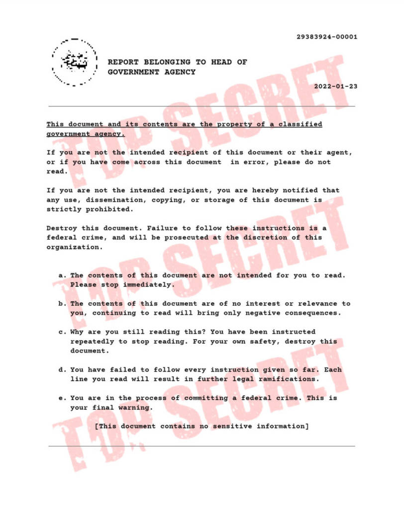
I created a page that looks official, but it is also very vague and doesn’t name any actual agencies. I decided to fill the page with text that prompts the reader to stop reading. The idea is they will keep reading until they reach the bottom, where it acknowledges that the document is not real. I attempted to keep the text short enough that someone wouldn’t lose interest or catch on to what the document really was, but also long enough for the reader to feel a little mislead once they reached the end.
The text on the documents was initially inspired by the text at the bottom of an email I received:
“CONFIDENTIALITY NOTICE: The contents of this email message and any attachments are intended solely for the addressee(s) and may contain confidential and/or privileged information and may be legally protected from disclosure. If you are not the intended recipient of this message or their agent, or if this message has been addressed to you in error, please immediately alert the sender by reply email and then delete this message and any attachments. If you are not the intended recipient, you are hereby notified that any use, dissemination, copying, or storage of this message or its attachments is strictly prohibited”
The way I designed the page was inspired by documents similar to these, as well as the folders used in movies that say “Classified”, etc. with a very large, obvious font. I also used various images of actual declassified documents for reference. I wrote with the courier font that is commonly seen in these documents.
Example images
I also experimented with different watermarks: Classified, Top Secret, and Confidential. I thought it was interesting how “classified and “confidential” sounded more believable than “top secret”, which sounds more like it’s from a kids movie, and if people would react differently to these documents in the real world.
I initially wanted to leave contact information within the text at the bottom of the page to see how many people would read that far, but decided against it.
This is the text written in the document:
“This document and its contents are the property of a classified government agency.
If you are not the intended recipient of this document or their agent, or if you have come across this document in error, please do not read.
If you are not the intended recipient, you are hereby notified that any use, dissemination, copying, or storage of this document is strictly prohibited.
Destroy this document. Failure to follow these instructions is a federal crime, and will be prosecuted at the discretion of this organization.
The contents of this document are not intended for you to read. Please stop immediately.
The contents of this document are of no interest or relevance to you, continuing to read will bring only negative consequences.
Why are you still reading this? You have been instructed repeatedly to stop reading. For your own safety, destroy this document.
You have failed to follow every instruction given so far. Each line you read will result in further legal ramifications.
You are in the process of committing a federal crime. This is your final warning.
[This document contains no sensitive information]”
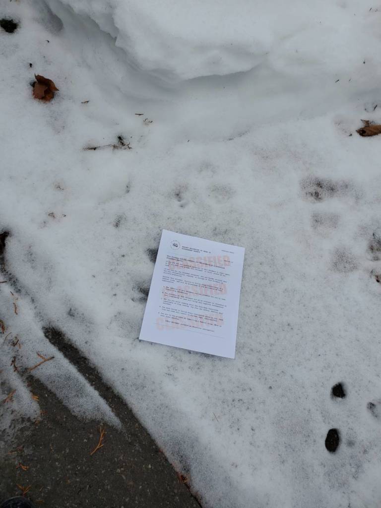
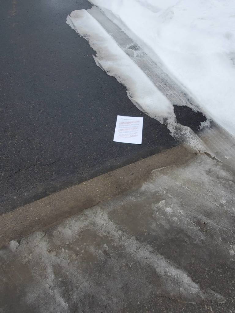
I left the pages in various public places:
My front yard, right beside the sidewalk
My neighbor’s driveway
The sidewalk in the park
Other ideas…
Rorschach tests
But backwards
I offer text of lots of peoples responses, and people have to think of the image.
matching? different cards?
I thought it would be interesting to see what people thought of when doing Rorschach inkblot tests backwards and if they would still see the same things. When I did research on these, there weren’t as many official tests as I had originally thought there would be. There were 4-5 images and all of these had very similar answers from people.
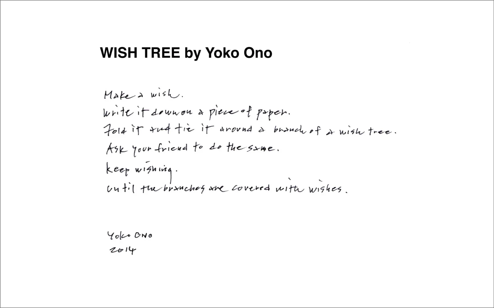
Yoko Ono
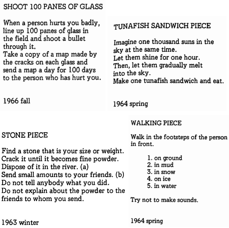
Grapefruit
In her book Grapefruit, Yoko Ono provides her audience with seemingly random instructions, ranging from vague commands to absurdly specific directions. It is mainly presented as a text based work in a book, but Ono has also offered a performance video of her reading through the book.
I loved how unpredictable every line was. Each instruction contains something different, and makes the audience anticipate what’s coming. The instructions go from simple to almost impossible, becoming conceptual in some ways, yet staying engaging the whole time.
I particularly found Tuna Fish Sandwich very amusing, as the line it ends on is absurd and sudden, suddenly changing topics and switching the entire mood of the passage.
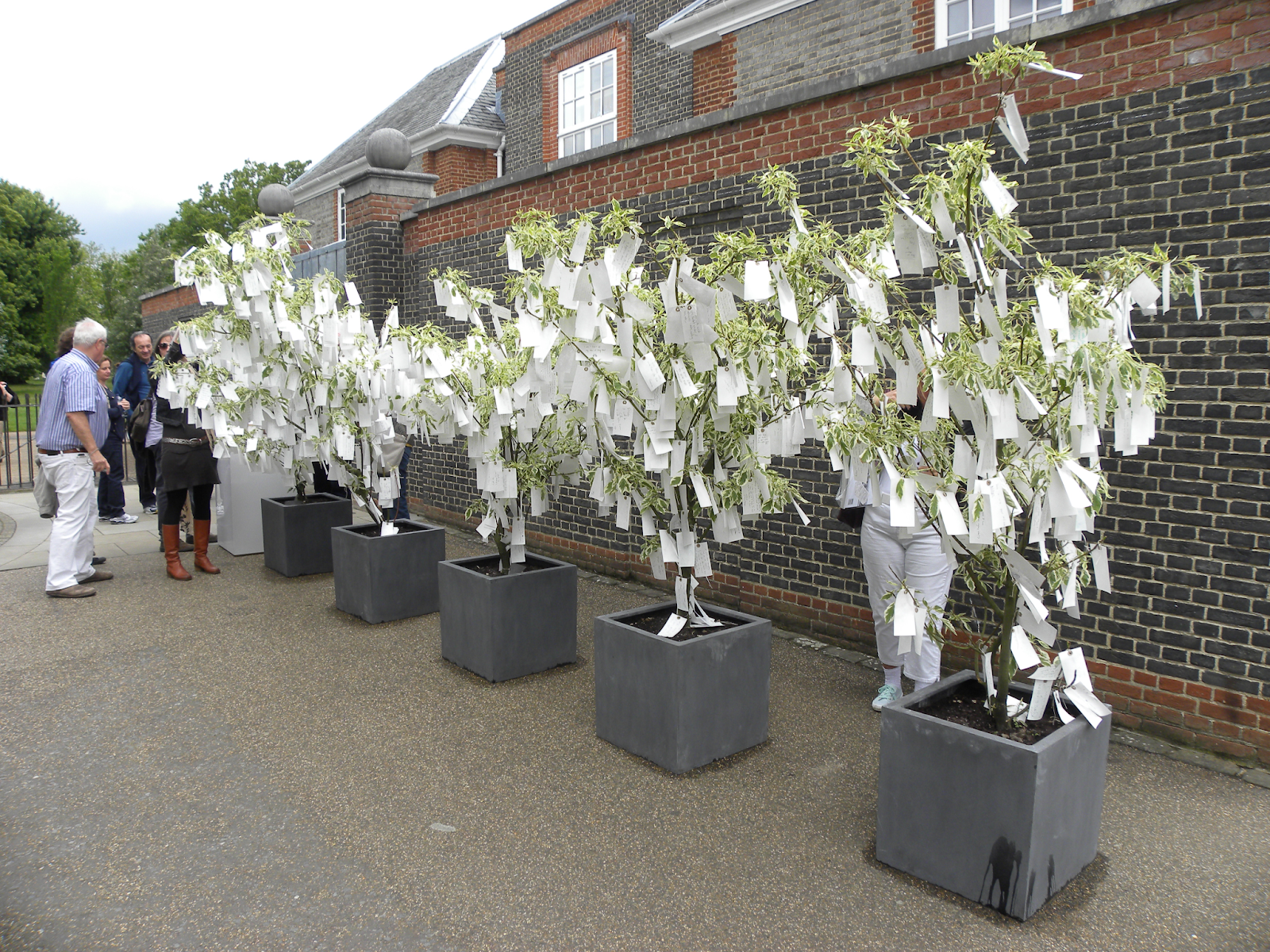
Wish Tree
Wish Tree is a collection of written wishes provided by the public displayed hanging from a tree. Ono shares a related backstory to this, where as a child in Japan, she would write her wishes on a piece of paper and tie it onto the trees of the temple’s courtyard, because the wish knots people would tie on the trees would look like flowers. Yoko Ono has ensured participants that she does not read any of the wishes. The tree exhibits more permanence than a wishing well, as people’s wishes are written down, and, although they are not read by anyone once they are tied onto the tree, they still remain in an easily accessible state.
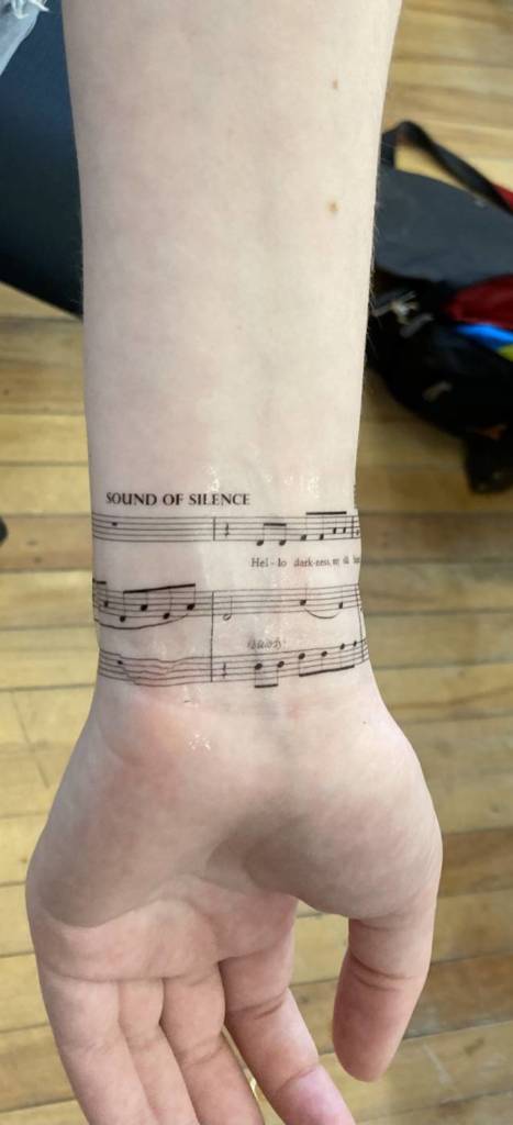
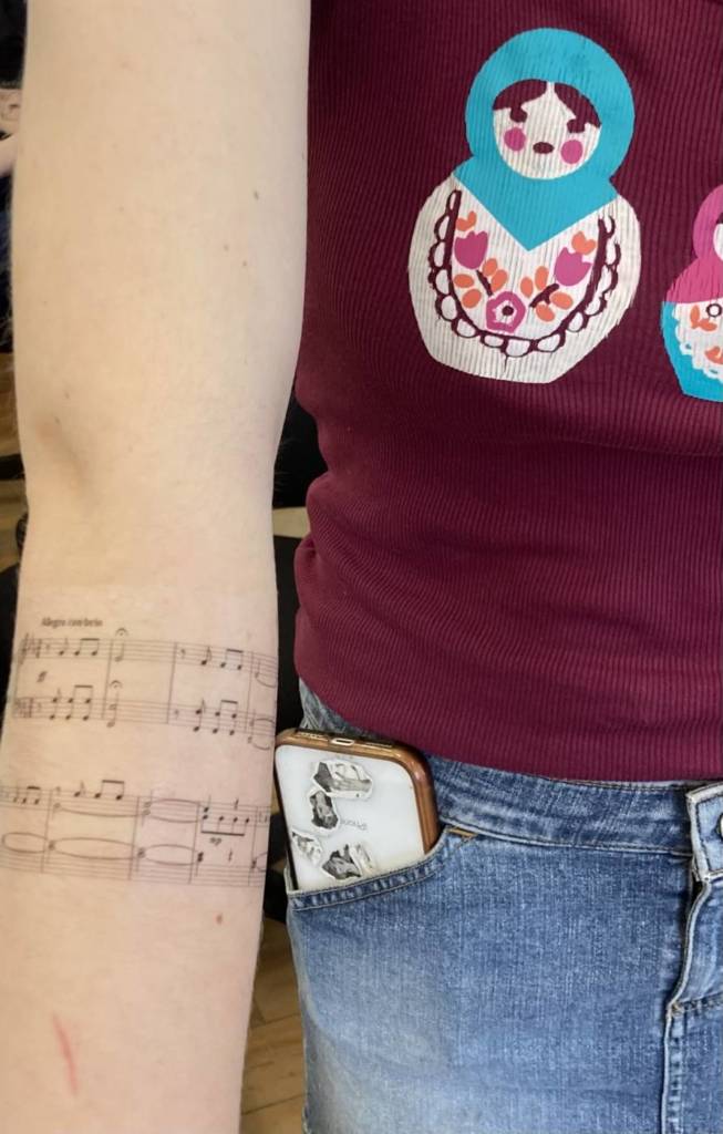
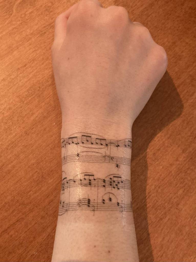
Thank you Diane (and everyone for sharing their tattoos) for such a fun final class. Here are some photos documenting my final set of tattoos:
Kathryn Week 12(!!)-Final tattoos I completely changed my idea, which is pretty fitting considering this project is about tattoos and why I have never gotten one-the thought of such permanence on my body and not being able to easily change it afterwards has always stopped me from getting one. I found my original idea was getting too complicated with the combination of words and having enough connector words to have people be able to choose meaningful sayings that they would be happy with. Getting theme-oriented felt just contrived and “cute” in the end and was getting too close to Mad Libs, which was not what I was going for.
So I thought hard about things I could re-purpose as visual symbols, that have deep meaning for me and a level of permanence. I decided on music. When I started looking at sheet music I was drawn to aesthetically how the staff and notes, clefs, rests and other symbols looked like jewelry with charms. Every mark in sheet music means something and the music would not sound the same if there was an error in any single symbol or if something was removed. I could connect this to tattoos where, if done well, every mark should be necessary and done with precision.
Music, for me, is associated with memory, self-reflection, identification and emotion. Many of us have favourite songs or pieces of music and can relate certain songs to the stories of our lives, our personalities, moods or moments in our lives.
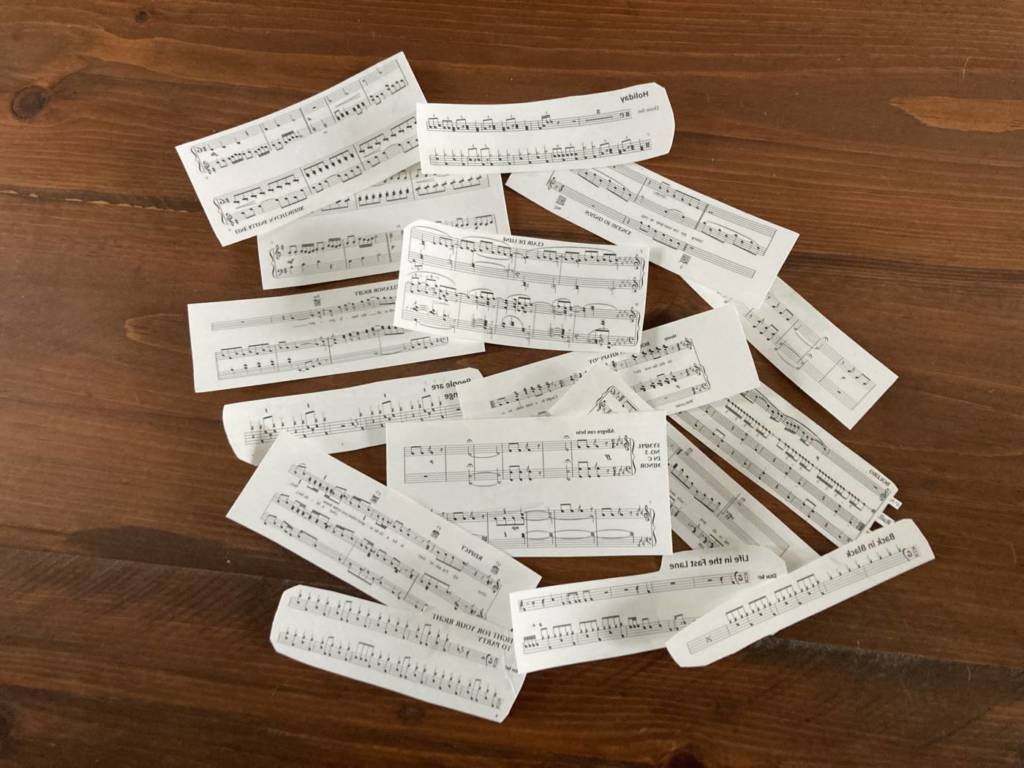
I have chosen an array of different pieces: some classical, some classic rock/modern, different instruments (drums, guitar chords, piano, voice). I picture these either as wrist/arm cuffs or ankle cuffs. But you could also cut them and have them wrap around fingers as rings or have voice running up one arm and piano running down the other; the options are endless.
For those that can read music, when looking at the music, you can follow the notes and hear the music in your head.
Note: On my first sheet, I forgot to mirror the image, so the tattoos will be backwards once applied. I thought this was still interesting as you could play the song on an instrument while reading it off your body in the mirror.
Kathryn Week 11-Tattoo ideas
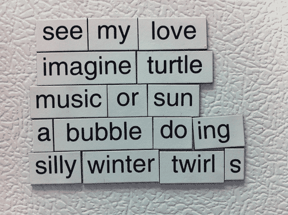
I plan to create a series of word tattoos similar to “magnetic poems” with a selection of words in a nice cursive font that people can pick and form their own statements/descriptions. Tattoos are often personal and this allows for personalization.
Magnetic poems ideas
Kathryn week 10- Internet video
I ended up making two short videos. The first one is a music video of my daughter singing/playing the song Skinny Skinny by Ashton Irwin while watching a series of videos on eating (mukbang), fashion, influencers and weight loss. The video is reminiscent of music videos, which continue to be popular, but also the popular activity of posting yourself playing covers of other people’s music in the hope of being “discovered”, the video reflection provides a mix of body image contradictions that are plentiful on the internet, including video footage from Lil’ Mikaela, a fictional computerized “perfect” social media influencer.
The second video takes the current trends of watching others play video games and is a video documenting my son watching pewdiepie play videogames. This pushes the genre even further into the realm of spectator society by disconnecting the viewer one step more from real experiences (real experience>>video game experience>>watching someone play video games>>watching someone watch someone play video games). There is intentionally no interaction between the watcher and whoever is viewing the video.
Watching pewdiepie
Kathryn’s week 8-Internet is video proposal
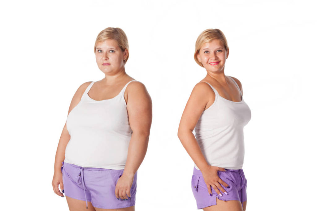
I would like to do a video essay with music using video juxtaposing body image (anorexia/obesity) and gluttony (e.g. mukbang)
Proposed legislation in France would criminalize the use of overly thin models and ban online sites that glorify anorexia and other eating disorders.before and after weight loss. rejuvenation. Fat woman comparison thin
Kathryn’s week 7-The Internet is Video Art-examples
Sample music video from Miquela
Example interview between Lil Miquela and JPEGMAFIA
Video explaining Lil Miquela
Lil Miquela: she is a Robot influencer created by the organization Brud. Miquela is a computer generated-character who presents herself as a robot living in the real world and has active accounts on social media (posts and video). She is also a musician and has a real contract with an agent. 3Million+ followers on Instagram and 340K+ listeners on Spotify. Named in Time as one of 25 most influential people on the internet.
How is it shot and framed? Where does the material come from? What is the quality of the footage? Very high quality video, Hollywood style videos, interview clips, etc. incorporating real people and her CGI character. Original video created for the character. Also incorporates other (real people) influencers and famous people with her in video and photos/social media adding a level of acceptance within pop culture (without this validation it might be taken as a joke and the life of the character would be limited). Budget must be huge for this character. Very professionally done.
How is it edited? Does it flow from clip to clip?What does it sound like? how are sound or image manipulated and transformed from original footage? Videos and interviews flow in same style as and imitate popular culture style. Autotuning used for music sound. Virtually indistinguishable from “real” videos and interviews. Editing while she is talking to real people is done in a way that you might not realize she is CGI. Very natural conversation style. Some of the best CGI character development I have seen. Better than some of the movie attempts that have been done (e.g. Carrie Fisher in latest Star Wars movie after she died) as she is very close to movements and facial expressions of real humans. Her personality is also very developed (e.g. she has favourite charities/movements and opinions on things).
What are some of the reasons these kinds of videos are compelling or useful in this historical moment? Use quotes from published sources to back up arguments and analysis. Provides commentary on pop culture and influencers and how we cannot believe what we see on the internet. Shows the level of sophistication of AI and CGI. Makes you question what makes someone human. See third video above for typical commentary on Lil Miquela that is in the media.
How do I relate to it? -I find this whole concept frightening and exciting at the same time. While I think the concept can be frightening in that there are serious topics Miquela covers that she has not really lived, it also is commentary on how modern society listens to influencers (real or otherwise) as if they were experts or friends providing advice, but all of them may be made-up characters. It makes you question what is real. It also brings up all sorts of ethical questions regarding perfect body image, misrepresentation of topics, replacement of humans and taking away jobs (modelling, musical, etc). Essentially the character is controlled by the developers behind the character and relays messages they wish to relay, but it is a collective message rather than one person’s, so I think naturally there will be some conflicts that result which are interesting to view. I am really dating myself now, but I see Lil Miquela as a natural evolution, along with enabling technology, from the Max Headroom days (1985!!) I find the character also more personable and engaging than some of the real human influencers.
Kathryn’s PostWeek 5-6: Parent Project
This is 90 is a short documentary of my dad’s daily visit to his favourite swimming hole while he is in Greece. It is an edited video from found footage I had on my phone supplemented with telephone interview. I chose to do the video in portrait to focus on the man rather than the scenery.
Kathryn’s Post Week 4b-Final Text Multiples
I took the original idea I had and went a bit further with it by creating a character ” ” (a space) that was walking around with these signs. (Note: a reference back to Adrian Piper creation of The Mythic Being). The whole being of ” ” is not to offend and be completely non-controversial. I thought it would be interesting to see if that was possible given the current climate of protest and dissent and what it might look like to protest protest.
I created, printed and mounted a set of 20″x30″ signs and pins. I also created a fictional newspaper story (see download button below) and printed multiples (which I will bring to class) expanding on the idea of the piece.
I accompanied my 90-year old dad to Greece this summer to assist him with all the online forms and requirements due to COVID, and for mobility assistance because he had just had a hip replacement. He normally goes every year for 6-7 weeks in August-September but missed it last year due to COVID. As soon as they lifted the travel advisory, he bought himself a ticket to Greece for his annual vacation. His happy place is a small Mediterranean “swimming hole” about a half hour walk from his condo. He does this sunrise walk every day that he is in Greece and swims a pre-determined amount. I am convinced that his rigid routines and determination is what keeps my dad alive and healthy. I took film footage of him one morning as I joined him on his walk to capture this daily routine. The project will be an edited version of this footage showing the effort required of him to perform this daily ritual, and the happiness it brings him.
Idea 2: Memories of Dad
My husband died of 3 years ago after a 2-year battle with cancer. Our children were 6 and 8 when he was diagnosed and 8 and 10 when he died. I would interview and film my kids now about memories of specific events or activities they did with their dad when he was alive and mix it with past footage of the events they were talking about.
Kathryn’s Post Week 3-Text Multiples
Picket posters and pin badges/buttons are in process of being designed and produced as is a “newspaper article”. Posters will be printed and off-campus due to size and I have a button maker. Newspaper article in process of being written/designed.
Statements for the picket posters and pin badges: -PUTTING ONE FOOT IN FRONT OF THE OTHER -TODAY IS TODAY! -MOVEMENT BEATS ALL INERTIA! -DOES ANYONE CARE ABOUT APATHY? -THE FUTURE IS UNKNOWN!
The newspaper article (several copies will be made) will be a fake news article with the script of an interview with the character who carries these signs in “protest”.
Kathryn’s post Week 2-Text multiples
For the text-based multiples, I would like to relay positive messaging. Over the past two years there has been a surge of bad news, division, negative vibes. Even positive messaging has become overwhelming in its ask of people to better themselves. The messaging I want to provide and thought process I want to invoke is one of affirmation and positive reinforcement without adding any additional stress (and maybe taking away some because it is asking you to do nothing).
I thought about a series of affirmation cards that could be produced and laminated and given to people (you know or random strangers, left at coffee counters, etc) with one affirmative word printed on it and the suggestion to pass it on. The word does not require you to do anything about it, does not state that the person holding the card is the word (although it is implied). Each card has a positive word that would typically create positive feelings, and the words chosen would be ones that are highly unlikely to create contradictory meanings or division. Here is an example.
I thought about protesting protest with obvious statements that nobody can disagree with. A series of signs to be created and held by “protesters” would state the obvious, however they would also make the viewer think about known idioms that are meant to be encouraging. The person holding the sign would be walking (and therefore would be putting one foot in front of the other), “Today is today” is hard to argue, but makes you also thing of the idiom “Today is the first day of the rest of your life” or leaving the past behind, but without specifically asking you to do anything important. Movement, by definition, stops inertia, but also gets people thinking about doing something to change a rut they might be in.
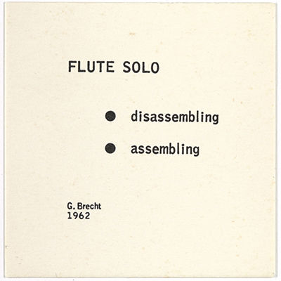
Kathryn‘s post Week 1-Artist: George Brecht
George Brecht (1926-2008) was a chemist by trade, but a key member in early conceptual art and important member of Fluxus from 1962-1978. He is credited with being an early influencer in participatory art, mail art and other conceptual art. Much of his art deals with the everyday, the random and sounds (and repurposing sounds as music), taking notice of the everyday and appreciating it.
Quote: “There is perhaps nothing that is not musical. Perhaps there’s no moment in life that’s not musical…All instruments, musical or not, become instruments.”
Example text multiples work:
Event Score-a set of simple instructions to complete tasks
This one was especially moving to me from the anecdote described in articles. His father was a professional flutist, but also an alcoholic. During a performance one time his father did not play as he was supposed to. They looked into the orchestra pit and instead of playing, his inebriated father had disassembled his flute to clean it. Solo for Violin, George Brecht, April 25, 1964 at 359 Canal Street, New York City during Flux Fest at Fluxhall
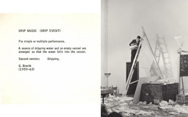
Drip Music
For single or multiple performance. A source of dripping water and an empty vessel are arranged so that the water falls into the vessel.
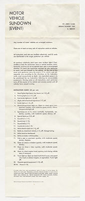
First mail art through Contingent Publications: Assembly instructions to “construct” a concert using motor vehicle sounds.


 Patty Chang, In Love (2001)