Week 2

This week I really enjoyed looking into a few of the handful of suggested artists, namely Hiba Abdallah and Barbara Kruger

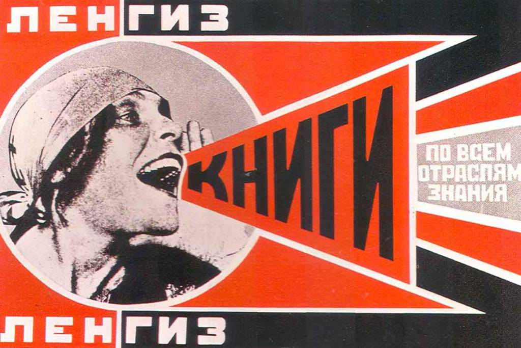
Starting with Kruger, it’s clear right off the bat, even before reading the text, that her message is immediate. That colour pallet of black white and red – the dark and light contrast combined with danger associated with blood red – screams urgency. Her messages are extremely politically charged and visually, the composition of her images resemble propaganda almost. The use of bold text, bold simple shapes, and urgent colour pallet remind me a little of Russian constructivist propaganda. Sometimes the messages aren’t all that far off, in the sense of calling for a mass group of people to organize, like in “Your Body is a Battleground” which was promoting a rally in support of abortion and women’s rights.

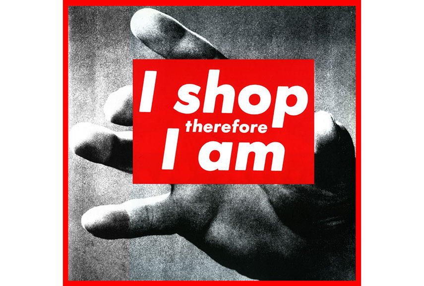
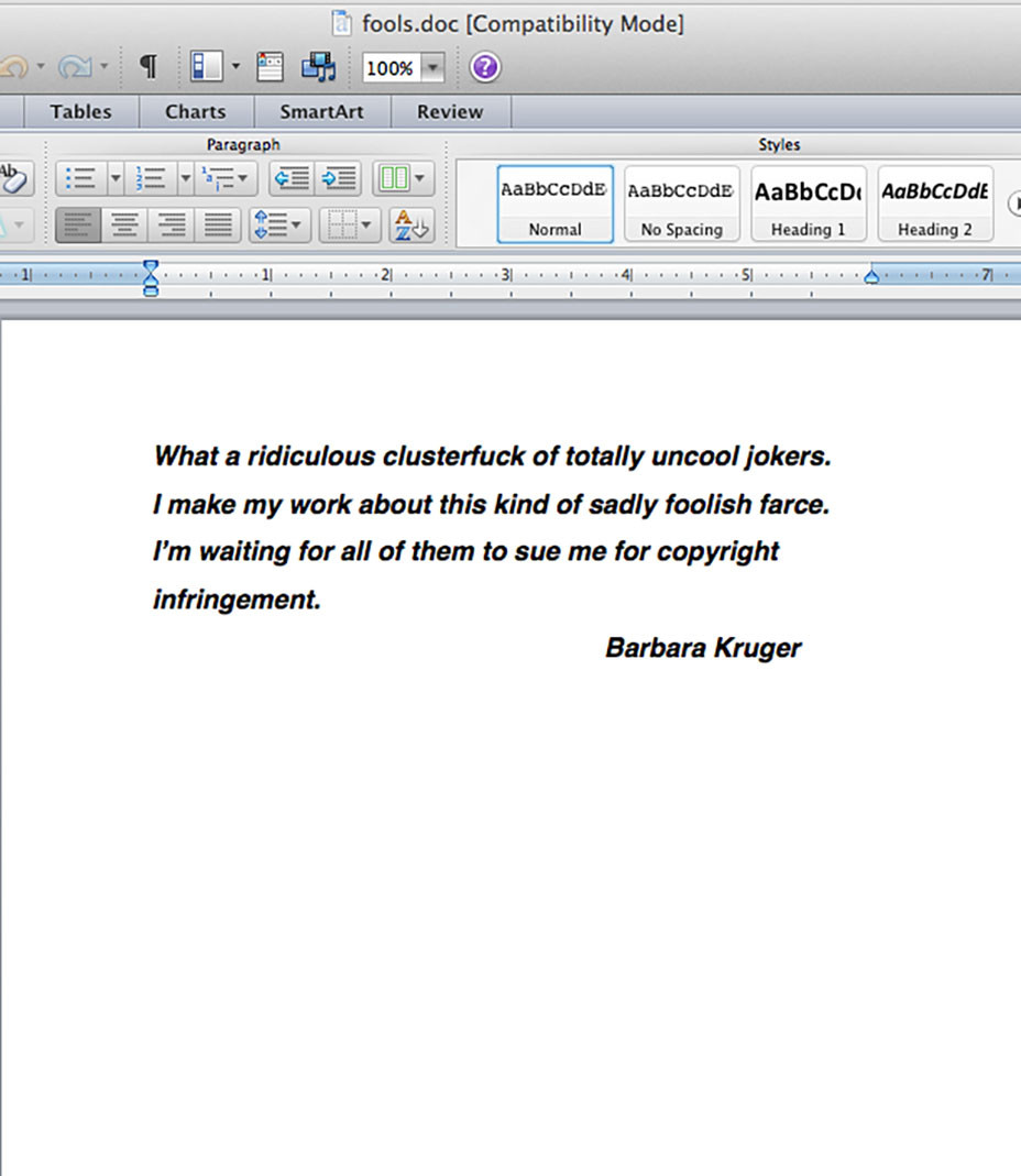
I love the “I Shop therefore I Am” as a comment on modern consumer capitalist society. The hand looks so ominous and mindless, reaching out towards us as if we the viewer are about to be consumed. I feel a hint of irony with Kruger’s work, or style I should say, as it relates to the Supreme skate and streetwear clothing brand. Supreme basically copied her white text on red shape design and claimed it as their own, suing other companies who remotely copy it, like streetwear brand Married to the Mob did in 2013. Kruger commented on this in an interview calling Supreme “uncool jokers.” The irony is definitely real comparing “I shop therefore I am” to Supreme, since the billion-dollar streetwear enterprise is entirely based off of fast fashion. Owning the latest product signifies some form of street credit, fitting into the consumers mantra of being what you shop, where the less you buy the lesser you are.

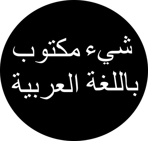
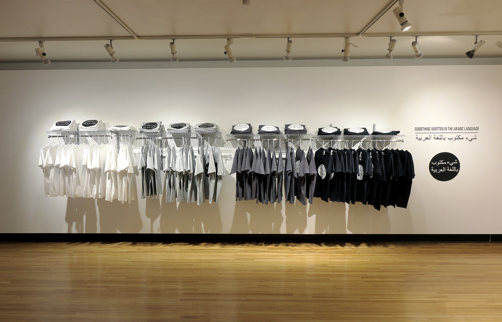
The other artist who’s work I loved looking through and who was not featured on the week 2 blog was Hiba Abdallah. She’s a UofG alumni who specializes in text based work and has done a lot of collaborative work with communities in Toronto to re-imagine public agency. One work of hers that I really love is her “Something written in the Arabic language” logo, which is placed on cards as a print, as well as on t-shirts. Here she uses corporate branding strategies to sell an Arabic logo that literally says: “something written in the Arabic language.” While the message is apolitical, the script and logo design is highly charged and can challenge people who carry so much as a hint of anti-Arab sentiment. To me, wearing one of the shirts feels like a really cool opportunity for some prejudice checks!

Week #1

Week #1 Notes:

Nina Katchadourian’s Book Stacks projects:

  • Started in 93’
  • Stacks of books, that are ordered  based on their titles to create a sentence
  • The goal was to symbolize what was held in the libraries
  • The project had multiple locations and re-creations, using libraries, private collections, and home libraries
  • The works were often presented where they were found

Video:

  • How books can tell a story
  • How books can represent a person
  • Think about the books in all terms (physical aspects, titles, author, style)
  • Does your library represent you?

Dave Dyment One Billion Years (Past and Future), 2012:

  • This collection represents the past, present and future by using the information inside the books
  • The Books selected by Dyment use the inner contents of the book to represent a timeline of one million years
  • Bright coloured books create a visually stimulating image, with lots of areas to focus on
  • The use a prominent dark background suggests similarities to the work of Katchadourian

Ryan Park, Untitled, 2009:

  • This work differs from the others as it offers an open book style of stacking, rather than the traditional stacking used in the previous works.
  • The use of colour is very apparent in this work, as the books transition from cool to warm coolers, then back to cool
  • The background is again a solid colour, but this example uses a white background which brings more openness to the work

Write:

  • Some strategies used by the artists would be choosing specific books based on specific characteristics, for example; Katchadourian stated that she was trying to create sequences with her books, so the titles would be the deciding characteristic in that case. She also mentioned representing the owner of the books, this can be done by using the titles, or it can be done with symbolism by using physical aspects of the book such as colour of the outside, size, shape, condition and many more.
  • Colour was used heavily by Park in the selection of his books, as can be seen the ascending then descending colouration of his work. A strategy used by Dave Dyment; he used the information written inside the books to create a timeline. Using the contents of the books can be a great way to represent someone or something because it gives you a well-rounded appreciation for whatever it may be.

My Process:

Unfortunately, my lack of interest in reading resulted in me owning only four books… at first I was stumped on what to do, my roommates only had textbooks and I didn’t want to use material that has no connection to me, while I still had the four other options. As I decided to use my books, I noticed how figuratively they represented me quite well.

The titles of my books are the following:

  • Breakfast of Champions, Kurt Vonnecut
  • The Art of Racing In the Rain, Garth Stein
  • Die Rich and Tax Free, Barry Kaye
  • Gucci Mane, Autobiography with, Neil Martinez-Belkin

I am a huge fan of rap/hip-hop (Gucci Mane), I love cars, especially fast ones. The book also heavily features a dog, which resonates with me because I’ve owned dogs all my life (The Art of Racing In the Rain). Die Rich and Tax Free, connects to one thing that I am known for which is my spending habit, the book was given to me by my former employer (a financial advisor) who constantly criticized my spending, till the point he found a book that has helped to reduce my spending. The last book, Breakfast of Champions, I have almost no ties to, besides the irony of me not typically eating breakfast, and the honest not knowing of where I got the book from.

For my “stacks” I wanted to make my library to seem more diverse than four books, so i tried several angles and positions till I arrived at three that i liked, I liked these three because of how different they are, I think in some ways it symbolizes how vast my own interests are.

For my stacks I wanted to make my library seem large and vast, so I tried to work with different shapes in order to accomplish that. I also wanted to incorporate some of Ryan Park’s ideas because I liked the look of the books being open, as I feel the back cover can offer a little more insight into the library. I also wanted to incorporate Katchadourian’s location selection, of stacking the works in the location they come from, so I decided to photograph my images inside my bedroom.