
WEEK 12

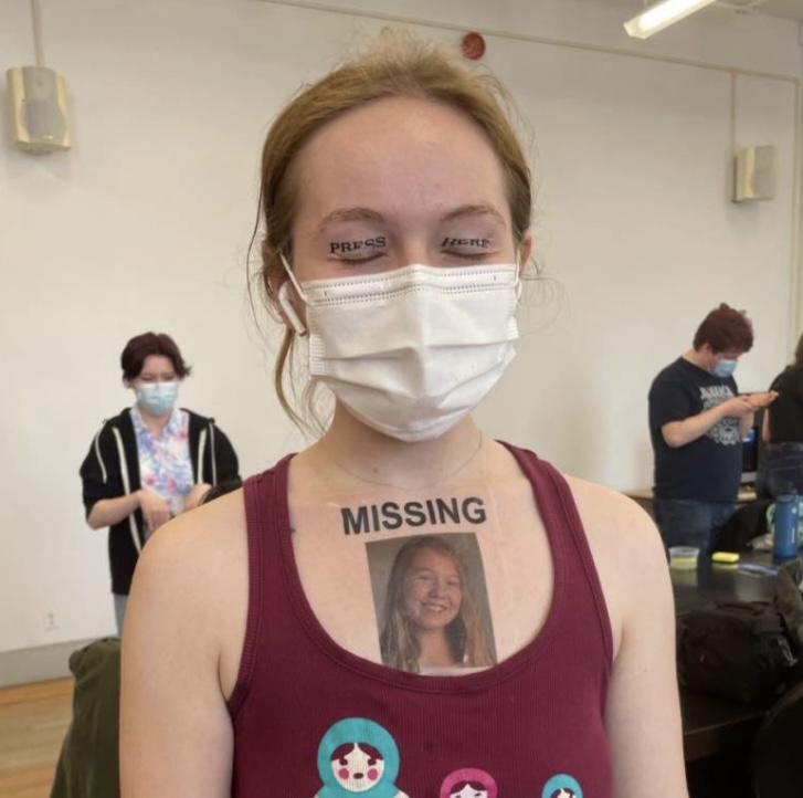


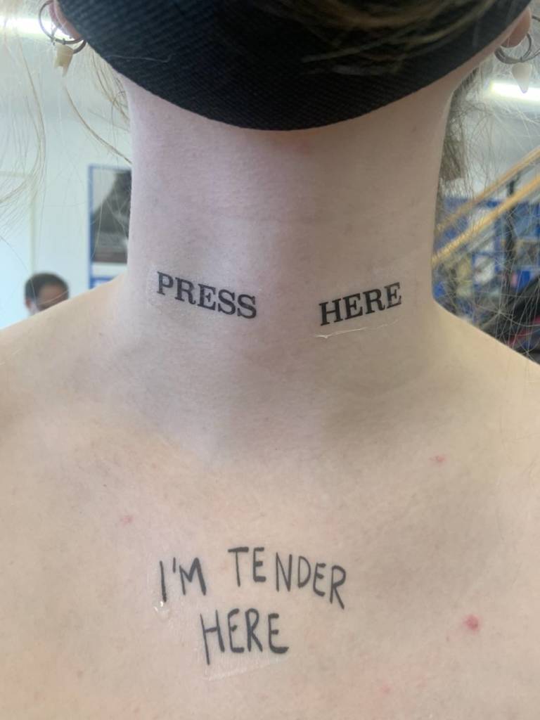
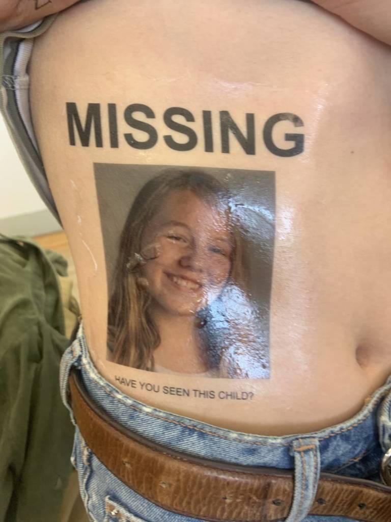

I decided to create two tattoo designs for this project. The first is press here. This tattoo was originally meant for the eyelids but works well in many locations. It invites action, whether that be a positive or negative action toward the one tattooed with it. The second tattoo is the missing poster. This tattoo features a picture of me when i was 14 years old. it was taken the year before i really started to struggle with borderline personality disorder. In the year following, i faced an episode that led me to run away from my home for a short while. This is something in my life i have always carried a great deal of shame towards, both my disorder and the situation i’m speaking of. i wanted to create this tattoo in an attempt to heal that little girl. To let her know that what happened is okay and that she is not inherently bad for mistakes she has made while struggling so deeply. I want to start a conversation surrounding borderline personality disorder. I want to speak and educate ones who aren’t aware of bpd about the intense emotions, mood swings, impulsive and self destructive behaviour and many other facets of life with bpd. It is a conversation that is more than worth having to understand these things and to destigmatize mental illnesses. This tattoo was very overwhelming for me to wear, it connected me to apart of myself that felt extremely lost.
WEEK 11
notes


WEEK 10
for my final video, I wanted to focus on the idea of a day in the life vlog. Although I wanted to track my daily life, I wanted to do so in a way that highlighted my own experience with technology and social media. I do not believe that people are meant to be accessible to other people 24 hours a day. With technology and our smart phones on us at all times, we tend to make ourselves there whenever anyone feels they need something or want to speak with us. There are societal expectations surrounding this and we feel as if we are not placing enough effort into our relationships or online personas if we do not respond or repost or make ourselves readily available at all times. if We are meant to have time to sit with ourselves away from our screens, to connect with the earth and the world around us and other people in real time face to face. I chose to use images of nature because I view it as the complete opposite of the technological world. It is also a true saving grace to me in many ways, one being when technology and the online version of me becomes to much, when I need to sit with the physical version of myself and understand my thoughts, my emotions and my being. The actions I chose to take are ones of me connection with nature in ways that are absurd, they are private actions and ones I would never share online to a social media platform. They accurately show my own digestion of a day in my life, connected to nature and afraid of the walls i’ve placed surrounding my self feeling the paradoxical need to be online, post and text while vehemently craving the opposite, natural connection and no technology clouding my being.
WEEK 7
notes


WEEK 5
For my final parents video, I decided to go with wrapping my umbilical cord like a necklace. I want to focus on the disconnect I feel surrounding an object that is so intrinsically connecting. In polish culture, a parent must keep their child’s umbilical cord or their child will be unsuccessful in all forms of life. I thought that using this would be interesting as it is truly a part of both my mother and I, neither of us really has any more claim over than the other does. In saying that, it symbolizes very different things for both of us. My mother used to love to wrap sea glass with craft wire. I used the same technique in wrapping my umbilical cord. I chose to have the unboxing and repacking of my baby items as the repetitive action and task based work reminds me of a parent completing tasks or packing a box with special things of you child’s. I also think it is necessary for the context of the video. I wanted the video to have fast cuts to signify this disconnect, to have the viewer jarred and acquainted with sharp cuts. I used an incandescent white balance while filming to make it look cold, distant, removed and sterile. Something I really struggled with is the audio. I tried many different forms of audio such as ambient noise, my mother reading the note that is in the box, breathing, end based text with a short phrase about connection but none of them felt right. I wanted the video to be very quiet in action so I decided to quiet the audio to make it match that. I found this video very emotionally draining but emotionally healing to make.
WEEK 3
notes

For my warning labels, I decided that I would focus more on the idea of wacky labels. The kind of warning label where you read it and think “woah someone actually had to do that to warrant a label”. I felt that stickers were the best format as they are easily moved around the world and placed in spaces that are commonly acquainted with the public. I chose to pair down the phrases to two “drinking pickle juice may cause harm” and “romanticizing apple sauce may cause harm”. I struggled with ideas of places to put these stickers as to put them in a traditional warning labels sense (ie on a windex bottle) would not be a place where my multiple could be seen by many. I decided to go for a walk and put up some stickers in places that felt right. I walked on Gordon street which is very busy so I know the ones posted there will be seen by many. I decided to place them in spaces completed unrelated to the content and in spaces warning labels wouldn’t usually be. This adds to the bizarre aspects of the viewers encounter with the label. Not only is it something they won’t understand and will wonder about, They will wonder why it is on the bus or a garbage can.


WEEK 2
When thinking about text work, i immediately thought of warning labels. I spoke with some classmates about the idea and thought of some bizarre warning labels, ones you know someone out there had to experience to warrant a label. I was thinking of content to produce these labels when i started thinking about intrusive thoughts. Intrusive thoughts at some points plague my brain and some thoughts can be harmful, even just to your mental health. I wanted to stick with the bizarre nature of wild warning labels though so I focused on some of these thoughts that were over on the bizarre end. These images of drawn warning labels include some intrusive thoughts and some absurd sentiments.
I am struggling to decide what kind of multiple I would produce these as. I was thinking stickers or posters. with stickers i think i would have to narrow down the number of varying designs. These are just some tests though so I wouldn’t be opposed to choosing 2-3 of them for stickers. I like the idea of stickers because you could place them on physical items as if the warning label was for that product. I think that posters could be interesting as well, printed fairly large.


WEEK 1
notes

Jenny Holzer is a text based artist who uses text on a public scale to urge a response from the viewer. He uses short, often provacative phrases to spark conversation and reaction. She focuses on themes of consumption, abuse, power, social structure and control. I am interested in Holzer’s work because of the feeling that is seeped into it. Her text packs a real punch of emotion and thought extremely successfully.


Holzer’s most well known work is her 1978-87 list of truisms. This piece is framed very interestingly because of the definition of truism. A truism is defined as a statement that is obviously true and says nothing new or interesting. Yet, Holzer’s phrases can be seen more as hard truths for some with different thought patterns. She uses this framework to enforce the idea that the ridiculousness that these phrases are not true to some people or society. The language she uses is simple and easily readable so it can be digested by many people. It is also featured in many different ways. She has shown this work through lists, t-shirts, billboards, large scale projection and installation, posters and other formats. Her work speaks on mass production and consumption as her use of simple text can and has been reproduced many times in many ways. An example of a truism in the list is “abuse of power comes as no surprise”. When acquainted with this phrase, knowing Holzer views it as truism, people are met with a feeling of discomfort. This is because it is a hard truth, people trust in their authority figures and government and hope or even in many cases turn a blind eye to their abuse of power. Holzer’s phrasing urges you to think critically about the structures surrounding you.
Another work is an essay from her 1979-81 series inflammatory essays. These essays were mass produced and scattered across city streets. This essay is printed on light pink paper, a colour associated with softness, tenderness, love and kindness. The words however, say something very different. It is a tale of destruction, of anger and hatred. It shows the narrative of a tenacious underdog, coming to take out the front runner after what feels like years of emotional build up. Although we do not know who the message is coming from and who is it is being delivered to, it feels very personal. The first two lines are “don’t talk down to me, don’t be polite to me”. I find this contradiction of phrasing very interesting as the first sentence is the only one Holzer writes that suggests some sort of retaliation. it then becomes quite aggressive with her saying “I’ll cut the smile off your face”. This rage and hatred is passionate. The final two lines are “The games almost over so it’s time you acknowledge me. do you want to fall not ever knowing who took you?” These lines make the piece more ambiguous. It is believed that Holzer is physically communicating with someone in the first few lines but these lines make that connection and speech more removed. It’s almost as if its a diary of a destructive thought pattern.
I believe that the real joy of viewing Holzer’s work is the feeling you experience from it. Although the narrator is removed and we are left with simple text on simple background, you can feel the emotion seeping through the production. The person speaking is removed yet enveloping you with word and thought. You can feel that they are enraged and want to push away from the mal things they experience.
Hannah,
Wow this is such an original project, I have not seen anything like it. I appreciate how much care you have taken to shoot this in a controlled, studio kind of environment, to light the action, to pace out the editing smoothly and consistently, and finish the video to professional standards. Your subject, so serious, personal and such a precious object merits this care. This is so weird and uncomfortable, in a way that is critical, that touches on the complexity of our connectedness to our own bodies, and to our birth parents, yikes! It’s really affecting – and a successful work by any measure. I will be thinking about it for a long time! I like the silence – but would be curious to see the ambient sound versions – at least to give me the extra sensation/tactility of being close to such objects. Wow – do be sure to show this in the JAS – somewhere, maybe intimately from inside the same box? Or something thought out – Excellent notes, exercises, and contributions to class.
Hi Hannah, I apologize – I notice the marks I uploaded for you at midterm are not showing up on Courselink – I must have made a mistake and only noticed it now! So sorry – do let me know if you have any questions about them before I submit my grades on Tuesday. Anyway – for this term’s work I’m glad to see your finished Internet Video, but the You Tube presentation is not here – nor did we see one in class. Also I appreciate your video – exploring the conflict between having digitally mediated/alienating lives and our desires for connection with nature, with earth. I like the idea of a performance for video in the tub – with dirt… and your monologue is thoughtfully written, and performed with focus and emphatic intonation. I wish we had a chance to discuss it in class together though – to see the wider responses to it, and think about ways it might connect to existing tropes on line. Anyway – I love your Tattoo pieces, Press Here is playful and sociable, and your Missing piece is mischievous, subversive and troubling in the spirit of art -instead of just a stylish Tattoo. It was wonderful to have you in the class – I’d love to see you and your work more often! Hopefully again soon, cheers and best to you, Diane