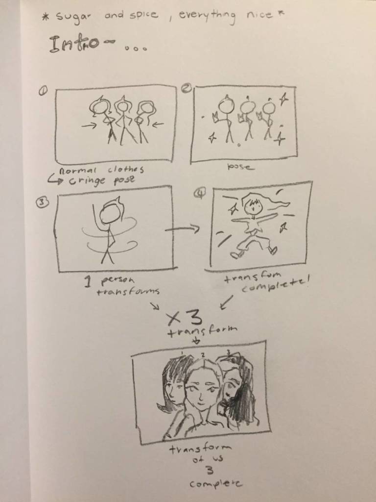
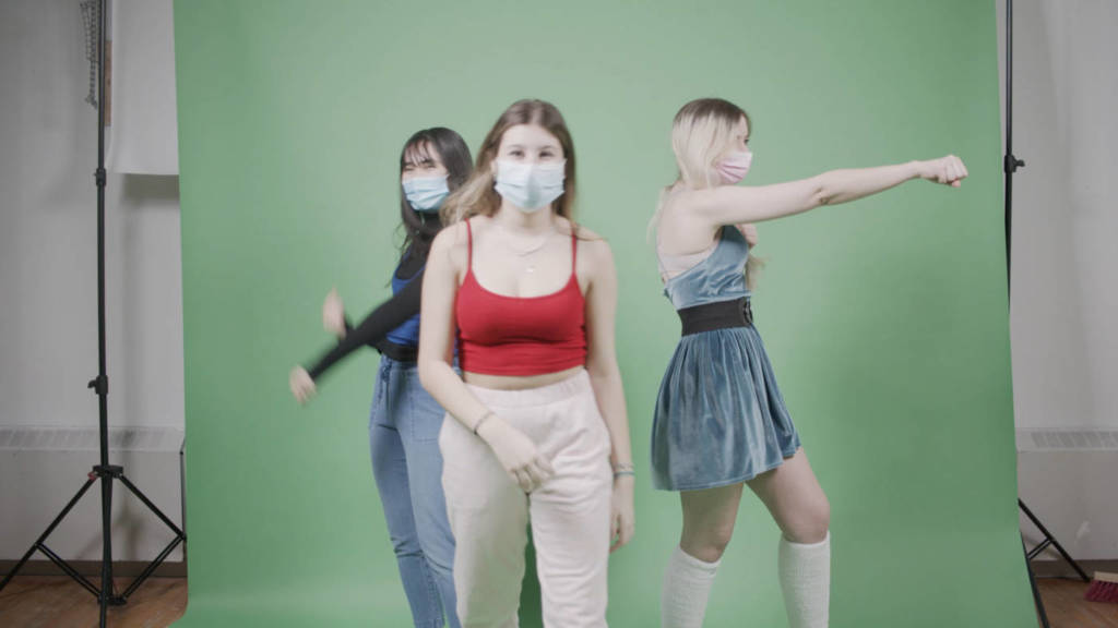
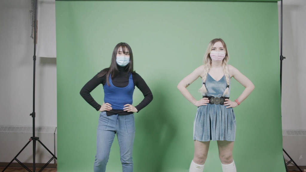
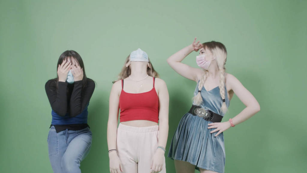
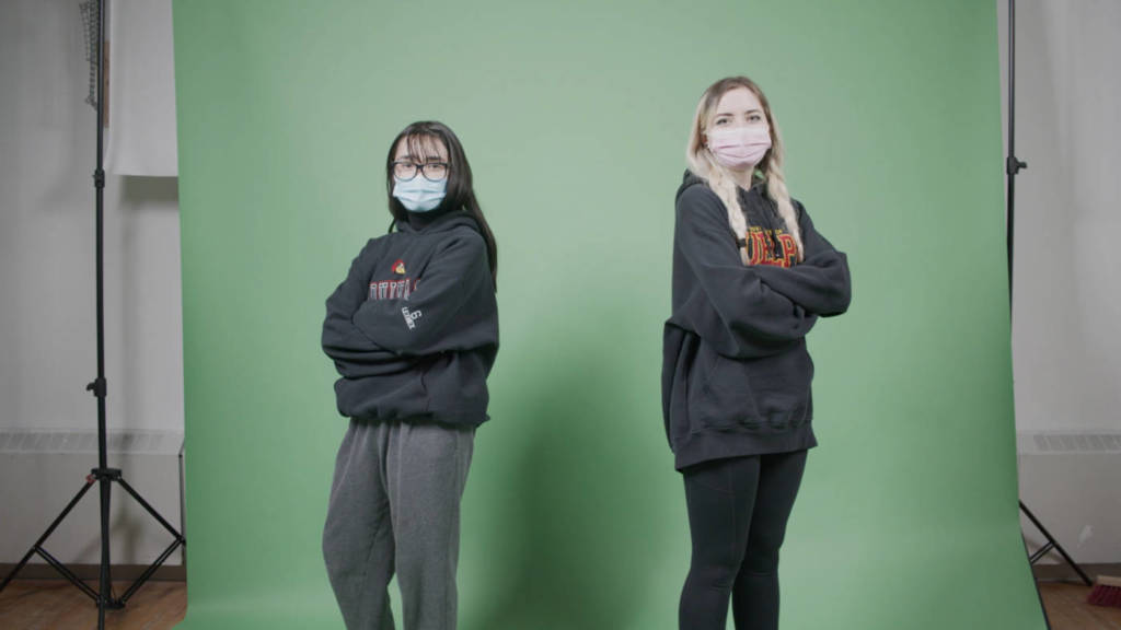
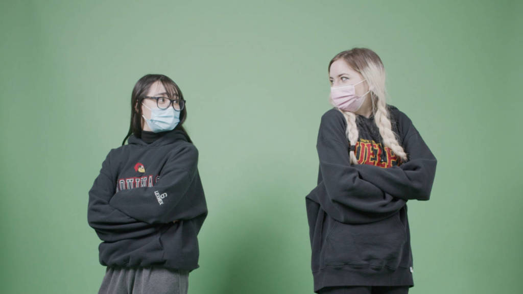
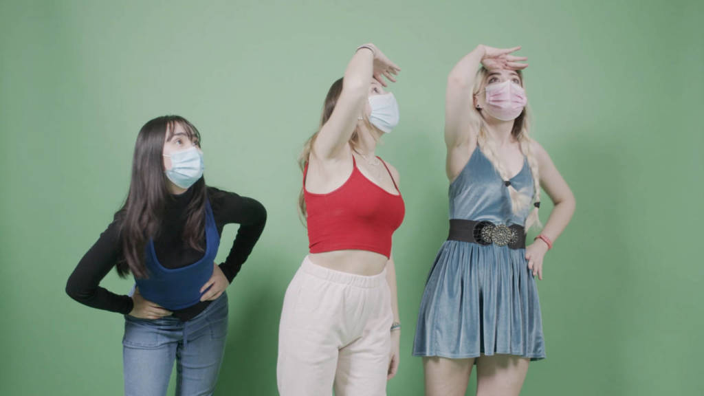
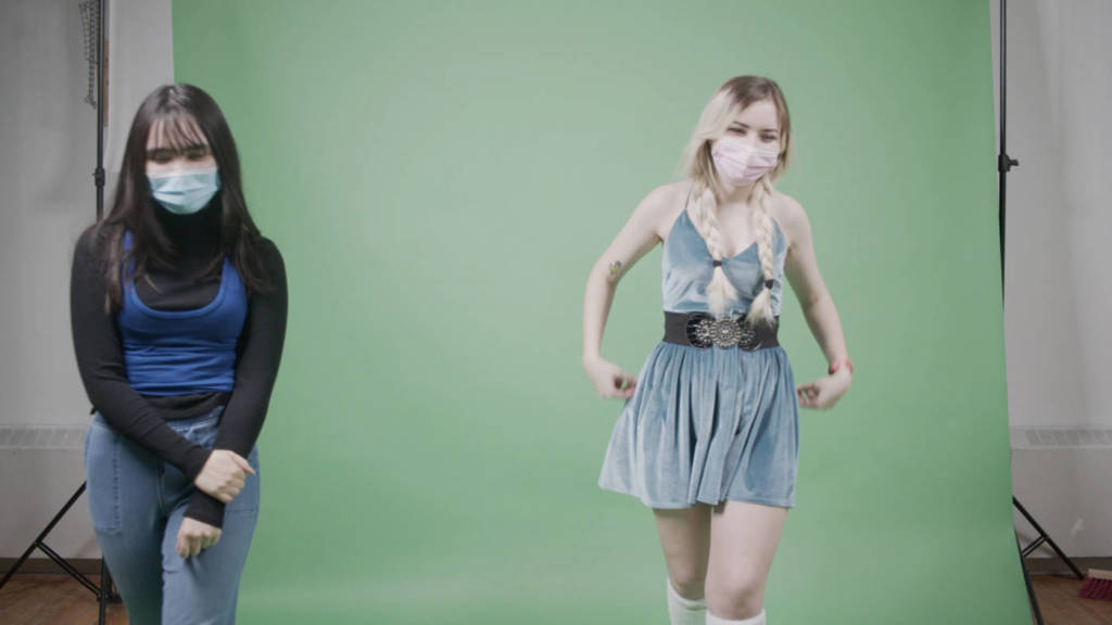
Participate in introductions and course information, demo of WordPress in class
Listen to short lecture on artist multiples.
TO DO: A short post on one artist from the list will be due for a 3 minute presentation on WEDNESDAY of this week.
A new work of text-based multiple will be assigned, due for final critique in Week 4. Details to be provided.
MONDAY
Welcome back to school everyone, I’m very happy to have a way to come together to learn about contemporary experimental art practices. During the pandemic, we will engage in weekly exercises, demos, readings and videos to learn some of the historic, theoretical, and technical aspects of working in experimental media forms.
Our virtual course will emphasize ideas, research, regular exercises and practices, and we will work on developing resolved artworks.
Students will perform and create studio exercises at home and in the world – within strict adherence to public health guidelines at all times – using materials and situations at hand. Together we will practice being resourceful and creative within the limits of any given situation. We will explore how to be an artist now – using aspects of performance, snapshot photography, video, audio, and artist multiples – in this unique and challenging historical moment.
Every week we will have Monday and Wednesday class meetings – and then you will do the week’s homework (things to read, write and create) posted under Weekly Assignments.
Due dates are shared on the Weekly assignment pages, and on the tentative schedule found here:
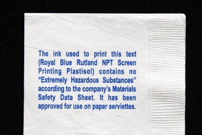
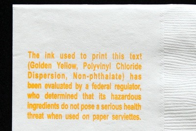
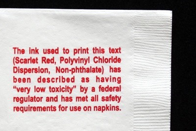
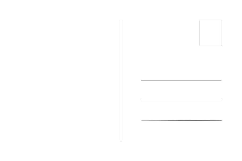
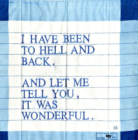
2011, Multiple, paper serviettes printed with one of three colours of ink. 5″ x 5″
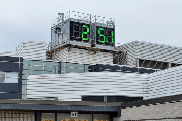
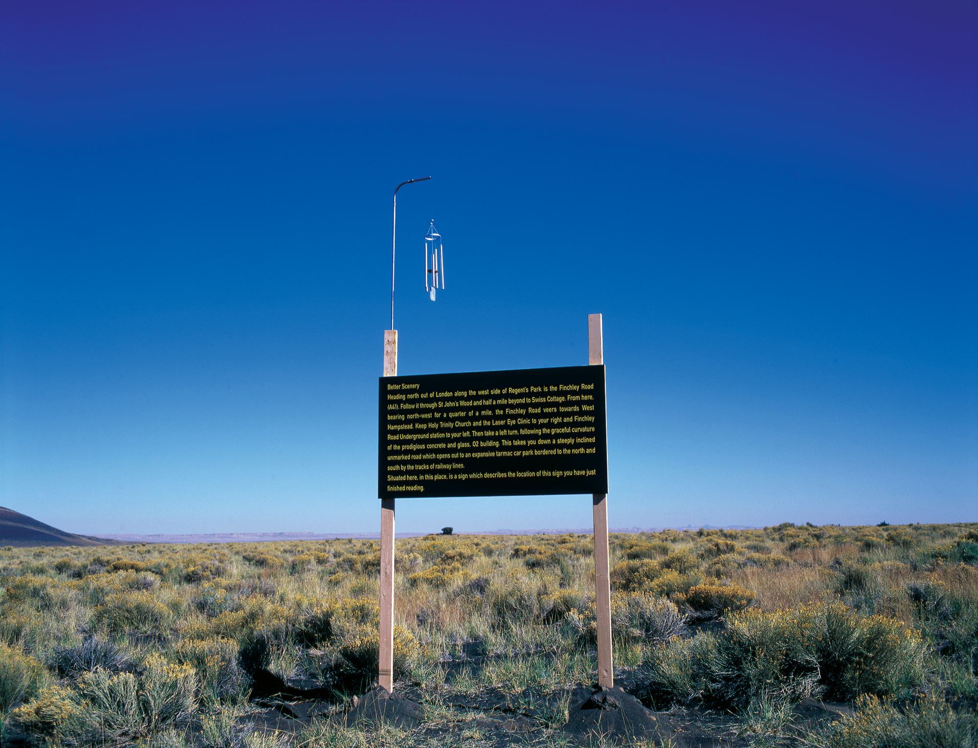
A Clock Set to 24 Hours Into The Future
2014-2015, public artwork for Sheridan College’s Temporary Contemporary, Trafalgar Campus, Oakville Ontario.
“Unlike most campus clocks, this one has been set 24 hours fast, always displaying “tomorrow’s time.” Of course, on a four-numeral digital clock, tomorrow’s time appears indistinguishable from “today’s time,” and therein lies a small bit of levity that is intended to open up a range of poetic interpretations.”
“A clock tower running 24 hours fast is in fact practical and functional in the present, but serves also as an aspirational signpost pointing towards the idea of tomorrow.” From his site Jon Sasaki
(the accompanying didactic panel)
An Obsolete Calendar Towel Embroidered with an Identical, Future Calendar Year, 1970/2065, 1982/2049, 1976/2032 and 1969/2042
2012, ongoing, embroidered found vintage textiles, each approx. 17″ x 28″.
In an ongoing series, obsolete calendar towels have been embroidered with the date of an identical, future calendar year. Beyond giving the discarded object a renewed relevance, it proposes a disturbingly banal vision of the future… that decades from now we will still be pining for some vague 19th century inspired nostalgia… covered bridges, copper kettles, cast iron stoves and millponds… images that were anachronistic wishful fictions even at the time the calendars were first printed.From his site Jon Sasaki
Please Don’t Take This 1000 Yen
2013, intervention in the neighbourhood of Konohana, Osaka Japan.
Upon arriving in Osaka, I observed hundreds of bicycles that had either flimsy locks, or no locks at all to secure them. I surmised there was some sort of honor system in play, and decided to test it a little. The results were surprising to me.
Four signs were placed around the neighbourhood early one morning, asking residents to please not take the 1000 Yen bill attached to it.
Two of the signs remained untouched until I retrieved them late that night. One sign disappeared mid-afternoon, although it probably had something to do with it being posted on the city’s bulletin board without permission. The fourth sign disappeared late in the day, which still impressed me. It turns out it was taken by a random, concerned neighbour who wanted to safeguard it. She did some sleuthing, somehow correctly guessed the restaurant I would be visiting later that night, and returned it (along with the 1000 Yen of course) a few hours before I arrived.
On his website, Lee Walton writes: “For Momentary Performances (2008-2010), I used vinyl text on city walls to announce ordinary moments that will take place. These texts are installed throughout the city weeks prior to each performance. Nearly 20 of these public works took place in Minnesota and Atlanta.
After acting out the script exactly on schedule, actors casually disappear into the city as if completely unaware of the descriptive text. Unexpected public is left to wonder about the reality of the serendipitous occurrence.”
Experiential Project:
The Experiential Project
Art in General, Project Space, 2005
These postcards became the access points for experiential interactions with shop owners, bars, barber shops, sandwich cafes, boxing clubs, and hidden city spaces. When a participant located the hidden starting point, an orchestrated experience unfolded. Participants become performers as more instructions and prompts are discovered embedded throughout each journey.
CLUSTERFUCK ESTHETICS “Lee Walton’s “Experimental Project” at Art in General is a sort of walking cacophony. It consists of a packet of cards, each with brief instructions that set you off on a situationist drift or do-it-yourself performance. A few weeks ago, one card sent you to a marvelous Asian store on Lafayette Street, where you were instructed to look “inside large music book on the top shelf.” A slip of paper then directed you to buy a lottery ticket and take it to a parking lot where you were sent to an OTB parlor and then led to a Chinese cardiologist and so on. This week’s instructions read, “Nancy Whiskey Pub. Lispenard at West Broadway. Inside pocket of red jacket.”
by Jerry Saltz
WRITE: Due in Wednesday’s class to present–
Multiple by Maurizio Nanuci
Best known for his large neon installations, Italian artist Maurizio Nannucci has been producing artists’ books, records and multiples for over forty years. As a publisher, he has produced works by James Lee Byars, Fluxus, Michael Snow and many others From the artist books and multiples blogspot by DAVE DYMENT
You will be assigned one of the artists below. Post 2 examples (image and description) of great text based works – look for instructions, scores, prompts, advertised events, and multiples that use text in a conceptual way.
Describe the artist’s general approach in their broader practice, along with why you like the works selected – how do these objects work in the world? How is the artist’s use of language different from other forms of public text? How do they use materials, fonts, and other formal decisions to activate the text?
You will have 3-4 minutes MAX to present the two works to class.
Adrian Piper
Adam Chodzcho
Michael Drebert
George Brecht
Yoko Ono
David Horvitz
Jonathan Monk
Mendi and Kieth Obadike
Janice Kerbel
Erika Rothenberg
Scott King
Hiba Abdullah
Jenny Holzer
Miranda July
Fiona Banner
—
WEDNESDAY:
Give short presentations
Assign Text piece
ASSIGNMENT:
Instructions for the world:
Text based prompts, interventions, and multiples
DETAILS TBD in next class.
Make an artist multiple that centres text as a main element – the text should be employed conceptually – you may use it to:
-Give prompts, propose uncommon actions
-Provide instructions for absurd or unexpected things
-Trick the viewer in a pro-social way
-Make minor sentiments majorly declarative
-Document a banal, ephemeral thing in an important or permanent manner
-Play with an awareness of fonts, styles, and with text as a material, or an abstraction
– Subvert the intentions of found text
-Give voice in public to something not usually spoken in public
-Consider some of the strategies empoloyed by the artists discussed in class
etc…
You will be able to use 13×9″ high quality paper to make an edition or a series of postcards, a poster or other paper based ephemera. Nathan will complete the printing for you in studio – deadlines to be discussed in class.
Works must be properly finished to a professional level – and documented in an appropriate context to show the intended manner of circulation/presentation of the work.
You may also choose to make a T-shirt, hat, a magnet, a mug – or other printed ephemera that you will need to find and have printed on your own and in time – in order to document the work and present it in class for final critique.
NEXT WEEK MONDAY: Post a proposal drawing/ideas, we will discuss in class, along with a publishing/design demo
Deadline for finished files to be sent to Nathan (or elsewhere) to print: Week 3 Friday Jan. 28
Recently I went through my mom’s hope chest which was filled with drawings and art projects from elementary school. As a kid I was drawn to fairies, mermaids, flowers, cats, birds and other nature-based imagery in my doodles. I thought it would be really sweet to draw over these doodles from my past and make them into temporary tattoos, in order to give them a life past my mom’s archive of my childhood, collecting dust in an old chest.
Photos of childhood drawings.
Final Images for Tattoo Sheets
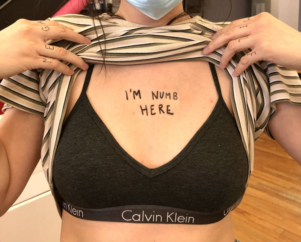
2. Verbal Bandaid Tattoos
The utter level of mental and physical exhaustion I have experienced this semester was new territory for me. The nervous, overwhelmed stomach aches, the numb feet after long, long days and the relentless and seemingly incurable anxiety deep in my chest is a point of reference for this tattoo idea: self-aware tattoos that signify where a person may feel numb or tender, or experience pain. These text-based tattoos will be written in an almost crude fashion, mimicking the style of a stick-and-poke tattoo. “I’m numb here”, “It hurts here”, “I’m tender here” will be written in varying sizes, so that people have free reign to decide where on their body these statements are true, and can place them accordingly. Interestingly, I feel that this tattoo concept compliments the verbal childhood drawings tattoo concept in an interesting way, as it reflects a somewhat sad departure from childhood’s whimsy and careless, fantastical energy.
Final Texts for Tattoo Sheets
WEEK 10 ASSIGNMENTS
Internet Culture Video – “dis/connected”
Issy and I’s internet culture video titled “dis/connected” is an exploration of the de-sensitization internet users possess towards problematic, violent, and out-of-touch content. Issy’s character passively consumes increasingly absurd video and audio clips, descending into a fugue state. The viewer’s senses are overwhelmed by the visuals and audio of Internet trends, viral videos and social media “influencers”. To emphasize that this hypnotized state is very much cyclical and a routine difficult to break, this video should be watched in a loop (right click on the video – loop option should appear).
Post Critique Updates
After our critique, Issy and I received some constructive criticism that led us to split our video into two separate parts.
Points we were recommended to consider:
make sure not to seem as if you are pushing a narrative (anti-internet)
don’t take on too much in one video
trust that the audience will know what you mean… leave some things to be deduced or thought upon
split into two videos – one of the outdoor clips and one of the internet clips
ideal setup/install, in a dark room, video looped for hours
Updated Internet Culture Videos
WEEK 9 ASSIGNMENTS
Internet Culture Video Notes
Plan:
make the Internet clips seem fun
blend to insanity
overwhelming of senses
problematic content that we passively consume
de-sensitization
illusions and dissonance
questioning reality and what it means to be connected
relationship to the internet and relationship to consumption
pop culture overload
element of control/lack of control
use an amalgamation of found clips from YouTube and TikTok to create a composition that slowly breaks down into meaninglessness and chaos
create the video with an intent to loop it
issy as the consumer of the chaos – show signs of exhaustion, madness and addiction to the Internet
WEEK 8 ASSIGNMENTS
Video Culture: notes/brainstorm/proposal
Selling our souls and bodies to the internet willingly
descent to madness after constant subjection to internet media
element of entertainment/parody (is this good, bad, both, neither?)
testing the limits of our relationship to the internet
constance consumption
the essence of online video culture
Clips to potentially rip from Youtube:
Day in the life
Torture style montage (the grinch scene)
Strapped down being fed tide pods
Cinnamon being thrown on face
Tik tok dancing while sobbing
Condom challenge
Organs in an etsy box
Selling toothpaste liquid
Feet pics behind the scenes
Parkour
Chain mail
Prank video style clip
Vlogging style at times
Documenting food
Slime videos
Clip of face in the dark on computer – eyes being held open by someone else’s hands
Mental health activism
Everything is cake
Mukbang
ASMR
Weird fanfic
stan/fan cams
Singing videos
Tied to train track
No privacy/ mental breakdowns
No eyebrows
Nods to porn
Strip tease
furries/yiff porn
Elements we could include in editing:
Flashback to contract signing – hysterically (“dont do it” Audio)
Unsubscribe (IM FREE…. Not really)
Fast forward? little timmy feet pics first job weird dystopia
Flashbacks and fast forwards pre and post internet soul selling
ghosts/ delusions, reality breaking down in front of the viewer
loop
WEEK 7 ASSIGNMENTS
Video Culture – Sylvanian Drama on TikTok
How is it shot, and framed? Where does the material come from? What is the quality of the footage?
These videos are shot on a smartphone in portrait mode, to fit within the formatting of TikTok. The material is suggestive of childhood playtime with toys while dealing with more mature and darker themes through parodying and addressing tropes of popular culture such as soap operas. The quality of the footage is technically good; it is quite clear, steady and in focus.
How is it edited, and does it flow from clip to clip?
The Sylvanian Drama videos are edited quite thoughtfully. Interesting camera angles and transitions are sometimes used, scenes flow into one another, and dialogue between characters is reinforced with back and forth clips. Certain clips use zoom-ins humorously and others are edited in slow-motion for added drama. The “dialogue” is conveyed through text captions that are often misspelled, abbreviated, and in current internet slang.
What does it sound like? How are sound or image manipulated and transformed from original footage?
These videos use popular music as the only audio, as if to further mock the themes that are being portrayed visually. For example, having a positive and upbeat song while the little dolls bully each other. The songs are not altered, but played as is to maintain their recognizability. Some of these videos had their sounds removed by the site (possibly for copyright reasons) and the reception of the videos changes completely. Somehow, they feel less like a parody, even with the ridiculous visuals and plotlines maintained.
What are some of the key features that define this genre? What are some weird variations on it?
This IS the weird variation of soapy or trashy reality narratives! Key features of trashy reality TV are obnoxious edits, music, transitions, etc., and even more obnoxious subject matter and conflicts.
What are some of the reasons these kinds of videos are compelling or useful in this historical moment? Use quotes from published sources to back up your arguments and analysis.
These videos are compelling because they are an amalgamation of music, visuals, and narratives derived from familiar and popular culture, to make something new. These videos poke fun at scripted conflict and allow viewers to find absurd humor within media that might have been previously considered serious. In a historical context, this is compelling because humor is a useful tool to cope with the experiences of the very significant crisis unfolding as a result of the pandemic; both on personal and broader scales. These difficult experiences beg the question if these cutesy yet dark videos would have ever been created without the confines and free time that multiple lockdowns have provided.
The creator of these videos stated:
“One Friday, I was bored,” Thea told us, “and I decided to take my old Sylvanian families out of the attic and set them up.”
As she did, she was inspired by the classically over-the-top American comedy-drama and mystery series from the early 2000s — “Desperate Housewives.
How do you relate to it?
On a surface level, it’s easy to relate to the process of opening up old boxes of childhood toys, feeling that warm sense of nostalgia, and playing with them as an adult. On a deeper level, everyone experiences physical or mental struggles in one way or another, at some point through life. In the age of social media, insecurities surrounding personal image (our appearances, our bodies, etc.) are especially widespread. These common issues are addressed humorously in the Sylvanian Drama tiktok videos – admittedly, alongside some less relatable issues like cold blooded murder.
WEEK 6 ASSIGNMENTS
Parents Video – “not all you left behind was love”
Celebrating food and family doesn’t seem entirely genuine to me, as many of the “fond” memories I share with my grandmother and parents were tainted by my own overwhelming preoccupations with my body and disordered eating. On the left side, this video shows my family and I celebrating my grandmother by recreating her recipe for Choereg, an Armenian easter bread. Before her passing, I would make this bread with my grandma annually. On the right side, this video depicts my obsessions with body image and my physical appearance. These thoughts would suffocate my mind at family gatherings and during the creation and consumption of food. All the loving memories I recall with my grandma were – in a way – tainted by my eating disorder.
I love my grandmother endlessly, but since her passing, I have had ample time to reflect on her extremely traditional views on the way a woman should look. When I developed an eating disorder at age 15 and looked frail and sickly, she would constantly applaud me for my newfound body and “motivation”. I still hear her voice excitedly saying, “What did you do? You lost so much weight, you look great now!”. These words served as fuel to my issues, and propelled me further into my disorder. I have had time to recover and rekindle my love for food and for myself, but I still remember all the compliments and attention I received from her when I was at my worst.
WEEK 5 ASSIGNMENTS
Plan for Parents Video
Over this week I have been communicating with my parents and brother about this video art concept. They’re all quite excited because the idea involves a delicious bread they can eat! As of now, here is a tentative plan:
Film each individual step of the bread making process. Hook up a MV88 microphone to pick up background noise and conversations amongst my family. Consideration: should I divide up each step between the four of us? Or should the process be entirely collaborative each step of the way?
Once the bread has been baked and cooled, I will set up a shot of us sitting at the dinner table and eating it.
Add a conceptual twist to either the bread-making process, or to the prompts for voiceovers from each member of my family.
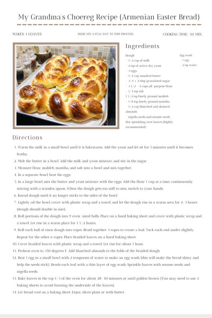
Recipe – To make your own!
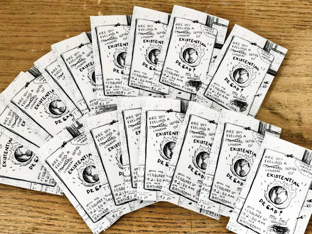
Stream of Consciousness Posters ZINES!!!
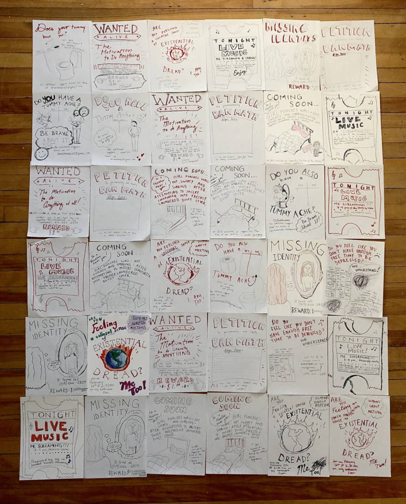
As an extra mini project in continuation of the text-based multiples assignment, I made a zine depicting some of my posters I presented last week. Diane said that these posters would make a great zine, so I had to give it a shot! I hand drew the original design, then photocopied it and printed 20 copies. They turned out super fun, equally as unpolished and unhinged as the posters they were based off of.
WEEK 4 ASSIGNMENTS
UPDATE! – Stream of Consciousness Posters
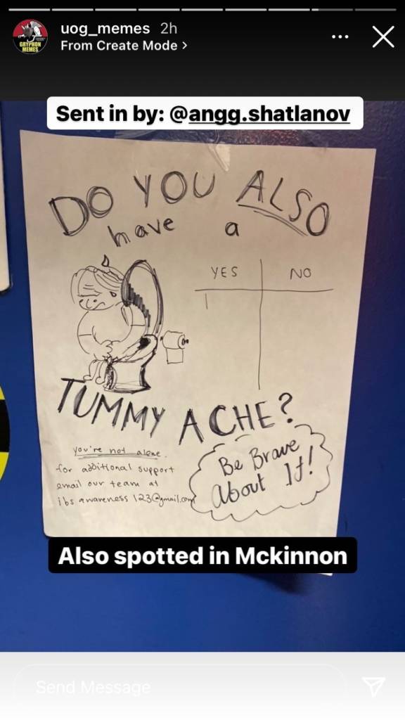
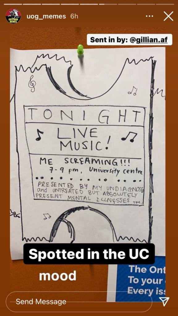
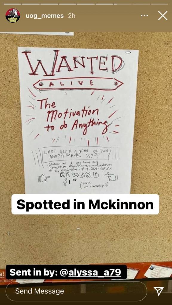
I have exciting news! My stream of consciousness posters are being noticed! Throughout the past week or so, I have been seeing photos of my cynical, crudely drawn posters on people’s social media. Yesterday, three different posters I have hung were reposted by a large instagram account (over 17,000 followers) that posts funny content relating to the University of Guelph.
I find it so funny that people on campus are taking the time out of their day to not only snap a photo of my posters, but also send them in to be posted by a meme page. The attention these posters are receiving is also comforting, in a way. The topics displayed in text and image are speaking to people and circulating in both physical and digital spaces.
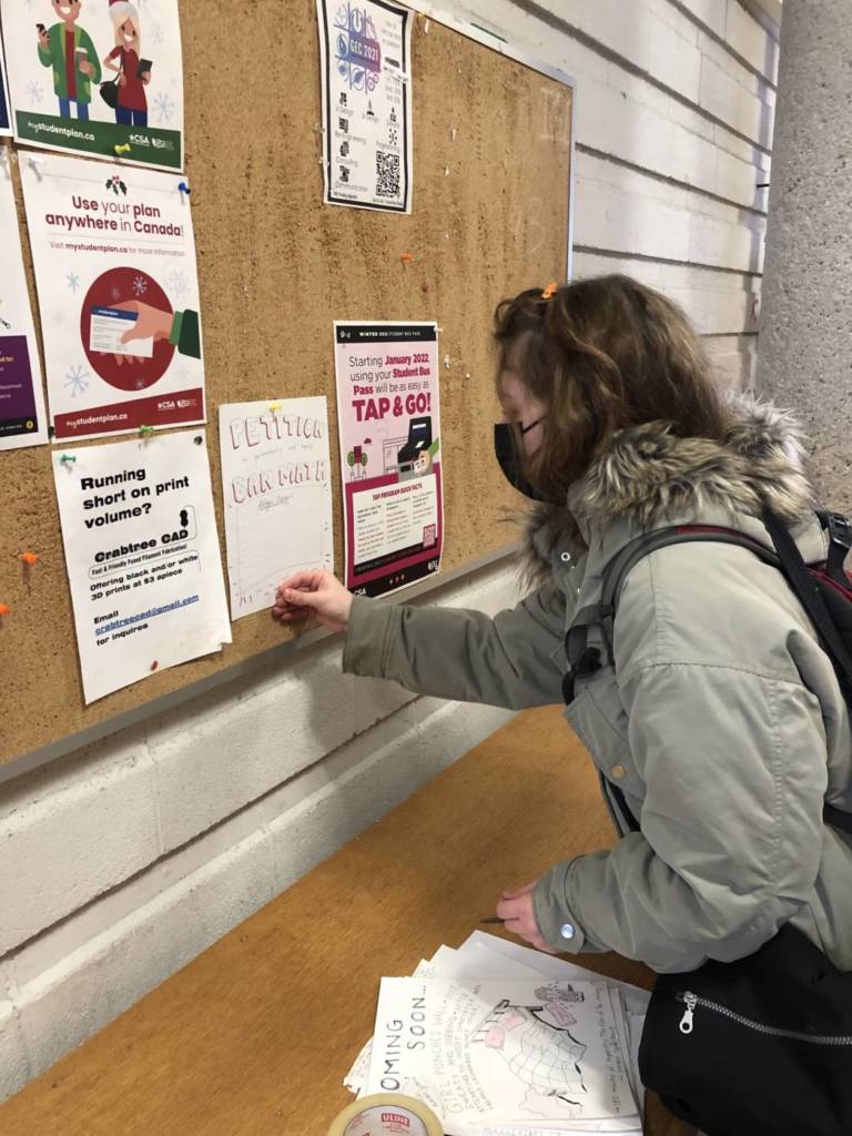
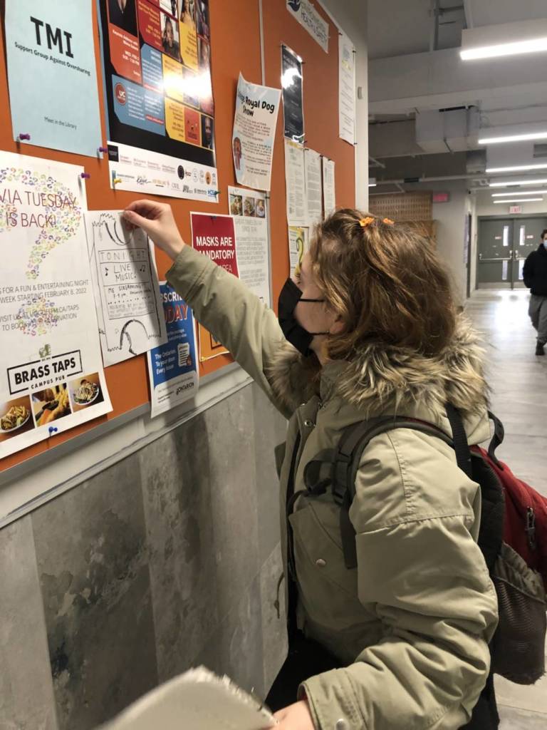
Text-Based Multiples Crit – Stream of Consciousness Posters
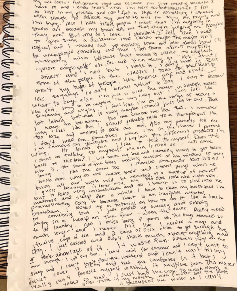
When I’m feeling particularly overwhelmed and unhinged, a process I enjoy using to decompress is stream of consciousness journaling. Stream of consciousness writing is a way of offering a reader insight to the fluid mental state of the writer. My stream of consciousness writing is usually private – strange and chaotic thoughts that I keep to myself. For this assignment, I figured why not broadcast the fleeting thoughts, the recurring ones, and the mundane ones, in the form of public posters. I picked out specific thoughts that arose from my journaling, and hand-wrote over 45 copies altogether, in an equally crude and unrefined style to my journaling.
One thing I’ve realized through this process and the reactions of poster-viewers, is that the absurd thoughts I have aren’t nearly as ludicrous as I once thought. A lot of people related to them. Some posters took form as participatory – allowing viewers to interact. I always get excited walking past locations where I’ve plastered these posters, hoping to see a new addition to my once private thoughts.
Parents Video Proposal
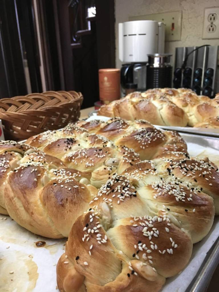
The unexpected loss of my grandma on my dad’s side two and a half years ago is something that I been exploring within my art for a while. Childhood homes, memories, nostalgia… I love capturing tender moments of the past that commemorate her. Something that saddens me to think about are the lost traditions my grandmother once practiced during her lifetime. She was a strong, Armenian woman with a passion for hosting grand parties and cooking massive meals. Around Easter each year, I would visit her with my brother, and we would help her make Choereg, a sweet Armenian egg bread. Those are some of my most treasured moments with her. Since she passed my family has not attempted to bake this bread.
Choereg loaves – braided to perfection <3
I thought for this assignment, a video of my dad, mom, brother and I, attempting to bake Choereg would be a fun experiment and a sweet way of honouring my grandmother. I would capture all of the motions of bread making -mixing the dough, letting it rise, blanching the almonds, braiding the dough, etc. Hopefully in the end my family and I will begin a new tradition of honouring parents and grandparents that have passed in the best way possible – through delicious food!
WEEK 3 ASSIGNMENTS
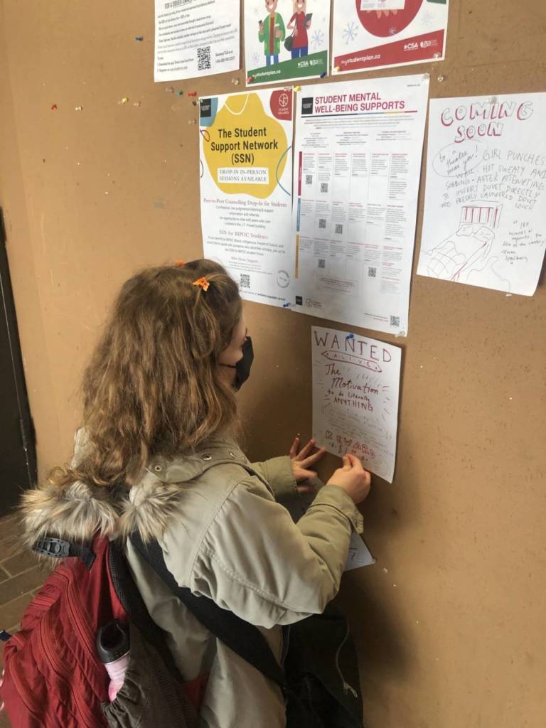
Final Idea and Installation of Posters
Last week, I had arrived at the idea of “Too Late” posters, highlighting events that are too good to be true and take place “yesterday”. However, after chatting with everyone in class about this idea, I ended up falling back onto the concept of sarcastic and sadistic posters (highlighting my thoughts and daily struggles that arise from stream of consciousness journalling). This idea combines two concepts that arose in my brainstorming for the text-based multiples assignment in a fun way.
The past week and a half I have been making crude hand-drawn copies of the concepts and thoughts that recur in my journalling. I considered making one copy of each design and then sending them to Nathan to have printed out on larger, better-quality card stock, but eventually decided that the unpolished and primitive style of hand-drawn posters was something I had to lean into – After all, these posters were born from my unpolished, unhinged and unfiltered thoughts. It has proven to be a lot more work conducting this assignment through the scope of hand-drawn multiples, but it adds to the mood I want to express.
Here is a small grouping of the Stream of Consciousness posters. Note the individually unique and varying designs!
At this point in time I have drawn upwards of 50 posters (I hope to make over 100). Currently there are 15 different poster designs/concepts within that 50. During the past few days I have begun installing them around campus and taking note of where they have been hung.
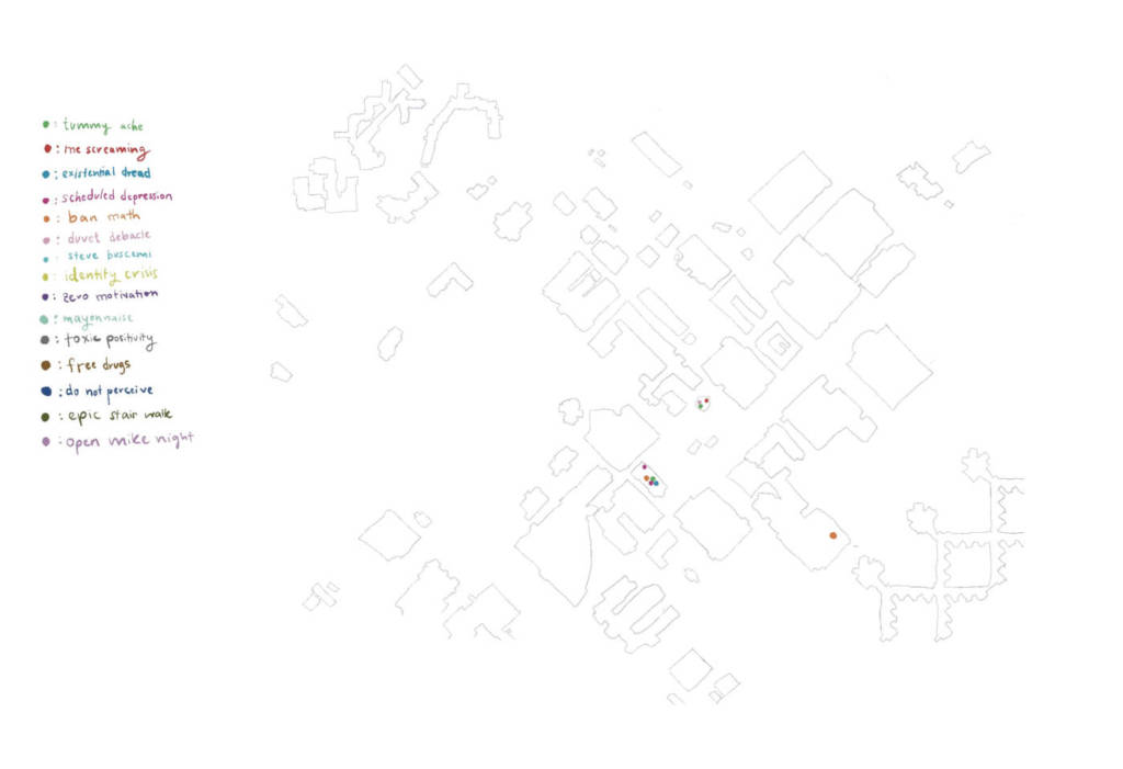
Through the process of installing these posters and taking photographic evidence of the locations in which each one has been hung, an idea was born. A poster of a map of campus, showing all of the places where each of my posters can be found. Poster-ception! So while I have been hanging these posters, I’ve been simultaneously working on this additional layer to my idea.
In progress poster of campus map depicting locations of posters.
There are three things I am considering regarding this campus map poster idea… The first is: Should the buildings be labelled? I’m leaning away from this as I feel it makes a clunky/busy design. And the second is: Should this poster have a title, or should it be left cryptic as displayed? I think I prefer the puzzling design as is, because the mysteriousness may be more likely to inspire viewers to embark on a self-directed scavenger hunt (one that potentially involves free drugs, mayonnaise, and Steve Buscemi????). The third is: Should these campus map posters be hung up across campus as well, or distributed to people so they can bring them on their hunt?
So that’s where I’m at! The plan of action for the next few days is to continue installing my stream of consciousness posters, update the campus map poster as I go, and then – once finished installing – print out the campus map posters. I’m loving the way that my original idea has morphed and developed!
WEEK 2 ASSIGNMENTS
Brainstorming for Text-Based Multiples
One conceptual artist we covered last week that especially resonated with me (introduced by Veronica) is Erika Rothenberg. I am minoring in Marketing myself, so I found her background in advertising to be interesting and relatable. I love how she combines the light-hearted, overtly cheery world of label design with the dark societal realities faced in the modern day. Sarcasm and humour is something I want to explore in my text-based posters.
I’ve had many ideas for this project, but none felt particularly inspiring to me until this evening. I will list the previous ideas I sifted through regardless, as I feel there is value in the journey I took to get to my final idea.
Multiples in the form of a zine
Zine about collections and the act of collecting
Took a poll on my instagram and received interesting responses (bobble head turtles from Mexico, fortunes from fortune cookies, etc.)
Depict collections through line art and text on each page
Distribute photocopied zines to people – inspire them to start a new collection: one of artist-made zines
Brainstorming for collection zine idea.
2. Stream of consciousness posters
Scale up my past journal pages written in stream of consciousness style to a large poster size
post very intimate and personal details in a public yet anonymous way
would this be freeing and therapeutic???
Example of a stream of consciousness journal page.
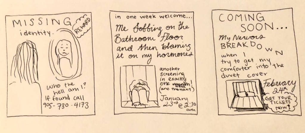
3. Satirically Sadistic Posters
The idea to create sarcastic and subversive posters has been circulating in my head since our class discussion of different text-based works. At first I was thinking of creating posters for upcoming events that will indefinitely occur in my life (rough drawings of ideas below).
Ideas for existential/satirical posters.
My Plan
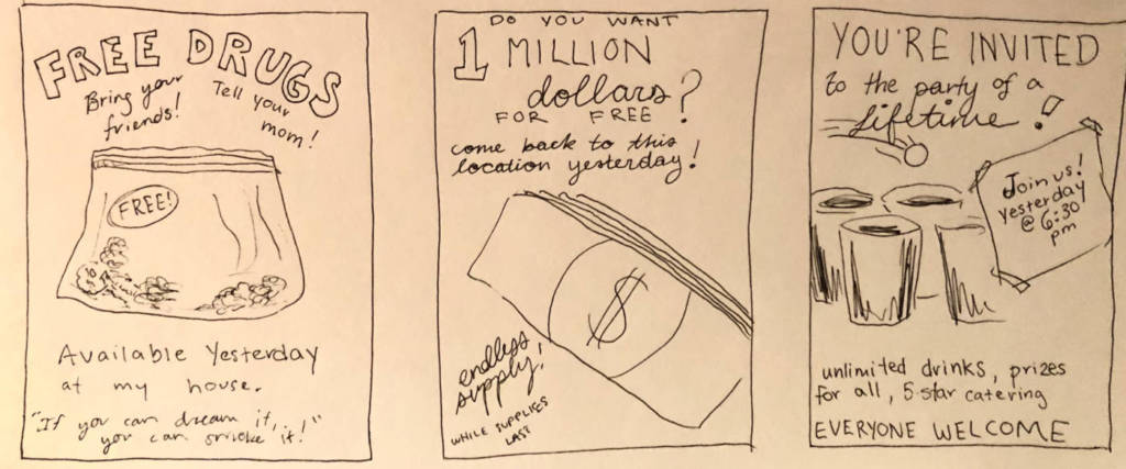
Too Late Posters
With Nevan’s help I arrived at an interesting idea that was born from the sarcastic poster concept above. We were discussing our plans and agreed that it would be funny to plaster posters all over campus and in Guelph that invite the public to events that seem too good to be true, but write “yesterday” as the event’s date. The idea that the viewer of the poster has missed such an amazing opportunity, but also the sarcasm in that the poster itself writes “yesterday” (it will always be too late to attend) is so silly and quirky that I have to see it executed! Below are some very rough sketches of potential posters:
WEEK 1 ASSIGNMENTS
Hiba Abdallah
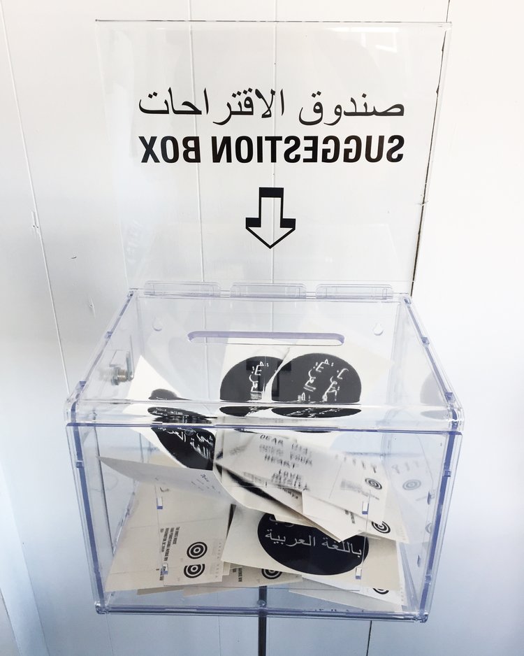
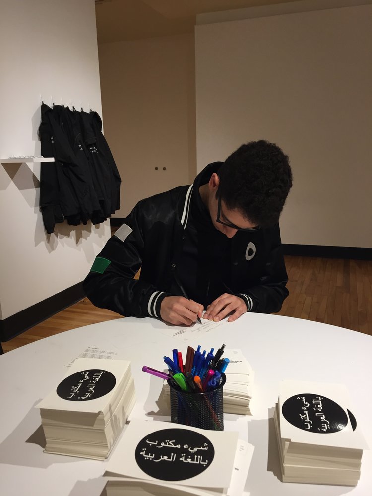
Hiba Abdallah is an Arabic contemporary artist (who completed her MFA at the University of Guelph!) interested in exploring the varying politics and social beliefs of communities. Her work is almost always public, either through collaboration with other artists, or with the general public.
Rehearsing Disagreement
Commissioned by the MOCA in Toronto, ON, Rehearsing Disagreement is a series of participatory works by Hiba and artist Justin Langlois. Included is a dartboard, seesaw, and customizable worksheet style text pieces that museum-goers can interact with. All works in this series investigate conflict of opinions and allow people to co-exist in their disagreement. Not only this, but the interactive manner of these art pieces break down barriers of what art galleries have been stereotyped as in the past – sterile, quiet environments where the viewer cannot touch and interact with art on a tactile level.
Something Written to the White House
Something Written to the White House is an ongoing text based art initiative in which the public can write postcards to the White House that are later on sent (According to rules set in place by the institution, all letters MUST be opened and read by the White House). This text based art initiative connects to another ongoing art initiative of Hiba’s: Something Written in the Arabic Language. The fronts of the postcards sent to the White House literally translate to “Something Written in the Arabic Language”, serving as a tongue-in-cheek mockery of the racism and absolutely ill-placed fear towards Muslim people that was especially prevalent during Trump’s presidency. Retrieved from Hiba’s website, these hand-written messages display a wide array of personal messages for Trump in particular.
Overall, both of these pieces by Hiba Abdallah employ text-based artwork to display different opinions the public. I like the way Hiba presents these contemporary art pieces because they appeal to a childlike part of the brain while still remaining introspective. They are different from other forms of public text because the message of said text is entirely up to the participator, not the artist.
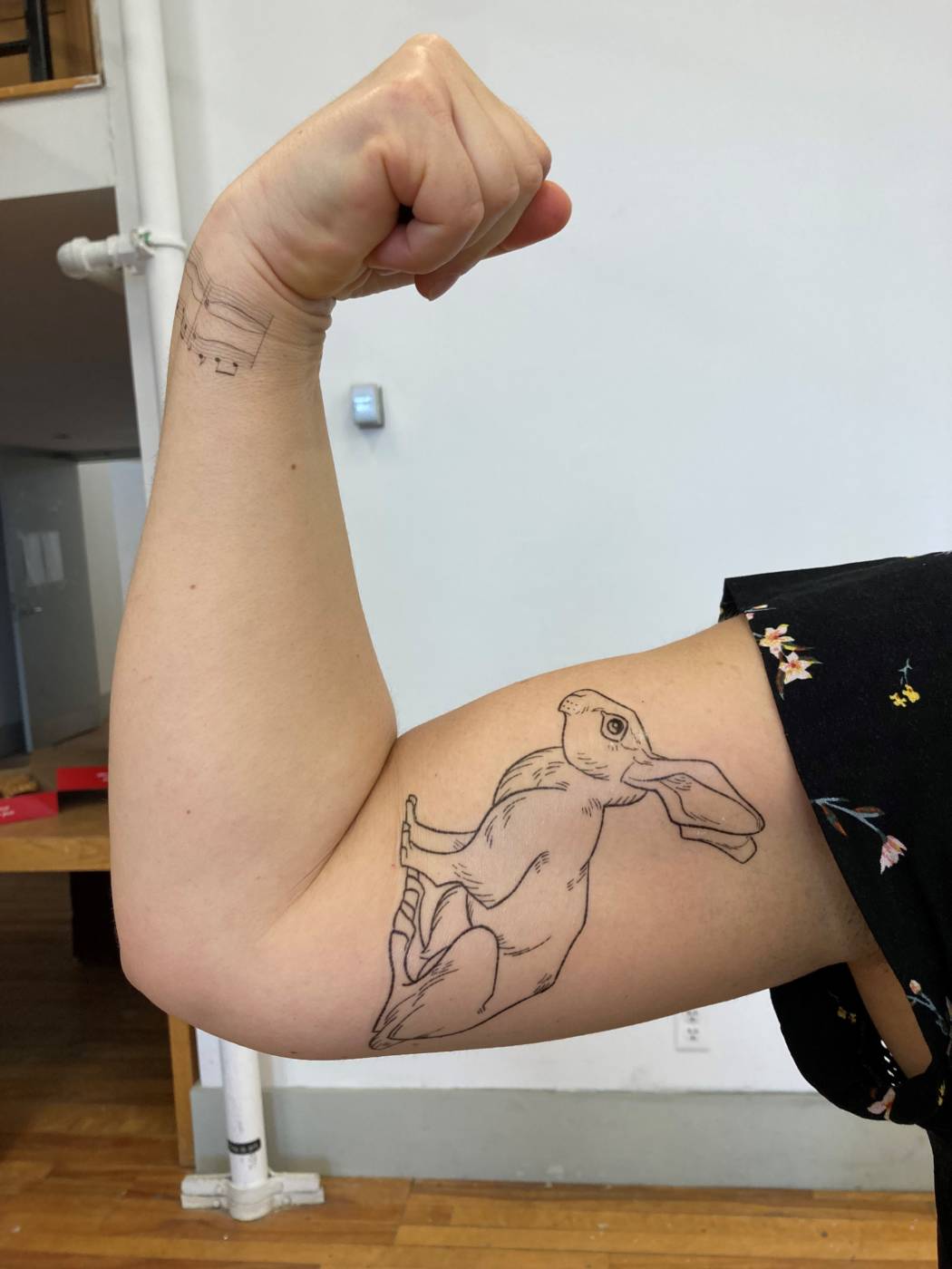
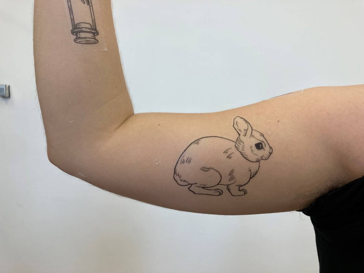
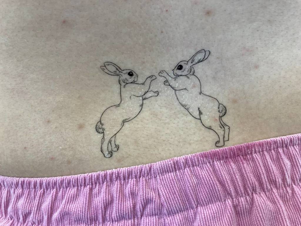
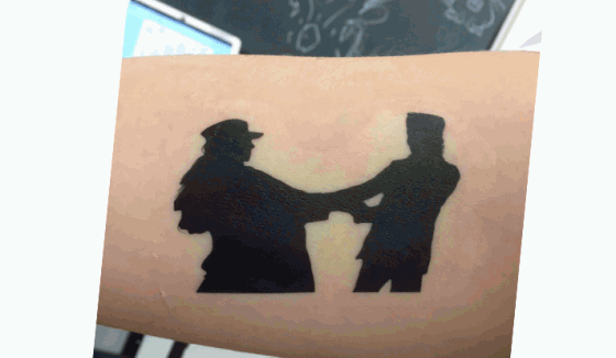
For my tattoo designs, I made a series of delicately-lined illustrations of rabbits and hares. My original idea had been to play with the representation of femininity and my experience with that, but through more exploration, I found a beautiful balance between the femme presentation of the rabbit and the butch presentation of the hare. I got really invested in researching boxing hares and the power and aggression that an animal with no sharp claws or fangs could have. I got interested in the weird poses of contorted limbs that the boxing hares would end up in, but what stuck with me most were the moments in the fight that looked more like an embrace than an act of violence. I started to experiment with the idea of a pause in the fight, a second of comfort within the conflict, and created the illustration of the two hares embracing. I like the ambiguity that comes with this image, especially since I originally wanted to explore the ambiguity of presentation and how I express myself to others. As a mirror to this image, I illustrated two rabbits fighting, even though this isn’t behaviour that is seen with bunnies. I thought it would be a fun role reversal exercise, in which I could blur the lines between the rabbit, a cute, helpless creature known for bringing new life, and the hare, a more aggressive animal with it’s exaggerated limbs built for running and fighting.
When placing the tattoos on the body, I wanted to focus on areas of strength – arms, legs, the abdomen – so that, whether the person identified more with the rabbit or the hare, they could still feel an inherent strength from these figures. I especially like the mirrored poses of the flexing arms in the image above, one with the hare, and one with the rabbit, but both displaying a confidence in their choice of animal.
Internet Video:
For our video, Julianna and I pulled inspiration from the vogue 73 question style interviews that many celebrities do. In these interviews, they tour the celebrity’s house and ask very mundane and surface level questions. What we found so compelling and odd about these styles of video were the way they were staged, the high production quality, and the uncomfortable, fake way the celebrities act. Instead of seeming like a spur of the moment, natural tour of their homes, these interviews become stilted and awkward – an obvious act. So, we wanted to heighten that feeling of the unnatural and the lack of meaningful information in these videos. Here are a couple examples of the vogue interviews:
As you can see, they come across as weirdly devoid of emotion, even though they’re supposed to be touring their personal living space. Instead, it feels very dethatched, and the questions and answers become easily ignored in favour of the glamour of these huge Hollywood homes.
FINAL VIDEO:
In our final video, Julianna filmed me as I gave a silent tour of my house to the camera. I did my best to replicate some of the body language and techniques that were used in the original videos while not saying anything out loud. So, I paused in different rooms and looked at the camera like I was answering some unheard questions. The goal was to make the interview seem more intimate that it was in the original vogue videos and to take away the glamour of the celebrity persona. The final video ended up being more of an engaging conversation than any of the meaningless questions and answers from the original videos, even though we didn’t say a word.
We took many steps to get to this final product, as you’ll see in the video bellow, which was an earlier attempt at conveying our idea. We had originally made a series of disorienting house tours where the audio was distorted and the interview could not be understood. We had hoped that this would show how little you actually get from watching the original videos and how there isn’t much substance to it, so by making it impossible to understand our voices, it would be equally unengaging. It ended up being too silly and hectic of a result, so we stripped the video down to the bare bones until we filmed the one above.
Popular Internet Videos Presentation
VIDEO ESSAYS:
What is it?
A video essay is a creative way of exploring a topic and making an argument through a visual and auditory format. It’s basic building blocks are it’s use of video and image, and the voiceover that actually reads the essay. They’re a new and popular way to present creative writing, often times to educate, comment on, or critique popular topics such as politics, film, art, and general pop culture. Most of the time, video essays don’t have any connection to academics – they’re not all school projects or used in a professional setting. It’s more just a way for people to explore topics and argue points that they’re passionate about, and although they are great educational tools, I haven’t seen a lot used in a school environment before. That being said, a lot of video essays are arguing personal opinions, so despite having examples and proof, don’t always assume they are the truth.
Making a video essay is a lot like writing a traditional essay, except with more technology involved. This added step helps to make your topic more accessible and engaging. Lets go over some of the moving parts in video essays:
To start, you need a thesis – Like any essay, you need to be making a point when you write it. Commonly, a video essay will explore a broader topic, such as a philosophical idea, a cultural phenomenon, or just a personal opinion while trying to prove this point with specific examples. For your thesis, you need two things: a topic, and an area of focus. Topics like “the meaning of life”, “beauty standards” or “good cinematography” are so broad it’s hard to narrow them down, but if you base your essay off of a focus point, like a specific movie, and talk about how that relates to the broader topic, you can now make a more compelling argument. This way, you’re not just rambling endlessly, which brings me to the next step:
Write your essay – just like how you would write any essay, start with an outline of all your points and proof, and how they relate to the overall thesis. You’ll especially need a strong introduction for video essays, because since there is so much content for people to browse, you’ll need to lure them in somehow. Make sure to fact check everything, people will call you out on it if you’re wrong.
Next, find your video clips – There are tons of free videos online that you can pull from, but the important point here is that you find clips that relate directly to what you’re saying. For example, if you’re talking about a certain musician, include a clip of them performing. If you just need filler images and videos, they the guide down bellow shows a great way of filling up your essay with visual aids that don’t relate to the topic, but correlate with the words that are being said. It’s not always going to be exact, but as long as there is something to look at, then it works.
Audio – when looking at the final product, a video essay really only consists of video and audio, so you want to make it good. All video essays have a voiceover, which is where you read and explain all the points you had make in your written essay. Since it’s one of the main components, be sure to speak clearly.
The last step is to put your video out into the world! People often use provocative titles and flashy thumbnails to garner attention towards their video, so if you want more people to click on it, be sure to use an image that represents your thesis and main points. The same rule applies for if you’re searching for a compelling video essay to watch – look for an intriguing title and an eye catching thumbnail. This isn’t always an accurate portrayal of which essays will make the best arguments, but it does help you to see who has put in the effort to make it more polished and engaging visually.
My video is composed of cut together clips of my mom and my dad each describing where they want to be buried. I chose this because I know they each have very specific spots, and have had them for a long time, which have a lot of family history tied to them. My mom, coming from Quebec and my dad, coming from Saskatchewan, both have multigenerational Canadian families, and then they met in the middle and had me. My sister and I were both born in Manitoba and now live here, so even though my parents both have such strong connections to these places, I don’t have any of the generational ties and memories that they have. It’s interesting to see how, although they’re married and have their own children in central Canada, they still have a connection to their hometowns, which leaves my sister and I in the middle to eventually chose our own plots. I thought this would be a neat way of getting them to explain a bit about their families without asking for a direct description. I even filmed the video on their dining room table, which has fittingly been passed down a couple generations and was made by a relative from my mom’s side.
Here are the separate, uncut videos of my mom and my dad’s maps and descriptions:
Text Based Multiple: Final
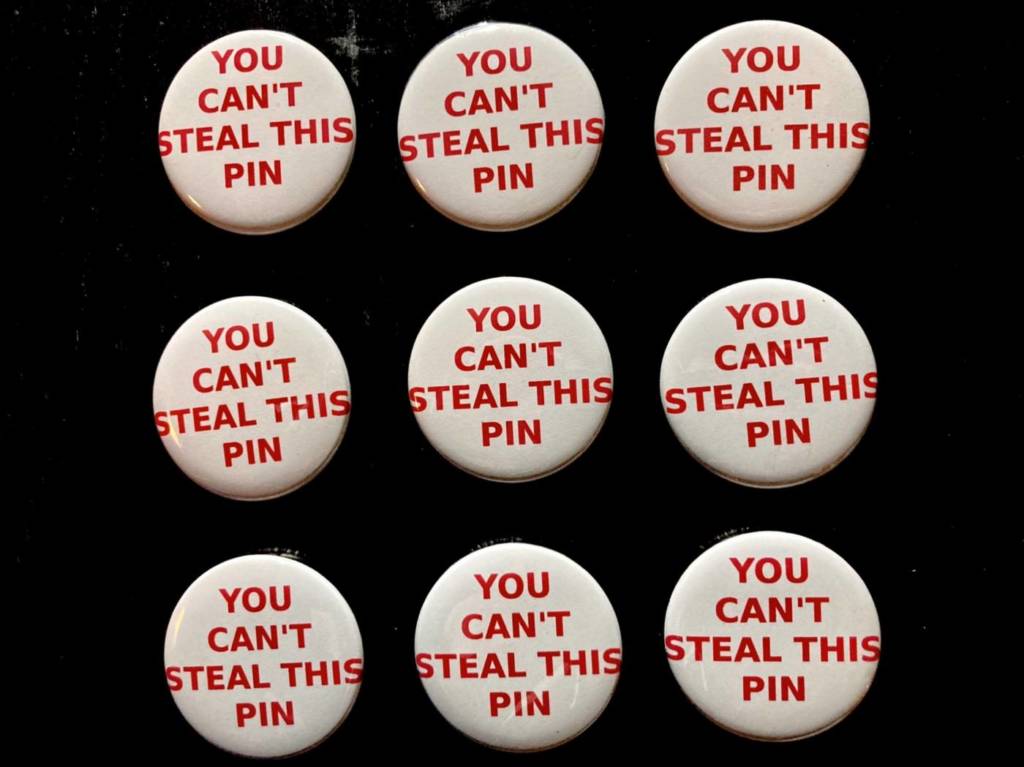
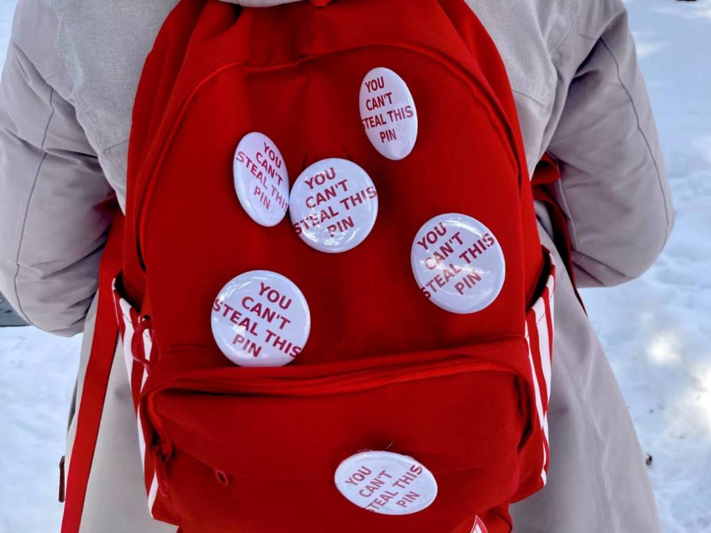
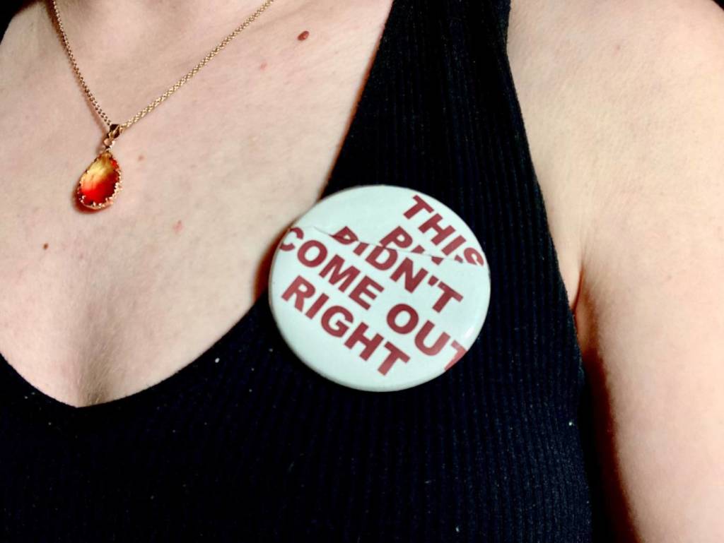
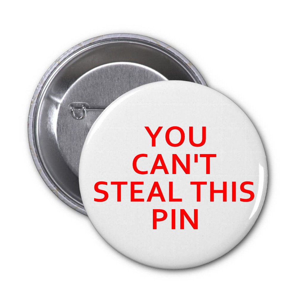
Anti-Theft Pins, 2.25 inches wide
With these pins, I wanted to run a sort of experiment on human behaviour and how people would react to seeing them. Originally, I thought that by issuing a challenge, people would be more likely to take the pin, but what really happened was the opposite.
I spent a day on campus, walking around and waiting in lines/crowded areas with the pins attached to my backpack. I thought that, since it was on my back, there were multiple to choose from, and the pins weren’t fully done up, people might be more tempted to take one. I even left some lying around in frequented areas like the library and the UC, but checking on them after a couple hours showed that out of the 12 pins I had placed on campus and on myself, only one had been picked up. The closest anyone came to taking the pins off my back were two people behind me in the Starbucks lineup that were whispering and debating about it, but eventually settled on taking a sneaky picture of my back instead. Unfortunately, people really couldn’t bring themselves to steal the pins, so they stay true to their name.
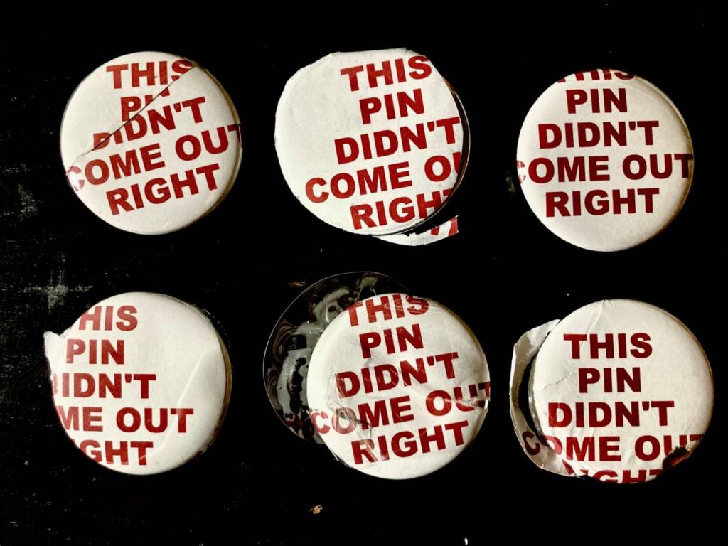
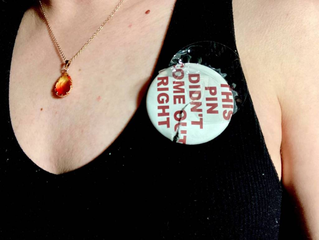
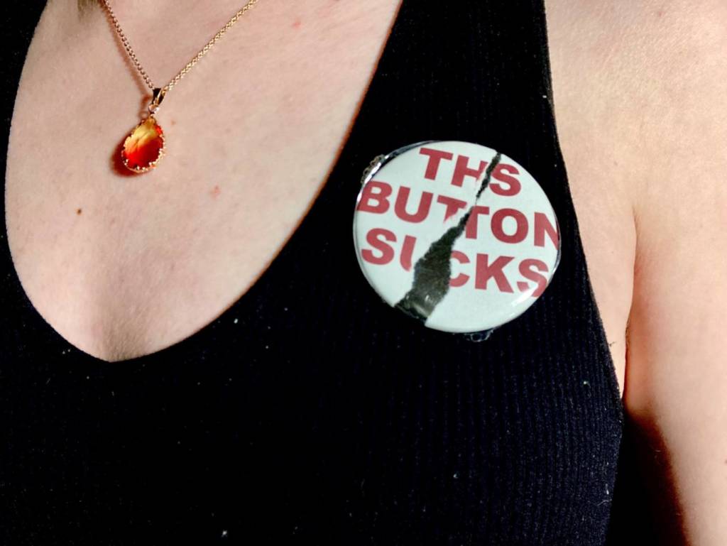
Failed Pins for Sale
While I was making the first pin design, I was having a lot of trouble with the button maker and a lot of buttons were not usable. But! That gave me an idea for a new design to make along side of them. For these pins, I purposefully found ways to mess them up. In a way, they turned out exactly how I had planned.
I thought it would be fun to try and “sell them” and see what people would say to these messy buttons if I attached a steep price to them. I’ve posted them on a couple sites, and I’m still waiting to hear if people think I’m serious, or if they react to the advertisements in any way.
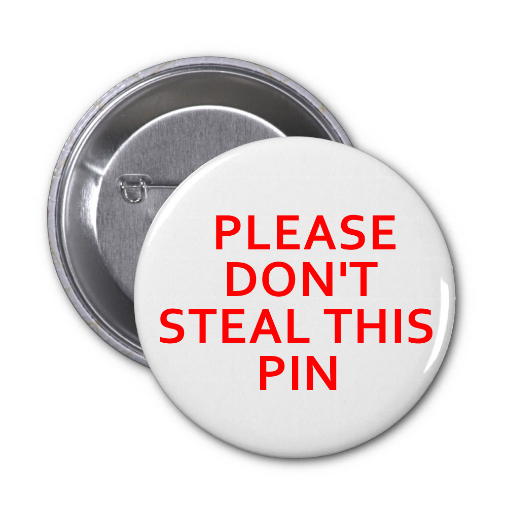
For these pins, I want to play off of people’s reactions to being told what to do versus the more polite one on the left, which asks them not to take the pin. I’m guessing people would be more likely to take the pin on the right, just to prove they can. What I think is funny, though, is that they’re free pins that I would make with the intention of people taking them, so even if they do take the pin on the right, they won’t actually be stealing it. You can’t steal a free gift, so the pin is true, in the end.
2. One of a Kind Postcards:
I want to print a series of post cards that each say they are one of a kind. Either these post cards will be exactly identical, but will claim to each be unique (so the receiver will try to find the differences), of each one will have tiny, insignificant differences in how the text is formatted (an extra space somewhere, one letter is a slightly different size, etc.). Playing with the idea of individuality in a multiple series
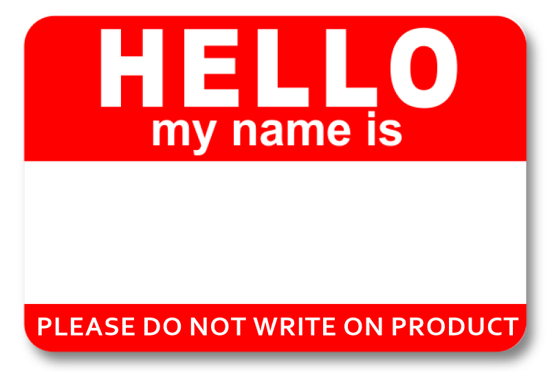
3. Name Tag (do not write):
I wanted to take a well known item and make it obsolete. It’s a contradicting statement, because these are made to be written on and in a way, made to be vandalized, so it would be interesting to see how many people listen to the request, especially with how tempting the blank stripe of white is on the tag.
David Horvitz
Horvitz is an American artist born in 1981 who’s work is inspired by Fluxus art and it’s focus on movement. He often critiques the commercialization of art and shares many of his works through physically passing on or mailing small-scale pieces, known as mail art. The way in which Horvitz explores movement in his work is particularly interesting, he makes his pieces very widely accessible through sending physical copies around the world or through digitally sharing them. By using the virtual sphere, Horvitz is able to make easily accessible editions of a single piece, or can even build off of an original concept by having the work navigate and interact with online spaces.
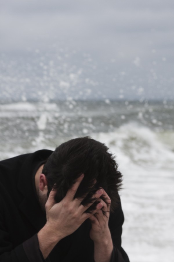
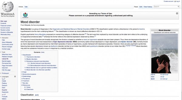
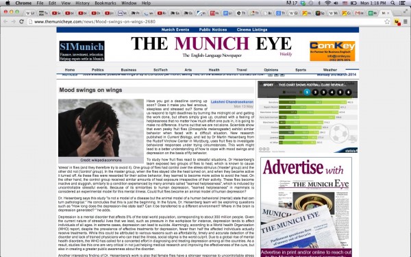
Mood Disorder – 2015, Stock Image and Artist Book
One example of virtual movement is his piece “Mood Disorder”, from 2015, where Horvitz took a staged picture of himself in a helpless pose, commonly seen in stock imagery representing depression or other mood disorders. The work was then posted on the Wikipedia page for “Mood disorder”, and since it was free and licensed for reuse, his photograph started to show up on other websites and articles discussing mood. So, the work became an artist book as the series grew and the image propagated across the internet. In this work, Horvitz plays with the stereotypical images used for depression in an almost satirical comment on mental health, and the fact that so many other sites were using it just highlights the modern need for a commodified “look” that can represent serious, intangible topics.
After several sites had picked up his original image and repurposed it, Horvitz collected screenshots of them and included them in the final piece. He says that the piece itself is “the image propagating over the internet”, while so many others add a new context to the original picture through the use of text. It’s an interesting take on authorship as a way of defining an artwork as yours, but one that you enter into the public sphere and can be reinterpreted and reproduced by everyone who views it.
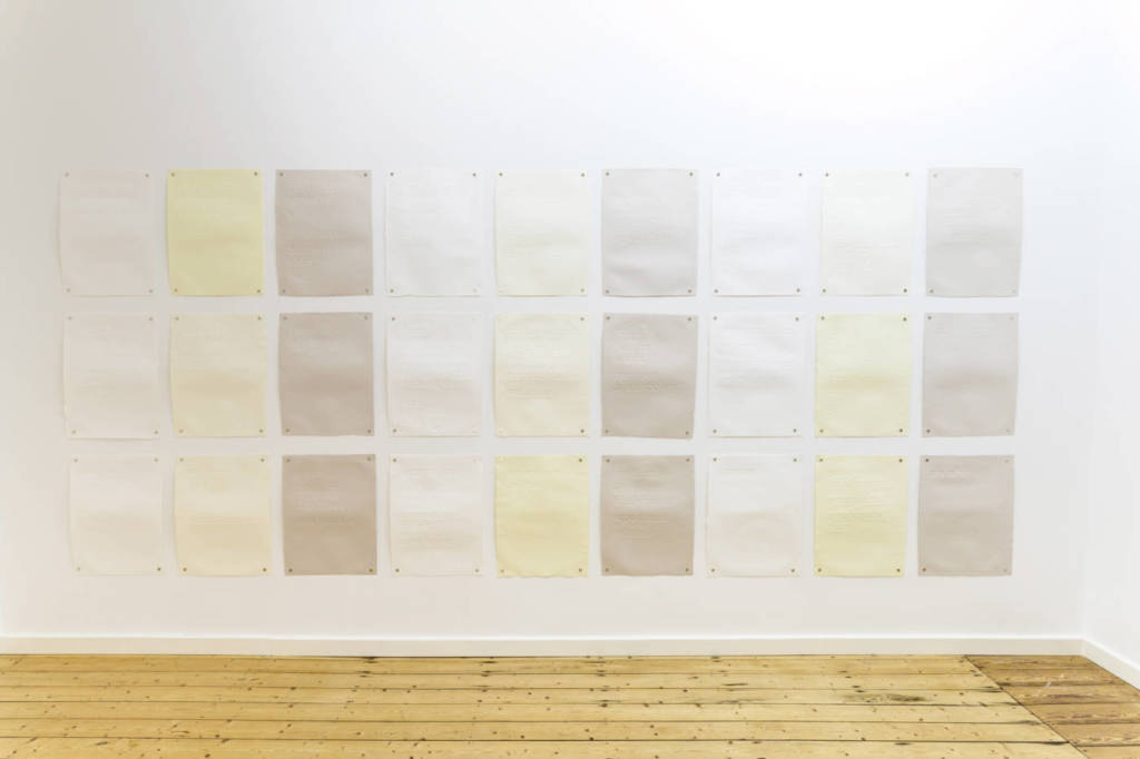
20th Century Alienation – 2020, poem hand-debossed on torn paper
Mental health and the depiction of depression in online imagery are common forms of inspiration in Horvitz’s work, which can be seen in a more recent piece called “20th Century Alienation”. In the piece, Horvitz has 27 pieces of paper pinned up with groups of words on each one that begin with the same letter. Each page is dedicated to one letter of the alphabet, and the there is one page that is dedicated to numbers. It’s an alphabetical poem consisting purely of words used to describe online images depicting sadness, loneliness, or depression. These words are “tags” that are used in photo databases to represent the content of the images, so once again Horvitz is using online tools as a foundation for his work. There are no images in the work, so it shows how photography is circulated through indexation online. Although the debossed editions are no longer in production, you are still able to get a PDF version of the text and print out the 27 pages yourself, in whatever way you’d like.
So, in both these works, Horvitz explores the circulation of digital imagery and how it is used to depict complex emotional subjects. He also invites collaboration in his work, starting with a strong foundation but allowing the viewer or wider, online audiences to interact with the art and further develop it.
Janice Kerbel is a British Artist born in 1969. She works with a range of material that including print, type, audio recording as well as the recent playing of light . Her work includes existing languages from a wide range of disciplines and re-imaging them. Her practice tries to imagine and develop new forms, which can be seen through many of her art pieces that including on her silkscreen prints on paper.
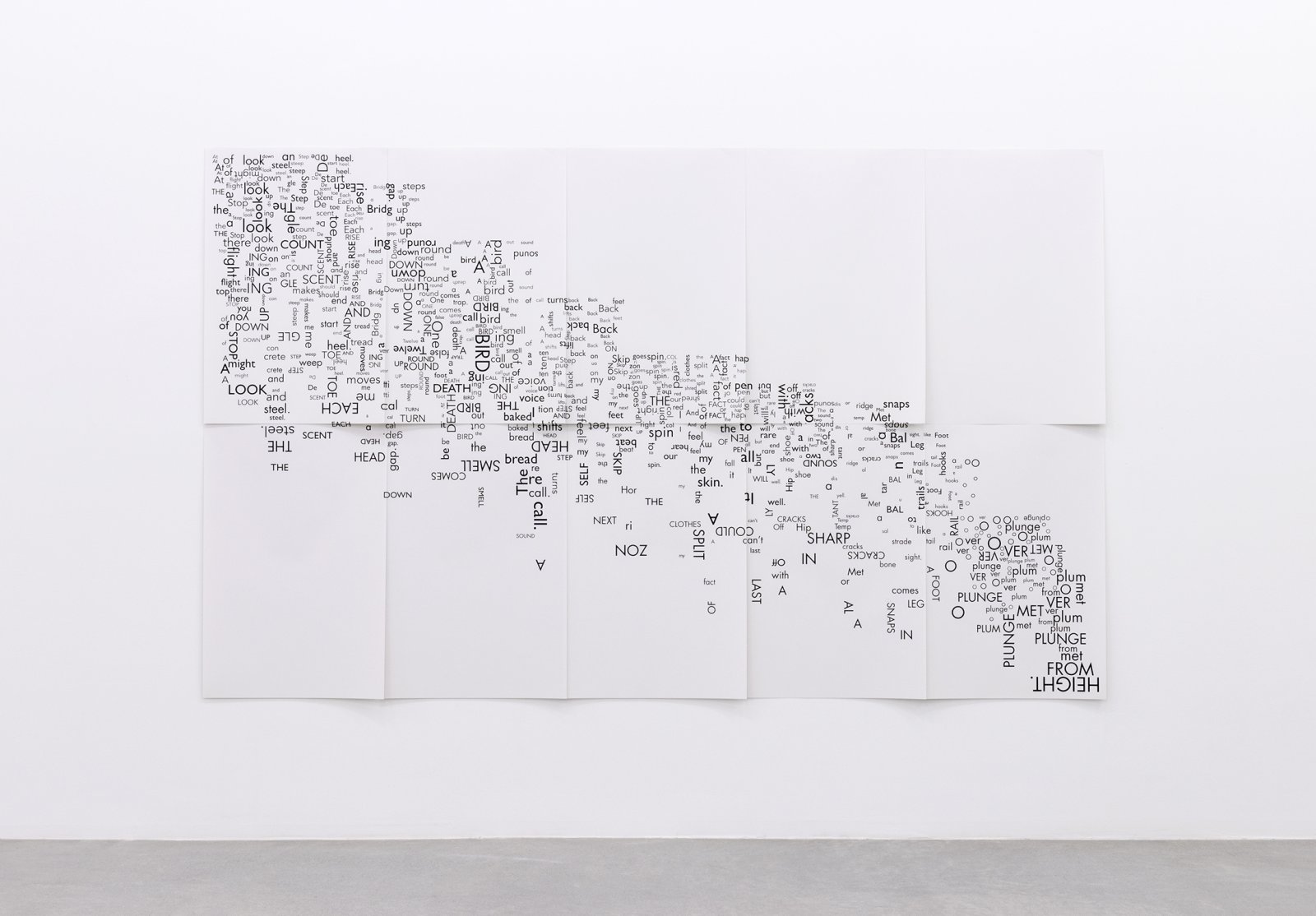
Janice Kerbel, Score, ‘Fall’
Janice Kerbel, Score, ‘Fall’, 2015, 10 silkscreen prints on paper, 108 x 66 in. (273 x 167 cm)
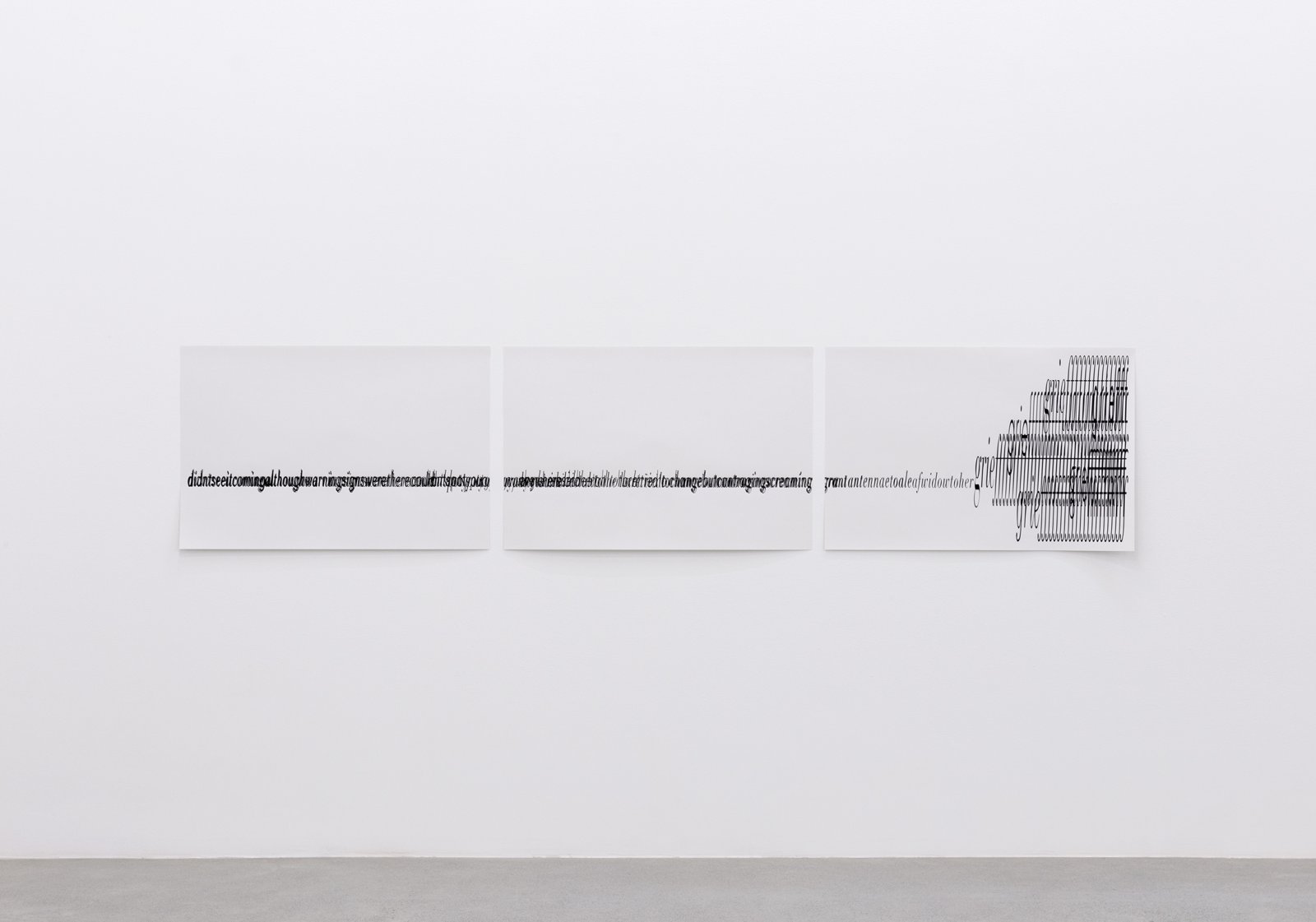
Janice Kerbel, Score, ‘Crash’
Janice Kerbel, Score, ‘Crash’ (detail), 2015, 3 silkscreen prints on paper, composition: 22 x 131 in
Why I choose these pieces …
I choose both silkscreen pieces that having Janice’s practice in developing new forms. The first piece I choose was “Score, ‘Fall’, 2015, 10 silkscreen prints on paper” where she split up her work into different pieces, but still continuing onto the next pages forming a motion or even showing a wave of words giving the piece movement implying a “fall” like its very name. The piece moves heavily from the top being more condensed then moves more openly when at the bottom where the words are more scattered. Having such words like “HEAD”, “PLUNGE”, MET”, “SHARP”, “snaps”, “BIRD” and other suffixes like “ing” almost adding to some words creating new ones like a scrabble game, such as “BIRD” and “ing” being close to one another making a new word, “Bing”. In a conceptual way, as the concept is more important than the execution, where Kerbel uses words and motion to convey this image of new form of a fall. The second piece I choose also shared the same concept of movement and also included letters, similar to the other piece I’ve chosen. Having the name “Crash” where her letters are formed into a visual image. The letters build up then crash by the end. This act of a crash shows her theme of “new forms” and the act of movement.
I choose these 2 pieces because It looks like inking or just printmaking that I thought was cool and the chaos of letters in an organized manner just jumped out to me as everything is so clean and well put together and that each individual letter can be a all put together as a multiple. These objects work in the world because we, as humans, are more advanced and now type more rather than hand write our work, so her piece just fits into today’s society era of technology. The artist use of language is different because she doesn’t form any sentences, rather she just makes it into a movement through words and letters like suffixes. The uses of font is vast by the different sized fonts in both pieces as well as the uses of caps where she makes some words in all caps. This usage of font activates the texts by creating a use of space in her piece that eventually lead to her meaning on movement and “new” form.
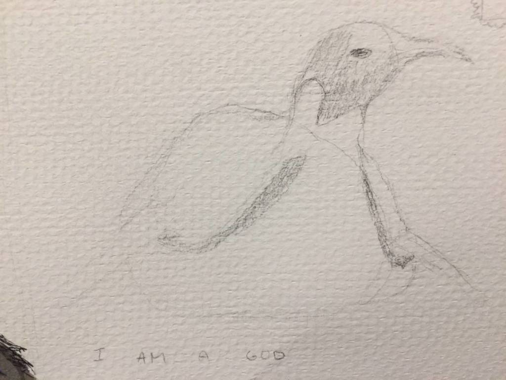
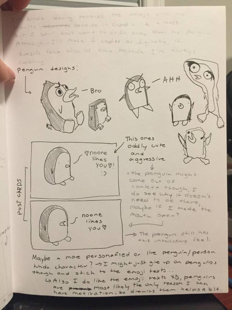
I’m incredibly interested in line art and inking, it can be a fast medium and can also be something done with care. I’m more interested in telling almost a story, through a mood and words. I wanted to show an animal I like, but with personality shown. My proposal is to make an angry post card that contradicts a normal welcoming card to have a little bit of ‘play’ into the act of welcoming. The words come through as the penguins thoughts, to show his angry mood that opposes the welcoming notation. I was also considering a poster multiple, or even changing up the words to have more script wise sentences. As for most of these outcomes, my favorite one is the one with blue fonted sentences as its not Grammarly correct and more angry but also cute.
Sentences
“Cringe cringe cringe…”
“Ughhhhhhhhhhhhh…”
“Stupid hoomanz such stupid man no wings means stupid hoomanz”
“Wow thats so wildd wow thats so crazy wow thats so cool wow thats gnarly”
Penguin Thumbnails
I’ve also been thinking about making more penguins to create a vast of the postcards, and to convey different moods, but still having multiples of this same ‘angry tension’. I lean more towards the comedic affect, where I bring a portrait-viewed figure to life.
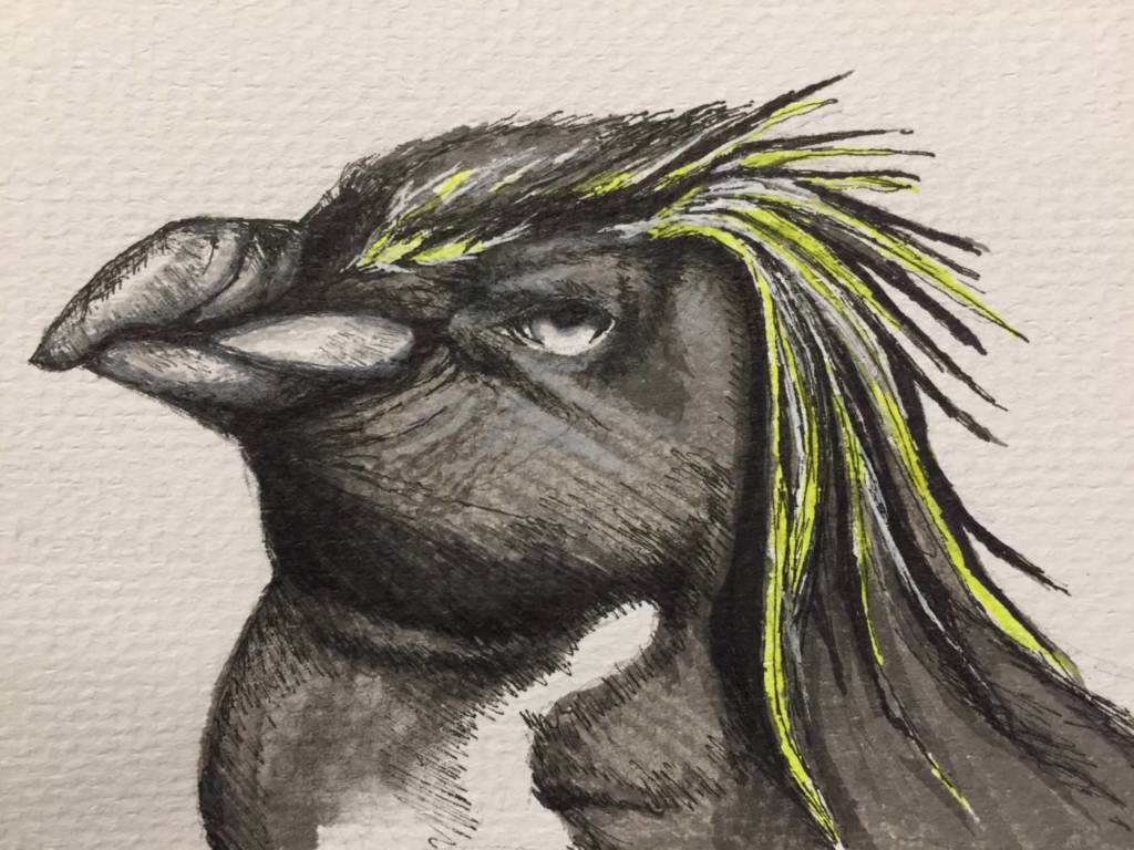
Mixed media, ink, fine line marker, highlighter
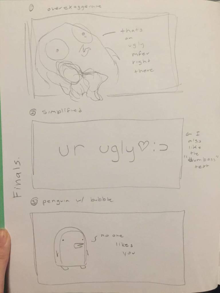
Changing up the penguin
I decided to change up my idea, into a more minimal art work with Diane’s help. I went back to the bases where my ideas were a bit sad and changed it into more of a comedic poster. With emojis I added a twist of letters and words that are almost mean and turned them into something more sassy rather than sad. Then, I started playing around with different ways to look at the letters on a poster.
Thought Process
I leaned towards emojis and the play emojis have to make things more light hearted. Below, I just started playing around with the text and words to see how it would look. I enjoy the sass there is found through words that creates humour and I moved away from penguins and illustrations towards just words. I didn’t like the curse words a lot, because without the cartoon figure it comes off as offensive and angry. I just want to keep this sassy humour while still giving an un-welcoming feel.
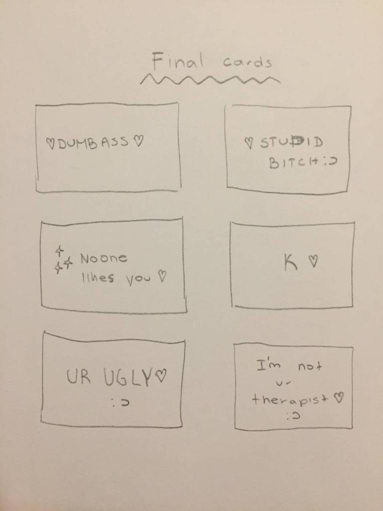
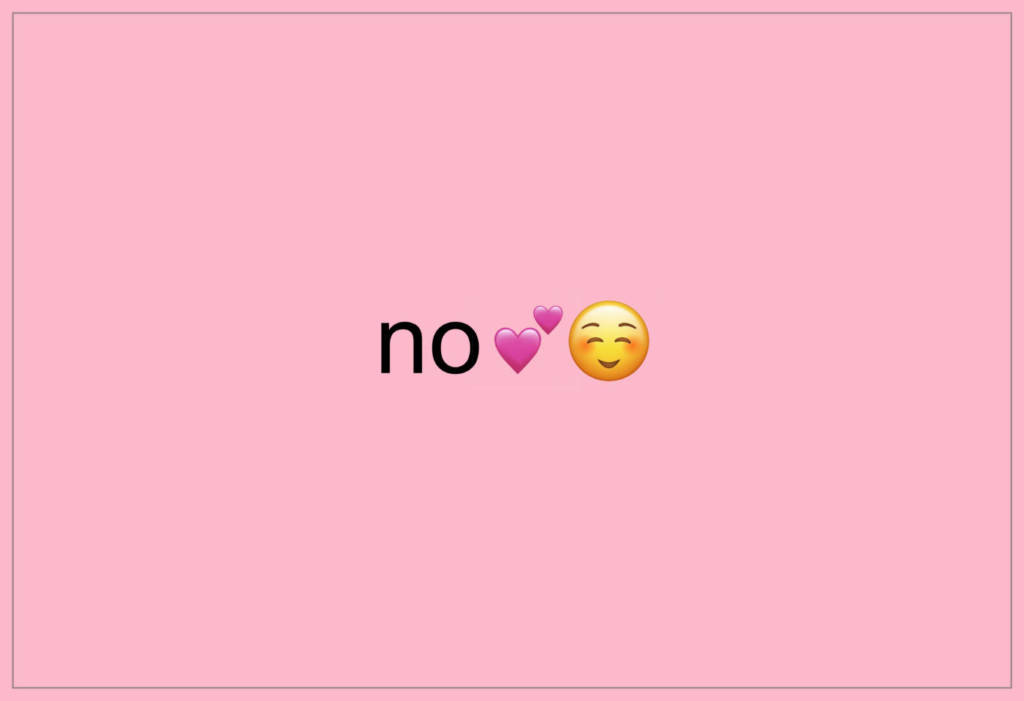
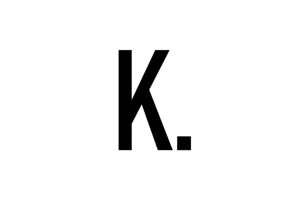
The sassy “K” was the most simplistic version of all my designs that didn’t include any characters. I started adding little details to try and make the piece a bit more pleasant to look at with the grey boarders, but I just discarded that design and changed it into a simpler, format with a pink background. I still don’t know if the pink background is necessary, but it leaves this nice sassy undertone.
Playing with text, but this time I added a boarder as well as negative space
Playing with words
I was thinking about creating posters, I’m not sure about the consistency seen throughout the pieces. So instead, I wanted to create 4 posters with various letters so that I have unique and different multiples. I might try to find more ways to incorporate letters, but so far, I came up with these few letters below.
Final printIdeas
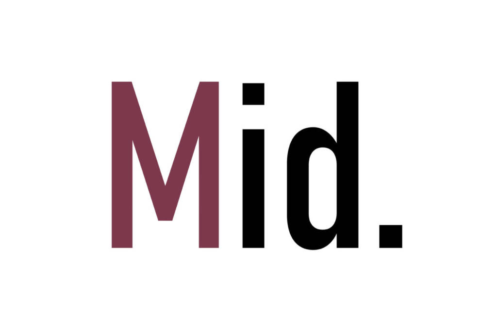
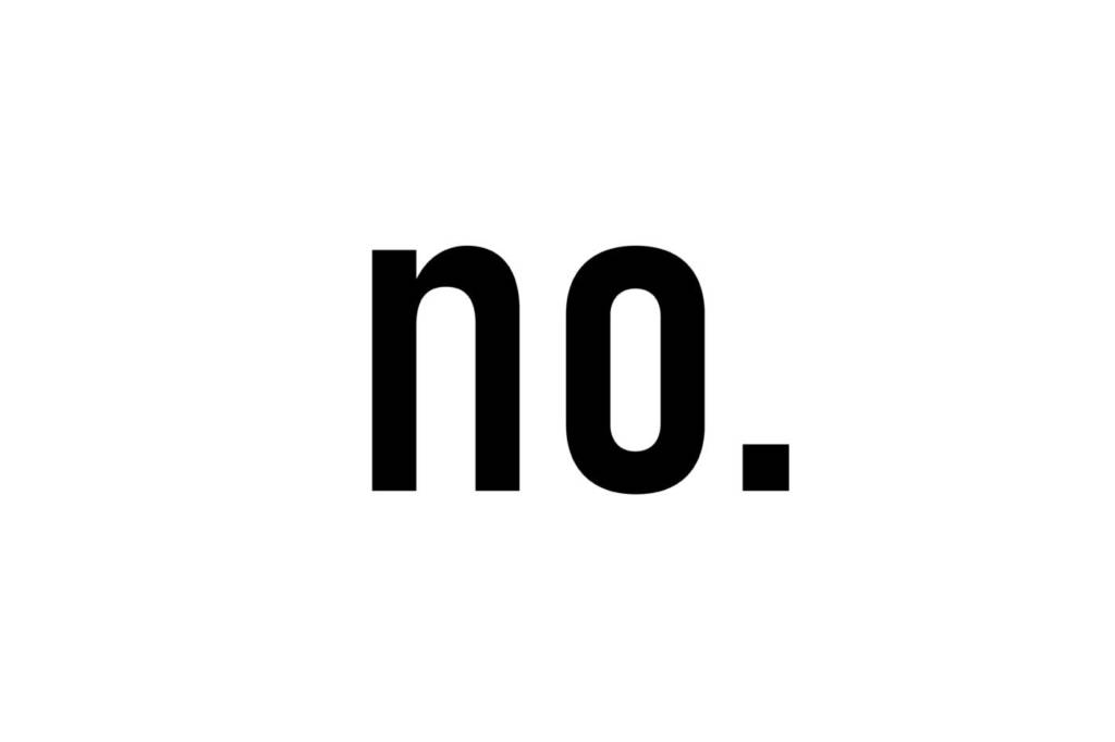
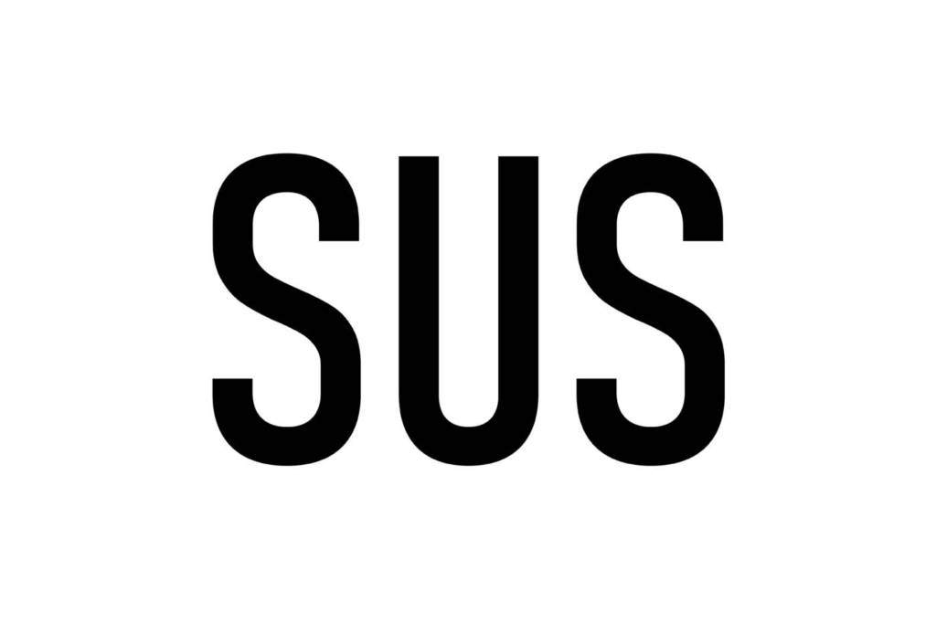
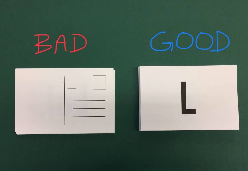
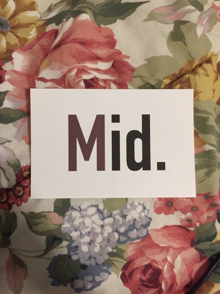
I changed the final postcards into simplified letters and words, and added one different font colour, which was a toned, darkened red to add a bit of urgency to the cards or a bit of a pop to have a mild uniqueness kind of like a business card. To keep the cards from having this boring consistency, I printed in some slangs and kept the consistent colour of black and sometimes mixed in the darkened, toned red to add variety. Over all, I mostly printed the letter “K.” with addition to “.” which added the intensity to the cards attitude.
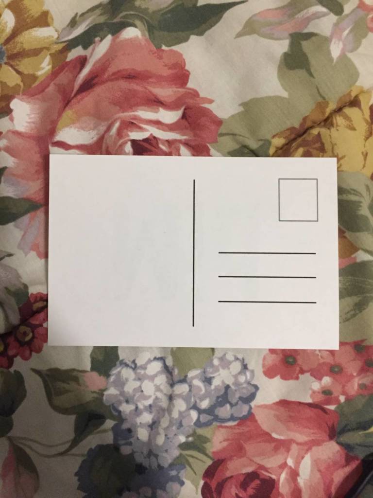
The process of mailing is simple, although when it comes to the letter “k.” you would have to wait for someone to email you or send you a response before replying with “k.” Other post cards can be sent just openly because of its vagueness such as “mid.” I also messed up quite a few…
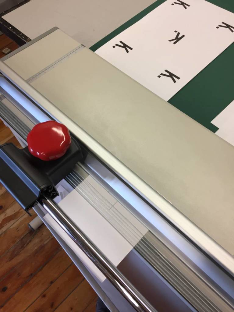
The cutting process…
Mailing process…
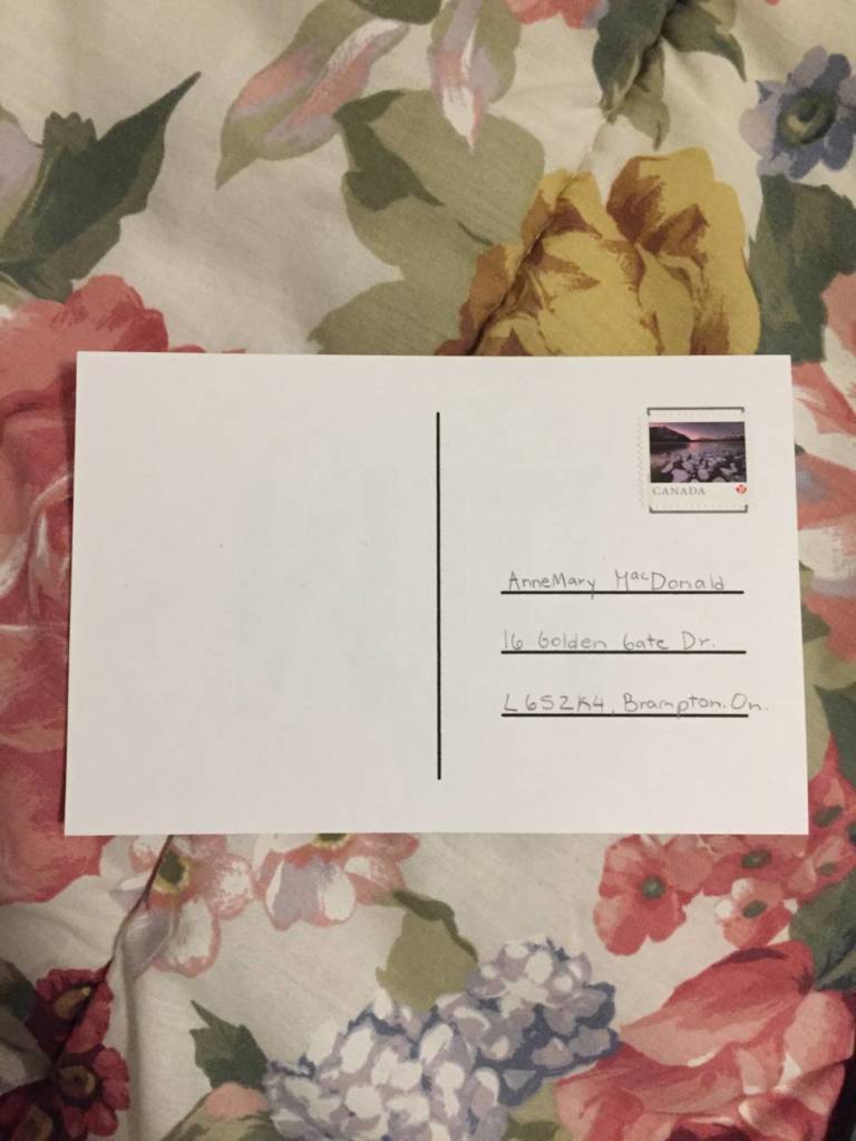
This is to my sister, I just purchased the post cards then added the name, address, postal code and city then province. These cards are really meant to be just a reply to someone rather than gifted to them, but could also be sent spontaneously for joking reasons or even urgent reasons where your mad at someone.
Parents Assessment video
Parent assignment: video art involved with your parents/ renters
Idea 1: Closeness
Being far, makes things different
The sense of things doesn’t smell like home. The comfort of my own house smell makes me miss my house.
Smell.
Stuffed animals, shows thoe closeness through objects.
Does Not have to include parents, use objects.
Cheese, febreeze. Cheese in the bedroom. Taking the cheese with you to take the smell. A candle. Could be a candle.
How to run with it: Closeness, clinging together. And bringing the object around with me in the places I go.
Idea 2: Phone texts
How to keep in contact.
I call them when my stomach hurts. I called my sister when bad things happened as well.
Connections/How I show I’m okay
With my sister I keep in contact with her through memes.
My family is generally close, we share a lot of things and I’d say I’m very sheltered. The idea of being at home, having the comfort of animals and regular noises seen throughout varies family members helps clutter the quiet out. Usually with many animals in the house I’d hear hear pitter-patters of their nails and feet walking across the wooden tiles. When I moved to the rent, all the noise stopped, there wasn’t any animal noises, or a lot of smoothing noises around me anymore, so I wanted to make a video on my surroundings as well as the smells seen throughout my house as it usually fades away after a few day’s and nights at my rent. People would except renting to be some sort of freedom from your parents but they didn’t say how quiet it was and how scents disappear. It’s astonishing to think that little things like noise, sound and smell could affect someone and the way they live, maybe it is a part of growing up to loose something for at least the littlest while.
For the video, I wanted to video tape parts of my house or things that create what I see, smell and hear as a comfort. Usually the smells are just strong fragrances of simple house cleaners and lotions. My house also has this distinct smell of animals so that’s why we cover it up with other odors and cleaners. My room is the biggest factor of comfort, but also, I used varies objects to help form this sense of a visual play on what certain objects can make us feel. That being my house reminding me of my parents, a physical home and a smell of them makes me think of them and miss them.
Process work
In the process I incorporated video of fragrances that most remind me of my house’s smell, that also being, the smell of animals. I tried to delicately snip and repeat a few videos and images that have a meaning for home, that including the origami being a gift to me from my mom’s friend when I was in grade 6. I kept it for so long because people don’t ever hand make me gifts, especially when I was younger and this gift reminds me of a sense of care, but also has this contrast of emptiness because of the apparat amount of negative space with addition to a string holding it up like a toy for a baby’s cradle. I tried my best to find images around my house that centers around prominent things that I don’t have when I’m not home, that also including my religion, I don’t pray as much as I used too but I still use god in a way to comfort myself if I’m ever overwhelmed or paranoid. Leaving my house to my rent, made me feel like god left me, for a bit, which sounds bad, but actually wasn’t, I genuinely believe I can be overdramatic when it comes to emotions, therefore god hasn’t left, it was just this sense of walking in my own body for the first time alone making it harder, but not in a dramatic way.
If I were to be at home, my cat would be sitting on me as I’m doing my homework and he’d watch the screen with me. He’s a very self-aware cat, and like most “pet-lovers” my cat is a sense of comfort and holds together the word “home” and plays a part into my parents as my pets are also their children.
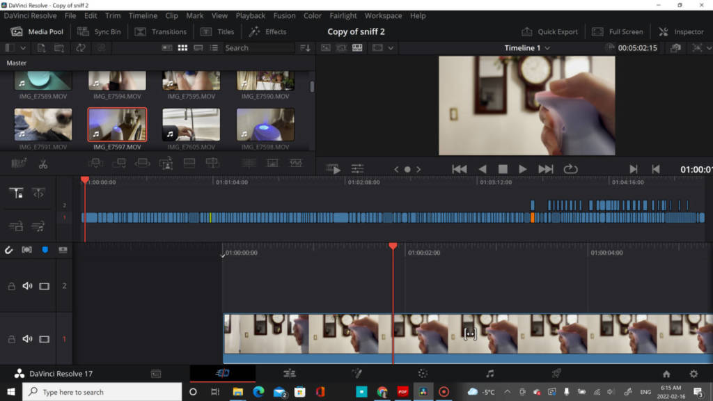
Final Video: Sniff the Comfort
Video assignment: JSchlatt
Here we see into a world of Jschlatt and the possibilities there is in being a Youtuber! Considering Schlatt as a digital creator, he creates many videos of him basically having fun and succeeding with viral content. When describing JSchlatt’s videos he has this very captivating, but chill-back personality with addition to lots of loud noises that grabs the attention of the audience, especially in this generation today, just like “Ryan Trecartin’s videos” having this chaotic nature. He is also included and part of a podcast called “Chuckle sandwich” which is less chaotic. As I do enjoy the style of choas in videos and the concept of not caring, I also do enjoy animation and the idea of putting a cartoon into reality. I might further base my idea in animation or at least have a technological aspect that involves a sense of cartoons.
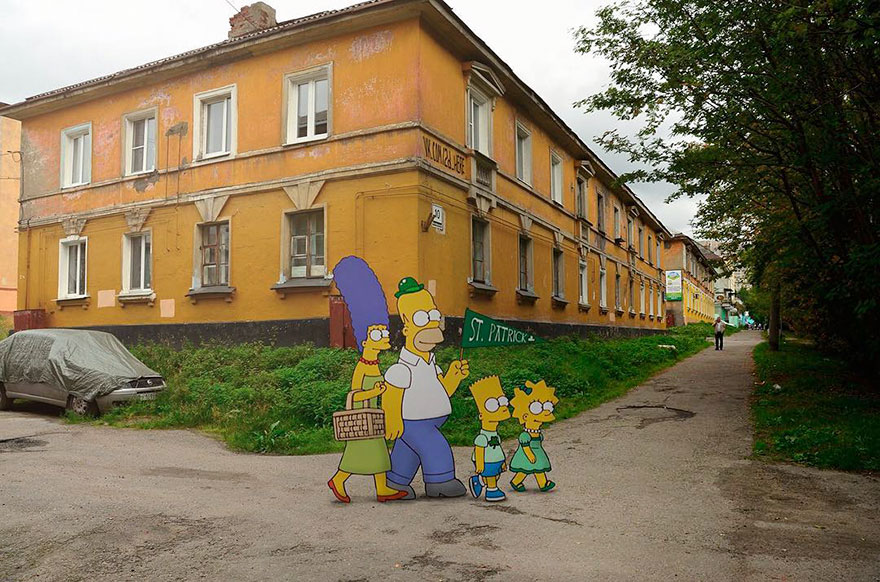
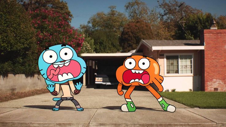
Cartoons in Reality: The SimpsonsCartoons in Reality: The Amazing World of Gumball
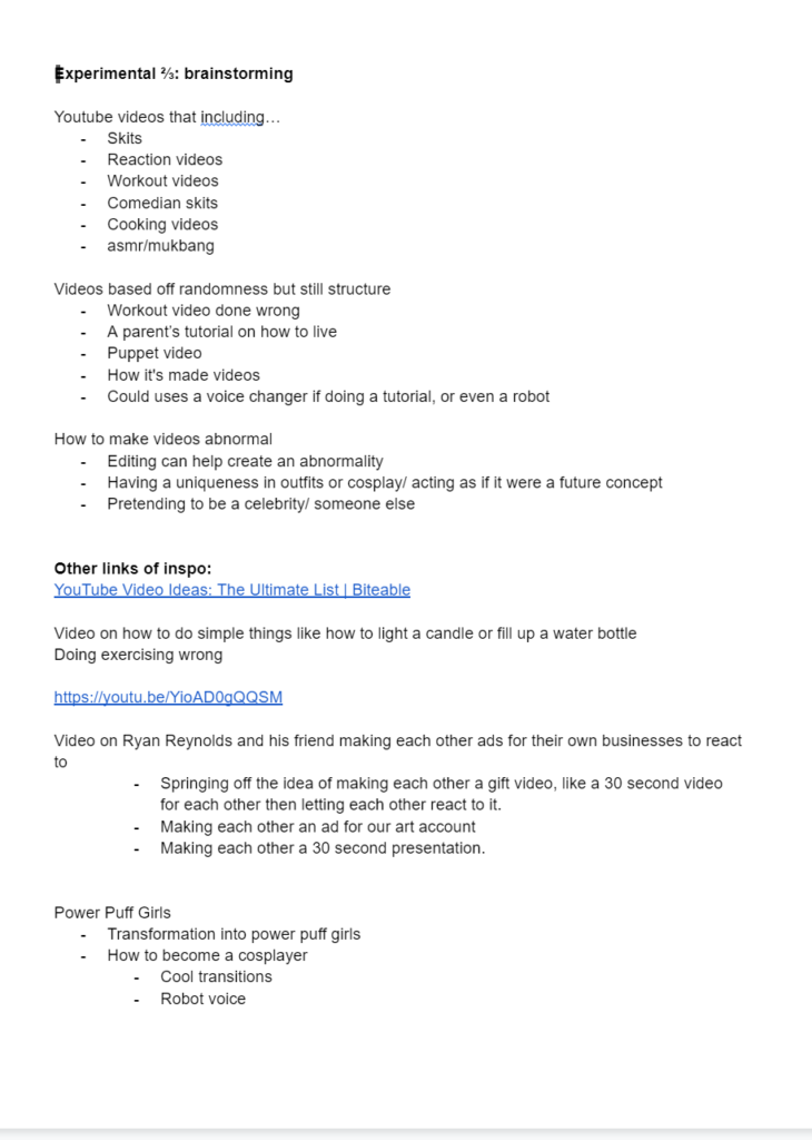
Video Assignment Brainstorming …
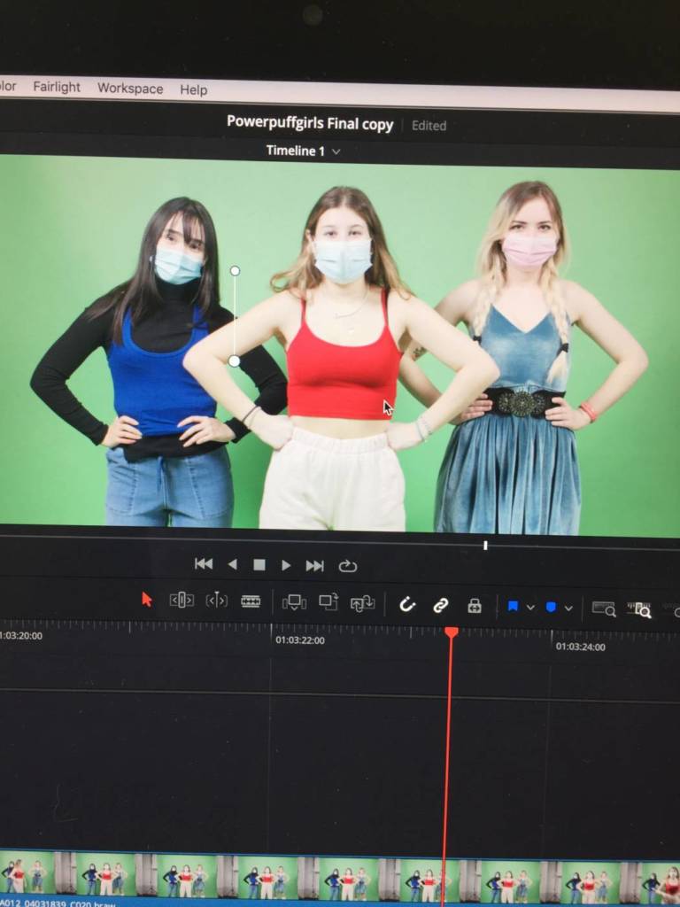
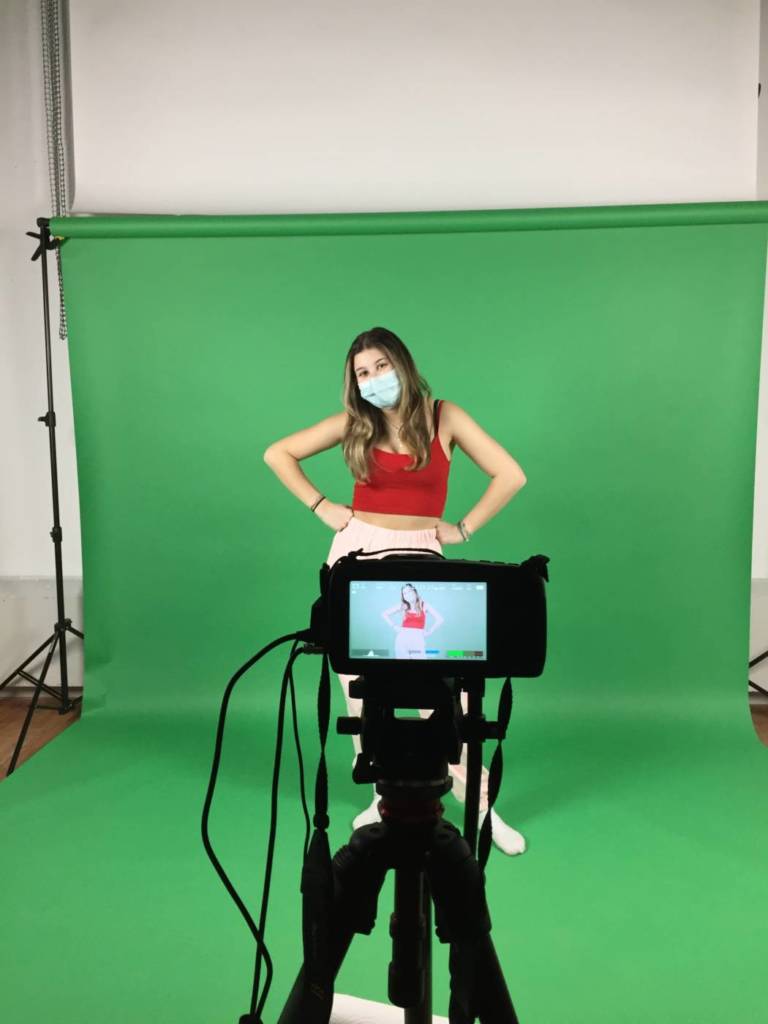
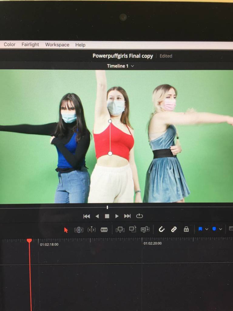
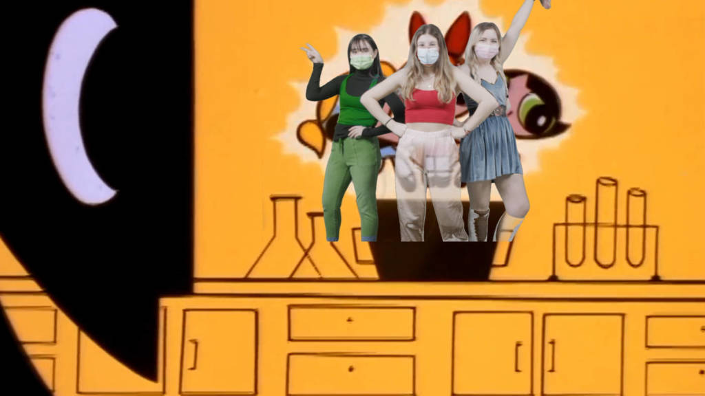
For this assignment, I worked in partners with Hallie, at first, and we both decided to make a video based off Ryan Reynolds and his friend, kind of like a comedy skit of both me and Hallie giving each other little videos or ads that we created. We also looked more into other video concepts that included comedy or generic YouTube videos, but made in a different manner to have a uniqueness or stand out from other youtube videos. After, we worked with Sam and our video ideas expanded into cosplay and the Realm of cartoons, which I personally love, I love animation. We began spiraling off ideas, and a story board that was fixated off a childhood cartoon called “Powerpuffgirls”, where we started our plan!
Video inspirations
Truce: Ryan Reynolds and his Friend
How its made: comedy skitProcess Work
In the Studio Production …
Screenshots!
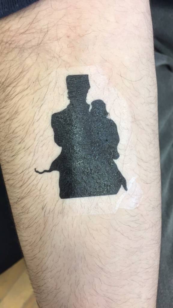
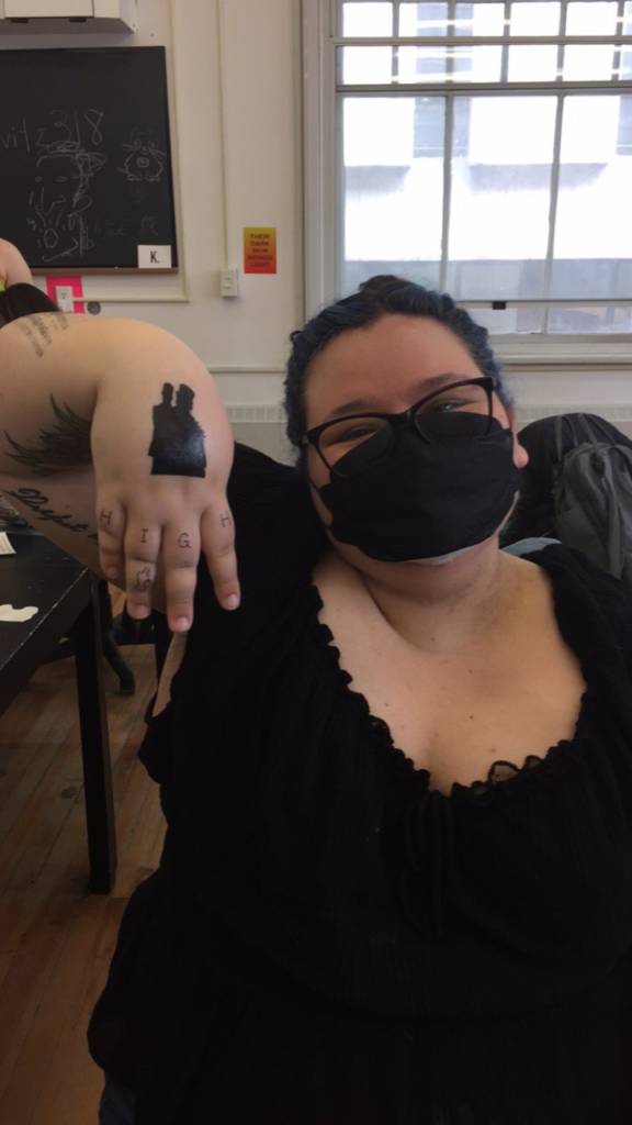
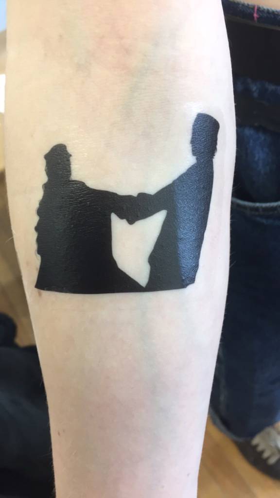
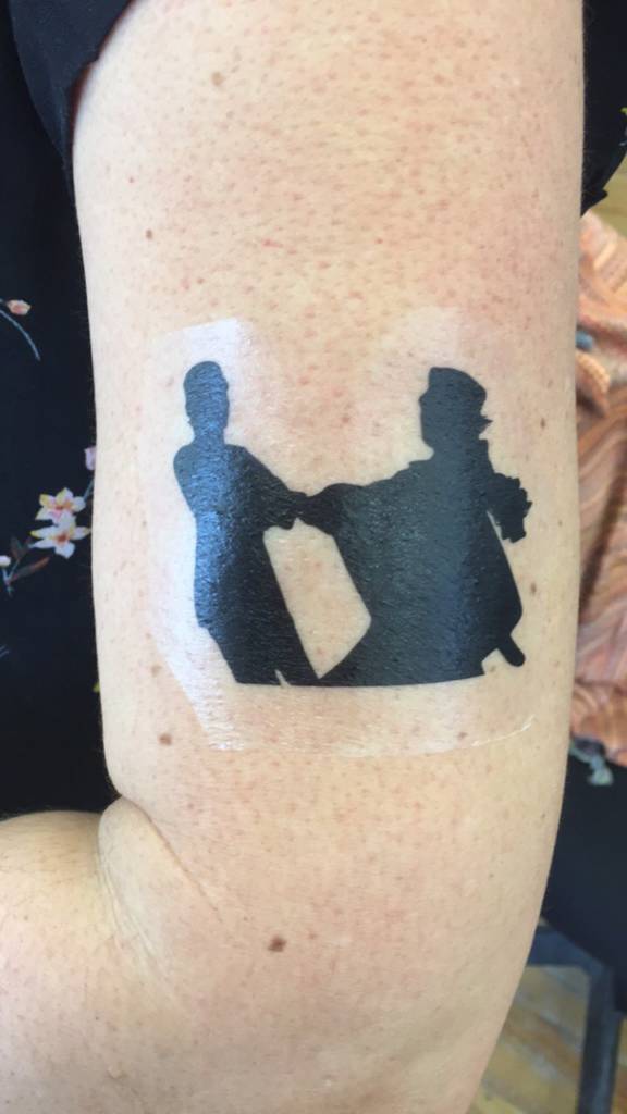
Tattoo Assignment
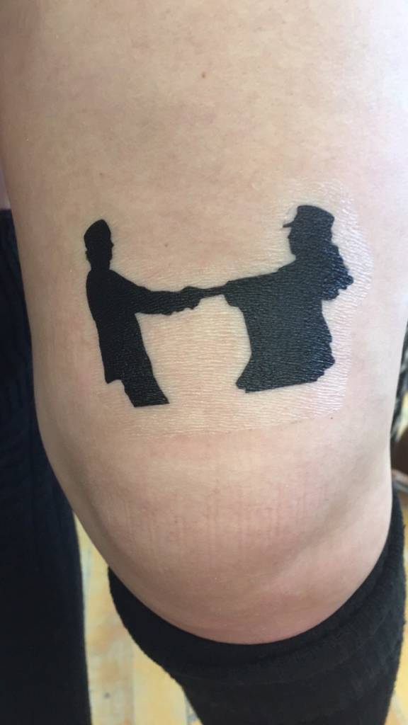
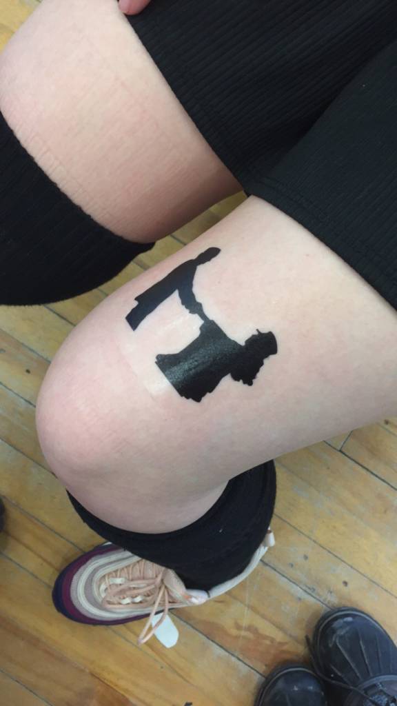
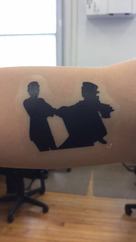
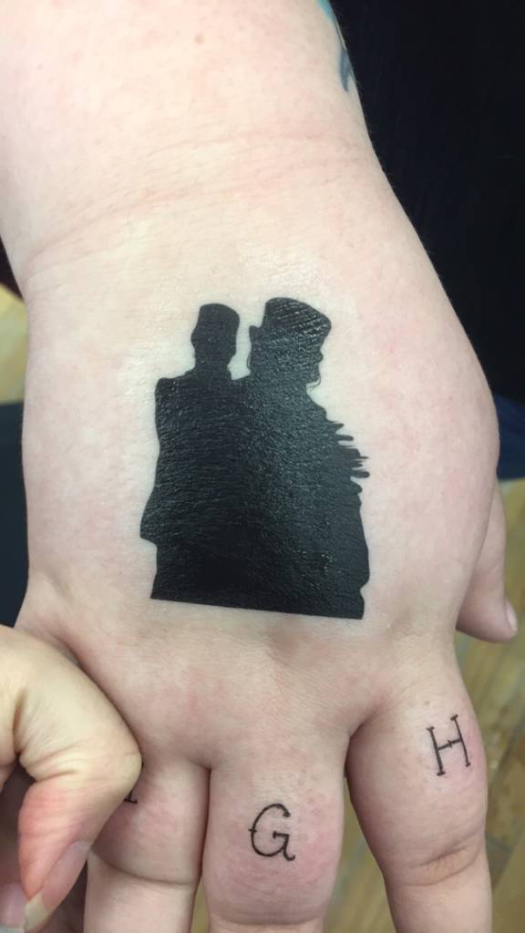
I started out thinking about tattoos and how no matter where I get a tattoo, my acne would still be visible, from arms to back, luckily for me, it almost comes off as an excessive amount of freckles. I began looking for image inspiration from other people who suffer from acne, specifically for me its all the way from back to shoulders to chest, so I never wear tank tops, maybe one day I will. I also, generally, have a lot of random dots on my face, which are really flat moles, as well as all over my body. This time was probably the worst it was at because my acne bases off stress levels, but its just part of me so I see it as freckles and sometimes I forget about it until I start to change my clothes. Its oddly a very forgettable thing to have even though it looks bad.
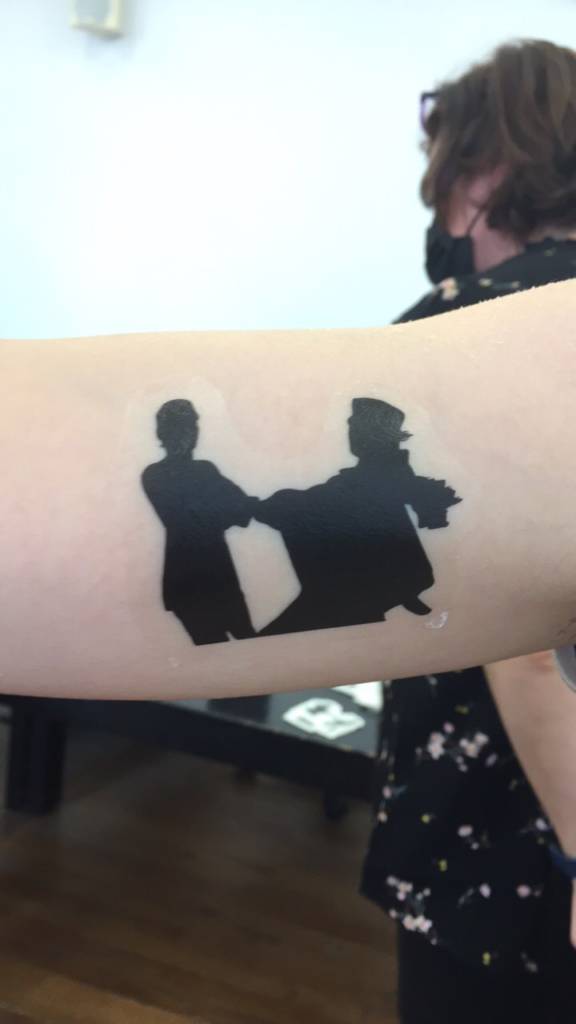
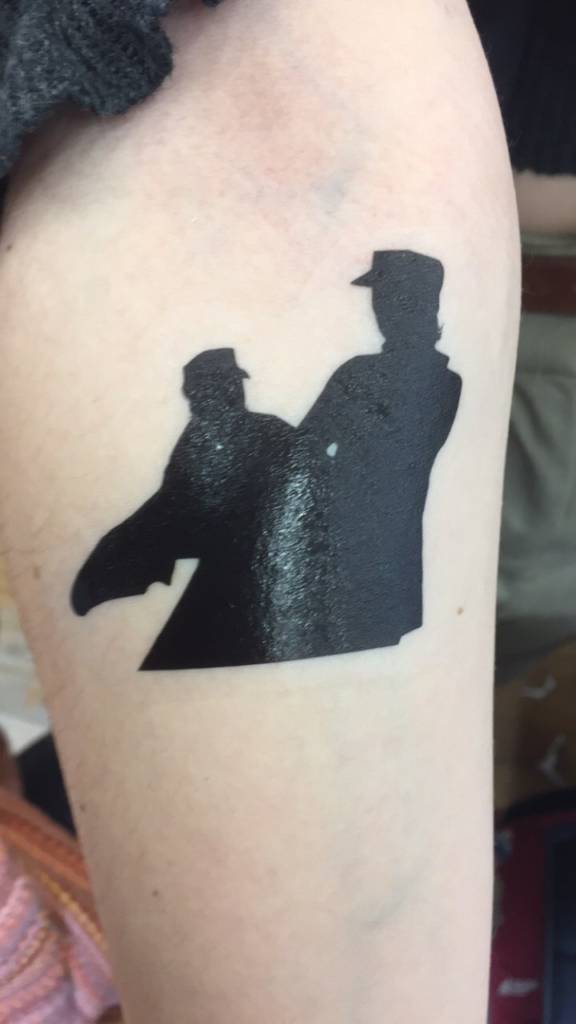
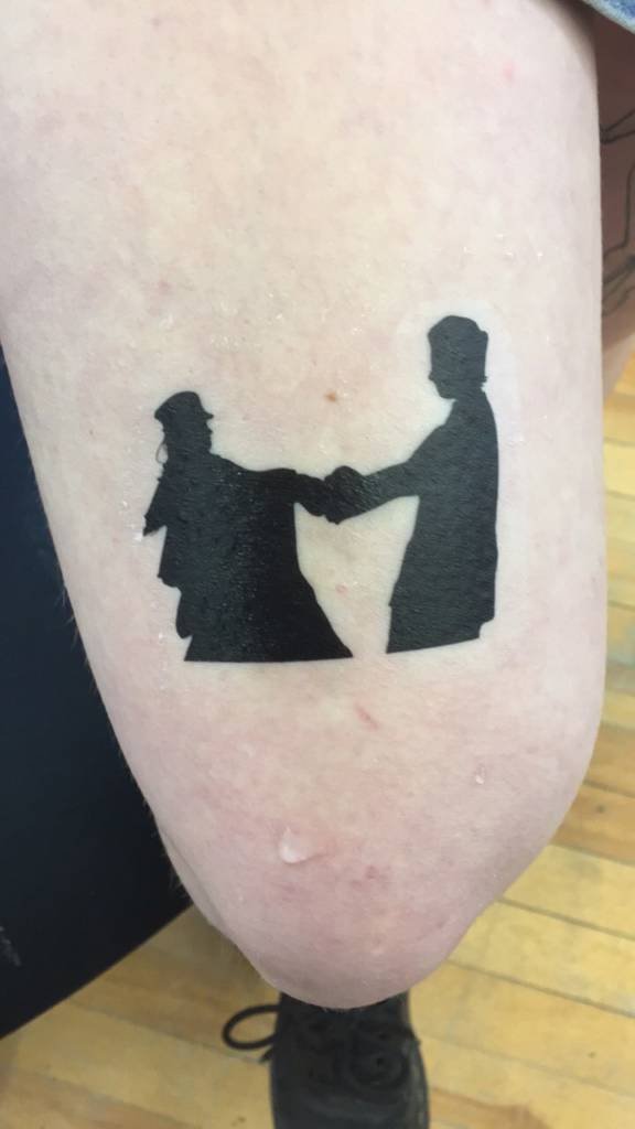
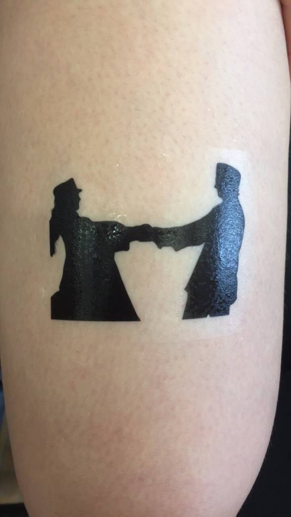
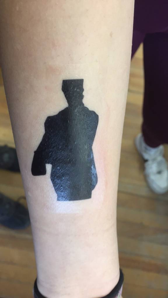
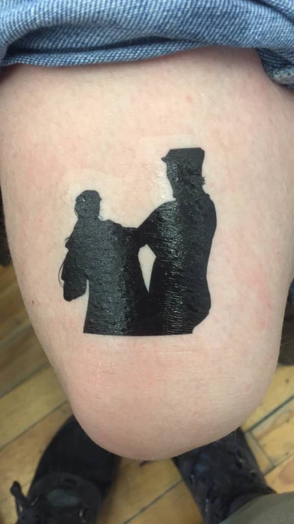
The vulgar aspects that people don’t like seeing, I think I am going to avoid any bad or nasty parts, its just skin so its okay, and there are beautiful aspects to flaws. I later on changed my idea of covering flaws to a more comforting way of solving things that include movies or tv shows. Watching or creating things you like or love absolutely take away or make you forget your own existence or being, kinda like being not self aware of yourself anymore. And in that I present an animation of two people I adore from the movie and book “Little Women”.
imagine inspiration
Digital designs: Changing up the concept…
I’ve been into animation for a while now, just haven’t considered further education in it, and there’s something in my soul telling me to make it a career, even if there’s already thousands of animators out there. My idea is based off two loves, the movement of a picture in motion and the movement of two people in love. In this specific animation, I took a scene from the movie of the two spinning on ice.
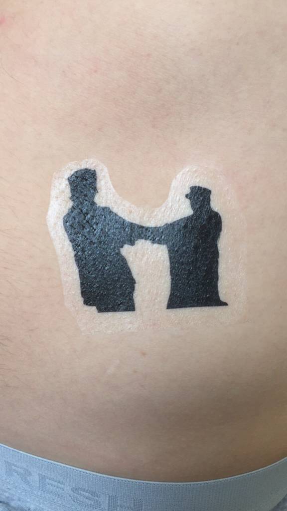
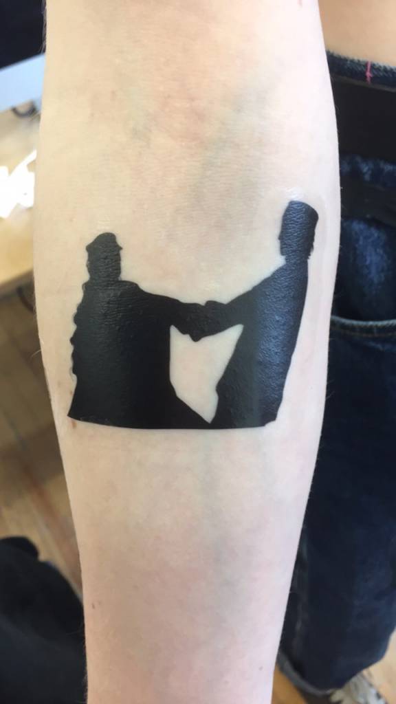
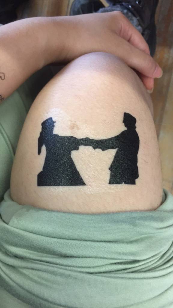
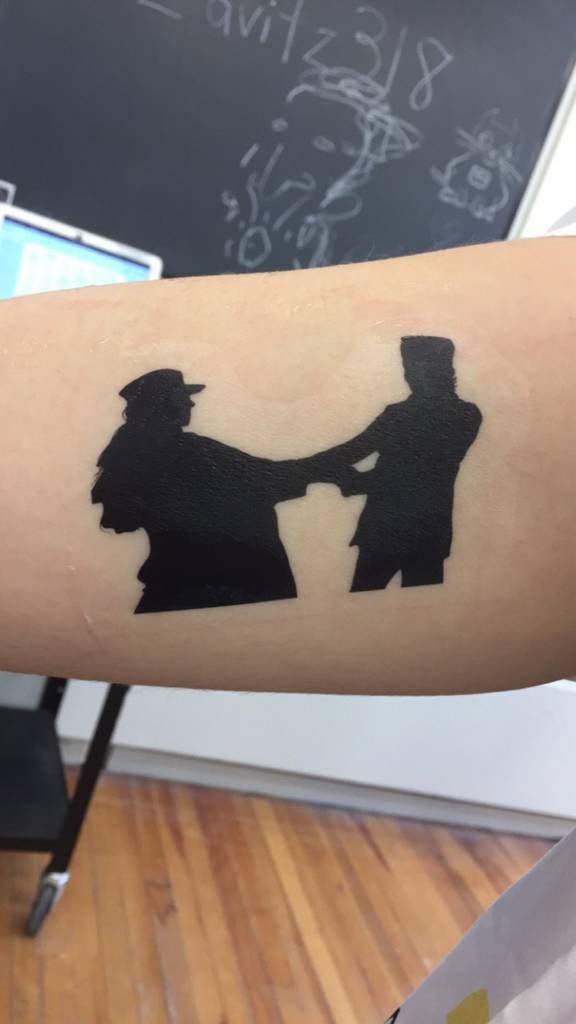
The final week was a fun time, I enjoyed seeing the youthfulness in the room as we exchanged tattoos and documented our art in a new form. For my projects I went inwards, I dealt with Xrays from years back and put them on my body so it is like you are almost seeing into me. I enjoy playing with the health side and family history for my art forms inspiration. If you didn’t know I am chronically ill, I spent a lot of my time since 2017 in hospitals and with new doctors and teams trying to make my body regular again, and it’s hard. I won’t go into detail about my illness I am not seeking attention, more aware if possible.
I turned up the blue in the x-ray to help play into my skin tones, and skin tone matching on computers is not an easy task when you don’t have a photo of yourself to work with on that computer. The final product turned bluer than I would have liked but in the end, it gives off this retro x-ray on a light screen, and I do like that aspect. I did my back, from shoulder to shoulder, and my knee. I chose these parts of the body because they are my most affected body parts for pain and flare-ups. I was looking into playing with my MRI scans and creating art that way and maybe seeing if it can be stretched and grown more. I will let you be the judge of my final piece of work.
On The Inside 2022
Week 1 – Wednesday’s Short Assignment (Michael Drebert)
Available Light 2008The Queens Eyes 2009
I find the broader aspects of Michael Drebert to be fascinating, the idea of making these on litho stones and not just a paintbrush or marker is so cool. A lot of his work is based around the litho stones and making these text-based works as well as other works that are also thought-provoking. I loved looking at and reading his pieces through his work pdf that he has posted on his website.
These objects work in the world because they are so simple but thought-provoking, like imaging passing that on the street and wondering what mind would have created this piece, I love it. I love how these two pieces alone show the different sides of the artist, what made him want to try to create fire with all the available light, what made him think the other piece would get him to see the Queen. I have attached the works information below so you can also read see how the artist themselves see these pieces when putting together pieces of works.
I find the language in these pieces is slightly different despite them being made by the same artist. The available light one seems more like a threat than anything else, like watch out all over the city because it is going to happen but not sure when or when next to the exact day. The other piece is almost a threat as well but instead of a whole city it is just a person that has really high authority, but it also seems like a vague statement, like I will set out and I will enjoy my time but I will also complete my mission, kind of feel next to a plain threat like the Available Light piece.
The Queen’s Eyes, 2009 Medium: performance Materials: entrance ticket to Buckingham Palace Size: dimensions variable Leaving Victoria, BC, I set out for England to try and look into the Queen of England’s eyes. Work exhibited at the Ministry of Casual Living, Victoria, BC.
Available Light, 2008 Medium: performance Materials: lithograph posters, fire Size: dimensions variable Over 1500 lithographic posters were placed around the city of Vancouver, BC announcing that I would try to start a fire using only “available light.” This project was commissioned by Artspeak gallery in Vancouver, BC
Project 1 – Brainstorming
(Week 1 and 2)
When it came to this project, I was stuck to one idea for the better part of the thinking period. I wanted to do something that would show my anger towards what took my grandma so quickly from me and far too soon. But for some reason I was unable to get the idea just right in my mind and after looking at things on google for some inspiration, I was able to find many ideas that I loved and wanted to recreate but I did not want to go step by step for my piece of work. I know this idea probably exists elsewhere but this is my idea thus far.
I will have people give me their answers to what they will put in the blank and henceforth put them in the blank of the poster prior to printing but I will be using different fonts for each answer that is put into the poster, so it kind of represents the idea of someone actually writing their response. I will make a few blank posters to hang and see if anyone will actually fill them out once in person is happening again. I have set out to my social media to get answers from people and I do not know how many I will be making just yet, because it really depends on how many answers I get from my socials to how many are made.
I want to share some of the art that I looked at and found interesting in my time of looking for a new idea, these pieces somehow spoke to me and I loved how they were created and placed in the world. These pieces did not really have an effect on the final idea that I came up with but I did enjoy them and I thought you might as well. I do not know the names of the pieces and one of them doesn’t come with the artist’s name so I shall just upload them for your eyes and mind to enjoy
These pieces as well as my own older poetry notes on my phone helped me come up with the “__________ is a fucking jerk.” idea, I love the idea of people randomly calling out things or people to the public without context because unless they are seen writing on the poster no one will ever know that they were the ones to put that answer(s). I love the idea of possibly creating a lined paper design and having the words on it like the one-piece below but the idea of a plain piece of paper with a super simple font next to the written answer is so powerful to me.
I also had the idea of just writing fucking jerk in paint and letting it drip down creating this graffiti type of piece but I see that as a side idea and the second edition in this idea of the jerk series. I love the dripping paint idea, I have had for a year or more now, I love how you can’t control it. I love that you are able to really decide where it goes next to turning the canvas or paper. I feel like I will complete this as a side project that is not for this class but I will probably end up sharing it to this post for everyone to see if I complete it.
“__________ is a fucking jerk.”
(fill in the blank)
Brainstroming UPDATE!
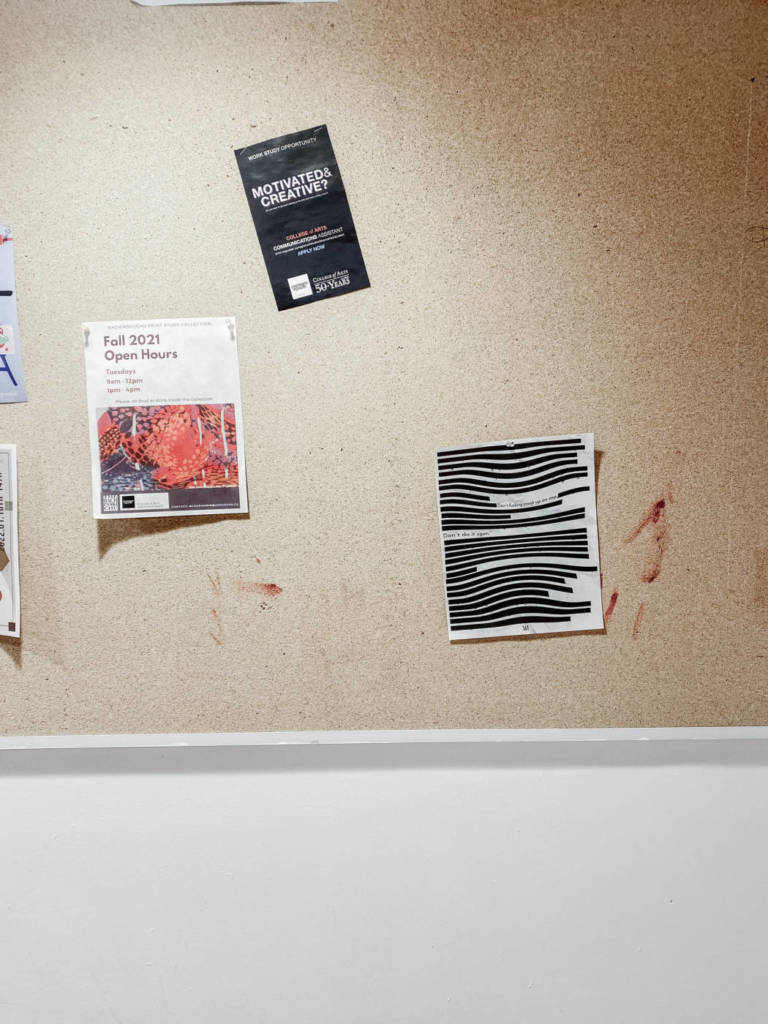
I decided to keep the blog clean and with this update, I decided to remove all the other brainstorming updates. They were poetry, tomorrow? shirt and just a number of days. I like the number of days but in the end, I fell in love with this idea of redacted papers? I like the blocked-out information, like what it is saying I really want to know, can I put it all together by just reading the unblocked part? It seems so intriguing. So I am posting my new designs that will be sent to print, can you guess which one I am printing, and what book or file the paper is from?
Text Multiple in location!
Parents Video Brainstorming
I have a few ideas and I went on an emotional rollercoaster to come up with a few ideas, I am still unsure what I want to do but I feel like it is something with emotion or education of something?
My first idea was to do with my grandma and use her final voice recording with a video, but I do not think I am ready to share that recording just yet, it is still too raw and fresh to a degree, but I loved the idea of playing off that type of emotion, sadness or grief but make it more board and open not just focused around my grandma? I love poetry and writing its a relaxing thing to do for myself and I enjoy the idea of writing letters to people that have passed or someone special. But that doesn’t really go with the parent prompt. So I am thinking of different ideas, some have info with that others are just words of ideas at the moment.
Dear Parent video: this one would be towards any parent, I have some supportive parents, not much trauma I would say but still there are some things to be touched on that could be an opening to many other parents. kind of like the video below this?
Dear Future Me: this idea is more focusing on me as a parent, what would I be like, how would I treat my kids, would I have kids? etc.
Explaining my illnesses to my mother: this idea is going towards how she sometimes forgets what it is like to live with chronic illness, she always says the same things and they normally don’t work anymore. I got the idea from a video I watched years ago, it is below!
The Mom Friend idea: this one is interesting, I see myself as a mom friend but also not the mom friend but I do have other mom friends around me, we make a group of mom friends and we gather sometimes. I am not sure where to go with this idea but I did love it.
The final idea is meant as humor I thought of it as a joke so I am probably not going to do with one unless someone can help me execute the idea. okay, the idea is ….. a day in the life of a childless milf ….. okay that is all for now
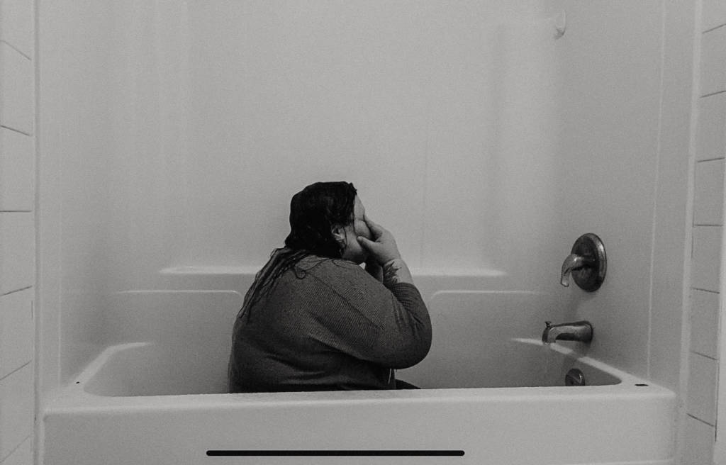
safe place to cry. – parents video.
when I created this piece all I could think about was the loss that I have felt in my family in the last 7 months, the loss that so many people have felt in their families be it a chosen family or a blood-related family, losing someone so close to you hurts. I created this as a safe place to cry when you lose someone or something. No one can see your tears in the streams of water. you are safe from judgment, from grief, let it all out, no one can hurt you in the shower.
Internet Video Research
this was an interesting research part. I watch what seems like regular things, like horror stories, podcasts, and gaming videos but when I went searching I found a gamer that did these weird but interesting videos. I am in love with cats and other pet videos. I found these two that made me laugh and enjoy the comedy.
I attached an old video from high school, 2012 ish was the year. please enjoy young me and the weird idea that we created at a film camp haha
Internet Video Assingment
this assignment gave me a headache, to be honest, the internet is such an open platform for finding an idea that sparked was a challenge. I had many ideas but after a few hours thinking about how to improve them, I ultimately ended up not liking the ideas. Some ideas were a non-binary gender reveal party, eating a book, horror ASMR (which I did), Best Friend Video Podcast, Ghosts Doing Random Things, Chronic Illness as poetry, and the list can go on. Once I found pleasure in the ASMR horror I went with a recreation idea, like it was a video at the time of the event and then the story over top of it. I love the idea of reenactment for stories, and I mainly watch ASMR and horror Reddit stories, so that is how this idea formed; from my usual watchings. I have the main reenactment video without the story overtop that has me talking to the camera, if needed I will post that but I much prefer it with the story and audio of my choice.
The video was a film one and done type of thing, it took time to get some of the expressions right but now I find little horror in these stories or I find myself feeling confident enough to fight these weird and bad people in the stories heard. So coming up with scared expressions was hard but easy, if that makes sense. I hope this gives peoples chills and I am thinking of broadening the idea to more ASMR horror or storytelling!
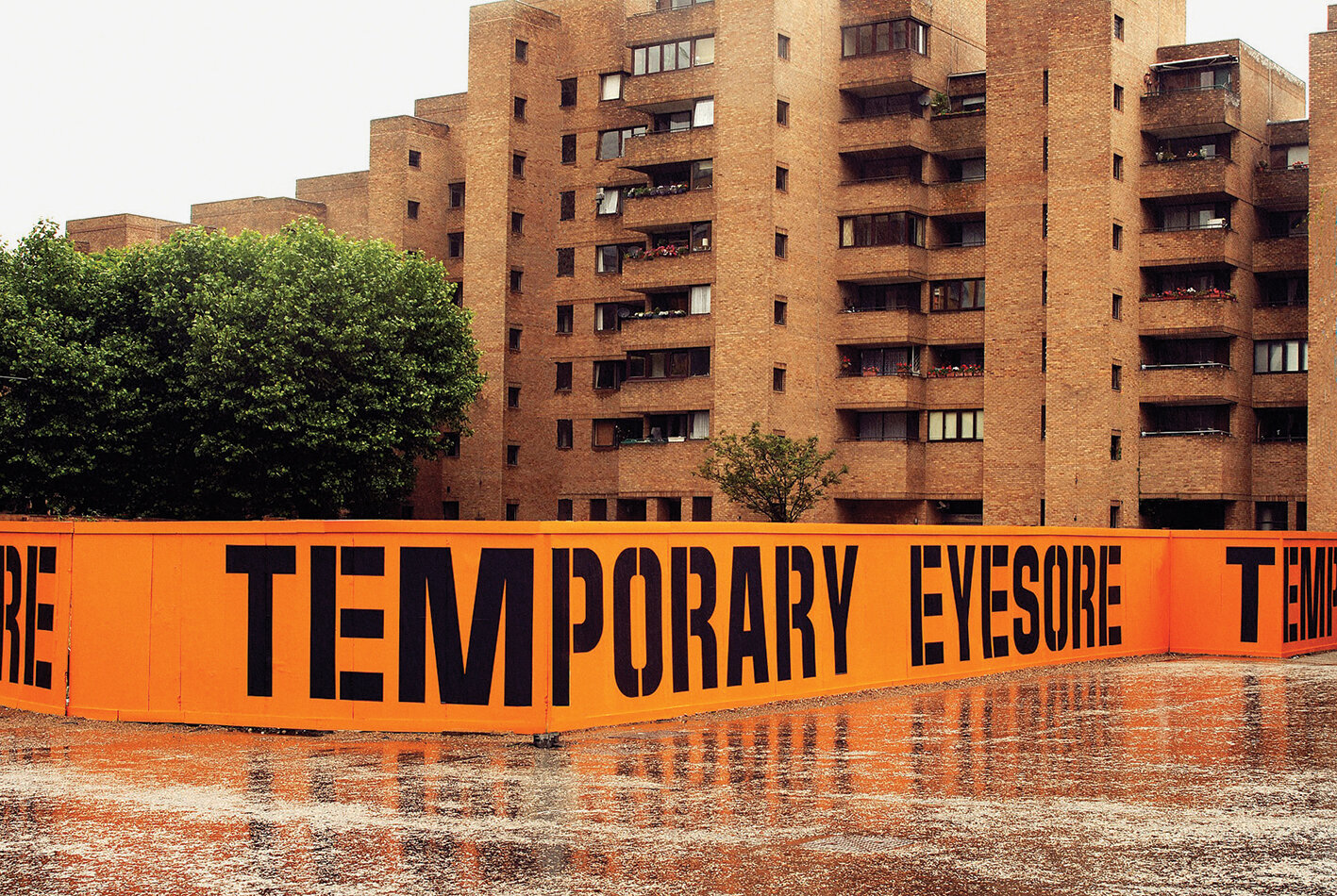
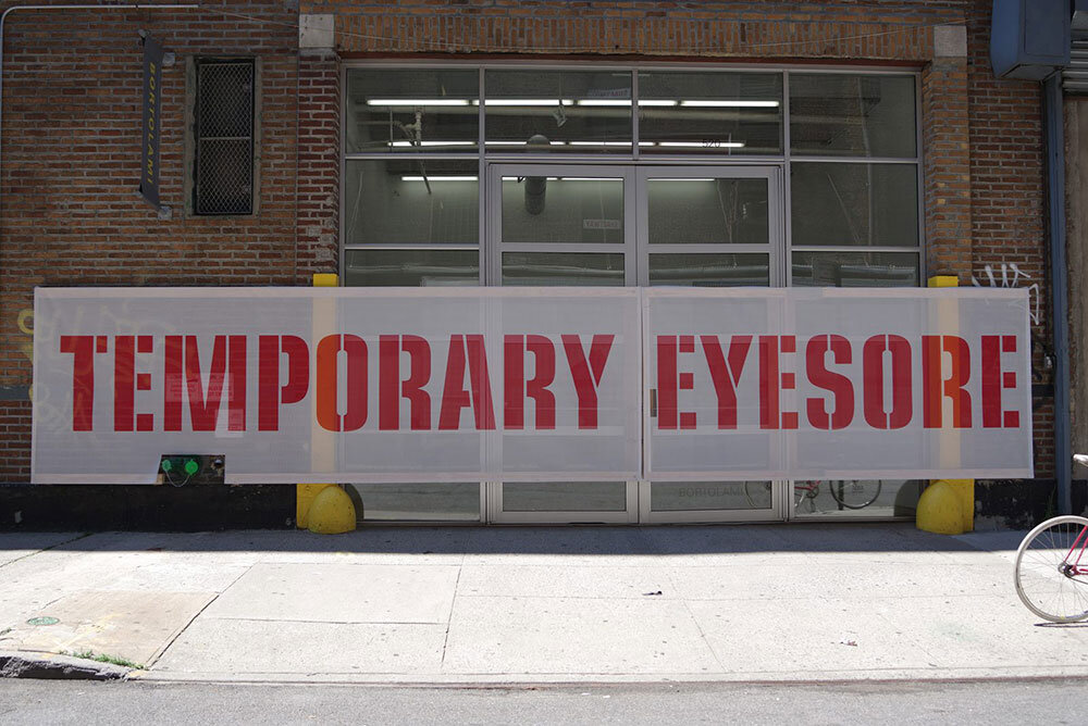
Scott King is a British artist born in 1969. King trained as a graphic designer and his work showcases an interest in how iconic images can be used as symbols to communicate information when detached from their original meaning. His interest in iconography can be seen in the following works:
Temporary Eyesore, Bankside, London SE1, 2008.
Temporary Eyesore, in I Beam U Channel, Bortolami, New York, 2016.
Temporary Eyesore, 2008/2016
Temporary Eyesore is a hoarding exhibit commissioned by the Architecture Foundation in association with Tate Modern. The goal of the 2008 project was to ‘transform this temporary and unsightly hoarding by means of an artwork”. The design was adapted into a ‘mesh hoarding’ for the 2016 I Beam U Channel group exhibition in New York. Hoarding exhibits typically aim to display public art that removes the unattractive aspects of construction, yet King decided to diverge from that approach. This conceptual, text-based work provokes a feeling of industrialism that calls the viewer to pay attention to what the piece itself actually is: a construction hoarding. Aspects of Temporary Eyesore including the contrasting colours, bold text, and the use of hoarding material communicate a sense of caution, especially because similar colours, text and material would be found in construction zones. The words “temporary eyesore” are cynical, while also ironic when placed into the context of art. The technical and conceptual aspects of this piece work very well together, contributing to both my personal taste and the success of the piece.
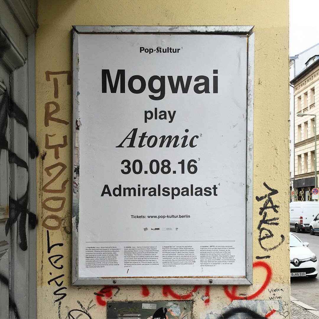
Pop-Kultur: Mogwai, 2016
This piece by Scott King is a poster for a performance by Mogwai at Berlin’s Pop-Kulture festival in August 2016. The festival organizers’ goal was to overfill the poster with explanatory information, which King decided to implement as a design feature. The black text on the white background is reminiscent of a book or magazine, especially with the use of the footnotes featured at the bottom of the poster. The various fonts and text sizes create a diverse visual experience without causing too much distraction or obnoxiousness. The poster creates a feeling of confusion because there is so much information to take in, but when looking closer at the footnotes it is clear that the information listed is promotional rather than educational. King uses font, colour and material to his advantage when communicating through text-based work. The magazine-inspired look is attention-grabbing, and the overfilling with text is humorous and effective when read more closely. This text-based poster work is effective at drawing in interest through curiosity, as well as providing an artistically effective pastiche to this literary style.
Week Two
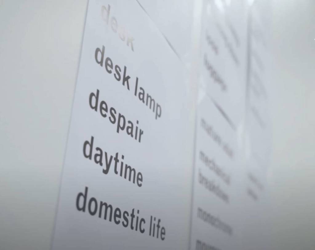
I thought a lot about what kind of route I wanted to go for my artist multiple, and I am still not entirely sure which of my ideas would be the most successful. I thought of sillier ideas, beginning with a word search where the only word being searched for is the word “search”. With this idea, I was thinking I could even take it a step farther, spelling out every possible word other than the “search” with the available letters.
I also considered the instruction prompt and thought about writing instructions of “how to psychoanalyze your friends” tying into my educational background in psychology or “learn how to collect until you have no more space” as a lighthearted way to express how my mother’s hoarding has been making me feel lately.
The uncommon action prompt made me think of a game mechanic of a Zelda game I played as a kid. In the game, jumping from high up while holding onto a chicken would make the chicken act as a glider until you are safely back on the ground. I have always wondered what this would look like in real life.
Lastly, I considered the minor sentiments prompt. As I was passing by someone this weekend they smiled at me, and I realized how this gesture occurs less often now that everyone is always wearing masks. I thought about that person smiling as they walked by me for the rest of the day.
The other minor sentiment that I have been thinking of recently is my childhood memories of my mother singing. Now that I am older, I haven’t heard her sing in years. When I was a child, I remember singing with her all the time and thinking she had such a beautiful voice. It made me sad to realize that I haven’t heard it in so long, and how much I wish I could again. However, I am too scared to directly tell her this. I have written my mother multiple letters in the form of poetry throughout my life, and I think if I was to go about putting these feelings into words, it would be through poetry.
I’d really like to experiment with fonts for this assignment, and maybe try to make a font of my own handwriting. I am not entirely sure what direction I will take yet, but I am excited to hear some feedback on my ideas.
Week Four
Text Multiple Final:
Word Search (Searching for The Word ‘Search’, But The Word ‘Search’ Isn’t There). Working Title. (2022)
Word Search (Searching for The Word ‘Search’, But The Word ‘Search’ Isn’t There) is a conceptual piece that examines the style and composition of text as a visual prompt to complete unwritten instructions. At first glance, this piece may appear to be a word search puzzle with no particularities other than having a single item in the word bank. However, when attempting to find this single word there will come a realization – the word ‘Search’ is not present in the puzzle at all. When this unspoken instruction is discredited, the true purpose of the piece can be highlighted.
The word search itself is composed only of letters that make up the word ‘search’. I wanted the puzzle to be made up of these letters, whilst omitting a solution to the listed word bank because I felt that the misguidance would precipitate emotions similar to those of a young child struggling with their homework. Such strong emotions boil up due to misunderstanding something that appears so simple.
Stop Searching, See What You Can Find
This piece also works with an element of optical illusion or rather blending into the background. When stepping away from the assumption that this word search is asking you to find the word ‘search’, the unwritten instructions can be reinterpreted. When considering the possibility that the word bank may not be a word bank, and rather ‘search’ might mean to search for yourself, the piece transforms into something entirely different. Now, you may begin to find something after all.
Word Search (2022) – Completed VersionWord Search (2022) – Completed Version
Week 6
Parents Video Assignment:
I Remember Animal Tracks (2022)
Artist’s Statement:
The last time I spoke to my father was over the phone in 2018, when I was asking him about our family’s medical history. After being connected for a short period, the weak relationship we had suddenly became vaporous and we didn’t speak for nearly four years. I took this prompt as an opportunity to reach out and reconnect with my father. I realize that much of the hurt I have experienced from him when I was younger are still left unhealed. When I look in the mirror now, as a 23-year-old woman, I wonder if someday I too will disappoint my children; What kind of hurt will I cause? Will I go multiple years without speaking to my child?
I Remember Animal Tracks (2022) is a video work that considers the invisible familial bond between parents and children. The piece opens with a video of my father showing and explaining animal tracks that he found in the snow – inferring that a partridge had been attacked by a hawk. The way that he vocalizes the actions of each bird as he investigates the markings is not unlike how he would do so when teaching me or my siblings growing up. Listening to him speak about the tracks is almost a surreal and transporting experience, and I can’t help but admire him as if I was still a child. I think that this is a part of my father that I will always cherish.
My father and I both share a deep connection to nature, and this is how we would bond throughout my early life. He taught me to raise animals, to plant a garden and to forage for food. It is partially the fault of my continued love for the outdoors that I found myself unable to completely dismiss my father. As I grow, I see more of my own faults, but also see less of his.
This video is an emotional expression and processing of the severing and mending of the parental relationship I have with my father. The spoken word includes my true feelings and recognitions about the past, my father and myself. The video is almost entirely made up of my own personal archive footage, and visual metaphors decorate the meaning of the paired spoken word. I Remember Animal Tracks (2022) is deeply personal, so I do not expect all of my artistic intent to be easily identifiable.
The only contact I have had with my father for more than five years now has been exclusively through the phone. Because our connection has been so dependent on the use of our phones, I felt this was a detail that would add to my video. I took each video and cropped them each to fit a 16:9 aspect ratio, the same ratio used when filming videos on an iPhone. Now, despite being hundreds of kilometres apart, there are many invisible bonds that are guiding me back to my father, and this is the first documentation of that process. Maybe it will blow up in my face. Maybe it won’t.
Week 7
Internet as Video Art – In-Character Cosplay
Cosplay has been a very important aspect of my life this past year, as I have transitioned from only wearing cosplay to cons, to now working with photographers and developing a personal brand. Maya Ben David’s work with character work and cosplay was majorly inspiring me to – but I don’t think my quirkiness or acting could compare, so I continued searching for inspiration that would involve a similar concept. Cosplay reels on Instagram and TikTok are majorly popular in the cosplay community and are something I have been very tempted to try myself. The videos above specifically involve in-character cosplay acting that incorporates actions and music that relate to the character, as well as camera work that aims to focus on aesthetic shots and highlighting elements of the cosplay. I’m not exactly sure how I would branch off of this genre, but I would be very interested in exploring how I could do so.
QUESTIONS
How is it shot, and framed? Where does the material come from? What is the quality of the footage?
The shots are very focused on highlighting in-character elements of cosplay. In the first video the sakura trees, melodica and the bouncing action are highlighted as these are all elements that showcase Kaori’s character.
In the second video, clips of the actual character are spliced together with the cosplay footage to show a cosplay/character comparison. Almost as if the character was plucked right into reality.
The quality of both videos is quite good, however, reels are often shot on phones which may impose limits regarding quality.
How is it edited, and does it flow from clip to clip?
These clips are edited to show multiple frames of in-character actions. They flow by using non-cosplay shots such as the flowers and melodica in the first video, and character footage in the second video. This helps to create a visually captivating piece and keep the viewer engaged.
What does it sound like? How are sound or image manipulated and transformed from original footage?
These videos use music from their respective series/game. This adds to the contextualization and characterization of the cosplays.
What are some of the key features that define this genre?What are some weird variations on it?
This genre is majorly focused on displaying the cosplays, so the way the videos are shot is incredibly important. There should be a focus on aesthetic shots and clear images of the cosplay.
Weird variations of in-character cosplay videos would likely include skits or lip-syncing character lines. I highly prefer videos without spoken audio, especially in this context.
What are some of the reasons these kinds of videos are compelling or useful in this historical moment? Use quotes from published sources to back up your arguments and analysis.
TBD
How do you relate to it?
I have been cosplaying since I was a teenager, and it is now a very important aspect of my life. I consume a lot of content related to cosplay, similar and different to the ones above, and have a very small following on my own cosplay TikTok.
Week 8
workshop notes / brainstorming
Week 11
Power Puff Girls Video
I was incredibly nervous taking on a group video assignment, as previously I have always opted to do video work on my own. There were initial struggles in terms of organization and scheduling due to absences and illness, but we were able to work through these issues to produce our final video.
We decided as a group to incorporate the idea of cosplay into our video, and use the concept of a ‘closet cosplay’ as opposed to purchasing/making full cosplays. We picked The Power Puff Girls as our group cosplay due to our slight resemblances to the characters.
Bubbles from PPG
I really love the way that the video came out. It was a very fun experience, and I enjoyed introducing my group members to cosplay. I sometimes feel awkward discussing cosplay with people I know in real life, but my group was very kind and open to the idea, which made me happy. We realized during the editing phase that the use of a greenscreen is often coupled with challenges and editing imperfections. I intend on learning more about lighting and how to avoid reflection of the greenscreen onto clothing, as that turned out to be a challenge we faced that affected the final product.
In my opinion, the final video transforms a piece of existing internet culture by creating an in-character piece (see week 7 notes) that is quirky and experimental, rather than polished and high quality. I was inspired by Maya Ben David’s quirkiness in her work, but felt that I would be unable to achieve the same effect on my own. However, my group members brought a lot of personality to the work, and it turned out so fun.
Week 12
Last year I purchased a hobby tattoo gun. I have always been interested in experimenting with different mediums, so I really wanted to give tattooing a try. That being said, I know there are a lot of technicalities when it comes to tattooing human skin. Thus, the only tattoos I have given in the past were to fruit clients.
For this assignment, I knew that I wanted to use my tattoo gun with fruits as the ‘canvas’, but wasn’t sure what to tattoo on them. Because most of my tattoos are inspired by different pieces of fiction/characters I like, I considered tattooing a few different characters. However, I wanted to push the idea of tattooing to be more conceptual. So, I began to consider what it means to have a tattoo at all. Tattoos are a type of self representation and expression of personality. The tattoos I have represent me – like a very strange self portrait. I used this idea to create Fruit Tattoos (2022).
I decided to tattoo a ‘self portrait’ line art onto different fruits. I also took this opportunity to test the result of tattooing on different types of fruit flesh. I think that self representation through how we treat our skin is so interesting, and something I was unaware that I wanted to explore more of, and I really want to continue to work with idea.
Fruit Tattoos Line Art
First, I designed the line art on procreate. Then, I printed out about 8 temporary tattoos of each fruit. I set up my tattooing area, and set up a camera to record the process video. Unfortunately, the banana that I purchased became discolored, so I was unable to use it. Moving forward, I definitely want to include the banana in this set, because it was actually my favourite line art design. I tattooed the fruits that weren’t discoloured and presented them in class with my temporary tattoos.
Fruit Tattoos on FruitFruit Tattoos Temporary Tattoos
I really love the resulting piece. Fruit Tattoos (2022) turned out exactly how I hoped it would. I really like the conceptual idea that is disguised by a visual that can be regarded as silly or fun. I also think that the ideas of bodies tattooed on bodies is something I would like to continue to work with further.
Jenny Holzer is an American neoconceptual artist based in Hoosick, New York. She investigates how language is employed as a medium of communication as well as concealment and control. Large-scale installations, advertising billboards, projections on buildings and other structures, as well as illuminated electronic displays are all part of her work. Her aphorisms remind us that language may be basic and direct: self-evident truths, street-level expressions concerning war, politics, death, and violence.
I used language because I wanted to offer content that people—not necessarily art people—could understand
The ability to move content is a great feature of electronic signs. I enjoy it because motion is similar to speech in that you can emphasize phrases and roll and pause, which is the kinetic counterpart of inflection. Having that programming capability is a huge bonus. For Holzer, technology is a tool that allows her to reach a much larger audience with her ideas. In her art, she frequently employs light projections and LED signs. The LEDs are based on technology that has been used in public advertising and warning signs for years. She may ensure that her art is displayed in locations “where people look” by using these screens. The first piece I chose is called Sign on a Truck (1984). Holzer employed a vehicle equipped with a sound system and an electronic display to offer a mix of lectures, interviews, and amusing pictures. On the eve of the US presidential election, the initiative was an attempt to use technology to ignite conversation and record a varied spectrum of voices and ideas. With the use of 27,000 electron tubes, Holzer’s Sign on a Truck allowed New Yorkers to have their pre-election remarks not only heard but also seen.
Inflammatory Essays (1979-1982)
The Inflammatory Essays are a collection of comments influenced by political theorists, religious extremists, and passionate “folk” literature. Holzer has always been interested in ‘rapturous writing’ and has wanted to compose ‘ecstatic, fantastic stuff’ since he was a child. She also employs this tight framework to investigate a range of extreme ideas, with each essay having exactly 100 words in twenty lines. She tests the audience’s reaction by juxtaposing obsessive declarations with the certainty of popular opinion. Originally, the essays were distributed by flyers across New York City. Holzer, like many other artists of her time, relied on mass media and advertising to support her work. She came up with around 300 honest principles, insights, and slogans based on universally acknowledged truths and clichés in the late 1970s. Initially, Holzer would disseminate these phrases to the public via a variety of media, including posters, stickers, and t-shirts, before moving on to electronic displays.
Text Piece
Gun Violence T-Shirt: Gun violence has become a global human rights issue in recent years. It puts our most basic human right, the right to life, in jeopardy. My first thought for this assignment is to would like to represent gun violence in the US. So far, my thought process has been to illustrate phrases related to gun restrictions and the resulting violence that people may encounter. I’d print this on either a t-shirt or as a poster with words like “stop,” “dead,” and “murder” on the front. I’d use a different font for each word to demonstrate that the words are getting darker and more meaningful as they go further to the worst potential conclusion of gun legalization. Another idea I have relating to this is to have these same words going from left to right with the same fonts below forming the shape of the gun.
Bullying Poster: For my second Idea, I would like to represent bullying. Bullying is a major issue that many people have sadly experienced. It is defined as unwelcome, hostile behavior with a real or perceived power imbalance. Over time, the conduct is repeated or has the potential to be repeated. Making threats, spreading rumors, physically or verbally abusing someone, and purposefully excluding someone from a group are all examples of bullying. There are a variety of people who express themselves through makeup and get bullied for it. My plan is to photograph my sister Jordyn with her makeup smeared down her face, almost as if they are her tears She’ll have a sad expression on her face, and in the background behind her, I’ll have terms like “ugly,” “fat,” and others that people have said to her. Makeup is her life, and she loves to experiment with different looks to express herself, which I think is fantastic! To make an artist multiple, I’ll print four copies, each with a different coloured background to emphasize how these colours reflect distinct emotions.
Paper Filled Boxes: My third idea is to have two boxes each filled with 100 pieces of rolled paper. One box will have a pen and blank white paper inside. This is for people who might be feeling down, want to express themselves, or even just wanna get something off their chest. It will be anonymous. The second box will include various coloured pieces of paper with encouraging sentiments written on them by me. This is for individuals who need a pick-me-up or simply wish to feel better. They are free to read as many notes as they want. On the side of the box, it will say, please return me after reading.
Final Idea and Coasters
I had been going back and forth on this assignment, attempting to come up with an idea that I liked for a long time. I chose to deviate from my gun concept because I was having trouble coming up with a component I was happy with. When I finally came up with an idea I thought was great for this project, I purchased eight coasters and decided to write messages on them telling people “not” to use the coaster. I came up with this idea when I noticed coasters on the table beside me, as well as my mug next to the coaster just sitting on the table. I began to come up with phrases and words like “STOP,” “Only for Show,” “Use the Table,” and several others that I found to be ironic. I can picture these in a house or even in a restaurant where coasters are used often. Due to the fact that many restaurants are closed and I do not feel comfortable going to them, I could not take pictures with these in use. Below are all the coasters I made.
Process Images
To make these coasters, I had to paint numerous coats of white over the cork until it was opaque, wait for it to dry, and then paint each word on. I had intended to make eight coasters, but trying to make every letter look nice and clean took a lot longer than I had anticipated so I ended up with six. I decided to paint over the cork as I felt it made it look more professional and clean. Although they look hand-made I truly think it adds to the overall effect.
Parents Video
My parents are a huge part in my life. They do so much for me and my family every day, by cooking, cleaning, working, and overall providing me and my family with an amazing life. For this assignment I felt it would be interesting to hear what goes on in both of my parents lives, as they are completely different and both amazing in their own way. For my moms video I curled my hair and wore something she would usually wear around the house in order to “become” my mom. For my dad, I tied my hair back into a pony tail and wore an oversized flannel that he wears very often.
It was a lot harder then I had anticipated to get all the words spot on as if they were coming out of my mouth. I had to redo this many times and eventually decided to do it in clips (although I did not like the look of it as much), I felt it would be more successful in the end. Although some parts are off with me mouthing the audio, overall I think I did a good job making it look like I was speaking.
Internet Culture Video Research
How is it shot, and framed? Where does the material come from? What is the quality of the footage? Many clothing hauls are either shot on an iPhone or a professional camera like a DSLR in order to achieve a good quality video. A vast amount of YouTubers set up a tripod and make sure the lighting is good, although this very’s from person to person. The footage is often of good technical quality; it is clear, stable, and in focus. Haul videos originally gained relevance around 2006/2007 through the beauty vlogging community on YouTube. But then the concept has since spread through plenty of other niches. And though they’re still most common on YouTube, they’ve also spread to other platforms like Facebook and Instagram.
How is it edited, and does it flow from clip to clip? iMovie is the most used editing app for YouTubers. It contains a wide range of editing tools, as well as built-in transitions and titles. When used correctly, these can produce astonishing results. Final Cut Pro is another popular editing tool available in 2020. Packed with features, it has been used on blockbuster films and is able to handle the most complex of editing briefs. The clip selector, editor, and timeline are all on the same three-panel interface as iMovie. It’s simple to see why the latter is so popular with YouTubers because it’s “magnetic,” allowing video to easily slide around each other. Lastly, Adobe has been the standard for Hollywood filmmakers for years and is trusted by many of the world’s most famous YouTubers. Premiere Pro has a vast number of capabilities that, after some practice, can help editors produce stunning video content. To sum it up, there are a plethora of good software editing alternatives available, and YouTubers employ a diverse range of tools to create their smooth flowing films.
What does it sound like? How are sound or image manipulated and transformed from original footage? A clothing haul is a recording, posted to the Internet, in which a person discusses items that they recently purchased, sometimes trying on the item for viewers to see how it looks or even going into detail about their experiences during the purchase and the cost of the items they bought. Many YouTubers add voice overs in order to either make their voices more clear or to add in something they missed, etc, they add transitions from scene to scene and or add images over top of the video to make it more interesting and or more original.
What are some of the key features that define this genre?What are some weird variations on it? Many young adults have displayed their shopping hauls, while including their beauty and design commentary in the narration. The videos are often grouped by store name or by type of product (cosmetics, clothing, shoes, postage stamps, etc.) Before haul videos became an online trend, millions of people spent time watching other people, in technical product videos, unbox their latest new gadgets and technology. The trend of “unboxing videos” had emerged during 2006.
What are some of the reasons these kinds of videos are compelling or useful in this historical moment? Haul videos have also led to celebrity status for some people. Other haul video bloggers have entered sponsorship deals and advertising programs from major brands. Haul videos are rarely negative about the products. This aspect of the genre of haul videos makes sponsorship by brand advertisers particularly appealing. Hauls are often used by YouTubers and influencers to encourage more brands to sponsor them and provide them with free products. This can be incredibly harmful for the planet. Not all brands are bad but many such as Shein and Zara are. According to research on the environmental effects of fast fashion, the industry generates 92 million tonnes of garbage and consumes 79 trillion gallons of water each year. The fashion sector produces 20% of worldwide water pollution and is responsible for one-third of all microplastics discovered in the ocean. What role do fast-fashion hauls play? The emergence of the clothing hauls has aggravated the industry by encouraging manufacturers to produce more. Since the year 2000, the number of garments manufactured annually has doubled. Production rates rise in tandem with demand. Furthermore, the more these businesses produce, the more waste they generate.
How do you relate to it? When I was younger I would sit for hours constantly watching clothing hauls and adding things to my cart, wanting to own everything they did. On top of this I have ordered from Shein as it is cheap and affordable for a student like me. Now knowing what I do about the harmful impact it has on the environment, I defiantly will not purchase from there again and will try to do better and educate myself on clothing stores before I make a purchase.
Power Puff Girls Video Assignment
Tattoo Assignment
Initially, I struggled to come up with a concept that was both conceptual and satisfying for this task. I attempted to design a tattoo based on my family and twin since I believed I could do a lot with it, but I became stuck. After a while, I decided to entirely rethink my idea, and that’s when I came up with the concept of facial hair. I was thinking about masculinity and how there are gender stereotypes that women should be hairless and shaved, whereas males don’t have to worry about it. This reminded me of my elementary school days, when I was often judged for having hairy arms. In the summer, I would always wear long sleeves since the kids would stare at my arms or make comments if I wore tank tops or t-shirts, making me feel self-conscious and sad about how I looked. For this project, I wanted to focus on the concept of hair and how it might be used on females. It makes no difference what gender you are so I took some photos in public and, while I received a variety of reactions, I was fine with it came to embrace it.
Miranda July is an American performance artist, musician, and writer.
Eleven Heavy Things
Installation of 11 interactive fiberglass, steel lined sculptures that ask the viewer to make physical and judgmental decisions, that thrusts a narrative upon those performing with the pieces.
Pedestals for the guilty onesPedestals for StrangersFinger tablet
For the tattoo assignment I was interested in exploring the concept of highlighting blemishes, bruises and scars. I had initial interest in this because I have quite a few scars from a few accidents and I thought it would be fun to incorporate parts of my body that was already there. I created a set of band aids that would bring attention to the area while also covering the location. Since we were working with temporary tattoos I thought that it was an interesting juxtaposition between the permanence of scars and the temporal attributed of the tattoos we were working with. I also thought it was funny placing a tattoo band aid on injuries or scars as the usefulness of them was questionable. Below I have images of people utilizing the tattoos in different areas and I also have photos of the band aids.
Media Video
Anastasia and I worked on this assignment together and we were interested in ripping off of the Vogue 73 questions concept. We wanted to create a disorienting interview where there is no substance being said. We both filmed different videos in each others houses and we toured the others house. We then took the videos and edited them with our own interpretation of disorientation. I originally attempted to shift the audio by reversing it or messing around with reverb settings. I found it difficult to apply this throughout the video so instead I chose to cut different sections of the video so there is no context as to where we are or what is being said. I also left out any transition of walking between rooms so there is no understanding of where we are around the house. I also made another version that is the opposite where it is only the travelling areas leaving out the majority of the interview and the content.
Sketch Comedy on Youtube
The definition of sketch comedy are a series of short scenes or vignettes and they are commonly between one and ten minutes long. Sketches are typically performed by a group of comedians or comic actors, the presentation can be shown on a variety of media platforms such as on a stage or through television or internet. Often sketches start out as improvised scenes and then fleshed out later on but this process is not necessary. Sketches are a comedic exploration of a concept, character or situation.
Example of a 2005 lipsync that started their channel
A specific Youtube channel that I watched a lot as a child is Smosh. It can be categorized under the term of sketch comedy. The channel was initially started by Anthony Padilla in 2002, later on his friend Ian Hecox joined and in 2005 they began producing videos together. They began their channel through lipsync videos to theme songs like Mortal Kombat, Power Rangers and Teenage Mutant Ninja Turtles. The example above where they are lipsyncing to Pokemon shows what Youtube looked like initially during the beginning stages of the platform. The quality of the video is bad because they were just using one of their parent’s cameras and the clips are incredibly random and strange. This launched their channel into starting comedy sketches and their channel began to grow rapidly.
Example of an early Comedy Sketch
This video is the first of a series known as What if (Blank) was real. In this scenario Ian and Anthony explore the concept of what would happen if certain movies were real and play out the situation in the form of quick videos.
In their earlier videos, there is a home made quality to their shots. You can tell that there is a person holding a camera during shots due to the shakiness of many of the scenes. It appears that there is an attempt at imitating cinematic scenes from popular culture during the time with a mix of home videos as well as comedic angles. Like in the scenario with A Hotel For Dogs and the camera shot is straight on and Anthony yells at the camera the punch line. The editing in the video remains consistent as it is a cycle where a scene happens and then there is the title of the next scenario then another scene plays out. The transition from title page to scene is very sudden rather than a slow transition in and out which adds to the comedy element.
During the early era of Youtube there was not a lot of monitoring about what people were saying or making content about. This allowed creators to make somewhat “edgier” less politically correct videos that might not pass in the same way today as it did back then. During this era there was also a large amount of overacting almost to the point where it was really cringey but it is a staple of the time. It is also interesting because during this era Comedy Channels audiences were generally young teens so many comedy channels attempted to be PG but still pushed their subject matter where they could. Initially these videos were compelling because it was something that wasn’t seen before. Youtube was originally created as a way for people to share whatever they want, it was developed in 2005 and this was around the time that the internet was really taking off and this was an exciting concept to many people. Channels like Smosh, where they have been around since essentially the beginning of Youtube shows the history behind this major platform that is incredibly prevalent in today’s media. It is also a major example of what the internet and Youtube were like in the early days before filters were really set in place so it is interesting to look at the time line and see how Youtube progressed.
My idea evolved from dressing up as my parents to becoming my “other” self and interviewing myself. This project became a lot about identity as I continued to explore my ideas. Initially I had a lot of questions about what I would look like or be like if I was raised in a Chinese household. Before this project I didn’t know that much about my birth place in the Hunan Province but it was enjoyable being able to take time and learn more about the area as well as the culture. For this project I attempted to explore more into my identity through an interview format. I filmed my “Canadian” self first and then my “Chinese” self and placed them side by side. I ended up posting the finished video on youtube.
Week 4 Parent Assignment Ideas
For my idea I was inspired by Janine Antoni’s work Mom and Dad as well as Gillian Wearing’s work. I was adopted and I have always been curious what my birth parents look like and what I would look like when I am older. For this project I would like to dress up as what I think my mom would look like and I would record my Mom’s voice describing what I was like as a baby, describing what I looked like and my characteristics. Then I would film myself lip-syncing to what she is saying dressed as my birth mom. I am unsure as to whether or not I would also dress up as my dad. I think it would be interesting mixing my Mom with my birth mom because it brings in some truth to my fictional recreation of a person.
Multiple text assignment
For this assignment I was originally interested in spacer sounds used like “um” or “uh” but this evolved into looking more into sounds that people make like “aaah” or “gugh”. I wanted to apply these sounds to well known brands because I thought it was an interesting juxtaposition since brands are always making a statement about what they represent while the sounds mean nothing. I attempted to recreate the font in Indesign and then traced the logo so it would not be pixelated when I printed it. I made five different designs: Adidas, Puma, Christian Dior, Gucci and Lulu Lemon. I used iron on patches to place my home made brands onto tee shirts that I purchased from the thrift store. I chose to leave the Goodwill tags on the tee shirts because I thought that it would blend into the store a bit better. Then to get the tee shirts out into the world I went to stores around a mall and hung them up with the other shirts. It was interesting because no one really cared that I was doing it, I got some weird looks but no one really said anything about it. I left them for a bit while walking around the mall and when I returned to retrieve them they were still there. In the future with this project I would love to properly print my designs on to shirts and learn how to embroider so I could apply it to hats. Below I have photos that I took from the store as well as other designs that I made on tee shirts.
Week 2 brainstorming
One of my ideas was to create multiple zines or a book of common words that I hear throughout my day. I would keep a small book with me and just write every time I hear the word. I would like to start with words that are used for spacers like um or uh or the word like. I am unsure if I would write the dates and have a page per day or if I would just have a constant stream of words. Along these lines I was curious about tracking my conversations or the things that I say throughout my day. I think it would be an interesting thing to track. For presenting this out in public I would love to place the finished product out in random areas like in newspaper stands or pin it to a board.
For my second Idea, my basement apartment has a walking path that connects to the backyard. I would like to leave up a sign that is like a COVID check in asking people walking by “how are you?” I would set up a station with a large poster and have a small book people could write in and I would have a cup of pens to try to be as safe as possible. Or I would like to put out a poster that has small talk on it at the back asking about the weather or common phrases used.
Revised Idea
After critiques I would like to use phrases like ‘Um’ and ‘uh’ and apply it to commonly used brands and create t-shirts and posters from this. I plan on using the colour pallet used so there will hopefully be an association. I think it is an interesting relationship as brands are always trying to make a statement and to be known for something. So to replace their main logo with meaningless phrases and place it on t-shirts and posters would be interesting to explore. Below I have photos of a few examples of what I would hope to put on items.
Week 1 Assignment
Fiona Banner
Fiona Banner
Fiona Banner was born in 1966 in Merseyside, North West England. She studied at Kingston University. Her work encompasses sculpture, drawing, installation, and text. Throughout her work she has shown a fascination with the emblem of fighter aircrafts and their role within culture. She is also well known for her early works in the form of ‘wordscapes’ or ‘still films’ written transcriptions of the frame by frame action in Hollywood war films. Her work has been exhibited in prominent international locations such as the Museum of Modern art, New York and London.
Top Gun
This is an example of one of her text base works describing everything that happens in the film Top Gun, like a transcript. Top Gun is a movie about a weapons school where people train to refine their flying skills. This artwork is a part of a collection of personal transcripts which highlight the way in which actual or imagined events are fictionalized and mythologised. In an interview she mentions why she uses text and how she is able to utilize it as a way of expression different to pictorial imagery. She became fascinated by the act of writing this pictorial space, translating it into black and white space and the translation of that a male to female viewpoint. She states that she employs a female slyness with how she approaches the material. She is able to create a landscape of words describing the events of the film. I chose this piece because I thought that it was amazing how she was able to create the imagery of the film onto paper. It is an interesting juxtaposition where a film’s visual aspect is extremely important while this piece takes apart the movie and transforms it into a string of words. Due to the size of the print it becomes incredibly difficult to read the words but it creates almost an abstracted image. Also the font that she chose is a typewriter-like font which is consistent with written scripts. It creates a repetition from the words across the page. I really enjoy taking a movie and creating a transcript of the movie from your own perspective.
Wpwpwp
The piece Wpwpwp is a part of a show that she did in 2014-2015 and is onomatopoeia for the sound that is made by helicopter blades as they rotate. The piece was installed as a wallscape in the hall leading towards the rear of the gallery. It became a literal wall of sound and a visual reflection of the sound made by the Chinook blades that spun in slow circles (the type of helicopter blades hung in the gallery). Banner was able to portray motion of sound through animated text as the font whirls up and down the wall in loose writing. I chose this artwork because I thought that the installation and text had an interesting connection where they create a sculptural landscape together.
Adam Chodzko is an artist who is primarily interested in investigating human behaviours, social relationships, and shared ideas. He uses photography, video, text, as well as unconventional sculptural materials to both convey these inquires, and speculate on future representations of these behaviours.
“Meetings of people with stammers to describe a fire” and “Better scenery” are both text pieces that upon first glance fit within our expectations for advertisements and signage. However after a closer look, they respectively describe an absurdly specific event, and instructions only relevant far away from the site of the piece. This use of text operates as an intervention of what is expected, and inserts nonsensical and overly complicated ideas.
“Meetings of people with stammers to describe a fire” uses multiples to activate the text, with many of these posters being displayed close by to one another, as to ensure viewership and to convey an importance of this event.
“Better scenery” uses a grand sign, not unlike those informative plaques which accompany significant sites, such as historical landmarks. This method presentation commands attention with a sense of importance, drawing in viewers that are maybe hoping to learn something new.
I chose these pieces because of the underlying humour in commanding the attention of those passing by, only for these viewers to be left confused, and hopefully amused. The language allows us to imagine unlikely scenarios, such as a collective stammering discussion of fire, as well as an impromptu adventure to a faraway place. While language is a powerful tool that can be contemplative, expressive, and provacotive, it is also a means for fun, which I feel is an underappreciated function of language within an academic context.
“Meetings of people with stammers to describe a fire” (1999-)
Pen and spray paint on acid-free paper.
Ongoing series.
“Better Scenery” (2000 – )
3 pairs of installed signs: 2000, 2001, 2002
These signs are located in various places within the United States, England, and Italy.
The text on one of the signs: Specifically in an English parking lot:
“From Flagstaff, Arizona take route 89 northeast, then route 510 east, then 505 northeast for 7 miles until you reach a left turn soon after passing Maroon Crater. Follow this dirt track (the 244A ) for 6 miles northeast passing the volcanic formations of The Sproul and the Merriam Crater on your right. Half a mile beyond a small well take the track that heads north towards Little Roden Spring. After exactly 6.7 miles a rough, overgrown cinder track leads off to the left. Head west along this for a quarter of a mile until you reach a fence post. Then walk 100 yards 160° south SE. At this point stop and face due east (visible on the horizon are the Roden Crater and the glow of pink rocks in the Painted Desert ). Situated here, in this place, is a sign which describes the location of this sign you have just finished reading.”
Free meet up for those who struggle with oversharing. Let’s gather and NOT share with others and gain valuable information and advice on how not to tell complete strangers about childhood trauma, personal issues, and family drama.
Place: 1 PM every Saturday @ The Mall
Group Leader Contact Info: email, Phone number, home address, social media username (and password)
FEEDBACK: keep it as concise as possible, say as much as possible in as few words, more absurd to have a supprt group sit in complete silence
PROGRESS:
WEEK 3
Week 2 & 3 notes + parents brainstorming:
I simplified the design and changed some phrasing slightly, plan to print on coloured paper and post over campus 🙂
TEXT MULTIPLE FINAL
For the text-based multiple project, I was very inspired by my mini-research project on Adam Chodzko. I love the idea of seemingly common-looking flyers posted evrywhere, advertising a completely ridiculous event. I thought about different types of clubs, and meetings and gatherings and concluded that they were all social events. Therefore, falsely and cheekily promoting a gathering to be anti-social – to not say a word – became my mission.
I posted MANY flyers all over campus. My favourite spots were next to mental health resources, such as actual support groups and counselling ads, encouraging people to share their problems. I attempted to hang some in the counselling centre, but they did not allow me. Ad real estate on campus is actually quite sparse. Most of the bulletin boards are monitored by the CSA, and my unapproved posters were put up without any permission. Very mischievous, but most likely the TMI flyers will be taken down sometime soon.
WEEK 4
I posted my flyers all over campus!!!!
I forgot to put this in my written notes, but most bulletins were monitored so I was technically vandalizing?? I’m not sure if that is the right word? ALSO I wanted to post them in the counselling office for some juxtaposition humour but they did not grant permission in time for the deadline, and it was overly complicated. I was put on hold 3 times, spoke with multiple supervisors and it was all a dead end because they told me to send out an email. I did, but they told me to speak with the receptionist again so I gave up because that’s who I talked to initially.
“TMI”
As someone who talks way too much, I am prone to oversharing, and often do not realize I am doing so. I find it difficult to read those social cues concerning what is appropriate or necessary information to share. I often enjoy being around people similar to me, who do not mind my babbling and contribute to the babbles myself. However, the majority of people are not like this, and will often point out my oversharing or react in a way where they are visibly uncomfortable, which in turn makes me feel bad. If only there was a safe space where I could practice not oversharing…..
WEEK 5
Lots of thinking & problem solving this week + demo(s) :p
It’s my intention with this piece that viewers will be able to fill in the blanks with descriptors that appropriately reflect their OWN relationships with their mothers.
My full original essay (script) is below. You can read it. The reason I wanted to censor it in the final video was to not hurt my mom’s feelings. That’s how my final concept was born, but as a piece of speech/writing, I think it could theoretically stand alone with some editing…. but it’ll never leave this blog because I don’t want to be mean.
How is it shot, and framed? Where does the material come from? What is the quality of the footage?
These videos are shot on a smartphone in portrait mode, to fit within the formatting of TikTok. The material is suggestive of childhood playtime with toys while dealing with more mature and darker themes through parodying and addressing tropes of popular culture such as soap operas. The quality of the footage is technically good; it is quite clear, steady and in focus.
How is it edited, and does it flow from clip to clip?
The Sylvanian Drama videos are edited quite thoughtfully. Interesting camera angles and transitions are sometimes used, scenes flow into one another, and dialogue between characters is reinforced with back and forth clips. Certain clips use zoom-ins humorously and others are edited in slow-motion for added drama. The “dialogue” is conveyed through text captions that are often misspelled, abbreviated, and in current internet slang.
What does it sound like? How are sound or images manipulated and transformed from original footage?
These videos use popular music as the only audio, as if to further mock the themes that are being portrayed visually. For example, having a positive and upbeat song while the little dolls bully each other. The songs are not altered, but played as is to maintain their recognizability. Some of these videos had their sounds removed by the site (possibly for copyright reasons) and the reception of the videos changes completely. Somehow, they feel less like a parody, even with the ridiculous visuals and plotlines maintained.
What are some of the key features that define this genre? What are some weird variations on it?
This IS the weird variation of soapy or trashy reality narratives! Key features of trashy reality TV are obnoxious edits, music, transitions, etc., and even more obnoxious subject matter and conflicts.
What are some of the reasons these kinds of videos are compelling or useful in this historical moment? Use quotes from published sources to back up your arguments and analysis.
These videos are compelling because they are an amalgamation of music, visuals, and narratives derived from familiar and popular culture, to make something new. These videos poke fun at scripted conflict and allow viewers to find absurd humour within media that might have been previously considered serious. In a historical context, this is compelling because humour is a useful tool to cope with the experiences of the very significant crisis unfolding as a result of the pandemic; both on personal and broader scales. These difficult experiences beg the question of these cutesy yet dark videos would have ever been created without the confines and free time that multiple lockdowns have provided.
The creator of these videos stated:
“One Friday, I was bored,” Thea told us, “and I decided to take my old Sylvanian families out of the attic and set them up.”
As she did, she was inspired by the classically over-the-top American comedy-drama and mystery series from the early 2000s — “Desperate Housewives.
How do you relate to it?
On a surface level, it’s easy to relate to the process of opening up old boxes of childhood toys, feeling that warm sense of nostalgia, and playing with them as an adult. On a deeper level, everyone experiences physical or mental struggles in one way or another, at some point through life. In the age of social media, insecurities surrounding personal image (our appearances, our bodies, etc.) are especially widespread. These common issues are addressed humorously in the Sylvanian Drama TikTok videos – admittedly, alongside some less relatable issues like cold-blooded murder.
Week 8
Video Culture: notes/brainstorm/proposal
Selling our souls and bodies to the internet willingly
descent to madness after constant subjection to internet media
element of entertainment/parody (is this good, bad, both, neither?)
testing the limits of our relationship to the internet
constance consumption
the essence of online video culture
Clips to potentially rip from Youtube:
Day in the life
Torture style montage (the grinch scene)
Strapped down being fed tide pods
Cinnamon being thrown on face
Tik tok dancing while sobbing
Condom challenge
Organs in an etsy box
Selling toothpaste liquid
Feet pics behind the scenes
Parkour
Chain mail
Prank video style clip
Vlogging style at times
Documenting food
Slime videos
Clip of face in the dark on computer – eyes being held open by someone else’s hands
Mental health activism
Everything is cake
Mukbang
ASMR
Weird fanfic
stan/fan cams
Singing videos
Tied to train track
No privacy/ mental breakdowns
No eyebrows
Nods to porn
Strip tease
furries/yiff porn
Elements we could include in editing:
Flashback to contract signing – hysterically (“dont do it” Audio)
Unsubscribe (IM FREE…. Not really)
Fast forward? little timmy feet pics first job weird dystopia
Flashbacks and fast forwards pre and post internet soul selling
ghosts/ delusions, reality breaking down in front of the viewer
loop
Week 9
editing and filming lots this week!
notes:
Week 10
Internet Culture Video Assignment:
Kira and I’s internet culture video titled “dis/connected” is an exploration of the de-sensitization internet users possess towards problematic, violent, and out-of-touch content. The character I play passively consumes increasingly absurd video and audio clips, descending into a fugue state. The viewer’s senses are overwhelmed by the visuals and audio of Internet trends, viral videos and social media “influencers”. To emphasize that this hypnotized state is very much cyclical and a routine difficult to break, this video should be watched in a loop (right click on the video – loop option should appear).
notes this week:
Altered Videos Post-Critique:
disconnected i
disconnected ii
WEEK 11
notes:
WEEK 12
NUCK TATS
left to right, top to bottom: ORAL HOUR, BONG MAMA, PUSS FACE, GOOD CAKE, FUPA KINK, CACA CULT, WEED WIFE, MOMS ONLY, LADY JUGS, DUMB DILF, HOMO CUNT, CAMP FOOD, SEXY VIBE, DANK GOAT, HAND MADE, LAXY GAYS, FAKE BRAT, BEEF BARN, NEED COCK, DELI FLAP, HIGH TOOT, MEGA MILF, CLIT BOSS, PISS LORD+ some other tattoo placements and workspace documentation, left to right: WORM PLUG, CACA CULT, SLUT, FUCK DADS, RIPE PUKE