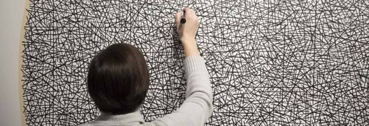
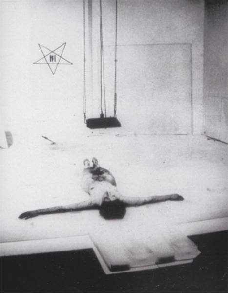
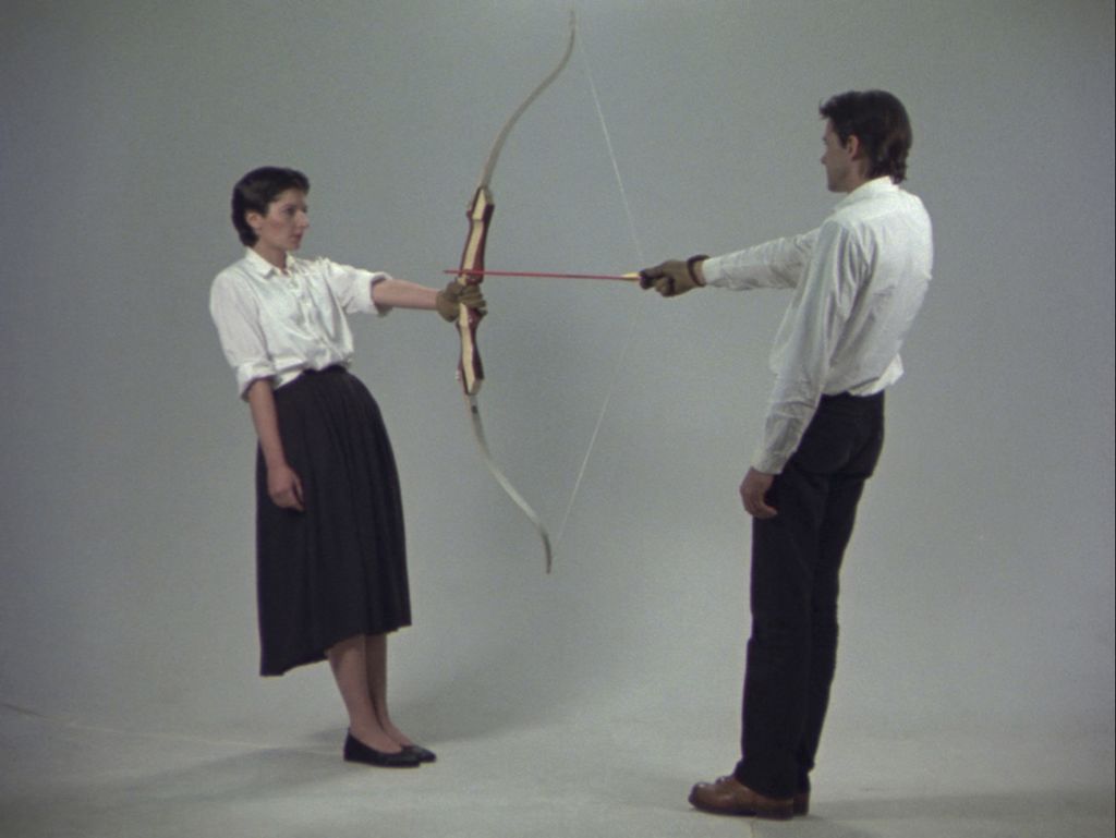
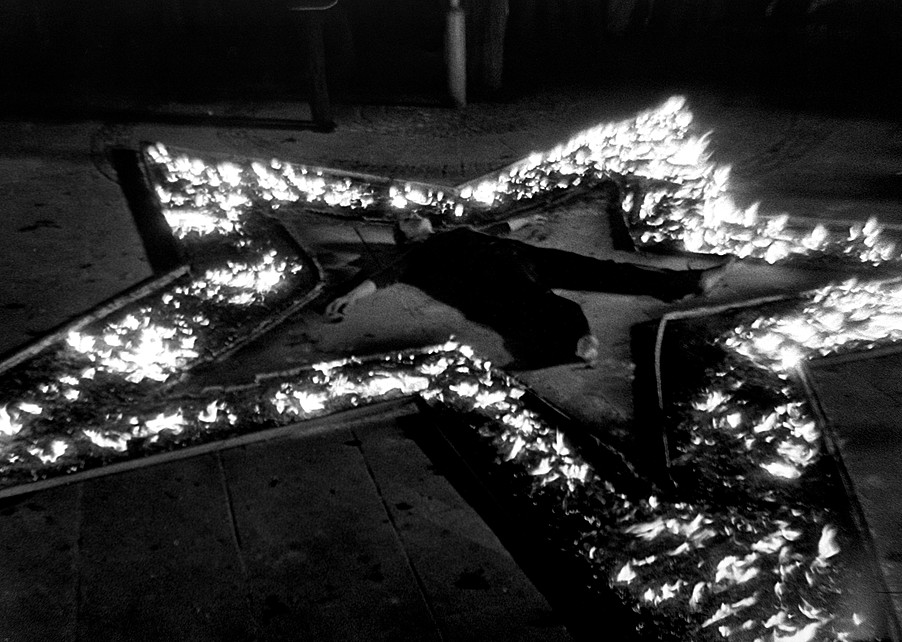
My first impression of Marina Abramovic’s work based on what we viewed in the documentary was that I would never be able to put myself in the vulnerable position that she does. Some of her work made me feel slightly uncomfortable, especially at the beginning of the documentary, but closer to the end what I felt was mostly admiration for the performers, including Abramovic, who were all so focused on the task at hand. I have researched some of her work in previous art classes, so it was interesting to see a more detailed, behind the scenes look at her creative process and her life. I admire how far she is willing to go for her work, and how dedicated she is to the whole process. Aspects I would say could be problematic are the danger in many of her artworks, like cutting herself in Lips of Thomas, standing in front of a bow in Rest Energy or suffocating from a lack of oxygen while surrounded by fire in Rhythm 5. I feel that new performance artists may believe that they must put themselves in similar situations, which could be very harmful. I don’t believe that being influenced by her work is a bad thing, just that if people see the risk as a standard to meet or overpass it may become problematic.
“When you perform it is a knife and your blood, when you act it is a fake knife and ketchup.“
I have learned that performance art involves you as yourself, and that while you would have to turn on a performer personality, it is still you. Acting can absolutely have aspects of your life and personality involved, but you play a character and are not completely yourself. Acting also often involves elements of illusion like fake blood, and props, and actors usually have scripted lines and movements; the exception of course being improvised moments and ad-libbing. Performance doesn’t include the same barrier as acting does, there is no way of separating yourself from the work because it’s real. I felt as though we witnessed a transformation to an even more grounded and authentic experience in Abramovic’s The Artist Is Present with the eventual removal of the table between artist and participant, which made the following performances even more real.
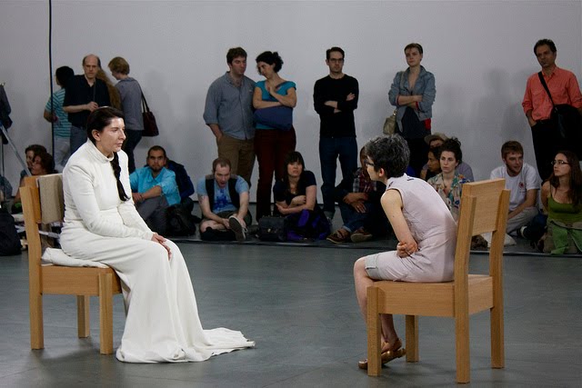
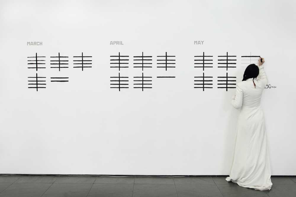
Marina Abramovic works around the challenges of the museum and commercial conventions by performing in repetitive ways that stay consistent, while still allowing the element of time passing to be noticeable, which is not important in the same way with non-performance art. Especially with The Artist Is Present, the days completed were marked off clearly on one of the walls, and it was the same situation made unique by the audience’s individual experiences. In a way, I think the success of that particular performance can kind of undermine the work. Near the beginning of the exhibition, audiences seemed calm and less stressed to be apart of the performance, but at the end there was a feeling of desperation that it might be the last chance they get to be a part of the piece. However, you could say that the anticipation of the last few days and the audience’s reactions to them adds to the work as well, as it shows the impact it had on people.
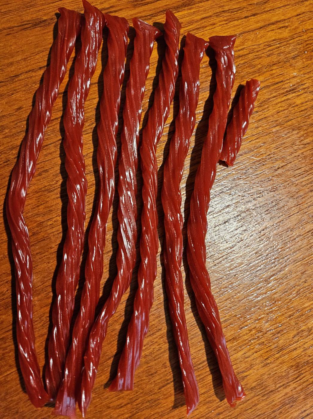
A Kilometer
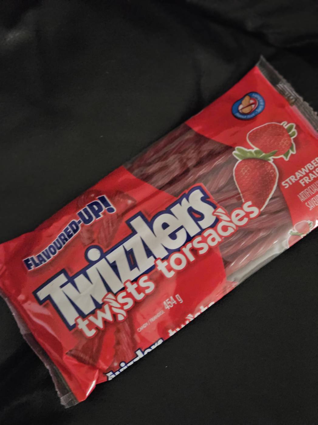
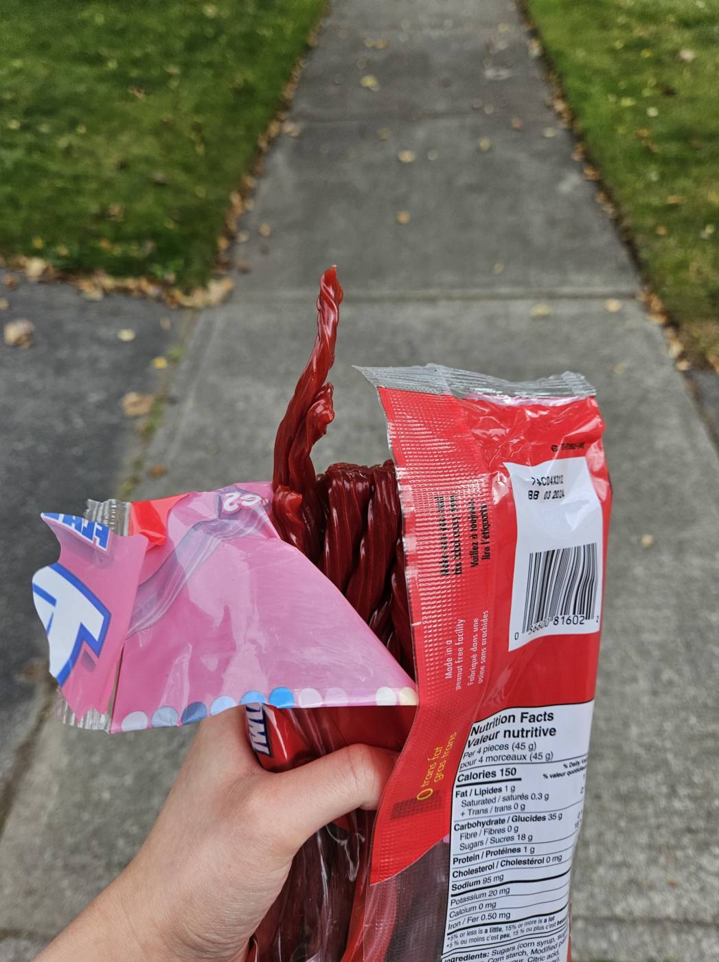
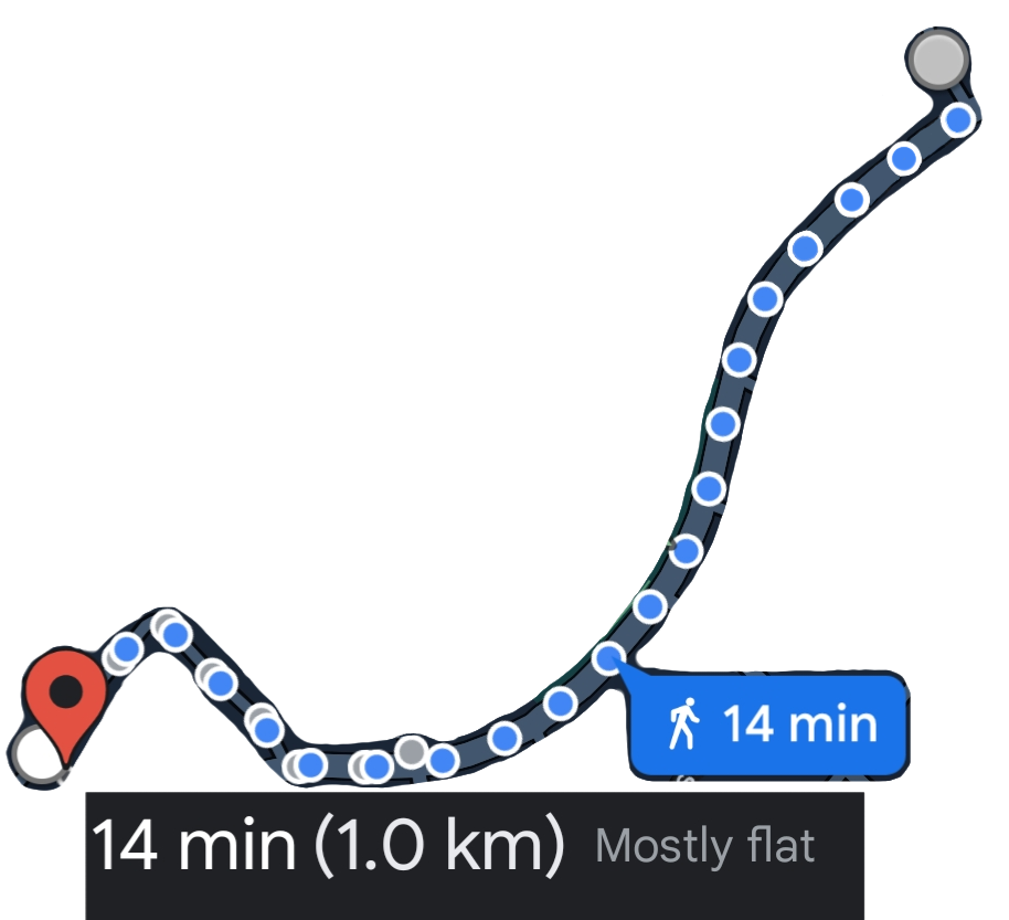
I continuously ate licorice on a kilometer long walk. During that time, I consumed seven Twizzlers and a quarter of one. Afterwards, there were thirty three Twizzlers left in the bag, so I could have walked roughly an additional 4.5 kilometers to finish the entire package. During this process, I was reminded of Halloween, collecting candy and wanting to snack on some while trick or treating, but having to wait to get home and sort it. It also made me think about the kinds of foods I’ve seen people carry and eat while walking, and what reactions I personally have had while witnessing that. I also thought about the kinds of food I had never seen anybody eating. Would it depend on where we were, their age, the time of year? I questioned what foods I would not pay much attention to, and which meals I would question, or be confused by.
Pipilotti Rist
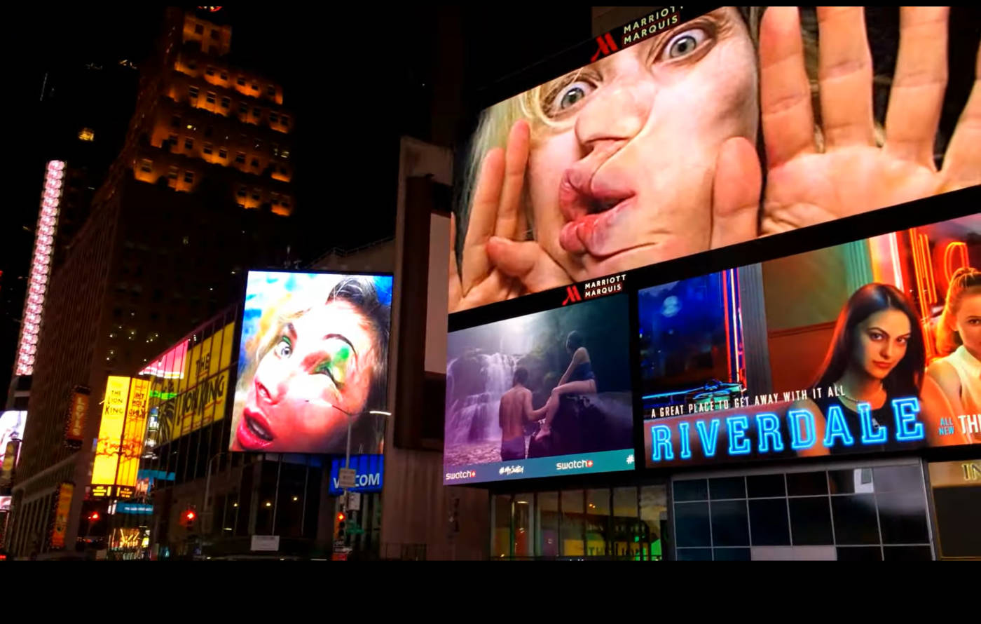
This work’s scale is very large, and it surrounds viewers by using multiple screens. Although, given that that Times Square is always busy and people may not always look up and around at the screens all the time, it may blend in with the advertisements and commercials if people aren’t paying attention. The work strikes me because of the bright colours and closeness of the filming. I felt drawn into the video because of scale and the contrast of Rist’s face and the dark background she shot the video in front of, plus the brightness of the screen in contrast to the night. This work feels like she could break through the screens, and is a bit uncomfortable because of the intensity of her stare during a large part of the video and how large and close the scale of the display makes the work feel.
Rist’s works do feel familiar to me in the way some content is now. There is a decent amount of videos now that seek to get a reaction from their audience no matter what kind of reaction it is. There are also videos that seeks to inform people about issues they want to call attention to in a way that’s a bit less direct but still gets the point across. Rist’s works highlight what we think about women and how society thinks we should act or how we present ourselves. By smushing and smearing makeup, or having on a dress and skipping down the street smashing car windows, Rist creates a contrast between expectations and the reality of what we see in her videos, generating surprise from viewers.
Putting my shirt inside out did feel strange and uncomfortable, but I don’t think anyone actually noticed. I didn’t get any strange looks at all. This can be a performance, even if no one saw, as it was done intentionally instead of by accident, and it was a personal performance. This taught me a lot about how much people actually notice when they’re busy and focused on their own lives.
One feat, three ways
One feat, three ways
For this video, we were originally going to use regular sized spoons, but when the bigger one was bought for the sequence, we knew using giant cutlery would make our task more difficult and the video more frustrating or painful to watch. I feel as if having us both lined up in the center of the frame looks better, and gives viewers more to think about than it would’ve if we had faced each other, so I’m glad that we chose to do to that way.
Sequence
In this video, we thought about different kinds of relationship dynamics and the ways that they could be shown through feeding someone. All the shots have us in physically different positions, and I feel as if this is a way to really define each one as their own, and adds interest.
Loop
This video took the longest to come up with because it was difficult for us to figure out what kind of action would work well in a looped format, as our other ideas involved more objects. We shot this video three times in full (not including a few where we learned how gently we would need to chew to stop it from breaking prematurely) to try to figure out how close we should get before biting and stepping away. This was the closest of those options.
Audio Art: is this what you want to say?
For this project, I used autosuggest and read out a small section. While typing this out on my notes app, I chose to tap the suggested words in different patterns, for example: only using the first key for a portion of time, and then all three from left to right, twice on the middle key and then once on the side keys, etc. During recording, I found three different areas of the text that I felt would work the best- some sections had mainly filler words and emojis, or the same phrase repeated many times over, and were not considered. I read for about 10 minutes to give myself multiples takes to choose from, and then found the best one for each of the three sections. During this entire process, I was curious about mainly two things: if the text made any kind of sense, and whether I recognized words or phrases I use often. I found that most of what I did recognize came from a note in my notes app where I write any dreams I remember after waking up, which I feel makes a lot of sense.
Ideas for conceptual portrait:
My first idea was to just take a picture of my corkboard and whiteboard (they’re attached) just as they are, because there are a lot of things on there that I feel would give a good idea of who I am. Another idea around this particular object was to take the items off of it and display them physically in some way.
Another idea was to do an audio project of sounds around my house – though that would potentially feel more like a conceptual family portrait (is that allowed??) rather than an individual one. The noises could be anything, but my main ideas were ambience, the sounds that different doors make, stairs creaking, sounds various objects make when tapped, or more electronic noises (different keyboards, light switches, oven buttons, washing machine, etc.)
Could do a portrait of vision, take all the pairs of (prescription) glasses I’ve worn and arrange them in a sculptural way? Could have interesting ideas around point of view and whatnot.
Birthday cards- been keeping birthday cards for a while, could do all of them or a select few and either take photos or do a sculpture with them. What can you learn about me from them?
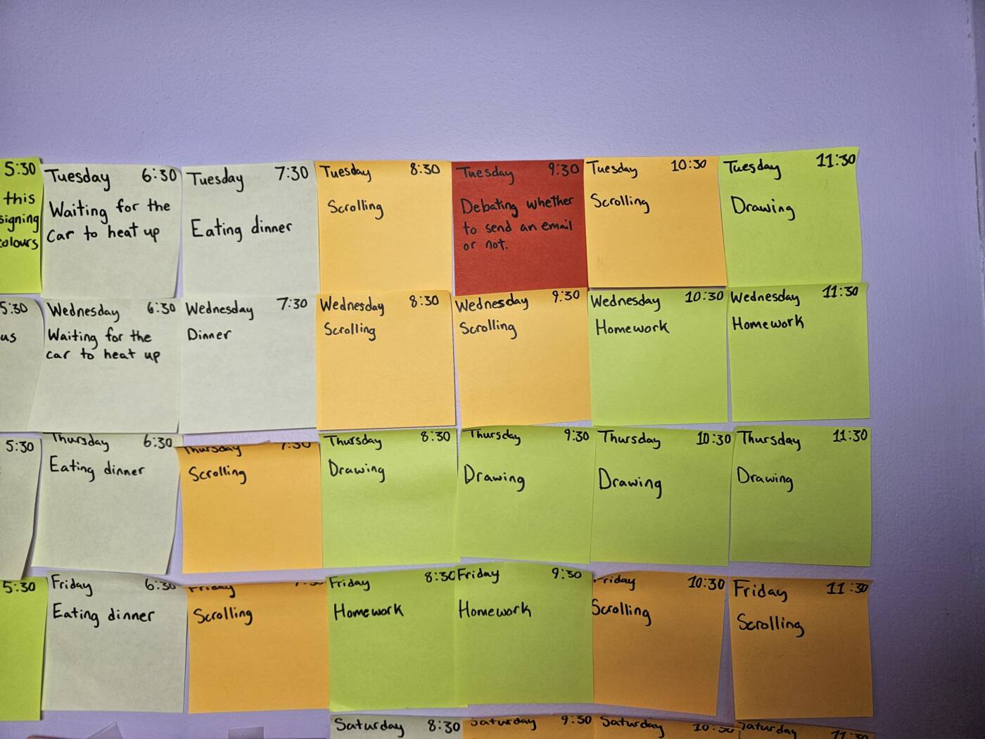
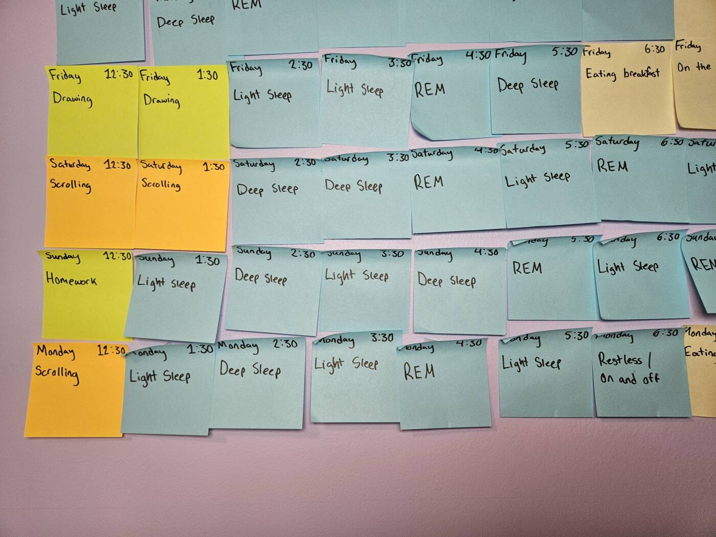
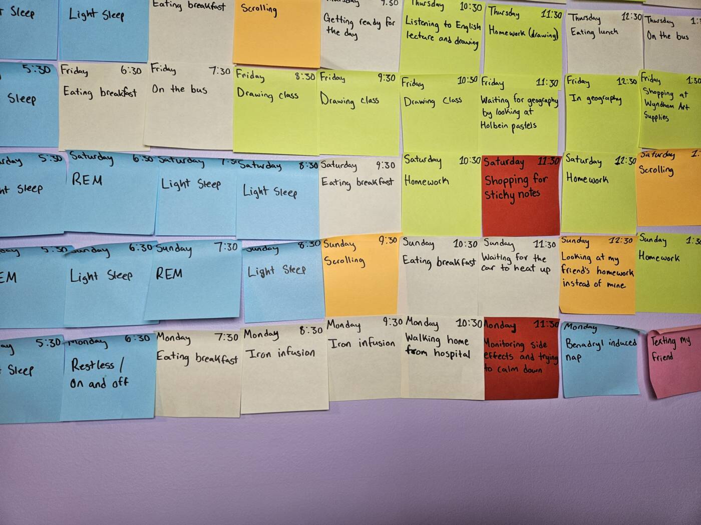
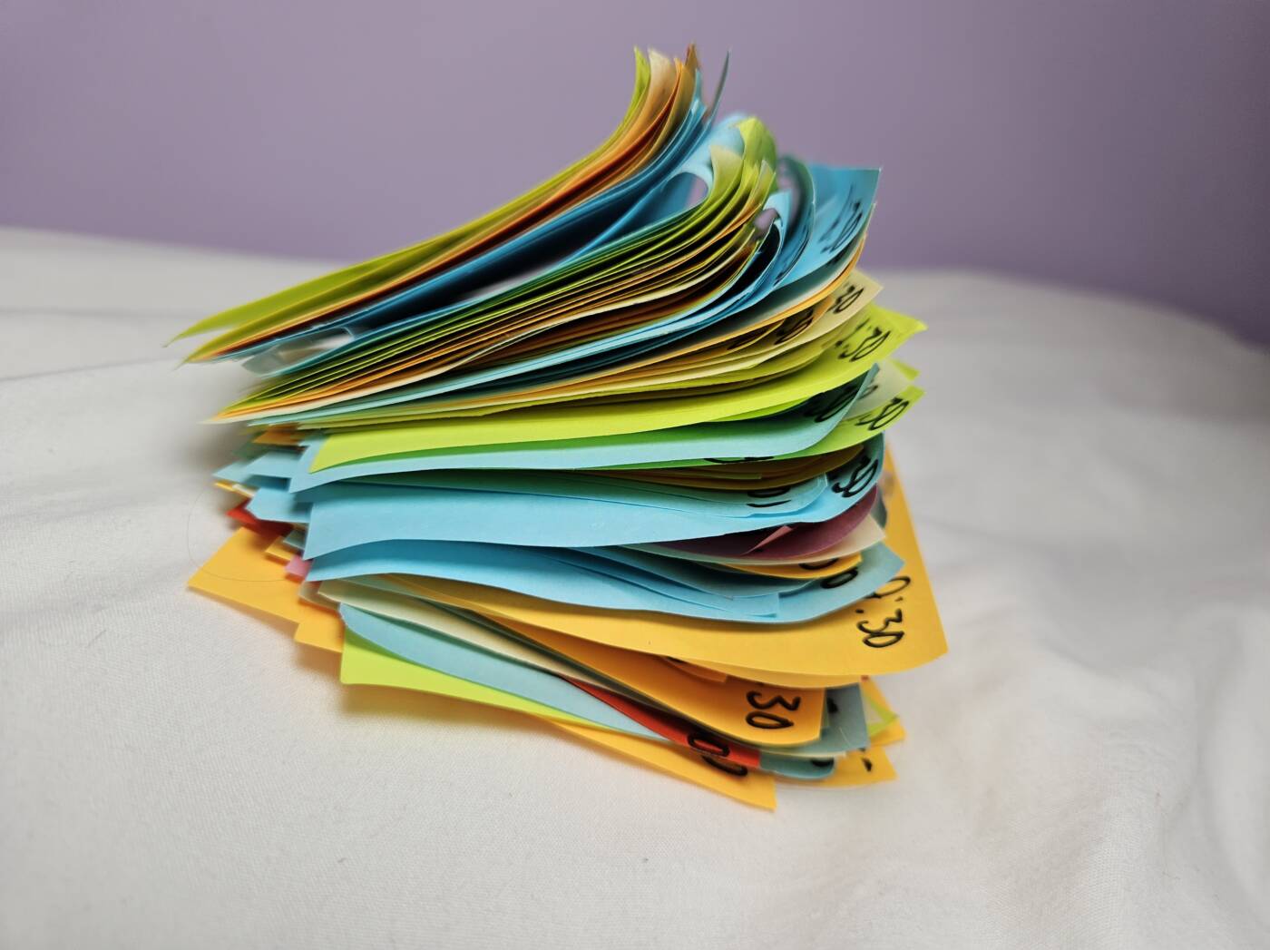
Conceptual Portrait: Elements of an almost-week
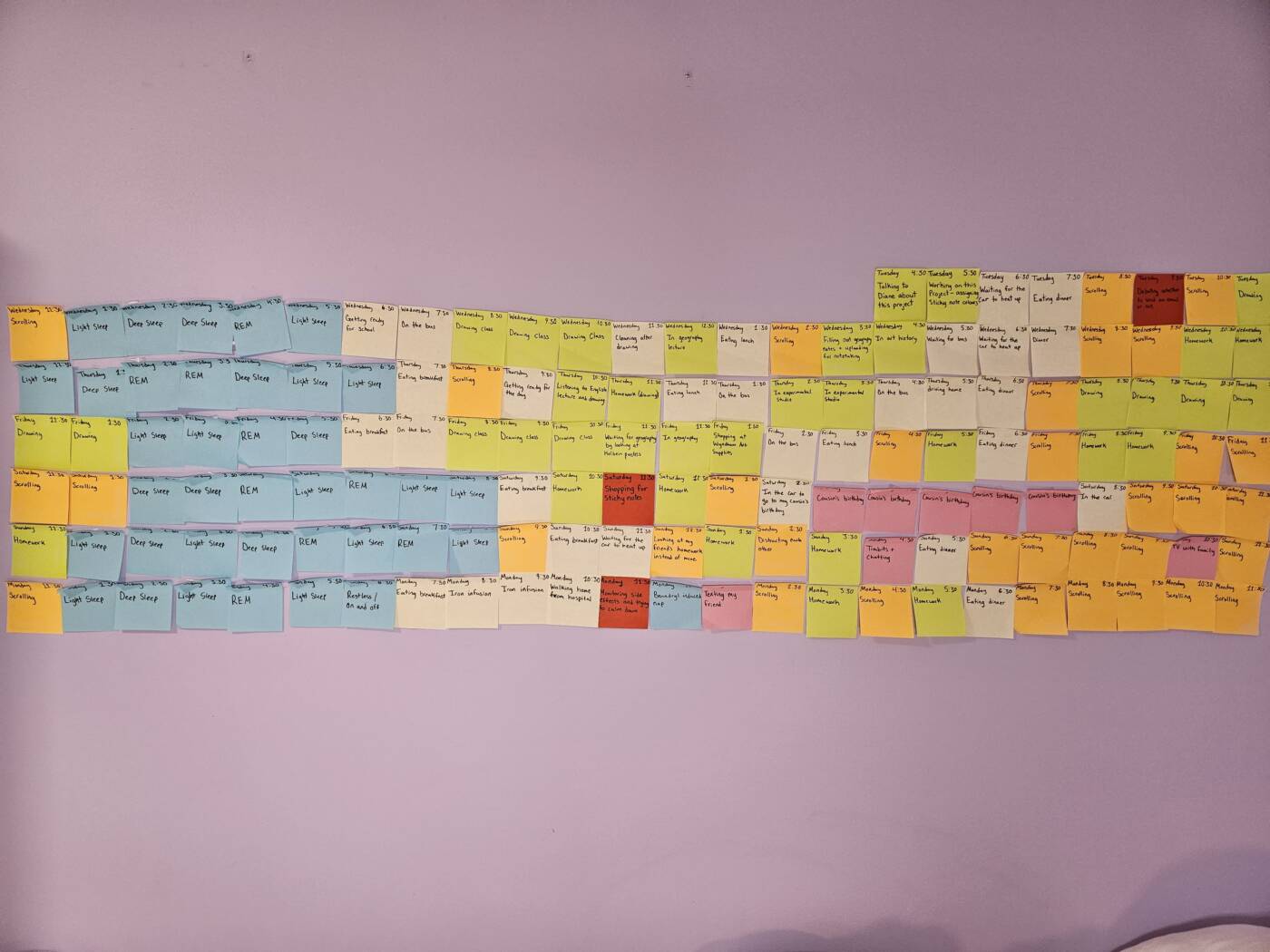
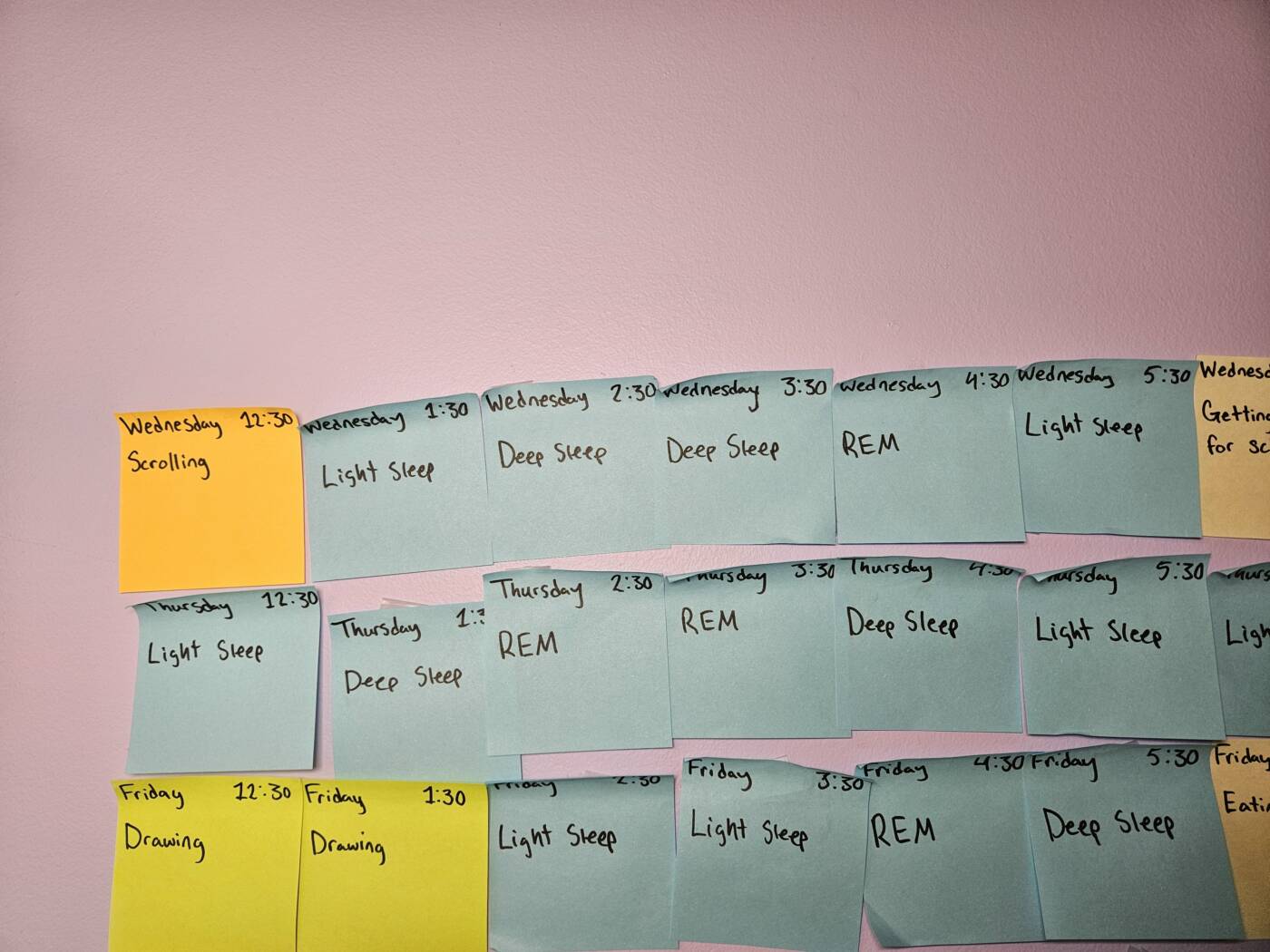
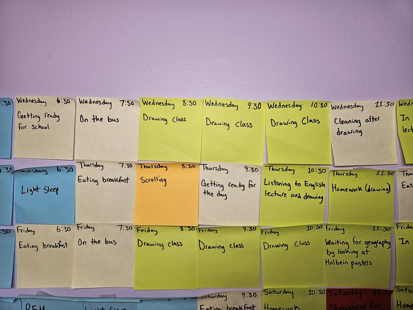
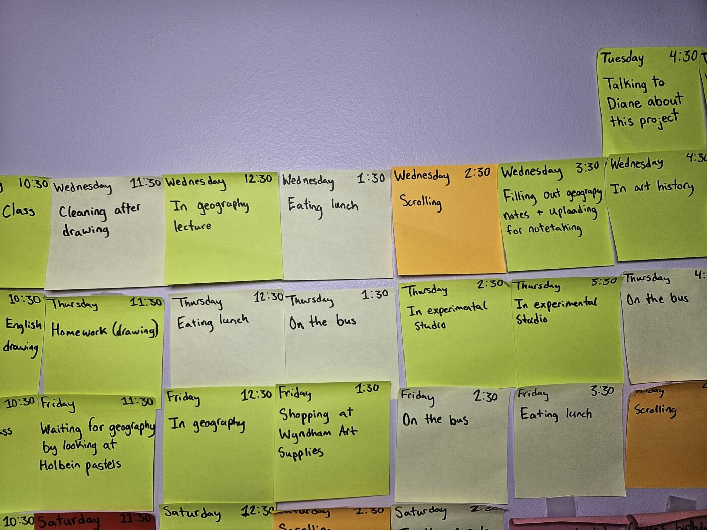
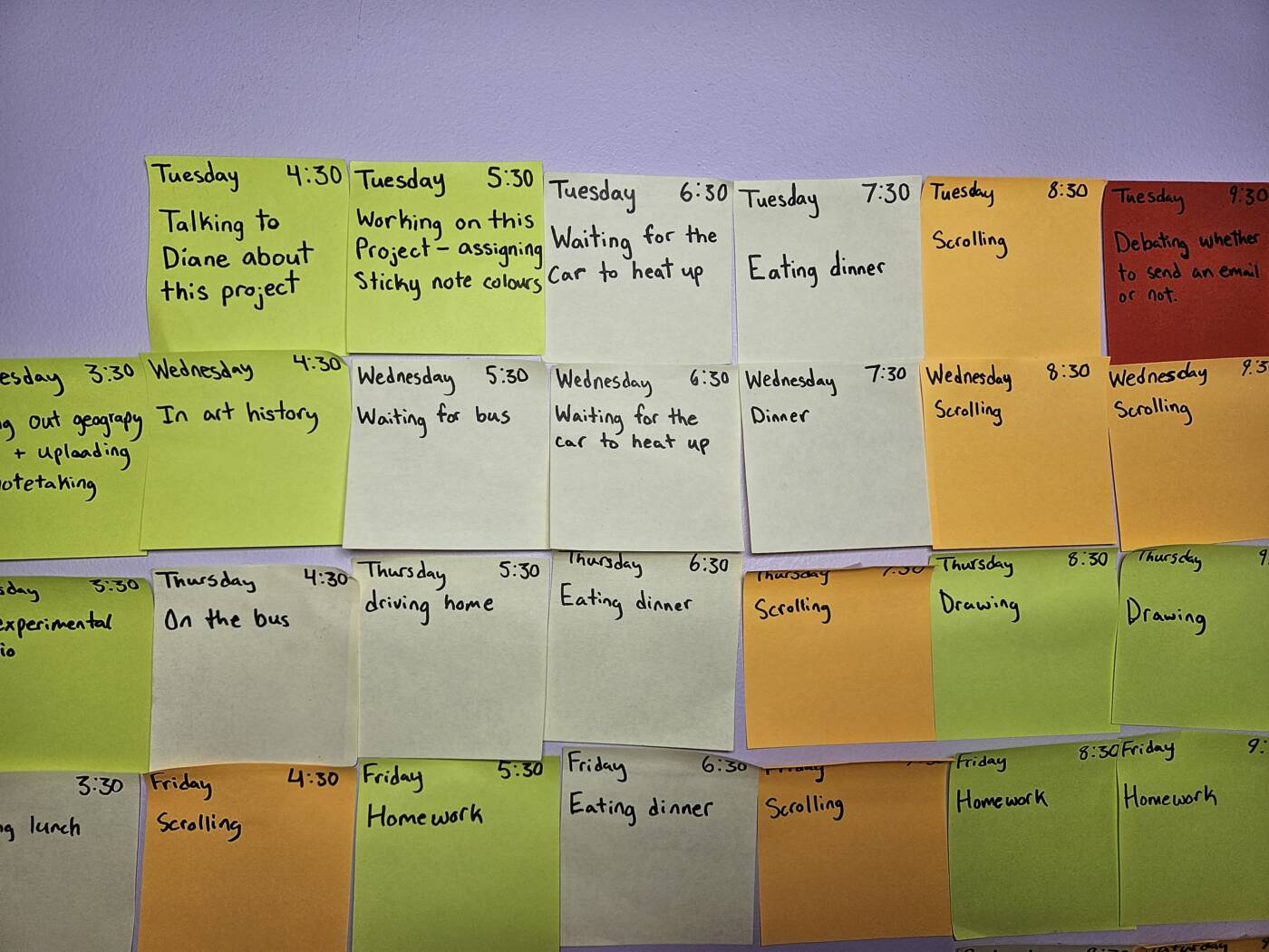
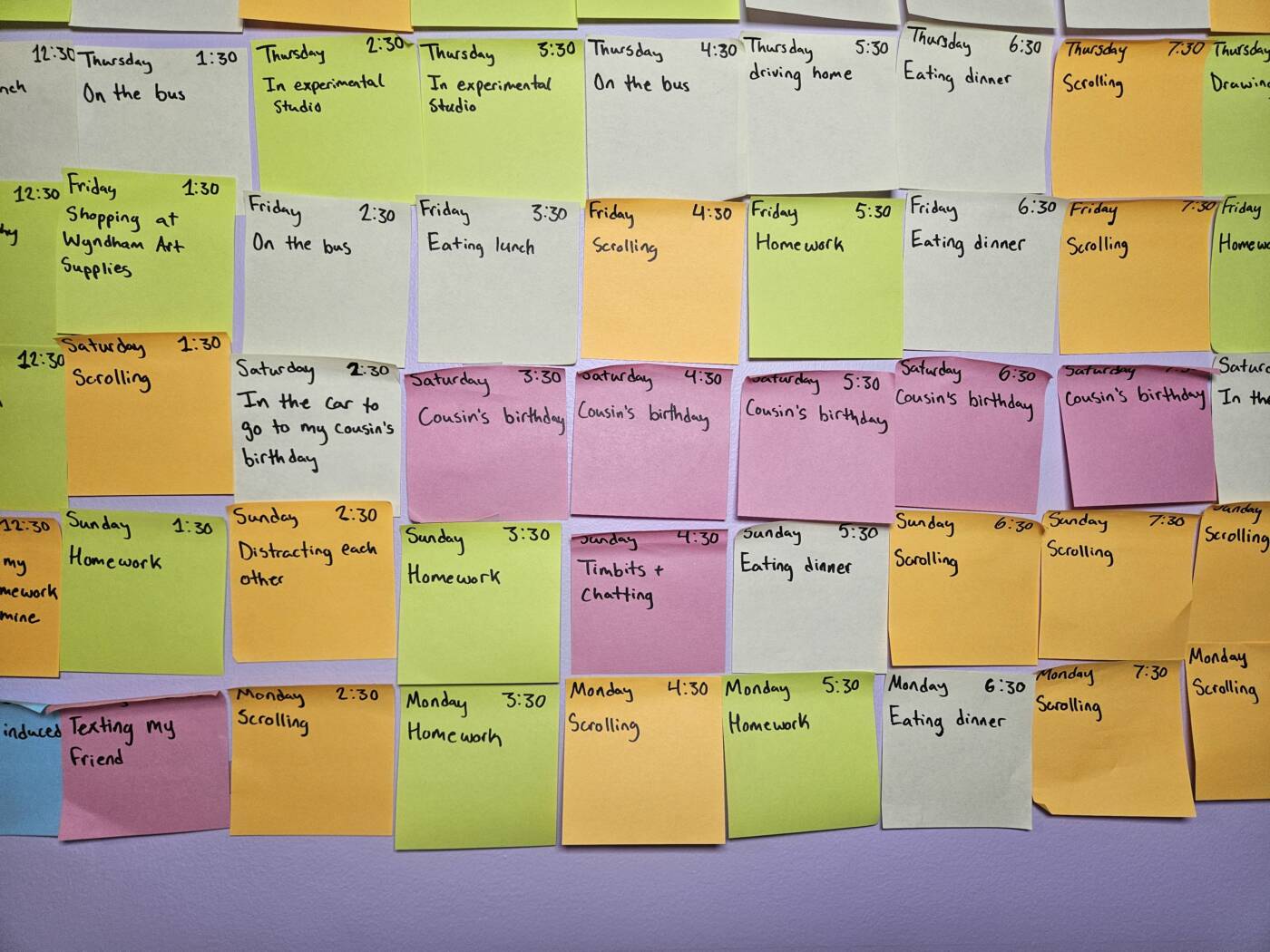
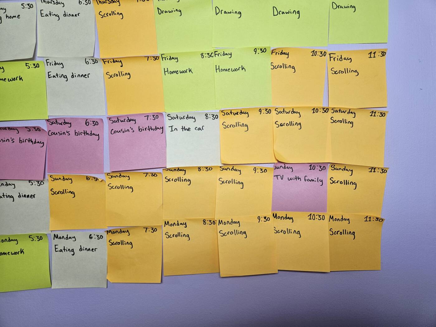
Tuesday, Wednesday, Thursday
Friday, Saturday
Sunday, Monday
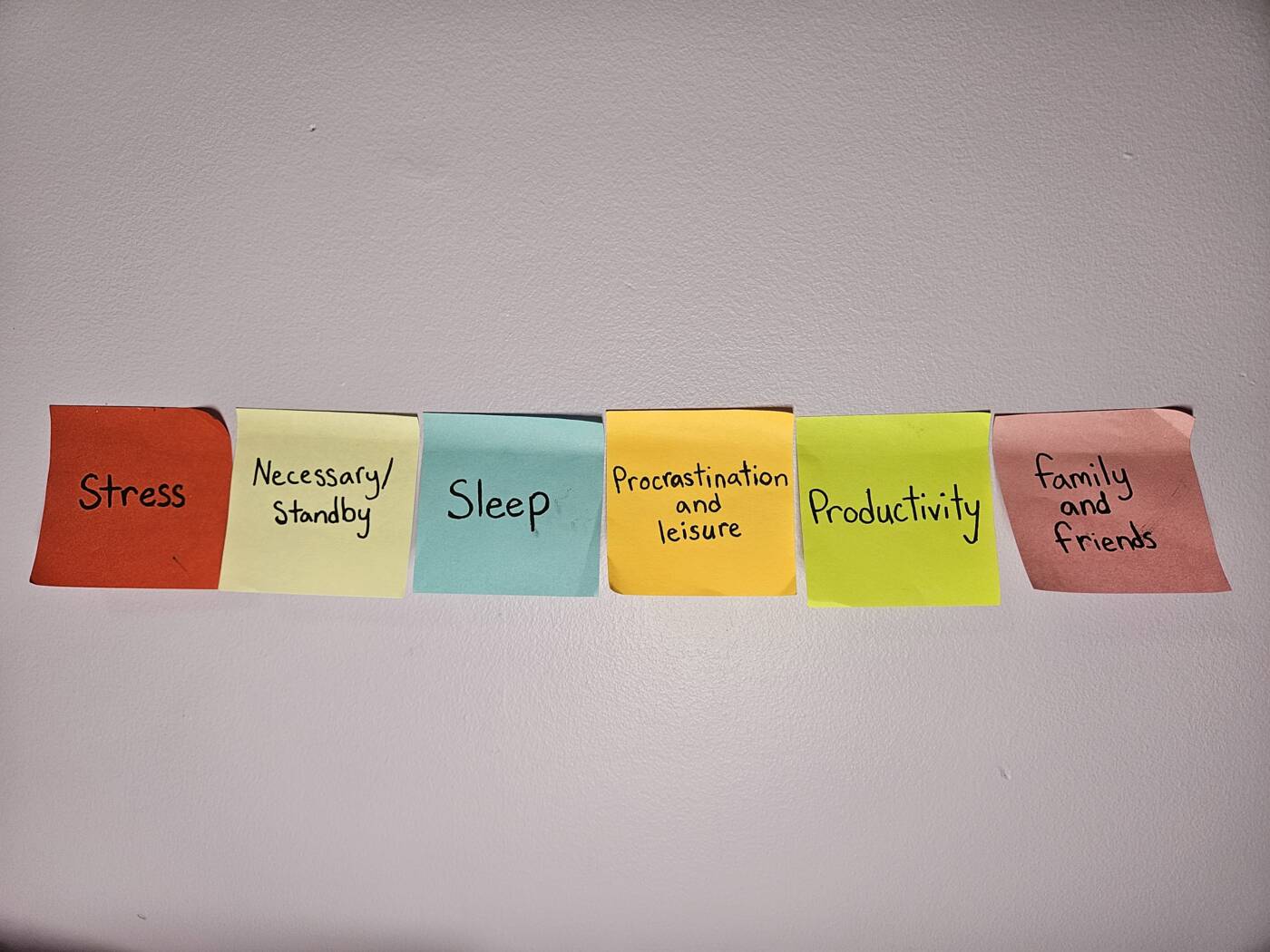
For this project, I took inspiration from On Kawara and Teching Hsieh and their time related works. I set an alarm, and snoozed it for an hour, every hour (besides during sleep) from Tuesday at 4:30 pm to Monday 11:30 pm. I then recorded what I had done for the majority of that time, sorting the hour into one of six separate categories, stress, necessary things, sleep, procrastination and leisure, productivity, and time spent with family or friends.
At the beginning of this project, I found it stressful to be constantly waiting for an alarm to sound, and also that I wanted to only begin doing something new once the full hour had passed. Over time, I got used to not overthinking it as much, which made the process much more enjoyable. I found that the results were basically what I expected, but having a visual of it has helped me understand what I did, and may encourage me to have a bit more of a schedule. Something I found a bit difficult was how to sort certain categories. Events like “sitting on the bus” are technically a time where I could be doing homework, but I classed it under essentials instead. Technically any time besides sleeping and driving (though I could’ve bought an audio textbook, I suppose) could be an opportunity to work, but I didn’t want this project to support the idea that people should be constantly doing something work or something productive. Finding this balance between honestly sharing how I spent my time and not being too hard on myself also led me to change the category to “procrastination and leisure” when it had formerly been just “procrastination.” It’s important to relax!
Overall, I am proud of myself that I stayed honest when sorting, because it was occasionally tempting to say that 25 minutes of hard work should make up for the rest of it being mindlessly browsing. I feel that even while sorting things in this way leads to not fully expressing every aspect, for the purpose of this– creating a conceptual portrait, but also understanding myself more, it works well.
Artist’s Buttons
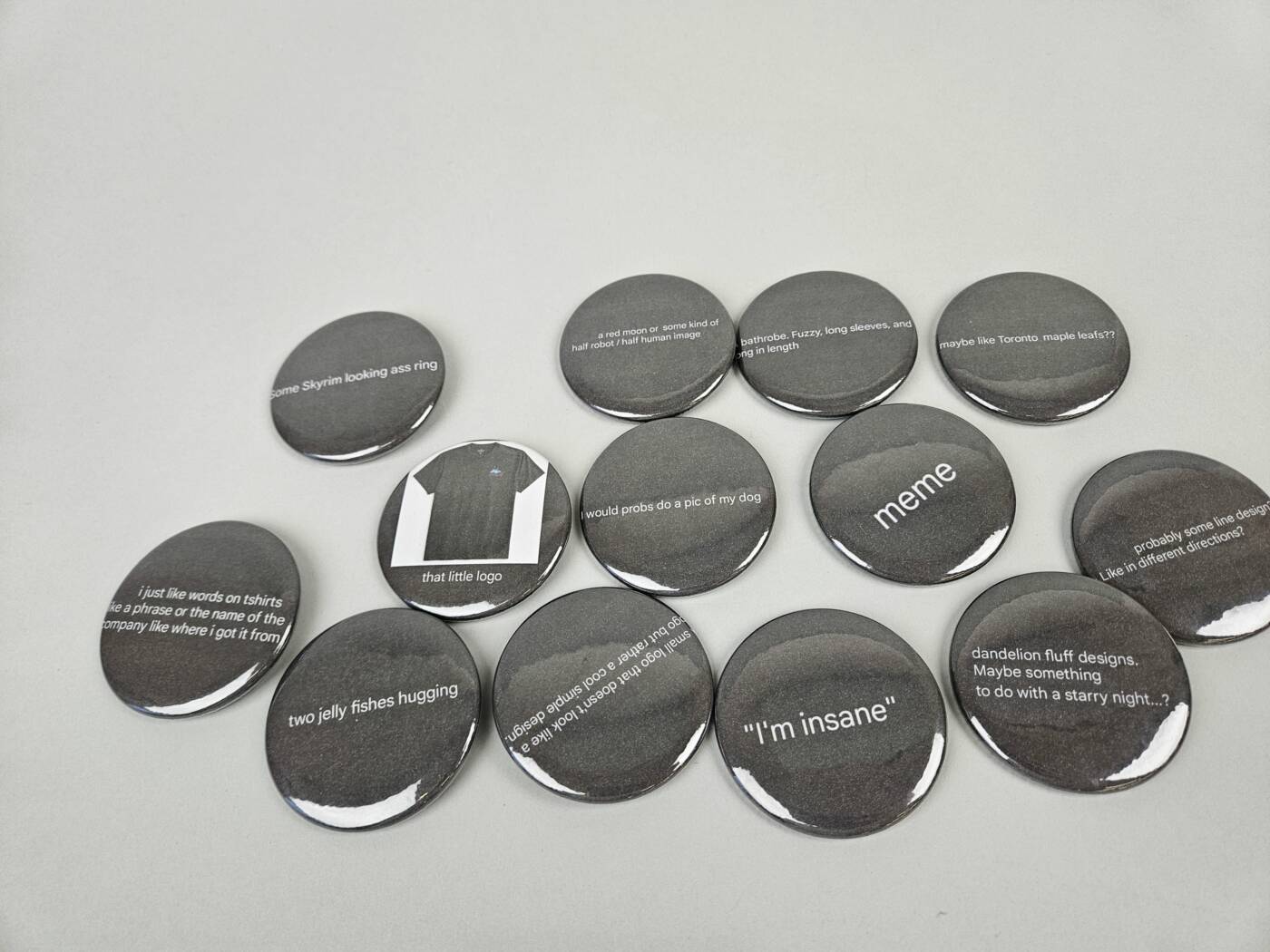

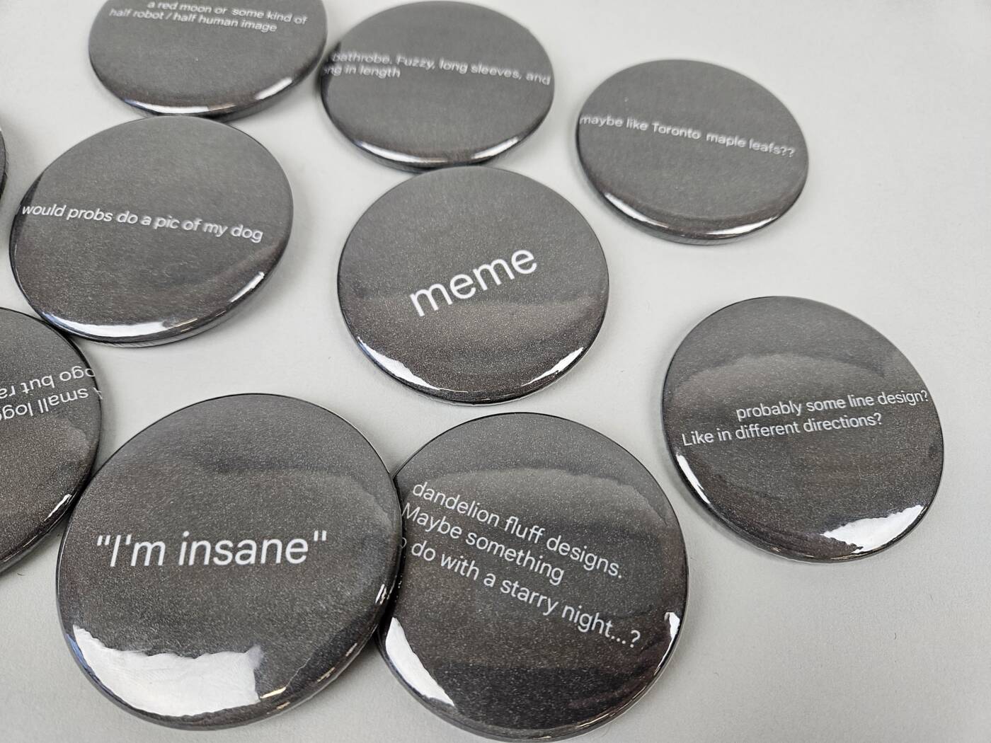
For this project, I asked friends and family to send me what they would most want to see on a button or another piece of clothing like a shirt. I do occasionally ask people for inspiration, but instead of actually giving them what they wanted, I screenshotted their responses and put them on the buttons. Still technically what they asked for!
You must be logged in to post a comment.