Sage V.

ARTIST BUTTONS

I see you

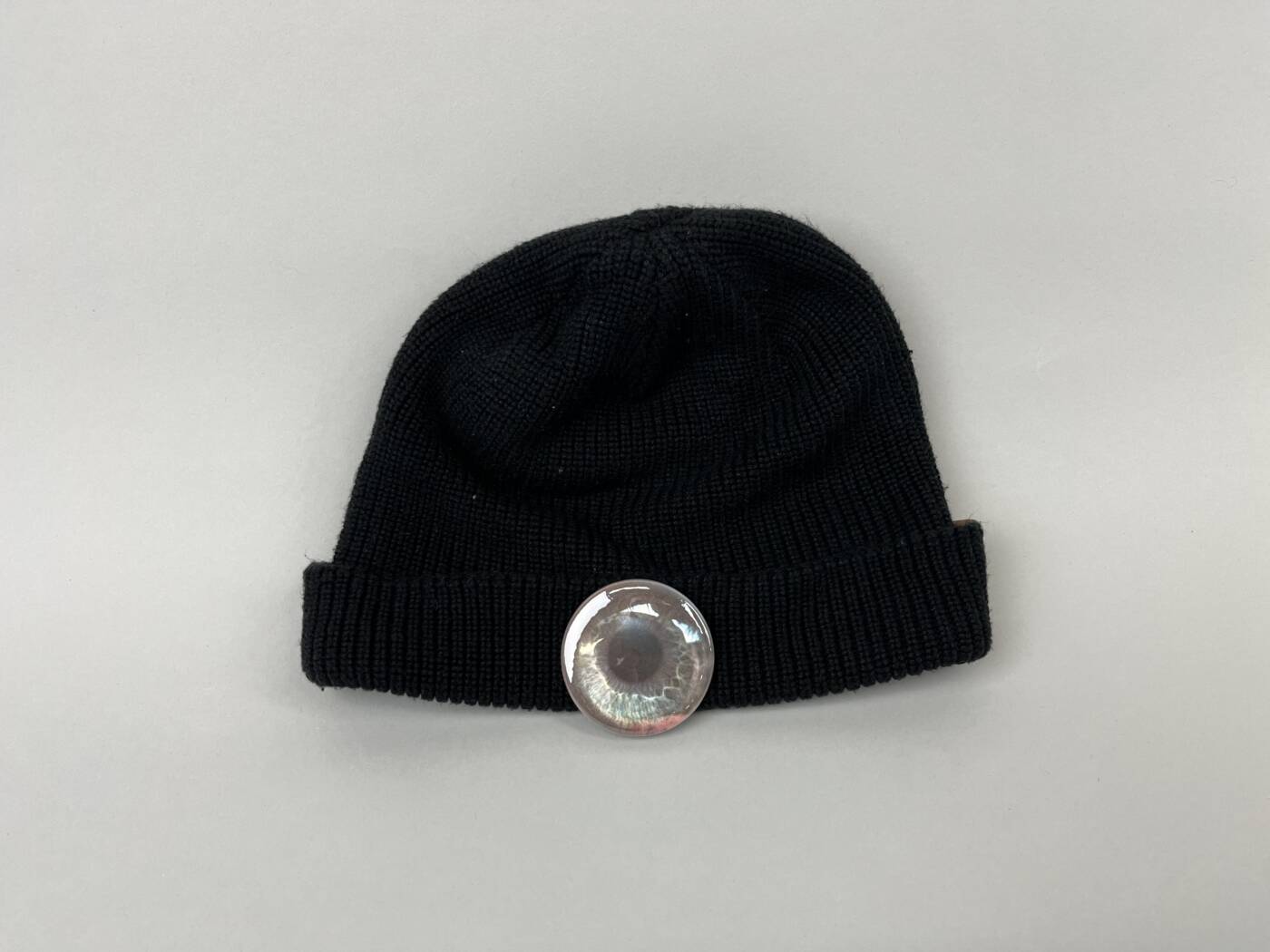
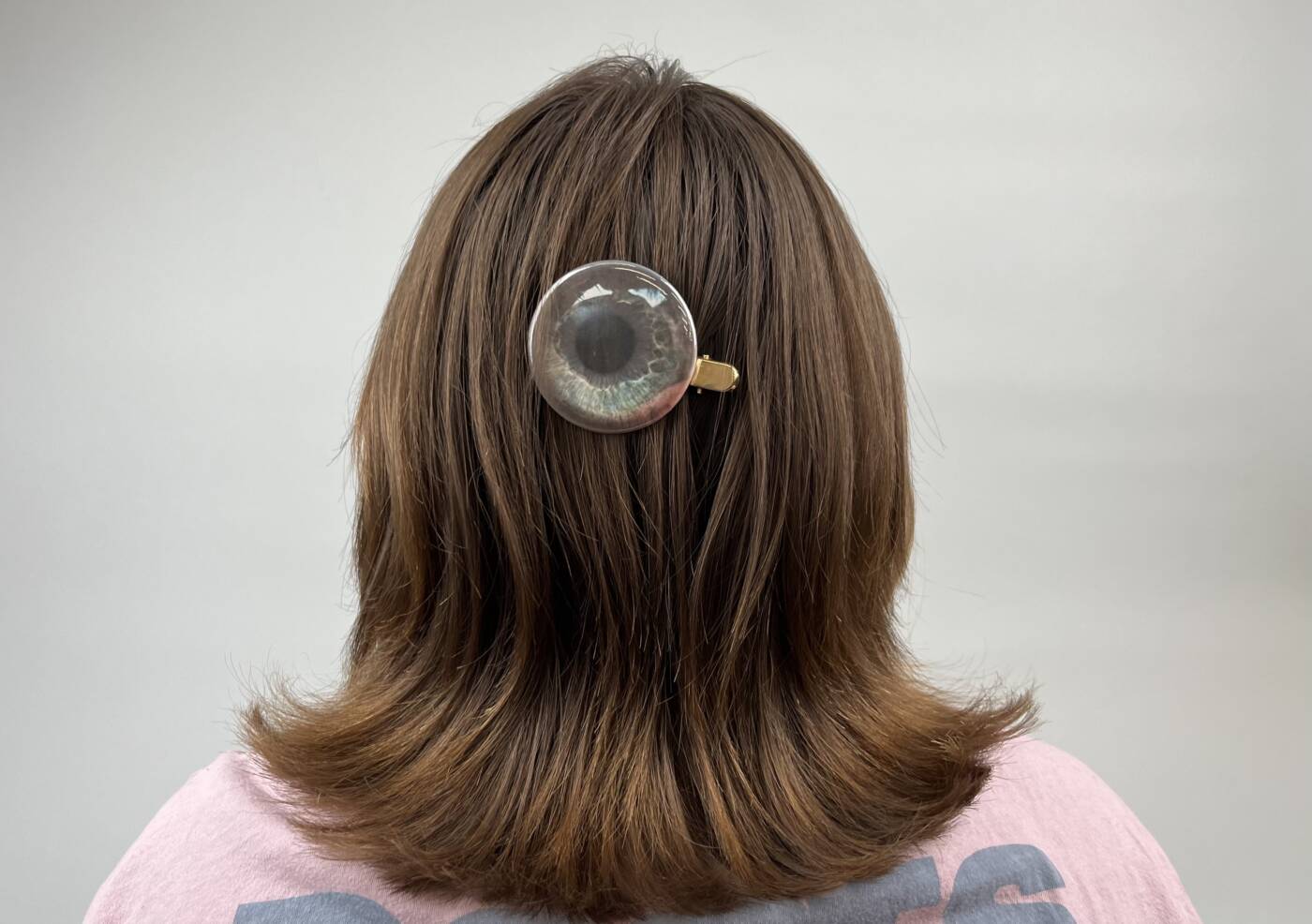
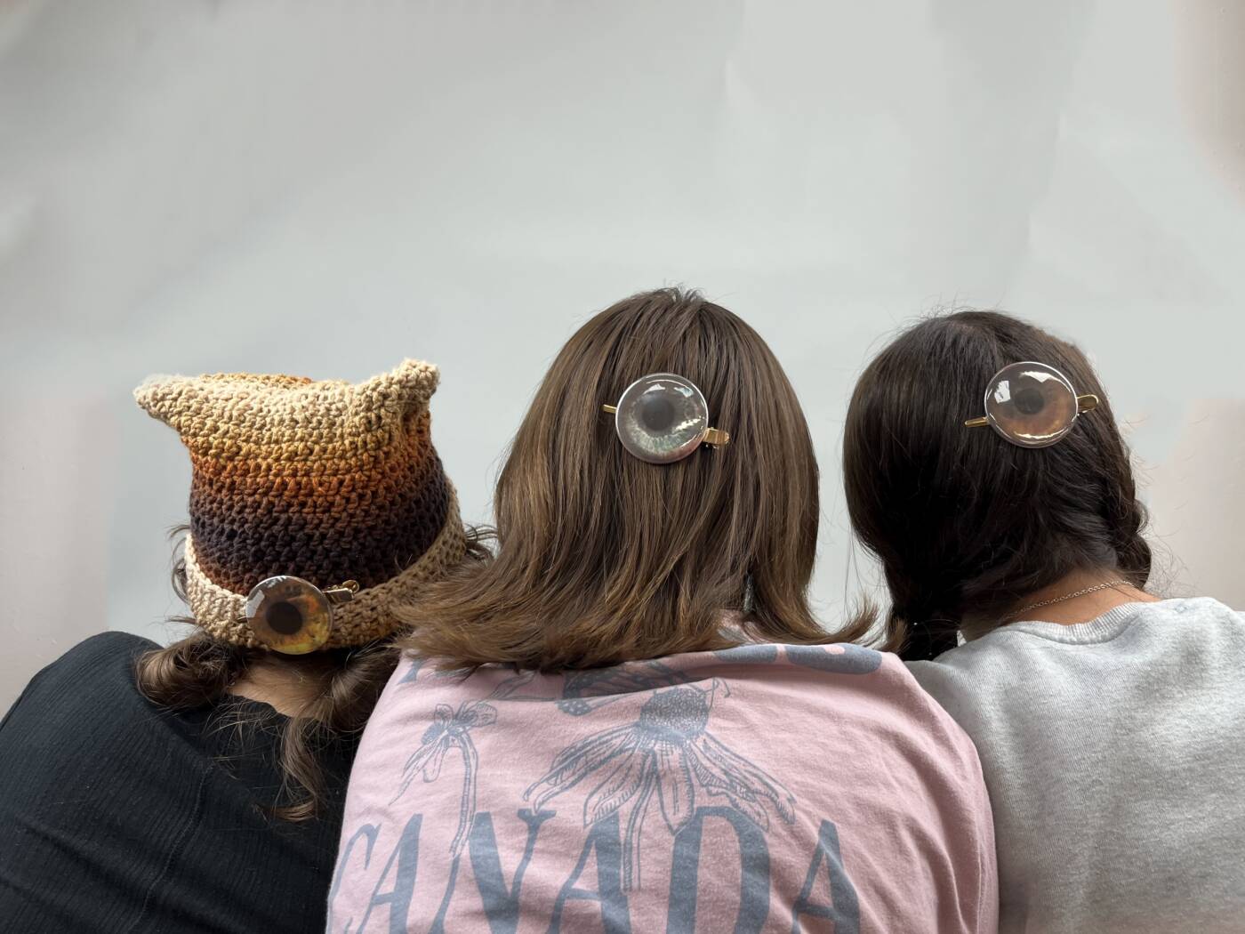
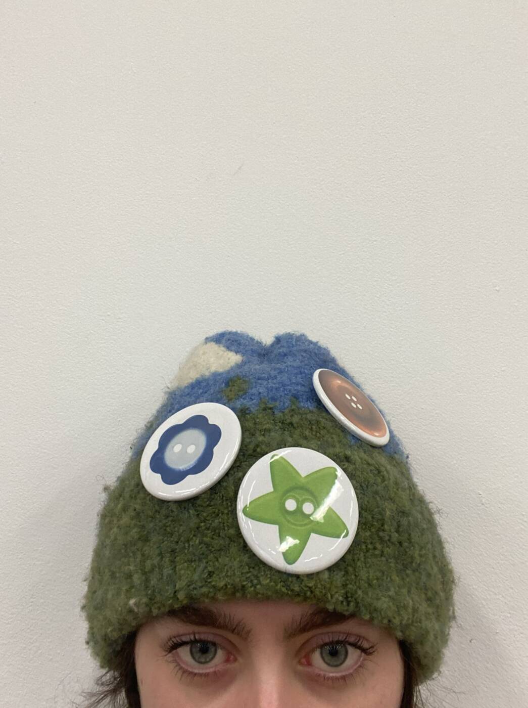
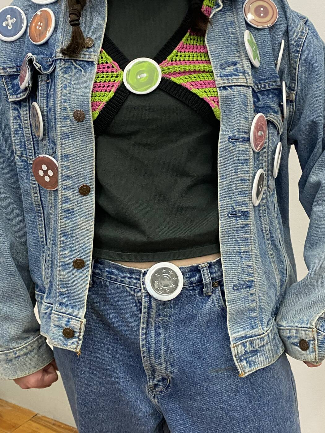
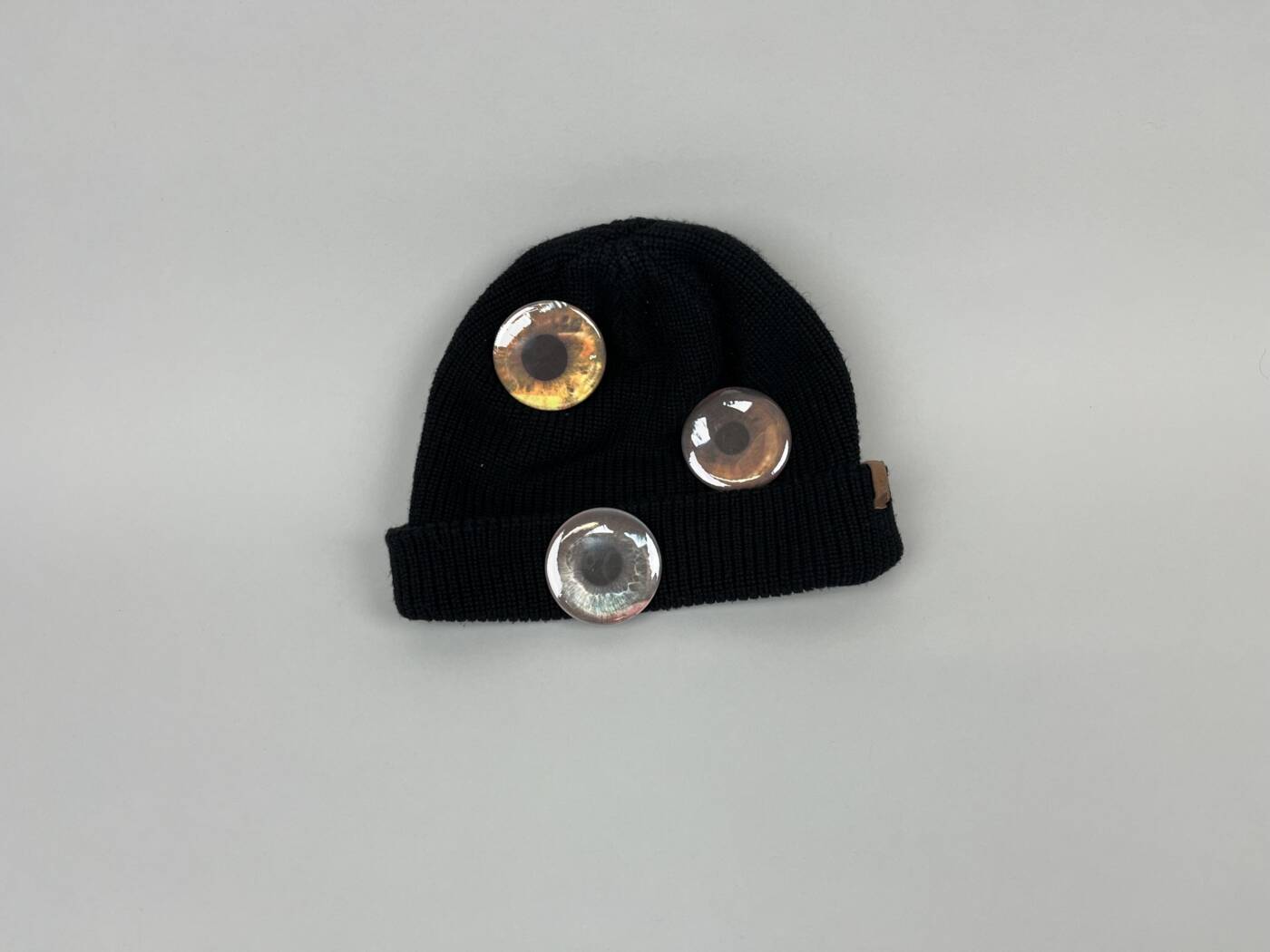
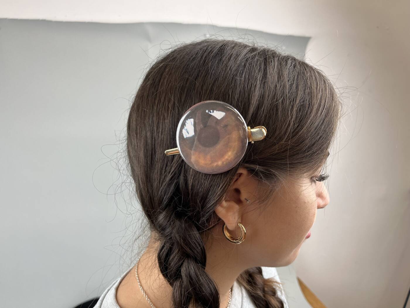
For my artist buttons I wanted to create large scale iris’ of peoples literal eyes. For this, I used a high resolution camera lens to capture as much detail of the iris as possible. I then edited the photos, lifting the contrast to illuminate the photos. I then turned these photos into buttons, which then were turned into hair clips. The idea of the hair clip is that it would be worn as a “third eye”. Oftentimes we wish we could see behind our back, not only literally, but metaphorically as well. Unfortunately in life, not everyone is to trust, making the buttons as almost a comfort. We feel comfort in knowing what other people say or think behind out backs, and with this project is it literally “behind our backs”. The hope is that this would be kind of similar to a button making booth, where people would go in, get a picture taken of their eye, then have it turned into a button. I like the idea that each button will be unique and when wearing you button, it is the same colour and pattern as your actual eye.
CONCEPTUAL PORTRAIT

“boobtrait”

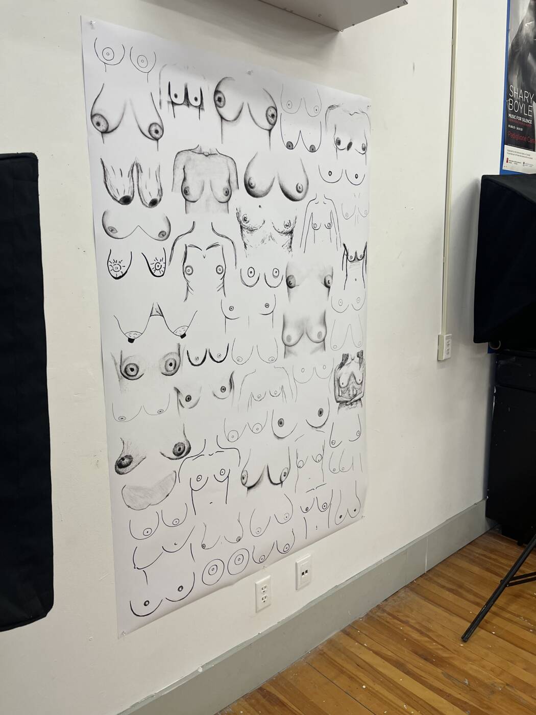
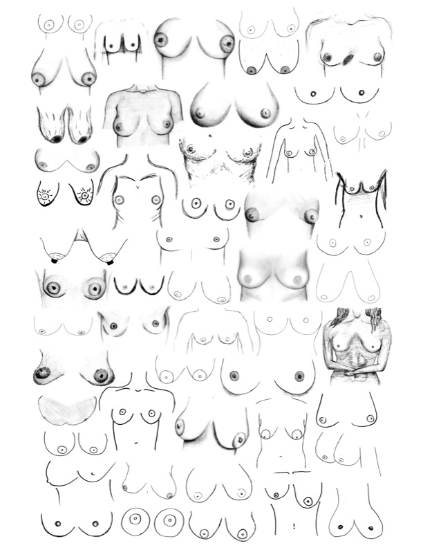
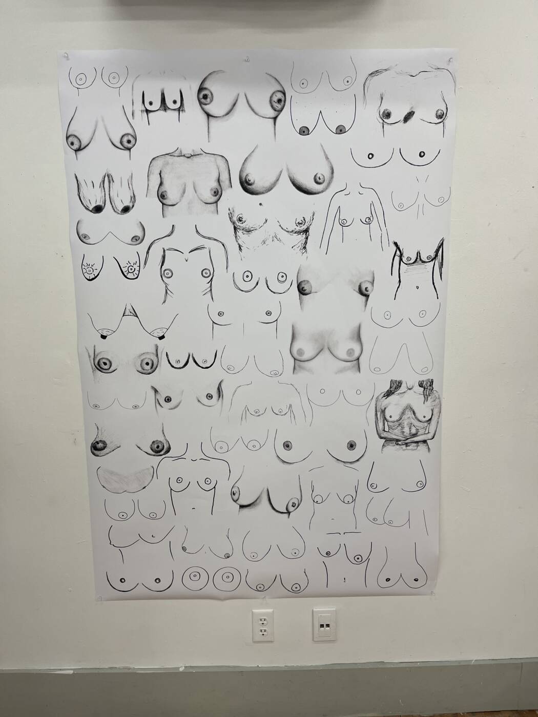
For my conceptual portrait, or shall I say “boobtrait”, I chose to exhibit several different portraits from several different people. With this piece, I wanted to channel the artists perception on their own body, and how that may look to them. We all see our bodies differently, and unfortunately not always in positive way. This experiment allowed people with breasts to have fun and draw whatever their heart desired. My initial hope was for everyone to draw their bodies how they may see them, but in reality, who would know if they just drew any old pair of breasts? That is what’s great about it, is that we will never know if these portraits are even close to the real thing. Breasts have such a large stigma of being sexualized, rather than being appreciated for all that they do, they give life for crying out loud! Breasts are truly amazing and each and every one of them is unique which makes them so beautiful! This piece would be preferably depicted as a wallpaper, coating an entire room with each sheet of wallpaper being 45×65 inches

I want to thank each and every person who contributed to my “boobtrait” as it would not have been possible without the tremendous amount of extraordinary artworks!
sleep giggling

AUDIO ART

For my audio piece I decided to collect multiple clips of my “sleep giggling” to make one continuous piece. Using the app “Sleep Recorder” I have recorded myself sleeping each night for years. The app is able to start recording when it senses sound of any sort, this could be snoring, talking, giggling or even just movement of the blankets. I quite enjoy listening to my sleep recordings, and hearing the amount of giggling I really do. It makes me question what my dream was about, am I laughing because I find something funny? Or is it because I am uncomfortable? Oftentimes, in my conscious day to day life, I laugh when a situation may seen uncomfortable, or maybe I just don’t know what to say so laughing comes out. I wonder if my sleep giggling is true authentic giggling, or is it just merely a coping mechanism.

One Feat, Three Ways (video project)

Lick: The Loop

For our loop, we decided to use Cyprus as the main performer while I sat without movement (trying my best) to take in all the licks. This performance shows the strong relationship many dog owners have with their dogs, and how the simple action of licking can convey that. For myself, I am very used to Cyprus and his love of licking peoples faces, yet this act was still difficult to say the least. As he continued to lick, his tongue went into my mouth, eyes and nose, while I had to stay as still as possible and let it happen. What is interesting here is that this is probably the first time Cyprus has been allowed to unconventionally lick my face without my hesitation and pulling away. He had free range to lick and lick and lick, until I could no longer take it. This being our loop shows a great demonstration of something going on and on forever, never truly knowing the end.

Discipline: The Sequence

For our sequence, we decided on doing multiple acts with first our subject (Cyprus) and then our actress (Serena). As the acts go on, Cyprus does a trick and Serena follows. In this particular video, the actions are all very expected, but what isn’t always expected is the outcome of what a dog is going to do. Is he going to listen to his trainer? Is he going to do whatever he wants to do? Being that he is a dog, he is very unpredictable, Serena on the other hand, is not. Going through and recording these clips, we were aware of what Serena was going to do, we could tell her exactly what we wanted and she would do exactly that. With Cyprus, it was a different story, we had to take twice the amount of clips as he is in a way, his own “boss” who comes up with his own ideas and actions. I feel this sequence went well as there are smooth and understandable cuts between each action, and the actions flow from one to the next. I also feel that there is sense made knowing he is a dog and not an actor, this leaves room for trial and error.

Tempting: The One Shot

For our one shot, we shot an unedited video of Serena, Cyprus and I in a line. This involved Serena and I sitting cross-legged while Cyprus was laying down in between us. As we sat, Serena and I passed a carrot back and forth, each time taking a bite. While this was happening, Cyprus continued to be in between us looking back and forth at the carrot, in awe. Although Cyprus was very interested in the carrot and eating it, he kept his composure throughout the video which showed amazing discipline. May I add, carrots are one of Cyprus’ favourite snacks, so of course he got the carrot when we were done. He showed tremendous self-awareness while being tempted. I feel this worked really well as a one shot, as it did not need any editing, it is a stand alone piece. Cyprus was great throughout all of the videos and I am super proud of what a good boy he is.

Ever is Overall, Pipilotti Rist. 1997

I have chosen Ever is Overall, which is a video of Rist walking down the street, smashing car windows as she passes them. This video installation consists of a large-scale projection of a woman in a blue dress walking down a street while smashing car windows with a large flower. I see this work as a feminist statement and a surreal exploration of female empowerment. The framing of the piece consists of a mixture of close-up shots and wide-angle shots. At times, the camera zooms in closely on Rist, capturing her facial expressions and actions in great detail. This framing allows the viewer to connect with the character on a personal level, emphasizing her emotional journey and the rebellious act of smashing car windows with a flower. It allows you to feel what she is feeling as she continues to smash the windows. As for the colours, wears a vibrant blue dress, which stands out against the urban backdrop, as well as blue being a colour of stability and strength. The red flower is a great choice as it stands against the blue dress, with red flowers being a symbol of passion. The sound features melodic music that includes a blend of electronic and acoustic elements. The music is often soothing and hypnotic, with a gentle and repetitive quality that helps to establish a dreamy atmosphere. It is installed in a gallery and projected onto a wall, with the other part of the wall being up-close flowers. I think this helps convey the feelings she wants the viewer to feel because it almost sucks you in and makes you feel as if you are watching it firsthand. This work makes me feel a sense of empowerment. Watching this made me feel like women can do anything if they put their minds to it. I think knowing this was an older piece it also helps put into perspective that women were seen differently at that time. To relate it to videos we see today is a bit hard because today making videos is so accessible, versus when more production was needed to make such a video. I find that Rists’ pieces have a lot of very obvious relations to feminism, but also a lot of hidden meanings as well. Her performances hold so much emotion and feelings, I feel it would be hard for anyone to deny these feelings while watching any of her performances. 

Wearing my sweatshirt inside out:

While doing this experiment I felt very self-conscious at first, but as the day went on I started to realize that no one really even noticed or cared. It made me realize how many times I walk around in public and worry that others are judging me based on my looks, but in reality, everyone else is just worried about themselves and how others are seeing them. We are so focused on others’ thoughts, that we forget that everyone is thinking/feeling the same thing we are. I really enjoyed doing this experiment because it helped change my perspective, knowing there probably wasn’t anyone who even noticed my shirt was inside out, and even if they did, did they care? No. 

Smo’km out

Have you ever been in a car, whether you’re the driver or not, and someone lights a cigarette? You instantly smell the smoke, it fills up your lungs as you gasp for fresh air. It feels like you have been driving with the smoke in the car forever, yet it has only been a Km. For my Km project, I chose to drive for exactly one Km, while my dad lit a cigarette, and continued to smoke. As the air filled my lungs, I instantly began to cough. I coughed and coughed, while he continued to smoke. I wanted to represent that feeling of being in a tight enclosed area with a smoker. Many times we are too anxious to say anything, and we suffer in silence. In this video, I chose to express my feelings and vocalize them by coughing. The Km felt like 10, as I was gasping for air, I felt like it would never end. My dad has smoked my whole life, and although he has never smoked with me in the car, I have hated it my whole life. Many children are subject to parents smoking in the car, while their kids cough and pray fresh air will arrive soon. A Km for them may feel like 100. Although going 60 Km an hour takes only 1 minute to drive 1 Km, for people in a car with smoke, it feels like longer. It can be hard to gauge how long a Km really is. When you drive normally with fresh air, the minute goes by fast. We usually don’t even feel each new Km. When you are in a state of discomfort, the minute can feel like an hour. The state of our emotions affects the way we feel a Km and the length it takes to travel. Everyone perceives time differently, some may experience larger amounts of discomfort than others. This can affect the way they feel the time passes, my dad probably felt normal as he smoked for 1 Km, but for me, it was hell.

Marina Abramovic

  1. What are some of your first impressions of Marina Abramovic’s performance works, based on the documentary? Use an image/example of one or two works. to describe aspects you admire, and aspects you might agree are problematic?

At first, I was very taken aback by her work, but I was intrigued. This is my first time hearing of Marina Abramovic. The longer the documentary went on, the more I began to love who she is and what she has done. She takes art to a whole different level, many of which can be very controversial. I think what I admire most about her is the fact that she seems to not care or worry about what others are thinking. For her, her work is art, it is everything art is. She comes across as almost emotionless, but yet full of emotion. Her performances are more than performances, they are her life.
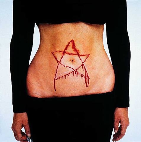
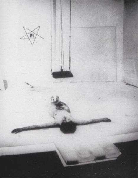
One of her pieces that I admire most is her “Lips of Thomas”, where she has taken a razor blade and cut a star into her abdomen. This piece has been both admired and criticized. I personally admire the emotional aspect behind the piece. The emotion that pulls from not only the performer, but the audience as well. I would assume, watching this piece in person there would be many different energies and emotions flowing around the room. I also admire the spiritual exploration as she begins to dive into the realm of spirituality, with trying to connect with those who may be beyond the “physical world”. Her commitment is what amazes me the most in all of her works. She always stands strong and with such confidence, it is so admiring. Although this piece can be seen as beautiful, there is also the side of it being problematic to some. The fact that she is performing an act of self harm in front of many can be problematic. The self inflicted pain is seen different by everyone, so this work can cause some issues with not only the real world, but in the art world as well. Many viewers may experience some discomfort while watching the performance, it can be uncomfortable to watch. This piece is one where emotions are flying rancid, and opinions are all over the place. I think that art is meant to confuse us, make us uncomfortable with unanswered questions. Art is here to push our “everyday” thoughts outside of the box and think creatively. 

  1. What have you learned about features of performance art based on Abramovic’s work? Name a few key features according to her precedents. Include an image to illustrate. Consider her quote “When you perform it is a knife and your blood, when you act it is a fake knife and ketchup.”’

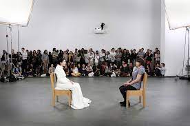
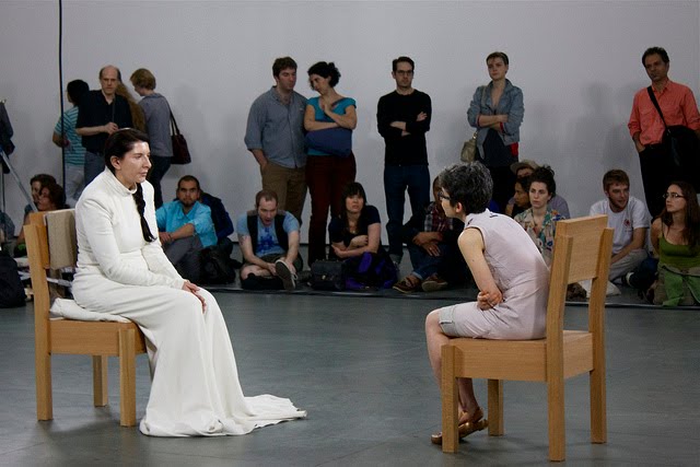
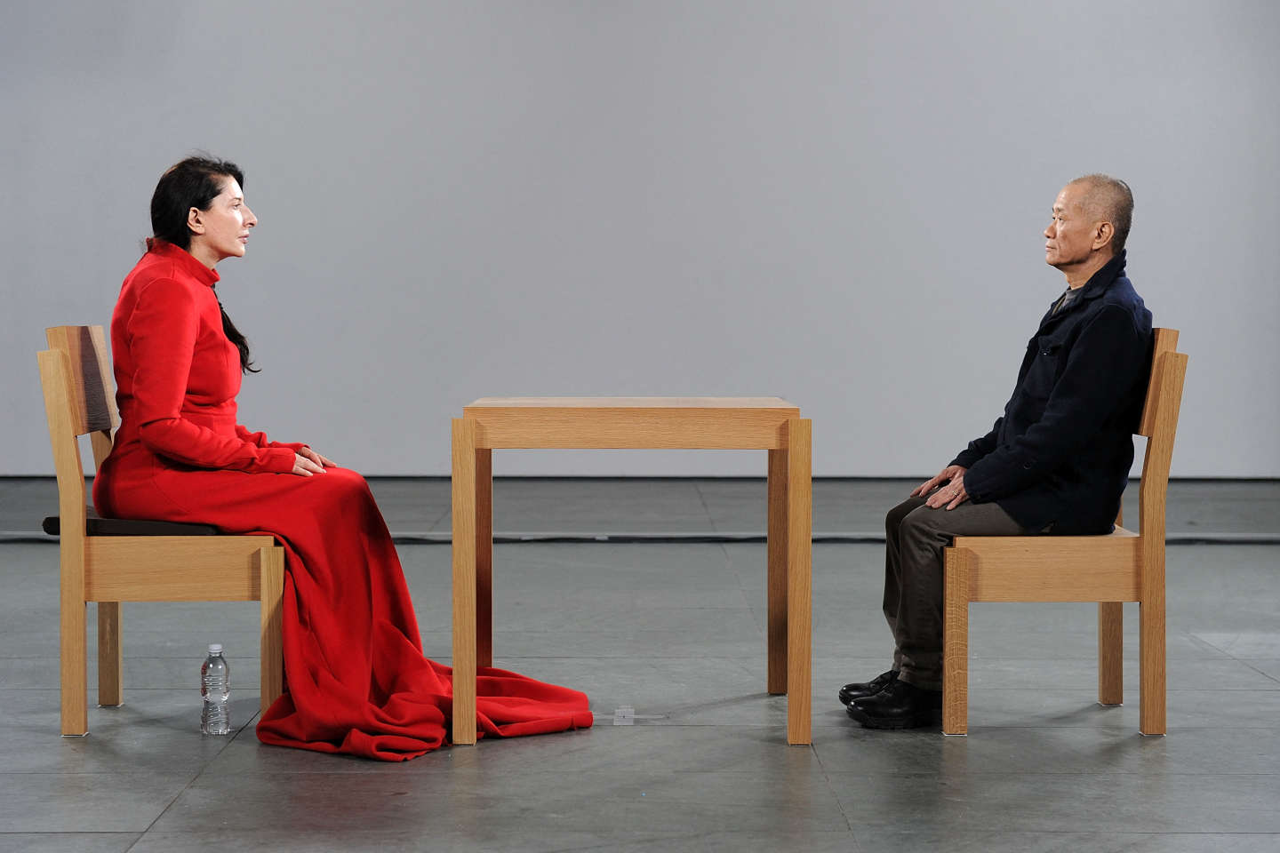
Abramovic’s art has had a significant role in shaping what we call “Performance Art”. One key feature I want to focus on is Durational and Endurance-based art. Marina uses this in many of her pieces but in particular her piece “The Artist is Present” she gives a whole new meaning to what endurance actually means. For Marina to be able to sit in a chair for so long, while her body aches and her stomach growls, it is truly an amazing thing to witness. She not only pushes her physical state but her mental state as well, she tests things many are afraid to do. Another feature used in her performance piece is the Physical and Emotional Vulnerability. Through her work she allows the audience to connect on a different level, she feels what they feel, sees what they see. In regards to her quote, I feel it is a great reflection of her work. As mentioned in the documentary, she is not an “illusionist”, she performs real life performances. 
  1. Discuss the ways performance art resists many museum and commercial art world conventions. How does Abramovic solve/negotiate some of these challenges, and do you find these compromises add to, or undermine the ideas at play in her work?

I think that performance art can be tricky for museums because they know it’s not something that can be sold, it isn’t something a big buyer can come in and take home to their penthouse. Performance art is something that is solely happening in the moment, it can be recorded, but it will never be the same as it was in the very moment it was originally being performed. During the MoMa exhibit, another issue arose. The issue was that the museum was only open for a certain amount of time each day. This means there is only a limited amount of time where the performance can be performed. There was a point in the documentary where a man was angry because it was time for the museum to close, and he was unable to sit in front of Marina and perform with her. I think she overcomes some of these challenges that occur by giving people feelings they have never experienced. When setting up her piece, she originally wanted it to be harder on the body and mental state than the museum would allow. They did eventually come to a compromise on how the performance was going to take place. Another issue was when she wanted to remove the table in between the two chairs. Security had a bit of an issue with this being that they were worried she was “too vulnerable” without the table in between. She assured them it was not going to be an issue, and she was right. Everyone was there to feel the whole experience rather than destroy it. I don’t necessarily believe any of these compromises undermined her work per se, but I do think they shifted the work in a different direction. I think when she originally had the idea to sit for such a long time, many were worried. She was able to overcome this by inviting others to experience the performance and be fully immersed in it. By allowing the audience to participate, she was able to share the experience and create the piece as a whole.
Tuesday

Artist Buttons

Button Buttons!

Conceptual Portrait


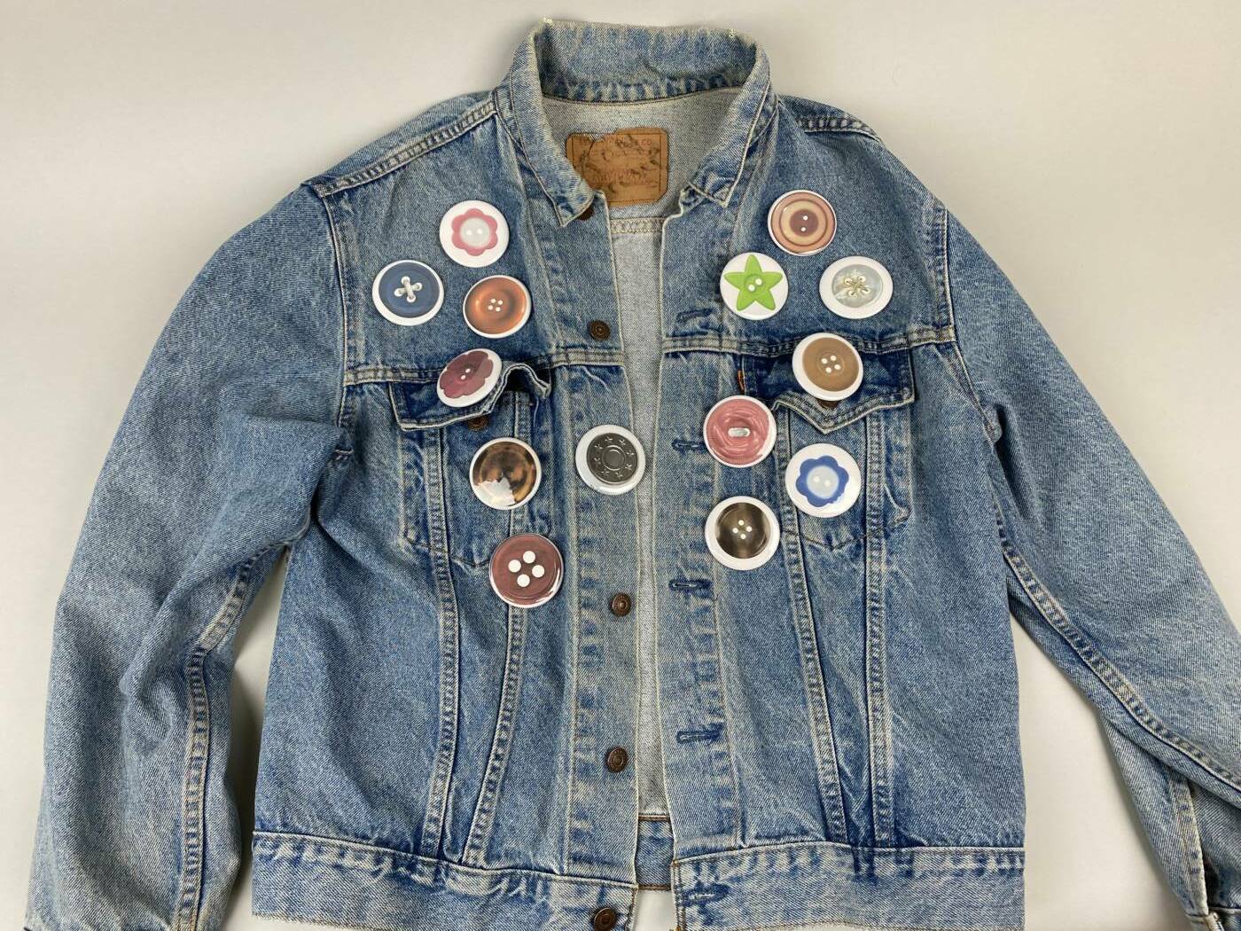
For my portrait I wanted to showcase my mother through her everyday outfits. My whole life my mom has been somewhat of a fashion icon to me as she has always unapologetically embraced her creativity through her clothes. The video includes ten second clips of her completing her everyday tasks in her classic “overdressed” look. She wears a vintage denim jacket with hand painted stars on it to make her coffee. She wears rooster printed silk pyjama pants and a chandelier necklace to work in the bakery, and a men’s Gucci jackets with an assortment of collected brooches to go to Costco, the list goes on. 

Audio Art

One Minute

One FEAT, Three ways

“Betrayal of Bags” Loop
“Hold My Bag” Sequence
“Where’s My Bag” One shot

Pipilotti Rist

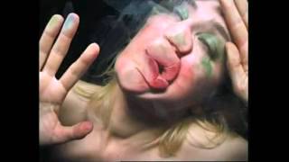
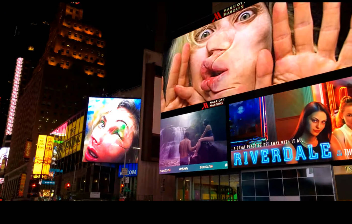
Be Nice to Me (Flatten 04) is a short video by Pipilotti Rist of herself performing by mushing and swiping her face across transparent glass. The video is framed up close and as though the glass is the screen you are viewing the video on, as though she wants to jump through. The bright green eyeshadow and the red lipstick accentuates the rough motion of rubbing her face across the glass and creates messy streaking which also acts as a record of her movements. The installation hinges its own significance as the video was projected in Times Square, which invites thousands of viewers to experience the intimate and striking performance. The absence of sound allows the viewer to be fully visually involved with the piece. This may have also been done to portray a theme of being stuck behind the glass so we would not hear her. 

Rist’s video art is created with a deliberate artistic intent, often challenging societal norms and expectations. While TikTok and YouTube host a wide array of content, ranging from entertainment to personal vlogs, they often lack the same level of artistic depth and conceptual exploration that characterizes Rist’s work. Rist’s performances and video installations are typically situated in galleries or museums, providing a distinct contextual setting that encourages a deeper, contemplative engagement. Rist’s work frequently delves into themes related to women’s bodies, sexuality, and gender dynamics. She has a knack for subverting traditional representations of women in media, offering empowering and unconventional portrayals. This differs from the often superficial or stereotypical depictions of women’s bodies and sexuality that can be found on social media platforms. Rist’s exploration of these themes is rooted in artistic expression and challenging societal norms. In her performances and videos, Rist often exposes herself both physically and emotionally, inviting viewers to confront notions of vulnerability and intimacy. This is a stark contrast to the curated and often polished images and personas prevalent on social media, where individuals may present idealized versions of themselves. Rist’s willingness to behave strangely or subversively challenges viewers to consider their own discomfort with raw and unfiltered experiences.

Kilometre

For my kilometre, I recorded one kilometre of wind and cloud movement. I was able to get an accurate measurement of one kilometre by looking at my location’s wind gust speed through the weather app on my phone. I recorded multiple days at different times but it was overcast and mildly windy upon every attempt. Initially, I was disappointed as I thought a bright blue sky with crisp white clouds would better achieve what I had in mind. After reviewing my footage, It was to my surprise that the overcast sky created a slightly ominous continuous flow which I found to be more intriguing. The mild winds moved the clouds at 15 km per hour, so I was able to capture one kilometre in a four-minute, uninterrupted video. I initially reduced the video to one minute but decided to keep it at four as it keeps the genuinity of the measurement. The four-minute-long video also allows the viewer to slow down and imagine they are lying in a field, watching live.

Marina Abramovic “The Artist is Present”

My first impression of Marina Abramovic was shock at the degree of pain she was willing to put herself through for a performance. The act of repeatedly whipping herself on the back or running repeatedly into a wall naked was uncomfortable and hard to watch. I admire her commitment to constantly pushing herself beyond her limits and defying the odds of what performance art is. I believe that what is admirable about her art is the problematic aspects of the work. Many would agree that injuring yourself is too far yet it is what has built the level of intrigue surrounding her. 

I have learned that performance art is far from acting. Within the film, Abramovic states “When you perform it is a knife and your blood, when you act it is a fake knife and ketchup.”. By this, she means to perform is to genuinely experience. Her manifest states that an artist should not lie, compromise or steal the works of others, as that would no longer be performing. By performing, the audience is able to connect with the work in a way one could never witness acting. Within her work “Rhythm 0” she allows the audience to do anything to her, whether that be hitting, screaming at or even firing at her. By conducting this performance she is able to test her own limits and test the audience as well. 

Performance art requires the response of a live audience. Performance art is not something that can be owned and hung up on a wall the way we do with paintings. Abramovic’s work came with the challenges of needing multiple performers specifically trained and willing to endure long physically intensive performances as long as the exhibit was open in the gallery. The 3-month long MoMa exhibit “The Artist is Present” requires months of planning including training retreats attended by Abramovic’s performers as well as a team of directors from the museum who needed to manage the large audience that would come in to witness the exhibit. They also had to make complex security arrangements as the viewers would be able to get up close to the Marina and could touch the other performers. I believe these compromises added to the final work as the viewers were able to get the personal one-on-one experience while the show remained safe and cohesive.

Kaitlin

Artist Buttons

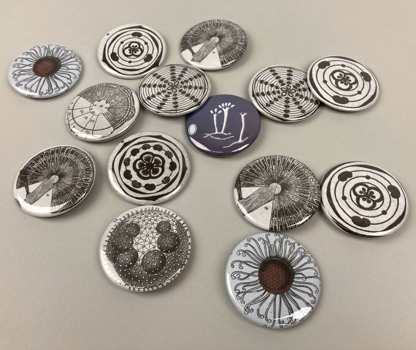
Antique Scientific Illustrations

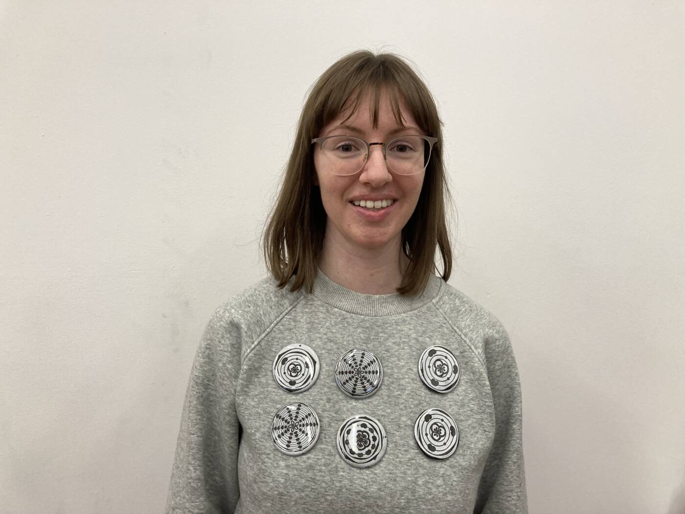
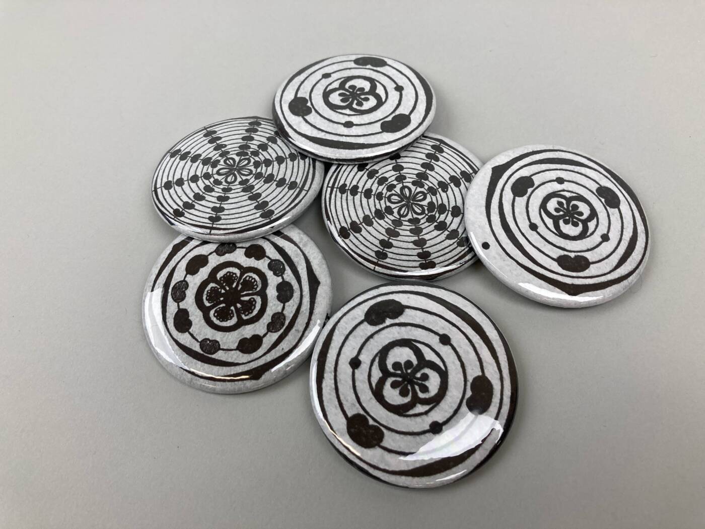
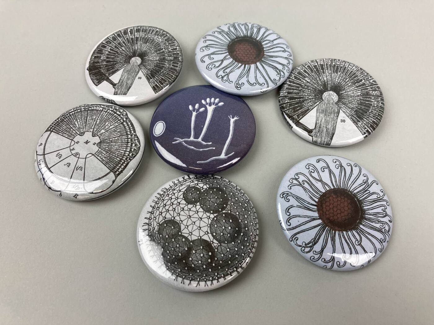
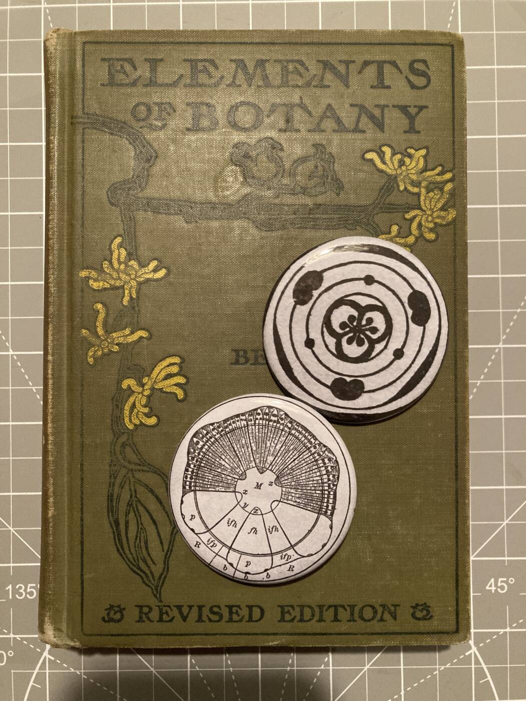
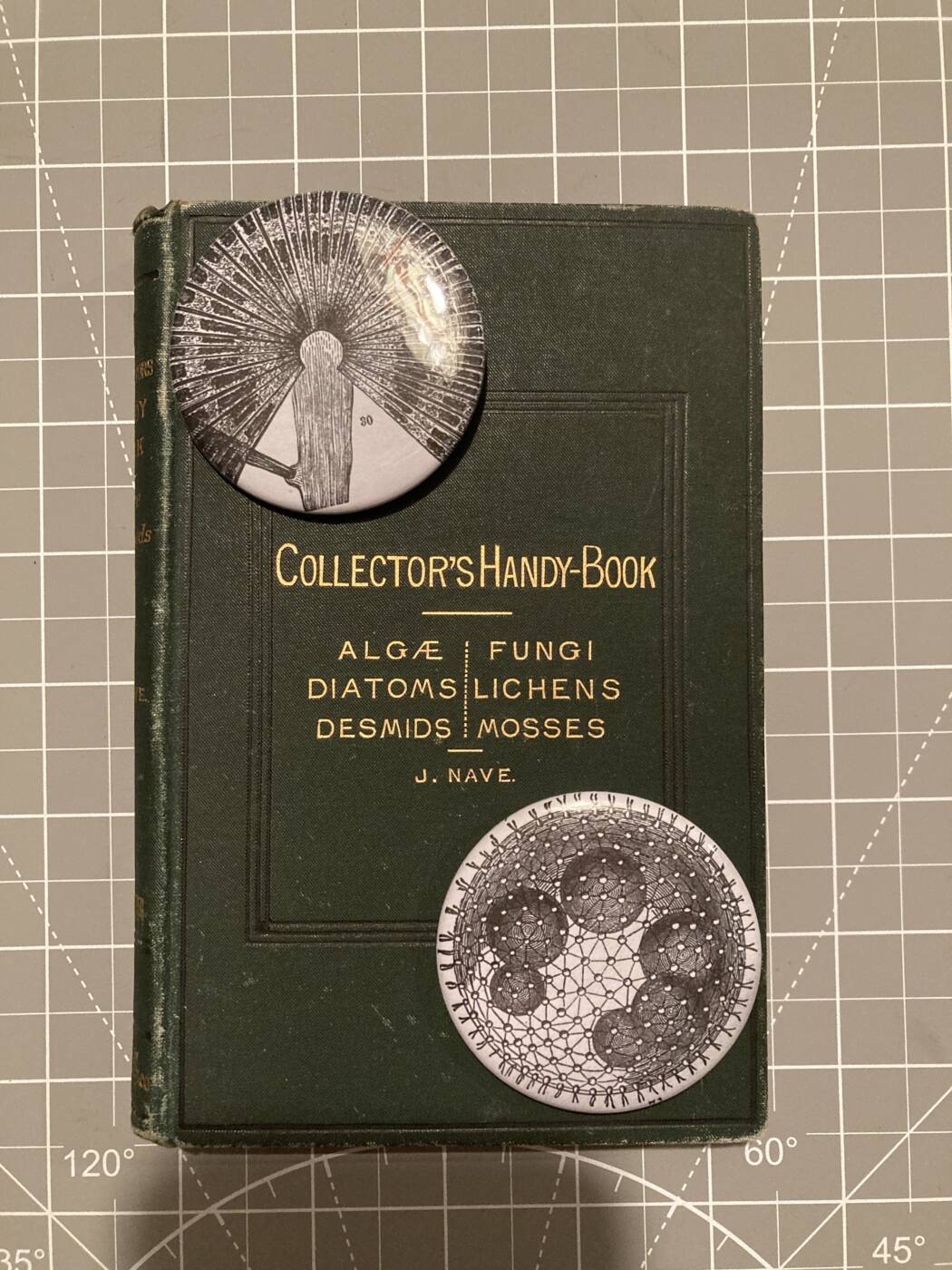
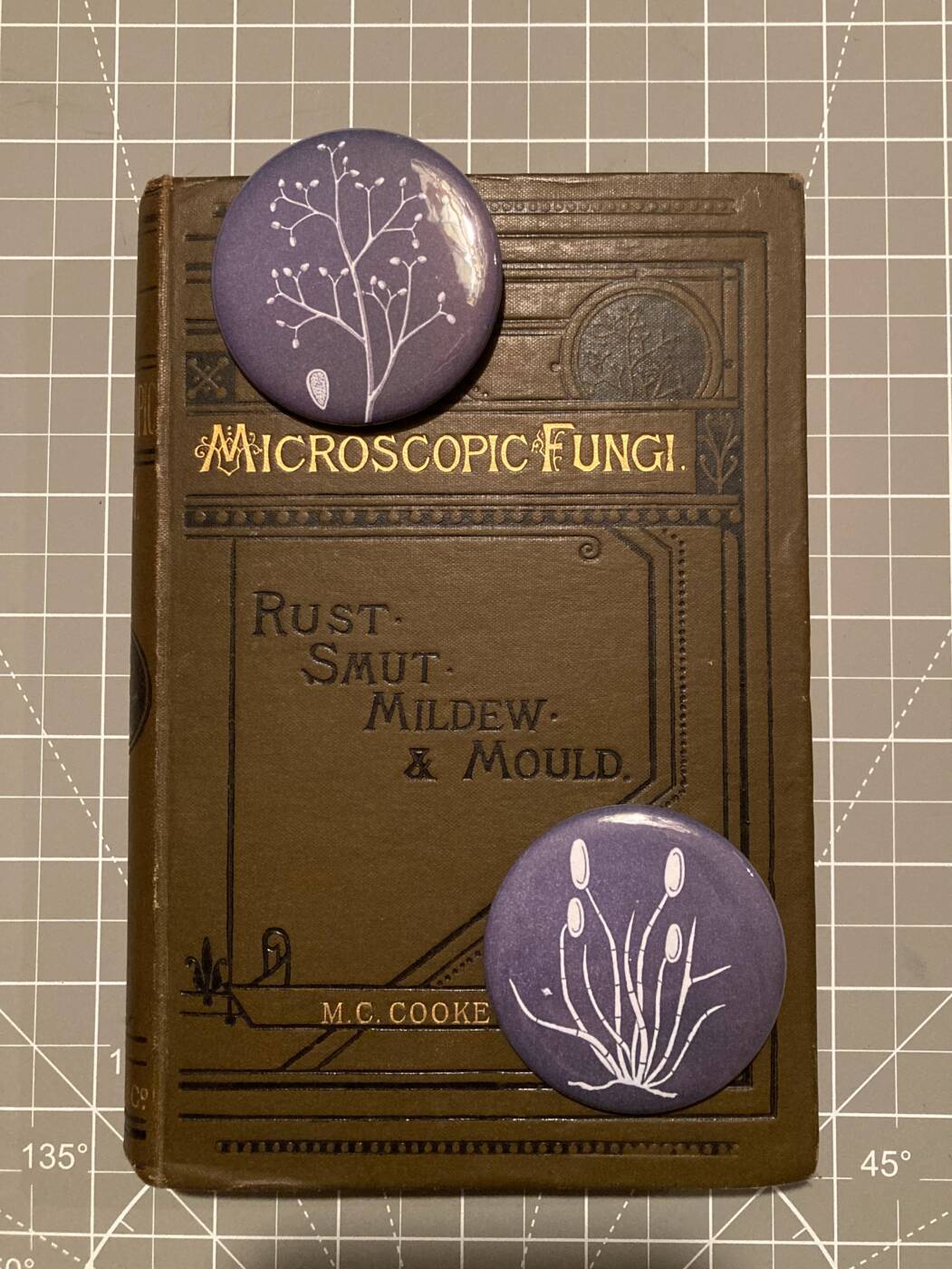
I have a small collection of antique books and I decided to make buttons out of the illustrations in them. I absolutely love the style of old scientific illustrations and I wanted to share them with others. These images have been hidden away in books for over 100 years and now they are back out in the public eye. By putting these illustrations on buttons I intentionally divorced them from accompanying text. In this way, they can be seen as art in their own right, not just supporting visual aids. Without the text to assign meaning to them, the illustrations become open to interpretation. People of different experiences may view them differently. The imagination is free to see whatever it wants.

However, for anyone interested in their original purpose, the illustrations include magnifications of a cell, a germinating spore, algae and mold. Other images depict a cross section of a plant stem and a diagrams of petal and sepal arrangement in flowers.

Portrait of a Research Technician’s Mind

350,000 Insects

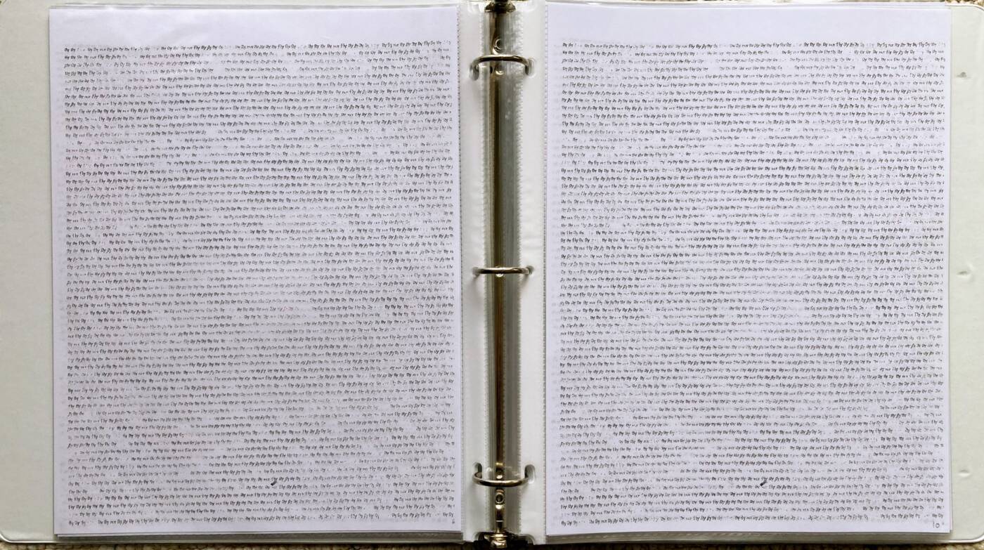
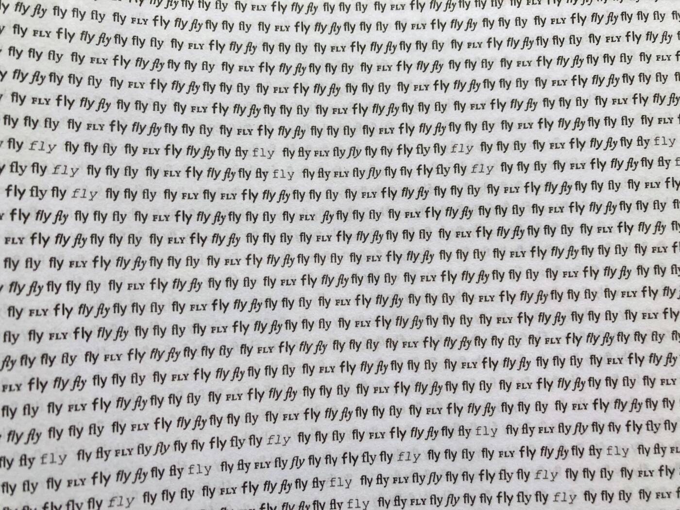
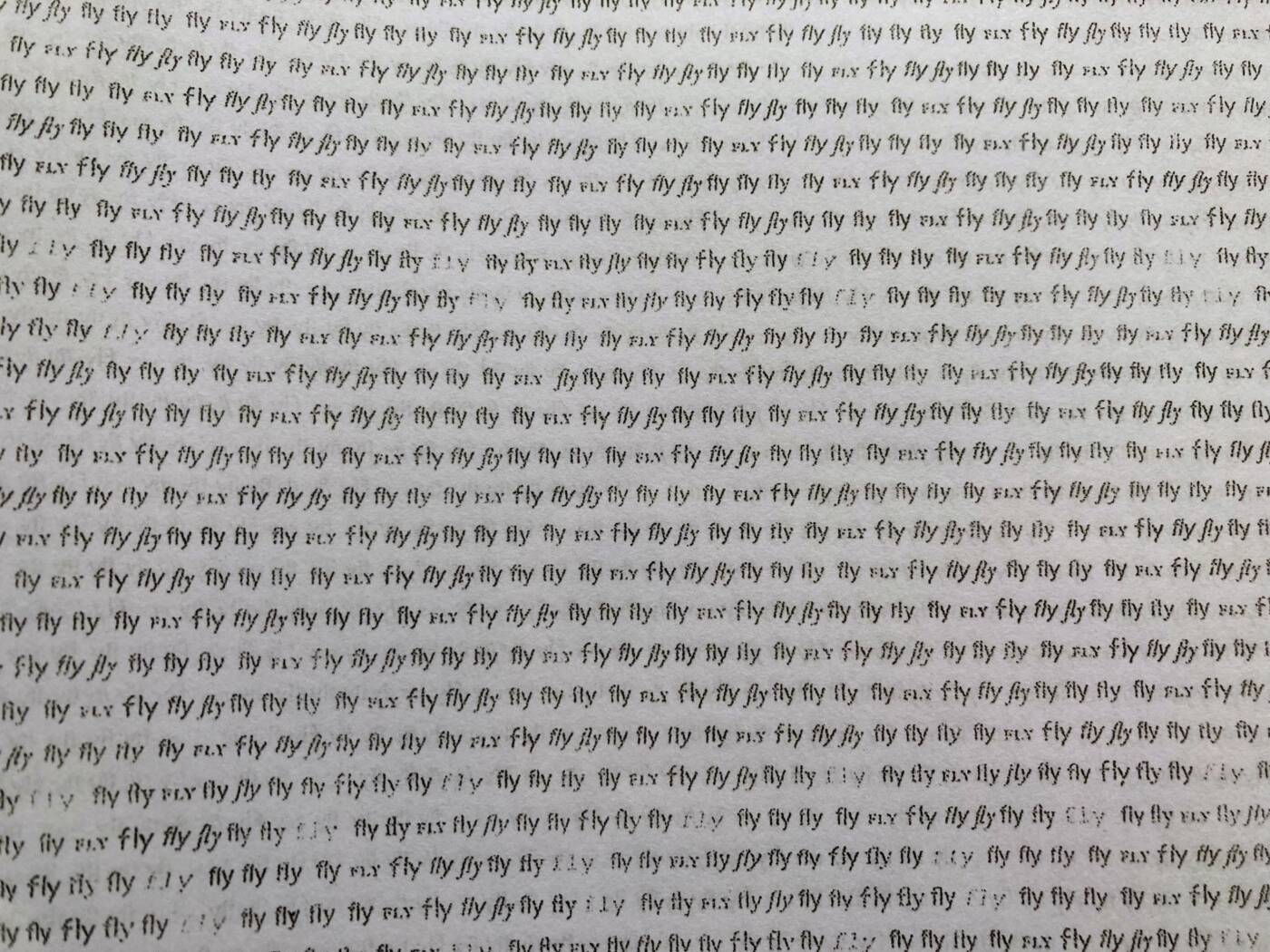
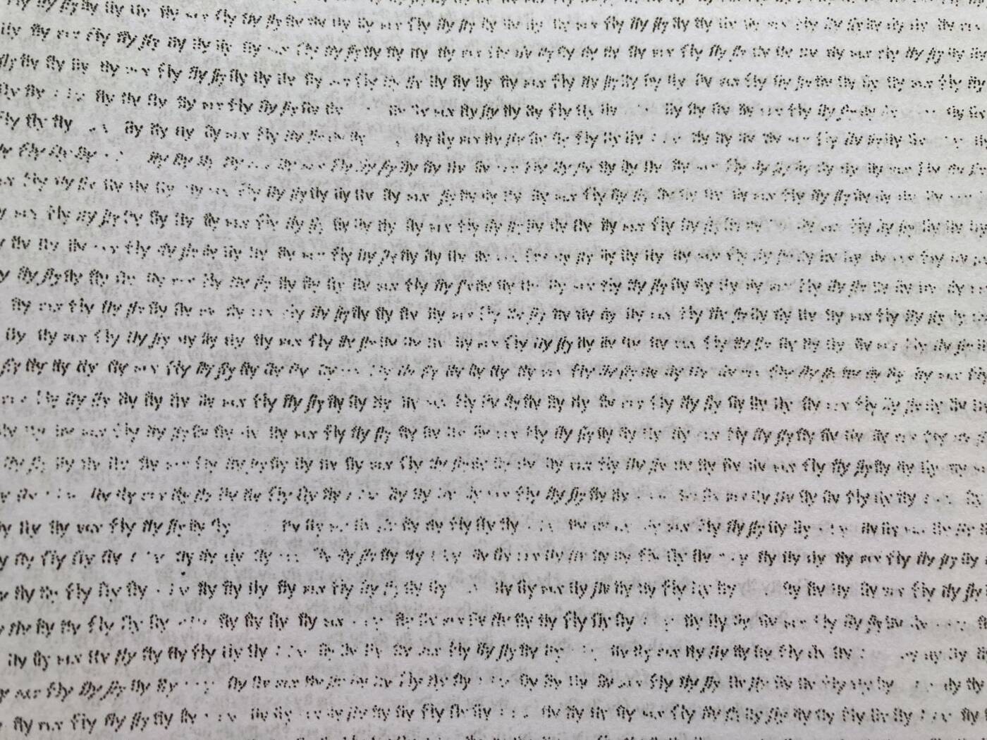
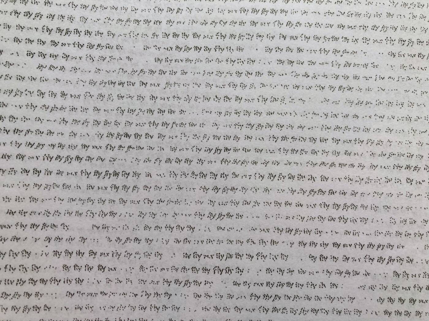
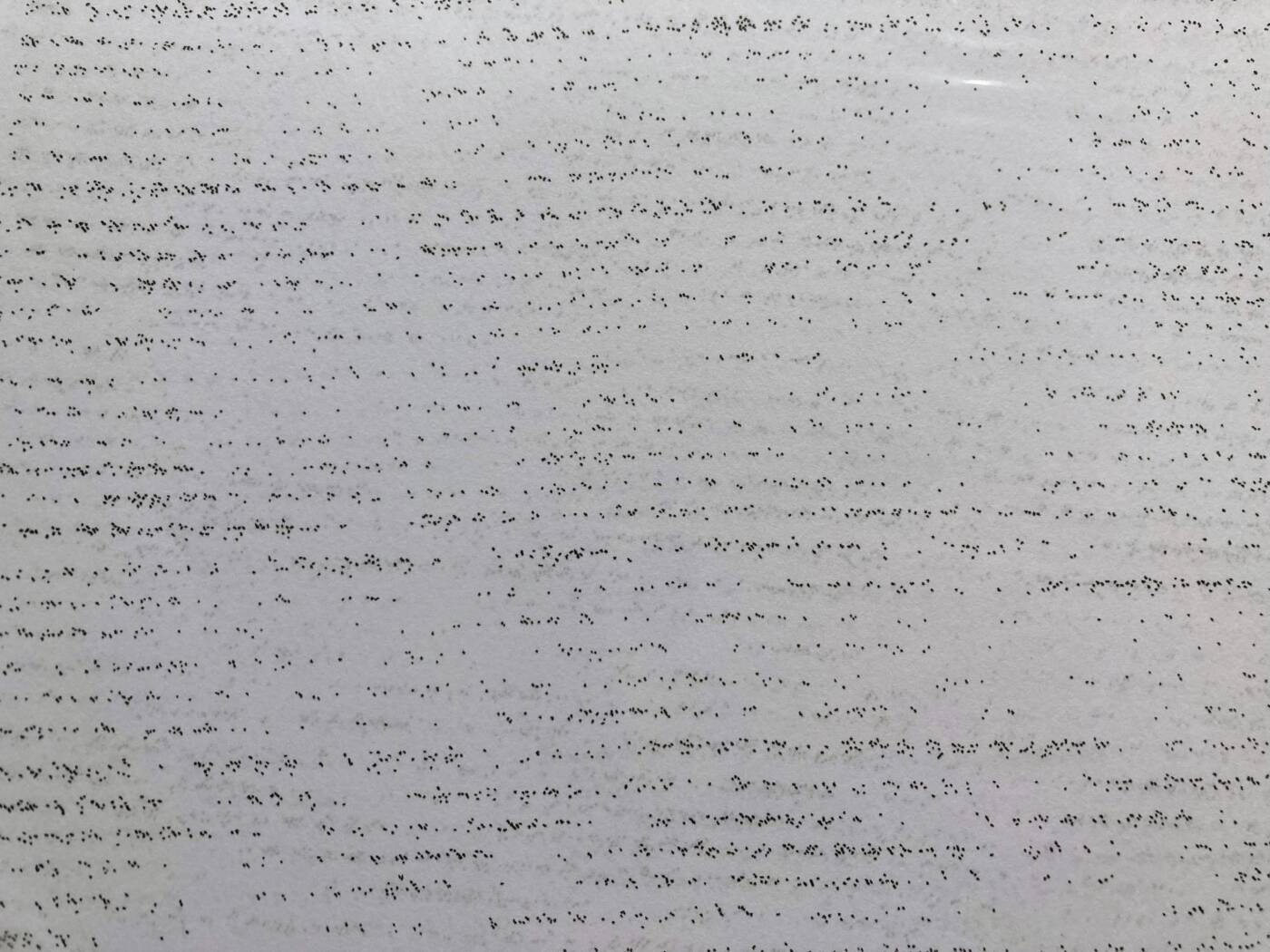
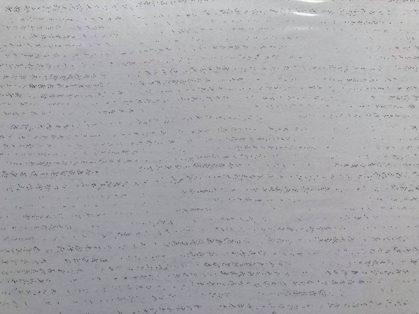
For this project, I wanted to showcase the rigour of scientific endeavour and the opportunity for human error. As a research technician, I sorted and processed over 350,000 insects over the course of 3 years. This work was very repetitive and demanded intense focus. The limits of my attention span and ability to sit still made this work quite tiresome. This inevitably leads to errors being made. To represent the gradual loss of interest and focus that comes with repetitive work, I photocopied the same document over and over again to reduce its resolution. For example, I started with the original document and copied it to make page 2. Then, I copied page 2 to make page 3, page 3 to make page 4 and so on. The greater the quantity of pages made, the lower the quality. The original page featured the word “fly” repeated over and over in different fonts and in a small font size. This mimics the view of the research technician as they look through the microscope at a petri dish containing hundreds to thousands of bugs, most of which are flies. This can be quite jarring to stare at for a prolonged period of time. The limits of the human condition make us prone to error. This is why validation and multiple levels of record checking are so critical in the field of science, where a high level of accuracy is paramount.

Audio Art

The Sound of Silents: 10 Silent Film Climaxes

  • 0:00 The General (1926)
  • 0:07 The Kid (1921)
  • 0:21 Nosferatu (1922)
  • 0:35 A Trip to the Moon (1902)
  • 0:42 The Cabinet of Dr. Caligari (1920)
  • 0:53 Battleship Potemkin (1925)
  • 1:02 The Man Who Laughs (1928)
  • 1:11 Sparrows (1926)
  • 1:23 Metropolis (1927)
  • 1:32 Pandora’s Box (1929)

I have always been impressed by the creativity undertaken in silent films. Since they must tell a story under the constraints of having no audible dialogue or background noise, the visuals are pushed to their most creative limits, having a lasting impact on the audience. An accompanying musical score is also heavily relied upon to convey emotion and captivate viewers. As a result, silent films are far from silent. I have made a list of 10 classic silent films and taken a short segment of audio from the most suspenseful moments of each of them. This celebrates moments of loudness in silent films.

One Feat, Three Ways video project

Kaitlin and Mariah

For this project, my partner and I chose to test the limits of flowers. Flowers are a common motif in art and have come to symbolize beauty, nature, femininity and the ephemeral quality of life. As a result, flowers are seen as delicate things that should be handled with great care. We wanted to contrast this notion by experimenting with different actions that destroy flowers. These actions include trimming, tying and plucking. The gradual destruction of these quality, store-bought flowers creates an uncomfortable tension as something beautiful is deliberately destroyed.

Just A Trim (The One-Shot)

Hand-Tied Bouquet (The Sequence)

Pluck (The Loop)

Pipilotti Rist: The World’s Most Colourful Video Artist

1. The image above is of a video installation by Rist titled “Worry Will Vanish Horizon”. The camera slowly swirls and pans across extreme close-ups of the human body. Images of leaves and nature are overlapped with images of the body. The colours are heightened and shifted creating a kaleidoscopic effect. Patterns in leaf venation, blood vessels, finger prints and tree branches can be seen. There are no abrupt changes in the frame. All images transition in and out softly and the overall experience feels like one continuous scene. The video is shot with a small camera attached to the end of a boom. The sound that plays in the background is soft and relaxing. I can hear the strumming of an acoustic guitar as well as some electronic sound effects. This music complements the video by matching its slower pace and enhancing the meditative effect of the experience. The video is 3D projected onto the walls of the gallery. Patron’s shadows are cast on the walls as they move through the space. Visitors are also asked to remove their shoes before they enter the exhibit. There are fluffy duvets on the floor for lounging. All of this aims to further relax and engage the viewer by making them feel comfortable and invited. The projection fills the space and creates an immersive experience. This work strikes me as soothing, warm, meditative and full of an appreciation for life. It feels like a celebration of the wonders of nature, including the human body – how intricate and complex it is.

2. I think there is a strong contrast between Rist’s videos and those on YouTube or TikTok. Videos on social media aim to grab the viewer’s attention immediately and tend to be loud, fast-paced and superficial. Meanwhile Rist’s videos require a longer attention span as they are usually quieter, slower and a meditation on deeper issues. Additionally, social media tends to feature filtered/airbrushed depictions of people (especially women). These people put on their best face and show the highlights of their experience. Rist is more vulnerable and critiques these superficial values in her work. For example, in “Be Nice To Me (Flatten 04)” Rist smushes and smudges her make-up covered face into a clear piece of glass in front of the camera. Her face is pulled into unflattering contortions and her lipstick and eye shadow is rubbed all over the glass and across her face. This is the kind of video I would never see trending on social media as it shows a women spoiling her make-up and behaving strangely or “unlady-like”.

3. I turned my jacket inside-out and walked around campus between classes. I was definitely uncomfortable walking around this way. It was obvious that my jacket was on the wrong way due to the visibility of tags, seems and interior pockets. I felt like people would think I was completely confused or oblivious. However, I did not notice any strange stares (perhaps they were going on behind my back). I think most people are so busy thinking about their own concerns that they probably did not notice. The campus was very busy and I was trying not to stand out. I feel this experiment had a much greater impact on myself than it did an anyone else. For that reason, I did not find this to be a performance. Perhaps, if I tried to directly engage with people while wearing a jacket this way it would have gotten a bigger reaction.

A Kilometre in Calories

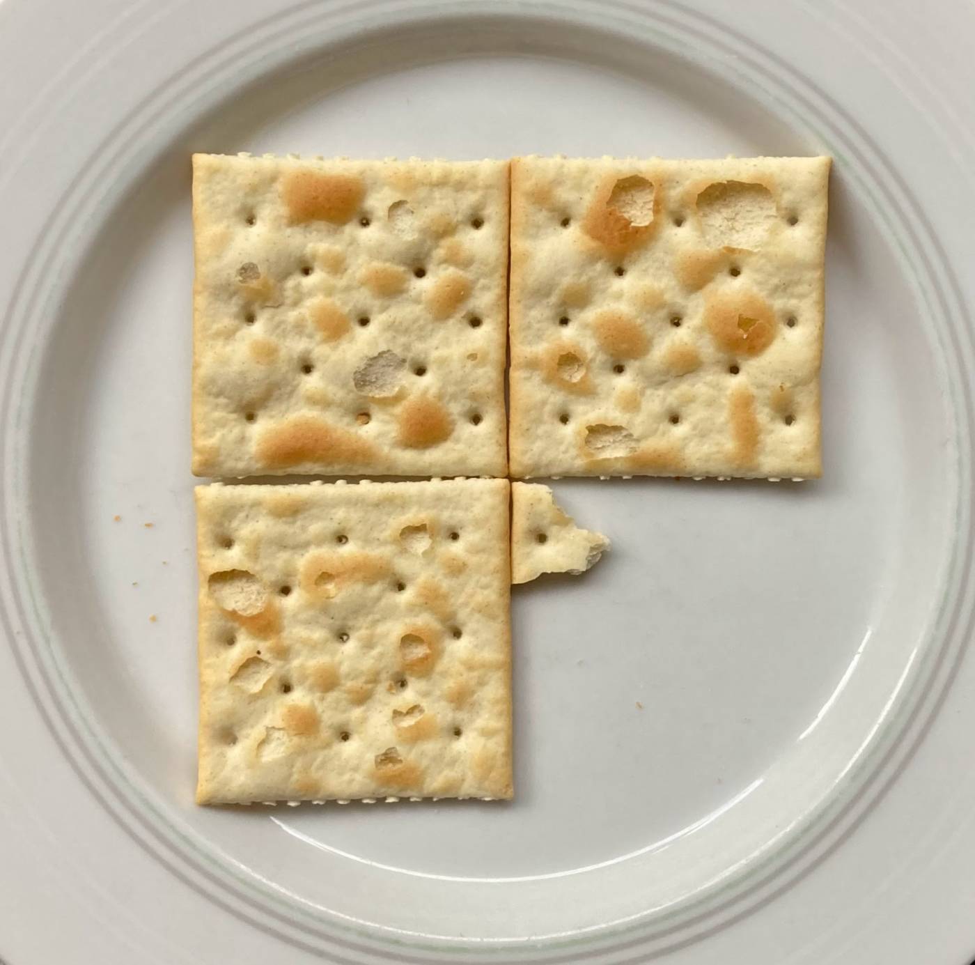
I chose to represent a kilometre in the form of crackers. These 3 (and a bit) crackers contain 41 calories. This is the exact amount of energy I used to walk 1 km along a forested trail last weekend. I felt it would be interesting to visualize a kilometre in terms other than length. Walking a kilometre allowed me to experience the physical effort it requires of myself to travel this distance. To see the small amount of food that fuelled this walk was surprising to me. It has made me appreciate how energy efficient the human body is – how far it gets on seemingly so little. Additionally, it has illustrated the importance physical activity to offset some of the unhealthier, calorie-rich food I enjoy from time to time.

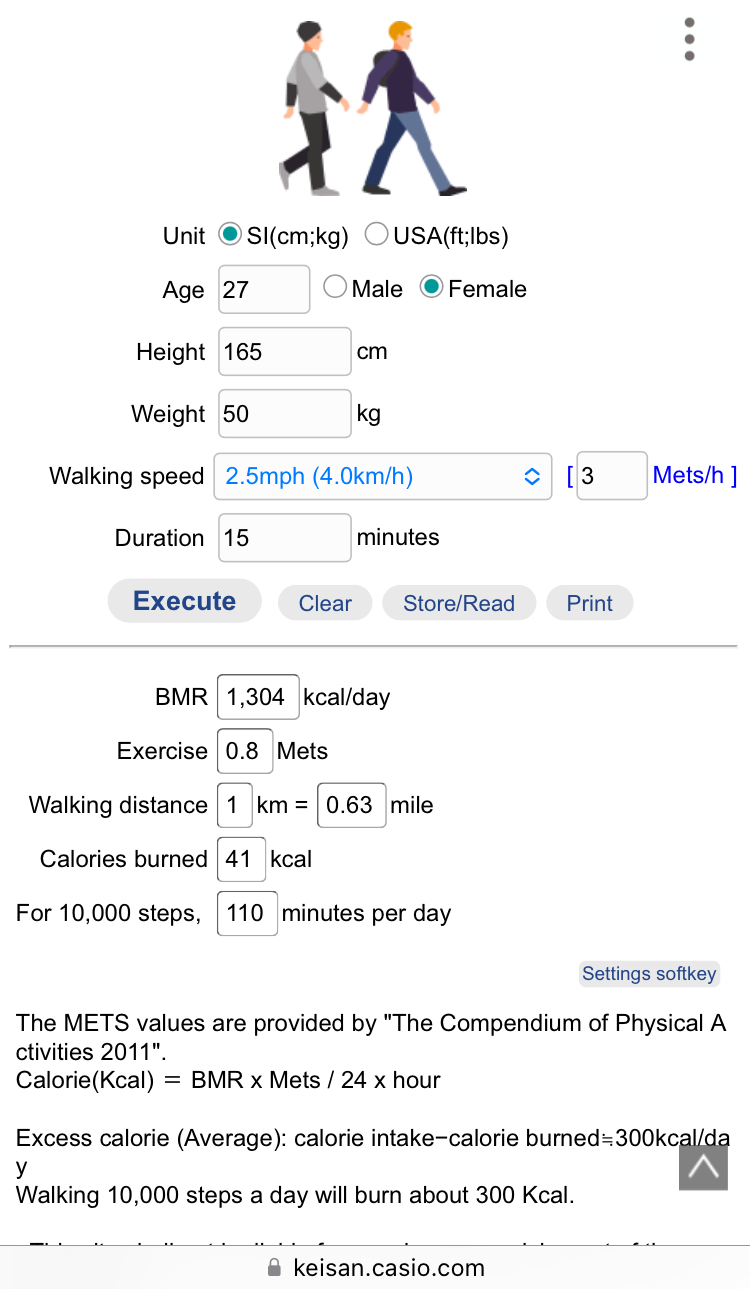
I used the Health app on my phone to measure my distance travelled to ensure my walk was exactly 1 km. I also timed my walk and found it look me 15 minutes to walk this distance. Then, I used an online calorie calculator found here to determine the amount of energy I used. It included factors such as my walking speed, my age, my weight and the duration of the walk. The final result of this calculation was 41 calories.

From https://keisan.casio.com/exec/system/1350891527

Marina Abramovic film

My first impressions of Marina’s works are that they are bold, dangerous and emotionally powerful. She places a huge amount of trust in herself, her partner or her audience. In many of her performances she risks her health, safety and even her life. I admire Marina’s courage and stamina. Her performances demand a tremendous amount of bravery as she pushes her limits. She leaves herself vulnerable, opening herself up to a wide array of experiences and deep emotions. The amount of physical and mental strength she utilizes to pull off these feats astounds me. I do find it uncomfortable that she could lose her life with the performances she does, such as in the work below. In the film, her ex husband mentions how she is in love with life. Therefore, her art risks destroying that which she loves most. However, this could be the very element that makes her art so compelling.

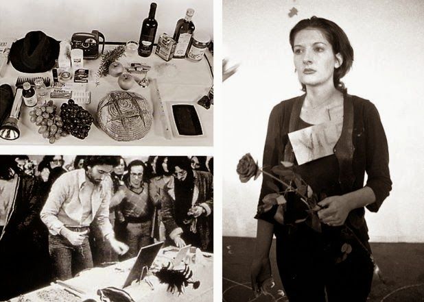
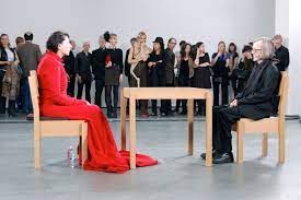
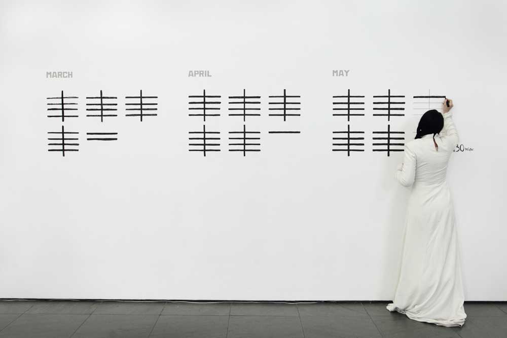
Marina’s work has demonstrated to me that performance art requires commitment, complete awareness of the present moment and vulnerability. In her exhibition “The Artist is Present” (photos below) she deeply committed herself to the 3 month time frame despite the pain and other challenges it posed to her. She showed up day after day for months and succeeded in her initial intention for the work. Existing in the present moment is also key during performance art. Marina gave each of her sitters her undivided attention and direct gaze, causing them to give her the same in return. This deep connection between artist and audience heightened the emotional impact of the performance. Finally, vulnerability plays an important role. Two months into her performance piece Marina had the table between her and the guest sitter removed, eliminating a physical buffer. This made the encounters completely direct with no barrier to protect her from the unpredictable actions of the strangers. For viewers and participants, this elevated the power of the performance.
Performance art resists numerous museum and commercial art conventions. It is ephemeral, lasting for only a brief period of time and may only occur once. There is no physical art object to hang on a wall or auction off. It might be shaped or changed by the interaction of an audience. I think some of the themes in Abramovic’s work are best conveyed by the medium of performance. She focuses on pushing her physical and mental limits and the acts she performs create quite a spectacle, especially live. I imagine that watching a video or looking at photos of her works does not compare to the experience of witnessing it in person. I feel that one of the challenges of performance art is it is not appreciated as art by the majority of the general public. This makes is challenging for these artists to be taken seriously. Abramovic explains how she is always questioned “How is this art?”. To navigate this frustration, she pushes herself to extremes in order to evoke stronger reactions from her audience. Perhaps, this is in the aim of trying to gain the public’s respect for performance art as a legitimate art form. I certainly feel she, as a performance artist, has done everything and then some to gain the medium the respect it deserves.

Ashley

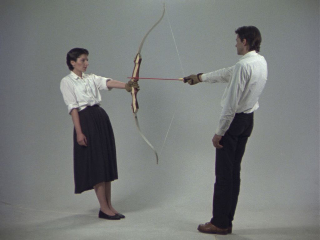
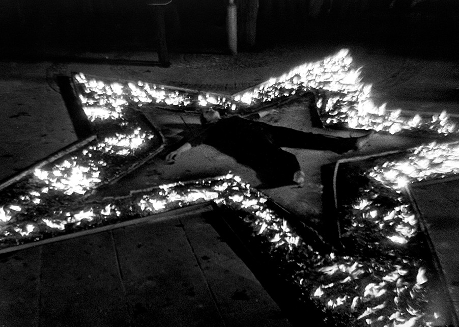
My first impression of Marina Abramovic’s work based on what we viewed in the documentary was that I would never be able to put myself in the vulnerable position that she does. Some of her work made me feel slightly uncomfortable, especially at the beginning of the documentary, but closer to the end what I felt was mostly admiration for the performers, including Abramovic, who were all so focused on the task at hand. I have researched some of her work in previous art classes, so it was interesting to see a more detailed, behind the scenes look at her creative process and her life. I admire how far she is willing to go for her work, and how dedicated she is to the whole process. Aspects I would say could be problematic are the danger in many of her artworks, like cutting herself in Lips of Thomas, standing in front of a bow in Rest Energy or suffocating from a lack of oxygen while surrounded by fire in Rhythm 5. I feel that new performance artists may believe that they must put themselves in similar situations, which could be very harmful. I don’t believe that being influenced by her work is a bad thing, just that if people see the risk as a standard to meet or overpass it may become problematic.

“When you perform it is a knife and your blood, when you act it is a fake knife and ketchup.

I have learned that performance art involves you as yourself, and that while you would have to turn on a performer personality, it is still you. Acting can absolutely have aspects of your life and personality involved, but you play a character and are not completely yourself. Acting also often involves elements of illusion like fake blood, and props, and actors usually have scripted lines and movements; the exception of course being improvised moments and ad-libbing. Performance doesn’t include the same barrier as acting does, there is no way of separating yourself from the work because it’s real. I felt as though we witnessed a transformation to an even more grounded and authentic experience in Abramovic’s The Artist Is Present with the eventual removal of the table between artist and participant, which made the following performances even more real.

Marina Abramovic works around the challenges of the museum and commercial conventions by performing in repetitive ways that stay consistent, while still allowing the element of time passing to be noticeable, which is not important in the same way with non-performance art. Especially with The Artist Is Present, the days completed were marked off clearly on one of the walls, and it was the same situation made unique by the audience’s individual experiences. In a way, I think the success of that particular performance can kind of undermine the work. Near the beginning of the exhibition, audiences seemed calm and less stressed to be apart of the performance, but at the end there was a feeling of desperation that it might be the last chance they get to be a part of the piece. However, you could say that the anticipation of the last few days and the audience’s reactions to them adds to the work as well, as it shows the impact it had on people.
Portraits in the presence of Marina Abramovic from “The Artist is Present” MoMA, New York 2010 Photo by Marco Anelli. © 2010 Marco Anelli

A Kilometer

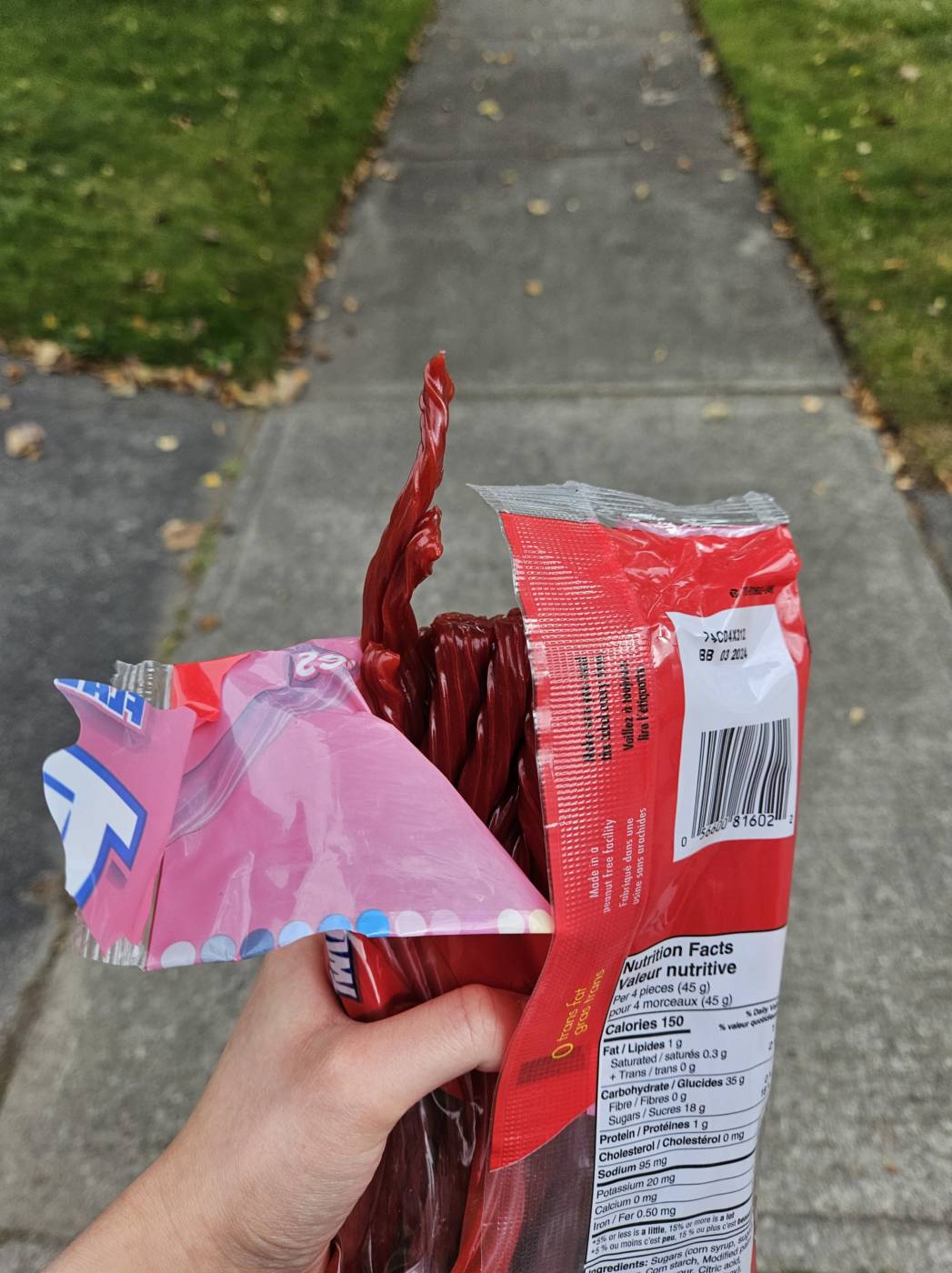
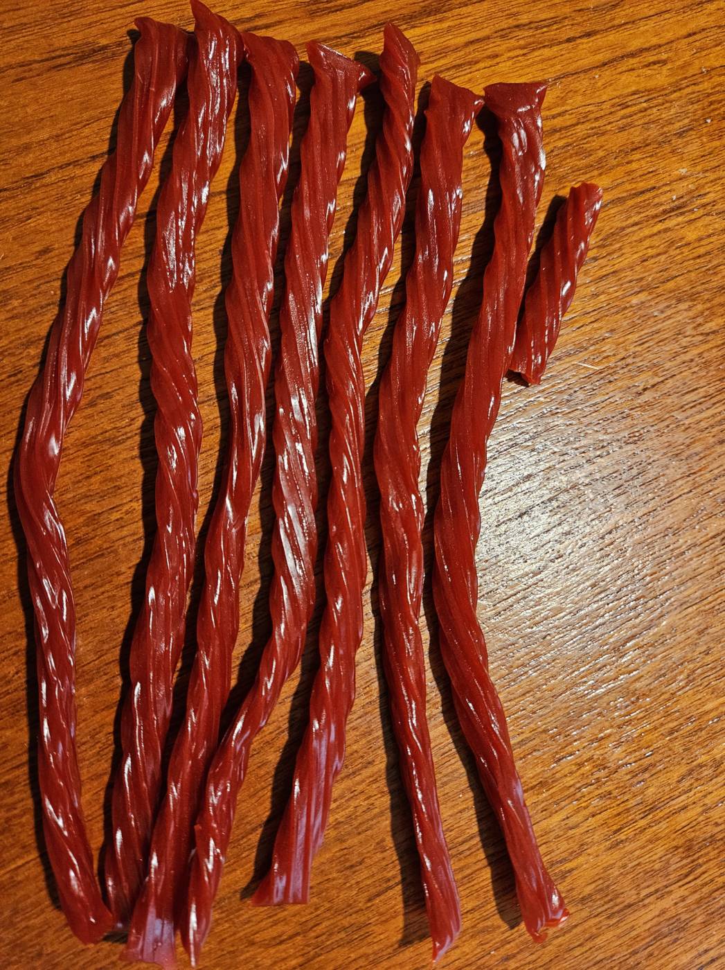
I continuously ate licorice on a kilometer long walk. During that time, I consumed seven Twizzlers and a quarter of one. Afterwards, there were thirty three Twizzlers left in the bag, so I could have walked roughly an additional 4.5 kilometers to finish the entire package. During this process, I was reminded of Halloween, collecting candy and wanting to snack on some while trick or treating, but having to wait to get home and sort it. It also made me think about the kinds of foods I’ve seen people carry and eat while walking, and what reactions I personally have had while witnessing that. I also thought about the kinds of food I had never seen anybody eating. Would it depend on where we were, their age, the time of year? I questioned what foods I would not pay much attention to, and which meals I would question, or be confused by.
Pipilotti Rist

Open My Glade (Flatten), 2000

This work’s scale is very large, and it surrounds viewers by using multiple screens. Although, given that that Times Square is always busy and people may not always look up and around at the screens all the time, it may blend in with the advertisements and commercials if people aren’t paying attention. The work strikes me because of the bright colours and closeness of the filming. I felt drawn into the video because of scale and the contrast of Rist’s face and the dark background she shot the video in front of, plus the brightness of the screen in contrast to the night. This work feels like she could break through the screens, and is a bit uncomfortable because of the intensity of her stare during a large part of the video and how large and close the scale of the display makes the work feel.

Rist’s works do feel familiar to me in the way some content is now. There is a decent amount of videos now that seek to get a reaction from their audience no matter what kind of reaction it is. There are also videos that seeks to inform people about issues they want to call attention to in a way that’s a bit less direct but still gets the point across. Rist’s works highlight what we think about women and how society thinks we should act or how we present ourselves. By smushing and smearing makeup, or having on a dress and skipping down the street smashing car windows, Rist creates a contrast between expectations and the reality of what we see in her videos, generating surprise from viewers.

Putting my shirt inside out did feel strange and uncomfortable, but I don’t think anyone actually noticed. I didn’t get any strange looks at all. This can be a performance, even if no one saw, as it was done intentionally instead of by accident, and it was a personal performance. This taught me a lot about how much people actually notice when they’re busy and focused on their own lives.

One feat, three ways

One feat, three ways

For this video, we were originally going to use regular sized spoons, but when the bigger one was bought for the sequence, we knew using giant cutlery would make our task more difficult and the video more frustrating or painful to watch. I feel as if having us both lined up in the center of the frame looks better, and gives viewers more to think about than it would’ve if we had faced each other, so I’m glad that we chose to do to that way.

Sequence

In this video, we thought about different kinds of relationship dynamics and the ways that they could be shown through feeding someone. All the shots have us in physically different positions, and I feel as if this is a way to really define each one as their own, and adds interest.

Loop

This video took the longest to come up with because it was difficult for us to figure out what kind of action would work well in a looped format, as our other ideas involved more objects. We shot this video three times in full (not including a few where we learned how gently we would need to chew to stop it from breaking prematurely) to try to figure out how close we should get before biting and stepping away. This was the closest of those options.

Audio Art: is this what you want to say?

For this project, I used autosuggest and read out a small section. While typing this out on my notes app, I chose to tap the suggested words in different patterns, for example: only using the first key for a portion of time, and then all three from left to right, twice on the middle key and then once on the side keys, etc. During recording, I found three different areas of the text that I felt would work the best- some sections had mainly filler words and emojis, or the same phrase repeated many times over, and were not considered. I read for about 10 minutes to give myself multiples takes to choose from, and then found the best one for each of the three sections. During this entire process, I was curious about mainly two things: if the text made any kind of sense, and whether I recognized words or phrases I use often. I found that most of what I did recognize came from a note in my notes app where I write any dreams I remember after waking up, which I feel makes a lot of sense.

Ideas for conceptual portrait:

My first idea was to just take a picture of my corkboard and whiteboard (they’re attached) just as they are, because there are a lot of things on there that I feel would give a good idea of who I am. Another idea around this particular object was to take the items off of it and display them physically in some way.

Another idea was to do an audio project of sounds around my house – though that would potentially feel more like a conceptual family portrait (is that allowed??) rather than an individual one. The noises could be anything, but my main ideas were ambience, the sounds that different doors make, stairs creaking, sounds various objects make when tapped, or more electronic noises (different keyboards, light switches, oven buttons, washing machine, etc.)

Could do a portrait of vision, take all the pairs of (prescription) glasses I’ve worn and arrange them in a sculptural way? Could have interesting ideas around point of view and whatnot.

Birthday cards- been keeping birthday cards for a while, could do all of them or a select few and either take photos or do a sculpture with them. What can you learn about me from them?

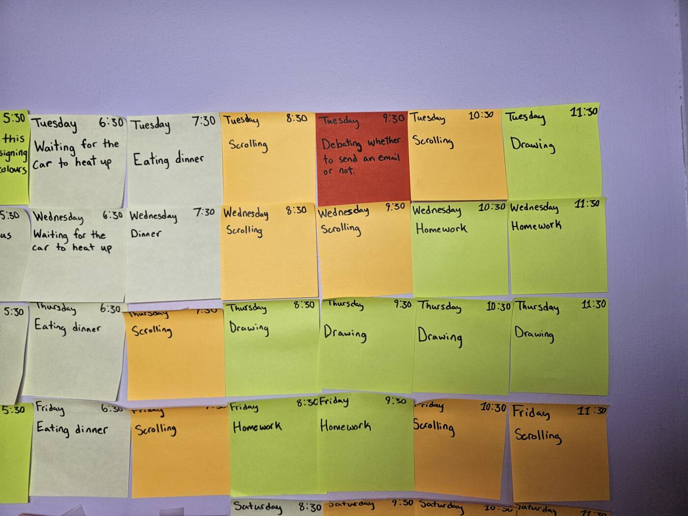
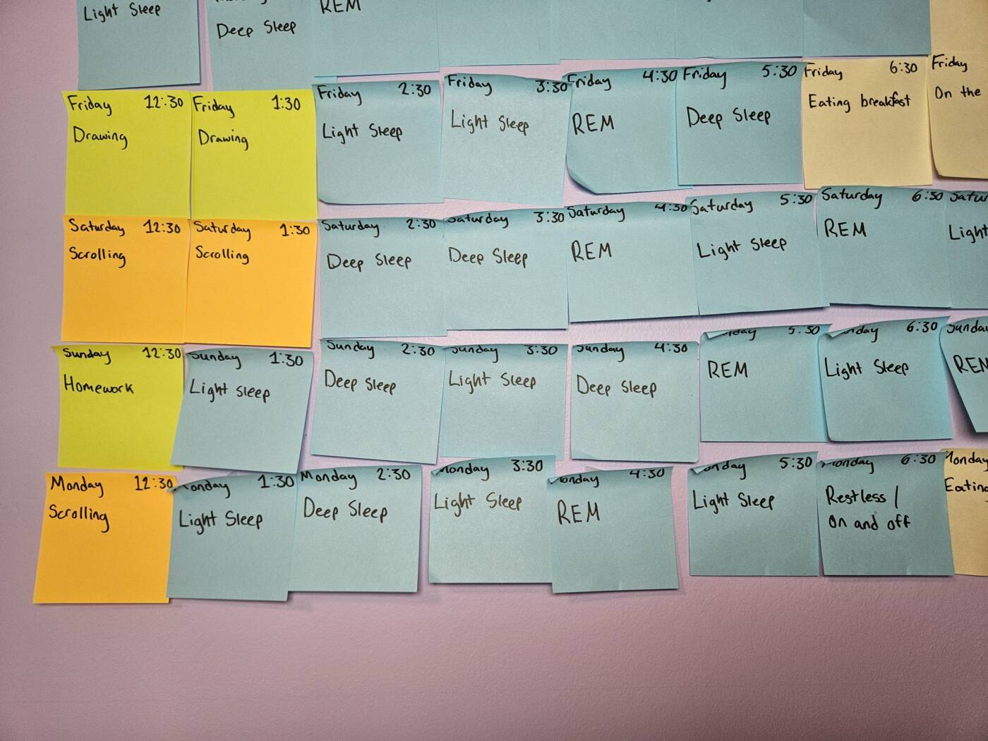
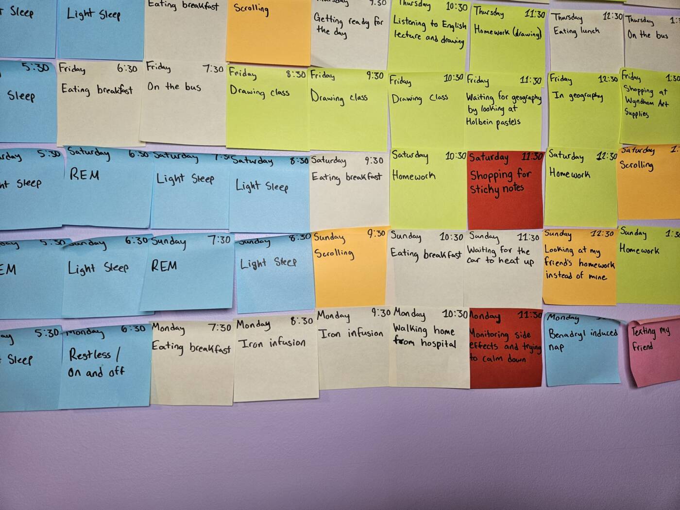
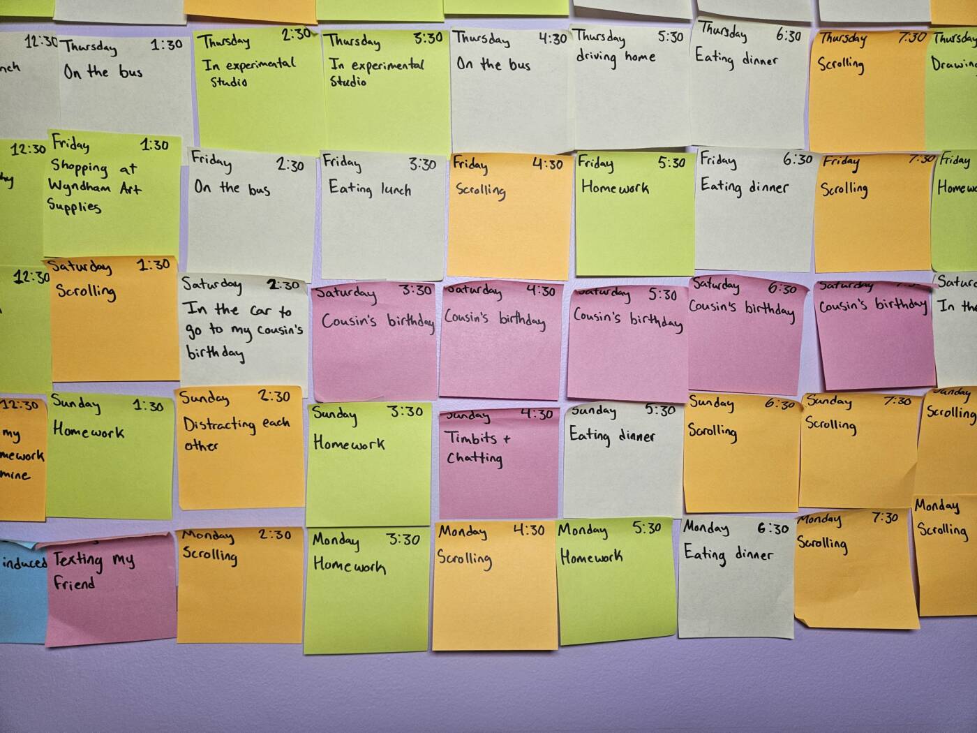
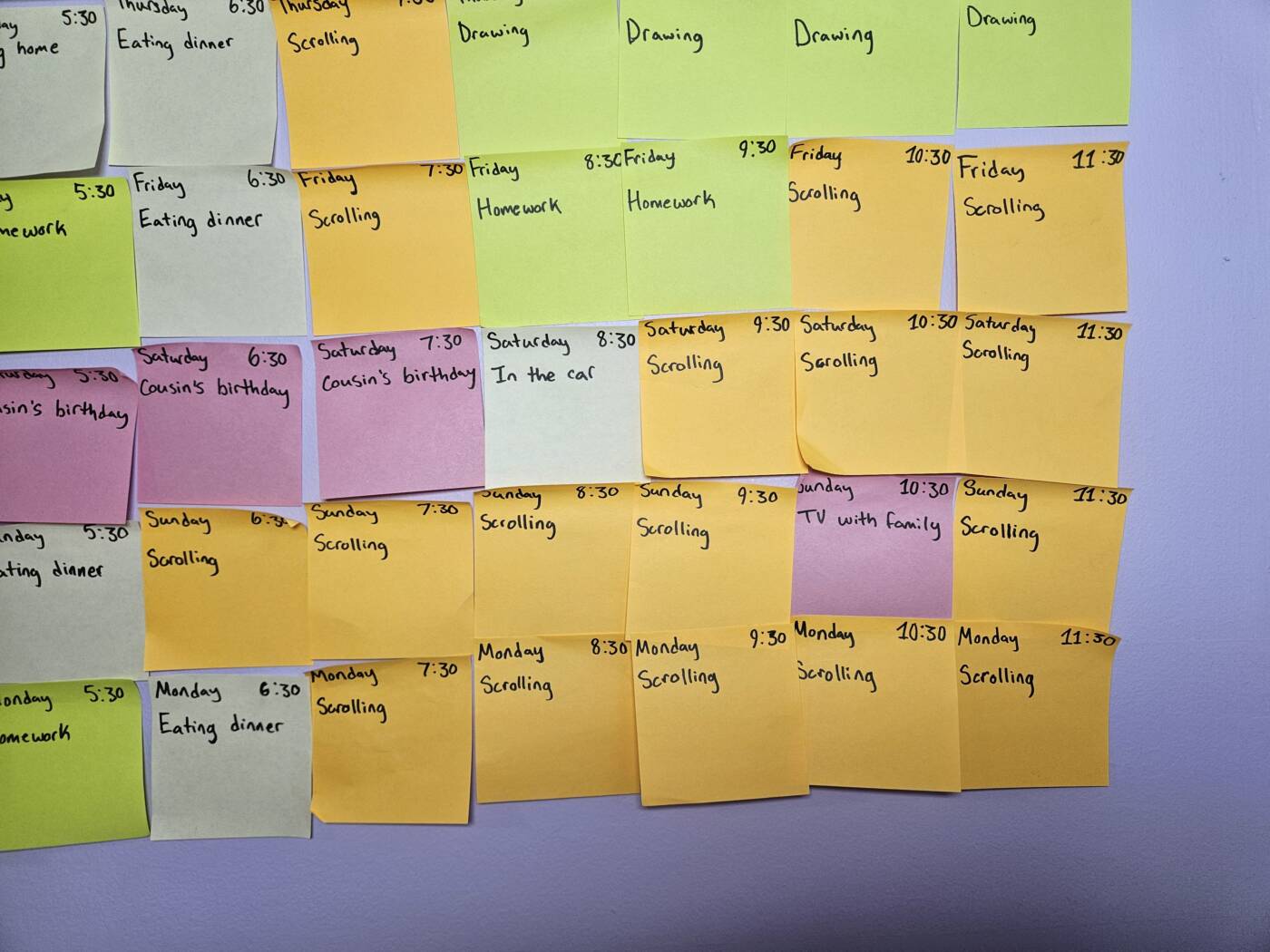
Conceptual Portrait: Elements of an almost-week

Tuesday, Wednesday, Thursday

Friday, Saturday

Sunday, Monday

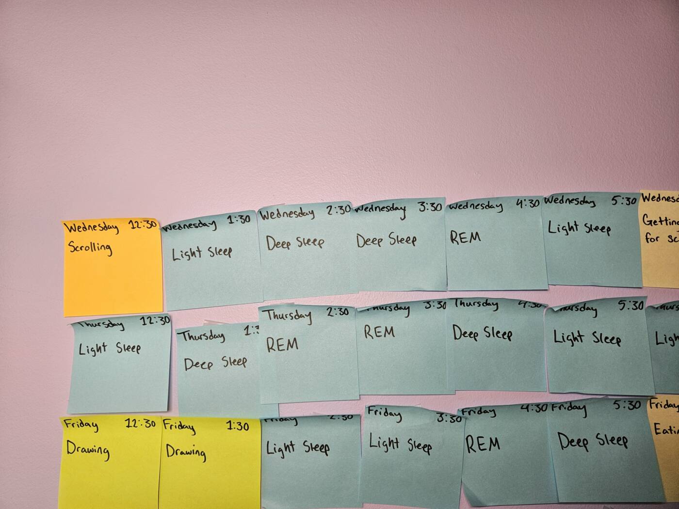
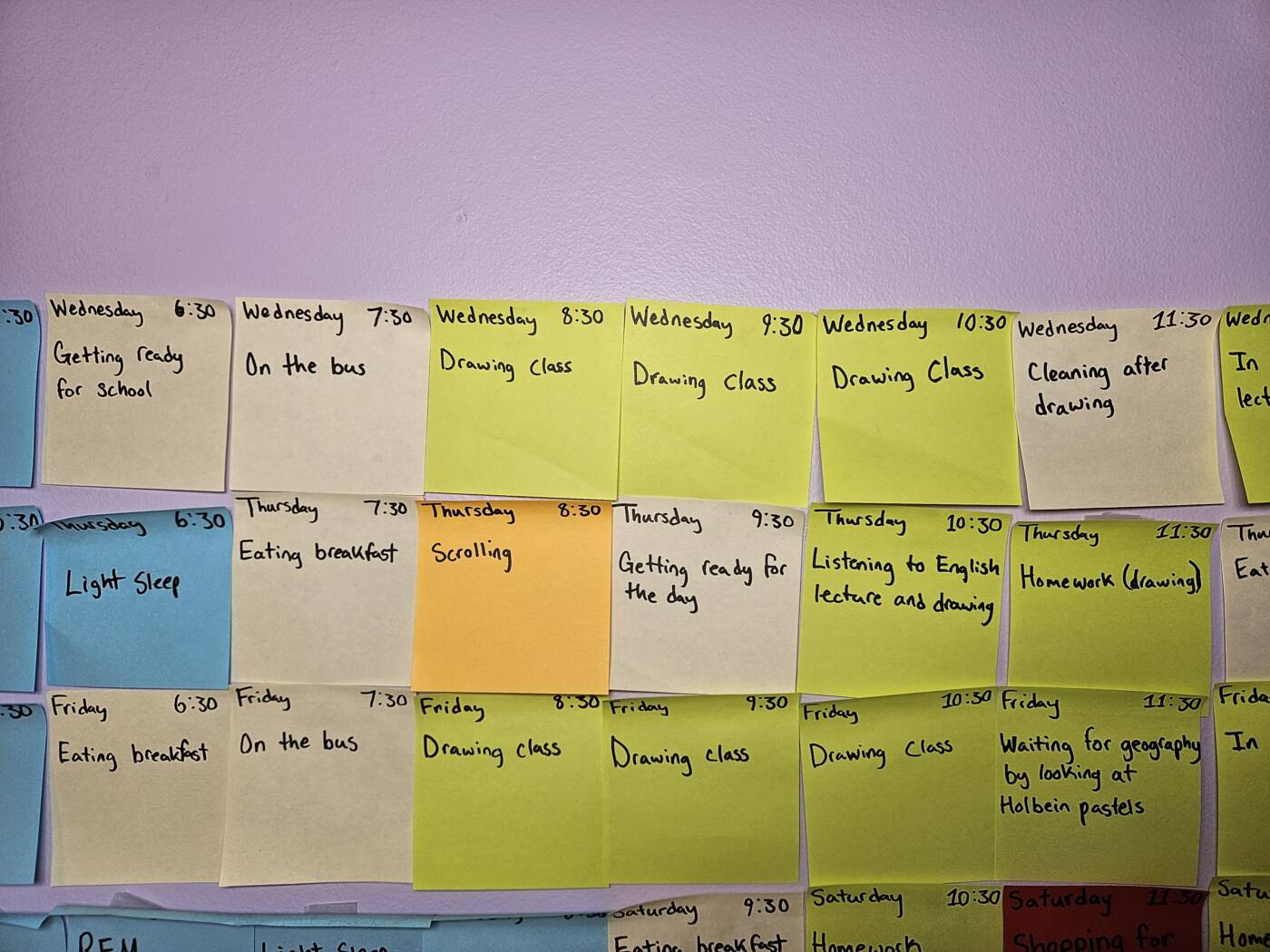
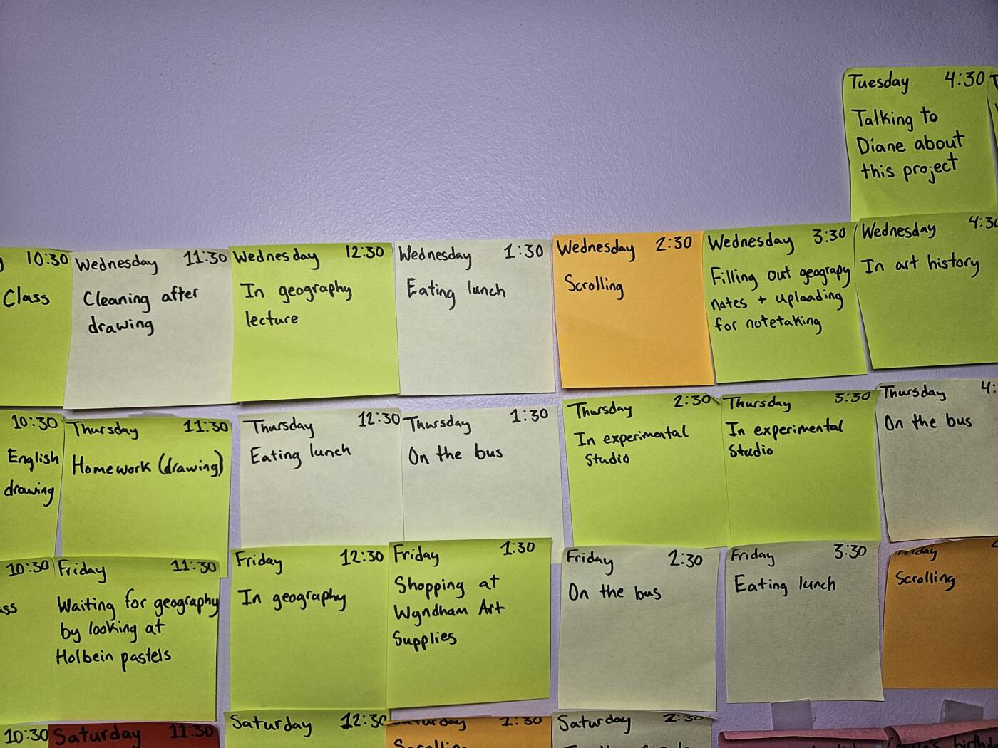
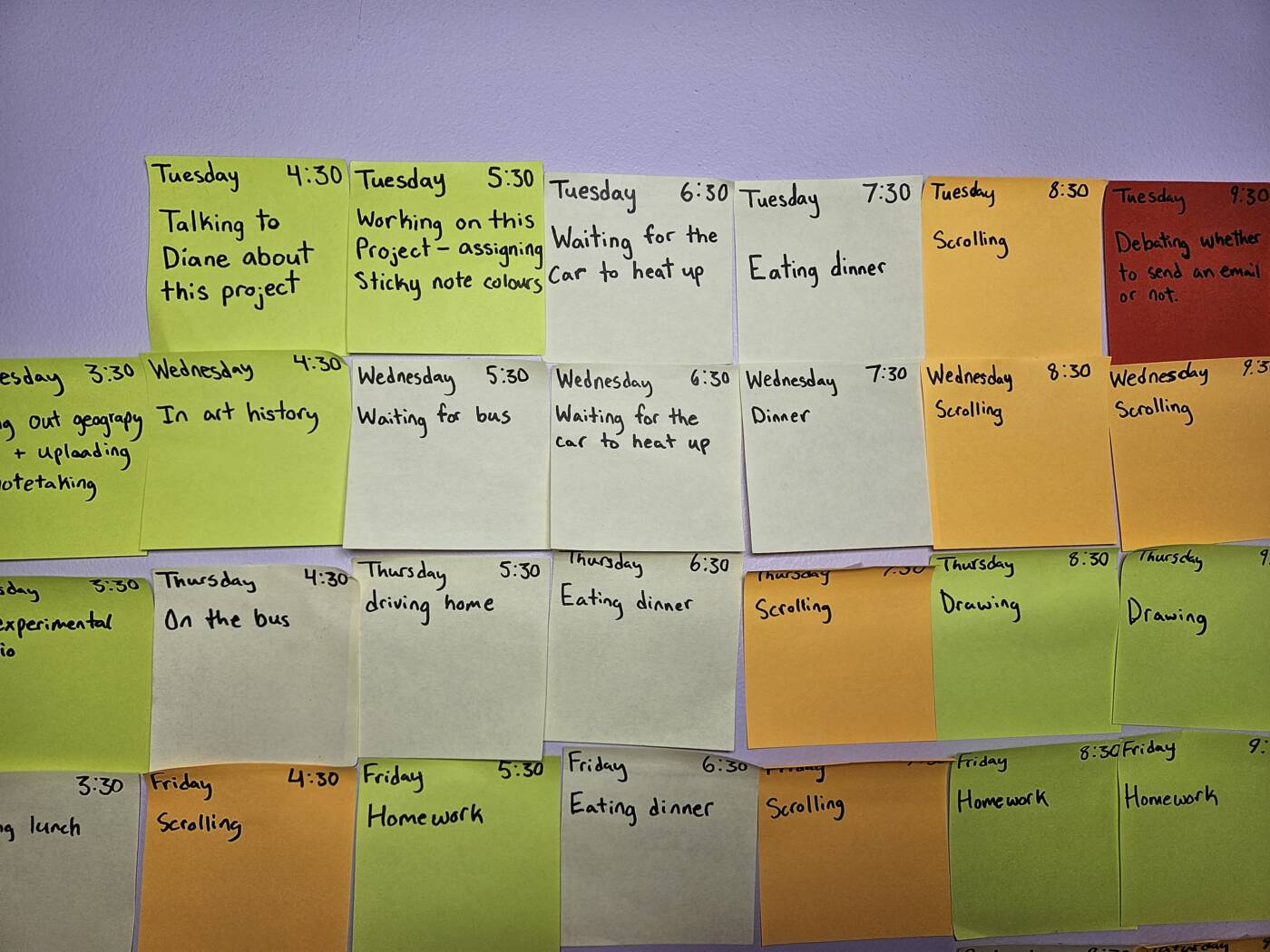
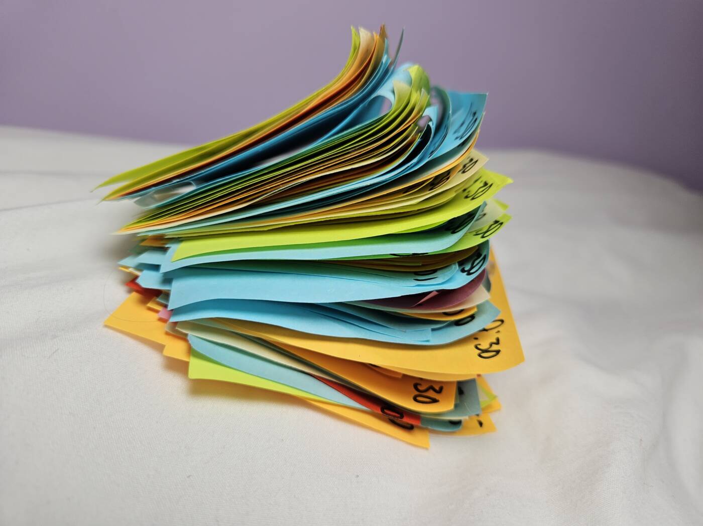
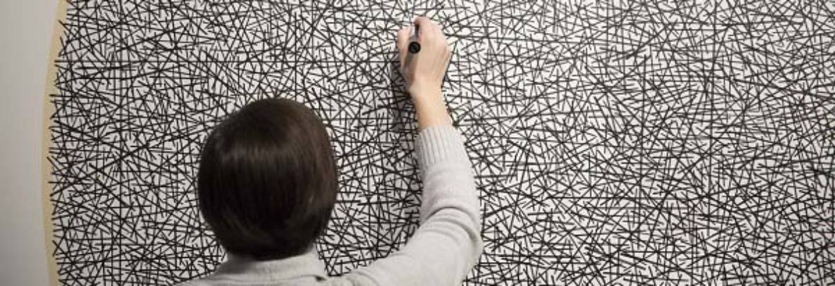
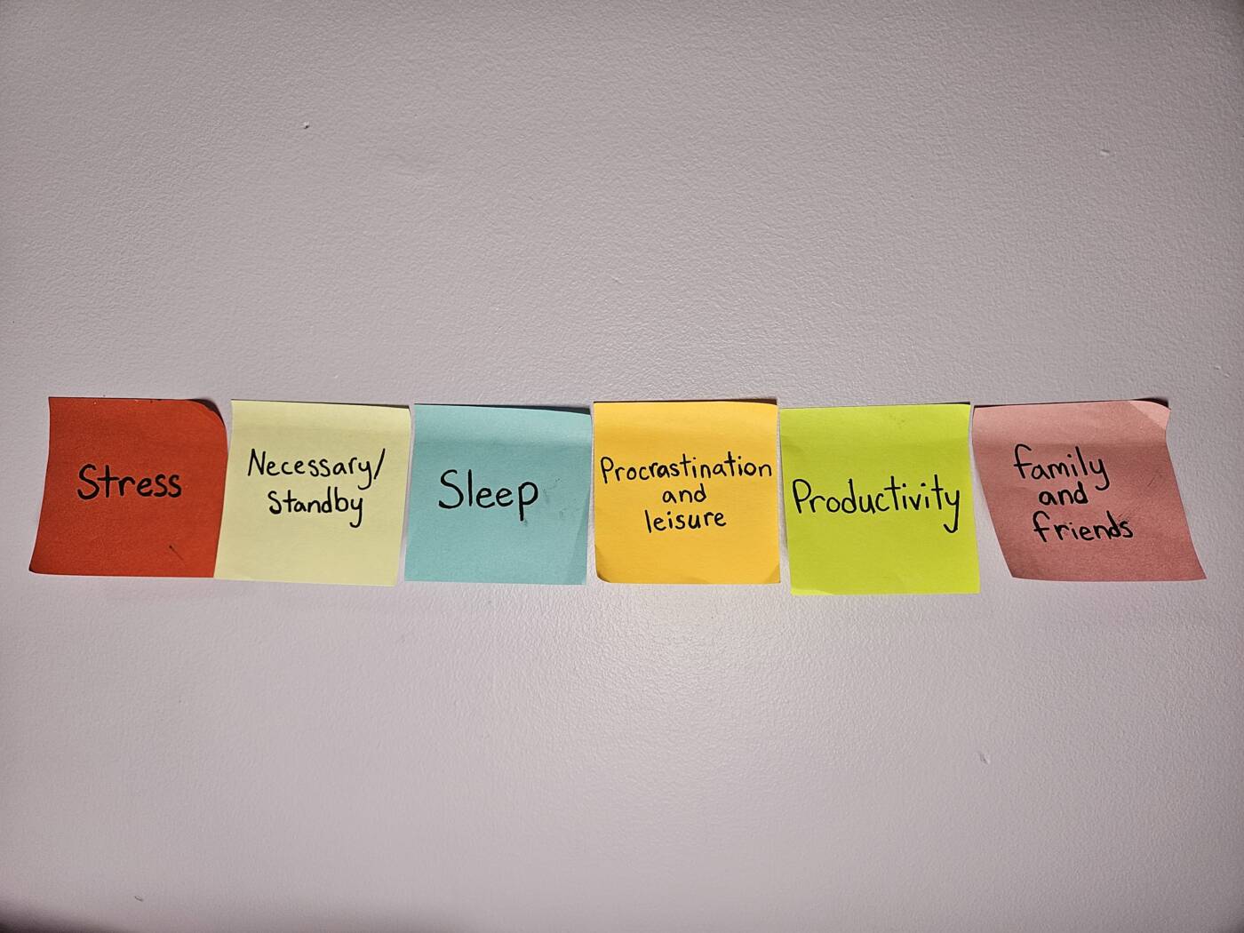
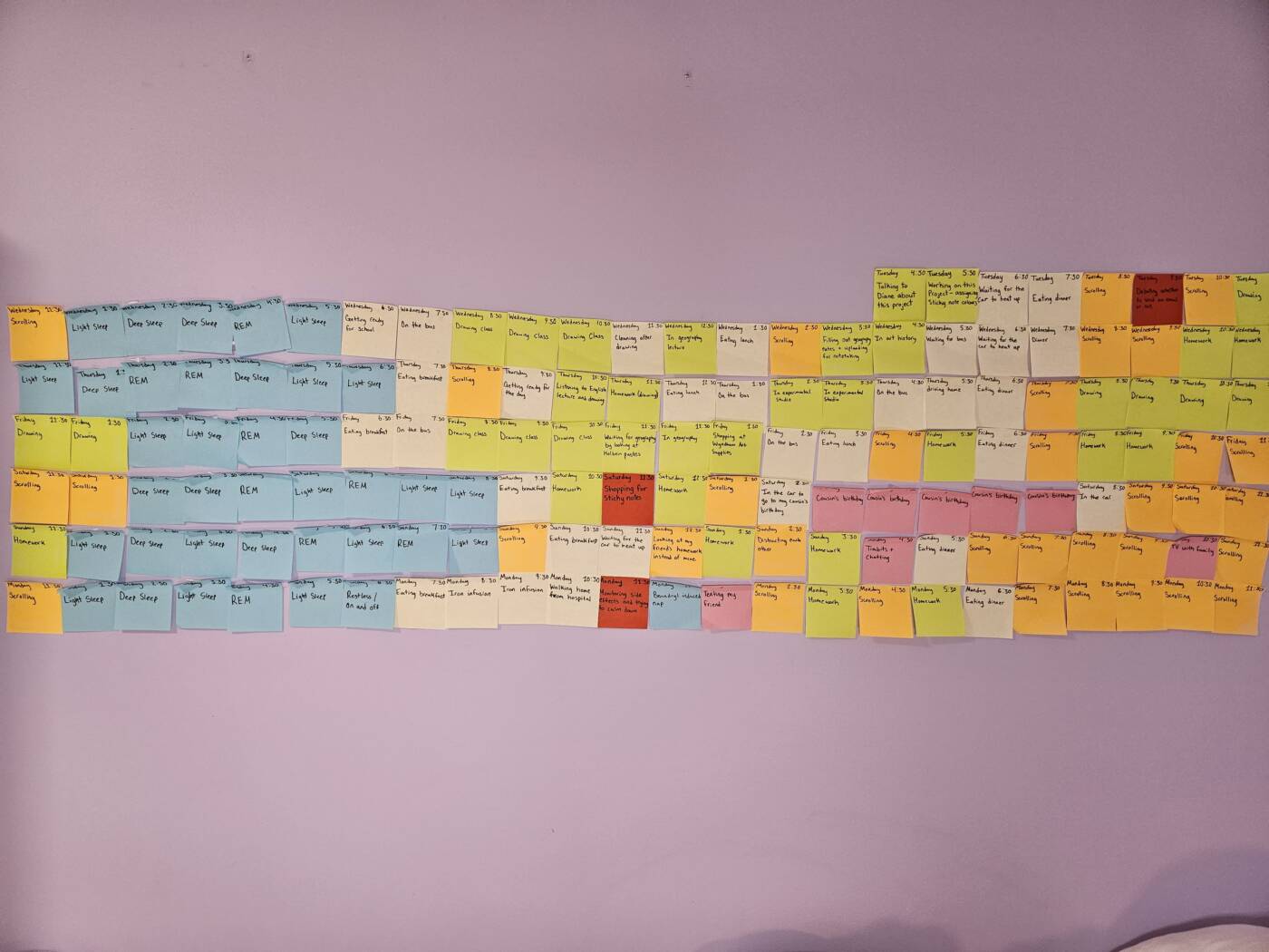
For this project, I took inspiration from On Kawara and Teching Hsieh and their time related works. I set an alarm, and snoozed it for an hour, every hour (besides during sleep) from Tuesday at 4:30 pm to Monday 11:30 pm. I then recorded what I had done for the majority of that time, sorting the hour into one of six separate categories, stress, necessary things, sleep, procrastination and leisure, productivity, and time spent with family or friends.

At the beginning of this project, I found it stressful to be constantly waiting for an alarm to sound, and also that I wanted to only begin doing something new once the full hour had passed. Over time, I got used to not overthinking it as much, which made the process much more enjoyable. I found that the results were basically what I expected, but having a visual of it has helped me understand what I did, and may encourage me to have a bit more of a schedule. Something I found a bit difficult was how to sort certain categories. Events like “sitting on the bus” are technically a time where I could be doing homework, but I classed it under essentials instead. Technically any time besides sleeping and driving (though I could’ve bought an audio textbook, I suppose) could be an opportunity to work, but I didn’t want this project to support the idea that people should be constantly doing something work or something productive. Finding this balance between honestly sharing how I spent my time and not being too hard on myself also led me to change the category to “procrastination and leisure” when it had formerly been just “procrastination.” It’s important to relax!

Overall, I am proud of myself that I stayed honest when sorting, because it was occasionally tempting to say that 25 minutes of hard work should make up for the rest of it being mindlessly browsing. I feel that even while sorting things in this way leads to not fully expressing every aspect, for the purpose of this– creating a conceptual portrait, but also understanding myself more, it works well.

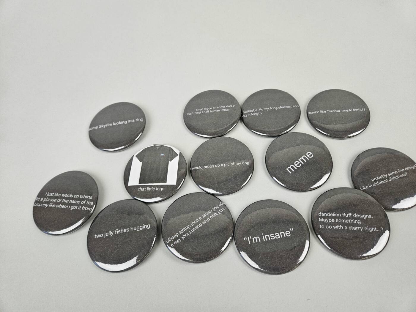
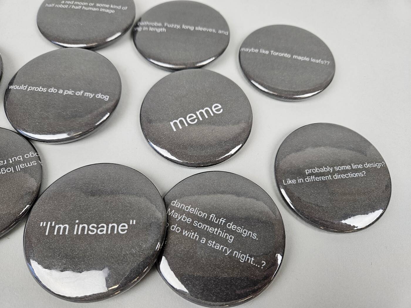
Artist’s Buttons

For this project, I asked friends and family to send me what they would most want to see on a button or another piece of clothing like a shirt. I do occasionally ask people for inspiration, but instead of actually giving them what they wanted, I screenshotted their responses and put them on the buttons. Still technically what they asked for!