BUTTONS
Skater’s Waltz
Growing up, my older brother loved to skateboard which also brought me into the interest of skateboarding. I remember having and collecting all these skateboard magazines and just flipping the pages looking at how interesting the body changes its form while skateboarding whether it is for balance or just muscle memory. I’ve always looked at these photos as if they were of contemporary dancers. This is why I removed the skateboards from each photo and chose only photos that fit enough of these unique positions while cutting out the boards. I knew as soon as this project was given that I wanted to incorporate these magazines that I’ve had since high school. The layout of these buttons reminds me of frames in an animation and I think if I wanted to continue this project I could find many more of these interesting positions and put them together into almost a stop motion type video. I also chose to use photographs with simple backgrounds or backgrounds that contrast enough to show the figure. I had seen many silly unique positions within each magazine but many had very busy backgrounds with a variety of colours and patterns. I wanted it to be obvious and clear that the figures of these skaters are the focal point and I wanted to make sure the figures didn’t just blend into their backgrounds.
CONCEPTUAL PORTRAIT
Unapproved Self Portrait
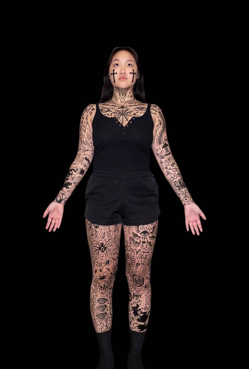
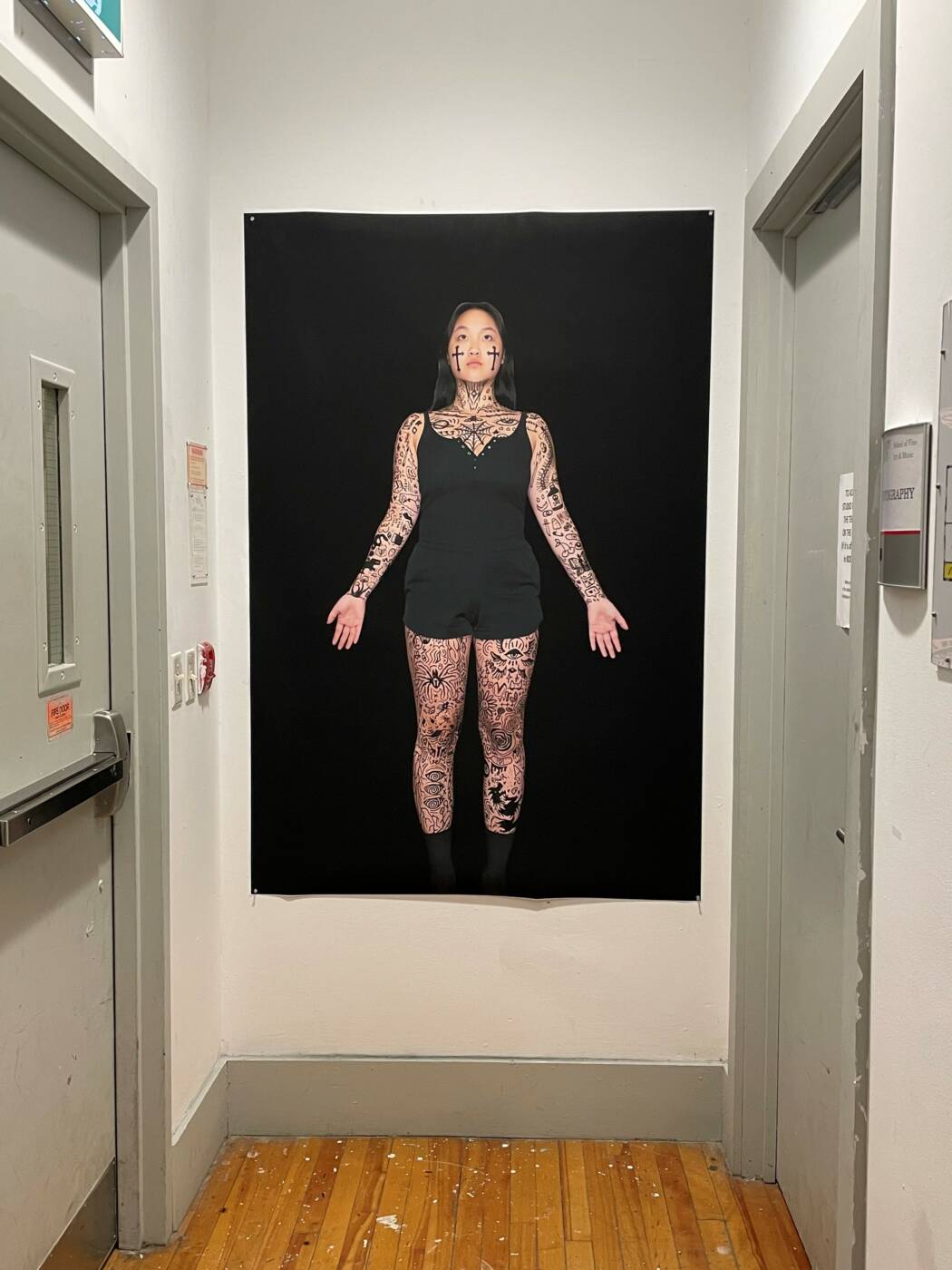
I definitely struggled a ton with this project because I couldn’t figure out an idea that I was really passionate about. I finally landed on the idea of tattoos. My parents are both Christian and Asian, so growing up, they have always been culturally and religiously strict about topics like tattoos, piercings, even make-up. This “Unapproved” self portrait of mine is sort of a rebellious self portrait. This is how I think I would be like if my parents weren’t so strict about tattoos, obviously a little exaggerated. Tattoos have also always been of great interest to me. I remember in elementary and high school, I would always get bored in class and draw on myself with pen or marker. Coming home to my parents, they often became angry with me and told me to wash it all off immediately. This was definitely the first sign that if I were to ever become a tattoo artist, they would be extremely against it. In another life, another universe, I think I would definitely pursue the career of a tattoo artist, but probably not in this one. I drew the two crosses on my face to symbolize this surface “Christian” personality that is usually seen from my parents’ perspective, without the giant face tattoos of course. From afar, the poster definitely looks a little intimidating and scary, but up close you can see that some of the tattoos are just silly little doodles. I wanted to incorporate these edgier tattoo designs with the more goofy designs because the edgy ones would definitely make my parents angry, but if I had permanently tattooed the sillier ones on my body with no meaning whatsoever behind them, they would be fuming. There are also a lot of little hints to religion and Christianity such as the way my body is positioned very vulnerable almost like a crucifixion and seems to be almost like levitating, as well as the small crosses scattered around my body. I also intentionally kept my hands vacant of tattoos to symbolize clean hands because part of why my parents hate tattoos so much is because of the stereotypes of the people who usually have lots of tattoos being that they are dangerous, promiscuous, and criminals. I wanted my clean hands to show that I could have millions of tattoos and still be a kind, caring, and gentle person. I used eyeliner for the tattoos on my body, not only because it was definitely easier and safer than using Sharpie or other kinds of markers, but it also brings another element of myself into the portrait. As I mentioned before, my parents were pretty strict about make-up growing up, eyeliner included. High school was when most of the girls around me started wearing and experimenting with make-up. The only make-up I tried in high school was eyeliner and my parents were very unapproving of the idea. But I kept pushing it and eventually they gave up and got used to it. Now, eyeliner is the only makeup I wear and to me it symbolizes approval and confidence in this portrait. I decided not to put the eyeliner on my eyelids normally because I wanted the tattoos to sort of be “replacing” it. What’s the difference between some black lines on my eyelids and some black lines all over my body?
AUDIO ART
Typing Game
For this project, I created a piece of audio art of the sounds of my keyboard when I am playing a video game. Without the knowledge that I am playing a video game during this recording, the audience can interpret this in many different ways. Perhaps, a dramatic email that is being written in this audio, or an intense homework session with only a couple hours left to submit. I have always been fond of the customizability of mechanical keyboards and how everyone who builds their own or even just buys a pre-built keyboard has a different kind of keyboard that sounds different and is used for different things. Personally, I use my keyboard mostly for schoolwork and playing video games like in the audio. I spend a lot of my time at my desk using this keyboard and it is definitely a subconsciously significant element of my every day life. Without a keyboard, I wouldn’t be able to type these words you see here. I wouldn’t be able to play my favourite video games or even communicate through emails or messages on my computer. My computer would be rendered useless and the only thing I would be able to do is click with a mouse. I titled the piece Typing Game because it is pretty self explanatory but doesn’t give away too much about the audio and what I am doing. From the name, it could be assumed that I am actually playing some kind of game about typing, like a typing race, but the pattern in the clicks of the keyboard definitely don’t match that kind of typing pattern. I think it’s interesting how this simple audio can be interpreted and I really wanted to incorporate my love for video games and keyboards into this project.
ONE FEAT, THREE WAYS
BAGS – Kat, Trinity, Tuesday
I worked with Tuesday Troup and Trinity Bishop to create these three video art performances. The bag is an everyday item that everyone uses to store items, carry items, transport items, etc. With such a simple prompt as our base, we were able to come up with creative ideas for each of the three videos. “Where’s My Bag” is our one shot video in which the performer (Trinity) unpacks bags that are packed with more bags, similar to a nesting doll. We were able to successfully pack exactly 30 bags to prepare for the performance. We decided to also use a variety of different kind of bags such as tote bags, grocery bags, purses, duffel bags, and even a small suitcase. At the beginning of the video, Trinity walks into the frame with the first bag that holds the 29 other bags. At the end of the video, she walks out of frame with the very last and tiniest bag. This sort of plays into the title of the video “Where’s My Bag” as if the performer had gone through the struggle and frustration of unpacking all these bags in order to find the final tiny bag. For our second video piece, we created a fast-paced edited sequence of using the performer’s (Trinity) body like a hanging rack. With each clip, a new bag is placed on her arms and even one on her head. The pace of the video shows the simple progress as her arms become more and more full with bags. We also only used grocery bags which provided a more unified and simple appearance rather than using a variety of bags like we did in our one-shot video. Our third video is the loop video in which all three of us (Trinity, Tuesday, Kat) are performing. We each take turns dumping out and repacking a back. We used various everyday items that you would find in someone’s bag such as a phone charger, coins, pens, etc. The struggle of repacking the items also made the video more interesting, especially with the smaller and flatter items like stickers and coins. In order the make a flawless loop, we had each person walk into the frame when dumping the bag and leaving the bag on the table as they walked away. Then, the next person would walk into the frame from the same direction and repack the bag and take the bag with them as they walked away.
PIPILOTTI RIST
- Post an image from one of Rist’s videos that you are most interested in.
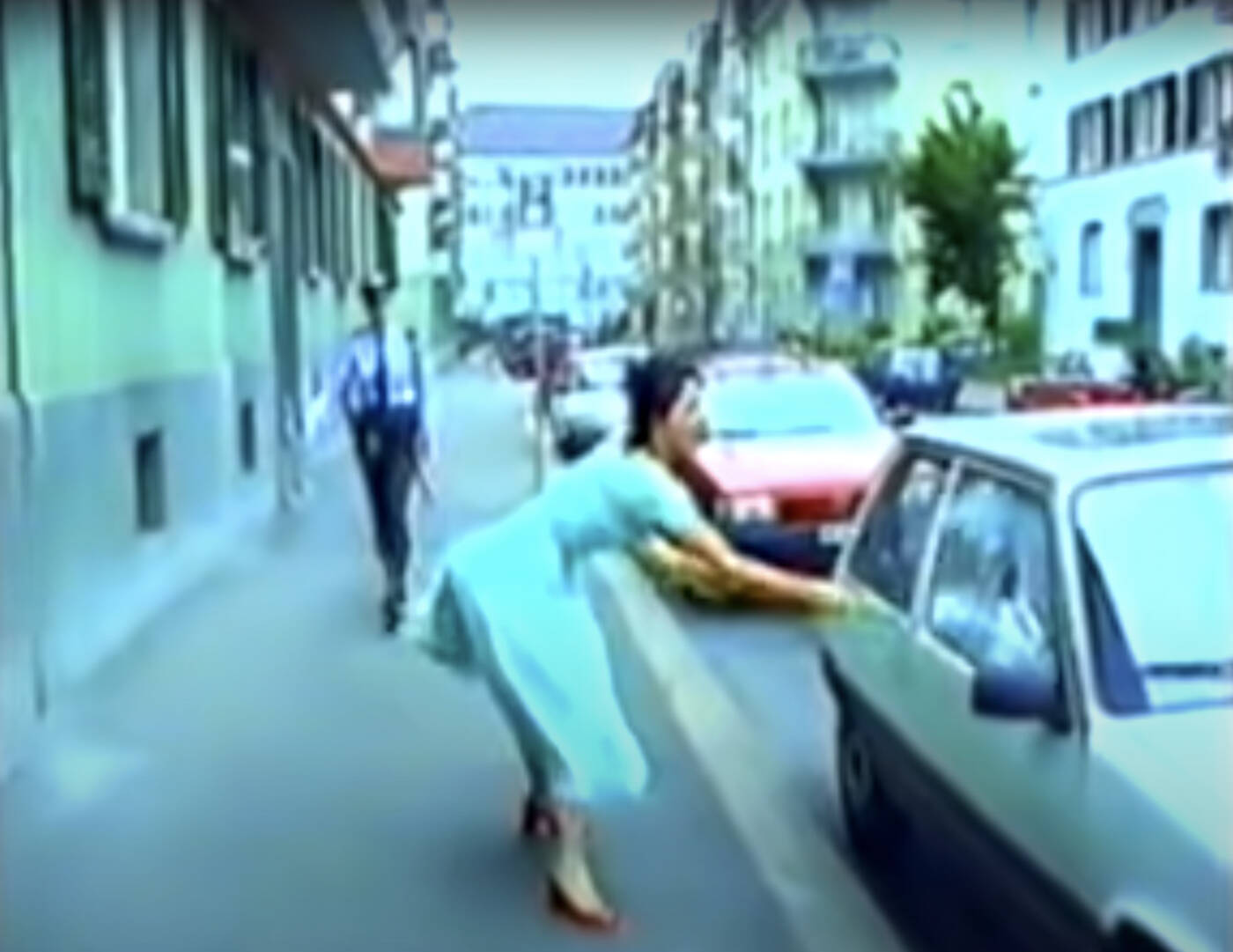
As one of Pipilotti Rist’s first large scale video artworks, Ever is Over All (1997) presents a happy, carefree, and beautiful woman (Pipilotti Rist) causing continuous damage to vehicles with a flower staff. This video’s use of music and editing make the content of the video more unsettling. For me, the music provides a very natural but eerie environment that contradicts the beauty and elegance insinuated through the flower staff and the flowy feminine dress. This particular screenshot above is from about a minute and a half into the video in which she is smashes the second car while a policewoman is behind her. I especially loved after this frame where it shows them both smiling and walking forward as the policewoman waves at her. Everything about this video feels very unsettling and almost frightening while also showing some empowering themes as well. The exposure and the colours in the video really help add to this unsettling feeling and almost make it seem like a slightly surreal imagination.
- Rist has had a long career in video art making – how do you relate it to the kinds of video that you might see all the time on Tik Tok or You Tube, in our time?
The video art that Rist makes often has many of the same feminine themes as we see on social media like Tik Tok and YouTube. Her video art uses a very playful approach on topics about women such as the female body, sexuality, behaviour, and exposure. Videos posted on social media about these same topics are often also done so in this playful way while also challenging these ideas. Be Nice To Me (Flatten 04) is a perfect example of the way playfulness is used to challenge the idea of beauty by smashing her face against a clear screen over and over again, ruining her makeup and creating a variety of altered faces that would not fall into our societal standard of beauty. I often see Tik Tok videos of women, in their own way, using makeup or different techniques like this to challenge these societal standards of beauty for women. After making this comparison, I am realizing that social media is a perfect platform for video art.
- Inside out experiment:
This experiment definitely put me outside of my comfort zone. I am personally the kind of person that always tries to dress presentable in public in a way that doesn’t make me stand out. Wearing my shirt inside out was a difficult thing for me to do, despite it being such a small change. It did not change the way I was treated by my peers on campus, despite a couple questions as to why I was wearing my shirt inside out. I think everyone around me had other things to worry about. However, being on the bus and going to get groceries was a different story. I noticed a lot more looks coming my way. This experiment completely changed the way I felt. I didn’t feel as confident as I usually do. Even on campus when barely anyone noticed my inside out shirt, I still felt uncomfortable and insecure. I think it was the fact that I knew I was wearing a shirt inside out that really got to my head. Being perceived by other people is something I definitely think about and even more so when I knew that I was wearing something incorrectly or differently. The deliberate intentions and consciousness of this experiment is why I think this was a performance. It may not have been a performance for those who did not notice, but it was a performance for me because I knew everything and was consciously thinking about how this experiment looked to others.
MY 1 KILOMETRE
“Block of Kilometre”
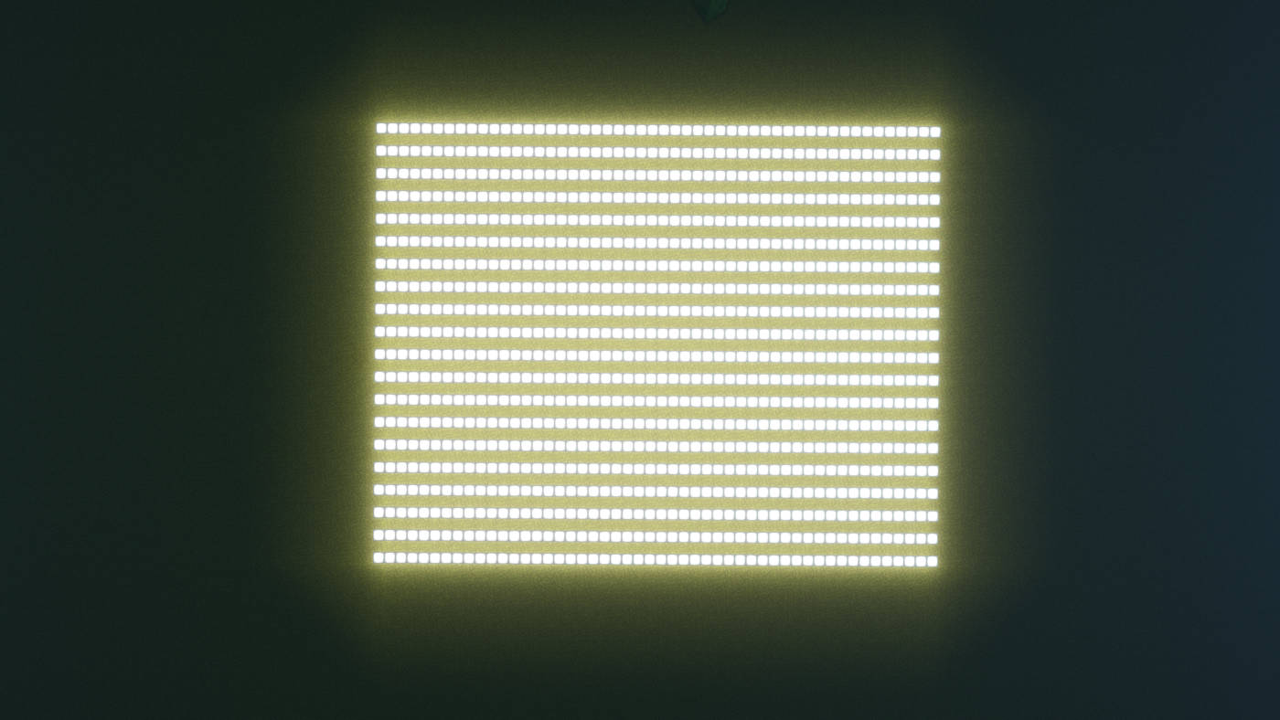
When I heard the instructions for this intro assignment, I instantly knew I wanted to incorporate my passion for video games using the popular game called Minecraft. As soon as the word “kilometre” was mentioned, I thought of this video game specifically because each block in this game is actually equal to 1 meter cubed. At first, I wanted to just create a line of one thousand blocks to display a true kilometre. However, my ability to capture this kilometre was greatly limited. I thought of building a rollercoaster in the game that is 1000 blocks long, but I didn’t want to overcomplicate my kilometre.
I ended up dividing the 1000 blocks into 20 lines of 50 blocks, adding up to a total of 1000 blocks; a kilometre. The background is a flat surface of grass blocks, and the glowing effect from the kilometre of blocks is done using sea lantern blocks. I used the grass blocks as the background because I still wanted to keep the most basic and well-known aspect of the video game. I used the sea lantern blocks as opposed to other glowing blocks like redstone lamp blocks or glowstone blocks because these blocks are much more detailed and the sea lantern blocks are very simply white with an outline. This outline also makes it easier to see each meter of the 1000 meters (1 kilometre) which I find much more intriguing than if it were all white and there was no differentiation between blocks/meters. I hovered above the in game installation to take a photo of my “Block of Kilometre.” I named it this because I really liked that, from a distance, the contrast between the lighter blocks and the dark background made the kilometre (light blocks) look like a huge block all together, despite not being a perfect square.
THE ARTIST IS PRESENT
1.
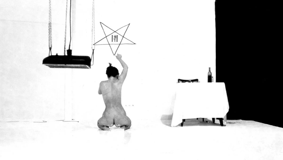
While watching this documentary, I quickly found myself in awe of Marina Abramovic and her performance works. The courage, stamina, and strength required to even attempt most of these performance pieces are beyond my imagination and I truly admire how she was able to present herself as such vulnerable body in front of her audience and the absolute commitment and determination that she has. For example, the performance piece by the name of Lips of Thomas involved Abramovic whipping herself and cutting a communist star into her stomach. The extreme lengths that Abramovic goes to in order to complete her performance clearly shows her commitment and determination. The theme of nudity also displays how she is often making herself so vulnerable to the audience. I can definitely understand how the nudity that is an essential aspect to many of these performance works might be viewed as problematic to the public eye, as shown in the documentary when the news anchor complains about how the nudity in the exhibit can be considered art. To the naked eye (pun intended), nudity is seen as a negative thing and only a sexual theme. However, in the world of art and in Abramovic’s performances and exhibition, I find that nudity is a means of expressing emotion or the lack of and vulnerability.
2.
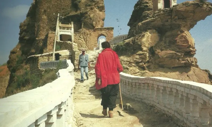
Even as an artist who is not too compelled to create her own performance art, the quote “When you perform it is a knife and your blood, when you act it is a fake knife and ketchup” from Abramovic will stick with me forever. Abramovic’s work as guided me to realize that performance art is not exclusively about the act of performing and watching. Just the raw aspect of reality that is involved in Abramovic’s performances such as Lips of Thomas is what makes performance art so much more than that. Although performance art and acting have many similarities and seem inherently identical, Abramovic’s quote is such a perfect way to describe the difference between the two. The image above is from the work The Lovers performed by Abramovic and Ulay. This is a great example of the raw reality of performance art as opposed to acting. If this were to be in a movie, the actors would only be walking small segments of the Great Wall of China to get the right scenes. However, in this performance work, they two partners both walked nonstop from each end of the wall to meet in the middle. The incredible commitment it takes to push their own bodies in order to make the performance piece more powerful is unbelievable. Some other key features of performance art that are evident in Abramovic’s work are the body and the relationship between artist and audience. The element of the body is very prominent in essentially all of Abramovic’s performance works, but the relationship between artist and audience is best found in The Artist Is Present as the documentary shows numerous clips of different audience members sitting in the chair across from her. The variety of reactions and emotions that are displayed on the audience members faces as well as Abramovic’s are clear proof that the relationship between the artist/performer and the audience is incredibly significant in performance art.
3.
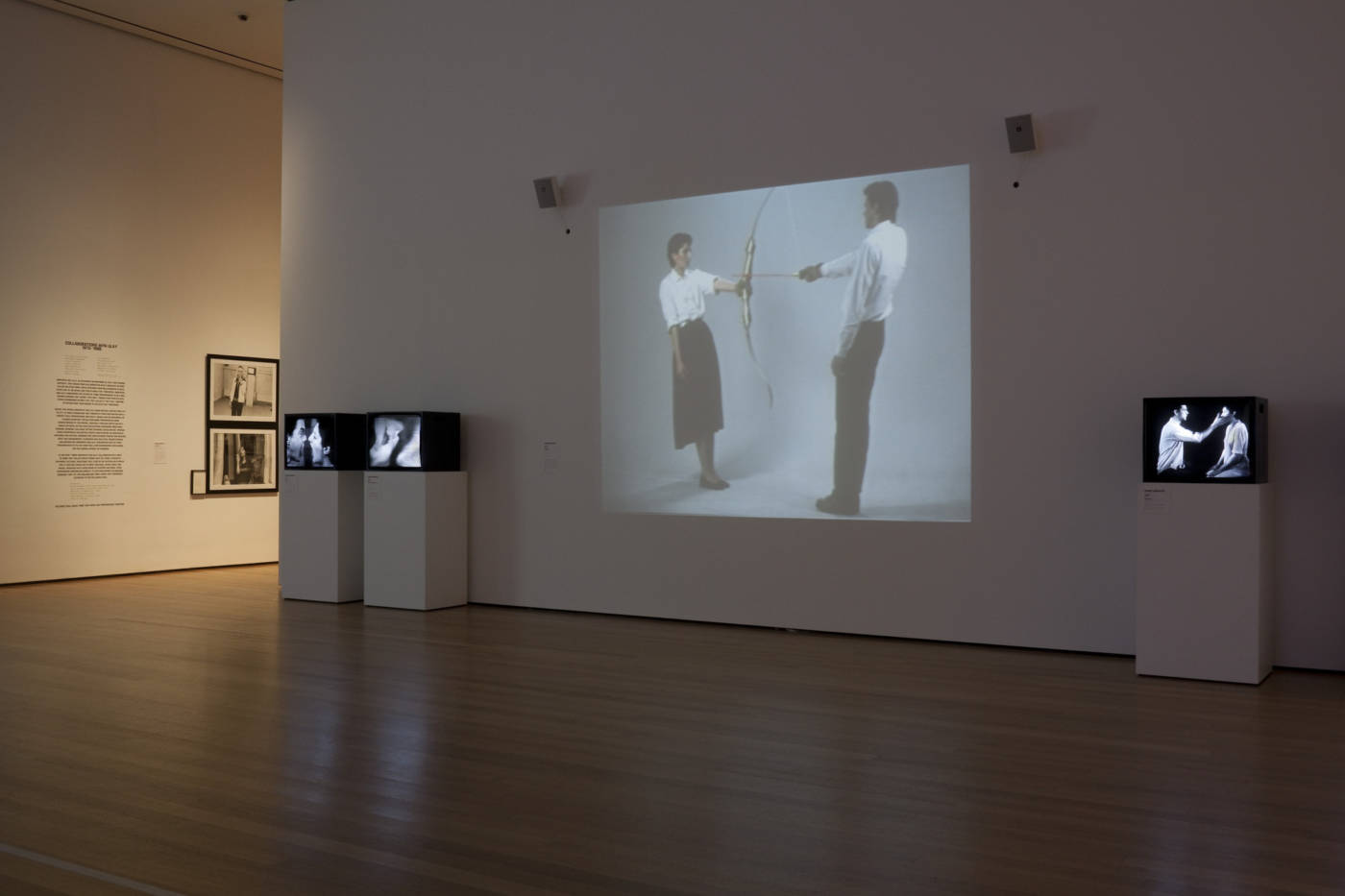
I think performance art definitely contradicts the idea of museums because of the way that traditional art has always been displayed in museums and art convections. Being a performer for so many hours in a day everyday for months is 100% something I could never imagine doing. Since the body is such an important key feature, I would assume that finding people who are willing to be so vulnerable and put their bodies on display while also sometimes doing repetitive tasks for hours on end would be very difficult and likely exhausting. Because of this, it makes a lot of sense that Abramovic required her performers to go through training to prepare and I think the way Abramovic approached this exhibition in MOMA was very well thought out. There also seemed to be many video recordings and photos of Abramovic’s older work displayed on the walls in the exhibition but I think this method of combatting the challenges that performance art may have in museums is not very effective. It undermines the experience for both the audience and the performer because they are just records of previous performances.
Hi Kat, remember to post a description/statement about your videos ok? Thanks!