1 Kilometer of Garbage
At first I really struggled to come up with an idea for my conceptual kilometer and I ended up spending most of my time for the project brainstorming what I actually wanted to do. I really wanted to incorporate an idea that would mean something to me, rather than just making a kilometer for the sake of making a kilometer. In a sudden spark of inspiration I thought about picking up one kilometer of garbage and as soon as I landed on this idea I knew I had to do it. Even if it sounds a little cliché, the environment and being able to maintain it is something very important to me. I have a theory of sorts, that if every person just took 10 minutes to go for a walk and clean up all the garbage they see every day, every other day or even just every week, the world would be a much cleaner place. I know 10 minutes might not sound like a lot of time to actually get much done, but within the first 10 minutes of my “1 Kilometer of Garbage”, I had collected almost a full 45 liter bag of garbage. I ended up taking 31 minutes and 41 seconds to walk a kilometer and pick up all of the garbage I saw along the path. Additionally, I ended up collecting 2 (very full) 45 liter bags of garbage.
I think that the hardest part of this project was actually the kilometer walk back to my house after picking up the garbage. I say this because by the time I was walking back, I noticed that there was already more new garbage that had been thrown on the ground since I had done my kilometer.
My main reason for creating “1 Kilometer of Garbage” was to give a physical and visual approximation of what a kilometer of garbage actually looks like. Most people can walk through the streets and see a piece of garbage on the floor every few steps and not think very much of it. However, I wanted to know what all of these pieces of garbage looked like together and how much of it is there actually on the ground within one kilometer.
Testing A Paper’s Strength
For this video performance me and my partner assigned ourselves the simple task of throwing different objects at a piece of paper until it breaks. For this particular video I was personally inspired by one of the artists that we viewed in class, Kelly Mark. Specifically, I took inspiration from one of her video performances titled “Sniff”, in which she gives different objects to her cat for it to sniff them. I really enjoyed the scientific and experimental nature of this performance and the concept of testing one thing against a series of objects. For our three videos, me and my partner wanted to focus on using paper in each of the videos, which is ultimately what lead us to the idea of testing the strength of paper against various thrown objects.
For the more technical considerations of this video, we decided to shoot the entire video in a close-up shot because we felt that the only necessary information for this video revolves around the piece of paper and what is being thrown at it. We felt that if this video was shot with both me and my partner in frame it would take away from the purpose, simplicity and scientific nature of the video. In addition we also decided to keep the audio in the video, as the sound of the objects hitting the paper gives more context to how each object effects the paper. We also decided to record a voiceover for the video as it is quite difficult to actually tell what is being thrown at the paper and we found that text on the screen was too distracting from the video. We also felt that this video was best displayed as a one-shot since there is really no need to cut the video at any point since the pace of the objects being thrown is quite quick and consistent. If this video were to be shown in a gallery however, I would mostly likely display it as a video that runs on a continuous loop. In addition, I would also like to re-film the video and incorporate a longer list of objects that are thrown at the paper, ultimately making the video itself longer.
Different Ways To Share A Piece Of Paper
In this video performance piece, me and my partner assigned ourselves the task of exploring a range of silent gestures and positions all involving sharing a piece of paper between ourselves. This video performance was inspired mostly by two videos which we saw in class, one being “Device” by John Wood and Paul Harrison, and the other was a previous students work which involved crushing a lemon between two different peoples hands. Both of these video performances interested me because of their exploration of actions and body positions that are completely unnecessary for daily life. An example of this is the student’s video of two people struggling to crush a lemon between each of their hands when one could easily crush the lemon themselves with their own hands. This was also seen in the Wood and Harrison video as they experiment with “devices” that have no real purpose or use. This concept of exploring pointless gestures or movements really stuck with me and I knew I wanted to incorporate it somehow in one of the videos. This video, “Different Ways To Share A Piece of Paper”, works with this concept and also includes the reoccurring object that me and my partner wanted to keep throughout each of our three videos, paper. We also wanted to do this piece as a duet because we felt that there would be a larger and more interesting range of gestures to explore.
We decided to film this video in the same long-shot as it would give an entire view of both me and my partners bodies while performing the gestures with each other. We also decided to leave out any sound in this video as it places a greater focus and meaning on the physical gestures. If I were to adapt this video for a gallery I might want to try and explore using microphones to record breathing and heartrate while performing the gestures, however this is just an idea. Me and my partner decided to make this performance the cut video as we felt that it made most sense to leave out our process of thinking between each of the gestures. We felt that this ultimately places more focus again on the actual gestures themselves and nothing else. However, if I were to put this video performance in a gallery I would like to, as with the previous video, explore making a longer video with more gestures.
Art Is Hard
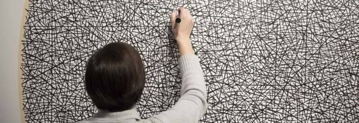
For this video performance, me and my partner assigned ourselves the task of filling and entire blank sheet of paper with a repeated phase or pattern. We weren’t able to come up with an idea for the repeated phrase/ pattern however until we saw a particular phrase that was written and left up on the chalk board in our classroom, “Art Is Hard”. This phrase really resonated with me and my partner, and my personal reasoning for using it within this video is as a reminder to myself as an artist and to any viewers that whenever you are struggling and working very hard on a piece of art, just remember that art isn’t supposed to be easy. I also thought that it worked well in a comedic sort of way when being paired with the extremally boring and somewhat tiring task of writing the same thing over and over. This is also why me and my partner decided that this video would be our loop, as it exaggerates the repetitiveness, excessiveness and boring nature of the task. We also found a great opportunity for a loop while performing this task: when the full sheet of paper is taken off of the table an replaced with a blank sheet. In addition we decided to shoot the video in a close-up shot of the hands, pencil and piece of paper, as it keeps the focus of the video centered solely on the task being performed.
The inspiration for this performance piece ultimately came from John Baldessari’s piece, “I will not make anymore boring art”. In this piece Baldassari performs a similar task in which he fills out lines on a page with the phrase “I will not make anymore boring art”. This particular performance feels similar to the task of writing lines for a teacher or parent when you misbehave as a child. To me, this is because of the phrase that was chosen to be repeated within the performance, as it is an instruction about what to do differently in the future. When compared to the phrase that we chose for our video, the performance we completed was much more meditative and similar to repeating a mantra to yourself. This was because we chose a phrase which was more like a statement that you are trying to come to terms with as you continue to write it over and over again.
Field Trip
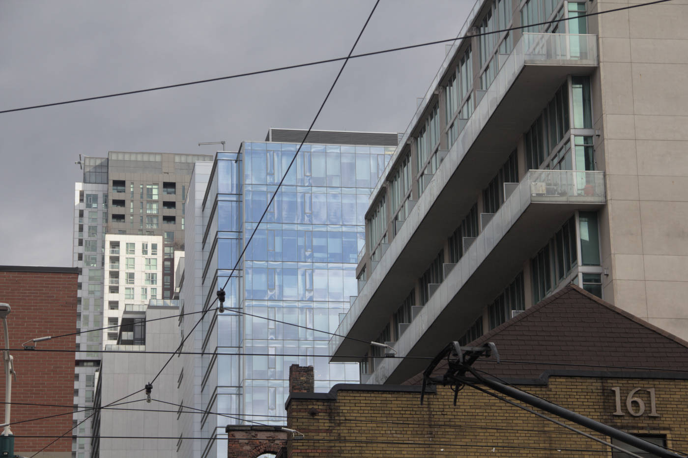


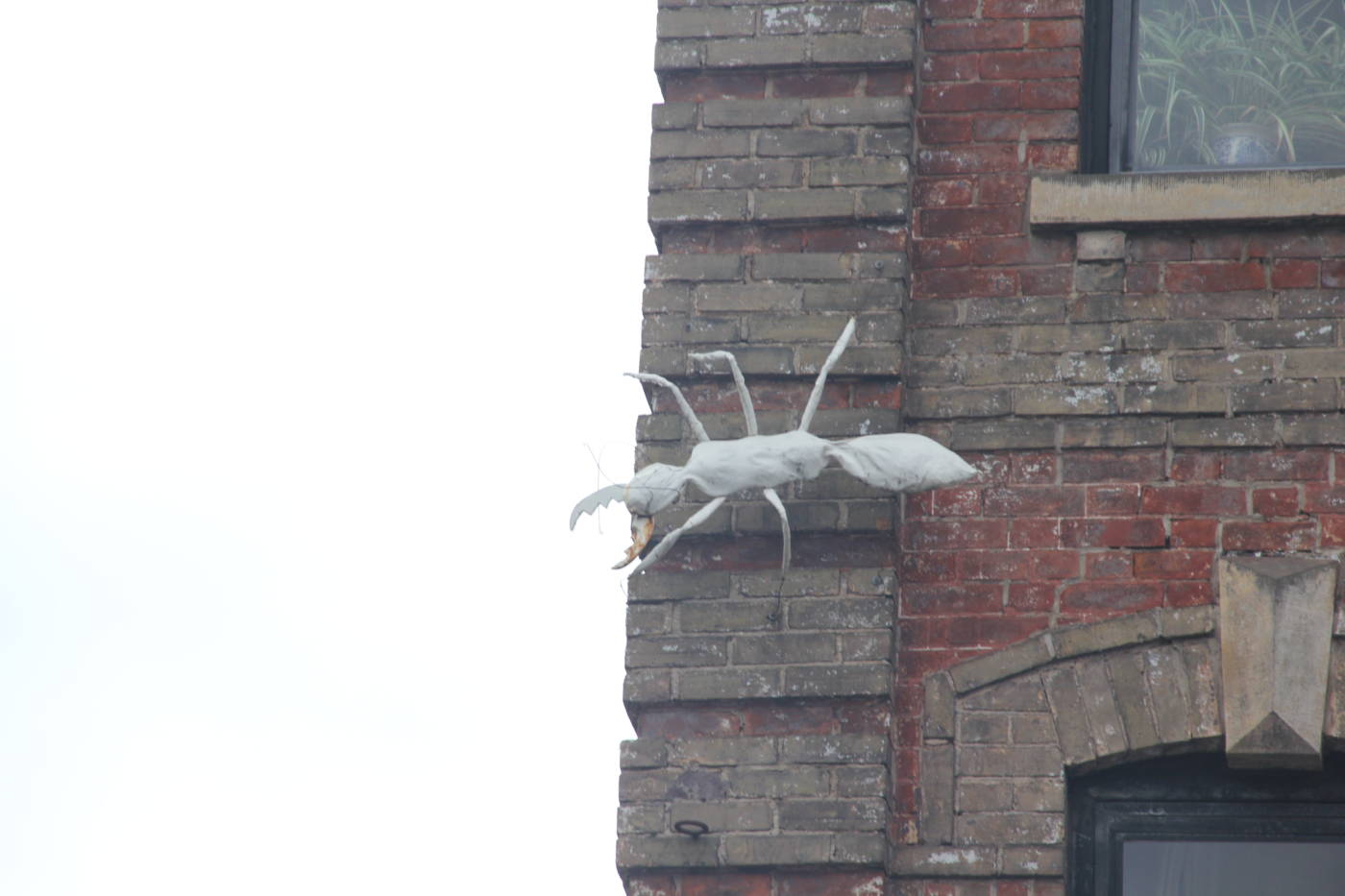
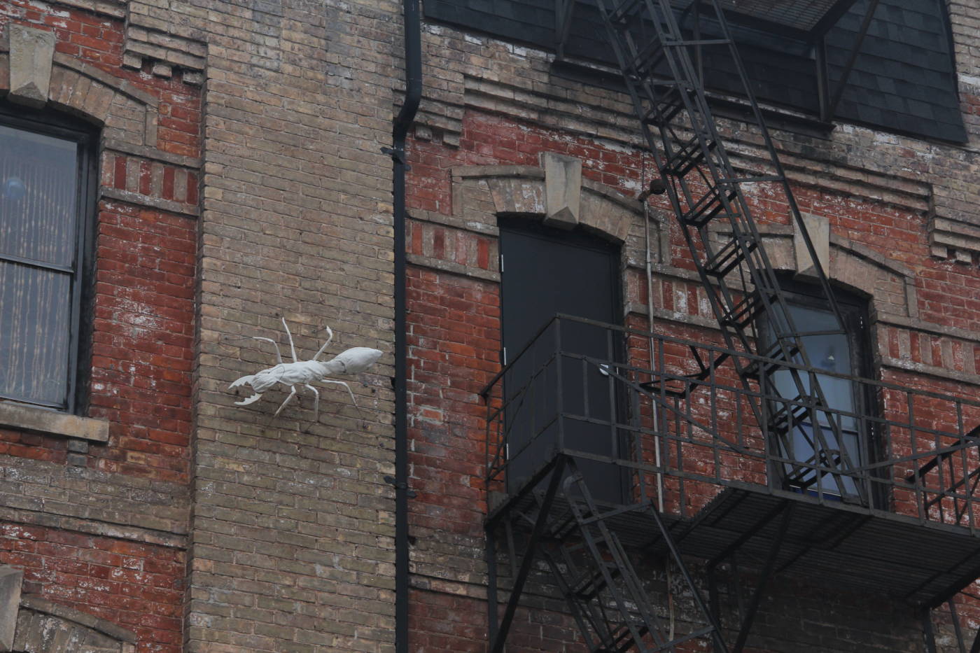
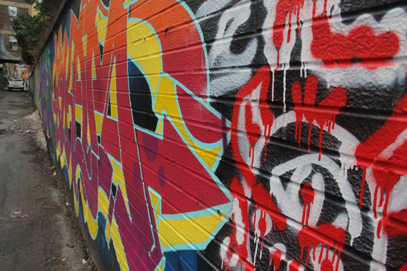
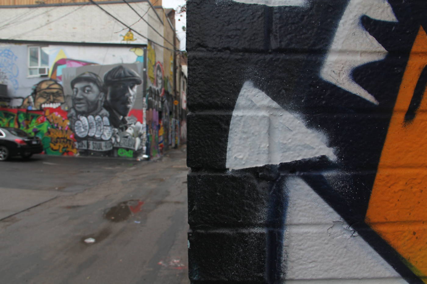
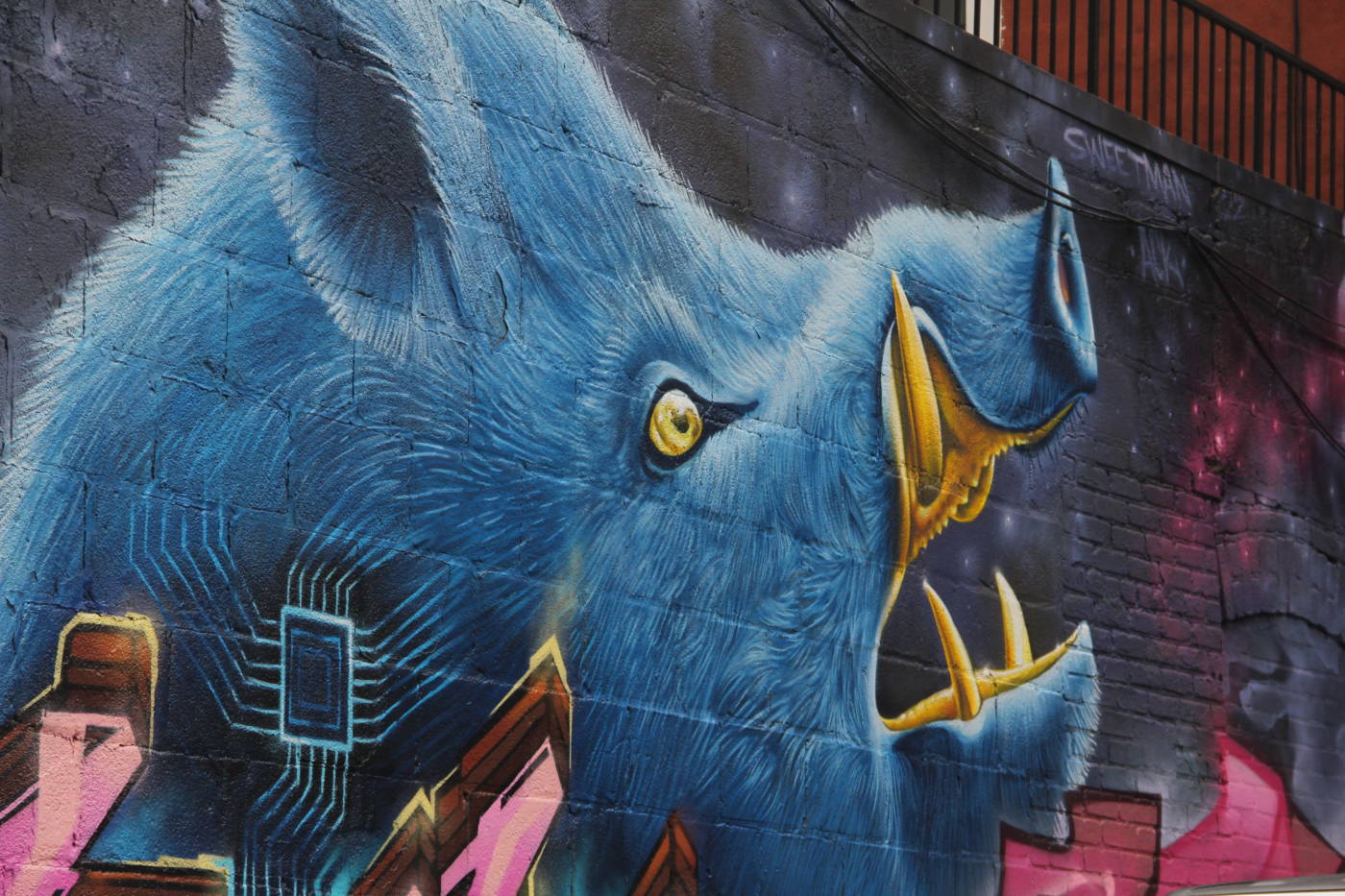
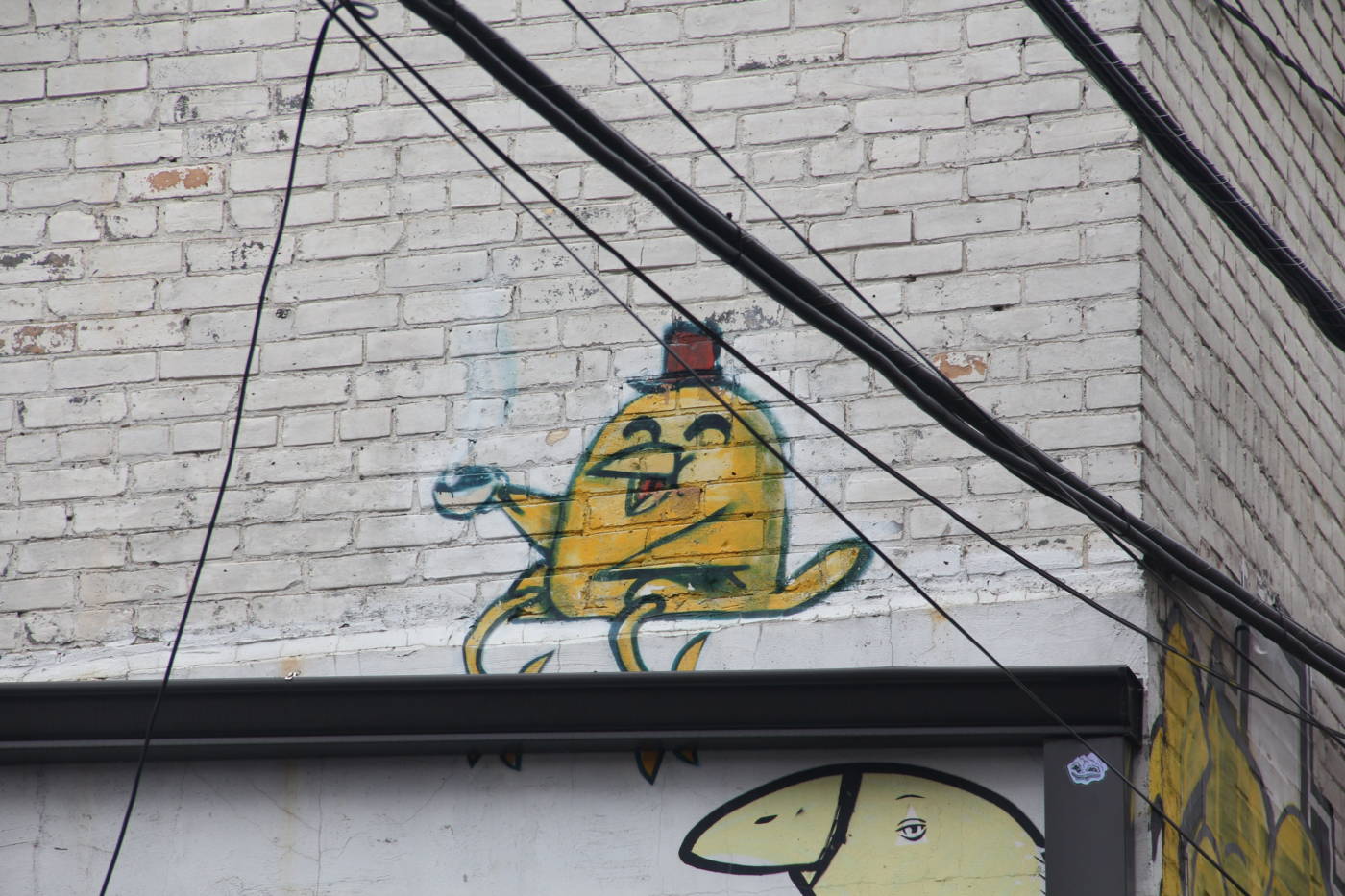
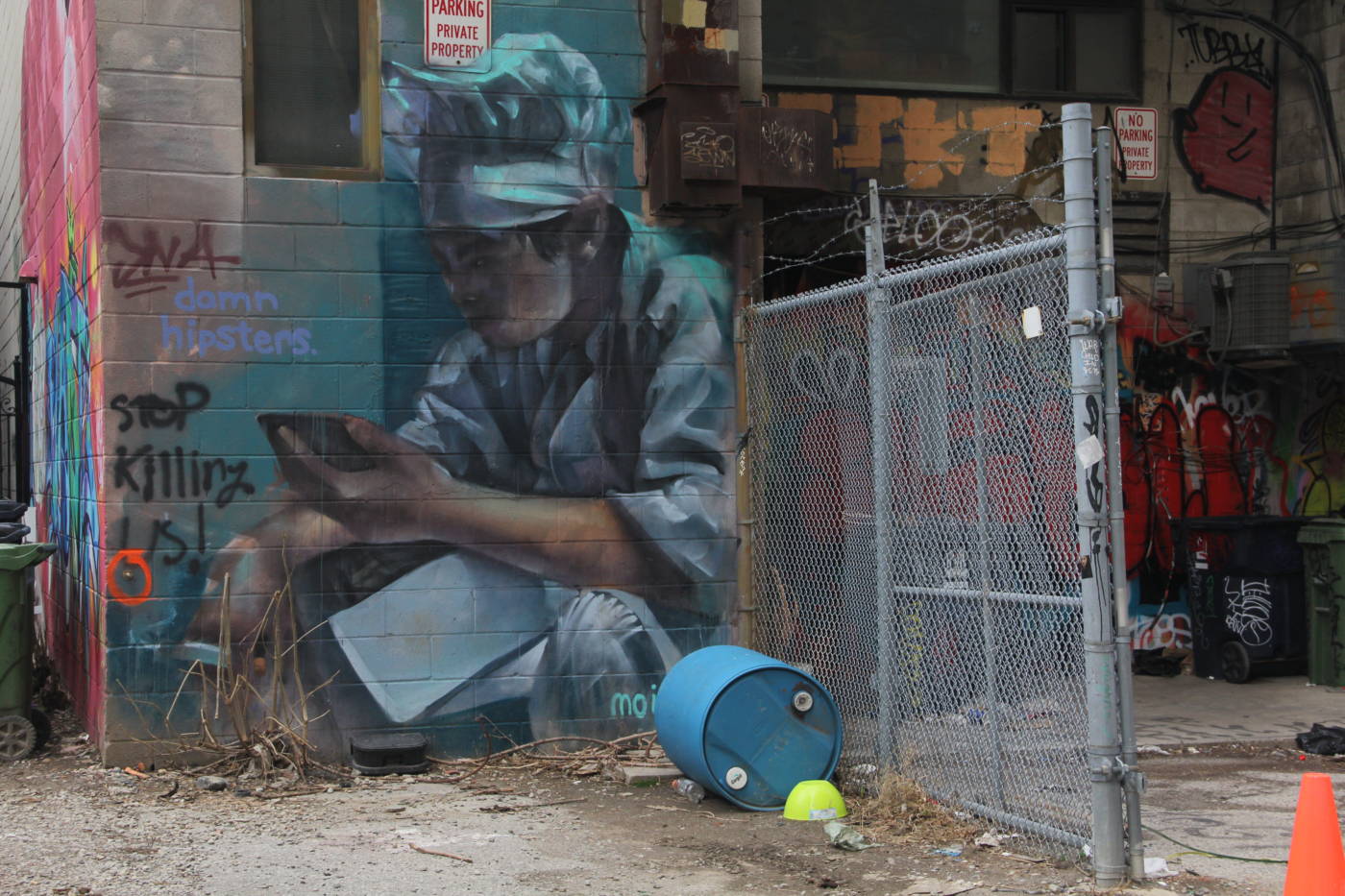
The Power Plant
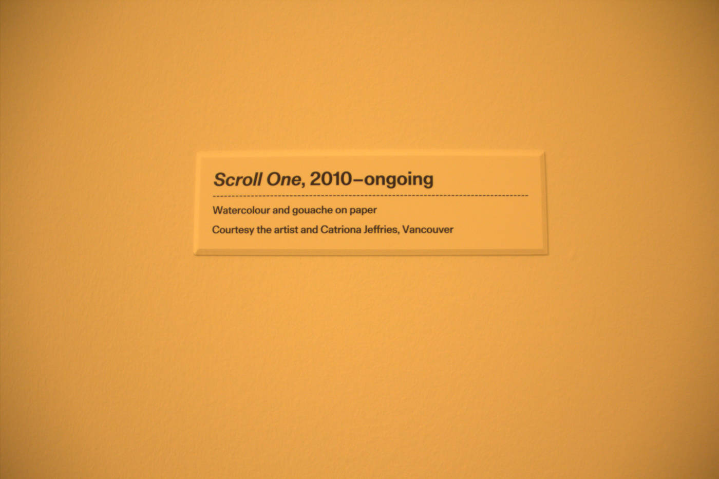
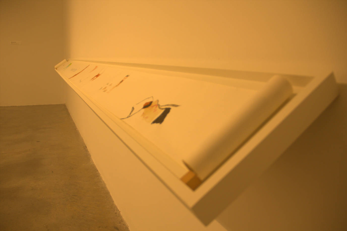
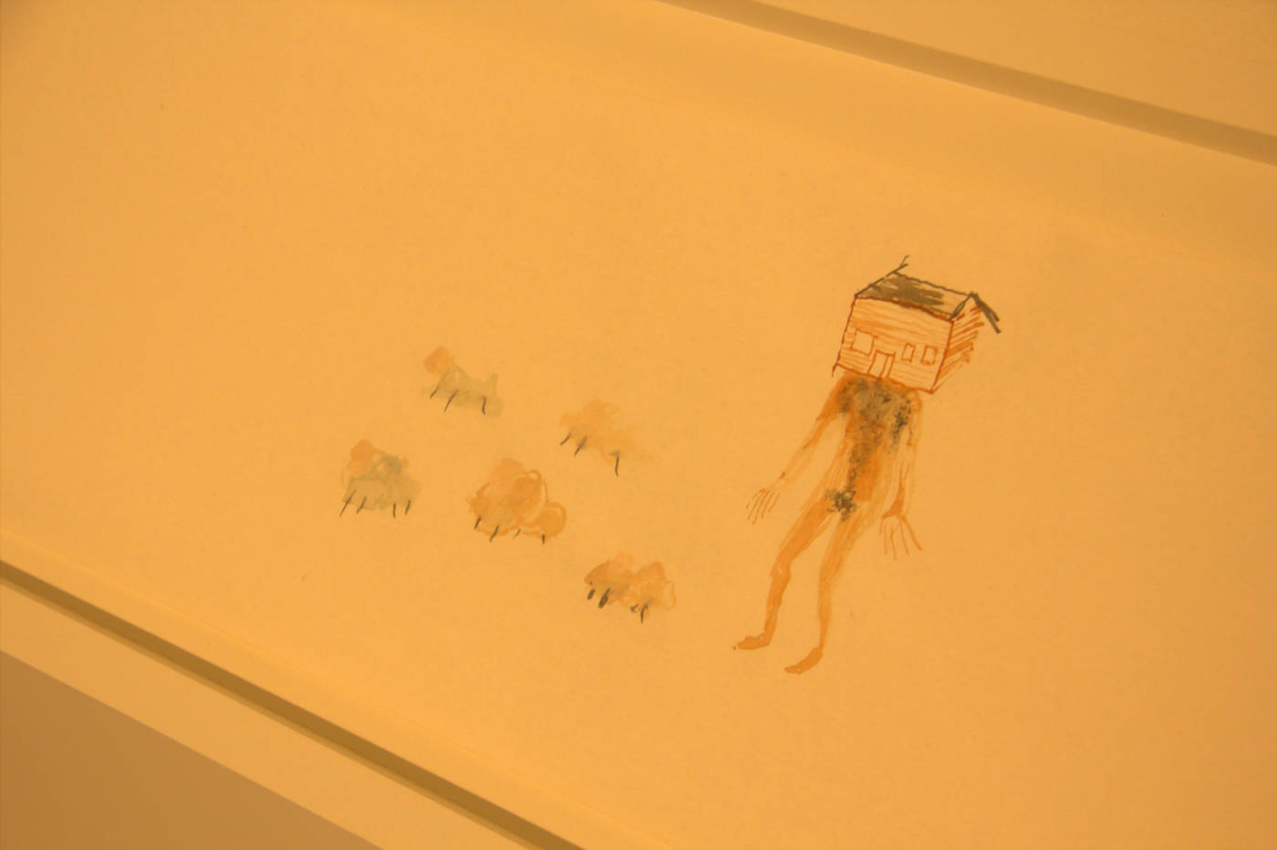
I really enjoyed the scale/ length of this piece and the material, which was the recognizable format of a scroll. I also really liked the sketchy and almost fantastical, imaginary and dream-like nature of the drawings that were drawn onto this long scroll. This nature of the drawings made this piece feel almost as if it had been drawn on by a child and brings about feeling of nostalgia of some of my own drawing I had done as a kid, as well as characters in older children’s cartoons.
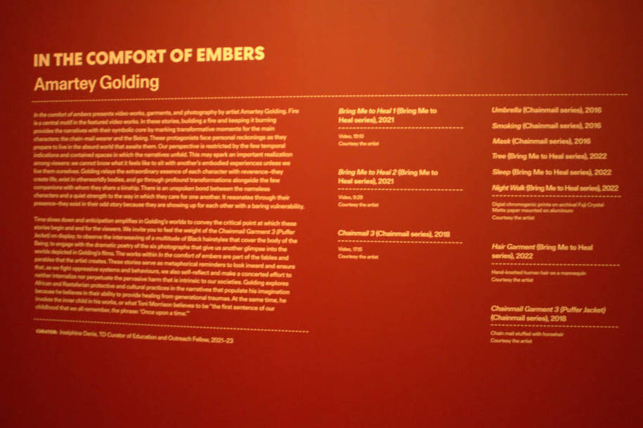
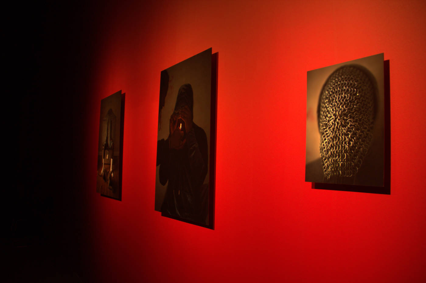
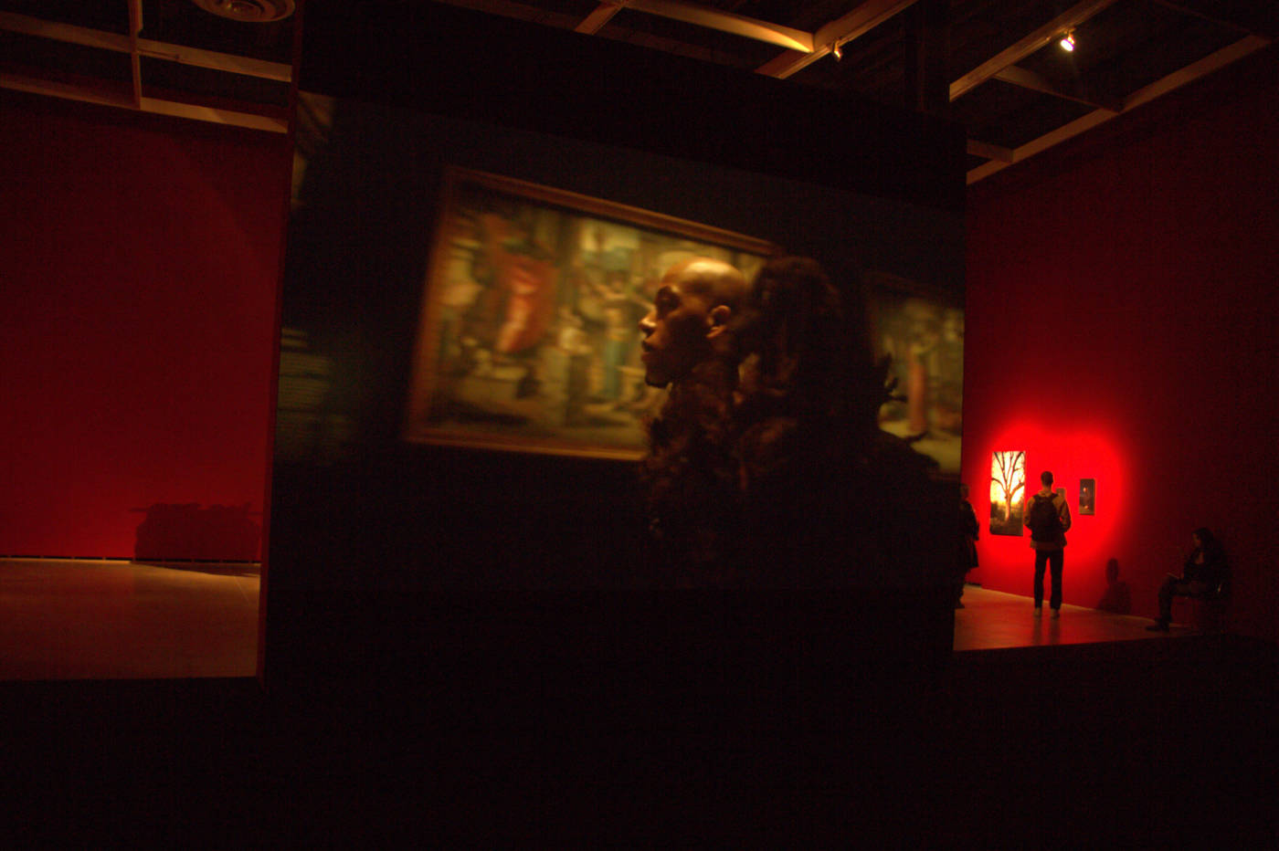


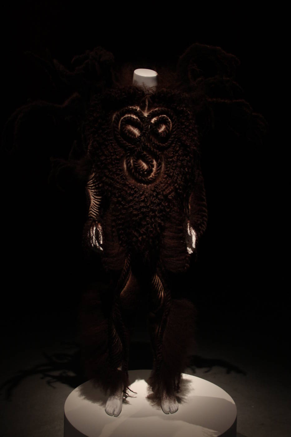
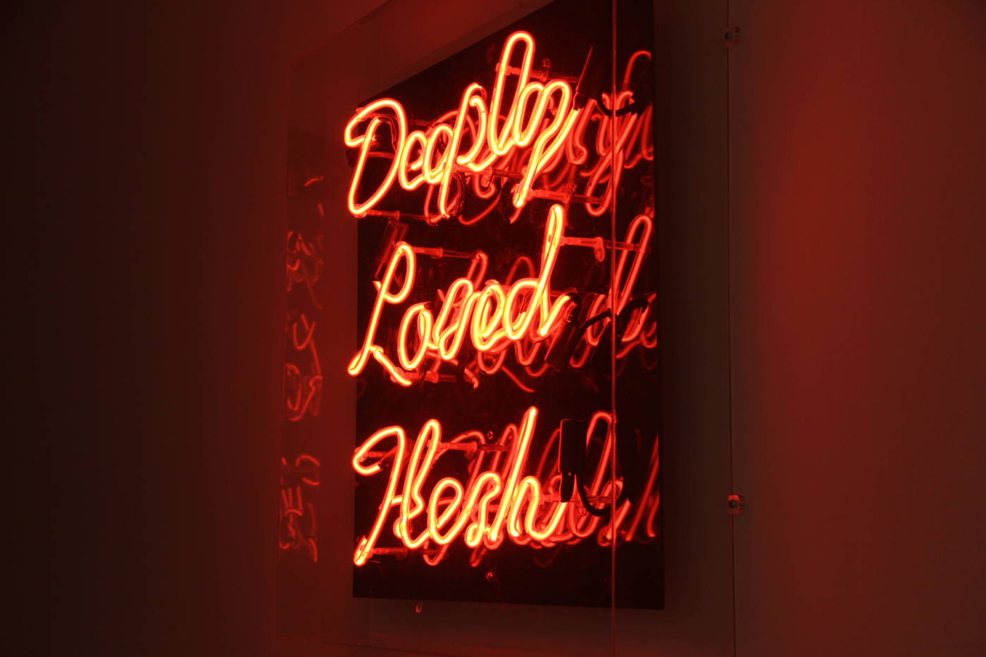
This collection by Amartey Golding was particularly striking to me, especially for its extremally dramatic and moody ambience and pieces. Firstly, I was very captivated by the scale of the video that was playing in the room and the loud but intriguing musical composition that went along with it. I am personally very interested in art works, particularly video art works, that are cinematic or narrative driven and I was very excited to see a piece like this in an exhibition. Everything from the costumes to the music to the locations (a museum and an intimate house setting), were very dramatic but it worked in the best way for this extremely impactful and striking piece. I was also very excited to see just raw photography (on a canvas on the wall) because I absolutely love photography and its nice to see how it can be used in a very conceptual and experimental way. I was also very impressed by the photography for its extremely moody nature and themes that complimented the videos playing and the costumes that were shown in the videos. I really enjoyed the consideration and use of lighting and depth of field techniques, especially in the shallow depth of field in the photograph of chains on a face, or the use of a lighter to create an interesting light source or the use of flash in the outdoor photos of the “creature” from the Bring Me To Heal videos. I also liked that the costumes from the videos were present in the gallery, as it really helped to get a feeling for the extremely dramatic size and stylization of them. Lastly, I was very intrigued by the bright red walls in the gallery. Red is a color that is commonly associated with strong and dramatic feelings like anger or passion and to me this added more charged emotion and mood to the videos and other pieces in the the exhibition.
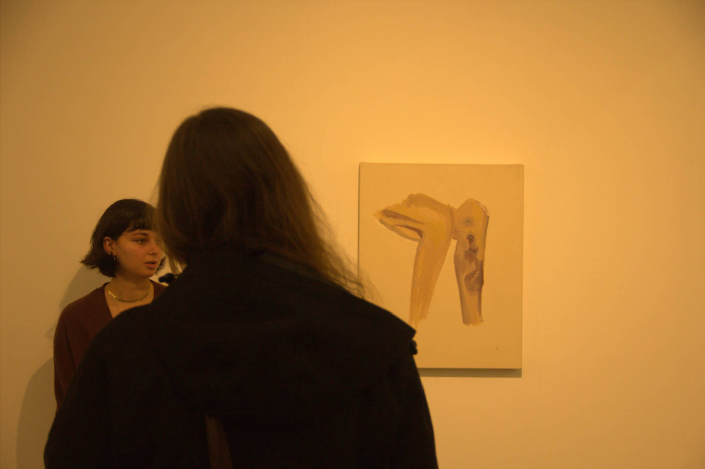
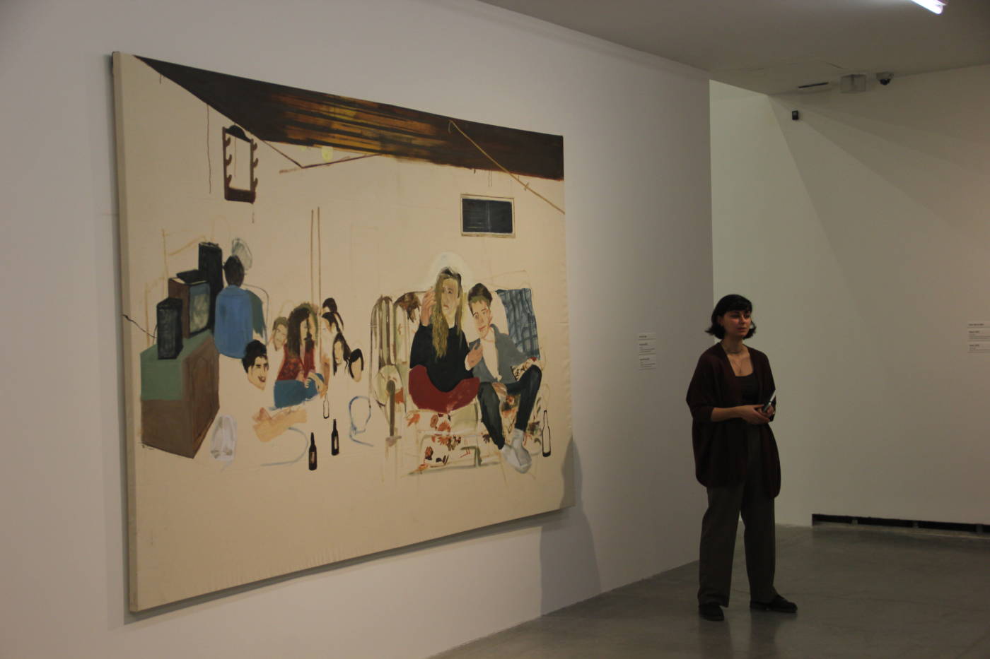

I really enjoyed how this artist lets the viewers make their own connections with her work and interpret them each in their own way based on their own nostalgic or personal moments.
SCREAM
For my audio assignment piece I decided to take inspiration partly from a piece we listened to during class and from the kind of music I like to listen to. I knew from the start that I wanted to work with music in some way for this audio assignment and work with how it is significant to me. Music helps me relax in stressful situations, as I tend to get anxious quite a bit and putting in ear buds has always helped me to calm down. However, if you have already listened to my piece, than you might be wondering right now, “how the heck does this kind of music help you to relax”. In these songs, the screaming is typically the most emotional part and it is also the part of the song that I lose myself in the most. A scream can mean anger and rage, but it can also mean a range of other emotions, like sadness or even happiness and excitement. I wanted to show a range of these screams in my piece and I also wanted to highlight how meaningful screaming is in music and how different each scream can be.
I also took inspiration from the piece we listened to in class titled “Love 100”, in which the artist Carmen Mattear compiled songs from the top 10 on radios from 1919-2019. In this piece, Mattear took the word “love” out from each song and played this compilation of the word “love” one after the other. I liked the way in which the audio cuts between songs, where sometimes there is a stark contrast between the two songs that are played next to one another, and sometimes the two songs flow right into each other. Once I heard this piece I knew that I wanted to create a similar effect with my own piece “The Scream”.
My audio piece for this assignment is a 1 minute and 4 second compilation of screaming from some of my favorite songs, however I also created a Spotify playlist with the songs I used in my project. I would encourage anyone to give them a listen, because it is better to experience screaming in music with the accompaniment of the rest of the song. If I were to present this piece in a gallery I would most likely create a list of the songs I used in my project and place it directly on the wall in front of a set of headphones to listen to the piece. I realized that this piece might not be best suited to play out loud in a gallery after watching my roommate flinching while listening to it (ha ha). Aside from this, I also feel that the experience of listening to this music through headphones is also very similar to my own personal experience of listening to music to relax.
Conceptual Portrait of Canada
The original idea for this piece was actually inspired by a book that I had and read as a child titled “M is for Maple: A Canadian Alphabet” written by Mike Ulmer and illustrated by Melanie Rose. Growing up outside of Canada my parents always tried their best to “raise me like a Canadian”, with Canadian values and some knowledge about the country. The book, “M is for Maple”, was a list of typically Canadian things that my parents would often read to me and try to explain what each thing on the list was and why it was important to Canada. However, I never truly got a sense of what Canada was like until I moved to Ontario for University. Now, since I mostly grew up in Europe, I can only really see Canada for how it differs from what living in small European country was like. For this project I decided to compile a similar alphabetical list as the “M is for Maple” book, however I would make a list of things that came as a culture shock to me and things that stand out as “different”. I also asked both of my sisters (who similarly grew up away from Canada) and some of my expat friends to add a few things to the list. I decided to present this list through a series images and audio, as it forces the viewers to experience the list in a paced manner. What I mean by this is that the video doesn’t allow much time for the viewer to dwell on certain things in this list and are rather tossed around between upsetting, somewhat insignificant and bizarre things. For example, in the list “residential school graves” and “ridiculously flavored foods” appear next to each other and the viewer is forced to contemplate a serious and upsetting issue and then right after view something that seems so insignificant. I really enjoyed playing with this contrast between the concepts within my list and I think that the alphabetical nature of my project solidifies this by making the order of important vs insignificant things more random.
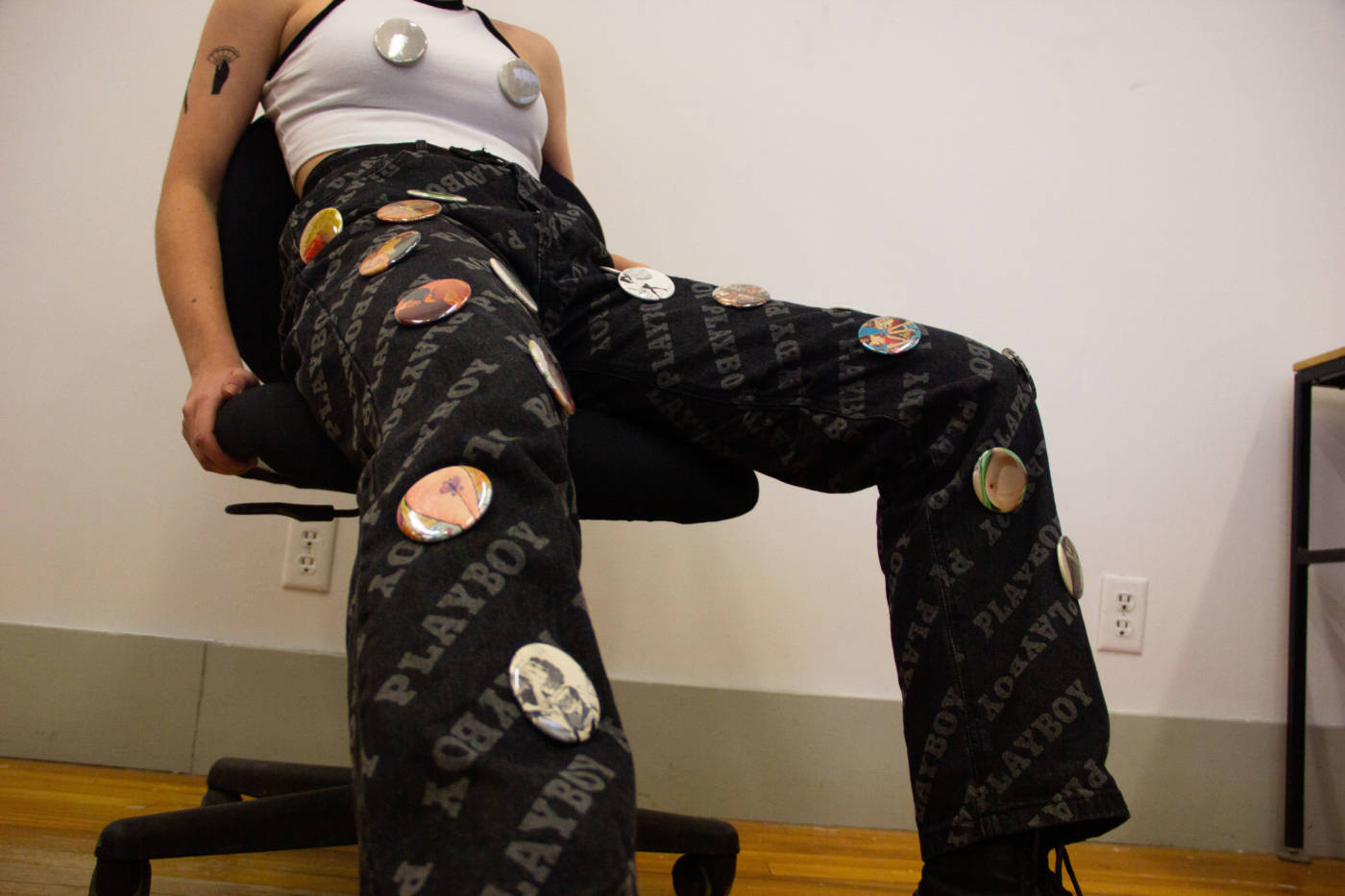
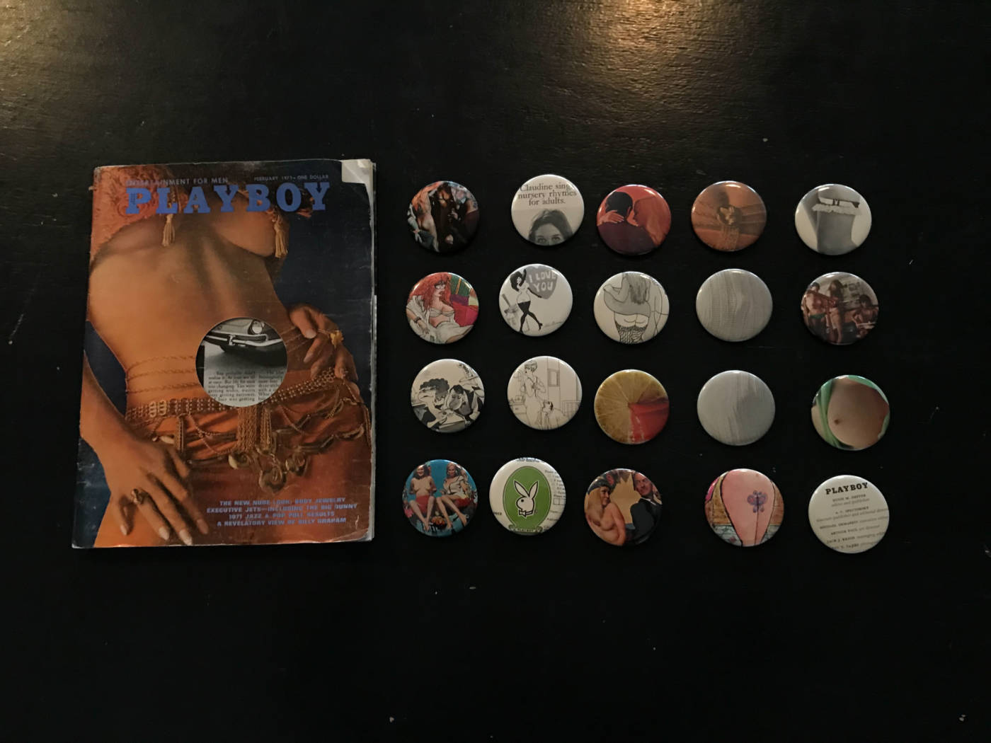
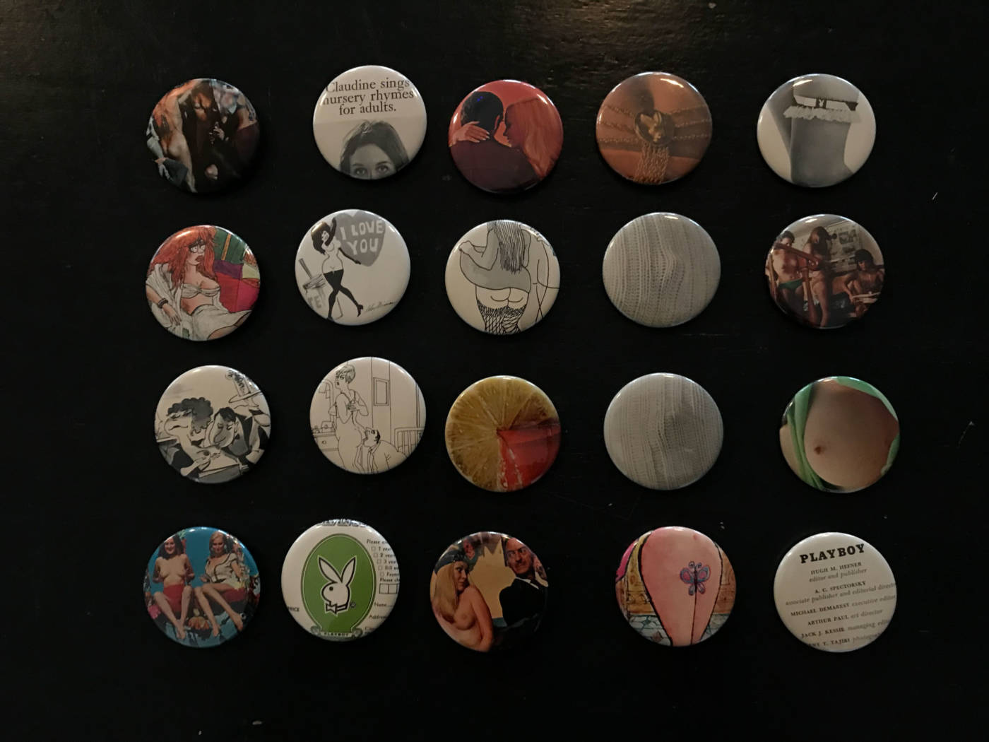
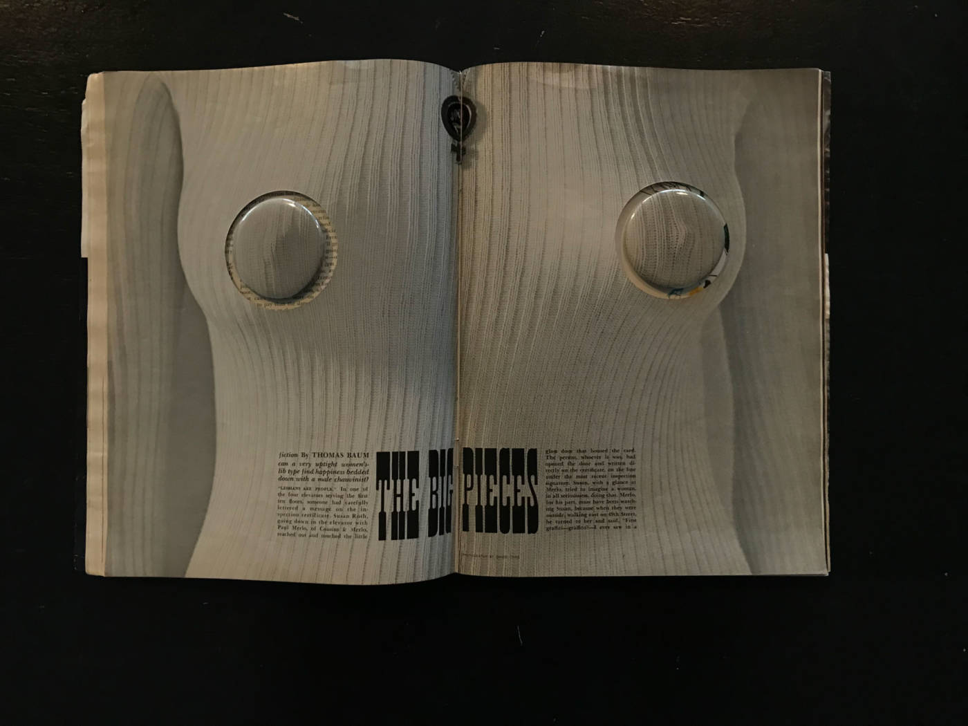
PLAYBOY Buttons
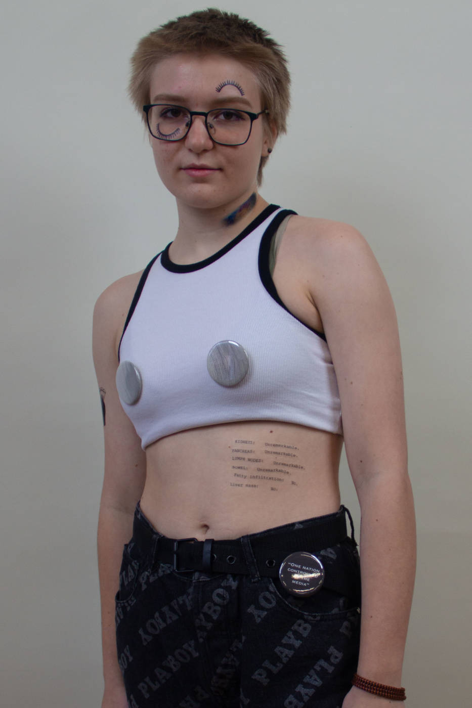


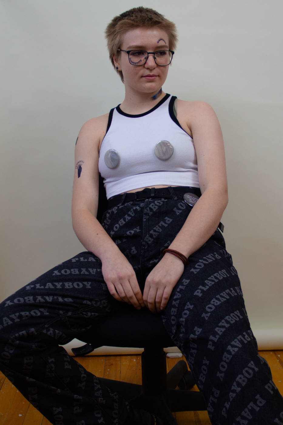
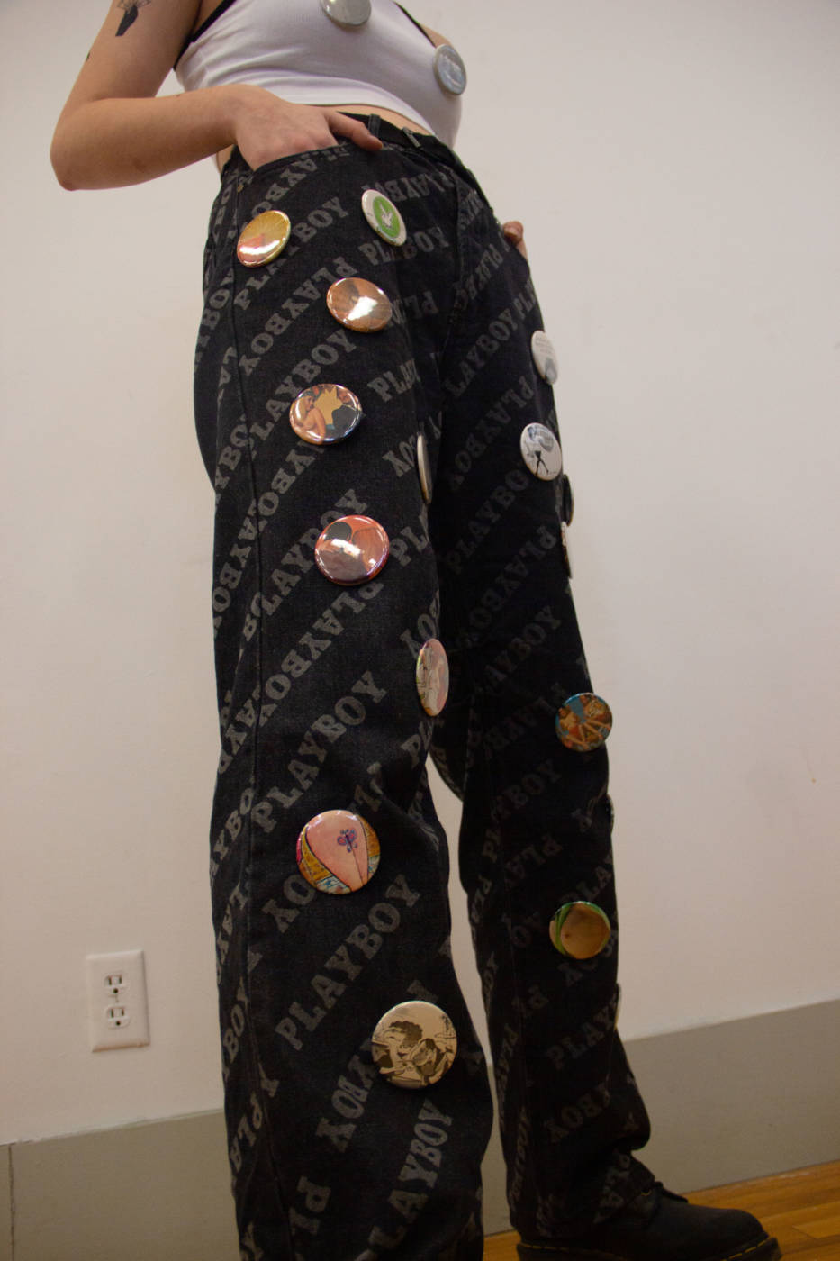

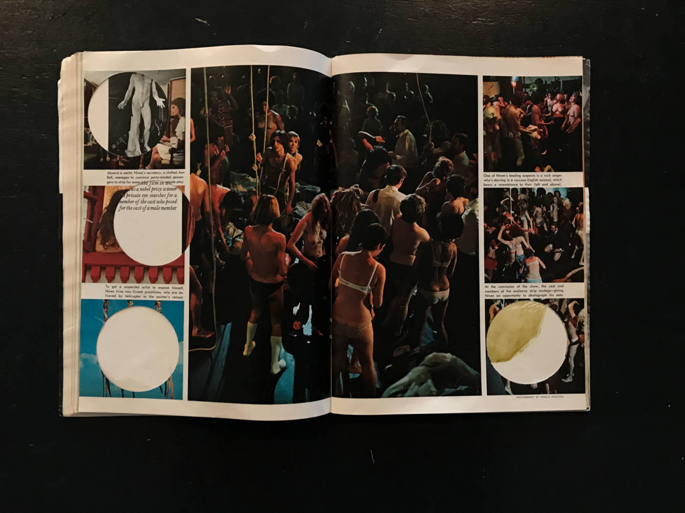
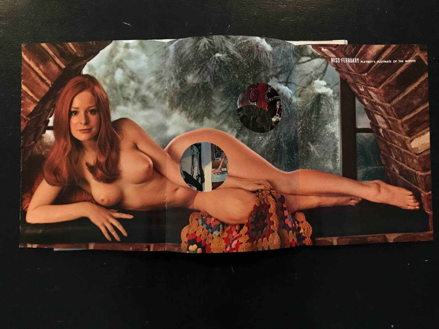
For this project I was really drawn to creating buttons that were each one of a kind and couldn’t be replicated multiple times, so from the start I wasn’t very interested in creating a graphic design for my buttons. I was also very interested in using a source of media to cut-out and create my buttons, so a magazine or newspaper seemed like the best options. I already had this 1971 February edition Playboy magazine that I had bought from an antique shop and it seemed like a very interesting material to use in order to explore aspects of femininity, empowerment, feminism and the absurdity of some of the aspects of Playboy magazines. I also really liked how the cut-outs of the magazine worked together as a collection, as each of the pieces work together to hint that these buttons are in-fact from a Playboy magazine. For example, just seeing a single button that is an explicit graphic or a naked woman doesn’t really speak to much, however as a collective the buttons make sense because you have a mix of explicit graphics, naked women, bunny iconography and erotic images viewers can gather that these are Playboy buttons. The buttons can also be quite nice as stand alone pieces (maybe pinned to a jacket or bag), however they can be quite controversial depending on the identity of the wearer. I really enjoyed the particular way that I decided to model the buttons, for example the nipple pins are quite entertaining and attention grabbing to wear over your actual nipples, especially since they are life sized. In addition, I think that my thrifted playboy jeans serve as a perfect canvas to display the buttons, the only thing that might be better would be a jean jacket version of the pants.
