WEEK ONE
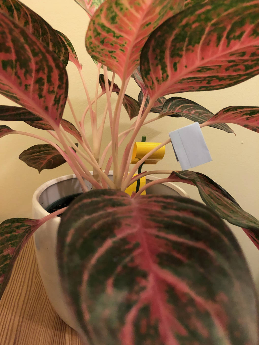
Hey all, I am very excited to explore contemporary art together this semester and I can’t wait to see what you have all come up with for the kilometre prompt! Here are my reflections on the contemporary artists we learned about this week. Here is my wish tree! (My wish on my first house plant, an Aglaonema or Chinese evergreen).
Sol Lewitt
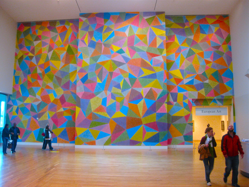
When Sol Lewitt states that “the idea becomes the machine that makes the art”, he makes sure that any creativity is used in the process of creating the detailed instructions for the work, so that the art comes directly from those original instructions and not the creative interpretation of them by others. You can have help from other artists to execute the vision, but those other artists will not be making any extra creative decisions as they will be following your detailed idea.
I found one statement in the video rather intriguing, when Lisa Freiman mentioned that Lewitt views his plans like a score for a piece of music and everything that happens afterwards is the artistic interpretation of that original score. I think this is the best way to look at conceptual art. In music, an original song can be composed with a certain instrument in mind, a certain melody, and a certain emotion behind it, but anyone who makes a cover of that song can choose how much they follow those original “instructions”. In a similar way, the instructions set out by Lewitt for the group of artists to carry out the recreation of his large artwork “Wall Drawing 652” were the instructions for the perfect execution of the original idea. These artists were set on recreating the piece exactly, not creating a “cover” of the artwork based loosely on the plans, making many calls to Lewitt to make sure they stayed on track. In his work, Sol Lewitt makes sure that the execution of the artwork requires no extra creative thought because he has already produced the artwork in great detail on paper. In the transition of this artwork to a new location, Lewitt did have to make a few adjustments to the plan, but, again, he as the artist made those calls and not the individuals who helped him execute the artwork.
The artist’s hand is found in the plans and the written diagrams and outlines, not always in the execution of the plan. With conceptual art, the main feature is the concept, which is where you see each unique artist’s perspective or “hand”, just like in painting you can see the artist’s hand through the brushstrokes used to create the final image. Without the unique ideas of the artist, the final product would never have been realized and in that way, you can see the artist in the concepts their work approaches.
Yoko Ono
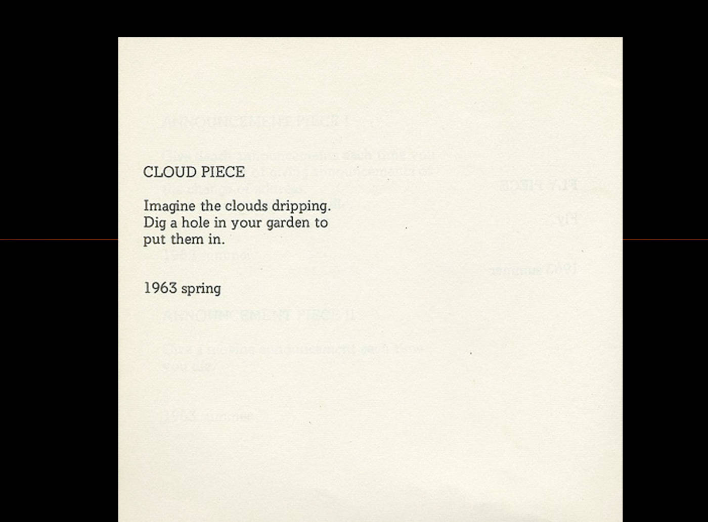
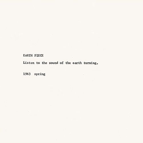
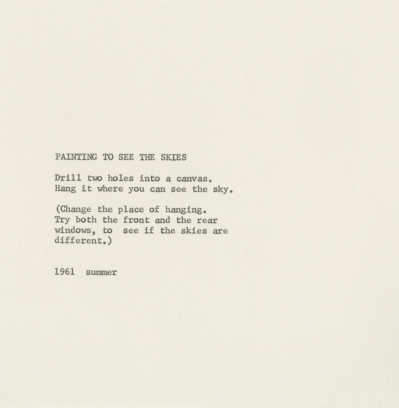
As Yoko Ono was reading from her book, Grapefruit, a pattern emerged. Each “artwork” was a concept and a very simple set of instructions to carry out the concept. I drew the boundaries around the artworks as they were separated by titles. Each introduction of a new concept meant the introduction of a new artwork. I think that even though the instructions are only written on paper, and this allows others the opportunity to go out and make visual products of the instructions, the artworks are the written instructions. If you were to go out and carry out the instructions for “Paint to see the sky”, you would go out and cut two holes in a canvas so that you can see the sky, changing the location of the painting to see if the skies are different. In the execution of this artwork, you aren’t making many creative decisions that aren’t already prescribed in the instructions and therefore you are just continuing to execute the original artwork. Just like I mentioned with Sol Lewitt’s work, Yoko’s ideas are what make the artwork original and anyone who uses her instructions to create something would still be following that original artwork.
I was really moved by the pieces about seeing the sky or the clouds, such as “Painting to see the Skies”, “Earth Piece”, and “Cloud Piece” because I always find myself admiring the sky and taking in the natural world when I go on walks outside and so I like what the prompts entail. A lot of Ono’s work in Grapefruit resonates with me because of its simplicity and its mindfulness. I appreciate that many of the works are attempts to get us to connect with the earth we live on and I think there is a lot of beauty in that connection.
Bruce Nauman
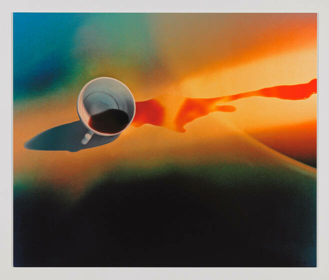
Coffee Spilled Because the Cup Was Too Hot (1966-1967)
This image produced by Bruce Nauman depicts a coffee cup that has been jolted enough to spill coffee across a surface. This would normally be seen as an accident, a mistake, and we would rush to clean up our mess, but Bruce took this common occurrence and used light, colour, and framing to make it into art. When he takes a photograph of this coffee mug, he forces the viewer to examine the scene closely. He makes us take a second look at an otherwise common scene and we start to pick apart the formal aspects of the image, the shape of the cup and the splatter, the light and where each colour intersects with another. This work doesn’t make me feel as uncomfortable as his other video and audio works do, and I think I like the fact that the image frames this “accident” as something beautiful and worthy of a colour photograph.
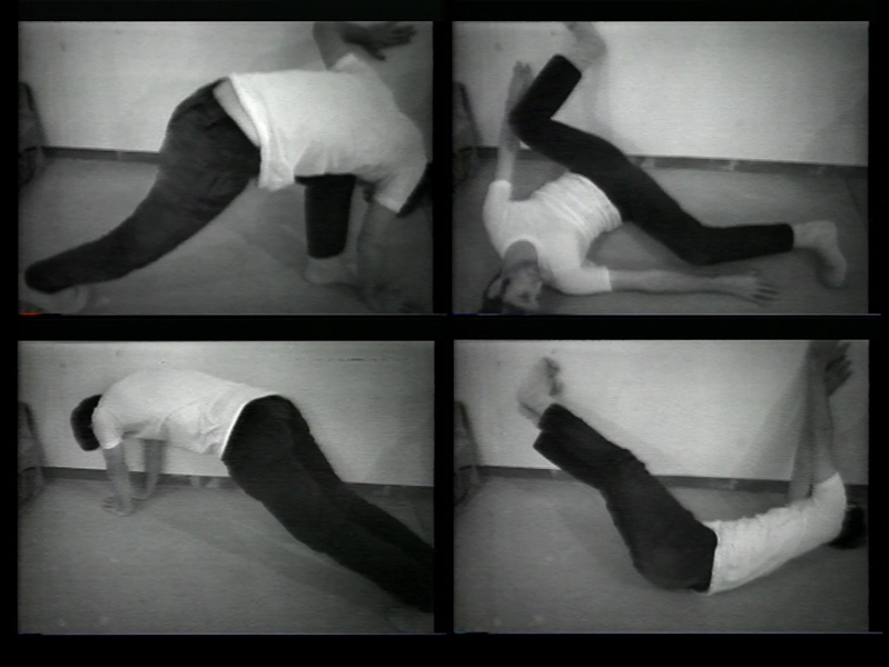
Wall-Floor Positions (1968)
This work is made up of short videos and stills of Bruce putting himself in awkward positions between the floor and a wall. In the short video we watched in class, this work is described as a work of sculpture with the least amount of material possible: your body. I appreciate the humour in the wacky positions and also thought it was very interesting to view these body positions as art or as sculptural forms. I guess the body is 3D and being contorted and documented in those contortions resembles the documentation of 3D sculptural work and so we can view it as such. I think that again, while the video might feel a bit unsettling as Bruce abruptly throws himself into these positions, there is some beauty in the simplicity of the work and the fact that he is documenting the human body and its flexibility as art. This work reminds me of trying to do random handstands and other weird gymnastic-style moves as a kid. I used to do one when I would lay on my back and swing my legs up into the air and lift my bottom half off of the ground and suspend my legs and hips in the air by holding them up with my hands and leaning on my shoulders and back. (I tried doing this to demonstrate but found it a tad more difficult than it used to be). This work brings a fun, child-like aspect to making art and moving through space and I appreciate that.
MAKE A KILOMETRE
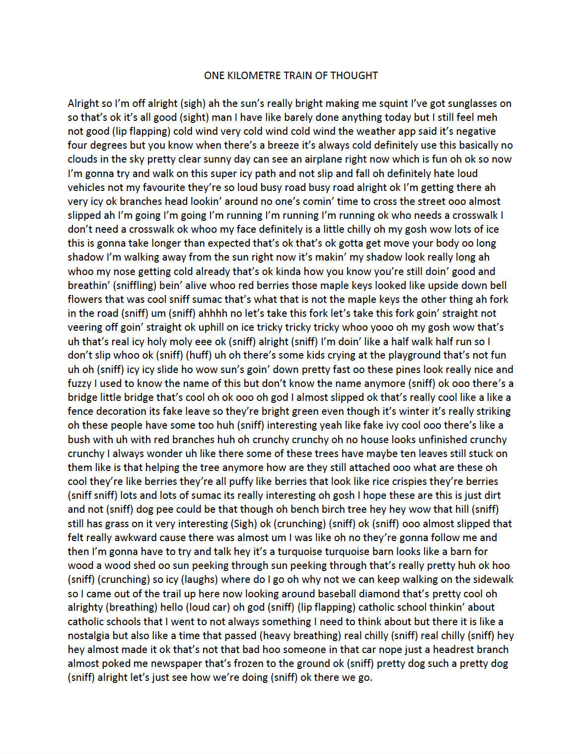
For this exercise I brainstormed a few different ideas of playing with the scale of everyday objects such as bread tags and seeing how many it would take to span a whole kilometre but I soon found myself gravitating towards the movement aspect of the concept. I decided to document a one kilometre walk through an audio recording of my train of thought throughout the walk. I wasn’t sure if I would want the final piece to be the audio file (which was 14:48 long) or use a transcript of the walk. In the end I decided I liked the look of one continuous sentence transcribing a 14 minute, 1km walk. It ended up fitting perfectly onto one page and the chaos of the never-ending sentence with no punctuation felt like it captured the essence of my random train of thought. I often stop stories in the middle of telling them to go off on a completely different tangent, leaving my friends wondering where I went off to with the story so I thought that rambling through time would match the concept of a kilometre as a distance travelled over time. I quite enjoyed this exercise and it was interesting to try and approach a widely used concept (common measure of distance) in a new way.
I documented the walk length on my phone’s health app, you can see that the specific walk I went on was 1km long.

WEEK TWO
Marina Abramovic
I have seen “The Artist Is Present” before and I remember the moment Marina shared with Ulay which I found to be quite moving as he showed his support for her long three month journey as a former partner and artist. I appreciate that she took the older performance, Nightsea Crossing, she did with Ulay, where he was injured from sitting still on the chair for so long, and brought it back with the empty chair that anyone could fill. I think it is a moving piece because of the unconditional love Marina brings to each individual who shares a moment with her. Many of us rarely take the time to sit and have such an intimate moment with someone else and it is such a powerful gesture. Each person who came to the table brought their own experiences and emotions and got something completely different out of the experience. The interactive format made the piece more poignant.
I have always struggled with performance art like Marina’s for a few reasons. I understand the motivation to be as far from conventional beauty standards and push the envelope in terms of what is perfect art (graphic images versus picturesque romantic scenes) and how human nature can dissolve into very violent tendencies after very short amounts of time. I do feel very unsettled when I look at Marina’s work and often have to take it in small chunks over a few hours or days even because it always upsets me very deeply. I knew I would struggle with the concept this week because this type of performance art always brings up very strong emotions for me. I will say that while I think it is incredible how much stamina and strength Marina has to be able to put herself through all of these gruelling performances, a lot of it touches on very real and dark emotions or habits that are associated with mental illness or abuse.
[TW: I briefly mention self-harm and abuse in the next paragraph]
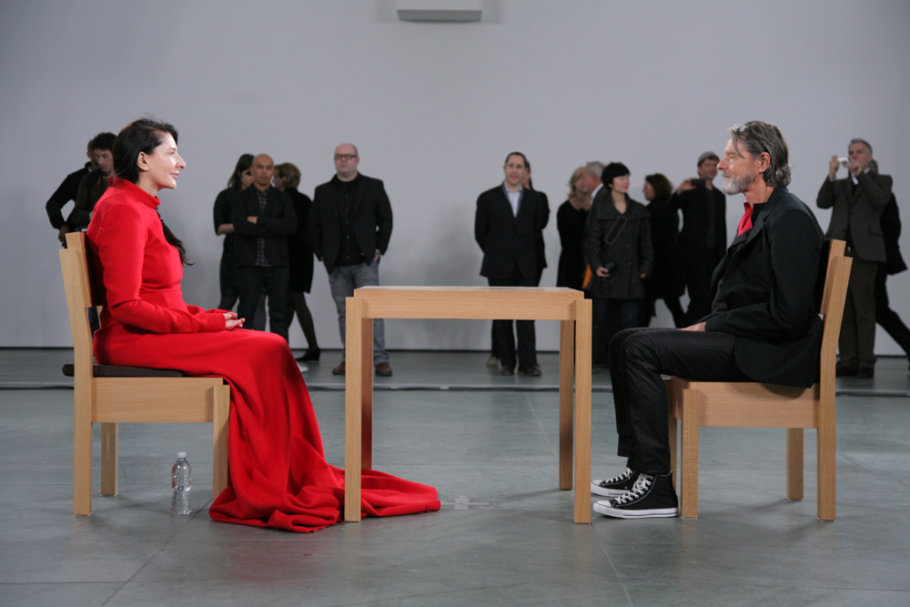
Some acts like cutting your skin or engaging in physical violence with a partner are very harmful and are associated with real mental health issues and I don’t really appreciate people who will do it as a show or a performance. Having loved ones who have experienced these very real issues I cannot fully appreciate someone doing something like this to their own body to make a statement or to perform a message, however strong that message may be. People who struggle with self-harm are not doing it for show or to perform for others, so I find it difficult to appreciate Marina’s works that show them as very deliberate public performative acts. I think there are other ways to achieve some of these messages without bringing up some very triggering imagery. I do understand that Marina has definitely struggled in her own life and has found a way to cope with her own upbringing in a very public form of art, but it is definitely not for everyone. I do believe there are more constructive ways of depicting mental illness to bring awareness and I am not sure I agree that we need to shed light on the evils of society when they are quite present every day in the news and around the world.
Maybe my strong reaction towards Marina’s work means she was ultimately successful in provoking emotion through art, and it validates her methods. I’m interested to see what we all share in our discussion on Monday!
Act of Stillness
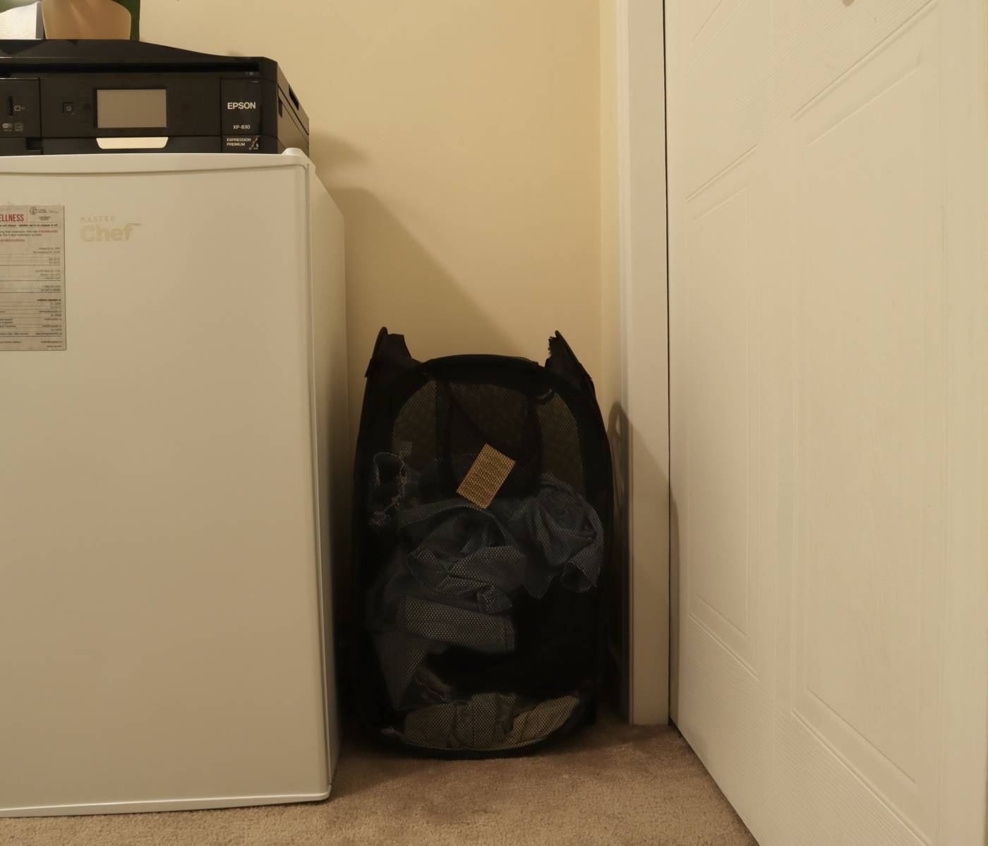

For this exercise I chose to be in my room just because I couldn’t find any great unusual places in the rest of my small rental to sit in. I decided to take the place of my laundry basket which sits in between my mini fridge and my closet. I originally wanted to sit inside of the basket, but it turned out to be too small to fit inside. I also contemplated whether I should stand or sit, but I figured I would be able to get through the hour with more stillness sitting rather than standing.
I set out in a very curled up position, I wanted to replicate the compactness of my laundry basket as much as possible because I was just taking up the space it usually takes up. I got to be tucked away in the corner just being present in that space and I didn’t feel too exposed, I was just part of the furniture. This was a difficult topic for me to explore this week as I struggle with a lot of Marina’s more violent works and so I wanted to finish the week off with a safe position tucked away somewhere so that I could feel secure and be still. I found this to still be a very difficult position after a while because my back and tailbone started to hurt a bit and it is so incredible how quickly you become aware of all the little discomforts when you are silent and still for an extended amount of time. I have always known I could never have the amount of strength and discipline that Marina Abramovic has while she performs, and I was gentle with myself for this exercise because I knew it was only an hour and I was in a safe space. Over the hour I switched between keeping my mind blank and my body still to fidgeting a bit to fix my position to having my mind wander off to all sorts of different places. I was reminded of some loved ones this week while exploring the more graphic of Marina’s works and I often found myself thinking about them over the hour and it was an emotional experience for me. Maybe I shed a tear or two.
WEEK THREE
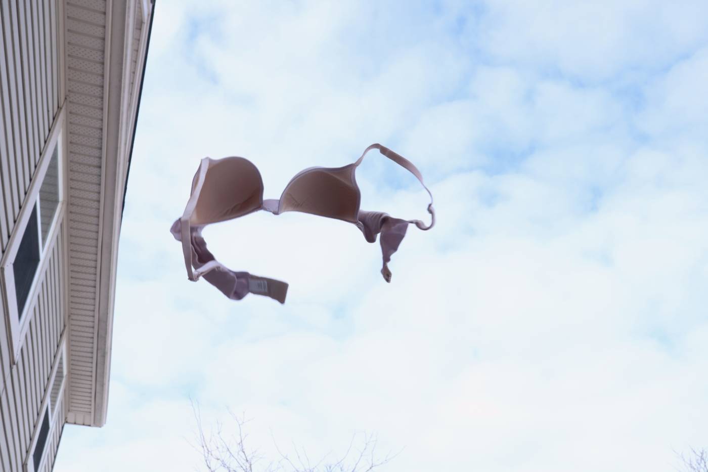
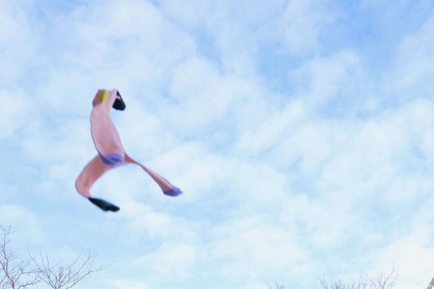
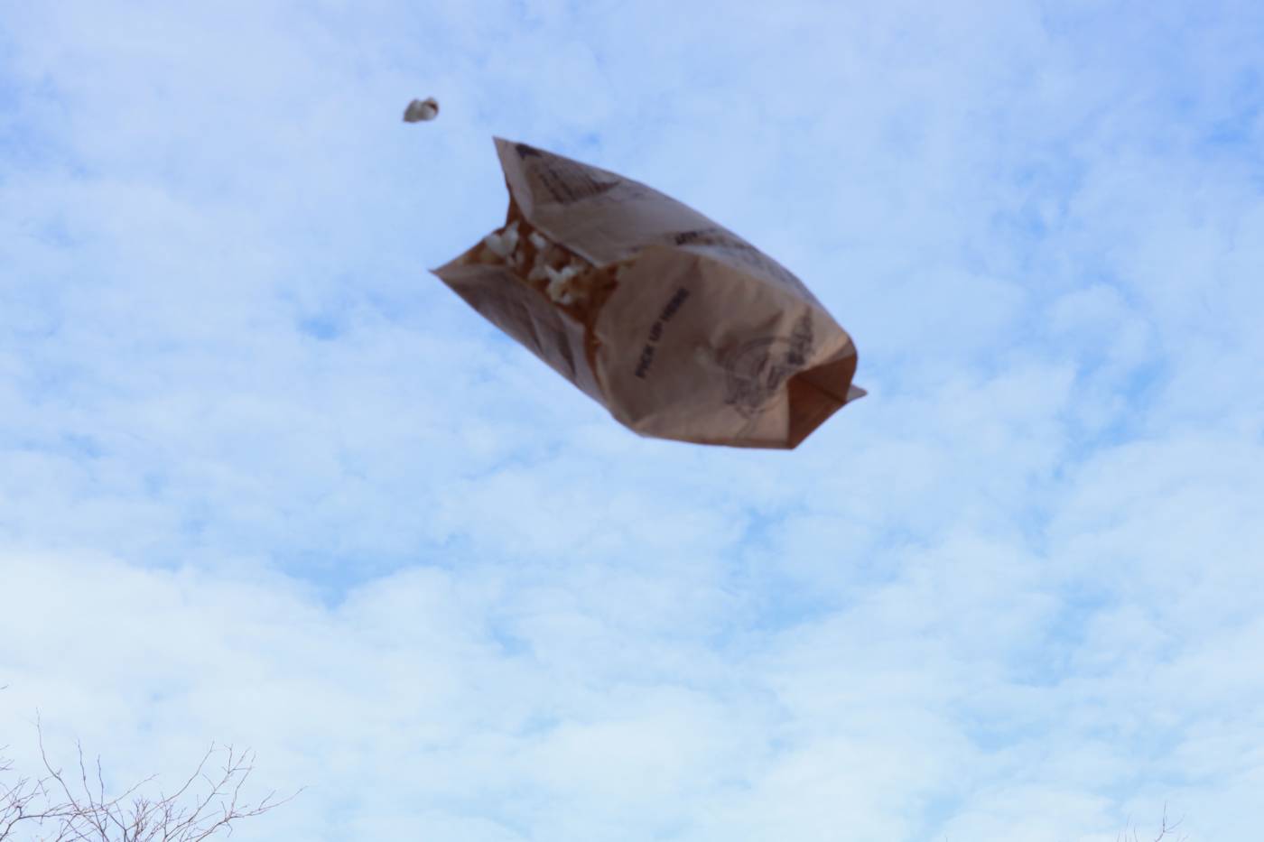
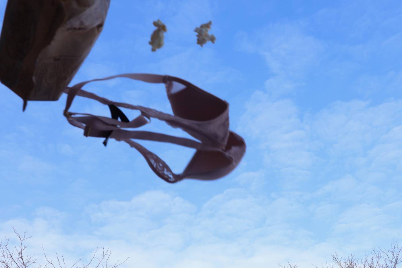
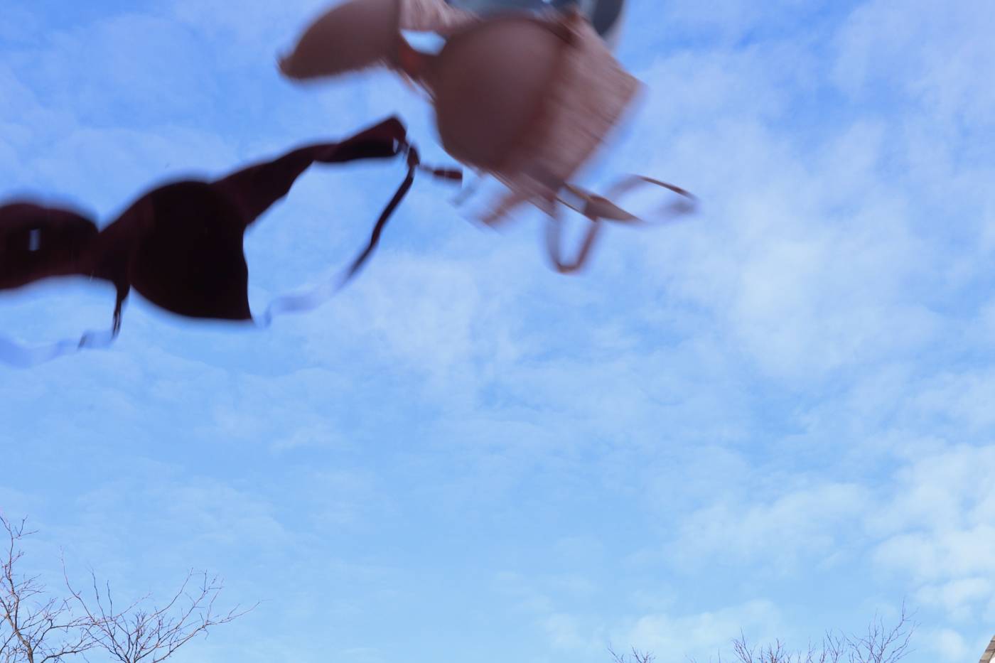
Defenestrate objects. Photograph them in mid-air.
This week we looked at a few different conceptual artists who experiment with text based work and video work that follow pre-determined instructions but make unique interpretations of those instructions or rules. I have always enjoyed Lee Walton’s work, especially the “Making Changes” video series. I love how it becomes quickly evident what the artist’s task is and there is so much humour in the execution of the action in all sorts of different places and around different individuals. I really appreciate the simplicity of the textual works where the art is the written instruction or idea.
I had fun with the prompt this week, and I almost wish I had more time with it. Maybe I’ll take more of these photos in the future in different seasons and somewhere where I have access to a proper window to experiment with different framing of the objects. I liked the look of the objects against the blue sky so I tried not to include too many other distracting objects in the frame of the images.
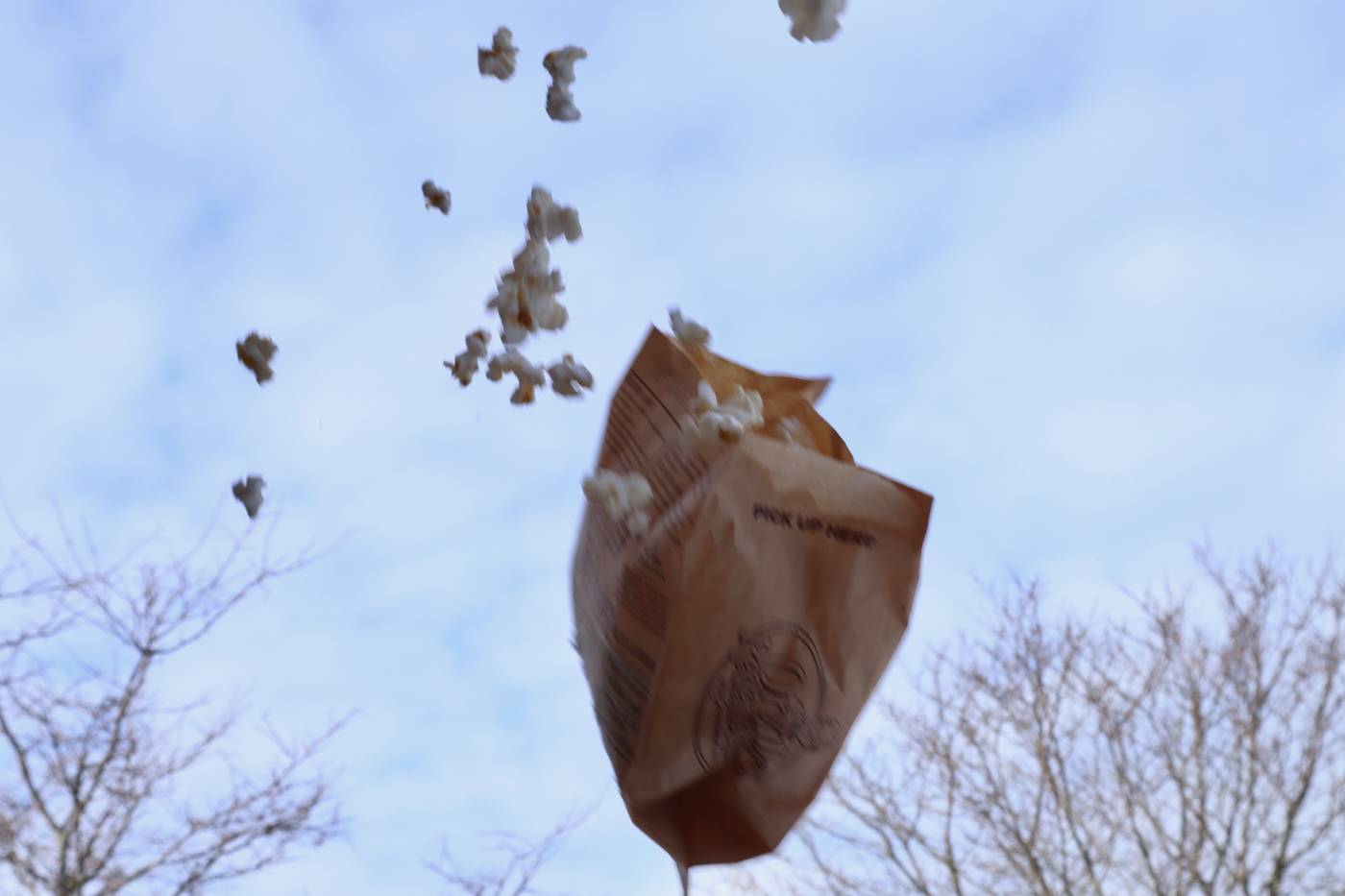
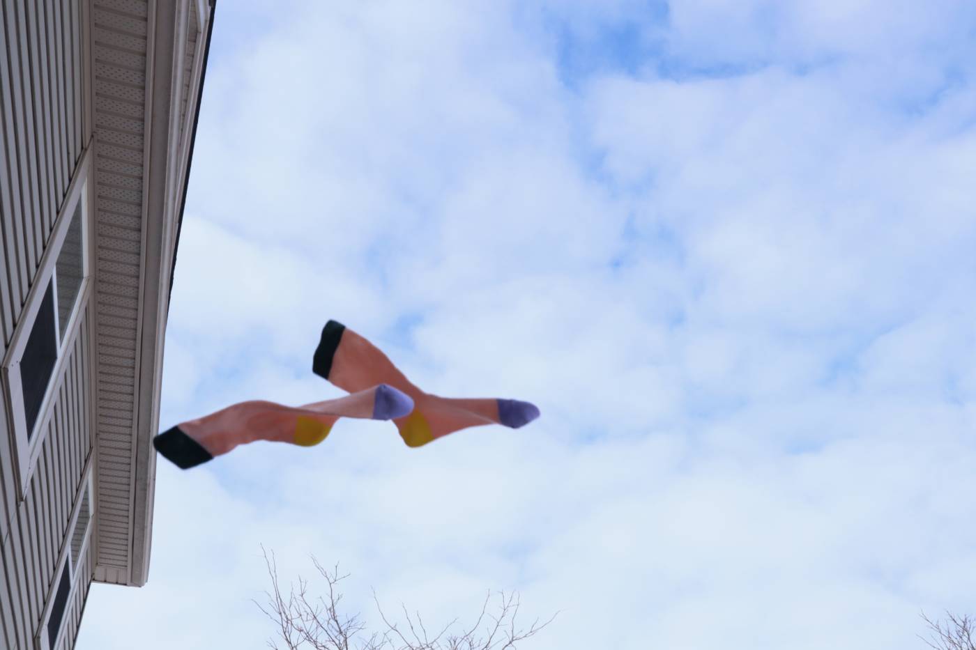
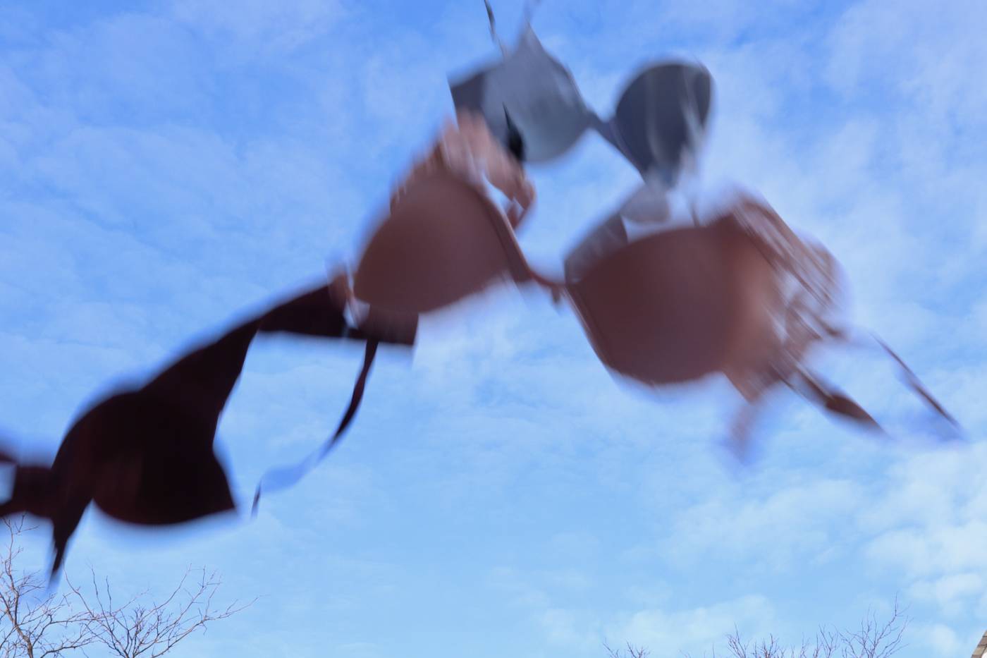
On the one hand, I had some ideas of the reasons I decided on my objects (bras, a pair of socks, and a bag of popcorn), but on the other hand I just appreciate the movement of the objects in the air and how they exist as formal objects. The image with just the bras flying through the air made me think about the past few years and how staying at home and not feeling the need to be “presentable” for certain settings have made many rethink the clothing items they wear every day and their comfort levels. While there are definitely pros to having support, many people who wear bras on a regular basis will tell you it is very freeing to take them off at the end of a long day and I thought of this image as the action of someone liberating themselves from the constraints of that darn bra.
The set of three images felt more like a combination of items one could find during a solo movie night. I really liked how the objects interacted with each other in the air and how they created this new form with weird appendages and different textures. It is a friendly clump of objects, familiar clothing items and the ever popular bag of microwave popcorn. The act of “defenestrating” gives a sense of excitement to the scene, almost as if the individual throwing the items was very eager to prepare for this event. The popcorn was very fun to work with because it felt so wrong to be throwing an open bag of popcorn through the air, making a mess.
Some attempts that didn’t make the final cut…
I had some technical issues with getting the exposure of my photos right, maybe I’ll try filming the objects next time and use stills from the videos, maybe they would be a bit clearer. I also liked when the objects took up the whole frame of the images, so these photos didn’t make the final cut because they just felt too small and their position in the frame didn’t feel balanced. I really liked how they froze in mid-air, though, and so I still wanted to share them. I especially like the last two images because the popcorn bag and bra (respectively) look like they are propelling themselves through the air instead of being thrown.
Final two series
I decided to choose two “triptychs” to make the final cut as I felt they were the most interesting in terms of formal quality, movement through the frame, and composition within the frame. There is a lot of action in the first set with three different coloured bras flying through the air. I appreciated the blur in these images as they whoosh through the air, although if I tried this again I would definitely try and get an even clearer shot that shows them really frozen in mid-air. The second set I really liked because each item is connected to another and they create this interesting creature mid-air.
Set 1: Ahhhh

Set 2: Ready to go
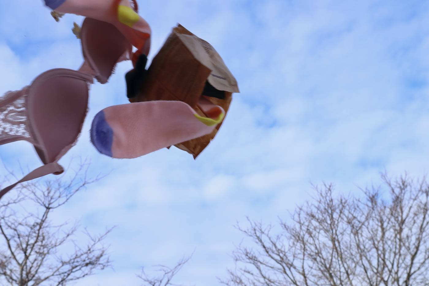

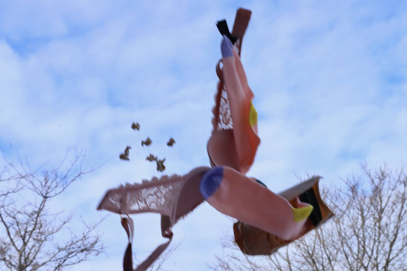
I am not sure how I feel about my decision to include the trees in the bottom of the shots. I figured it was helpful to have some small background feature that established where the ground was, but looking back at these images, especially the second set, I would like to see them without the trees in the background.
WEEK FOUR
Pandemic Portraits: What’s pent up?
Here are my two video portraits in the Adad Hannah style. I found this assignment to be particularly scary as I am really not comfortable asking strangers questions as they go about their day. I took this class to push myself into ways of making art that make me uncomfortable and I am very proud that I was able to accomplish this small task. I struck out quite a few times before Billy was gracious enough to let me film him. His message is very moving and made me understand why this form of art making is so freeing and important. You can take a snapshot of a person at one point in their lives and share that moment with them forever, even if you never see them again. It was also encouraging to me that he felt comfortable enough to share such a personal statement and the significance and the story behind that statement didn’t fully sink in until we had parted ways. It wasn’t my place to push for follow up questions and if I was able to provide Billy with an opportunity to let out some thought that he has had pent up then I feel that this short exercise was successful.
I stopped Billy as he was exiting Stone Road Mall.
Billy
“Anniversaries aren’t the same once you lose the person.”
I am also so thankful to live with one of my best friends, Lindsay, and over the years she has been so open to helping with all my random art projects. I really appreciated her taking part in this project and I know it was hard for her to have something personal be filmed, but she is just so great and fearless and I am glad we can add her to our collection of individuals. She is working very hard on midterms right now and took a bit of time out of studying to help me film this.
Lindsay
“Um, I feel like I guess I’ve just been passively living my life lately.”
WEEK FIVE
Change your face in three ways
Works in progress
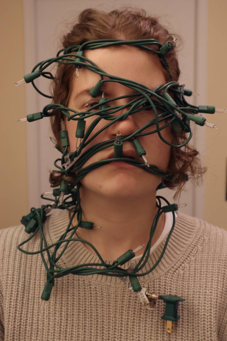
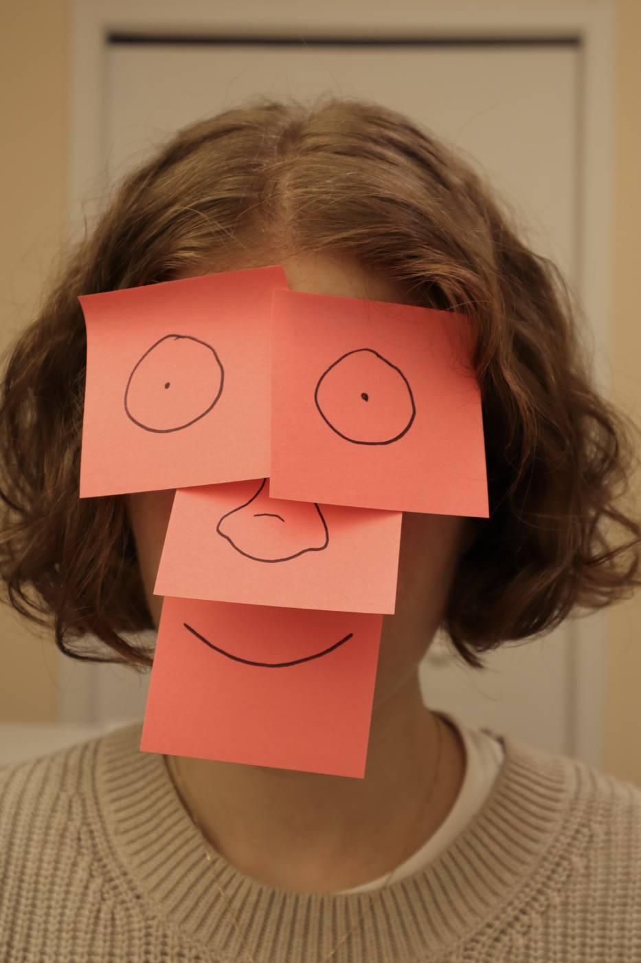
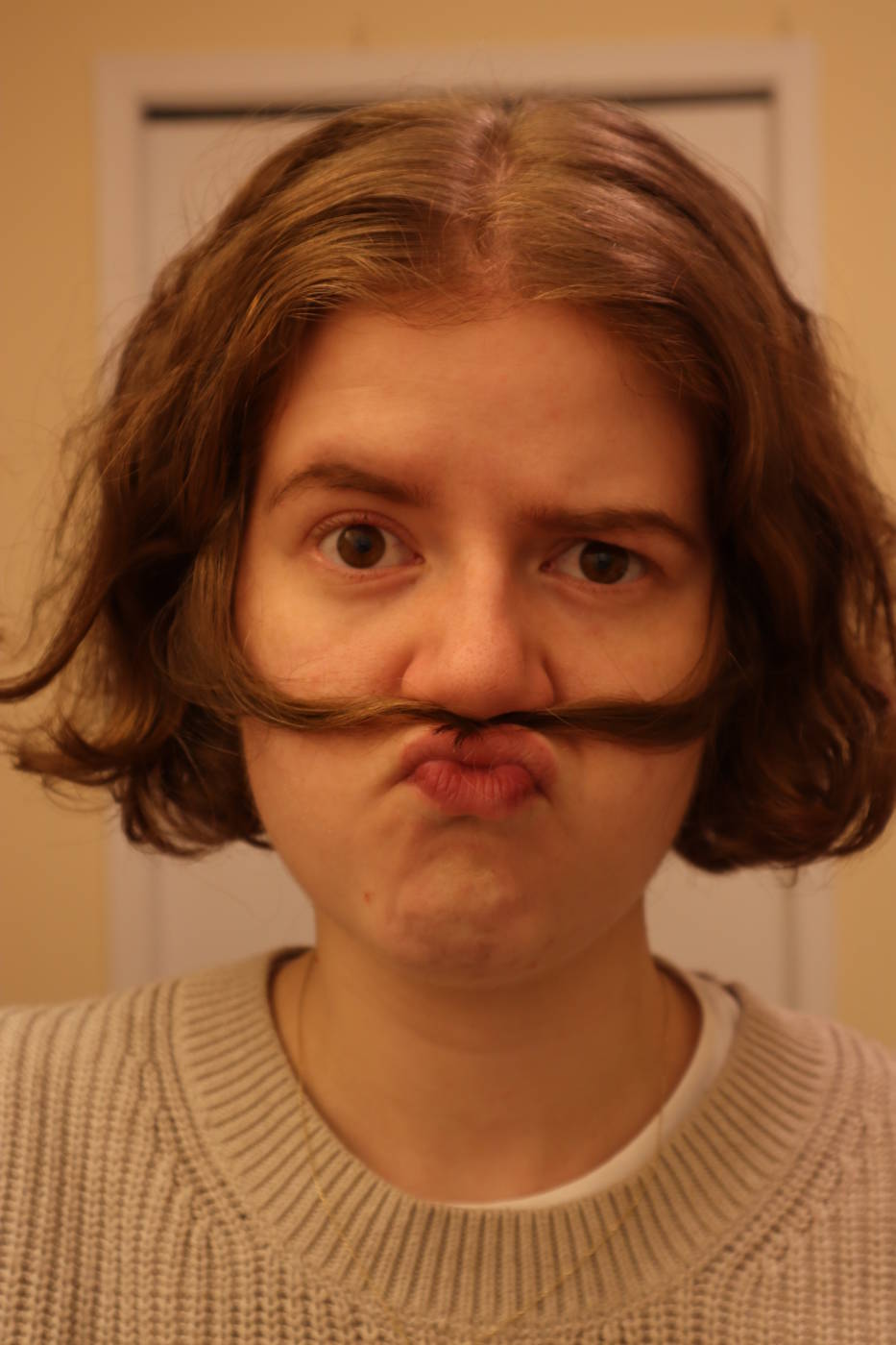
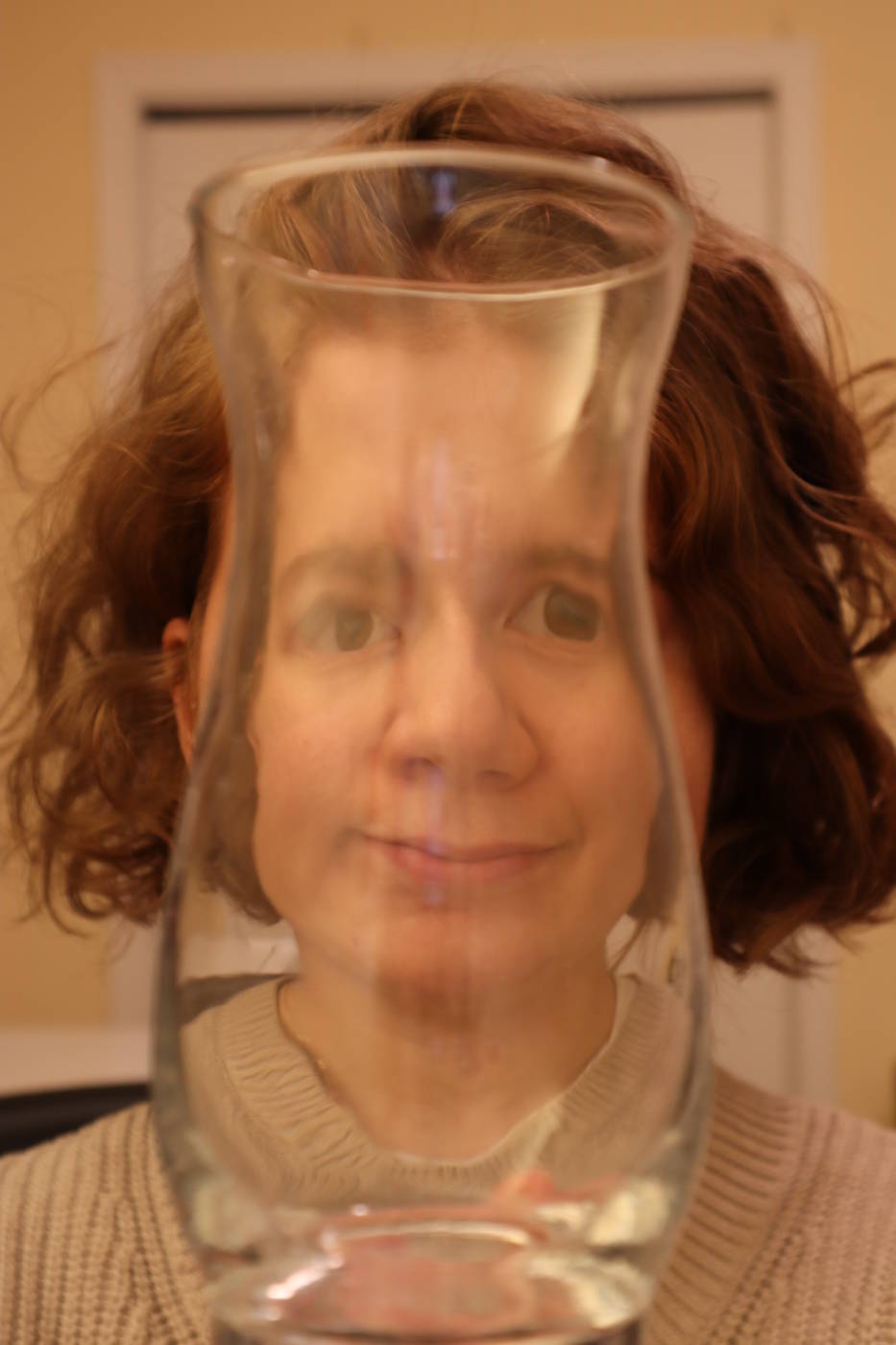
Final three faces


Face #1
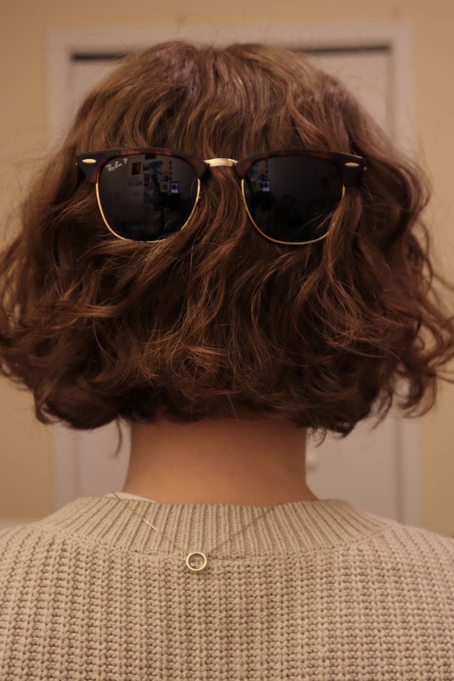
In class we read the essay “Turn and Face the Strange: Darcey Steinke on Our New Life with Masks” and the work elaborated on quite a few different examples of how faces and masks are integral to our everyday life. I found some of these examples very interesting such as the section about pareidolia, which is when you can see faces or other pictures in any object. We often associate the features of a human face with emotions, sentience, and identity and when our brain sees a pattern that resembles a typical human face, it makes us double back and take a better look. For my first face transformation, I wanted to explore this checklist of features that make a face, a face. With my sunglasses perched on the back of my head, I posed for this portrait and it created this face that makes you stop and think for a second. You might instantly associate sunglasses with eyes and then subconsciously assume that there are eyes directly behind these glasses. Even without other features like a nose and mouth, the sunglasses seem to be enough to create a whole new face on the back of my own.
Face #2
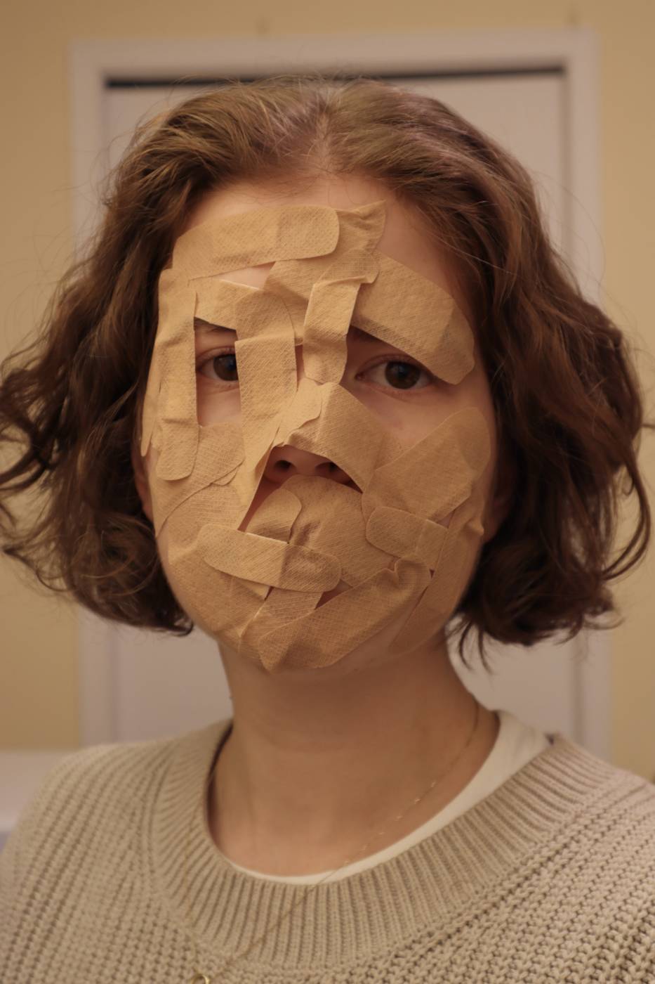
For the next face, I started experimenting with covering up my face with different items such as a bunch of string lights, Q-tips, and band-aids. I chose the band-aid portrait because I really liked how sculptural the pile of band-aids became as I kept adding layers. I didn’t count how many I used, my only goal was just to cover the majority of my skin with them. We usually use band-aids to cover up wounds, they protect us when we are hurt, and I like to think of this mask as a protective layer. It could be protecting the subject’s face from any number of things, internal struggle or external attacks. It reminded me of some of the transformations that Jan Hakon Erichsen created for the “How to survive a deadly global virus” series, specifically the maxi pad being adhered directly onto someone’s face. Our face helps us not only to communicate and emote, but also to eat, drink, breathe, and blink and it can be unsettling to adhere something to this multi-functional part of your body, especially if it interferes with these basic functions.

Face #3
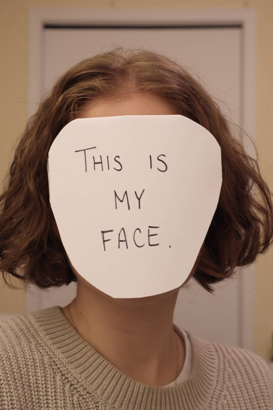
For this face I decided to explore the work of John Baldessari when I saw the reference to his coloured dot photograph works in the examples of Jackie Nickerson’s portraits. The concept that John explored with his works was how, by painting or covering someone’s face, their fame or popularity becomes less important and you start to focus on what is actually going on in these pictures. Some are of business men or politicians shaking hands, cutting ribbons, and you start to focus on the business being done and less on the identity of the people involved. Without their unique, identifying facial features, are their actions more or less important? Does it matter who is at the ceremony or does it only matter that something has been built, agreed upon, or proposed? This was my take on making myself a new face that allows the rest of me to come into focus.
WEEK SEVEN
Artist Multiples: Buttons
This week we worked on developing conceptual button designs that could be quickly reproduced to create cheap artist multiples. I had a few ideas floating around, but I remembered that I have been collecting bread tags since the start of the pandemic in March 2020. At first, the collection was a product of wanting to have something to look forward to (collecting random items in the hopes of making something in the future, especially easily found items since we were all stuck inside), but as time went on it became interesting as a commentary on all the small mass produced plastics we make and discard every day. My family continues to collect their bread tags for me almost two years later and I have basically amassed a collection of these tags that tell the story of living for two years in a pandemic.
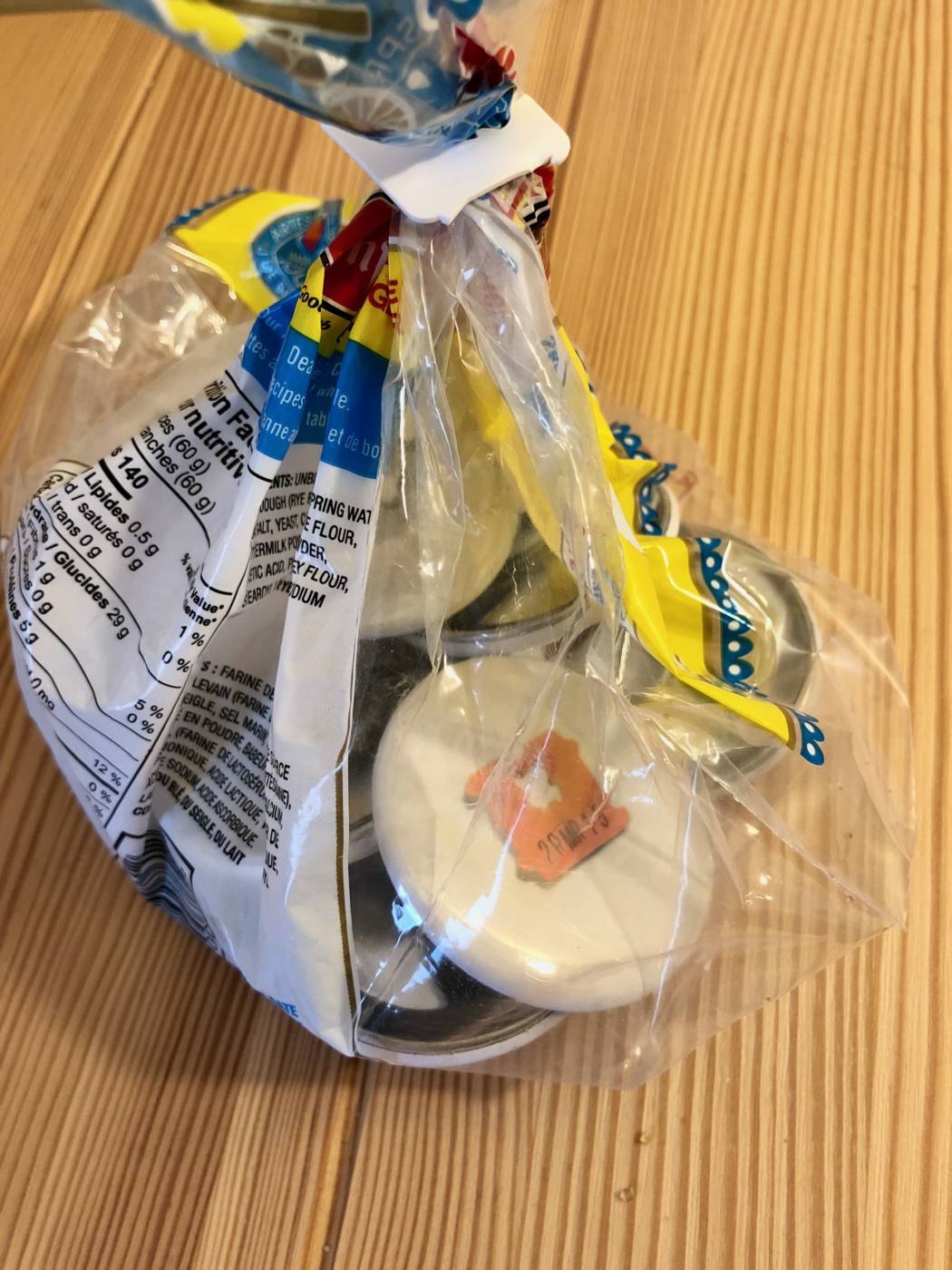
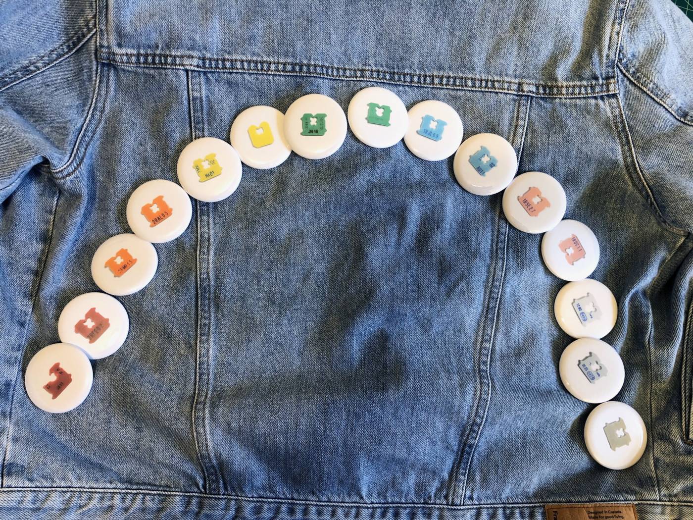
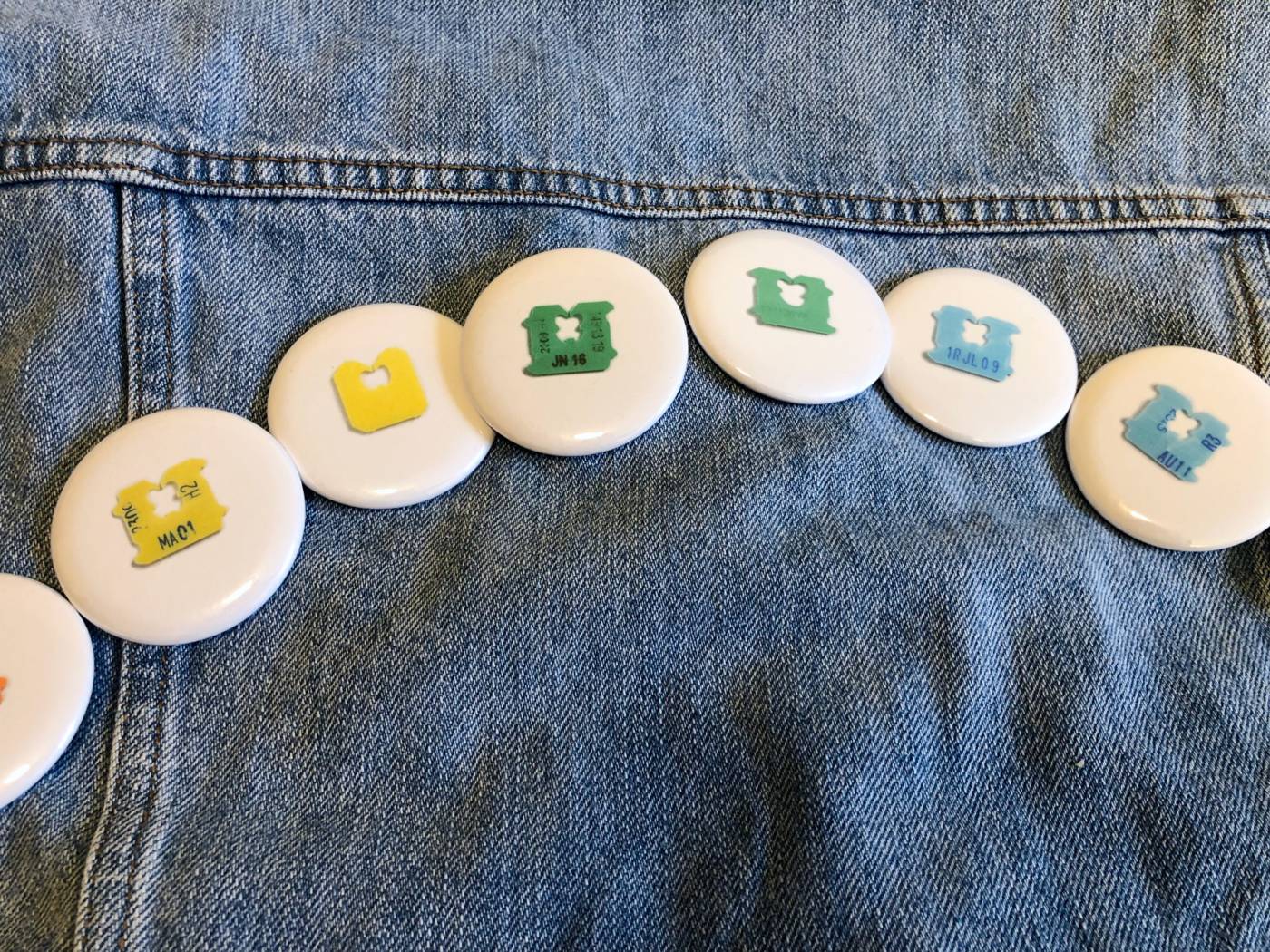
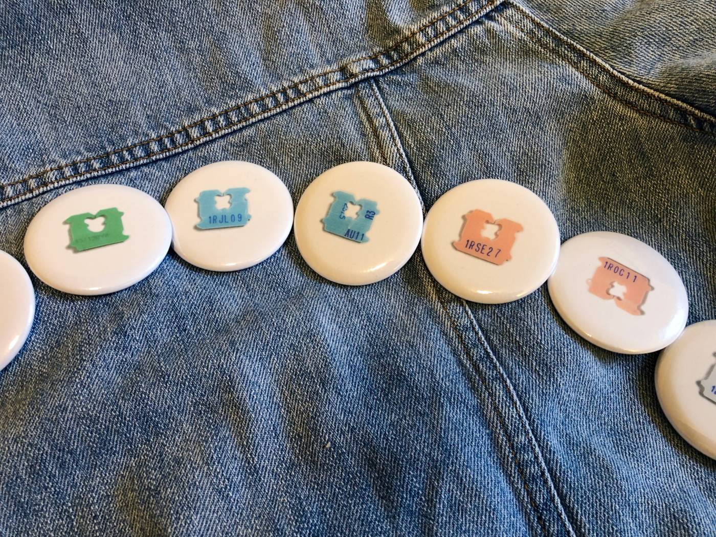
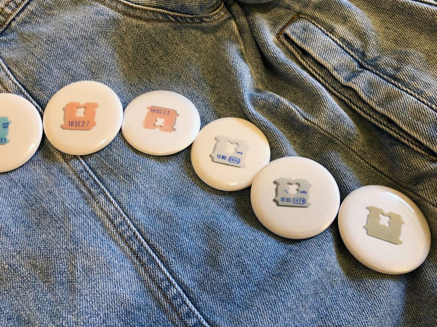
I thought about how this passage of time could translate into a collection of buttons and I decided that while this collection demonstrated the passage of time in my life over the past two years, the buttons didn’t necessarily need to speak to just my experience. I decided to create a series of 15 buttons with all the most unique bread tags I could find featuring one for each month of the year plus a few extras that were very unique. I also created the series in a rainbow pattern to showcase the variety of these little plastic pieces we use and discard so regularly every day.
I am interested in this collection showcasing the prevalence of these mass produced plastics in our lives as the buttons display dates from a whole year, the individuality of each of these tags even though they are mass produced, and the idea of mass producing something (buttons) with the image of another mass produced piece of plastic (bread tags). Where does the loop end? Thinking about the series, I think it brings up some good discussion if someone asks you why you have a button with a random bread tag on it, it opens up the question of why that button makes the bread tag seem any more important. It highlights the hierarchy of value we place into certain items based on their aesthetic qualities and usually a button is worn to provoke while a bread tag is made to be thrown away. I thought this would make for a fun button collection.
Bread tags


Bread tag buttons in a bread bag held closed by a bread tag


Collect the rainbow!

WEEK EIGHT
Audio Piece Ideas
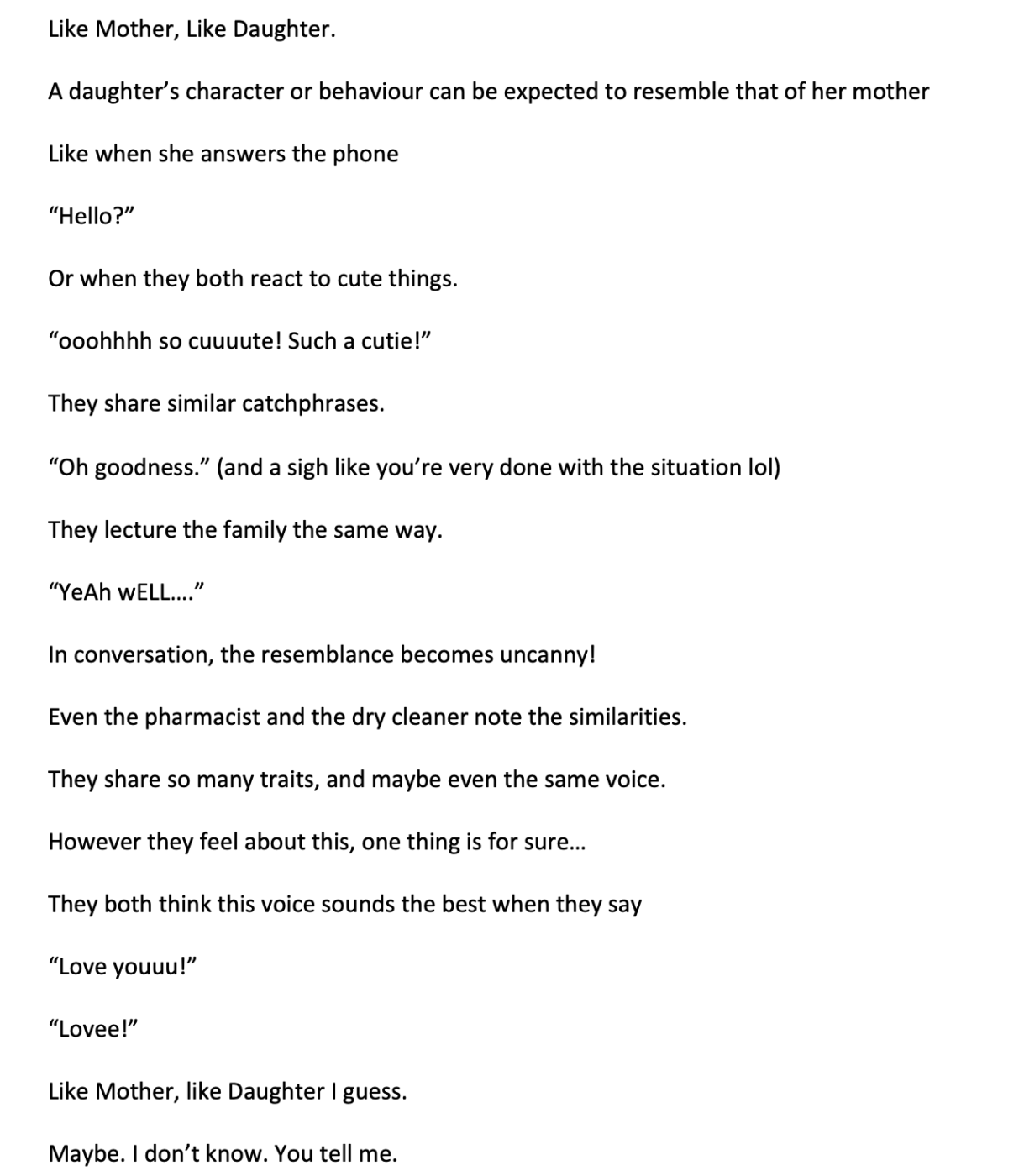
- “Like Mother, Like Daughter”
When I answer the phone at home I often get mistaken for my mom by her colleagues and even our own family and there have been many occasions where my mom and I will be out somewhere and we say the exact same thing in the exact same tone of voice and it sounds like only one person spoke. I thought it would be interesting to write a one minute script (not sure what it should be, maybe a poem? maybe something written by someone else or made up by me) and have my mom record herself reading it. Then I would also record myself reading the script and play the two audio clips over top of one another to see when our voices and intonation line up. Maybe the script could just be a string of common phrases like “Hello?”, “Love you!”, “Oh goodness”…
- “Notes App”
I would use the minute to read out the first sentences/titles of each note in my notes app. It will be a funny mix of grocery lists, drafts of text messages and emails, and reminders for random things. This collection would be interesting because it would give an intimate look into my day to day life and things I deem important enough to make note of.
WEEK NINE
Like Mother, Like Daughter
Final Audio File
So here is my final audio piece! It was really interesting and fun to do something collaboratively with my mom, even if she was far away. Because of the time restraints on actually recording (with JAS this past week being crazy busy) my audio ended up sounding more muffled than hers! So I’m impressed with her technical prowess.
But anyways, the concept I stuck with was to create a script that could showcase how similar our voices are through intonation and catchphrases. I tried so hard to find definitions of mothers, daughters, heritability of voices, even scientific articles on the subject but I basically found nothing. There seems to be a strange hole in research around why children can sound so similar to their parents. So instead I had to write a short script for us to read to create this piece. In the end, I am worried it comes across as too literal, too cute, too “scripted”, but I had really gotten stuck for ideas so I decided to see this one through with what I had come up with.
I’m not sure what I had in my head that I couldn’t translate into the audio work, but I now have a healthy respect for any artists who work primarily with audio as I found it quite difficult to conceptualize and record. I do feel that with a bit more time and practice I could get this piece to an even better spot, but this is what I have for this week.
I did like the whimsy, fun feel of some of the audio examples we heard in class like the Art History comedy piece or the cartoon voices skit, so I can see how my script went down that road. I think for the concept, I got it pretty good, but the execution could be better.
Editing
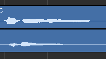
Here are some screenshots to show just how similar our two recordings were. I was consistently amazed when I tried to match everything up and the recordings fit almost perfectly sometimes.
“Oh goodness! *sigh*”

“Loveee”
“Like Mother, Like Daughter I guess.”
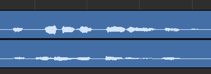
“Maybe. I don’t know. You tell me.”

FINAL PROJECT
Conceptual Portrait
I can’t believe we made it to the end of the semester already! I really enjoyed this course and I feel like I have stepped out of my comfort zone enough to be able to create much higher quality art that is more thought-out and less literal. I can’t wait to keep creating more and take more time to perfect some of the concepts I had this semester.
For this final project, the conceptual portrait, I knew I wanted to further explore text-based art in some way so I started out with that medium in mind when deciding on my concept.
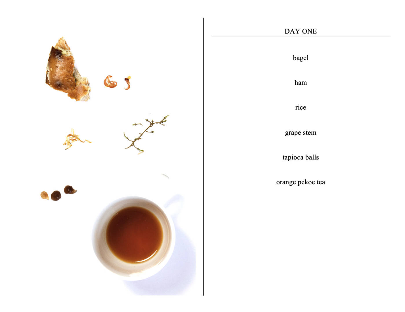
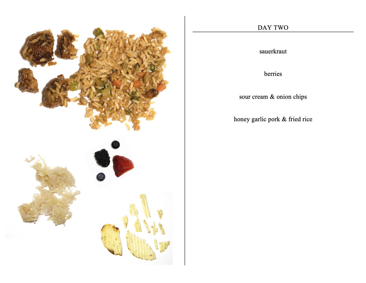
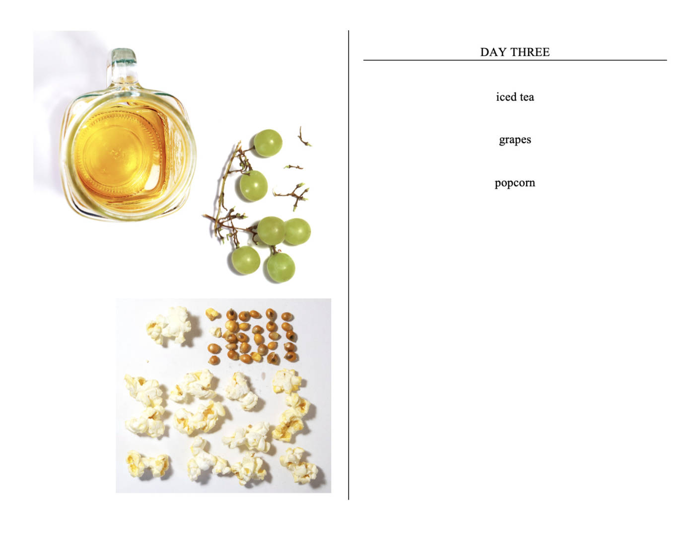
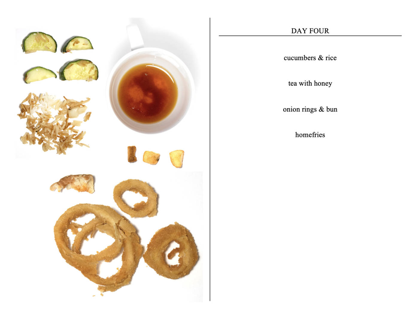
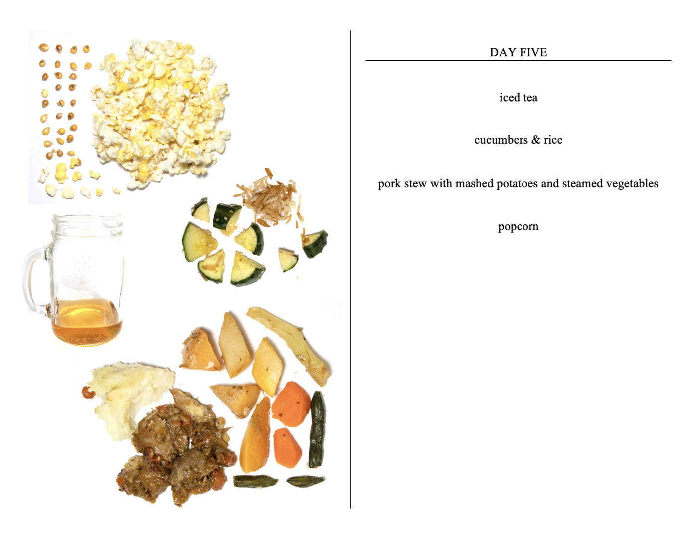
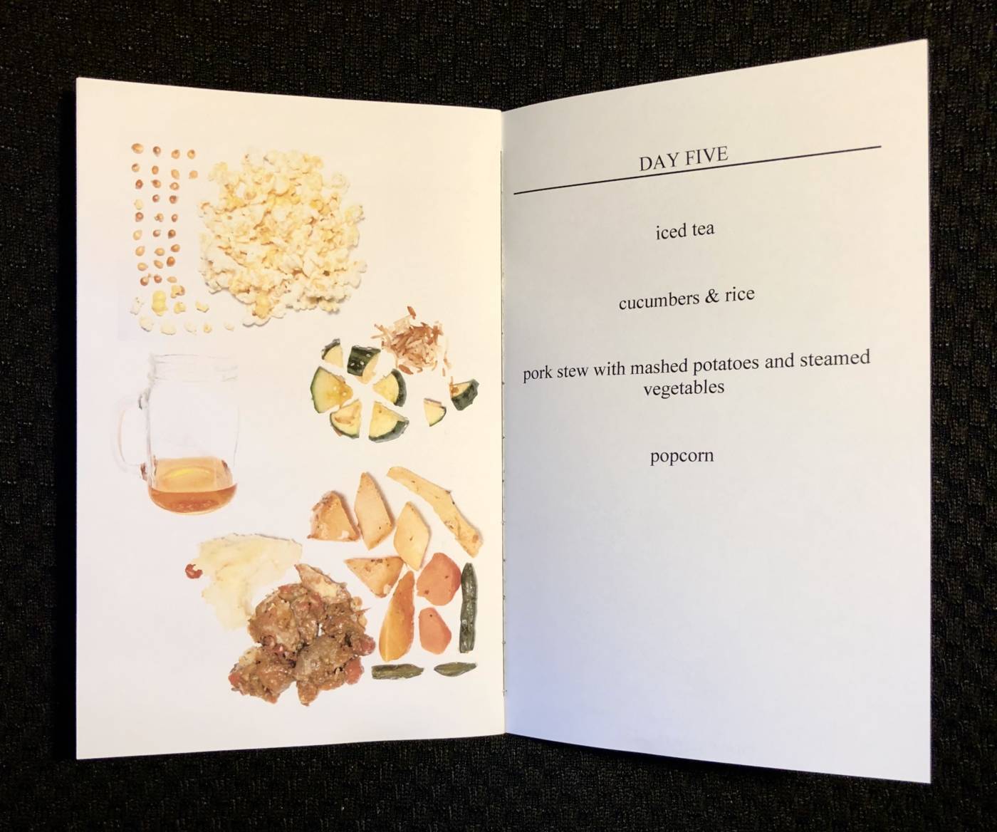
My family always tease me when I’m home because I have a habit of leaving a tiny bit of food or one inch of a drink in a glass instead of finishing everything. I find that at school when I get very busy and stressed I accumulate many glasses and mugs with tiny bits of drinks in them and I decided I wanted to document some of this habit. My conceptual portrait ended up becoming a portrait of a week of food for me, a portrait of my diet as a student, a portrait of me based not on the things I ingested but of the things I decided NOT to eat.
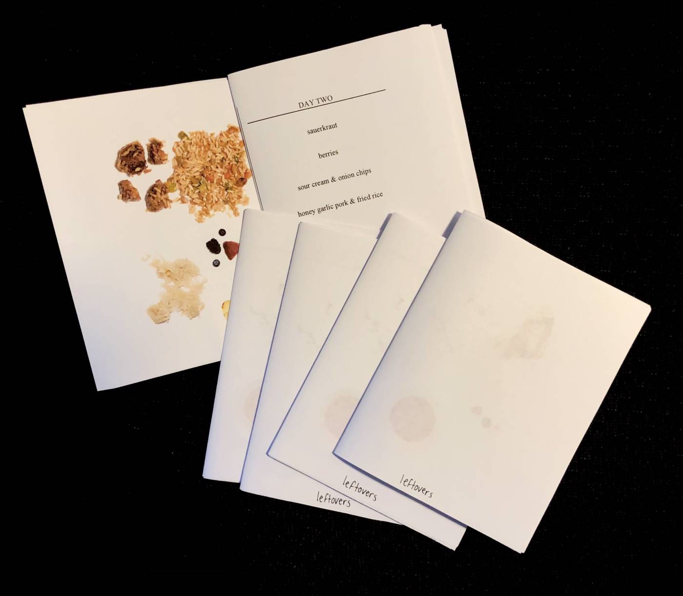
After discussion with Diane and classmates, I decided I needed some images to go with the text and it was suggested that I create a zine to showcase this collection. I liked this a lot as this also touched on artist multiples which I quite enjoy so I set out to photograph the leftovers on my plates and in my glasses for four days. I photographed the images very scientifically as if I were documenting observations for a research report and edited them so they would stand out on the page. The following images are of the completed zine. I am quite happy with the outcome and the images of the food started to become almost sculptural in nature and I think it is a very unflattering portrait of me, which is something I am proud to create.
Title of zine
After the critique with the class, I decided to name the zine “leftovers” as it explains the concept that these items were left over, but still leaves room for interpretation of the images and collections.
Final pages for zine conceptual portrait: leftovers
Zine distribution
I decided to create a final zine the size and quality I would prefer for this project on full 8.5″ x 11″ printer paper and bound it properly with thread.
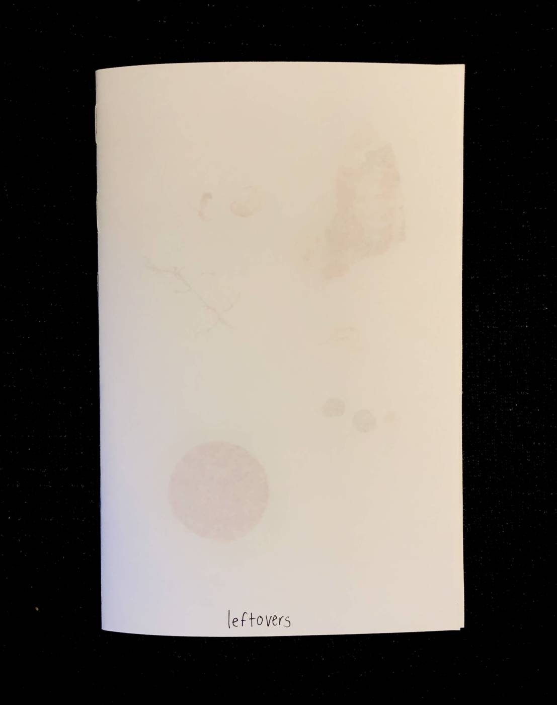
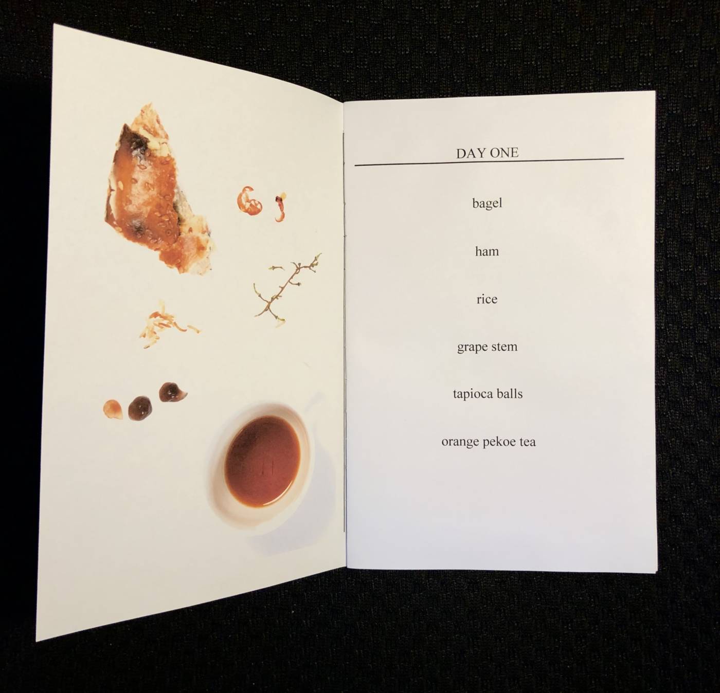
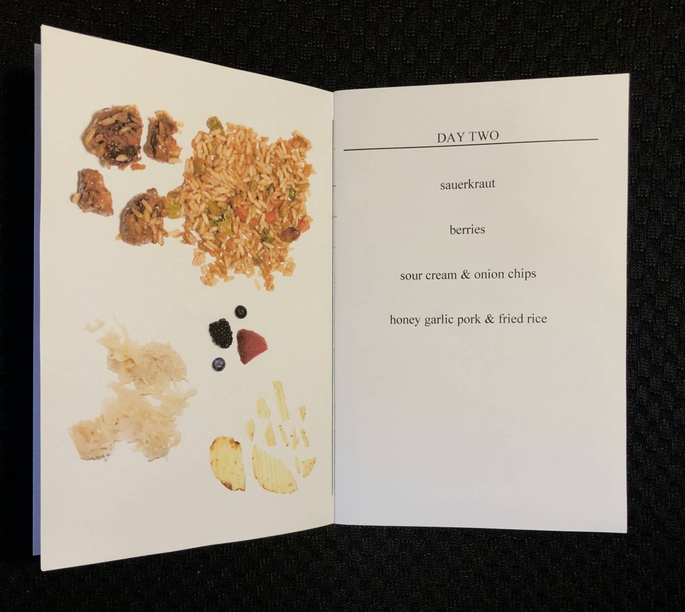

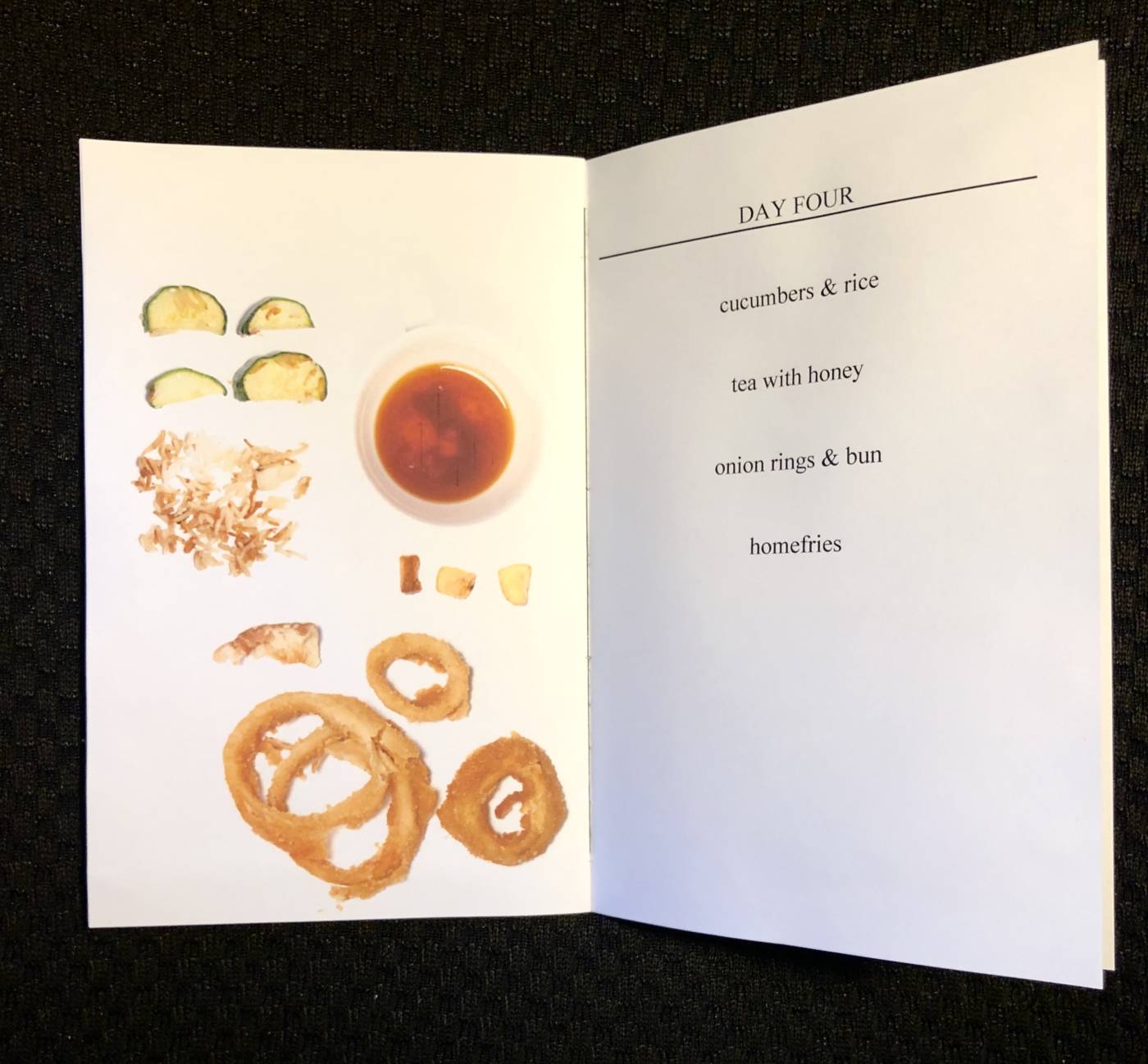
Mini-zine distribution
I also wanted to make smaller zines to give to the class to have and due to paper and ink costs I decided to make the zine smaller so that they were easier to make and distribute and used less materials overall. The formatting wasn’t as perfect as the nice final zine was, but it still honours the easy distribution of artist multiples. Here are a few of the small zines I made up, I made 18 in total!
I am overall pleased with how everything turned out and I think I might perfect these zines in the future even more! I might add a fun cover (something colourful) and I think this collection would be really fun if I continued it for many more weeks. I look forward to sharing my leftovers with friends and peers in future zine-swap events!
Hi Emma!
I appreciate your projects so much so far – and real evidence you get the conceptual modes of thinking, and strategies of conceptual art- along with trying many iterations of things to get a shot you care about. I still love your Stillness gesture – replacing a laundry basket, and your KM translated into text is like a work of experimental writing, and in the tradition of text as material in conceptual art. Great effort and investment in each of these posts, comprehensive notes, and wonderful participation in class. Cheers!
Super stellar work Emma!
All of the Buttons, Audio art, and Conceptual portrait have comprehensive and thoughtful notes, process, and good documentation. Congratulations on all of your hard work! It was so great to have you in the class Emma, thanks for your tremendous participation and your full imaginative and intellectual engagement with the course materials, and for working at JAS too – I really hope we’ll see you again in Experimental 2! You belong in Experimental Studio!
Diane