
Tattoos:
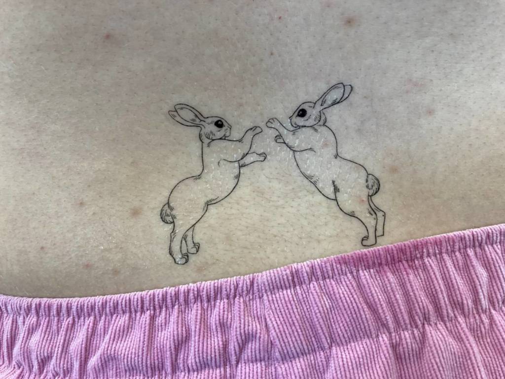
For my tattoo designs, I made a series of delicately-lined illustrations of rabbits and hares. My original idea had been to play with the representation of femininity and my experience with that, but through more exploration, I found a beautiful balance between the femme presentation of the rabbit and the butch presentation of the hare. I got really invested in researching boxing hares and the power and aggression that an animal with no sharp claws or fangs could have. I got interested in the weird poses of contorted limbs that the boxing hares would end up in, but what stuck with me most were the moments in the fight that looked more like an embrace than an act of violence. I started to experiment with the idea of a pause in the fight, a second of comfort within the conflict, and created the illustration of the two hares embracing. I like the ambiguity that comes with this image, especially since I originally wanted to explore the ambiguity of presentation and how I express myself to others. As a mirror to this image, I illustrated two rabbits fighting, even though this isn’t behaviour that is seen with bunnies. I thought it would be a fun role reversal exercise, in which I could blur the lines between the rabbit, a cute, helpless creature known for bringing new life, and the hare, a more aggressive animal with it’s exaggerated limbs built for running and fighting.
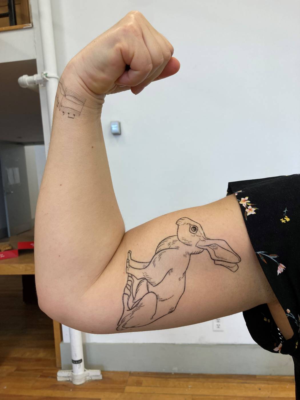
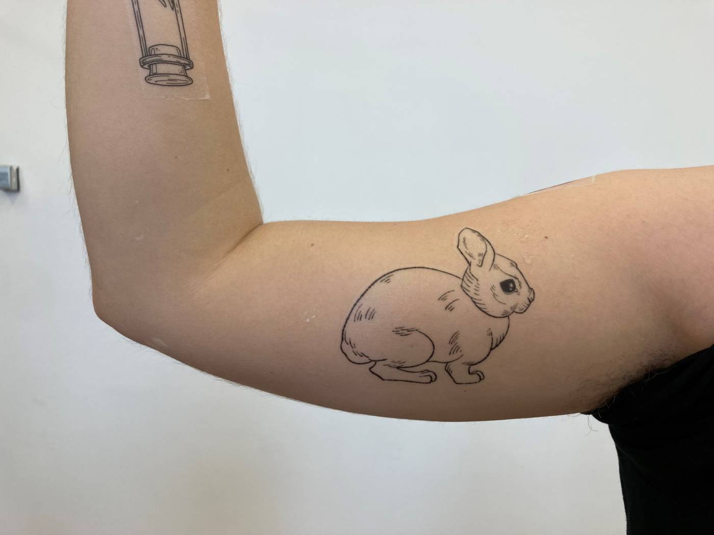
When placing the tattoos on the body, I wanted to focus on areas of strength – arms, legs, the abdomen – so that, whether the person identified more with the rabbit or the hare, they could still feel an inherent strength from these figures. I especially like the mirrored poses of the flexing arms in the image above, one with the hare, and one with the rabbit, but both displaying a confidence in their choice of animal.


Internet Video:
For our video, Julianna and I pulled inspiration from the vogue 73 question style interviews that many celebrities do. In these interviews, they tour the celebrity’s house and ask very mundane and surface level questions. What we found so compelling and odd about these styles of video were the way they were staged, the high production quality, and the uncomfortable, fake way the celebrities act. Instead of seeming like a spur of the moment, natural tour of their homes, these interviews become stilted and awkward – an obvious act. So, we wanted to heighten that feeling of the unnatural and the lack of meaningful information in these videos. Here are a couple examples of the vogue interviews:
As you can see, they come across as weirdly devoid of emotion, even though they’re supposed to be touring their personal living space. Instead, it feels very dethatched, and the questions and answers become easily ignored in favour of the glamour of these huge Hollywood homes.
FINAL VIDEO:
In our final video, Julianna filmed me as I gave a silent tour of my house to the camera. I did my best to replicate some of the body language and techniques that were used in the original videos while not saying anything out loud. So, I paused in different rooms and looked at the camera like I was answering some unheard questions. The goal was to make the interview seem more intimate that it was in the original vogue videos and to take away the glamour of the celebrity persona. The final video ended up being more of an engaging conversation than any of the meaningless questions and answers from the original videos, even though we didn’t say a word.
We took many steps to get to this final product, as you’ll see in the video bellow, which was an earlier attempt at conveying our idea. We had originally made a series of disorienting house tours where the audio was distorted and the interview could not be understood. We had hoped that this would show how little you actually get from watching the original videos and how there isn’t much substance to it, so by making it impossible to understand our voices, it would be equally unengaging. It ended up being too silly and hectic of a result, so we stripped the video down to the bare bones until we filmed the one above.
Popular Internet Videos Presentation
VIDEO ESSAYS:
What is it?
A video essay is a creative way of exploring a topic and making an argument through a visual and auditory format. It’s basic building blocks are it’s use of video and image, and the voiceover that actually reads the essay. They’re a new and popular way to present creative writing, often times to educate, comment on, or critique popular topics such as politics, film, art, and general pop culture. Most of the time, video essays don’t have any connection to academics – they’re not all school projects or used in a professional setting. It’s more just a way for people to explore topics and argue points that they’re passionate about, and although they are great educational tools, I haven’t seen a lot used in a school environment before. That being said, a lot of video essays are arguing personal opinions, so despite having examples and proof, don’t always assume they are the truth.
Making a video essay is a lot like writing a traditional essay, except with more technology involved. This added step helps to make your topic more accessible and engaging. Lets go over some of the moving parts in video essays:
To start, you need a thesis – Like any essay, you need to be making a point when you write it. Commonly, a video essay will explore a broader topic, such as a philosophical idea, a cultural phenomenon, or just a personal opinion while trying to prove this point with specific examples. For your thesis, you need two things: a topic, and an area of focus. Topics like “the meaning of life”, “beauty standards” or “good cinematography” are so broad it’s hard to narrow them down, but if you base your essay off of a focus point, like a specific movie, and talk about how that relates to the broader topic, you can now make a more compelling argument. This way, you’re not just rambling endlessly, which brings me to the next step:
Write your essay – just like how you would write any essay, start with an outline of all your points and proof, and how they relate to the overall thesis. You’ll especially need a strong introduction for video essays, because since there is so much content for people to browse, you’ll need to lure them in somehow. Make sure to fact check everything, people will call you out on it if you’re wrong.
Next, find your video clips – There are tons of free videos online that you can pull from, but the important point here is that you find clips that relate directly to what you’re saying. For example, if you’re talking about a certain musician, include a clip of them performing. If you just need filler images and videos, they the guide down bellow shows a great way of filling up your essay with visual aids that don’t relate to the topic, but correlate with the words that are being said. It’s not always going to be exact, but as long as there is something to look at, then it works.
Audio – when looking at the final product, a video essay really only consists of video and audio, so you want to make it good. All video essays have a voiceover, which is where you read and explain all the points you had make in your written essay. Since it’s one of the main components, be sure to speak clearly.
The last step is to put your video out into the world! People often use provocative titles and flashy thumbnails to garner attention towards their video, so if you want more people to click on it, be sure to use an image that represents your thesis and main points. The same rule applies for if you’re searching for a compelling video essay to watch – look for an intriguing title and an eye catching thumbnail. This isn’t always an accurate portrayal of which essays will make the best arguments, but it does help you to see who has put in the effort to make it more polished and engaging visually.
https://www.studiobinder.com/blog/what-is-a-video-essay-examples/
Parents Video
Text Based Multiple: Final
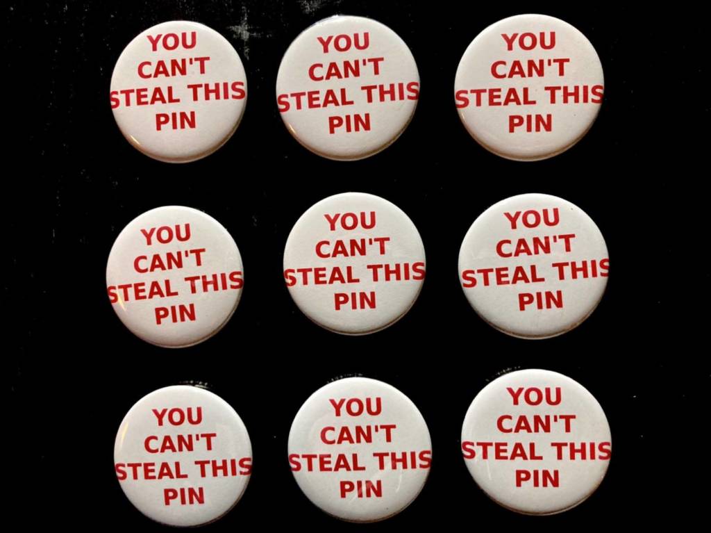
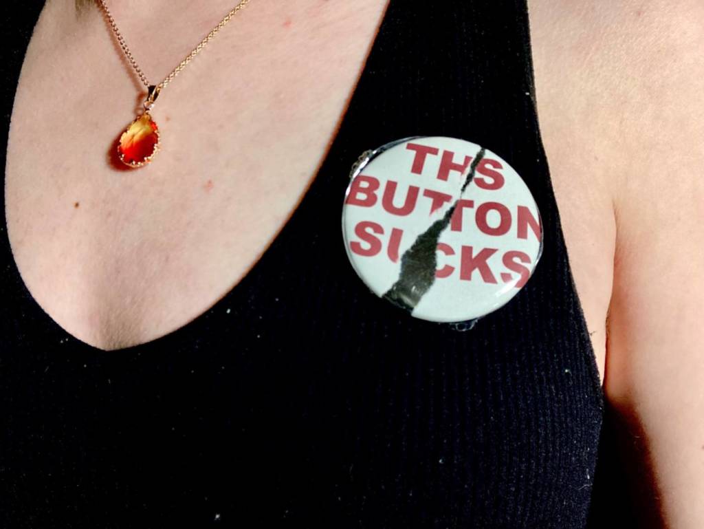
With these pins, I wanted to run a sort of experiment on human behaviour and how people would react to seeing them. Originally, I thought that by issuing a challenge, people would be more likely to take the pin, but what really happened was the opposite.
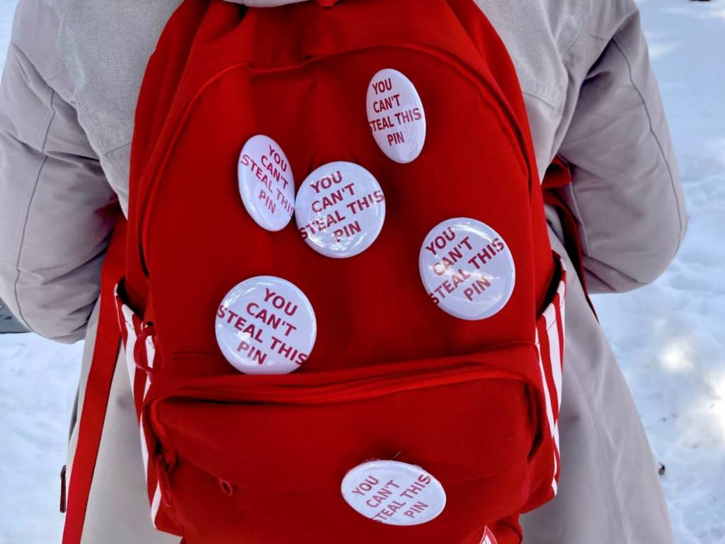


I spent a day on campus, walking around and waiting in lines/crowded areas with the pins attached to my backpack. I thought that, since it was on my back, there were multiple to choose from, and the pins weren’t fully done up, people might be more tempted to take one. I even left some lying around in frequented areas like the library and the UC, but checking on them after a couple hours showed that out of the 12 pins I had placed on campus and on myself, only one had been picked up. The closest anyone came to taking the pins off my back were two people behind me in the Starbucks lineup that were whispering and debating about it, but eventually settled on taking a sneaky picture of my back instead. Unfortunately, people really couldn’t bring themselves to steal the pins, so they stay true to their name.
Failed Pins for Sale

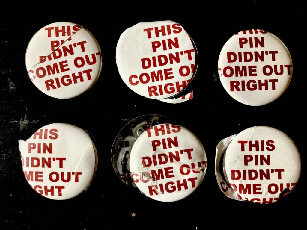

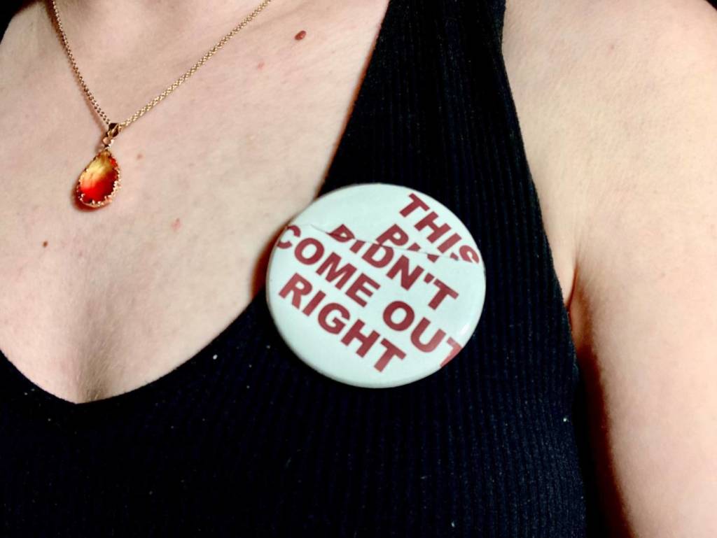
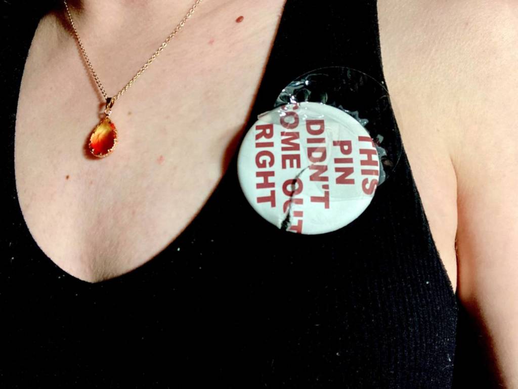
While I was making the first pin design, I was having a lot of trouble with the button maker and a lot of buttons were not usable. But! That gave me an idea for a new design to make along side of them. For these pins, I purposefully found ways to mess them up. In a way, they turned out exactly how I had planned.
I thought it would be fun to try and “sell them” and see what people would say to these messy buttons if I attached a steep price to them. I’ve posted them on a couple sites, and I’m still waiting to hear if people think I’m serious, or if they react to the advertisements in any way.


https://www.fiverr.com/anastatiart/make-you-one-of-a-kind-buttons
Text Multiple Ideas
- Anti Theft Pins:
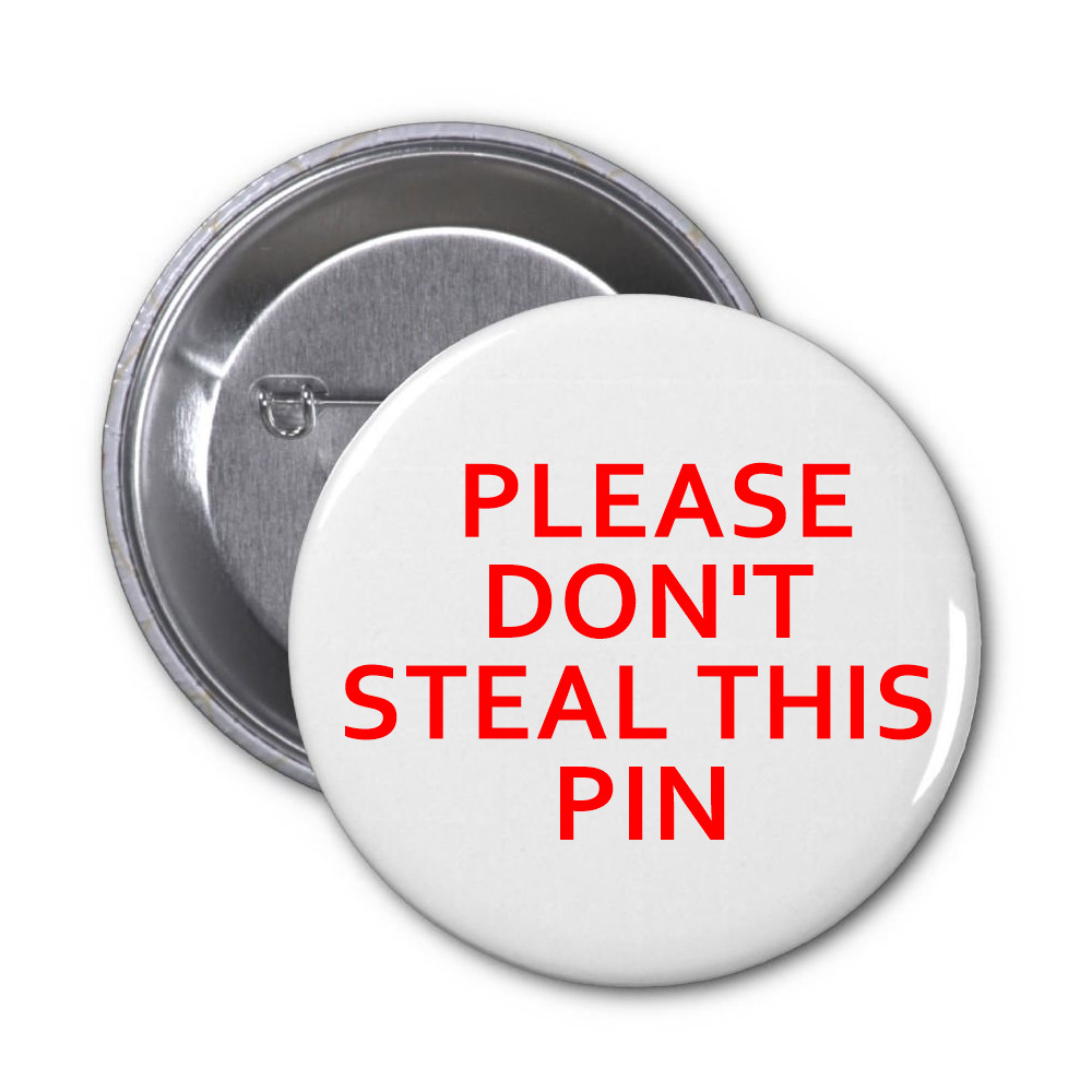
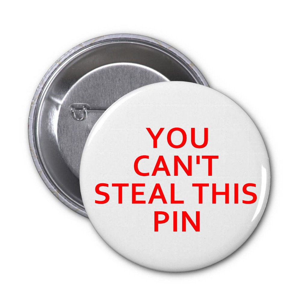
For these pins, I want to play off of people’s reactions to being told what to do versus the more polite one on the left, which asks them not to take the pin. I’m guessing people would be more likely to take the pin on the right, just to prove they can. What I think is funny, though, is that they’re free pins that I would make with the intention of people taking them, so even if they do take the pin on the right, they won’t actually be stealing it. You can’t steal a free gift, so the pin is true, in the end.
2. One of a Kind Postcards:
I want to print a series of post cards that each say they are one of a kind. Either these post cards will be exactly identical, but will claim to each be unique (so the receiver will try to find the differences), of each one will have tiny, insignificant differences in how the text is formatted (an extra space somewhere, one letter is a slightly different size, etc.). Playing with the idea of individuality in a multiple series
3. Name Tag (do not write):
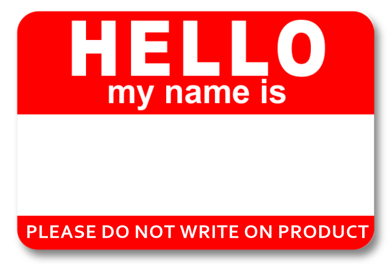
I wanted to take a well known item and make it obsolete. It’s a contradicting statement, because these are made to be written on and in a way, made to be vandalized, so it would be interesting to see how many people listen to the request, especially with how tempting the blank stripe of white is on the tag.
David Horvitz
Horvitz is an American artist born in 1981 who’s work is inspired by Fluxus art and it’s focus on movement. He often critiques the commercialization of art and shares many of his works through physically passing on or mailing small-scale pieces, known as mail art. The way in which Horvitz explores movement in his work is particularly interesting, he makes his pieces very widely accessible through sending physical copies around the world or through digitally sharing them. By using the virtual sphere, Horvitz is able to make easily accessible editions of a single piece, or can even build off of an original concept by having the work navigate and interact with online spaces.
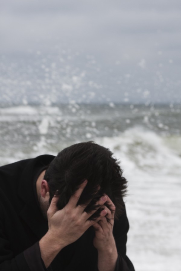
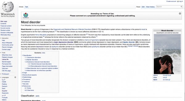
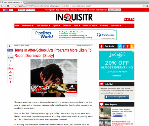
One example of virtual movement is his piece “Mood Disorder”, from 2015, where Horvitz took a staged picture of himself in a helpless pose, commonly seen in stock imagery representing depression or other mood disorders. The work was then posted on the Wikipedia page for “Mood disorder”, and since it was free and licensed for reuse, his photograph started to show up on other websites and articles discussing mood. So, the work became an artist book as the series grew and the image propagated across the internet. In this work, Horvitz plays with the stereotypical images used for depression in an almost satirical comment on mental health, and the fact that so many other sites were using it just highlights the modern need for a commodified “look” that can represent serious, intangible topics.
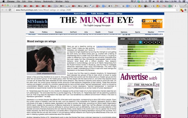
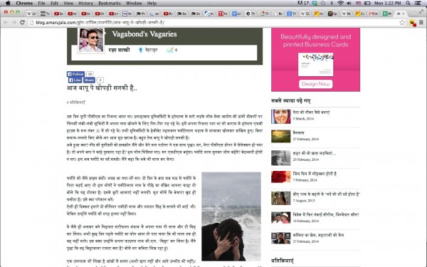
After several sites had picked up his original image and repurposed it, Horvitz collected screenshots of them and included them in the final piece. He says that the piece itself is “the image propagating over the internet”, while so many others add a new context to the original picture through the use of text. It’s an interesting take on authorship as a way of defining an artwork as yours, but one that you enter into the public sphere and can be reinterpreted and reproduced by everyone who views it.
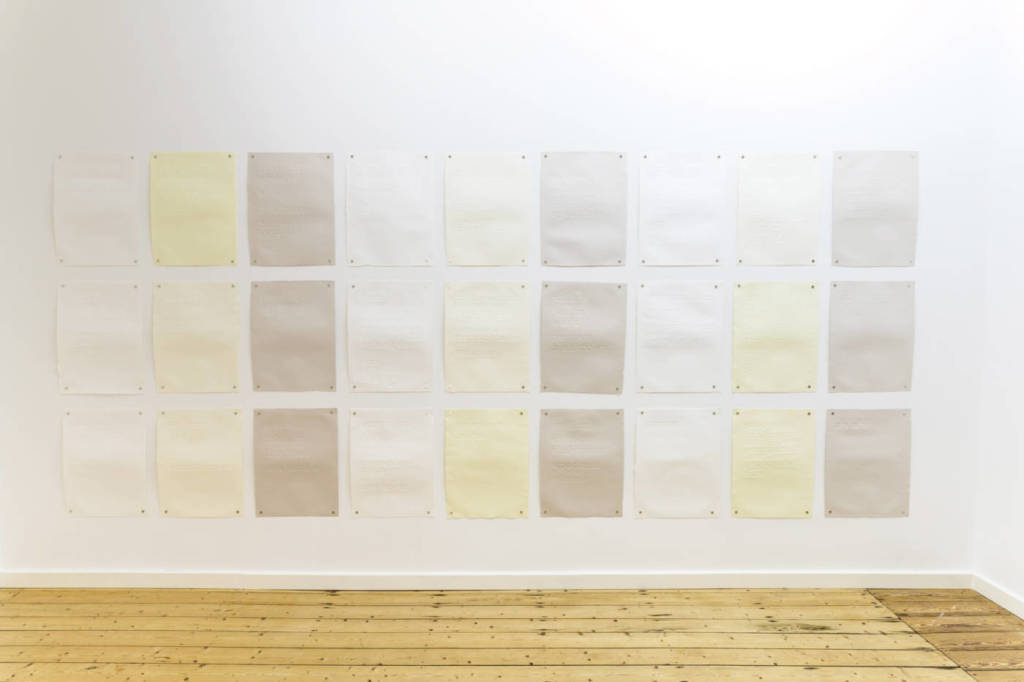
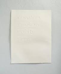
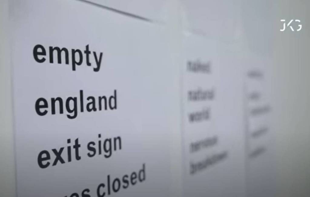
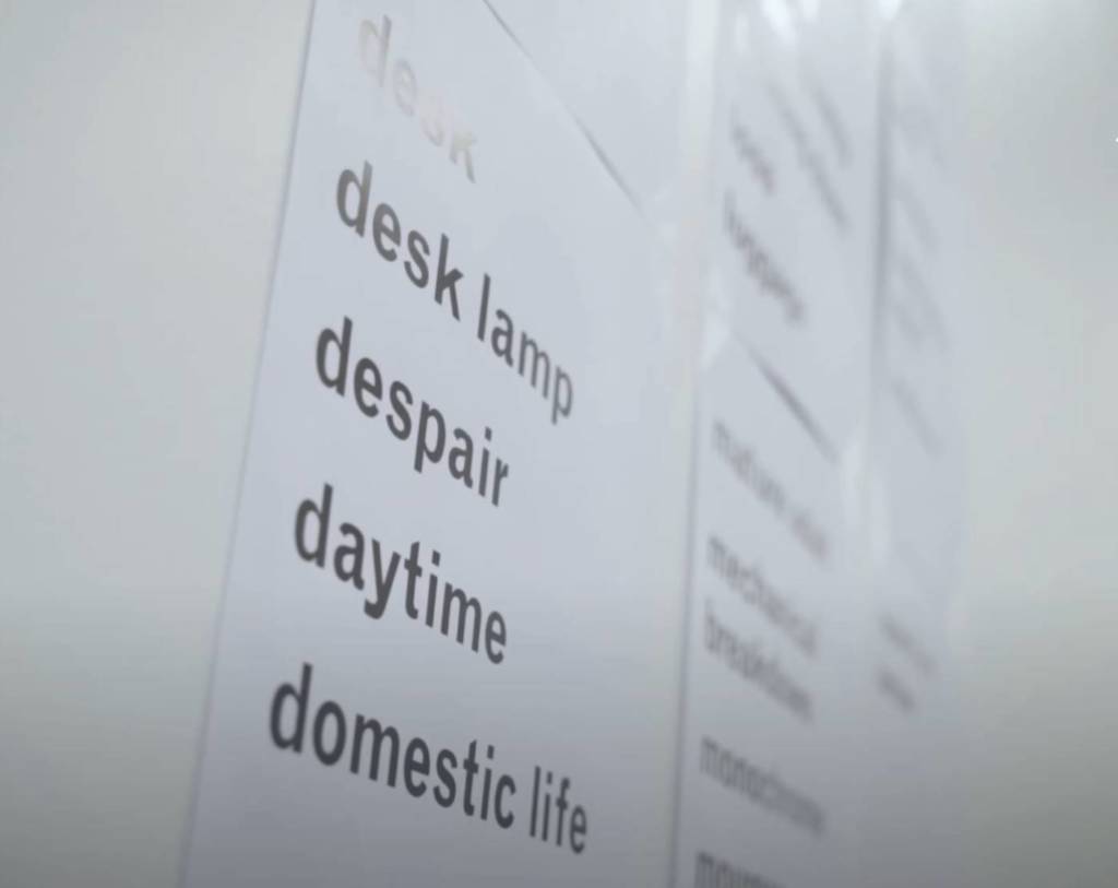
Mental health and the depiction of depression in online imagery are common forms of inspiration in Horvitz’s work, which can be seen in a more recent piece called “20th Century Alienation”. In the piece, Horvitz has 27 pieces of paper pinned up with groups of words on each one that begin with the same letter. Each page is dedicated to one letter of the alphabet, and the there is one page that is dedicated to numbers. It’s an alphabetical poem consisting purely of words used to describe online images depicting sadness, loneliness, or depression. These words are “tags” that are used in photo databases to represent the content of the images, so once again Horvitz is using online tools as a foundation for his work. There are no images in the work, so it shows how photography is circulated through indexation online. Although the debossed editions are no longer in production, you are still able to get a PDF version of the text and print out the 27 pages yourself, in whatever way you’d like.
So, in both these works, Horvitz explores the circulation of digital imagery and how it is used to depict complex emotional subjects. He also invites collaboration in his work, starting with a strong foundation but allowing the viewer or wider, online audiences to interact with the art and further develop it.
Ana
I appreciate this perfect Parents video project so much! Especially as two separate videos – to install them with some symmetry somehow ( I still think 2 ipads, like gravestones could be great!), this is a real conceptual portrait, a memorial even – of your parents (while gratefully you still have them!) Your instincts and sense of working conceptually are very strong Ana, Thanks for your great investment in the course, all of your comments and how hard you push yourself in each new task! Do be sure to show this in the JAS – somewhere prominent! Excellent notes, exercises, and contributions to class.
Hi Ana! What a spectacular span of works on this page, congratulations on all of your efforts – especially the multiple iterations of the Internet video – I am still so impressed by your performance in it – sort of understated and intense all at once – It’s a strong work and should be shown. I appreciate your Tattoo projects too –and loved witnessing how your ideas deepened and the finished bunnies/hares looked on everyone’s newly tough arms! I note here so many thorough documents, references, prep work and notes about your finished projects. Check out my images from the Week 12 page, there might be a few you like, and feel free to use any of my photos there for your own dossier as needed. Wonderful to have you in the class, cheers and I hope you have a peaceful spring!