Margaret’s Work

Last Class – ‘cake’ brownie, decorated with icing sugar and pearl sugar sprinkles

ASSIGNMENT 7 – FOOD ART FINAL

REVIEW OF CLASS COMMENTS ON PROPOSAL:

  • Hands only, have a shot from the side or above…
  • Have your mom teach you what her mom taught her. Photos and uncut video.
  • I really enjoy this idea… Going to experiment with this idea. Simple yet not a story being told.
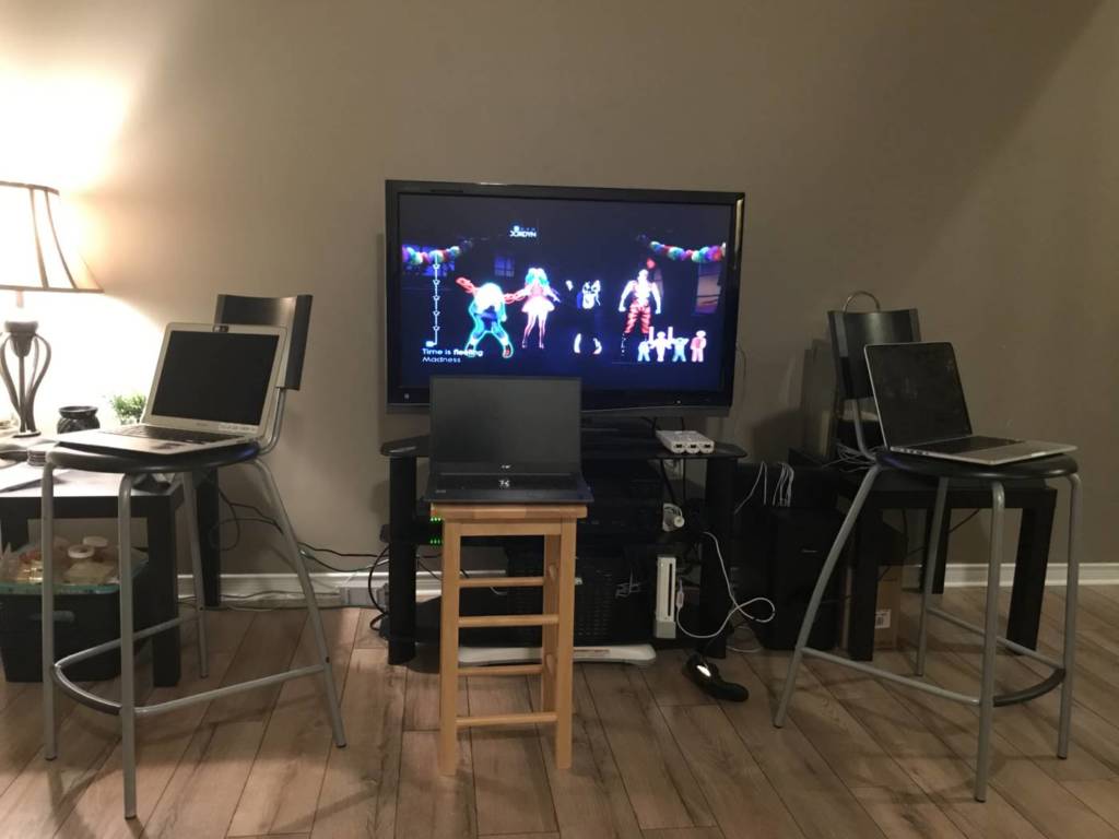
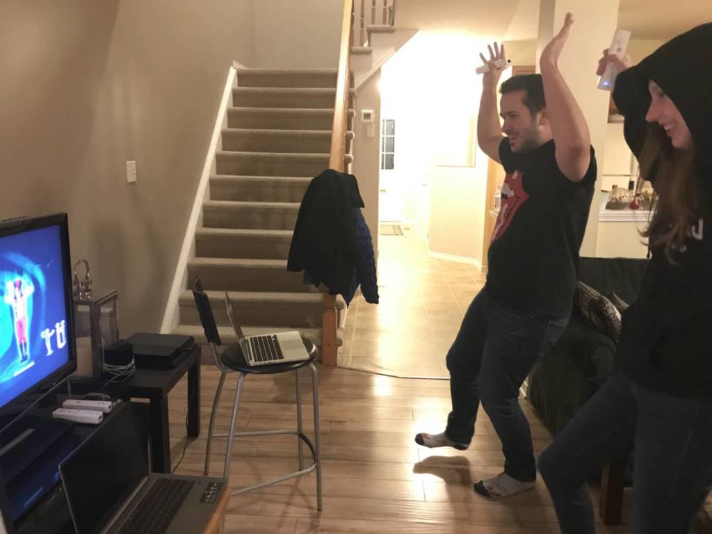
Final Food Project

Shot with a canon camera. manipulated both video and audio to run sections of the making and baking process together.
  • I included louder sounds like the hand mixer and the water from the sink because I enjoyed the closeness that the figure came to it.
  • I wasn’t going to include the awareness to the camera but since is two people in a space I thought that since its a shared experience and storyish piece, I thought that it was additive rather then subtractive.
  • Used a tripod and kept the camera steady at one view point. Camera was angled down to see hands and parts of body.
  • My grandmother has used the same cutters for years, since my mother was a child. Only recently has she changed shape, I think she lost them.
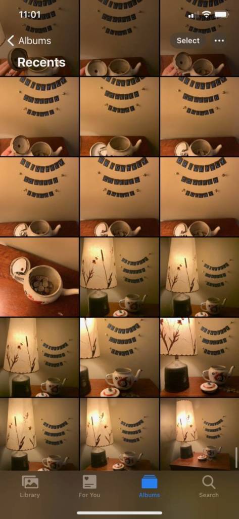
  • Video is 10:36 minutes long.
  • Double click to enter full screen. file too large to post on WordPress, it is linked to youtube.
My grandmother was pleased with the final product. Posted it to facebook and people are sharing their own shortbread recipes.

ASSIGNMENT 7 – FOOD ART

Reflection on in class videos

Out of the video presented to us during class and on WordPress I found the storytelling aspects of Rod, Bernie, Peggy and Aislinn to be the most intriguing.

Video, 2009
  • Last year in Sculpture 1, I was working on a project about Toronto/East York as a geographical location and how the Danforth and its decent into the Don Valley used to be just a large dirt hill. I had found old photographs posted on blogTO that had these wonderful scenes of what my part of Toronto looked like between 1908 and 1965.
    • https://www.blogto.com/city/2012/11/what_danforth_avenue_used_to_look_like_in_toronto/
danforth toronto
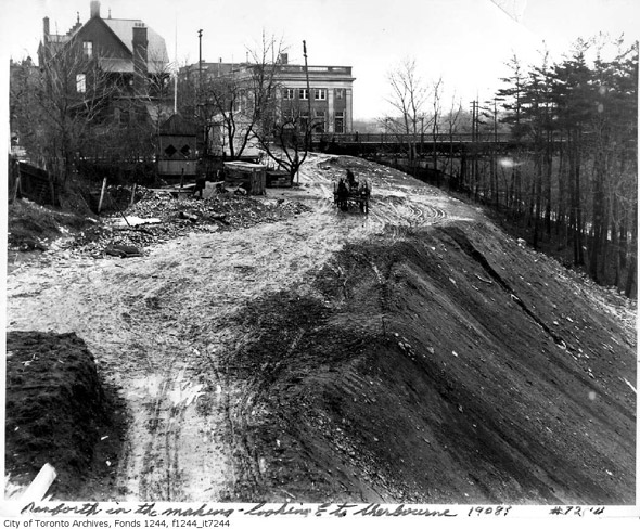
  • From these photographs, I dove deeper into my specific area and tried to find information about the Sammon (my street name) Farms and the Italian flower farmers who lived in the houses, mine included, that were rolled up from the Danforth from on logs with horses to make space for the building fo the Danforth.
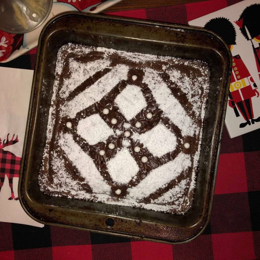
  • This history of Toronto and my house included still sparks interest… I thought it would be a great story to tell while making something a cake or food with local ingredients.
  • My second train of thought after watching and listening was thinking about my grandmother. we have a tradition in our family to either make shortbread cookies or rum cake with Barbados rum, she lived there for over 25 years, and my mother/aunt lived in Jamaica and Guyana growing up, it has a special place in all of our hearts.

Proposal Ideas

  1. Retell the stories or a story from either the construction and neighbourhood building of Toronto or center the story around my family and baking of the cake/cookies.
  2. Reflection on my last video project, I liked the idea of telling a story not using my face, I want to push using different body parts such as my hands doing the mixing and rolling out of the materials. I mentioned in the reflection on the bread podcast that the instant part of instant yeast took away the work and effort it takes to bake, that the tradition of making bread in general is lost. I want to really focus on the effort of my hands and body.
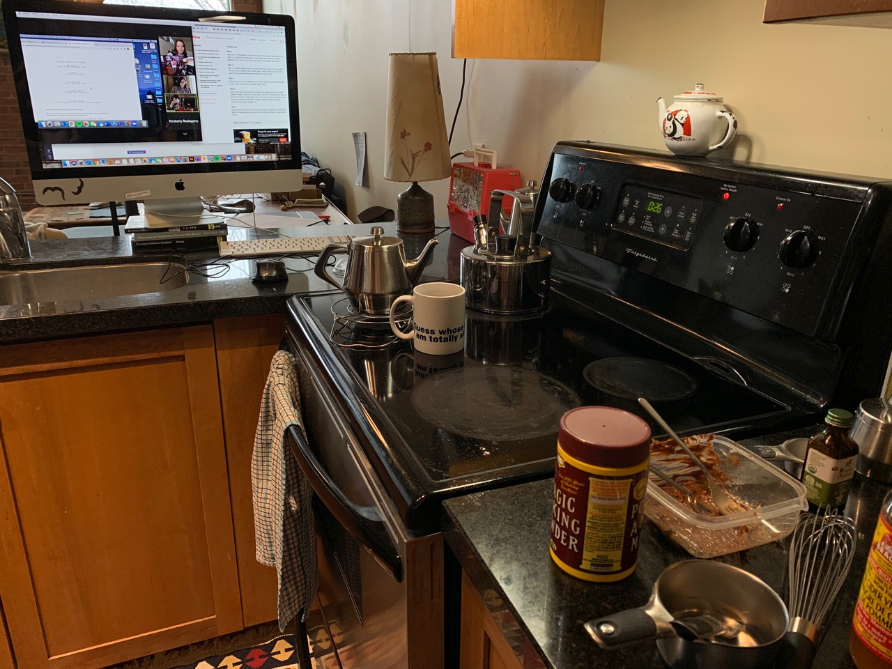
  3. I will be using local ingredients and sourcing them from mom and pop stores not big grocery stores, other then the rum of course. I will be measuring tools but staying away from the metal and sticking to wood and painted ceramics.
  4. I hope to shoot using at least a couple different angles then edit together. The idea of wanting these baking moment to be collaborative and messy, I an hoping my mother will join me in this endeavor both using voice and her hands, and ending the assignment’s video with a short reaction from my grandmother (if she can figure out the technology).
  5. I love the tranquility of the story teller and the nicely framed shots with natural lighting. My video will surly have louder moments and laughter but I would like the video structure to be the same. Not only for this project but also for my wellbeing and building stronger relationships with my family, these moments/activity will bake more meaning to myself and hopefully the peers on my class.

ASSIGNMENT 6 – THE RISE AND FALL OF BREAD: REFLECTION

  • Notes on Podcast – CBC | The Rise and Fall Bread & my own experiences: Bread is historical. The context of when, where and whom it’s made with is extremely important. How one makes the bread shows tradition, culture and technique that vary by geographical location and how much the ingredients were available.
    • While listening to the podcast I understood that for the first half they were talking about how to make bread and the different religions that used bread as a symbolic object for the sharing of christ, but I was more interested in when the narrator called it ‘the rise’ then its unleavened bread.
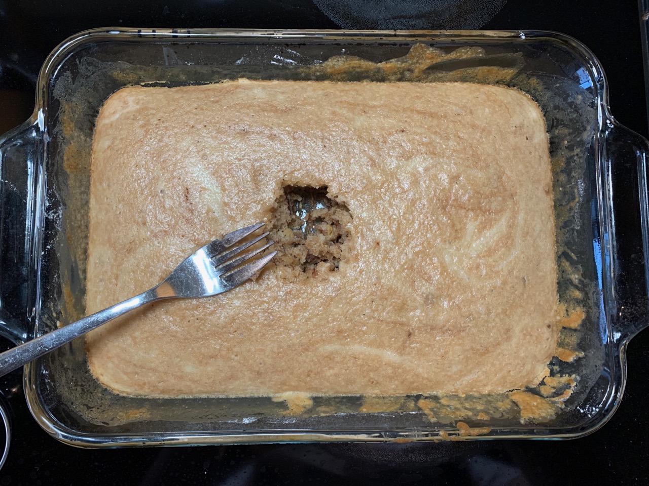
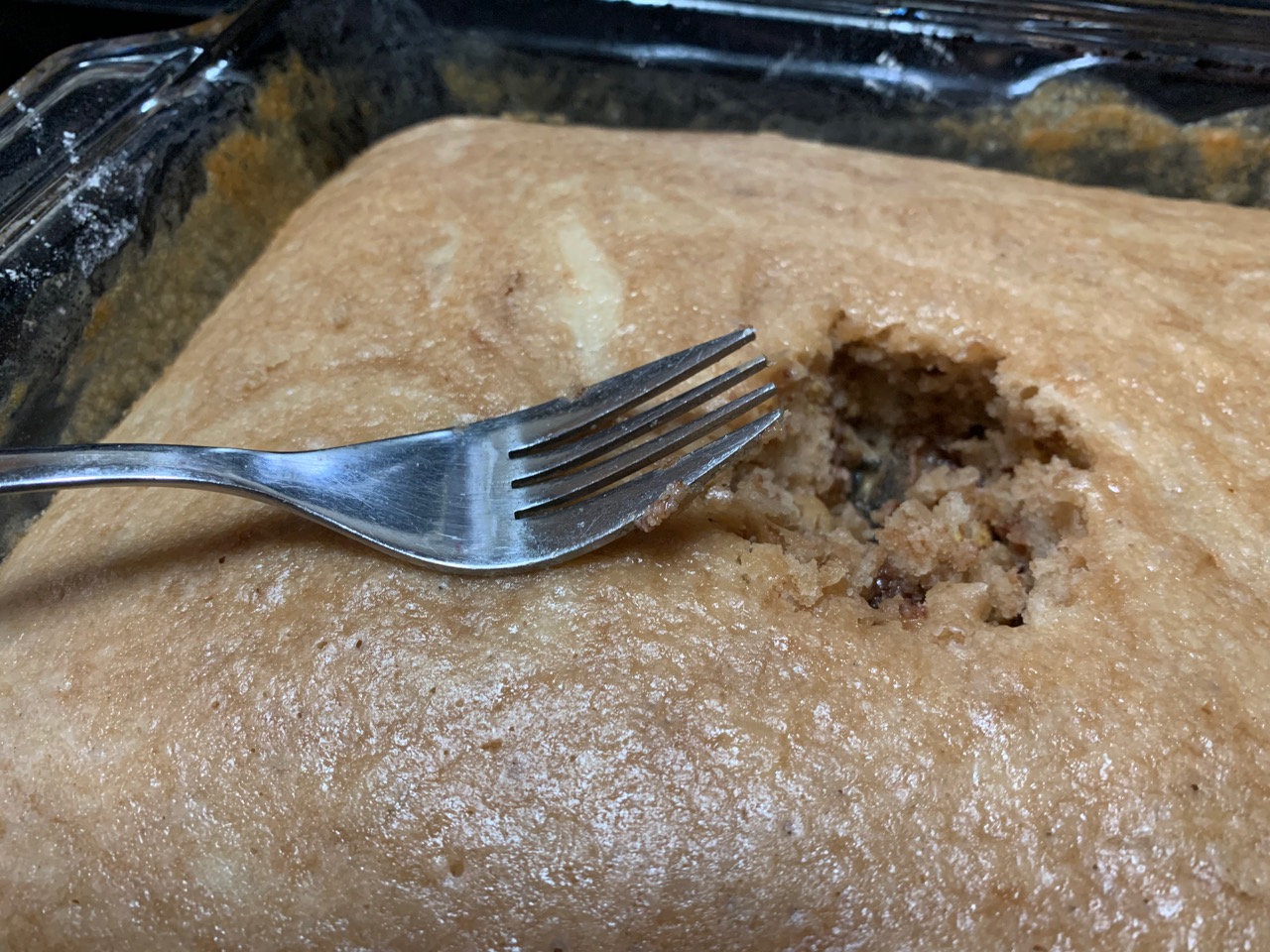
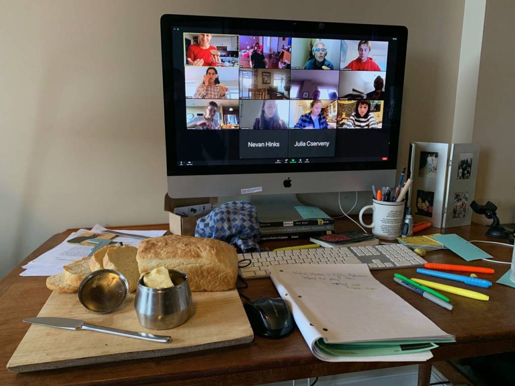
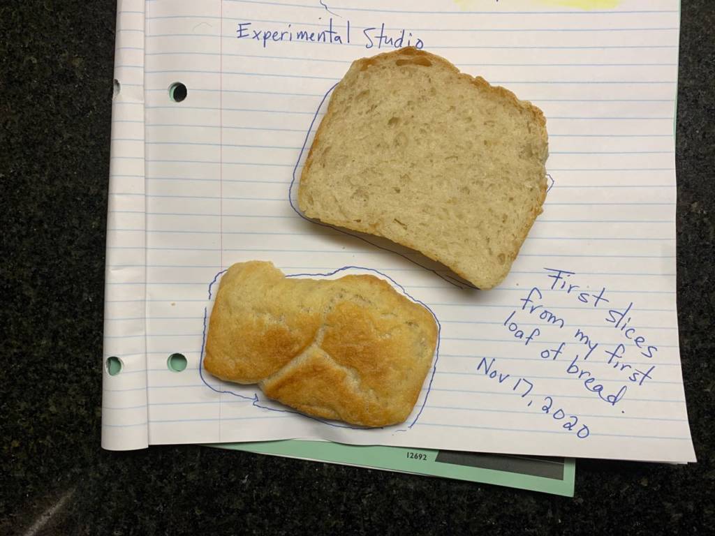
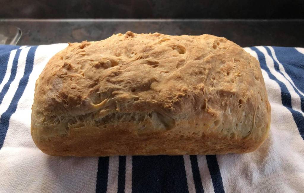
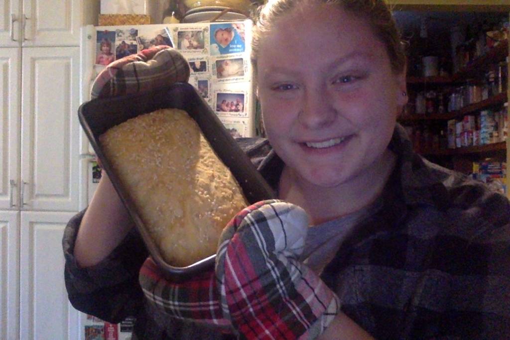
    • Similar to making any dish in the kitchen, bread is communal in its making and eating. When making a test loaf before class (Nov 13th – Picture of test loaf below), I still needed another set of eyes to read instructions and help hold the bowl then mixing the dough together.
    • At 16:10, a person is speaking about the meaning behind the ingredient, how yeast means patience, etc. For future bread, that I now know how to make, I think I will stay away from instant yeast. To really understand a material you need to put time and effort into its process, for this upcoming class and the bread loaf is something for us to share together but it does take away the meaning of the time and physical energy it takes to kneed with our hands and time to its and watch the yeast bloom, when connecting the ideas/activity back to the podcast.
    • I agree with the idea of leaving Eden and putting in work and effort, even when making bread and sourcing ingredients, takes work. Like taking the subway to find instant yeast or mixing in the till you arms hurt. Although it’s not the same as sourcing from raw material and grinding them to the right consistency, I would like to think all bakers, new and old have the same amount of concentration and attention put into the making.
    • A point that surprised me was the historical points made around 23:00, how women had more babies, due to a high infantile death rate- they would give the new babies bread to suck on for nutrients instead of milk so the women can have more children for the family. This story/fact is both understandable due to the it’s social and historical context, yet, just for a moment I got the feeling of, knowing more about the history as also made me want to know less, as a female myself… Just an interesting thought that came through while listening.
    • My favourite quote: “When you plunge your hands into the kneading trough, even if you are working with a machine, and you feel the flour around your fingertips, you commune with the flour, you- it has a sensuality a vivacity a viscerality.”
  • Before starting the podcast I really didn’t think much about the actual eating of bread. I just thought it was the moment around the event of dinner or buying freshly made that I liked so much. Although growing up there have been a couple of defining moments.
    • The church I grew up in we used the circular disk bread with an embossed cross symbol, until Father David decided to bake bread every Sunday morning before service. He knew that I really liked the recipe so much that he would save the crust for me. I was the only youth that attended the church at that time and someone had to eat them, waste not, want not. As I got older I did attend less due to school and extra curricular activities. I was saddened to find that after he retired, they stopped making his recipe. I guess after thinking about that fond memory of the person and the place I still call a second home, It’s not just just the experience I have in that location but the bread itself that I have ties to.
    • I was at camp, a music camp that I wasn’t very fond of but I developed a nice breakfast tradition by sitting with the pianist. He taught me that toast has to be perfect and should not sit on a plate when you take it out of the toaster. They need to breath and maintain a crispiness on both side, have then leaning on your salt shaker in the morning until you are ready to butter them. I still do this now and often remember his words.
    • As a child, even now, I have been very fond of Pea Soup, green or yellow, It was co commonality that with any heavier soup in the winter we would either have bread to help eat it with or make grilled cheese, I still find that without a starch some dinners feel incomplete. We mainly use either a baguette or rye bread to complement the main course.
    • When my parent was living in Paris for school, since she didn’t have a lot of spending money she would go down to the bakery really early in the morning and wait by the back door, she had make friends with one of the staff and he always gave her the runoffs or halved pieces for breakfast. If she had more money that day she would splurge for a chocolate croissant.
    • My grandmother lived in Barbados for at least 25 years, almost every Christmas we would head down to visit her, we would spend days at the beach, since she got herself a membership to a yacht club in the last few years she was there we made it a tradition to order cinnamon sugar toast with tea in the afternoons. They were cut into soldiers, which was also my favourite as a kid, and the best thing I had all day, besides ice cream of course. I always asked to have the last piece. Since she moved back to Canada to be closer and, us stopped going a few years before, I don’t think we continued that tradition since. It’s something I miss that now remembering hopefully I can find a way to replicate it here.
  • On the topic of the pandemic: People were home, all of us were at home, the ones who could be, there was time, people spend much more time online surfing the internet for things to do besides Zoom calls and appearing for class. This includes parents, already avid bakers and the curious. Although production slowed in manufacturing, of things like yeast and grocery stores could restock the shelves as fast as people were buying… Birthdays didn’t stop, family dinners just became virtual, thanksgiving stuffing was still being made, brunch didn’t stop just looked different, bakery were still producing just changed how to deliver, people who once had full lives while living alone, not needed something to fill their time. Thus, bread became a way to pull people together as a common relabel base. The worst thing you can do to bread is forget an ingredient or burn it. It is a safe, consistent source of amusement and it makes you feel good, thats why people flocked, they needed something easy and certain because nothing else was.
Test Bread (made it for dinner with homemade fish chowder)
Final Product – Butter, sea salt and sesame seeds were added. Ate it with butter, peach jelly and peanut butter.

ASSIGNMENT 5 – VIDEO CONFERENCING FINAL

Anything but Zoom

  • Hi, my finished video project consists of the same idea as my proposal, I just centered the concept around attending an online Zoom class. What one does when their camera is off and audio muted.
  • I for one love making food before and after class. I stuck with both the feet and face to document body language, i.e. if one were to give a presentation on Zoom in front of the classmates, their face may be calm, but their feet may show a nervous twitch, etc.
  • Time passing, not chronological.
  • I found DaVinci Resolve to be relatively easy to navigate, had assistance from Tech Nathan, but i did have some minor set backs, having to start again from last saved and trouble with some audio, now fixed…
  • I am not a fan of attending class in my pajamas, even if my peers can only see half of me, therefore jeans seemed more appropriate then fuzzy taxi slippers/socks and Christmas PJ bottoms.
  • Enjoy!

Class reflection on video: they lied it, could get muddied when overlapping video, different secret moments when you camera is off. Would have be interesting to see 12 mes with all the moments, ie feet, faces, hands etc… Documenting the parts that are less visible… Faces draw people in more then feet…

ASSIGNMENT 5 – VIDEO CONFERENCING PROPOSAL

Class/Reading Notes

Article on Vivian Castro Notes:

  • I can agree with their statement on ‘Zoom Fatigue’ I for one am prone to headaches and now more than ever by 7 pm have to lie down just to rest my eyes because it affects my head. As the University of Guelph as started advertising ‘Zoom out’ i.e ‘did you zoom out today?’ to try and get students to take a break from the amount of time on screens. Just like the use of Lysol and it’s possible impact on our bodies… I would like there to be a study done for both, how much is too much and what are the longterm issues with everything being online. But I get it, ‘stay home stay safe’. If only I could print out everything… But that’s not eco friendly either. So here’s to taking naps at 7 pm.
  • When I think of video art I think of the piece of a Buddha being live streamed to itself on a small TV. It’s presentation of being shown in a gallery gave the viewer a change to integrate itself in the screen if the stand at a distance behind the camera and Buddha. This on the other hand is interesting, calling friends or calling ourselves on the screen is daunting in itself. I find incorporating new people into a project that don’t understand the class can feel just off.
  • The idea of showing just the face on a Zoom has an interesting meaning, what if one were to record something else, as Castro mentioned in the text, it can be personal or not, normally from class or group project many of us show a clean room or a black wall of you even decide to turn your camera on.
  • I do agree with the notion of speaking to a person face to face is not the same as video conferencing, there is the issue of the glitch as well as having to take turns within the conversation. Zoom for one doesn’t take more than one voice as we learned in the in class laughing trial. I find that in person, within a group body language is extremely important when you see someone is itching to say something or wanted to raise their hand. Which I still do even in Zoom classes for comfort in this strange year. You loose that in person body readings around you. Plus I do believe that emotions are lost when not in person. Joy and sadness don’t have the same affect on someone (either doing the action or watching someone).
  • My last note on the reading, the immobility Castro mentioned is right, we are all roughly doing the same thing, sitting in class, staring at a screen, either getting up for the necessities then returning to our stations and waiting for the next call. For me it’s my bedroom, I am either sitting on the bed or working on art projects at my desk, but it’s the same set up day in and day out, same expectancy and readiness for classes and my hopeful ability to work my way through assignments. I found that the only thing recently that has lifted my spirits is Halloween, although it’s cancelled this year, I have put effort into decorating and dressing up with things from my closet. My lurking dread is that once halloween is over I’m just going to have a slump until Christmas. Let’s hope not, I just got out of one.
In Class Jot Notes

Videos on Week 6 Notes:

  • The idea of stop motion and DADA artists making films appeal to me more than the ones where taking happens, I find I have done a few drawing videos and simplistic object videos in high school (in a similar course to Experimental called NonTrad). I also have a love for posters and the type of Typography/colour layout used for band and museum posters.
  • I was volunteering at an art space in a hospital a few years ago and one of the staff had made these stop motion films they played for the youth in the program. Although the set ups/framing were static the movement on the screen made these youth jump for joy, they loved the old film sound and how the machine projected the images on the wall. The staff member had videos on everything on monsters to one completely with cut up letters that just made weird sounds as it zipped along the projected image. Personally, it was more the reaction to the videos from the youth in the room more than the videos I looked at but they were catchy enough that they stayed in my mind for at least a couple months after. That would be something to think about instead.
  • The work of Candice Breitz especially the Madonna video resonates with me. Out of all the singling I found myself paying close attention to the parts where there was a pause or only one person was signing during the instrumental, almost as if I was specifically looking for the mistakes rather than the harmonious moments.
  • Pipillotti Rist, Open My Glade made me fell unconformable, had the same felling of the people that do to asmr of eating honeycombs or squish bread with their faces…

Proposal Ideas

IN CLASS SHARE FEEDBACK (on proposal idea)

  • Multiple perspectives, from low or human angles (socks perspective or under the table or on a self).
  • Have editing be the key, displaying the videos side by side or distorting the images or sound. Add something warped.
  • Have a visual rock (anker) to each video in view, do something in the frame thats less mundane although the idea of a Zoom call is normal and integrated in our daily lives.
  • Possibly: have multiple people do the same thing, each videoing themselves in two perspectives.

  1. My first idea plays along with the idea of having two recorded videos, presented together side by side or spliced together, of a zoom call but with no one on screen or at least them (me) in the background.
    1. I thought about having an angle that was not the face, I’d choose another body part like the elbow or feet. It would be interesting to record myself with my daily actions while ‘in class’ but not having the desired angle, showing what others would see of they were in person in my same space, i.e. chair shifting, making food, playing with my hands, or clipping toenails or movement of my feet during class, etc.
    2. As a thought progress continuation – I find that when logging off after a class there is about an hour where I try and get mu basic needs met before more family members come home, this means, cleaning up, making food, setting the dinner table, dancing in the kitchen, these are things that are a common occurrence recently but still a part of me time, a time to ‘Zoom out’ and be happy with no screen and no-one around to invade and disrupt my thoughts.
    3. The camera angles wouldn’t be anything dramatic but I think I lower angle would be great, like sitting on the floor.
    4. I don’t want it to have any facial recognition just moment, almost like the quietness that you experience in a library, you can hear rustling, humming, or headphone music playing, as much as this is a video project I was thinking more of a sound scape.
    5. The idea of it being voyeristic without the personal intimate aspects is the direction I want to go. I am hoping to use my kitchen as the location while not having the screens on the same shot together.
    6. If I wanted to push it I could think about the idea that our phones are always watching us, and listening but I’m not sure of I want to go that far. I quite liked Nevan’s piece with her lying in bed, but without the sed up unless it looks better that way.
    7. IN terms of presentation. I was thinking either displaying both side by side with a black screen or have both play over a still image from the shot but blurred to not interfere with the noises in the video.
    8. The technology I might use is Zoom or Facebook… I will let it run for the half an hour and leave it to chance with my animals roaming around.
    9. My influences with this are really the Lo-fi sound scapes available on youtube or the study with me videos, although I think how the videos will be presented will be the most important aspects of it rather than the video themselves. I’m open to suggestions.
  2. Below are some videos and images I found for inspiration:
  • breakfast. [jazz hop / lofi / chill mix] – https://www.youtube.com/watch?v=zOPn5meO3lE
  • Open Window New York City Soundscape at Night – https://www.youtube.com/watch?v=Vg1mpD1BICI
  • Recording a 3D Soundscape of a Winter Forest (with 3D Binaural Audio) – https://www.youtube.com/watch?v=o83eP_o5ZOU&t=202s [Start at 3:44]
  • The Western Soundscape Archive | Preserving nature’s soundtrack – https://www.youtube.com/watch?v=vueZOquE4qc

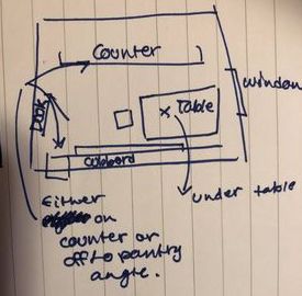
3. Here is a sample drawing of where I could put the two computers and what they would see: (I’m not the best at drawing maps, I will add some freeze frame images when testing out his idea soon.)

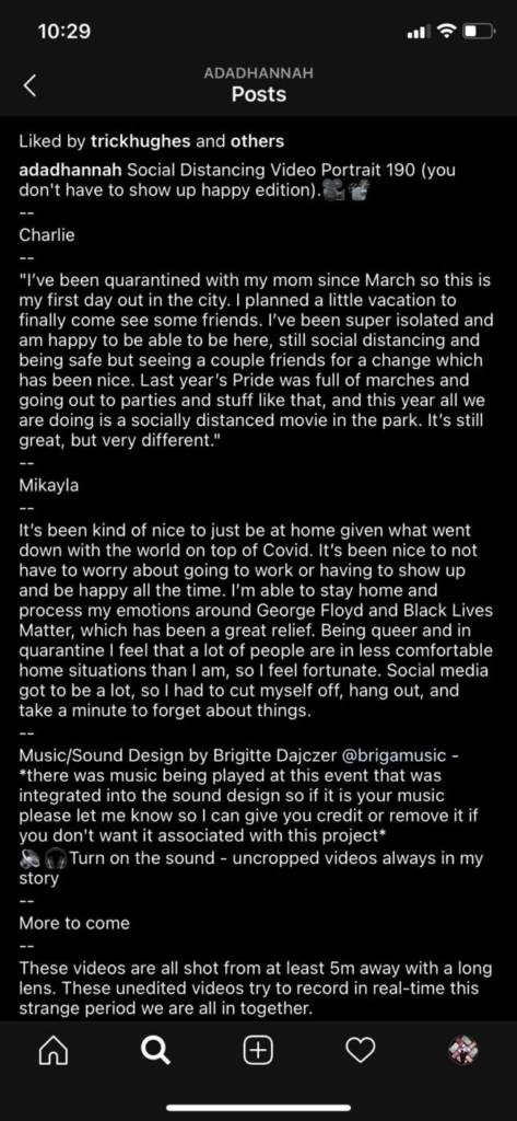
ASSIGNMENT 4 – SOCIAL DISTANCING PORTRAITS + Adad Hannah REFECTION

Rules for making his Instagram video clips:

  • Each subject is framed in the center of the shot. He also posts the uncropped video version in his Instagram stories.
  • He is standing at least 5 meters away with a long lends to capture onto the subject and not the background.
  • How they are presented on his Instagram, you can see the whole body(ies) even in the thumbnail.
  • He either angles them to look indirectly at the camera or depending on the pose i.e. the BLM Marcel video has them looking directly at the camera.
  • The Vancouver sun’s article shares that he likes taking the video and a still image at the same time, it would be nice to see bother presented in the same post.
  • His posts change with the government guidelines and the information that comes out about safety precautions one should take to not transmit the virus. In the beginning, you can see that no one is wearing a mask up until March 22nd where Jaya is posing with their skateboard outside.
  • He also doesn’t shoot groups together unless they are from the same household.
  • At first, he tries to have the pose of the person to be natural to them and relate to their statement. For example, Qadir (March 28th) with his boxing gloves, standing in an action pose which complements his statement about staying positive, staying in shape and supporting the front line workers who are doing a wonderful job. Another example is Melissa, a teacher, she holds an inviting stance, as she is excited to welcome her students back to school, who have been desperate to connect with each other.
  • Some of the backgrounds he uses in relation to where he asked the person to take their photo have reference to the pandemic, either congregating in small groups all the park. Either warned by the city not to… (A recent news story in Toronto about all the people that were in Trinity Bellwoods Park, springs to mind). Or capturing protesters for the black lives movement has an impactful statement of people coming together but still distancing and wearing their masks.
  • When looking at the layout of the Instagram feed, He posts the images from the same location or area one after another. For example, the videos of the beach trip are together and the park photos are together. On some occasions, there is music attached to the video but most have the natural sound.
  • One of my favourites is Kelly and Aria (Oct 9th). The music is haunting but seeing her eyes move adds life into the image.
  • His approach is similar to the Humans of New York Instagram but with more originality in the poses. He shows a snippet of what the last 6 months have been for many while not giving too much away. Fundamentally we are all going through the same thing no matter or political opinion, or race, class or age, just like passing a stranger on the street and giving them a discrete once over as we pass, there is now a sense of understanding and care we have for one another. I do hope that continues.

Social Distancing Video Portrait 1 (I have no choice, but I’m lucky edition)

Alan

“Myself it’s a risky job. I have been working in a convenience store since middle of March when Covid 19 started. In my store, I was serving all customers. So far I’m lucky and safe. I instructed all customers to wear a mask when entering in my store. I have no choice continuing this, my job. Until our country finds the right medicine for Covid 19, as a Canadian I try to do my best in the community. Thank you.”


Social Distancing Video Portrait 2 (Mounting COVID numbers; is change in the wind edition).

Laurie

“The last 6 weeks have been full of change causing internal anxiety for the students and the teachers. It seems like procedures shift daily and take up space in my brain. The COVID numbers are mounting in the city and businesses are closing down once again. I fear that I will be back in my kitchen staring at a screen all day trying to make the students buy into the lesson. But Casinos are opening up in Ontario today…”


Notes from Maggie: As of the end of this month, Alan, will be selling the store. He has been the owner on and off for many years and will be missed.

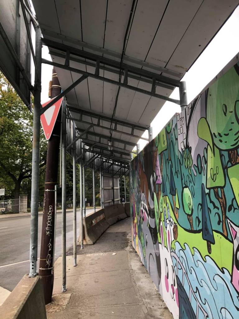
ASSIGNMENT 3 – BANNER + canadianart ESSAY

Class Notes

Photographs

Location: Bloor, On route to Sherbourne Station in Toronto.

*** This is my knowledge of this area. I’ve had a few opportunities to work with the kids in the area, but I’m still an outsider. I don’t live in the residing towers. Here is my perspective from a community-building/engagement perspective.

  • This area is residential, it is filled with children and families of all ethnicities and cultures. It as sandwiched between Riverdale, Cabbage Town, Bay St area and the Don Valley.
  • The area has mid to lower-income households.
  • Lots of families live in small apartments, mainly 8 floors tall and lower.
  • There used to be a patch of green space with an abandoned house here.
  • Nearby there is one school playground, during the summers it is packed with children. That is the only main space to play in large groups within walking distance of all the apartment buildings.
  • What’s going up on this corner is a massive building, has no connection to the area, only affordable to few, not all.
  • The construction safety walls has the vision of art made by community programs and artist but does not reflect what is being built, or what it lacks, in terms of supporting the community, other than the chain restaurants nearby.
  • Saftey walls have repeating pictures of lush green trees, vendors, humans and characters enjoying being outdoors, etc.
I chose to put my banner on the green artist board and the red company’s name, although hard to see, I used the same red and white colours as a Stop Sign or Yield Sign.

Materials: White printer paper, red dollar store gift bag repurposed paper and cotton string (in reference to cotton socks worn by construction workers).

References: https://canadianart.ca/essays/dirty-words-interesting/ https://inps.net/graphics/sites/default/files/pdf/MTO-Book-5.pdf https://en.wikipedia.org/wiki/Stop_sign

Sample of construction walls placed around the site.
Location: From a distance

ASSIGNMENT 2 – TEXT AS ART

Class Notes

Class discussion about last week’s blog post: Book Stacks

Class discussion notes: Katachdourian’s love of the physical notion of the book. She enjoys using their feel in her hands, the shape, colour and texture. She uses the material presence of the books.

  • Look closely at things that we know so we know what they are.
  • Discoverists in our own libraries.

Week Two – WordPress Assignment: Looking text as art images. Choose two images and write about… How they use text (size, shape, letter accents, the composition of the text on a surface). Different media – billboards, books, lights, installations? How the work is crafted. How is the work intended viewer. What is the meaning and what media works well with the message experienced of the viewer. How the text stands in for the artwork and the affect it has? Use letters and words as the material itself.

Reading/Artwork Response

The two art pieces I have chosen to write about are John Baldessari, Tips for Artists Who Want to Sell, 1966-1968 and Joi T. Arcand, Northern Pawn, South Vietnam, 2009.

The typography within John Baldessari’s, Tips for Artists Who Want to Sell, 1966-1968, uses westernized and European references. The material and dark beige colour it’s printed on has looks like either a store sign written by the owner on a sample size a 8.5×11 sheet of paper. It is similar to the work of Sol LeWitt as he gives a set of instructions. Although not numbered on the page, the bold list spots next to each paragraph gives each text piece a surge of attention to each first word of the paragraphs. If he had created the piece with text only, no special characters, it would make the words like they hold less importance. I would not be enticed to read the whole of the text but only read the first and last sentence.

He is addressing a target audience of creators and mark-makers. He uses impersonal text, i.e. no tales on the ends of his letters, yet does not go for the obvious Ariel or Calibri. There is a formality to the piece, like a professor giving an assignment sheet to students. The text in all capitals adds to this formality, and showcases everything written below the initialized but bolded title. This gives importance to the text. The text is also selective in its word choice. Unlike Arcand’s photograph, there is no visual stimulation. It does not dictates a location or want the viewer to imagine a future that could be within reach. European/westernized representations are used with not collaboration with different cultures or norms. Joi T. Arcand work below, uses the Cree written language as a cultural statement taking us out of the European norm.

John Baldessari doesn’t want the artists who use this text as instructions to fail or loose focus. He aims to have a controversy free result from this work. The text also has little connection with art history other than the Christian Madonna reference. Yet on the other side, he chooses to state that masculine and strong imagery like rosters and bulls sell more. A note to the bias found to society?

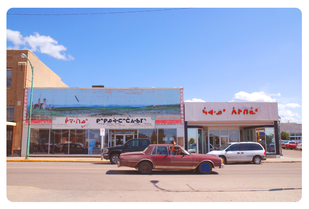
Joi T. Arcand’s photograph and series Here on Future Earth is a contemplative and exciting look into text, how it shapes our surroundings and our perception of one’s local environment. As the website: canadianart put it, her implementation of exchanging English titles and labels of storefronts, buildings and signs for text in the Cree language, “changes the visual landscape” and challenges how we conceive the geographical location we reside in. Arcand changes the meaning of each logo or title of building; but creatively uses a ‘painterly’ format by understanding the breakdown of syllables and how each letter looks in comparison to one another. How the text sits and shapes its surroundings.

So often, we are over saturated with the same labels and logos of companies that we are able to identify a sign just by its colours such as McDonalds, Starbucks or even our favourite book stores. Especially if we don’t travel by foot, the passing of buildings or storefronts become a large blur. The language, the font, colour or letter shape can influence what we think of an area. For example, I live in Toronto, and near me there is a section of the Danforth called Greek Town. The sign hanging over the street when you enter and the constant shades of blue stripes on each pole give the perception that the area is full with Greek owned restaurants and stores. In actuality, the population of the area is very diverse, few Greek people actually live in the area because the Greek diaspora in Toronto has sped its wings. However one would not know this from the visual representation that is prominently shown on the Danforth when one is passing by. Greek Town feels “Greek” in its visual representation.

Joi T. Arcand’s Northern Pawn uses text and the sculptural aspects in both her painted words and the commercialized plastic material as a transportation vessel to get her new norm across. She brings you forward and backwards in time. For example, she make’s a ‘lens’ to show how land is governed by language, how changing the language changes the political power relationship. The syllables allow us to envision the past and who used to live or still lives in the town. Who has the ownership of the businesses, are they power present or power past? Arcand strives for a non-western outlook in language/letter representation. This allows the normalization of this practice and perspective. Hopefully choosing language alternatives when labeling will further more diverse positions in art and society. It is well known that many languages, some old dialects or languages that have a small population of speakers are slowly being lost in the swath of the majority speakers, therefore, Arcand’s photographs revitalize and preserve language by increasing its visibility. The affect these photographs is refreshing, like visiting another country, helping one to rethink the norm. There is a sense of satisfaction in seeing marginalized cultures and language integrated into westernized civilization as if they were the norm or not. It is an interesting mind game. We need to see more non-majority languages represented in our society on a daily basis, normalizing Indigenous languages, changing power relationships. Common use of any language both written and spoken is important for education of the general public and the visibility of marginalized peoples.

References

https://en.wikipedia.org/wiki/John_Baldessari

https://imageobjecttext.com/tag/john-baldessari/

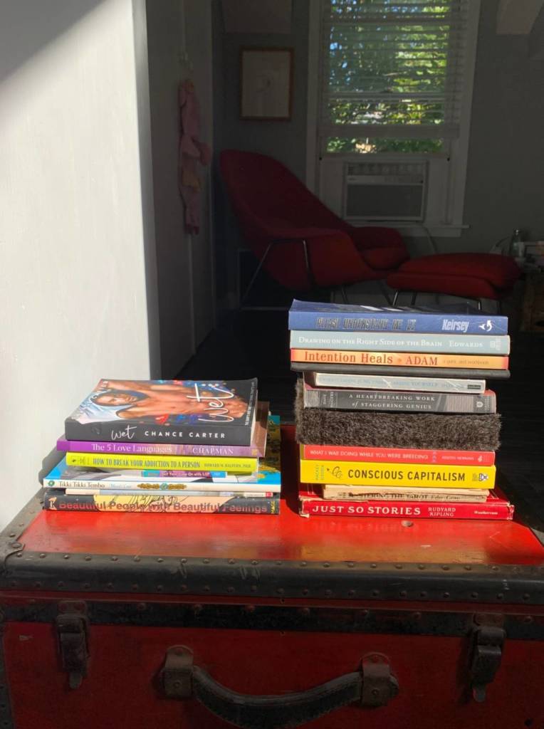
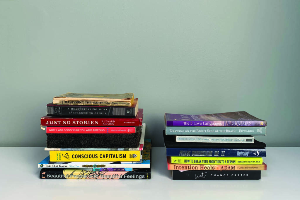
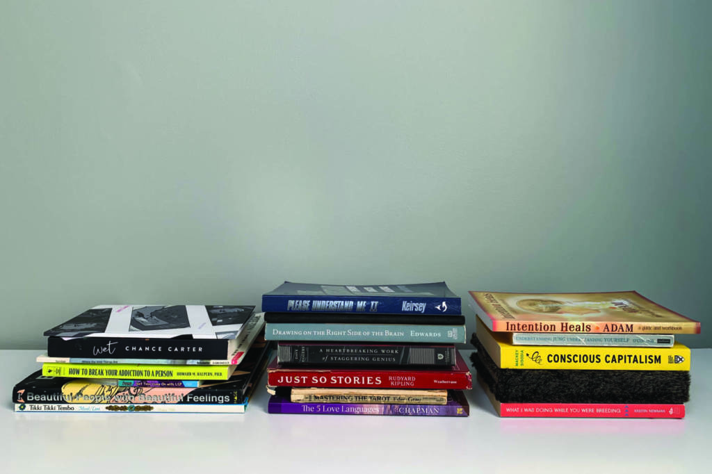
ASSIGNMENT 1 – BOOK STACKS

Photo One – For Whom The Bell Tolls

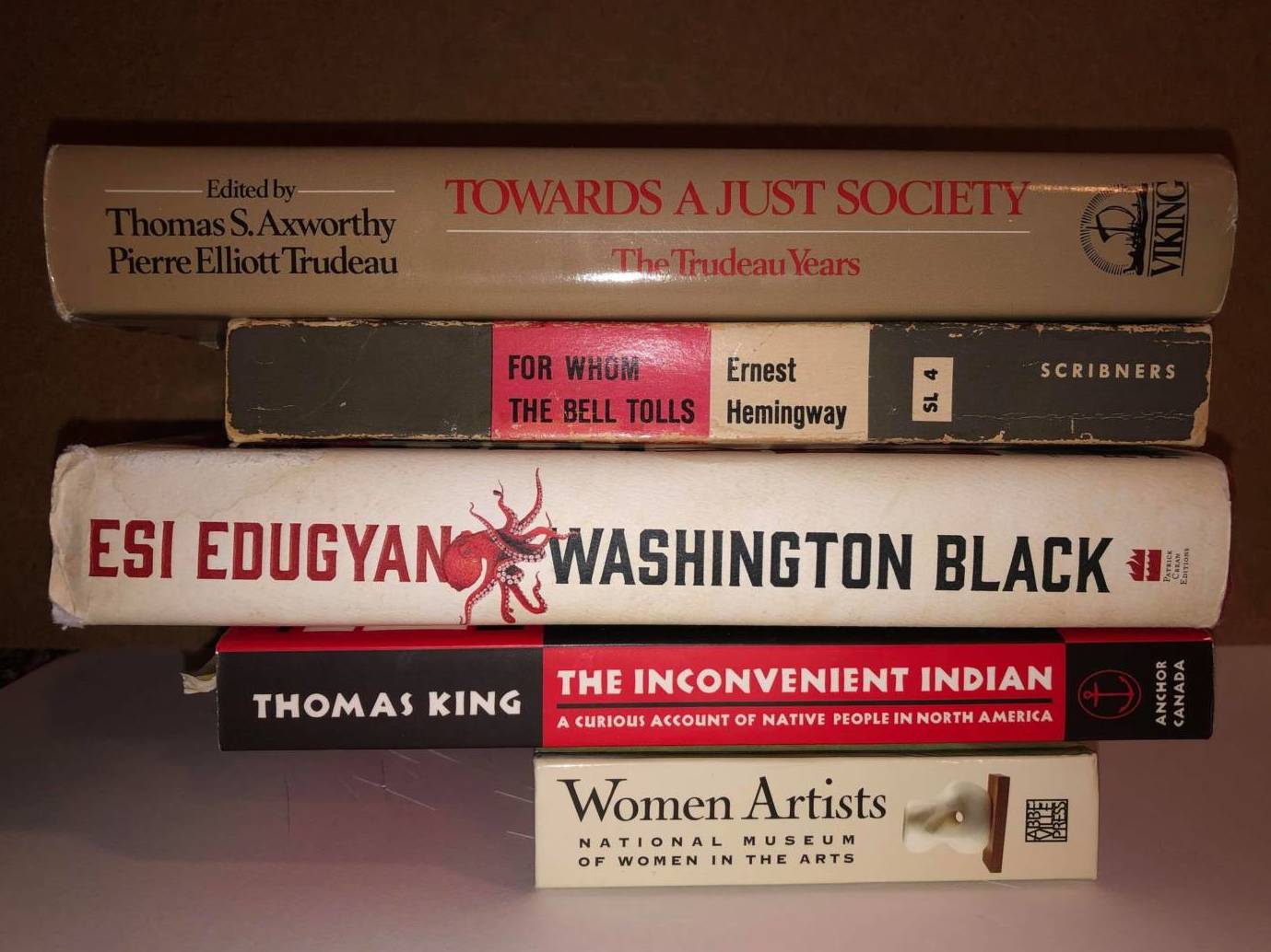
The first book stack assembled is a combination of books I own and my parent owns. I wanted to create a stack that commented on the events that happened over the summer without delving too deep. I identify as a white person who has ancestral ties to both Métis and colonial history. This means I should and do care about the racial inequalities that are currently rearing their heads in the general conscience of society. Too bad some think racism and inequality are new and not the ongoing societal bias of our colonial past. The last book is of woman artists, I thought it would be an appropriate nod towards the feminist march that took place in 2019. Our library is diverse and thought-provoking, reflecting the controversial richness of the world we inhabit. Each day on social media there’s a new petition or event to attend, it can be hard to not get lost in the melee. I wanted to showcase what I’ve been witnessing and self-educating on with my peers.

Photo Two – Fashion is…

This second book stack is an opinionated piece. In my personal opinion, I am on the fence about how art is displayed in galleries. The Art’s monetary value is tied to the name of the artist, word of mouth and the marketing machine that pushes the trinkets being replicated from the original art without sustainability. Funnily enough, this was an ongoing topic of discussion two years ago when I took Dave Dyment’s class. Yes, I love art galleries and museums, I am guilty of buying magnets, socks and posters of famous art pieces, but I do believe there is a point where the societal saturation of a painting or sculpture goes too far. But on the other hand, I also believe that art should be for the general public and not locked away in someone’s vault. As an artist who makes and consume art, I’m still trying to work out my feelings toward the subject.

Photo Three – Comfort Food…

Top to bottom: Comfort Food, Along Memory Lane, Mushroom Salad, Milk and Honey

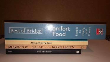
This last stack of books is a nod to food and its comfort. After posting the picture I do harbour some reluctance towards the recipe book to the stack, it’s size and content don’t match the other three but if taken away there wouldn’t be a set theme. In this case, compared to the other two stacks I was caught in the sphere of family dinners and diner parties. There is pathos here as the parties are not on the menu these days.

READING and REFLECTION (Class Notes)

Nina Katchadourian’s Only Yesterday photo from the series: Kansas Cut-up which is part of the Sorted Book Project is an interesting example of an intuitive assembly. It reminds me of moving plastic letters or word magnets around the surface of my fridge to make a sentence or finding creative word associations in a novel by erasing/covering sentences until you are happy with the end result… She is creating a story, moreso poetry with titles of books. Katchadourian uses the physical qualities, title relations, lists and blocks of colour. She pays close attention to book cover typography and backgrounds of covers to mismatch these stacks from the libraries of many, including the personal library of Willam S. Burrows.

Understandably, from the video, Sorted Books | Nina Katchadourian we learn that she has an extensive process of sorting, labelling and physically moving the book stacks around until she is content with the end result, this may take hours or just a few minutes to put together. As she sorts through a library she learns about the person through their use of books.

  1. How many times they may have picked up the book to re-read?
  2. The condition of a book: Is the spine cracked in multiple places?
  3. Are the pages ripped?
  4. Are their notes or sticky notes peaking out the sides?
  5. How has the book owner organized the books on the shelves? By colour? Most read? Least enjoyed?

From there, she takes these books and tries to create a profile of the person. Out of all the photographs presented on the assignment page, I was drawn towards her Only Yesterday, 2014 photograph.

The series Kansas Cut-Up from the Sorted Books project
Pictured above: Only Yesterday
C-prints, each 12.5 x 19 inches, 2014
Only Yesterday,
I Left My Grandfather's House,
Flashback, 
I Left My Grandfather's House,
Flashbacks,
Flashbacks.

Visually, one can see that she has assembled these books based on having multiple copies, the size and colour as well as their composition. Reading from the top book to the bottom, the text holds more that one linguistic inflection when reading these titles aloud. The first two books set up the story while the repetitive titles and vibrancy can make the viewer, me, understand it’s urgency and prominence. To be able to relate to why Burrows had various amounts of the same book and multiples is a mystery, yet may have insight into his own body of written work.

He was known for beat literature and paranoid fiction. All things considered, he was writing and creating in a post-war era, the 1950s, where PTS was not uncommon for many people in America who had been affected by WWII. Therefore, Katchadourian’s process of assembling this particular book stack, in my eyes, is an ode to the 1950s and Borrow’s body of work.

Side Note: Out of curiosity I wanted to see if this particular book stack had any colour relations to his geographical location and Katchadourian’s series title. Burrows spent the latter part of his life in Kansas. The city’s colours are red and gold and Kansas State’s colour is royal purple (shades of purple). Just an interesting thought as to why he owned the books (depending on when he bought them), other than for their content. Just like in Guelph, seeing the school colours on a daily basis may draw you towards buying something with similar colours…

* * *

The second Photograph from the assignment page I would like to unfold is the work of Dave Dyment, ONE BILLION YEARS [PAST AND FUTURE], 2012.

ONE BILLION YEARS [PAST AND FUTURE], 2012
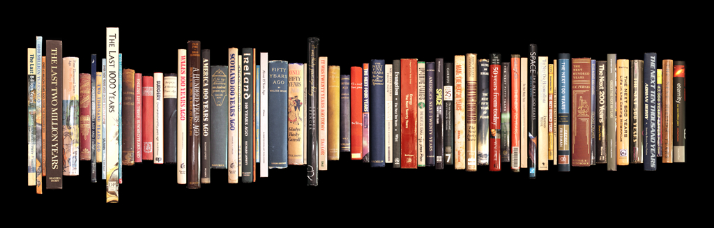
A collection of books pertaining to the past and future, arranged chronologically from One Billion Years Ago to The Next Billion Years.

As a student at the University of Guelph, I had the opportunity to take two of Dave’s classes (Extended Practices 1 and 2). Knowing his lecture style and opinions purely based on what objects he willingly shared with his students during class hours gives me some insight into his work. Along with the multitude of photographs he collected and commented on during our weekly PowerPoint presentations, I have to say that this artwork (pictured above) is not unusual and is consistent with what I learned about in class. He enjoys collecting, both functional and sometimes impractical objects, he always took great care in how he sorted through bookstores or websites to find the one piece that was missing from his home collection and needed for his work. He is meticulous in maintaining and preserving their quality over time. His art world connections aided in his searches. He is always direct with his thought processes/explanations and has no qualms letting you know when there was a piece or artist he did not care for. I believe the same type of time and focus went into the creation of ONE BILLION YEARS.

Listed below is the ways he may have chosen these particular books:

  1. Quality and value to himself or the artist who made the product (i.e. the limited additions available and their uniqueness).
  2. If the book was written by another artist he was friends within the art community, he’d put in the effort to buying it.
  3. Colour doesn’t overwhelming matter within this composition, it’s more the text he was focused on, to stick to the pattern of past and present.
    • After further analysis there is a slight colour pattern to his work, the three prominent colours are red blue and shades of yellow, yet this may be accidental due to it having no correlation to the text on the spines.
  4. In this case, the content may have some relevance but for appearance sake, I don’t think it mattered. Nor would the print date as long as it is relatively close to the first print release. Again, he favoured limited editions of objects.
  5. I hypothesize that he may have already owned some of these books and put great effort into sourcing these books in person and curated the covers. He may have also exchanged books every so often to be more inclusive of eras and locations (America to Scotland).
  6. Lastly, from the photograph, he chose all used books, the spines are cracked, edges dented and worn embossed titles.

Other than his organization of books from one ara to another and the slow visual uniformity of the printing press sizes, I don’t see any major correlation to the language of books and no familial ties he represents within the work. Yet… circling back to the uniformity of the books based on the future half of his arrangement (right side) this can be a connected by itself.

  • With access to the internet, we now have lost some of our creative nature as an individual artist because the world is so interconnected, whatever we make as artists will be or has been a copy of someone else work.
  • The new global rules on how tasks are completed or guidelines for making art are drawbacks to spontaneity, i.e. book sizes…

In conclusion, my theories on how he assembled the books based on uniformity and societal interconnection/loss of creativity, would be an interesting avenue to explore.

Jackie’s Work

WEEK 11: Cake, Tea & Best Shirts

I don’t have baking soda or cocoa – so I improvised with baking powder, and crushed mini eggs. And much to my surprise, it wasn’t awful to eat! Though, it wasn’t amazing to eat either haha. Yet somehow, I kept taking bites every time I was in the kitchen. I really like the mini eggs in it actually, the crunch of the candy shells is nice. I’ll probably pick up some baking soda and try again, and it’s sooooo sweet, I’ll probably cut way down on the sugar too.

Of course, I had to take a scan of a bite of my class cake!

In class I mentioned that my best t-shirt was a shirt by a band, The Boo Radley Project. They’re a great local band (Elora/Guelph/Toronto). They took parts of each member’s face to collage them into the above masterpiece.

Since I love sharing music, here’s my favourite song of theirs. You can even get your very own t-shirt here.

(Full disclosure: My nephew is the drummer 😀 )

WEEK 10/11: Food Art

Update of work in progress: Scanned Food

I tried another way of scanning my first bite… just the bite, spit out on the printer bed, before being chewed. I think I might have a winner!

Though, I do kinda still like these ones too. I like the look of the scanned saliva. I think it makes the image more difficult to know what you’re looking at. It looks like it has the consistency of the white of a raw egg.

WEEK 10: Food Art

Work in progress: Scanned Food

For my scanning food idea, I decided to focus on “The First Bite”. I wanted to play on the idea of how we always want to savour and remember the first bite of something delicious.

I took a few test scans to compare a few possible approaches. I’d love to hear your thoughts on the images and what works best and any other ideas/feedback.

Warning – it’s gross – but hopefully in a good way!

I’ve started a list of what I was eating for meals/snacks, and at what time, and then, photocopied my first bites. I tried a few different ways to see what works best. I think it’s safe to say that the Pipillotti Rist video work Be Nice to Me influenced me more than I realized when we first watched it!

NOT CHEWED

CHEWED

CHEWED BITES

Some Thoughts:
– I think the images of just the food are the strongest. Especially when I crop them to be more close up (see below)
– I could try taking a bite, and spitting it out before chewing (not sure why I didn’t think of that).
– The face ones are a little better when I really zoom in, to abstract it from being so obvious what you’re looking at.


Presentation:
– I’ve started a list of what I eat, and at what time, but I’m not sure if it should be included in any way.
– Sometimes I picture laying it out like a book, with a big image on one side, and on the other, just very small text in the center of the page, saying what it is.
– If I go along the “memories of my first bites”, maybe including dates/times is good?
– I also thought if not a book, it could be a webpage or Instagram account.

A lot of decisions to make still!

WEEK 9: Food Art

Lecture notes/brainstorming/research (that turned into a proposal in class)

This assignment reminded me of this work of art (?) that I saw on Facebook a few weeks ago, and I haven’t been able to unsee it since. Blarg. So gross, but I can’t look away… 0_o

I saw this work by Joseph Beuys that someone shared on Instagram and thought it was an interesting idea. The one on the right is by Beuys and the one on the left is by someone else using a more modern light bulb. The bright yellow in these images is so nice. This work actually reminds me of an assignment I’m currently working on for Special Topics in Sculpture with Nestor. We have to choose two objects in our space, and design and print a 3D object that can be used to connect them to each other, to form new meanings and relationships.

I did a quick Google search for “Joseph Beuys Food Art” to see if he had more food sculptures, but I didn’t see any right away. However, I did see that he (and Lucrezia De Domizio Durini) have a book called the Art of Cooking!

It looks like I great book. I was able to find these images online. I really like the design of the layout, and the style of writing, like a journal, processing thoughts and memories about food and all of its connections and relationships. Despite food being so colourful, I like the decision to publish black and white images too, it makes it feel like a historical document, and therefore more important, crucial. I checked the UoG library, and unfortunately, they don’t have a copy.

Images borrowed from here.

Joseph Beuys also has this typed list of foods, complete with grease stains. It reminds me of one of my mom’s handwritten recipes that I kept, (for chicken Diane!). Have you ever had it? My intention is to eventually frame her recipe to hang in my kitchen, I think I might borrow the way they framed Beuys’ list.

Image from here, where you can zoom in to see detail.

Maybe there’s an art project idea somewhere in her recipe?

Here are some other ideas I’ve been fiddling around with this past week…

Abstracted photography/video…

**SOUND ON**

Scanning/Photocopying food…

I haven’t quite found the idea I want to propose for our final assignment, but I’m working on it!

WEEK 8 & 9: Bread

Notes/Research/Reflections

I love bread. I love bread so much that I am in complete denial that the bloating and discomfort I experience after consuming too much of it, has any relation at all. Can’t stop. Won’t stop.

One of the main takeaways I had from listening to the bread podcast, was it reminding me how much I loved it when my mom or aunts would bake beat leaf bread. Soooo delicious. Memories of it came flooding back and I could smell it and my mouth started salivating for its garlicky goodness.

My mom’s side of the family is Ukranian, and the podcast made me realize that food is really the only part of that culture that has been passed down through generations. Perogies, cabbage rolls, and beat leaf bread are a few of my favourite foods, and were staples of our Christmas dinners. My 3 sisters have all taken to cooking and baking, and are really good at it, but I always joke that that gene skipped over me. They are all really good at making all 3 of those Ukrainian foods, but because it all seems so involved as processes, I’ve never bothered to try – until Experimental III made me!

One of my less desirable traits is my resistance to picking up/enjoying things that have become popular/trendy/mainstream. When locked down first happened, it was impossible to check my social media feeds without seeing someone else’s loaf of bread. “Big deal! You made bread!” I couldn’t stop rolling my eyes. Sometimes I can be this guy from Portlandia:

As I mentioned in class, I figured that bread was becoming the quarantine craze because it was a way to pass the time. I was surprised after reading/following your (Diane’s) instructions that it was so quick and easy. And after I took my first bite, I was so thankful that this assignment forced me to get over myself and just bake bread! It was so simple and so tasty to eat. The loaf didn’t last a day.

I’m going to try baking beat leaf bread next! 😀

WEEK 8: Video-art

FINAL PROJECT

Hi Everyone, Tori here!

Jackie and I knew from the beginning that we wanted to share a meal on zoom/teams. We saw this as a modern way to connect through technology and maintain the connection involved with sharing a meal together. We decided to go with cake based on it’s large size and celebratory aesthetic qualities! We researched the popular phenomenon of Mukbang on Youtube. Many viewers simply want to watch people eat interesting foods while having conversations. For our video, based on the test shots … we found that the “in-between moments” were most interesting in our conversations. We also wanted the video itself to be about the cake and eating (big bites) not our conversations. We both got the same cake and sat at our kitchen counters. Although we are in different towns, there was something funny and connecting about eating the same thing. We would have experienced the same tastes (much like sharing one cake together in person). I think of this project as an ode to all the lost birthdays and celebrations lost due to isolation in this time. Cake is symbolic of happiness and partying… and I find lots of people are a little bit depressed based on the lack of social interactions. We found a way to draw attention to the unity that can be achieved via technology.

One could also read this bizarre video from a feminist viewpoint. Women are pushed towards taking up little space and being as thin as possible (watching what they eat). So it’s interesting when we stare into the camera and take huge bites of cake. I would almost read this as a rebellion if I didn’t know our prompt.

Anyhow, it was a wonderful time to chat and eat cake together in this strange circumstance. I enjoy that our private conversation is unknown to the viewer and they may wonder what we discussed.

Jackie’s Post-Production Reflections:

When we were going through the video recordings from our Teams brainstorming/test shooting session, the in-between moments, when we weren’t speaking were so interesting. You could see our internal wheels spinning as we worked through the idea.

Our grand scheme was to re-create those, while eating cake over a casual conversation, however I don’t feel like we pulled it off. The cake eating video, to me, seems so self-conscience and forced. Tori and I are pals, and have met over Teams to keep each other company and gab about the semester, so we figured we could just have one of our normal conversations. Our final video is natural, but unfortunately not AS natural.

Afterward, I got an idea for a similar, but bigger and slightly different project. To have participants (at least 12 maybe?) sit alone in a room, in front of a camera and a cake, while audio plays for them. There would be at least 3 different audios, maybe a podcast about bread, stand-up comedy and a montage of Donald Trump speeches.

I see it as a video grid installation, of people eating cake, while reacting to the audio. The audio would be silent to the installation viewer, but there would be 3 pairs of headphones displayed next to the screen (this is obviously for a post-Covid world), each one playing one of the audios. The viewers could put them on, and then watch the 12 screens to try and see if they can figure out who was listening to the same audio.

WEEK 7: Video work con’t…

Jackie & Tori’s Video Collab:
Test shots, questions & storyboard

Based on the great feedback we got from everyone in class last week, we decided to go with the eat cake idea, as it seemed to get the most enthusiasm.

We called each other on Microsoft Teams to see how the videos displayed and recorded, and to play around with ideas. Teams is tricky to work with as an artist because what you see, isn’t what gets recorded! The recorded video ends up reversed from what we were seeing as we recorded.

As I was editing all of our questions together, I noticed that the in-between speaking moments were almost more interesting. So I slapped this together to see what it would look like.

Tori also drew us up some storyboard ideas to use as a guide for framing shots and following the same flow of actions.

Jackie’s Notes on artists/artworks on blog

WEEK 6: Video work

Jackie & Tori’s Video Collab:
Proposal

We have 3 ideas that we are interested in exploring. The first two involve just Tori and Jackie, the other one requires a full class (or close to it) collaboration. Here are the ideas:

Idea 1: Internal Dialogues

This idea was inspired by issues brought up in the article by Vivian Castro that was assigned for us to read/consider. In it, Castro asks a series of questions to consider…

“How do we construct our thoughts and express them to others in a mediated and strange space?”

“Are we expressing everything we want to?”

“Do we have trouble making connections between thoughts?”


She also mentions that in psychological studies on video meetings, that our minds need to work harder to focus and process non-verbal features.

Based on this, what we are proposing is:

A video of two people (Jackie and Tori) engaging in a typical Zoom meeting. Maybe 2-5 minutes long, guided by an agenda of school work content. We would then overlap audio tracks of our individual internal dialogues that are taking place during the video call.

Examples:
– Struggling with when we can interject with a point we think we need to make…
– Looking at our own physical attributes and feeling insecure…

The script for the internal dialogue would be written after the initial video meeting call is recorded, and it would be written to correspond to body language, gazes, and any fidgeting that occurs during the meeting.

The idea/goal of the video:
To illustrate how overwhelming and physically, mentally, visually and audibly exhausting the experience of video call meetings can be.

Artist Influences:
Artist examples are Richard Serra’s Boomerang with Nacy Holt, which came up in the Castro article. We like the irritation of the audio feedback.

Another video work to consider as far as overlapping audio is concerned is Paul Wong’s Miss Chinatown.


Idea 2: Sending Food and Eating Together

Inspired by Mukbang video art: Internet eating culture

What is a Mukbang?:

This video phenomenon is a recently popular Korean trend known as an eating show. A Mukbang is an online audiovisual broadcast in which a host consumes large quantities of food while interacting with the audience. The performance is often done on streaming platforms like Youtube or Twitch. Korea has always shown cultural pride in its healthy eating practices and strict etiquette. Recently, people have shown interest in observing people consume elaborate/ large quantities of comfort food.

Connection to video collabs and the pandemic :
Food has always been a popular way to bond with someone. Sharing a meal implies a level of closeness and safety. Every culture has specific customs that accompany meal sharing. Now that we are separated physically, many people crave physical contact and closeness. Bars and restaurants have been shut down and visiting people in their homes is largely discouraged. Sharing a meal online would be a way to adapt to the pandemic and still enjoy that connection of friendship over food.

Artist Influence: Rirkrit Tiravanija‘s Untitled (Free)

the artist moved the contents of the gallery’s back rooms into the exhibition space, placing the business of art on display, and transformed the emptied office into a temporary kitchen, where he prepared Thai vegetable curry and served it free to anyone who wanted it.”

The core idea:
Jackie and Tori order each other food through Uber Eats and have it delivered to the other person’s house.

We then open and eat our meals together on a Zoom or Team meeting.

Why we would do it:
Cooking food for each other is a love language. Hospitality and preparing a meal for someone is a way to demonstrate that you care for the person. Food fuels the body, making sure someone has a good meal implies that you’re taking care of their basic survival needs.

In 2020, we cannot prepare a meal for the other or welcome them into our home. Doing this project would demonstrate us making use of the existing technologies to adapt to the situation and still provide nourishment to the other.

It would be that same gesture of hospitality with the intimacy of eating together, on a virtual pandemic safe platform.

Idea 3: class twister collab

Concept: class twister game via zoom

Everyone is on one zoom call in their individual squares. 

The video is captured by a screen recording of the session. 

We print out and distribute spinners or dice to the class that have the various categories (left foot, nose, right eyeball, right hand etc). This object would function like the twister spinner. Everyone spins their spinner and all at once, we put that body part up to the camera.  

This exercise would function like playing a party game together but in a virtual way. 

We can’t play real twister together because of CIVID-19, so virtual twister will be the next best thing. It will also create a visually dynamic shot to have all the body parts approaching their camera at once. Making the viewer feel like limbs are jumping out at them.

WEEK 6: Video-Art

Research & Notes (so far)

WEEK 5: Social Distancing Video Portraits

FINAL PROJECT

Social Distancing Video Portrait 01 (Jackie’s experimental studio edition).
– –
Ardin
– –
“It hasn’t been that bad. I’ve noticed not being able to travel. Going into the city when they lock down and stuff is less of an option, so you’re more just locally focused. But our town hasn’t made massive changes because of Covid. So, it’s pretty similar, apart from the lockdown, which was very different, because I was in my apartment for 2 months.”
– –
Music/Sound courtesy of the video’s environment
Turn on the sound – uncropped videos always in my story
– –
More to come
– –
These videos are all shot from at least 5m away with an iPhone X. These unedited videos try to record in real-time this strange period we are all in together. Inspired by Adad Hannah.

– –
Jackie’s notes on this video: This is my brother-in-law, Ardin. Him and my sister Becky own The Friendly Society restaurant in Elora. I had originally asked my sister if she would participate and she said yes, but when I got to Elora, she chickened out and asked her husband to instead.

I used Nathan’s tip and sliced into a toilet paper roll to make a tripod, and I set it up on a large concrete traffic barrier. It worked well, however it was a very windy day, and it wasn’t sturdy enough to withstand the wind, so the video isn’t totally still.

I did two takes of this shot because near the end of the first video, a passerby says something to us and then walks behind Ardin in the shot and my immediate thought was that he ruined it because that doesn’t happen in Adad’s videos (that I saw). Ultimately, I decided to use the video with the interruption for my final project because it makes me smile. The interrupter is “Stahly”, a key character in Elora that everyone in town knows. He’s an older man who’s a little down on his luck, but the whole town loves and supports him.

Social Distancing Video Portrait 02 (Jackie’s experimental studio edition)
– –
Daley
– –
“Well, I’ve been playing a lot of drums, and not getting to play them for people very often.”
– –
Music/Sound courtesy of the video’s environment
Turn on the sound – uncropped videos always in my story
– –
More to come
– –
These videos are all shot from at least 5m away with an iPhone X. These unedited videos try to record in real-time this strange period we are all in together. Inspired by Adad Hannah.

– –
Jackie’s notes on this video: This is my nephew, Daley. Since my make-shift toilet paper roll tripod couldn’t resist the wind in my first video, I decided to do my second one indoors. Thankfully I was already planning on doing a video of Daley, and he’s in my social bubble, so I could go inside his house. It also worked out perfectly because Daley is a very talented drummer who practices obsessively, so getting to do a portrait of him behind his drumkit was perfect.

Another benefit of going to Daley’s house was that I was able to use one of his mic stands as a higher tripod. I put my phone in the mic holder and stuffed it with gloves to keep it in place. While Adad centers his people in the middle of the frame (for the most part), I made the decision to have Daley slightly off to the right, because it allowed me to get the whole drumkit in the shot, which I felt was important.

Social Distancing Video Portrait 03 (Jackie’s experimental studio edition)
– –
Spencer
– –
“It’s been hard because my profession is events, so there’s nothing. Events are essentially at a standstill. So, it’s a little scary, but we’ll see. I think when it’s over, we’re going to come out of it, um, like people are going to be really excited to do things again, when they’re allowed to. I mean even now, we’re DJing on a patio right now, and it’s full, and its like 7 degrees out. ”
– –
Music/Sound courtesy of DJ Spenny and the environment
Turn on the sound – uncropped videos always in my story
– –
More to come
– –
These videos are all shot from at least 5m away with an iPhone X. These unedited videos try to record in real-time this strange period we are all in together. Inspired by Adad Hannah.

– –
Jackie’s notes on this video: This is my friend Spencer. Spencer is one of the key people behind the Riverfest Music Festival in Elora and he is also a DJ – DJ Spenny. I was nervous about my first video with Ardin not working out, so I did a backup portrait so I could choose the strongest two videos to submit for the final assignment.

I ended up liking and using Ardin’s video, so I didn’t need the third portrait, but I decided to include it because there was an interesting moment while shooting. This was the next day, and I didn’t have my “tripod” with me, but I gave it a shot anyway. Since I didn’t use a tripod, it was a totally different experience for me, as the videographer. It became an endurance/stillness exercise for me as well, and it was as if Spencer and I had entered into a sort of stillness performance with one another. I thought that was interesting, and a nice way to feel connected to someone, despite being at a distance.

Reflections on Adad Hannah’s project and technical observations

Considering Adad Hannah’s Social Distancing Video Portrait project:

Through this project, Adad Hannah has been able to interact with and feature people from all different walks of life in outdoor public spaces, from a safe distance, capturing them in honest moments during the pandemic. What I really appreciate about this project is the way it captures how we’ve all been forced to slow down in our lives. Ironically, the idea originated from Hannah’s restlessness with feeling paralyzed during the initial lockdown in March. By starting this assignment for himself, he satisfies his urge to get out and create, while simultaneously documenting this historic moment through the people living through it. The quotes provide interesting insights into the people he takes videos of, not just in what they said, but in how much they say. Some people offer a full paragraph, others a couple of sentences and some have no comment.  

In the beginning, his posts described the idea/project, and how he was feeling, and why he started it. He also would give a brief description of his interaction with the person, and included a quote from them on their Covid-19 experiences. He also had a composer friend put some music to the videos.

Over time, his video descriptions became more uniform:

Project Title (Social Distancing Video Portrait) Video Number (208) and a quirky edition name related to the video.

Subject’s first name

Quote about the pandemic.”

Details about music with credit to composer and note that video is uncropped.

Teases us with the promise of more.

Summary of how he does it and why
**He then comments on each of his posts and includes a series of related hashtags and tags some galleries.

Technical Observations:
Consistencies:

  • I am fairly certain he shoots his videos with a vertical orientation.
    • They fit nicely on my phone screen when he shares the video as an Instagram story. If he was sharing from a horizontal video, I suspect the subject would have been a lot more zoomed in.
    • When viewed while scrolling through his feed, the videos are vertically rectangular.
  • Subject always framed in the center of the shot.
    • When looking at his videos as a grid on his Instagram profile, the stills are square and more often than not, the subject touches the top and the bottom of the frame. There are some instances where they are slight cut off, or, if the person is sitting, they are centered here as well as when viewing it larger.  
  • In his descriptions, he mentions that he uses a long lens to allow for proper social distancing (min 5 meters away).
    • This long lens also allows him to focus sharply on the subject and blur the background.
  • Given how still his shots are, I assume he’s also using a long-legged tripod
  • Adad gets the first name of his subject and asks them about their experiences with Covid-19
  • I suspect he gives people creative freedom when deciding how to pose for the video. I think this because there is a mix of people with straight faces and smiling faces, so its clear he didn’t instruct them to do a serious shot. Additionally, some people, who are clearly more eccentric and comfortable in front of the camera, did more expressive posses, arms outstretch, leaning forward and balancing on one foot etc.

Inconsistencies:

  • I like that Adad isn’t totally strict on what’s in the background of the video. Sometimes it’s a static background, with no movement because it’s a wall for example. These are nice because you have to pay closer attention and watch for subtle movements in the subject to figure out that it’s a video. In others, there are people in the background at a park, or perhaps it’s a windier day and hair and branches are blowing. These are equally as nice because you appreciate how still the subject is able to stay.
  • While the majority of the videos are of one person standing outside, it’s not a strict rule because there are also people sitting in parks, in cars or even in their homes. Additionally, he has pairs of people, or even groups in some videos.

Week 4: Social Distancing Portraits

More research

On the weekend, I was at a farmer’s market with some animals in the back. I noticed that one of the donkeys was standing still, and looking at me, so I quickly got out my camera to see if he would do it for a full minute for me.

Note to self: Don’t shoot videos horizontally.

Week 4: Social Distancing Portraits

Research Notes

The other night while scrolling through Adad Hannah’s Social Distancing Project on Instagram, I was surprised when I found someone I know in one of the posts! I used to work with the girl on the left, Charlie, years ago in Vancouver. See the original post here.

I reached out to Charlie on Facebook to ask about her experience as one of Hannah’s subjects. She was glad I did because she hadn’t seen what he did with the video/interview yet!

Week 3: Interesting Banners

FINAL PROJECT

I’m still shocked (read: embarrassed) and unsure how I had convinced myself that coveted meant ‘held dear’. I thought about it after class, and I’m fairly certain that the only plausible explanation is that my mom possessed me, because she desperately wanted to be a part of one of my art projects.

I liked how Diane (you), said that it looks like a place where a variety of objects could be displayed. Though, as I reminded myself of what it means ‘to covet’- to yearn to possess or have, it speaks to the absence of something desired. You can’t want it if you already have it.

By hanging a banner above nothing, it creates ambiguity, inviting the viewer to mentally insert their own coveted things in the vacant space. It becomes a place for manifestation. Visualize what you need or want, appearing beneath the banner.

– Jackie

Week 3: Interesting Banners

Trial runs

Over the weekend, I narrowed my ideas down to my two favourites. I went to Len’s Mill Store and picked up a few options for materials, so I could play around to find what worked best, with what, and where.

Here’s a collage of my trial shots:

WEEK 3: Interesting Banners

Reading/Research/Notes

I’ve got some decisions to make this weekend! ? ?
Feedback welcomed!

WEEK 2: Text As Art

For this assignment, I have chosen to discuss John Baldessari’s ‘I will not make any more boring art‘ – specifically the instructional piece he had the 1971 class at NSCAD University perform, and the Belief+Doubt installation by Barbara Kruger at Hirshhorn Museum and Sculpture Garden in 2012.

John Baldessari, I will not make any more boring art, 1971
Gallery Archives, Anna Leonowens Gallery, NSCAD University

In each example, Baldessari and Kruger use walls to convey their messages through text. Though coincidentally, and also similarily, neither artist actually put the words on these walls themselves. In the case of Baldessari, because he couldn’t physically come to the gallery space, he gave a specific set of instructions for one or many people to write his phrase repeatedly in columns on the wall, from the floor to ceiling. I am assuming that in Kruger’s case, a professional company was used to install the work. Clearly, the budgets for these projects were vastly different.

Both works were installed in art galleries, however, the Baldersarri piece was located in the exhibition space of a school gallery, whereas Kruger’s work swallowed up the lobby and bookstore areas of a Smithsonian’s museum. While they both install directly on the walls, Kruger takes it a step further by including the floor, and various architectural features of the space. Baldessari uses human hands and a simple pencil to write directly on the wall, and Kruger’s text was designed and printed using technology and industrial machinery to print on vinyl to be applied to the surfaces of the space.

When considering each artists’ texts, the mediums they chose to work with and in were perfectly suited to convey their individual messages. Baldessari had a message for himself as an artist, which is then written repeatedly by aspiring artists, in the exhibition space of a gallery that is located on the campus of an art and design University. Baldessari’s message is by artists, for artists, in a space where people go to spend time with art.

On the other hand, Kruger’s message is for the masses and critiques consumer behaviour and she delivers the message by mimicking the ways advertisements constantly bombard us with loud messages. So to take over the lobby and bookstore area is a perfect decision. By using bold fonts and colours, at such an enormous scale, Kruger is demanding attention in a space that is usually moving too fast or too loud to notice the details.

WEEK 1: Sorted Book Stacks

Research / Notes / Brainstorming / Experimenting

One Billion Years [Past and Future], 2012, Dave Dyment

When I first saw Dave Dyment’s stack of books on the class blog, I assumed that those were books that within the text/stories, that’s where references to the various dates were mentioned. I think I automatically assumed this because I am familiar with a work that he did (but Christian Marclay was working on something similar and got it out first – The Clock), where they searched movies for scenes that showed clock and collected enough to cover the 24hrs in a day. Holy labour and obsession intensive!

Once I went to Dyment’s website, I zoomed in on the books and saw that it was actually the titles that have the year references. I actually felt slightly relieved haha. One thing I’m curious about with Dyment’s process is where he searched for the books. There are no library codes on them. Did he source them through friends and family? Or maybe he searched titles online and was able to order them all?

Relax, from the series Composition from the Sorted Books project, 1993, Nina Katchadourian

I like that both Dave Dyment and Nina Katchadourian experiment with different ways of displaying/stacking the books, with different backgrounds or aligning the books vertically or horizontally. Of all of the variation’s I saw in Katchadourian’s work, I think the above approach is my favourite. I like that it’s a surprise sentence in the middle of the other books. It would be fun to spot that in a library.

This particular example is made up of books from someone’s personal library. It’s interesting what a difference it makes to know whether the books she stacks come from a smaller personal library or a large public library collection. With the subject of relax, and knowing all of these titles are relating to relaxing and struggling with control, it’s an insightful autobiography of the person. On the other hand, if Katchadourian was in a public library, and decided on the theme “relaxation” and searched for related titles, it’s slightly less interesting.

The below pictures are some of the experimental shots I took (not the final project). I was pretty set on displaying the books on my red trunk, but I found that it was too distracting and took away from the stacks. Another problem was that I had the idea of doing 3 stacks, and there wasn’t enough room on the trunk for that.

I really loved the sunlight that was coming in from the skylight in my living room. I thought it would be cool to take pictures of my stacks with bold shadows. Though to get the good lighting, the background was the room, and again, distracting. The angle and direction of the sun weren’t going to work in my favour.

WEEK 1: Sorted Book Stacks

FINAL PROJECT

Title: #7 – Doesn’t Like To Read

One Stack, 2020
Two Stacks, 2020
Three Stacks, 2020

For this assignment, I used all of the books in my personal library. This is actually all of the books that I own, and the same number of books are in each of my 3 pictures. Since my library is so small, it really became an unavoidable autobiographical project. Which I like!

As you may have already concluded, I don’t own many books. It didn’t really occur to me just how small my collection is until this assignment made me take a look at it. Sometimes it’s embarrassing, but mostly it’s hilarious to me. I attribute my small collection to two factors.

1. I have lived a nomadic life style. I have moved back and forth across the country 4 times, and would shed personal belongings each time. Also, since leaving home when I was 19, I’ve never lived in one location home for longer than 3 years. So with all of that packing and moving and unpacking, I have a really limited collection of material object.

2. I don’t like to read. Which influenced my title choice for this piece. When I was 22 and living with my first real boyfriend, our relationship was starting to crumble. In the final days, I found a small list he had made in his sock drawer. It was a list of all the “Cons” about me – and number 7 was that I didn’t like to read.

Process/Image Descriptions
Since I could easily fit all of my books in the shots, I wanted to use them all in each picture. There aren’t many titles or themes to play with, so quickly my brain started sorting them.

I purposely didn’t name each picture by the meaning behind their stacks. I wanted to leave it up to the viewer to look at all three images together and try to figure out for themselves the significance of each stack.

One Stack
All of the books that I own.

Two Stacks
Left: Books that were given to me.
Right: Books that I bought.

Three Stacks
Left: Books that I have read.
Middle: Books that I started but never finished.
Right: Books I have never started.

(note: The blog seems to really compress my images, making it hard to read the book titles. I have them set to display large, but it doesn’t seem to help.)

Tory’s work

Week 6: video art:

Please See Jackie’s page for details on our collaboration!

throwback to Experimental studio 2 two years ago

Bread: The Rise and Fall podcast!

I followed the class recipe and man oh man. This recipe changed the game.
I love bread. This quick bread made me feel so accomplished

Food ART:

Cheeto pyramid, Victoria drobot 2020
The bright Cheeto dust colour reminds me of this work by Wolfgang Laib. He uses pollen to make these fantastic swatches on the ground. I find the colour to be quite similar.
pomegranite print, 2020 Victoria Drobot

My Love of Borscht and family !

Borscht
Beet Dye on canvas, 2020

Week 4: video portrait week

Week 4: research

Week 4: video portrait #1

Social Distancing Video Portrait 1

– –

Zoe

– –

“I was on exchange in London when I was told to come home. It really hasn’t been too bad, man. I hate online school and I could use a break from my family… but I’m thankful to have my health and safety. I’ve become a lot more introverted and to myself. I think we’ve all grown from this and now have a better grip on who we are”

More to come

Tory’s Notes: I filmed Zoe in front of her house. We were about to go on one of our nightly Starbucks runs we usually meet up once every two weeks and go on a walk with some tea. These interactions let us walk outside which is a socially distanced way of staying connected. The fresh air and good conversation is a sort of ritual we have done since highs cool. It felt special to take a portrait of her in these weird times. I like to compare this to the old photos we have together to see how different life is now.

I shot this with my Huawei P30 Pro with flash because it was dark.

week 4: Video portrait #2

Social Distancing video portrait

– –

Dorothy

– –

“you know me… I was socially distancing long before this all started. We are living through some strange times. I feel like all I do is watch CNN and come up with new home projects to do these days.”

More to come

Tory’s Notes: This is my mom. She let me take her video portrait when she came back from the hardware store. She is currently doing the kitchen cabinets in the basement and painting the original Brick white. I feel that we have gotten closer in this time. I do feel that she misses seeing family and her friends. She is 62 so her friends are a lot more reluctant to see people (due to their risk). She is the strongest person I know. I can see that throwing herself into her work makes her feel accomplished. We work together on these projects a lot. It feels good to make and repair our house when the world is in chaos and only seems to get worse.

week 3 Banner assignment: “Day 235”

I wanted my banner to document how many days it has been since Corona impacted my life. On may 5th, 2020 we were in the welding shop on campus and by the end of class, all the schools in Ontario had closed. The FASTWÜRMS said this would probably be our last day together and it was. We never went back to campus after that. I have not counted every day and documented my daily pandemic experience. The days seem to form a blur. I think of this time as being in a black hole. We don’t know when it will end. We only know we are in it and try to settle in to the new normal. Highlighting day 235 is ironic to me. There is nothing special about this day… or the last… or the next. Yet a banner implies a celebration. I think by highlighting one average day and the number, I celebrate the idea and hope of being in the middle. The middle of the COVID-19 black hole .

I hung the banner over my office. the time and days I’ve spent here seem to blur together. I figured I should celebrate this.

week 3 Banner Art notes:

week 3 research notes:

week 2 assignment and research

week 2 research:

week 2 Writing Assignment:

week 1 assignment and research

For my book stacks, I wanted to play around with themes and narratives. 

I think the first stack combines themes of toxic masculinity with American culture. I was inspired by Trump’s attitude and tone when speaking to the American people. 

The second stack was simply the combination of spooky creatures (witches and vampires). The witch book is actually about practicing Wicca, while the vampire book is a fictional novel. I wanted to combine the real spiritual practice with the horrors people think of when they hear “witch”. I also think its formed a fun answer to the question presented in the witch book.

The final stack was intended to be funny. I Think many of us know a mother in law who gives someone anxiety. I liked the phrasing of “my age of anxiety” after “THE MOTHER IN LAW”. It seems like she IS the age of anxiety. 

NOTES

Hannah’s Work

Week 1 Writing and Notes

Week 1 Activity

Book Photography from my Collection:

This piece alludes to a feminist narrative and points to a future where women artists are recognized and appreciated as equal to male artists.
Sometimes our dreams and goals can be thrown off by fear in misery. The toppling bookstack signifies this struggle.
An honest display of my personal library.

Week 2 Notes and Written Work

The two artworks that I have chosen to compare and contrast from this week are Barbra Kruger’s Belief+Doubt (2012-Ongoing) and Eleanor King’s, No Justice No Peace (2015).

Both works use text that is displayed large scale in a space in which viewers can occupy. For instance, in both works, text is displayed all over the exhibition walls, surrounding the viewer in language. With that being said, not only do these works relate to high art culture, but also architecture and design. The font used in both text works are bold and graphic. To contrast, Barbara’s work used white red and black, whereas Eleanor’s work uses just black and white. To further contrast, Barbara’s work comments on the dangers of consumerism whereas Eleanor’s work comments on injustices in society. The medium speaks to the meanings of the texts because the text is so large and in the viewers face. Furthermore, the phrases presented are though provoking and ask the viewer to question things such as consumerism and its effects on the environment and life, and reflect on injustices against marginalized groups. In this way, the viewers can also relate to the text, and think about their own lived experiences in relation to the messages in the works. Often times in art we see how images are used to convey a meaning or message. In this case, both Barbara and Eleanor show how phrases can have a similar impact when presented in such a way. Overall, both works provide thought provoking text that are impactful to the viewer. 

Week 3: Banner Time!!

notes

For my banner, I chose the phrase “found images:”.

I hung up my banner in my room accompanied by all of my posters. These posters and images I have decorating my wall would be considered found images. I did not create these images, but I gathered them together to form a documentary-like mural of my interests. I like to think of the banner as the introduction to my museum-like collection of found images.

Notice that I kept the colon in the phrase. A colon separates two independent clauses when the second explains or illustrates the first. The second clause would be the found images seen on my wall, illustrating the meaning of the term “found images”.

Week 4 – Video Stills

notes

Week 4 Activity

“My eyes and brain hurt from all of these online classes”.

This is a point of view video still from my computer during online classes. With this online format, I find myself zoning out a lot and my eyes getting tired quickly. Additionally, I find my self in one position, not having to leave my couch for hours at a time while in class on my computer. This video captures this notion.

“Its almost impossible painting in such a small space”

This self portrait video still captures the small space in which I do my painting. It has been really hard not being able to use the studios on campus for my paintings and canvas building. Typically, I work between the small crevice between my kitchen table and the wall, using my kitchen wall as an easel. I live with 6 other students in a small town house and I try not to take up too much space when painting or creating art.

Week 6 Notes

Zoom Project Proposals

Proposal Idea 1: visiting different places on zoom with friends

Proposal Idea 2: interactive museum visit with friends

Proposal Idea 3: among us on zoom on phones

Week 7: Notes

Final Zoom Project Assignment – My Zoom Vacation

Me in Tokyo
Me at the Rock and Roll Hall of Fame
me visiting alien in Utah
Me at the Macy’s Parade
Me in Paris

Week 8 – Thoughts on Bread

Bread is such a staple to my grocery list and my everyday meals. Every morning I have berries, vegan yogurt and toast. My mom and I used to always make banana bread, and I always make it now that I am living apart from her. Bread is almost always the centre of my meal at least once a day, whether it be pasta, noodles, oatmeal, etc. There is a bakery down the street from me where they always have fresh French bread and I buy it once a week and dip it in a bread olive oil with rosemary and garlic. 

I think people have been making bread during the pandemic initially because there was a fear of supply shortage. I remember around the same time toilet paper was being sold out, so was yeast for bread making. From there, I think people realized how fun and therapeutic it could be to make your own bread, not to mention delicious. It also became a trend on tiktok to make bread and film the results, with different people baking bread with unique patterns and designs. 

My Bread Process:

Week 9

My Food Art Rant

I am going to be honest, I am offended and beyond annoyed by this weeks assignment.

I would like to point out that we are in the middle of a global pandemic. Many of us have lost our jobs, are low on income, and have extremely tight budgets. Some people can barely afford groceries. I am one of those people. I am so tight on cash, a voice in the back of my head tells me that I am not hungry, when I am hungry, just so I don’t run out of groceries, because I don’t have the money to buy food as much as I would like to. With that being said, this is a reality for many students, as not only do many of us have to buy our own groceries, we also just spent around $5000+ on our university courses.

It is extremely ignorant, insensitive, and out of touch to encourage us, in this time, to create food art where the food will go to waste. I feel that this assignment comes from a standpoint of food privilege. In particular, the piece A Stack of Pancakes was frustrating. The artist even describes how after the piece was documented, she just threw the pancakes away…

Another piece that I found extremely offensive during the lecture (I can’t remember the piece or find it, but I will describe it), was the piece where a woman starved herself and documented the changes to her body. I don’t think this type of art should be encouraged in this setting either, especially when diet culture and eating disorders are a huge problem in university settings.

There is a way to do food art without wasting food and I wish that this was touched on in the lecture. It is in my best interest to work in this format. Additionally, I hope that my contemporaries do the same, and not waste the food they use. Food waste is not art, it is ignorant and privileged.

My Assignment Idea

The idea I have for my assignment is pasta art. The pasta will not go to waste, as it will not be glued down like traditional pasta art. I will arrange the pasta accordingly, photograph it, and then save the noodles for dinner at a later date.

With that being said, I want my assignment to be based on the internet phenomenon of copypasta. Copypasta is a play on the term copy/paste. The copy and paste options on computers, allows people to copy posts that they see, and post them elsewhere. The urban dictionary definition of copypasta is below.

The pasta art will reflect this. I will write out the following post in pasta:

Another idea that I have is based upon the exercise proposals by artist William Burroughs. Burroughs exercises consist of color walks, a walk where you identify objects of a certain color. He also talks about eating foods that are only a particular color. For example, eating only green foods for a day.

According to my feelings and thoughts, Ive noticed that my root chakra has been out of line. The colour for the root chakra is red. It is suggested, to realign root chakra, one could use grounding techniques like walking outside bare foot, or yoga. It is also suggested that you wear the colour red, and associate with that colour.

For this assignment, I would dye my foods red, literally eating a healing colour.

Notes:

Week 10-11-12

RED FOOD EATING

Red Thai Iced Tea
Vegan Mac and Cheese with paprika
Apples UWU
tomato red tortilla chickpea wrap
vegan butter chicken with tofu+tomato sauce
vegan strawberry almond yogurt
red velvet cookie

Final thoughts: I ate red foods for about 3 days, up until I felt that my chakra was re aligned. Obviously I don’t think that eating red actually helped me feel better, but I think the spirit of eating red and having fun making new recipes helped me feel better 🙂

Sydney Rowles

Week 12

My cake by the fire!

My experience during this pandemic has been far from normal or even close to convenient. From not having proper functioning wifi, to a broken computer, to having an extremely loud household, to being close to people that don’t respect public health guidelines. I have travelled far and wide from Guelph to St. Thomas ON, to Toronto, to Kitchener, all with the intention of finding a better living situation and being able to properly focus on a full school course load. Unfortunately for some projects, I have not been able to fully participate which makes me incredibly sad. From living in unfinished basements, to couch-surfing, while continuing to travel back to Guelph for work, the pandemic has definitely been one of the hardest and most frustrating times of my university life. I hope these photos express my tireless efforts but also my gratitude to such an understanding and accepting class. Thanks for everything!

Week 6 Notes

Zoom Video Project Week 7

Class Notes

What the Mirror Sees Everyday! By Sydney Rowles, with Victoria Abballe

Bread Week 8

Class Notes

My bread!! It turned out denser than I would have liked, but I though it resembled a baguette texture, only fatter! I am not a baker at all but I found this exercise of not having to bake for anybody but myself very liberating. I was so happy and surprised with my result that I shared a few pieces with my housemates. We all had a piece with some herb and garlic cream cheese spread on it! Yum! Next time I will try incorporating different spices or maybe chocolate chips inside the dough to give it some extra flavour. Overall, I loved this week and felt so connected with everyone in class with this super simple idea of making bread all together!

Bread is Life

Week 9 Notes

Week 10/11 Video Project

There are many different uses for fruits that everyone should take advantage of! Try them out! by Sydney Rowles, 2020

************************************************************************

Sorted Books Stack Project Week 1

By Sydney Rowles

Katchadourin, Dyment and Park, the 3 artists studied in preparation for this assignment, all used interesting techniques when selecting books for their final works. One strategy I believe was commonly used was choosing books by interpreting them as sculptural objects; looking at their weight, size, mass, their wear and tear, even the font sizes since all of these factors have major impacts on the overall finished look and message of the work. Another technique that was mentioned that I, personally, tried to include in my sorted book stacks was to align all of the titles on top of one another or ‘flush left’ in order to increase legibility and have the message of the work come through quickly and easily to the viewer.

I specifically enjoy the book stack A Day at the Beach from the Sorted Books project, not only because I am drawn to the stacks that tell a story through a series of words, but the repetition of the sharks (Shark 1, Shark 2, Shark 3) is so simple yet helpfully adds to the suspense of the short story and creates an image in the mind. Above all, the Sudden Violence book is what stands out the most among the other books by not only being the climax of the story, but with the added colour and scary font. I believe the effect would not have been as great if the book were the same font and colour as the other books.

The second book stack that inspired me was (I believe it is called) Cult of the Cat, again from the Sorted Books project. Not only am I a personal lover of felines but I also loved how this funny stack was created simply by a group of books all with a similar subject. The fact that they are all different colours and fonts adds to the individuality of the cats themselves and helps create images of real cats with these names in the mind.

The three book stacks I have created are all comprised of books that came from my mother’s book collection. She is one of the biggest, widely-spread genre book readers I know and I thought it would be interesting to look through her collection for the first time. To my delight, she was happy to share her collection without any fears of judgement and by the end she became equally interested in the project and was finding and adding books to what became my final stacks!

The Heart is a Lonely Hunter by Sydney Rowles, 2020

For my first sorted book stack, I first found the book The Heart is a Lonely Hunter and thought to myself “and what would it do?”, so just like the A Day at the Beach short story stack, I created a story about the heart. My favourite part has to be the irony of the small and almost missable Mostly Harmless as we all know what the heart is capable of.

Bon Appetit! by Sydney Rowles, 2020

For this sorted book stack, I looked for books in my mother’s collection that had a unifying theme of eating and food. To my surprise, the final menu cam out pretty interesting… Bon Appetit!

1, 2, 3, 4, 5 by Sydney Rowles, 2020

For my third and final sorted book stack, I randomly discovered a trend in some of my mother’s book titles that surprised the both of us! Books with numbers in their name! I wanted to continue the theme but the only other numbers I had to deal with were 7, 10, 50, and 101! Sadly the pattern had to end here but if I get the chance, I would love to add on and repost a larger and longer stack someday soon!

Text as Art Week 2

By Sydney Rowles

Nadia Myre’s Indian Act is a large group-effort piece that contains all 56 pages of the Federal Government’s Indian Act, each mounted on individual pieces of cloth and sewn over with red and white beads.  The white beads stand in for each and every letter while the red beads fill the background. This was a very clever medium as not only are beads close to the same size as the documents and words they cover, but also, beads are a well-recognized material used in many First Nations art and this well represents their culture.  This work is an extreme statement on opinions of colonialism and the realities of government effects on the Indigenous population.  The fact that the artist gathered many people of her background who share the same story to help finish this work feels like a valuable group contribution to the Indigenous rights movement.  This is a great example of how an artist belonging to a marginalized population re-appropriates a document that is used to oppress them and turn it into a powerful art statement.

Barbara Kruger’s Belief + Doubt installation is extremely immersive, dramatic and makes many powerful statements.  The artist has chosen the inside of a Museum bookstore to completely cover with her photomontages.  She has covered the entire space in black, white and red vinyl, and has chosen to display her words in a confrontational high-contrast manner.  The way she has chosen to display her art is extremely effective since her messages all highlight the problems of consumerism and themes of desire.  It is interesting that she has chosen to place these words in a place of consumption, ie. the bookstore, in order to target the customers and make them think twice about their needs and wants.  I feel like if I were in this space, I would feel extremely uncomfortable and almost smacked in the face by these statements, which I believe is the feeling the artist is aiming for in viewers.

Banner Project Week 3

Notes:

After poking through the article Dirty Words: Interesting, I discovered the powerful words “depend on the feminist” and decided to turn it into a statement piece. Currently, the feminist movement is stronger than it has ever been, its main focus on the rights of the female population and the issues of equality, domestic violence, sexual harassment, maternity leave, and many others. When creating this banner, I felt that the words “the feminist” deserved special attention and chose to have them stand out in a bright sparkly red. This setting reminds me of a banner on a wall at a party and the thought of having a feminist party after the movement becomes successful would be amazing, and I believe these exact words would fit the occasion perfectly.

Depend on the Feminist by Sydney Rowles, 2020

My 2nd banner I decided to create just for fun was the word “camouflage” found within the article Dirty Words: Interesting. I thought it would be intriguing to camouflage the physical word ‘camouflage’ and so I shot the image of the black letters in a very dark room with only a little light coming from a window.

Camouflage by Sydney Rowles, 2020

Social Distance Videos Week 4

Notes:

I was very inspired by Adad Hannah’s 1 minute stills of people protesting and holding the motivational signage, as I felt very moved and thought they made powerful statements. Here are some examples:

THIS IS NOT A PROTEST ABOUT ANY COMPLAINTS THAT HAVE BEEN SPOKEN DURING COVID OTHER THAN THE ONES ABOUT PEOPLE NOT WANTING TO WEAR MASKS !! As a statement contrary to the recent protests against wearing masks where people have been saying “my ears are hurting from wearing masks”, I decided to create a still video of the opinions me and my housemates share on the matter. COVID-19 is not going to disappear on it’s own and everyone needs to do their part by following public health policies and wearing their masks properly! #wereinthistogether

Our Ears Are Hurting by Sydney Rowles, 2020

Housemates: Serena, Sheyda, Anna, Shelby

Serena: “Covid has been a tough time for everyone, its so important for us to follow public health guidelines so we can hopefully end this thing sooner than later!!”

Sheyda: “Pointing fingers at anti-maskers and making this a political problem is not going to solve the issue since it is against human nature to do the right thing when they’re forcefully told to do so. Instead if we want to motivate good public health decision making, we have to appeal to people’s core values. This means connecting mask wearing to the value of caring for each other in all Canadians and how it is worth the inconvenience and discomfort to wear one.”

Anna: “Think of it this way: wouldn’t you want a stranger who could possibly have COVID who comes near one of your family members to wear a mask? I just think people need to put themselves in other people’s shoes!”

Shelby: “I think the main problem is that people don’t believe they have it since it takes up to 14 days for symptoms to show up. Thats the real danger in all of it! Protect yourselves and others!”

Where is all the Paper Towel? by Sydney Rowles, 2020

Another still video I created regarding the COVID-19 pandemic, focusing on the over-consumption of the public and how so many people are being left without their amenities or basic human needs. This obsession with the fear that the world is going to run out of paper products is so mind-boggling. Why aren’t the food isles completely sold out instead? The first wave was toilet paper. Now, WHERE IS ALL THE PAPER TOWEL?

Kimberly’s Work

Week 11

Nouilles instantanées $0.59

FOOD ART

Asmr that only cost $0.59.

Week 10

Killer ramen: College students who eat cheap instant foods are at risk for chronic diseases :

https://www.nydailynews.com/life-style/health/killer-ramen-college-students-eat-cheap-instant-foods-risk-chronic-diseases-article-1.447754

Week 9

Food Art Proposal: Food Poverty and Privilege

I want to compare how much food you could get for $100. Due to the pandemic you can order online and I want to collect screenshots of the cart with a budget of $100. I want to compare how being healthy or veganism is many times a privilege for those who can afford it. I want to see how many different kinds of carts for different kinds of family I could feed with $100.

Also wanted to focus on the price of food in different provinces and the food insecurity throughout Canada, and how it had disproportionately affect indigenous, minorities, students and working class in Canada.

Food insecurity is on the rise due to the high unemployment rate in Canada since the outbreak. Those who cannot work from home, such as the working class including grocery store workers, are at a higher risk of contracting the virus.

Ive been unemployed until recently so food was something I struggled to afford. Expected students who are most likely to facing food insecurity and poverty to situate themselves to view food as art not a necessity is a privileged perspective. Food art is for the privileged, for those who do not have to struggle to afford food, for those who food is not their enemy like those suffering from eating disorders and for who are not aware of the privilege they have to be able to afford their groceries.

https://proof.utoronto.ca/food-insecurity/

Week 8

Title: Happy Tortillas From Memory Video

With no recipe or help, somehow due to the conditions of my upbringing I know how to make a tortilla. Ive rejected making tortillas till now. Tortillas can represent the misogynist expectations placed on women in domestic spaces but can also represents a culture and traditions. By recreating the shape of a tortilla I reject societies expectation of what a tortilla should look like and represent. No matter the shape, a smilie face to a broken heart, a good tortilla and some good queso fresco (fresh cheese) will always make me happy.

Format: I was inspired by the layout of Zoom where multiple screens are both cohesive and Independently unique. During my Zoom meeting I found that often whenever someone was speaker sometimes others in the call would be cut off, therefore I only included the audio on the Masa (flour) mixing. The success of a tortilla relies on the consistency of the flour and since touch is virtual, only the sense of sound can be experienced.

Week 8 Continued

What does bread mean to you? What is your family’s relationship to bread? What is the centre of your meal – or your comfort food – if it’s rarely bread?  Why do you think so many people have been baking bread during the pandemic? Which aspects of the podcast did you find surprising, or striking and why?

Bread or other forms of bread such as tortillas, symbolizes a complete meal and family. I love bread and tortillas, but as I got older they symbolized guilt because diet culture constantly criminalizes bread. It is funny because if bread is life why are we allowing others to tell us not to eat it? Most of the time Bread itself wasn’t the cause of negative side effects but the decisions made by humankind. As in the podcast discusses the negative effects due the development of agriculture that is a direct result of the the creation of bread.

My family relationship with bread became a form of cultural identity. Tortillas are usually made by hand but a loaf of bread is always store bought. The ability to make tortillas is a cultural identity especially since availability of store bought tortillas. Making tortillas is also a form of resisting assimilation and rejecting western food that sometimes our bodies cannot process those foods. I can eat as much corn tortillas as I want but I can only stand eating a few pieces of bread.

I think bread is comfort food because it almost always will taste good and will always create security maybe in instances where the outcome is uncertain. Even if I don’t like any of the food at a gathering, I know that if there is bread I can make or eat something.

The podcast also spoke of bread as a form of trust and sharing. I never though of bread as having a deep symbolism but after hearing the podcast I was really intrigued by how important bread can be.

Week7

Proposal Feedback:

  • Cooking through zoom
  • visual instructions or no instruction
  • ASMR cooking

Suck Teeth Compositions (After Rashaad Newsome)

This work is really interesting to me because I really like the slight variance of sucking of teeth or “kissing your teeth” can change meaning or intent. This work especially resonates with me because sucking of teeth is something my sister does whenever I’ve done something that annoyed her, and I immediately laughed. In class some classmates expressed discomfort to hearing a sound and I found it interesting how sound in speech can vary depending on where and how you’ve grown up even in same geographically location.

The triptych videos and only a single sound source really reflected the importance of the sound to the work and a reflection of the African origin and how it is present through the diaspora.

With The Mobile Kitchen Lab (2010 – present), AlZeri

Using a technology for communication has increase importance through the virtual presence during this pandemic. AlZeri’s work reflects the importance of technology and how immigrants or those who like far from there family have always relied on it to keep contact. Distance and contact is very important to those who want to feel a connection through their culture or traditions, especially through food. Comfort food is call that for a reason, but depending on what exactly it is the accessibility to is varies.

The laptop out on the countertop while AlZeri cooks in very much the situation that would happen if we were at home doing the same thing. The artist recreates the environment and preforms the reaction to the instructions. I really like how the Skype is also shown in the projector as well, giving the mom a precedes in the work virtually.

Week 6

Topic: Food as Video Art

Cooking/Food can symbolize the domestic, gender roles, and tradition and I really want to embrace the domestic aspects cooking. Also the suggestion of distance and physical disconnect associated with the ZOOM format.

I wanted to explore cooking as a medium and find a way to make the work meaning full without feeling like a food commercial. I want to emulate cooking ASMR YouTube channels and create a ZOOM cooking channel.

For example:

Idea#1: I have a large collection of old recipes from a family friend who passed away 3 years ago. I wanted to recreate these recipes in a way to celebrate the legacy of the person they represent.

Idea#2: Have my mom explain how to make traditional food on camera outside of the cooking space and then have my try to recreate the recipe in the kitchen sold based of the instructions in the video. Focusing on the importance of recreating tradition and the matriarchal legacy.

Idea#3: I want to play with Idea #2 and ask my sisters to recreate family recipe from memory, without a recipe, to show how discrepancy of tradition when passed down. I felt that the outcome would vary since each sibling embraced cooking differently within the same household. I know I refused to learn many traditional cooking because it was a way I protested misogynist gender roles within the kitchen, but later in life saw the value learning as a way to pass on tradition.

Week 4

Bed portrait

I was inspired by Adad Hannah’s series From An Arrangement, Stripes. The conceptual morphing of subject and environment really interested me, but instead of matching the subject with the background I wanted to become part of it and represent with a green screen. The green screen depicts the the a time-lapse of 35 Million Coronavirus Cases & 1 Million Deaths worldwide since January, which is when Covid-19 started to get news coverage in North America (https://www.youtube.com/watch?v=Z4q_9XLz1YE). Since the pandemic intimate and personal space have become public due to virtual meetings and learning that happens online. I have included the background music which is very similar on almost any case count on YouTube, which is very dramatic and reflective of the mood surrounding the information they depict, which includes the dead and recovered. Pandemic is in everyone mind and I wanted to reflect that and the forms of anxiety that have arise during it, fro example I am picking my nails in the video which became a new habit after quarantine which I still as struggling with.

bed portrait

These portrait are can easily be recreated and change over time as information become dated easily and begin to reflect a certain time period if the green screen in not update or live count

Week 3

Text Art
Emotional labor: is the process of managing feelings and expressions to fulfill the emotional requirements of a job or action. Emotional labour is relative and meaning varies depending on the individual and just like any text art the meaning can be prompt by its locality. 

I was inspired by Hiba Abdallah‘s neon text art “we remain profoundly and infinitely connected”, I tried to emulate the script and continuous text. Hiba’s work are relative but language can be simple and evocative to those who read it. 

Emotional Labour to me is an action of self awareness and reaction to an environment. The labour is the effort evident through the action of care and the emotional expression of those actions. 

Week 2

Write:

Jon Rubin, The Last Billboard, 2010-2018, “There are black people in the future” Text by Alisha Wormsley and Elenor King, No Justice No Peace, 2015, The Peekskill Project, Hudson Valley Center for Contemporary Art, art both works that reflect the Black Lives Matter movement which protest the racial discrimination and inequality. Both mediums are text focused but the The Last Billboard is a public work and No Justice No Peace, is inside an institution. The Last Billboard due to it’s public message which is not “There are black people in the future” text by Alisha Wormsley, is not a controversial statement but the context of the gentrified location and racial tension that gentrification has notoriously disadvantageous towards BIPOC communities. The similarities in the message but the approach each artist took immensely affected the outcome because No Justice No Peace stays within the confines of what is comfortable to challenge the privilege while The Last Billboard challenged the context of the text and questioned then white western hemogony canon pushed by the elites, for example the area developers which pressured the removal of the program.

Week 1

Open Veins Book Stack

I wanted to abstract a book stack as much as I since most of the books I had have titles that did not really create a readable spines. The stacks are cropped to emphasize the titles.

I started playing around with books that had titles that dealt with colonial and post colonial history.

History is Vintage Stack

Carmen’s Work

Notes for Food Video Project

Sips & Bites

Zoom/Grid Video Edits

Video Art Notes

For reference, this is the still from Moonrise Kingdom. I was drawn to this movie not only because of the location, but its escapist nature and playfulness. It is an extremely colourful film and the story is told like a children’s story book, it bridges realism and fantasy in such a unique way. One of my all-time favourites, would definitely recommend 🙂
On the other side of the spectrum is this still from The Lighthouse, this is shot on black and white film (not digital!), with a 1:1 ratio. This film is dark and psychological, with only two characters alone on a giant rock manning this lighthouse. The aspect ratio itself makes these characters feel trapped as if they don’t even have the frame to move freely within. Again, one of my all-time favourites, everytime I watch this movie I have new theories about the premise, would recommend 😉

Social Distancing Film Stills

When I was researching Adad Hannah, I was inspired by his painting stills of The Raft of Medusa (St Louis) and A Vulgar Picture based on a series of paintings by William Hogarth. The idea of shifting mediums is key in the works I was focusing on; namely, the painting becoming video performance, and the social distance portraits with photographic elements becoming video performance. I wanted to incorporate this and bend it with my own tastes while still remaining true to Hannah’s style of the still video performance. To do this, I originally asked a few of my friends at Sheridan college if I could take some social distancing portraits of them while they were shooting one of their films, then take the medium of a moving picture (film) and freeze it. Due to the increase in covid cases in Ontario they were no longer able to shoot the film together, so I had to shift my idea. I wanted to stick with altering the medium of film and the unique paradox of a tableau film still, while still being a video performance with obvious intriguing movement from the elements of wind, water, birds, human balance. I carefully selected two films with opposing genres and styles of cinematography that I was able to use on location, the pier. By using the same location for the two stills, I am speaking to our situation in the world right now, we are all in the same physical place we were a year ago, but the angle has changed and we are looking back to the world before the pandemic, which feels very juxtaposed compared to the way we live now. It’s up to the interpreter whether or not the darkness was before or after the pandemic, or perhaps it is a combination of both. 

Still #1 | inspired by Wes Anderson’s Moonrise Kingdom

Still #2 | inspired by Robert Egger’s The Lighthouse

Notes Week 1

WRITTEN RESPONSE

Nina Katchadourian used multiple techniques to select books for her books

  1. Going in blind and objectively, getting to know the person through their books
  2. Looking at every book in the “getting to know you phase” and listing repetitive and interesting titles
  3. Categorize the titles that jump out
  4. Testing out different combinations with Q cards and finally going to the books and taking into account their mass and sculptural quality

The book stack “RELAX”

  • The layout is very compelling, the spines are framed by a yellowish border, with the one green book and the purple spine emphasis good the colour in the word “guilty”
  • The composition of colours is truly purposeful and carries your eye to the important words (“relax”, “no”, “guilty”, “yes”) and the book with the simple, dainty type is like a faint voice in the story of the titles or a thought in the back of this person’s mind, a whisper “God Always Says Yes”.
  • I believe even apart these books say something about their owner, the repitió of the titles emphasizes this persons possible struggle and internal conflict. The back-and-forthness of the titles is as if the books are fighting with one another and an interesting dialogue reveals itself from within this person’s library and brain

Books Stack “The Junky’s Christmas”

  • This assortment of books made me laugh. First off the title “The Junky’s Christmas” is a jarring title and these books truly bring it to life
  • without one another these books do not speak all that loud, but together these titles almost read as a comic book, especially with the “SMACK!” Title
  • The colours are cohesive and come together well, even thee design of the top book points down encouraging you to keep reading the spines while also mimicking the needle, and book titles turn to red evoking the look of blood dripping down the stack.
  • These books tell a different story about the owner than the “relax” stack of self-help books an the story of an internal struggle. I do not believe these books point to the owner as being a junky.
  • It is fascinating to me that simply arranging a person’s library can tell such stories and create these narratives, truthful or not, the care and purpose put into these stacks is admirable

Book Assortments from My Family Library

Notes Week 2

Text as Art Written Response

After watching the lecture on text as art, two pieces grabbed my attention for very different reasons (1) Fruit and Other Things by Lenka Clayton and John Rubin, and (2) Jenny Holzer’s Truisms. 

In Clayton and Rubin’s piece there was an underlying melancholia and sombreness that is provoked in this exhibition. They carefully write out the title of the rejected painting and display it alphabetically and then give them away. What caught my attention of this work was the very mechanical systematic production of these pieces; from archival records, in alphabetical order, all in the same size, colour and font. But with this systematic nature there is also something beautifully poetic and calming about their choice of medium; the display room is plain, simple, not overpowering or demanding, it’s almost meditative. The works read together in a completely new context, they are no longer categorized by their era, or artist, or genre. These are the mediums that failed the original artist, and now all that exists of their work is the titles, the titles hold a paradox of failure and success not the original material. 

In contrast, Holzer’s Truisms were made for contemplation and questioning, they are blunt, political and hilarious. The broad and loud medium of her truisms is “in your face” and anything but calm and sweet. Her statements have found themselves on billboards, subway posters, t-shirts and hats, LED signs and more, they are more of a public forum in that they are not there to be appreciated they are there to start conversations, make people ask questions and consider their own views. Since they are prominent in public spaces they are likely to be seen by many more people, and people from different walks of life, and when you get all types of people talking, sharing perspectives and listening to one another, you can start to chip away at ignorance. 

Notes Week 3

until our eyes bleed

‘Until our eyes bleed’ is a relatively horrific statement, and its imagery lends itself to this time of intense technology use. The feeling this phrase gave me was a trapped uneasy one, in which we have a growing dependency on our screens. Our lives can entirely become defined by pixels (zoom. FaceTime, social media, online shopping, streaming services) if we are not self-aware, and carve out time to unplug. I used the plain default Apple font Helvetica Neue in red to signify the ‘bleed’, I used wire to string together the letters, and made the sign rather quaint and un-invasive. This is because the spiral of getting sucked in to the internet and being on a screen happens quite naturally for a lot of people, it is gradual. Secondly the viewer is intended to zoom in to get a better idea of what the sign says; zooming in on a screen within your own screen. The banner may not physically be overtop of your screen but the message is still there inside the pixels, encouraging self awareness and the importance of putting down the technology when you can.

Below is a photo of each member of my immediate family on their screen in their work space, on a program they frequently use, I felt the ‘our’ in ‘until our eyes bleed’ lends itself to a collective.

Jordyn’s Work

Week 10: Food Art

The Colours of Food

For this project I created a series of photos of fruits and vegetables, with colour as the visual aspect of food. Originally I wanted to focus on the compositions and displays of food. I wanted my photos to look like the photos of food that you see in advertisements such as commercials, or grocery store flyers. When I began this project I photographed my many different meals. I played around with the lighting and camera angles, and ended up with a bunch of photos of food like pasta, chicken, and bread, but none of them really stood out to me. I then took a few photos of blueberries and bananas, and realized that I wanted to focus on the colours of food as one of foods visual aspects. So I decided to only photograph fruits and vegetables as they are the most colourful type of food. I love how vibrant the colours of these foods turned out. I really enjoyed taking these photos, picking out the most colourful fruits and vegetables I could find, and playing around with different camera angles and the positioning of food.

Week 9:

Food Art Ideas:

For this project I really want to focus on the overall look of food, the composition of it. When I think of food photography, I think of the photos of food you see in advertisements, such as commercials, magazines, billboards, and grocery store flyers. You can tell that there is a lot of thought and planning that goes into these type of photographs, from the specific positions and arrangements of each piece of food, to the overall composition, the lighting, and a clean background. This is what I am looking to do for the project. I want to really focus on the specific positioning and placement of food to truly capture the visual aspects of food photography.

These are a couple of my very rough unedited ideas. I shot these two photos with my phone, however, I plan on using my DSLR camera for this project, and much better lighting. But I find that these photos are still able to capture the idea of the display and composition of food that I am looking to focus on.

Here are a couple examples of food photography seen in advertisements. With these images you can see that there was a great deal of thought and planning that went into the arrangement of food and the composition. This planning and arranging of food is kind of what I want to base my idea on for this project.

Week 8:

The Rise and Fall of Bread Podcast Notes:

  • A companion is someone you break bread with
  • There is a social aspect to bread, it is meant to be shared
  • Bread teaches us civility, democracy, and who we are
  • Bread is life
  • The yeast that makes bread rise is a living organism
  • We use bread because Jesus was the first to use bread
  • Bread is a symbol of God’s generosity
  • The art of baking bread is in the feel
  • Bread needs the human mind, and is what caused the population to grow
  • Is bread our salvation or our damnation?
  • Grain has shifted the balance of power
  • Bread is money, people used to be paid with bread. “Making dough”
  • Bread is about religion, politics, society, language
  • Bread gave rise to civilization
  • Bread is a connection to the divine, and a symbol of equality
  • Flour, water, and time are the three main things to make bread
  • The story of bread is every story

I’m not really sure what I would do without bread, it is one of my favourite foods. I eat some sort of bread at least once a day, I have a bagel or toast everyday for breakfast, and I always have a loaf of Villaggio bread and either sesame seed or cinnamon raisin bagels in my house. Bread is also one of my favourite smells, I love the smell of a bakery or the bread section of a grocery store. Whenever I go to my mom’s house there is always a lot of food there, especially bread. She will always have a loaf of bread, a couple things of bagels, english muffins, wraps, and baguettes. I never understood how four people could go through that much bread, but apparently its possible. My mom also has a bread maker, she’s had it for 20 or so years and it doesn’t get used that much, but in April at the beginning of quarantine we used it a lot. She would get my brother and I to make bread to go as a side with dinner. Surprisingly my teenage brother was a lot more interested in making bread than I was. One of my comfort foods is probably grilled cheese. Bread and cheese are two of my favourite foods, its easy to make, and I’m always cold so I love eating food that warms me up. I think the reason why so many people have been making bread throughout the pandemic is that it is a fun and enjoyable way to pass time. It may also help with stress, and there are many different recipes and kinds of bread you can make that it will never get boring. One thing that I found very interesting about the podcast is that bread can have so many different meanings and can be about so many different things.

Week 7:

Notes:

The first video I watched was Benny Nemerofsky Ramsay’s Live to Tell. This work is made up of 16 screens of surveillance camera footage. It consists of 16 men who look similar and are all wearing black clothes, in what appears to be a dance studio. The men are singing a cappella and performing a choreographed dance routine. I found this video to be very interesting because I still can’t quite tell if there are 16 different men or if its the same man wearing different clothes. I also can’t tell if each screen is in the same room because the walls and floors look very similar, but the camera angles are different. I think that this video was well thought out and choreographed because the dancing and movements were perfectly lined up for where each of the 16 screens were placed within the video. I also really like how some of the men were facing the surveillance cameras while others had their backs to it. The artist chose to use multiple camera angles, multiple screens, and had each person standing or dancing in a different position or doing different movements. I think that these choices made watching the video visually interesting. However, with 16 screens I found it a little difficult to watch because I couldn’t just watch one screen, I would have to jump back and forth between all of the 16 screens.

The second video I watched was Michelle Pearson Clark’s Suck Teeth Compositions. This work consists of multiple people standing in front of a white background performing the act of sucking their teeth. This video stood out to me because at first I thought it was such a weird and simple task for random people to perform. Then it seemed as though the artist was trying to make some sort of beat out of the different sounds of sucking teeth, and I found that to be quite interesting. I like how the artist decided to use three people on the same screen, whether it was three shots of the same person or three different people. I feel as though when explaining the instructions the artist simply told the performers to suck on their teeth, and thats why it looks as if the people are kind of judging her and look a little confused.

My video:

I ended up changing my video a bit from my video art proposal. I still went with the idea to do a zoom call while playing just dance on the wii, but instead of having three screens and three people, I decided to use two screens and two people. We originally tried using three screens but I found there wasn’t enough space in the living room for three people because we kept getting in each others screen, and there was a lot more random sounds with three people that the song we were dancing to wasn’t picking up in the video at all. The problem of getting in each others screens lead me to decide on a song that my roommate and I have played maybe once or twice that also involved a lot of side to side movements where we could jump back a forth between screens. I think that jumping between the two screens made the video more visually intriguing. I also like that even though my roommate and I were standing next to each other, it looks as though we are in different rooms because the lighting is different on the two screens. I was really interested in making and capturing a fun, energetic video that shows how my roommate and I have been spending our time during the pandemic doing something that we both enjoy.

Week 6:

Zoom Video Art Proposal

My first idea is for my two roommates and I to do a zoom call in the living room playing just dance on the wii. I was thinking we could each set up our laptop and angle them so that there would only be one person in front of each laptop. I thought of this idea because my roommates and I play just dance pretty much everyday. I’m leaning more towards this idea because I think it would be a lot of fun to try, it would be a very interesting video, and my roommates have already both agreed to it. Some of my thoughts on this idea are that I’m not too sure how the sound will work with three laptops being in the same room. I’m also not sure if we should pick one song to dance to or a couple and keep recording the zoom call in between songs. If I try this idea I would want to pick a more upbeat song with lots of movement, and one that my roommates and I know pretty well. If I were to record a couple of dances, I could choose one song the three of us know well and one song that none of us have ever played. Below are some images of how I would set up this idea. The laptops are angled so that there would only be one person on each screen and in a way that we would all be able to still see the tv.

For my second idea I was thinking about using my instrumental ensemble group and playing our piece over zoom. One of the courses I’m in this semester is an instrumental chamber ensemble. I play the flute, and in my group there is another flute player, a violin player, and my instructor also plays the violin. It’s been very different this semester, we record ourselves playing the piece and then talk about our recordings over zoom every week. Sometimes we all try playing over zoom. It’s not always that easy as it’s difficult to listen for the other parts over zoom, but I think that if all four of us played the piece over zoom it would make for an interesting video.

Week 4:

Liam: “Not thankful for covid on thanksgiving.”

Erynn: “Stressed but happy he’s in my bubble.”

This video is of my brother and his girlfriend at an apple orchard and pumpkin patch in Stouffville. I took this video over the thanksgiving weekend. They wanted me to come to the apple orchard with them only so I could take photos of them. It was very awkward and I felt like the biggest third wheel, so I said to them if I’m taking photos of you then you get to be a part of my project. In this video I wanted them to stand 6 feet apart because thats what I think of when I think of social distancing. I also thought it was a bit ironic to make them stand that far apart because they are always close together. I noticed that in Adad Hannah’s videos, the people in them are close to the camera, most of them are looking directly at the camera, and the videos are shot from eye level. I wanted to change it up and kind of make it my own, so I decided to place the camera on the ground for a different perspective. I got my brother and his girlfriend to back away from the camera until they were six feet apart and in the frame. I also wanted them to look at each other as if they were having a conversation while social distancing.

Paul: “The pandemic allowed for more time to get into shape.”

This video is of my dad right before he left for his bike ride. Adad Hannah’s videos seem to be of normal people out in the world simply living their lives, and doing everyday activities. So I asked my dad what is the one thing that you enjoy doing everyday, and he said biking. That’s why I decided to take the video of him on his bike. I also wanted to include the mask because I think that with it on it shows that we are living in different times, where a mask is one of the most important things you need, and is something you can’t leave the house without.

Week 1:

The strategies that Katchadourian uses to select and order books is sorting the books by titles that she finds interesting. She then orders and stacks the books so that the titles are readable and almost tell a story from the top to the bottom of the stack. Dyment orders books chronologically. In his one book stack, the books are ordered chronologically over the span of one billion years. Park orders books by the colour of the book covers. The books are colour coordinated, and they are all opened up about half way through each book within the stack.

In Nina Katchadourian’s A Day at the Beach, the final composition of the seven book titles tell a story. Each one of the books need to be where they are in the stack in order to understand the story. If one or two of the books were not in the stack, the final composition would have a completely different meaning, and tell a much different story.

In Dave Dyment’s One Billion Years, the final composition is ordered in chronological order, with the books dating over the span of one billion years. If a few of the books were switched around, it would change the meaning of the work entirely as it would no longer have order. I really like how the books are stacked in a way that the centre or the middles of each book are all lined up.

My Book Stacks:

This first book stack consists of all of my philosophy books. They are stacked in alphabetical order by the last name of each philosopher. I tried to line up all of the last names on each book so that they were right in the middle of the photo. As you can see they are kind of tipping, so it’s not perfectly centred, but I do like how the top three look like they’re about to fall over. I chose to use my philosophy books because I liked that they were all one genre or theme, and these were the majority of books that I had in my house.

This second book stack consists of all of my books that I could find. They are also stacked in alphabetical order, but by the titles instead of last names of the authors. I personally love when things are organized or are in some sort of order, and alphabetical order is one of my favourite types of order because it makes sense to me and is visually pleasing. With this book stack I wanted to stack it kind of like Dyment’s One Billion years. I really like how he centred all the books directly in the middle.

With this third book stack, I kind of wanted to use Katchadourian’s strategy of sorting books by titles that I find interesting, and then stacking them so that they are readable and almost tell a story. In this stack I used a couple of my roommates books, who is in criminal justice, and a couple of my philosophy books. I liked how these book titles gave the overall composition a kind of dark philosophical feeling.

Week 2:

The first artwork I chose to write about is by Yoko Ono titled Fly. This work is the word “Fly” on a giant billboard, in black text on a white background. The work is so simple, yet it is so bold with its large, noticeable letters. The medium that is used is a billboard, and the message simply says “fly”. The medium is relevant to the message because in order to view the message you must look up in the sky where things fly. I think it would be very ironic if a bird were to sit on top of this billboard. The viewer can interpret this word in different ways, and it can have many meanings based on who is looking at it. The first thing that I thought of when I looked at this work was freedom.

The second artwork I chose to write about is Barbara Kruger’s Untitled (Your Body is a Battleground). Barbara Kruger uses found photographs and then places bold white text on a red background on top of them. I think that in this image the message comes off as strong, bold, and intense. Just like Yoko Ono’s Fly, Kruger’s work is mainly noticeable billboard sized images. At first look you can already tell that the image portrays a very feminist theme. The medium used in this work is a black and white found photograph of a woman. This medium is relevant to the message as the message is clearly about a woman’s body. The small text on this image reads “support legal abortion birth control and women’s rights”. The large text that reads “your body is a battleground” is a metaphor for women not having much of a say in what happens to their body.

Week 3:

The words I decided to choose from the article were “Accumulating Endlessly”. I’m not exactly sure why, but the word accumulating really stuck out to me. It made me think of earlier that day when I went to get into my car and it was covered in leaves that had fallen from the tree hanging over the driveway. The leaves had accumulated on top of my car. I looked up and could see that the tree had many more leaves left on it, so I decided to park in the garage so that the leaves would stop accumulating endlessly on top of my car. This story is why I chose to use a floral, leafy looking paper to cut the letters out of. It is also why I hung the banner outside in my backyard with trees and leaves present in the background.