
Joi T. Arcand, Northern Pawn, South Vietnam, 2009

Here on Future Earth is a series of photographs that Arcand produced in 2010. In a phone interview, Arcand explained to me that this is where her photo-based practice and her interest in textuality synched. Arcand wants us to think about these photographs as documents of “an alternative present,” of a future that is within arm’s reach.
For this series, Arcand manipulated signs and replaced their slogans and names with Cree syllabics. By doing this, Arcand images something of a present beside itself and therefore loops us into a new mode of perception, one that enables us to attune to the rogue possibilities bubbling up in the thick ordinariness of everyday life. Arcand wanted to see things “where they weren’t.”
Hers is not a utopian elsewhere we need to map out via an ethos of discovery. Rather, Arcand straddles the threshold of radical hope. She asks us to orient ourselves to the world as if we were out to document or to think back on a future past. That is, Arcand rendered these photographs with a pink hue and a thick, round border, tapping into what she calls “the signifiers of nostalgia.” Importantly, these signifiers are inextricably bound to the charisma of words, to the emotional life of the syllabics. The syllabics are what enunciate; they potentiate a performance of world-making that does not belong to the mise-en-scene of settlement.”
Text and Image: https://canadianart.ca/features/optics-language-joi-t-arcand-looks-words/
Joi T. Arcand, Amber Motors, 2009

YOKO ONO, Grapefruit, 1964

“Ono’s event scores were intended to replace a physical work of art with written instructions or suggestions for acts that the person experiencing them could create. Pulse Piece, for example, suggests, “Listen to each other’s pulse by putting your ear on the other’s stomach. 1963 Winter.” The activities usually highlight a simple day-to-day activity. Often considered a Fluxus work, Grapefruit has become a monument of conceptual art. The title comes from the way Ono felt about herself: a hybrid between American and Japanese identities, the way a grapefruit is a hybrid between a lemon and an orange.”
Text and Image:
https://www.swanngalleries.com/news/art-press-illustrated-books/2017/06/grapefruit-yoko-ono-guide-living-art/
Yoko Ono, The RIVERBED, 2018

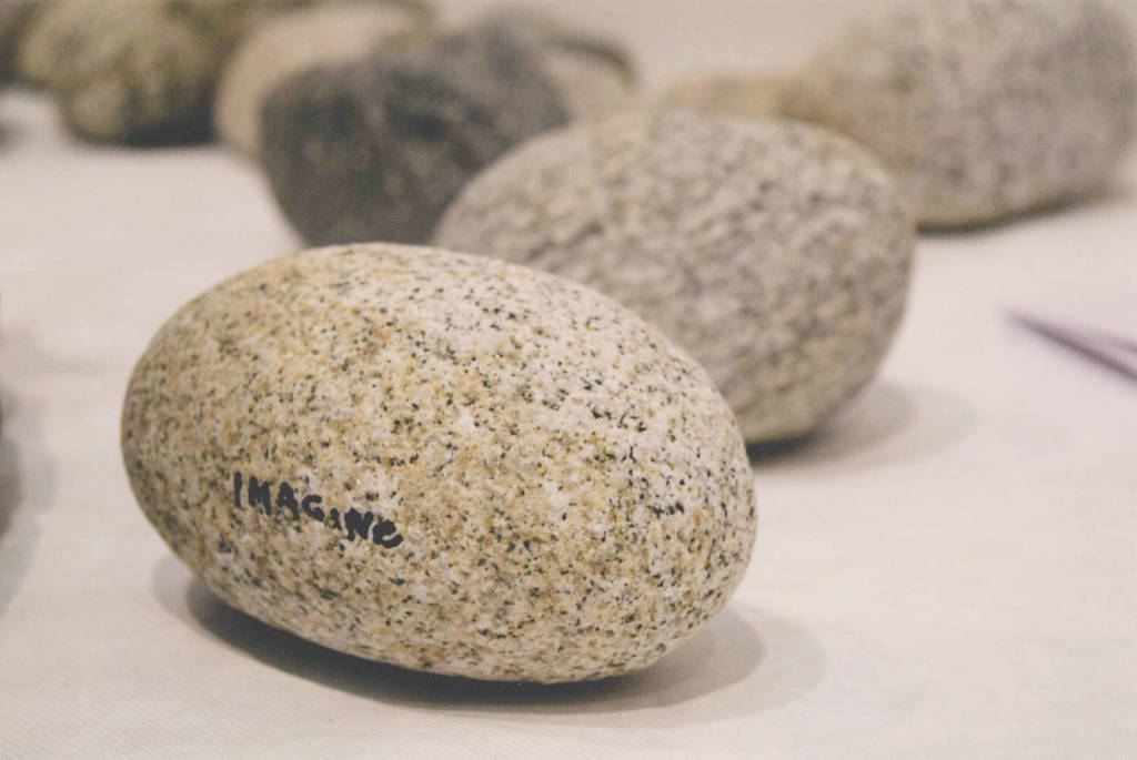
Stone Piece features a pile of river stones that have been honed and shaped by water over time. Ono has inscribed some of the stones with words, such as dream, wish, and remember. Visitors are invited to pick up a stone and hold it, concentrating on the word, and then placing the stone upon the pile of other stones in the center of the room.”
Text: https://www.gardinermuseum.on.ca/event/yoko-ono-riverbed/
Images: https://nuvomagazine.com/wp-content/uploads/2018/02/Stone_Piece_08.jpg
https://www.thestar.com/entertainment/visualarts/2018/02/25/yoko-onos-gardiner-museum-show-asks-you-to-look-and-also-touch.html
Laurel Woodcock, wish you were here, 2003

Image: https://canadianart.ca/news/news-brief-remembering-laurel-woodcock/
Text:https://canadianart.ca/reviews/laurel-woodcock/
Laurel Woodcock, on a clear day, 2010

Woodcock treats words as ready-made or found objects, often lifting phrases from songs and screenplays. on a clear day (2010), four sky-blue aluminum panels originally produced for the Toronto Now space at the Art Gallery of Ontario, borrows its title phrase from two films:Gaby Dellal’s On a Clear Day (2005) and Vincente Minnelli’s On a Clear Day You Can See Forever (1970).”
image and text: https://canadianart.ca/reviews/laurel-woodcock/
Laurence Weiner, Bits & Pieces Put Together to Present a Semblance of a Whole, 2004

“Lawrence Weiner’s texts have appeared in all sorts of places over the last five decades, and although he sees himself as a sculptor rather than a conceptualist, he is among the trailblazers of the 1960s to present art as language. He defines his sculptural medium simply as ‘language + the material referred to’ in the sense that language is a material for construction. Accordingly, his first book Statements (1968) contains 24 typewritten descriptions of works, where only a few had actually been made, suggesting that a work’s existence requires a readership rather than a physical presence. Self-taught as an artist, his urgency to make art broadly available and engaging stems, he says, from his childhood in the South Bronx: “I didn’t have the advantage of a middle-class perspective. Art was something else; art was the notations on the wall, or the messages left by other people. I grew up in a city where I had read the walls; I still read the walls. I love to put work of mine out on the walls and let people read it. Some will remember it and then somebody else comes along and puts something else over it. It becomes archaeology rather than history.” (2013) While Weiner’s works exist only as language and can be displayed in any form, he is closely involved in manifestations, detailing the size of the font, the surface texture and placement of the paint or vinyl letters and indeed often inventing new fonts. Texts appear on walls and windows of galleries and public spaces, as spoken word in audio recordings and video, printed books and posters, cast or carved objects, tattoos, graffiti, lyrics, online, ad infinitum. “
Image: https://commons.wikimedia.org/wiki/File:WeinerText.JPG
text: https://www.lissongallery.com/artists/lawrence-weiner
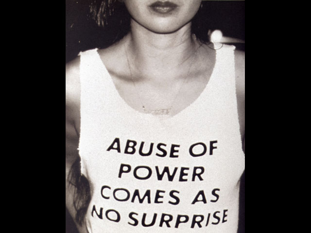
Jenny Holzer, All Fall Text: Truisms, 1977-79 (in English and Spanish); Living, 1980-82 and Survival, 1983-85

If Holzer’s benches transform public park fixtures into artistic media, her LED banners co-opt a structure associated with commerce and advertising. On screens that would typically promote sales, company names, or stock market updates, Holzer broadcasts punchy phrases such as “DON’T TALK DOWN TO ME” or “WITNESS,” along with longer, looping messages. The artist often repurposes her poetic phrases, or “Truisms,” building their power through repetition. (One of Holzer’s most famous messages, “ABUSE OF POWER COMES AS NO SURPRISE,” has been readopted as a protest mantra in the #MeToo era.)
“I like placing content wherever people look,” Holzer told fellow artist Kiki Smith
in a conversation for Interview Magazine, “and that can be at the bottom of a cup or on a shirt or hat or on the surface of a river or all over a building.” Holzer turns the public realm into her exhibition space, gifting her thoughtful poetry to anyone who wants to sit or read a sign.”
Image and text: https://www.artsy.net/article/artsy-editorial-13-artists-highlight-power
Jenny Holzer, Truisms, 1980-

Jenny Holzer, Survival Series, 1986

Shelley Niro, The Shirt (detail), 2003
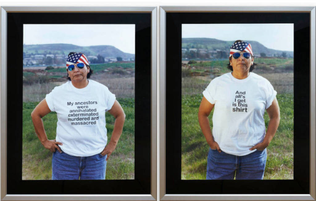
“In “The Shirt” – a video that debuted at the 2003 Venice Biennale – Kanien’kehaka (Mohawk) artist and director Shelley Niro parodies the archetypal tourist tee-shirt from the point of view of First Nations Peoples as an exploration into the lasting effects of European colonialism in North America. Facing the camera directly and poised against the landscape of “America”, an Aboriginal woman with biker-like accessories bears a sequential series of statements on her tee-shirt that together comprise a discourse on colonialism. The darkly ironic and yet brutally truthful messages of “The Shirt” draw attention to the history of invasion that indigenous peoples have experienced in North America. By presenting the tee-shirts as souvenirs and memories of these impositions, Niro’s work suggests that the consequences of colonialism are still active today. The Shirt is an ironic and humorous take on colonialism enacted through text on T-shirts worn by an Aboriginal woman (artist Hulleah Tsinhnahjinnie). Directly facing the camera with the landscape of “America” as a backdrop, the woman poses in shirts that bear a sequential series of statements that together comprise a discourse on North America’s troubled past.”
Text:https://www.gallery.ca/collection/artwork/the-shirt
Image: https://www.thestar.com/entertainment/visualarts/2017/05/21/shelley-niro-the-way-of-the-subtle-warrior.html
Barbara Kruger, Untitled (Your body is a battleground), 1989

Kruger has said that “I work with pictures and words because they have the ability to determine who we are and who we aren’t.”[15] A larger category that threads through her work is the appropriation and alteration of existing images. In describing her use of appropriation, Kruger states:
Pictures and words seem to become the rallying points for certain assumptions. There are assumptions of truth and falsity and I guess the narratives of falsity are called fictions. I replicate certain words and watch them stray from or coincide with the notions of fact and fiction.[16]”
Image and Text: https://en.wikipedia.org/wiki/Barbara_Kruger#/media/File:Untitled_(Your_body_is_a_battleground).jpg
.jpg)

Image: https://www.widewalls.ch/consumerist-culture-art-10-artworks/
BARBARA KRUGER: BELIEF+DOUBT 2012–ONGOING
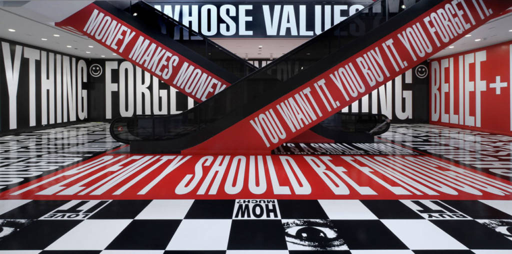
At a moment when ideological certitude and purity seem especially valued, Kruger says she’s “interested in introducing doubt.” Large areas of the installation are devoted to open-ended questions (“WHO IS BEYOND THE LAW? WHO IS FREE TO CHOOSE? WHO SPEAKS? WHO IS SILENT?”), while the section occupying the bookstore explores themes of desire and consumption. At once addressing the individual, the museum, and, symbolically, the country, Kruger’s penetrating examination of the public sphere transforms one of the Hirshhorn’s key public spaces.
Text + Image: https://hirshhorn.si.edu/exhibitions/barbara-kruger-beliefdoubt/
Bruce Nauman, Eat Death, (1972)

“Much of his work is characterized by an interest in language, often manifesting itself as visual puns. He has an interest in setting the metaphoric and descriptive functions of language against each other. For example, the neon Run From Fear – Fun From Rear, or the photograph Bound To Fail, which literalizes the title phrase and shows the artist’s arms tied behind his back. He seems to be fascinated by the nature of communication and language’s inherent problems, as well as the role of the artist as supposed communicator and manipulator of visual symbols.”
Text: https://en.wikipedia.org/wiki/Bruce_Nauman
Bruce Nauman, American Violence, 1982

Text and Image: https://artsandculture.google.com/asset/human-nature-life-death-knows-doesn%E2%80%99t-know-bruce-nauman/vwFYkbSOKHQcxA
Christian Bök & Micah Lexier, Two Equal Texts, 2007

Micah Lexier, Here, Not Here (Dark Blue), 2017

Website: http://micahlexier.com/
text: https://www.theglobeandmail.com/arts/books-and-media/micah-lexier-weve-got-his-number/article4319088/
Image: http://birchcontemporary.com/artist/micah-lexier
Michael Fernandes, Arrivals/Departures, 2010

Text: http://ccca.concordia.ca/nuitblanche/nuitblanche2010/artists/c4.html
Images: https://www.thisiscolossal.com/2010/10/arrivals-and-departures/
Jose Andres Mora, Continuous Script, 2019
Jose Andres Mora, Reeler, 2019
vimeo: https://vimeo.com/joseandresmora
Mel Bochner , Blah Blah Blah, 2016

In another series, Bochner renders a group of synonyms—for words like “money,” “obscene,” “obvious,” or “amazing”—in rows. The viewer is forced to consider both the subtleties of language and the garishness of English: We have an awful lot of ways to discuss commerce and convey hyperbole. Bochner’s style amplifies this sense of ornamentation; exclamation points and bright oranges, yellows, and reds abound.”
Image and Text: https://www.artsy.net/article/artsy-editorial-13-artists-highlight-power
Nadia Myre, Indian Act, 2002

Between 1999 and 2002, Nadia Myre enlisted over 230 friends, colleagues and strangers to help her bead over the Indian Act. With the help of Rhonda Meier, they organized workshops and presentations at Concordia University, and hosted weekly beading bees at Oboro Gallery, where it was presented as part of the exhibition, Cont[r]act, in 2002.”
Text and image: http://www.nadiamyre.net/#/indian-act/
Adam Pendleton, Black Dada, 2017
Not all of Pendleton’s work with text, however, is illegible. He’s appropriated phrases from writer Gertrude Stein, artist Ad Reinhardt, and musician Sun Ra, and frequently overlaid varying backdrops (photographs of bricks or an African mask) with the word “INDEPENDANCE.” For the 2015 Venice Biennale, he created large-scale wall works for the Belgian pavilion that replicated the words “Black Lives Matter” in a loose, graffiti-like scrawl.”
Text + image: https://www.artsy.net/article/artsy-editorial-13-artists-highlight-power
Guerrilla Girls, Guerrilla Girls Definition Of A Hypocrite, 1990
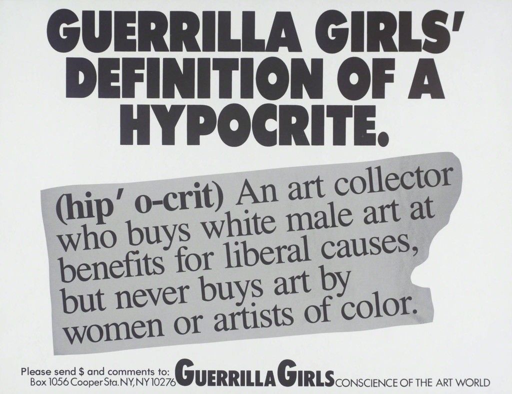
appear. The answer to their provocation? The state accused both men of murdering women (Simpson: his ex-wife Nicole Brown Simpson; Andre: his wife Ana Mendieta). Both enjoyed acquittals and avoided jail time. The Guerilla Girls discuss the prevalence of domestic violence beneath the pictures. They also include a tagline at the bottom: “A public service message from Guerilla Girls conscience of the art world.”
Another famous work, Do Women Have to Be Naked to Get Into the Met Museum? (1989), critiques the lack of art by female practitioners in major institutions. Across the Guerilla Girls’s oeuvre, wry ideology becomes an art form. Their messaging—and its situation within the institutions it critiques—supersedes all other aesthetic concerns.”
Image and Text: https://www.artsy.net/article/artsy-editorial-13-artists-highlight-power
bpNichol, First Screening, 1984
Text and video: https://torontopubliclibrary.typepad.com/trl/2015/09/bp.html
bpNichol, Blues, 1968

Eleanor King, No Justice No Peace, 2015

The Peekskill Project, Hudson Valley Center for Contemporary Art
Image:http://eleanorking.com/index.php?/projects/wall-texts/
Jon Rubin, The Last Billboard, 2010-2018

“Founded in 2010, The Last Billboard was a 36 foot long rooftop billboard located on the corner of Highland and Baum in Pittsburgh, PA, USA. Each month a different artist was invited to use the billboard. The custom designed billboard consisted of a rail system with wooden letters that were changed by hand.
The Last Billboard ended operations in April, 2018 after artist Alisha Wormsley’s text was removed from the billboard by the property’s landlord under pressure from area developers. “
Image and text: https://www.thelastbillboard.com/about
Lenka Clayton, Fruit and Other Things, 2018
Collaboration with Jon Rubin / Carnegie International 57th Edition 2018, Carnegie Museum of Pittsburgh
Full Project Website
“From 1896 to 1931 the Carnegie International selected artworks for its exhibitions from an international competition. The museum kept meticulous records, not only of all the works accepted, but of those rejected as well. Only the title, artist’s names, and the year of each work were recorded, no images exist. Over this 35 year span, 10,632 artworks were rejected from the exhibitions. For the duration of the 57th Carnegie International, each of the 10,632 rejected titles were made into individual hand-lettered text paintings. Each text painting was exhibited for a day, and then given away to visitors.”
Text and image: https://www.fruitandotherthings.com/home
Germaine Koh, Dear Mercer, 2006
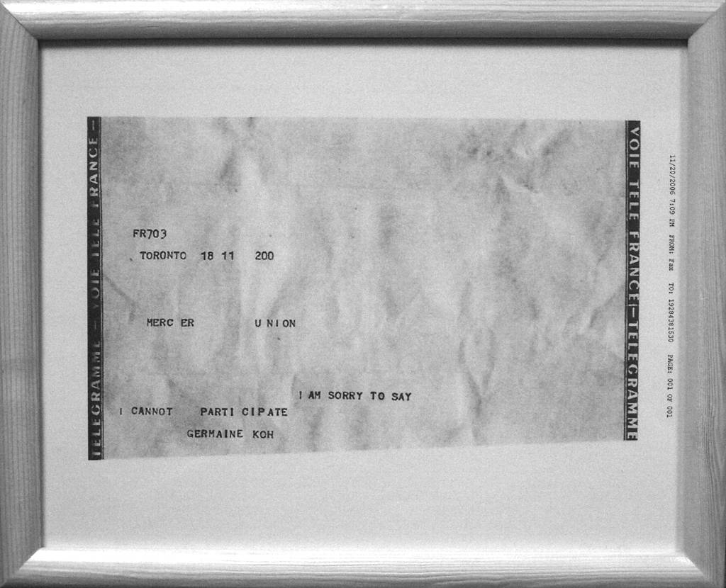
unlimited series”
text and image: http://germainekoh.com/ma/projects_detail.cfm?pg=projects&projectID=19
John Baldessari, Tips for Artists Who Want to Sell, 1966-1968

By 1966, Baldessari was using photographs and text, or simply text, on canvas.[2] His early major works were canvas paintings that were empty but for painted statements derived from contemporary art theory. An early attempt of Baldessari’s included the hand-painted phrase “Suppose it is true after all? WHAT THEN?” (1967) on a heavily worked painted surface. However, this proved personally disappointing because the form and method conflicted with the objective use of language that he preferred to employ. Baldessari decided the solution was to remove his own hand from the construction of the image and to employ a commercial, lifeless style so that the text would impact the viewer without distractions. The words were then physically lettered by sign painters, in an unornamented black font. The first of this series presented the ironic statement “A TWO-DIMENSIONAL SURFACE WITHOUT ANY ARTICULATION IS A DEAD EXPERIENCE” (1967).”
text: https://en.wikipedia.org/wiki/John_Baldessari
image: https://imageobjecttext.com/tag/john-baldessari/